Download as PDF, PPTX


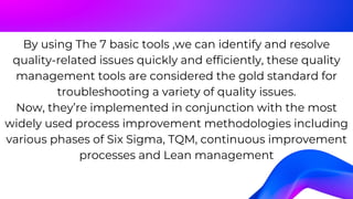
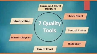
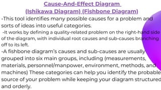
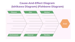
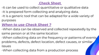
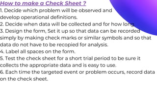
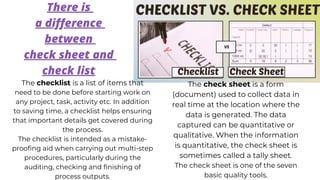
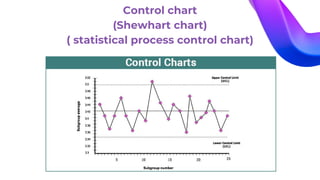
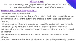
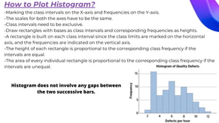
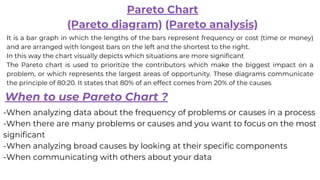
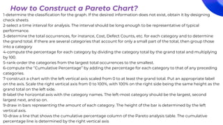
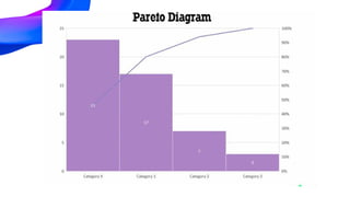
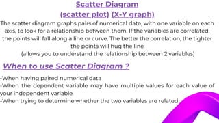
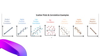


The document outlines the seven basic quality tools developed by Kaoru Ishikawa in the 1950s for effective quality control, emphasizing their importance in identifying and resolving quality-related issues. Key tools discussed include the cause-and-effect diagram, check sheets, control charts, histograms, Pareto charts, scatter diagrams, and flow charts, each with specific applications and methods for use. These tools are crucial for implementing various process improvement methodologies such as Six Sigma and Total Quality Management.


![ECG [Compatibility Mode].pdf](https://cdn.slidesharecdn.com/ss_thumbnails/ecgcompatibilitymode-230828072404-d338c45c-thumbnail.jpg?width=640&height=640&fit=bounds)


