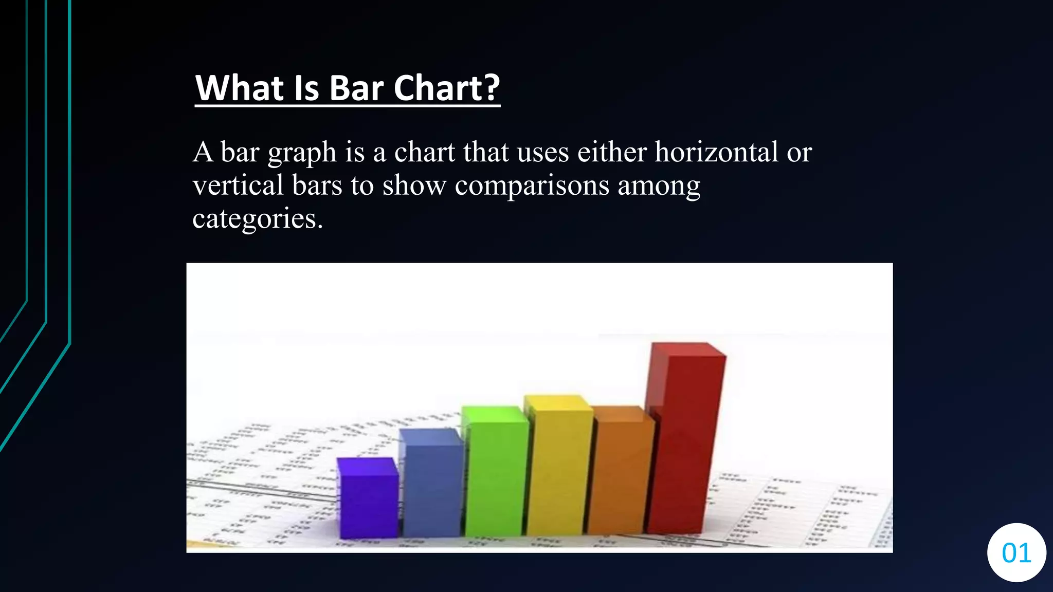
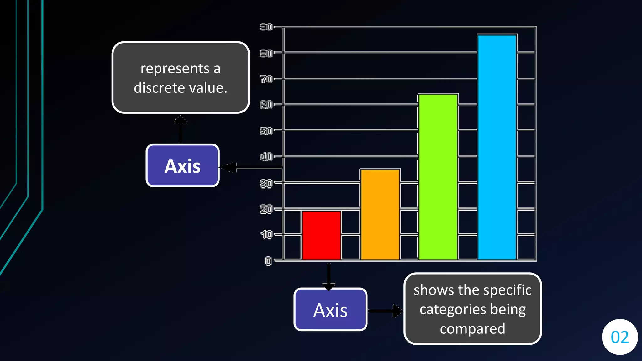
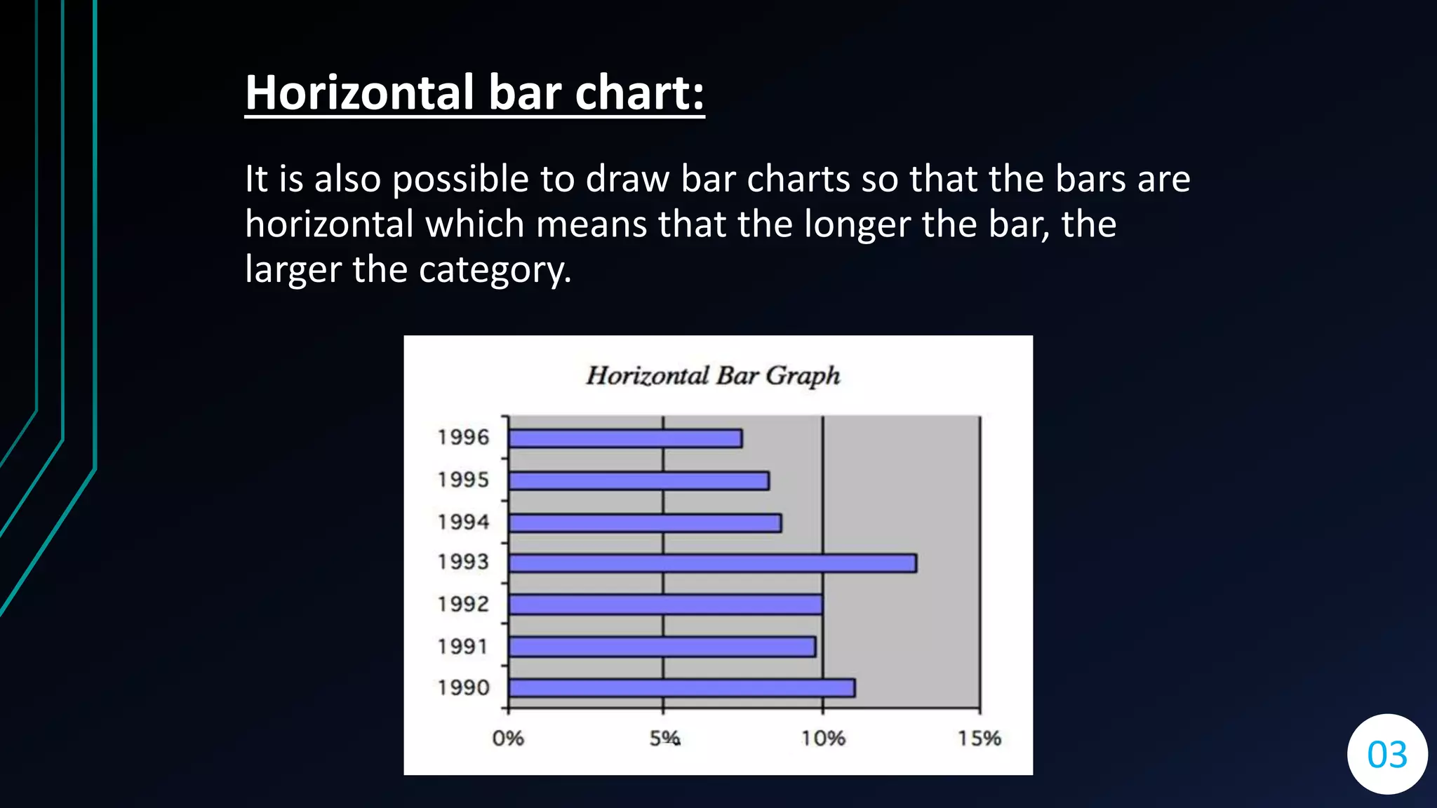
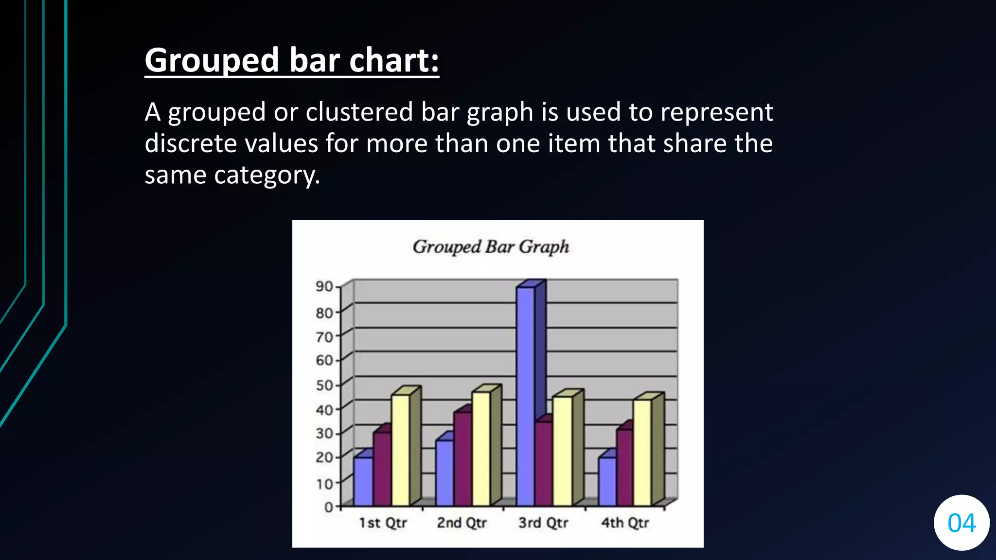
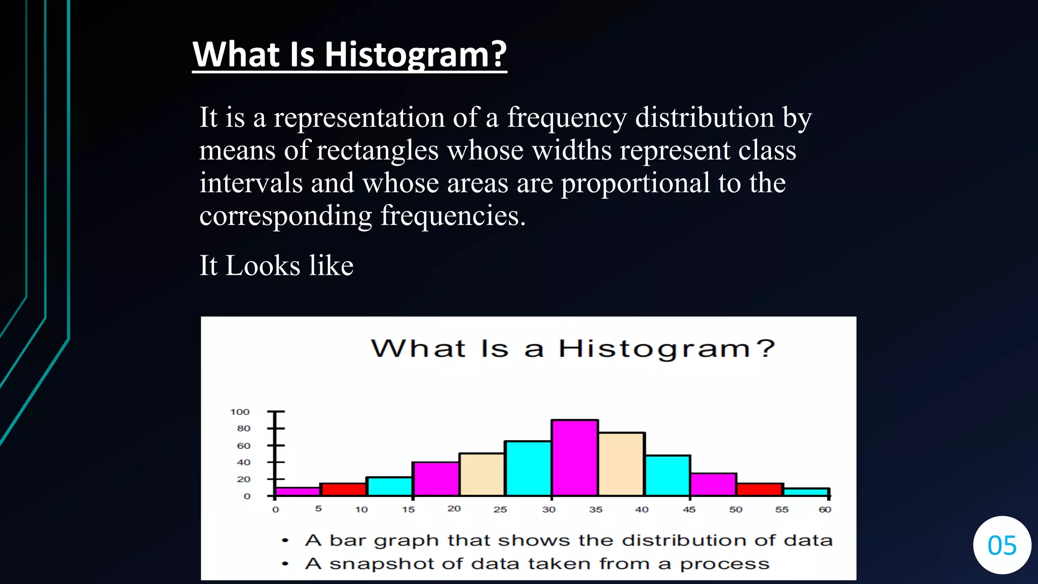
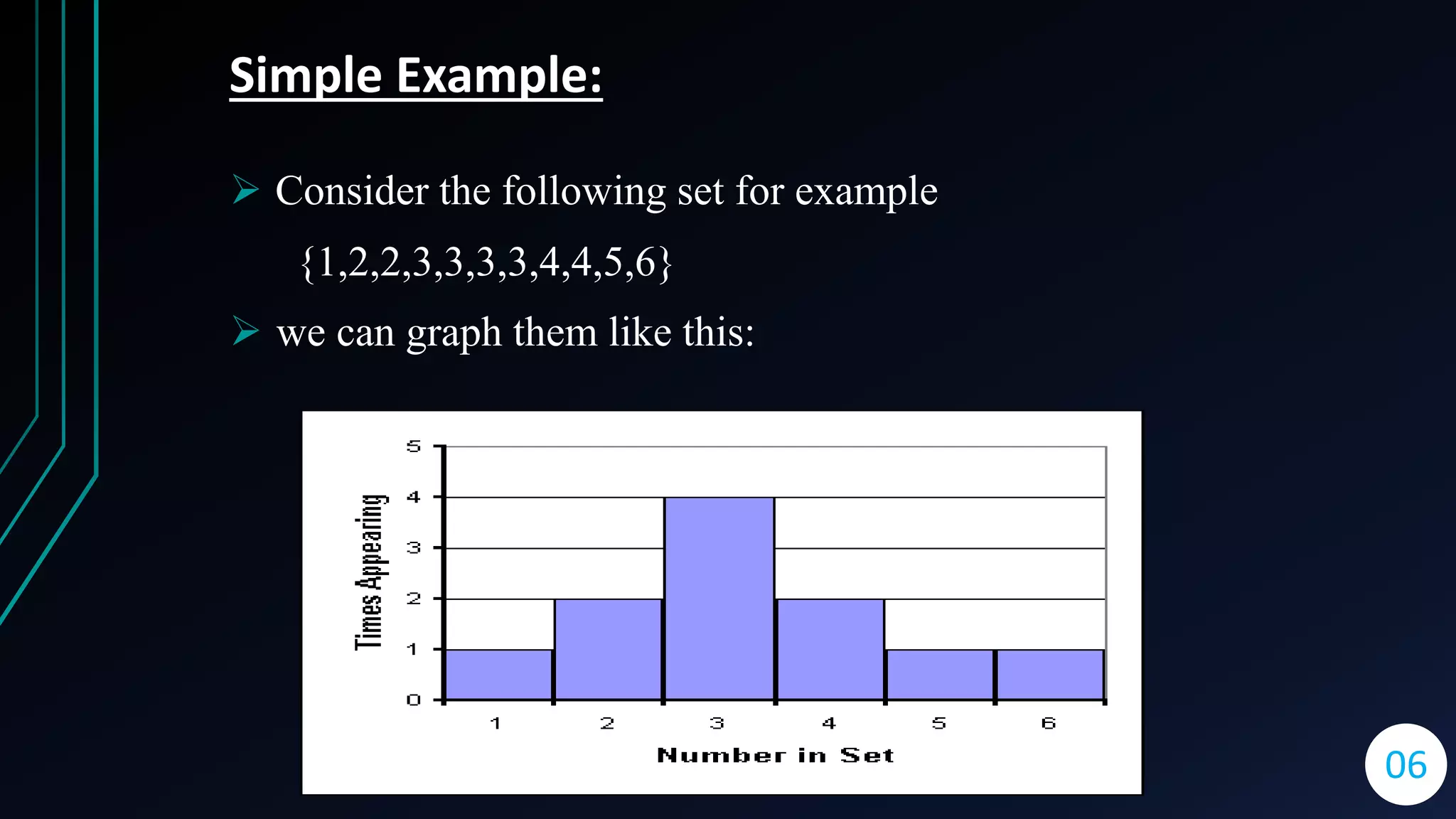
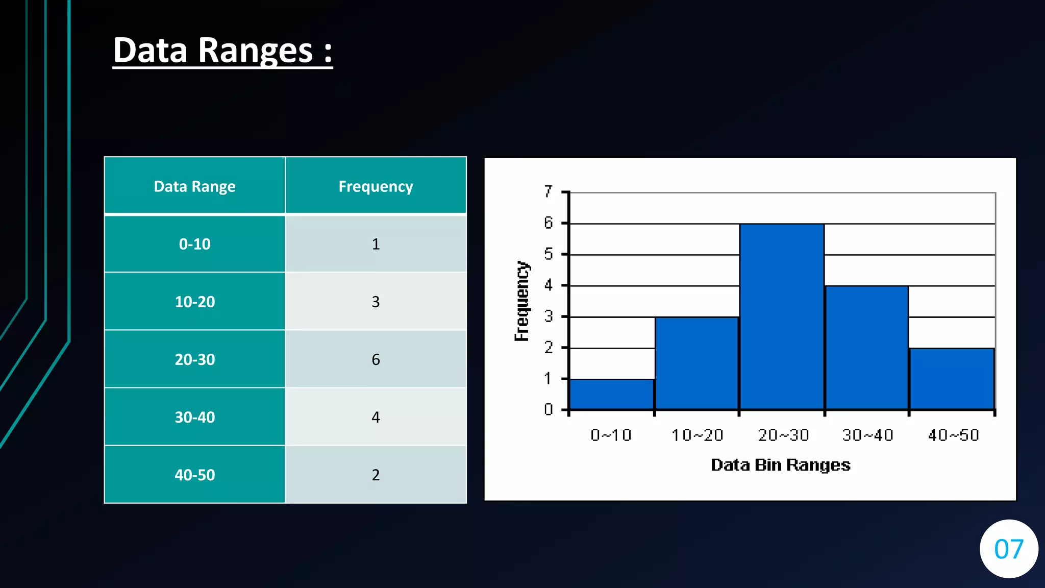
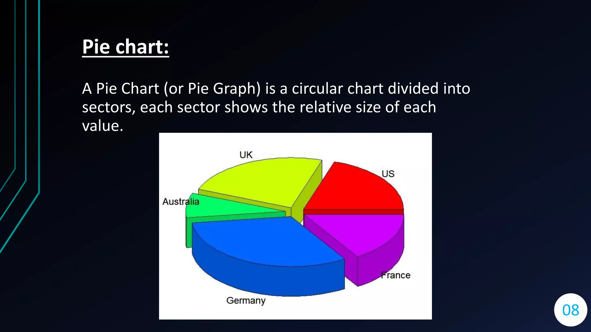
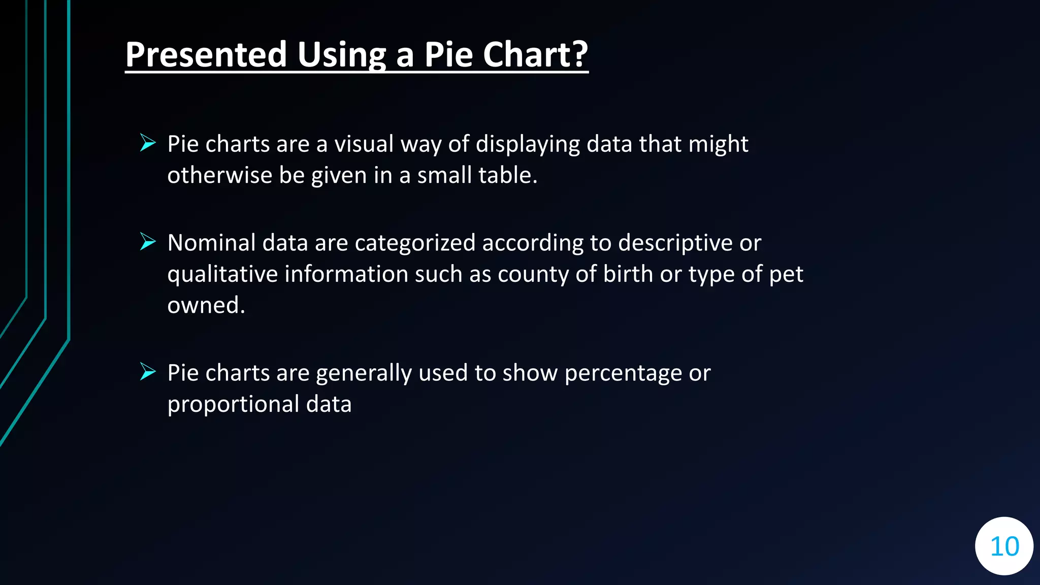
The presentation covers three types of charts: bar charts, histograms, and pie charts. Bar charts compare discrete values using horizontal or vertical bars, while histograms represent frequency distributions with rectangles. Pie charts illustrate relative sizes of different categories in a circular format, often used for percentage or proportional data.