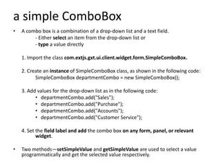
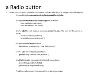
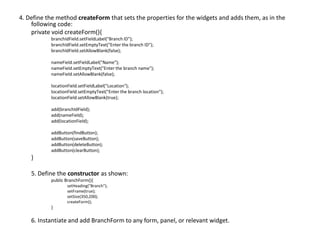
GWT
GWT Panels
• GWT panels are container controls that layout widgets in various
  ways
       <Simple Layout Panel>                           <Complex Layout Panel>
       - FlowPanel                                         - StackPanel
       - HorizontalSplitPanel, VerticalSplitPanel          - TabPanel
       - HorizontalPanel, VerticalPanel                                           -
       - Flex Table, Grid
       - TabPanel
       - DeckPanel
       - DockPanel
       - HTMLPanel

       < Simple Container Panels >                     < Complex Container Panels >
           - Composite                                     - FormPanel
           - SimplePanel                                   - DisclosurePanel
           - ScrollPanel                                   - PopupPanel
           - FocusPanel                                    - DialogBox

                                     - AbsolutePanel
                                     - GroupBoxPanel
Widgets
•   A widget is an element of the GUI that displays information and is used for interaction with
    the user.

•   An elements which display for information (the user input and displaying information to the
    user)

•   Widgets are the visual building blocks for a GUI application.

•   Having various ExtGWT/GXT library.

•   Various types of widgets . Some of the common widgets are
       <Static Widget>      <Form Widget>
           - Label,               - Button, Toggle Button, Push Button, Radio button,
           - HTML,                - Check box, List Box, Combo box, DialogBox,
           - HyperLink              Suggest Box, Text field, Password Text Field,
                                  - TextArea, RichTextArea,
                                  - File Upload
                                  - Hidden
                                  - Date picker,

     <Complex Widget>
          - Tree
           - Menue Bar
Using a widget
Create instances - Set some properties - Add the widget on the form or panel

1. Create instances of the widget class. For example:
    –   CheckBox checkbox = new CheckBox();
    –   ComboBox comboBox = new ComboBox();
    –   DateField dateField = new DateField();
    –   Radio radio = new Radio();
    –   TextArea textArea = new TextArea();
    –   TextField textField = new TextField();

2. Set some properties for the widgets. For example, for a text field:
    – textField.setFieldLabel("Name");
    – textField.setAllowBlank(false);

3. Add the widget on the form or panel. For example:
    – FormPanel formPanel=new FormPanel();
    – formPanel.add(textField);
a TextField
• Allows the user to input one-line text information

   1.   Import the class com.extjs.gxt.ui.client.widget.form.TextField
        from the GXT library.

   2. Instantiate it as shown:
      TextField<String> nameField = new TextField<String>();

   3. Set the required properties. Some examples are as follows:
            –   nameField.setAllowBlank(false);
            –   nameField.setEmptyText("Enter Employee's Full Name");
            –   nameField.setFieldLabel("Full Name");
            –   nameField.setSelectOnFocus(true);

   4. Add the field on the required form or panel.
working with TextField
• Instantiating TextField with a String type parameter
        • TextField as String
        • If Integer is given as the parameter type,
                  - The setValue method of TextField will accept an
                  Integer value as the argument, and
                 - The getValue method will return an Integer value.
        • setAllowBlank method
             – Giving false as the argument means that it is a mandatory field and that the user
               must give an input;
             – Giving true as the argument makes the field optional for input.
        • TextField, an empty text with a light foreground
            - the setEmptyText method with the message given as an
        argument.
        • a label for the TextField, the setFieldLabel method is used.
        • the existing value in TextField is automatically selected if the
          setSelectOnFocus method is called with true as the argument.
        • To use TextField to accept a password, invoke the setPassword(Boolean)
          method.
        • Create ReadOnly
            TextField passwordField=new TextField();
            passwordField.setPassword(true);
a simple ComboBox
•   A combo box is a combination of a drop-down list and a text field.
         - Either select an item from the drop-down list or
         - type a value directly

    1. Import the class com.extjs.gxt.ui.client.widget.form.SimpleComboBox.

    2. Create an instance of SimpleComboBox class, as shown in the following code:
          SimpleComboBox departmentCombo = new SimpleComboBox();

    3. Add values for the drop-down list as in the following code:
          • departmentCombo.add("Sales");
          • departmentCombo.add("Purchase");
          • departmentCombo.add("Accounts");
          • departmentCombo.add("Customer Service");

    4. Set the field label and add the combo box on any form, panel, or relevant
           widget.

•   Two methods—setSimpleValue and getSimpleValue are used to select a value
    programmatically and get the selected value respectively.
a Radio button
•   A radio group is a group of radio buttons which allows selecting only a single radio in the group.
            1. Import the class com.extjs.gxt.ui.client.widget.form.Radio.

            2. Create an instance for each of the options as shown:
                  Radio maleRadio = new Radio();
                  Radio femaleRadio = new Radio();


            3. Set a label for each instance appearing beside the radio. The code for the same is as
            below:
                  maleRadio.setBoxLabel("Male");
                  femaleRadio.setBoxLabel("Female");


            4. Create a RadioGroup instance:
                 RadioGroup genderGroup = new RadioGroup();

            5. Set a label for RadioGroup as shown:
                 genderGroup.setFieldLabel("Gender");

            6. Add all the radio instances in the RadioGroup instance:
                genderGroup.add(maleRadio);
                genderGroup.add(femaleRadio);

            7. Add the radio group in the required form, panel, or widget.
a DateField
• A calendar widget and a text field combined
  into the DateField widget allows to input date-
  type data.
• This calendar widget has more control of the
  date ranges.
• We can
  – disable all the dates before a particular date,
  – disable future dates, and so on.
  – Keyboard navigation is also supported.
Using DateField
1. Import the class com.extjs.gxt.ui.client.widget.form.DateField.

2. Create an instance of the DateField class as shown:
   DateField dateOfBirthField = new DateField();

3. Set the minimum and maximum(not set/set) allowable date:
    dateOfBirthField.setMinValue(new Date(80,1,1));
    dateOfBirthField.setMaxValue(new Date());

4. Add the DateField instance to any form, panel, or relevant widget.
a simple form
Create a simple form for adding, updating, deleting, and finding

   1. Import the following classes:
        import com.extjs.gxt.ui.client.widget.button.Button;
        import com.extjs.gxt.ui.client.widget.form.FormPanel;
        import com.extjs.gxt.ui.client.widget.form.TextField;

   2. Create the BranchForm(as for example) class that inherits the
         FormPanel class:
                  public class BranchForm extends FormPanel

   3. Create the widget instances, as in the following code:
        TextField<Integer> branchIdField = new TextField<Integer>();
        TextField<String> nameField = new TextField<String>();
        TextField<String> locationField = new TextField<String>();

        Button findButton=new Button("Find");
        Button saveButton=new Button("Save");
        Button deleteButton=new Button("Delete");
        Button clearButton=new Button("Clear");
4. Define the method createForm that sets the properties for the widgets and adds them, as in the
    following code:
    private void createForm(){
           branchIdField.setFieldLabel("Branch ID");
           branchIdField.setEmptyText("Enter the branch ID");
           branchIdField.setAllowBlank(false);

           nameField.setFieldLabel("Name");
           nameField.setEmptyText("Enter the branch name");
           nameField.setAllowBlank(false);

           locationField.setFieldLabel("Location");
           locationField.setEmptyText("Enter the branch location");
           locationField.setAllowBlank(true);

           add(branchIdField);
           add(nameField);
           add(locationField);

           addButton(findButton);
           addButton(saveButton);
           addButton(deleteButton);
           addButton(clearButton);
    }

    5. Define the constructor as shown:
           public BranchForm(){
                  setHeading("Branch");
                  setFrame(true);
                  setSize(350,200);
                  createForm();
           }

    6. Instantiate and add BranchForm to any form, panel, or relevant widget.

GWT Widgets

  • 1.
  • 2.
    GWT Panels • GWTpanels are container controls that layout widgets in various ways <Simple Layout Panel> <Complex Layout Panel> - FlowPanel - StackPanel - HorizontalSplitPanel, VerticalSplitPanel - TabPanel - HorizontalPanel, VerticalPanel - - Flex Table, Grid - TabPanel - DeckPanel - DockPanel - HTMLPanel < Simple Container Panels > < Complex Container Panels > - Composite - FormPanel - SimplePanel - DisclosurePanel - ScrollPanel - PopupPanel - FocusPanel - DialogBox - AbsolutePanel - GroupBoxPanel
  • 3.
    Widgets • A widget is an element of the GUI that displays information and is used for interaction with the user. • An elements which display for information (the user input and displaying information to the user) • Widgets are the visual building blocks for a GUI application. • Having various ExtGWT/GXT library. • Various types of widgets . Some of the common widgets are <Static Widget> <Form Widget> - Label, - Button, Toggle Button, Push Button, Radio button, - HTML, - Check box, List Box, Combo box, DialogBox, - HyperLink Suggest Box, Text field, Password Text Field, - TextArea, RichTextArea, - File Upload - Hidden - Date picker, <Complex Widget> - Tree - Menue Bar
  • 4.
    Using a widget Createinstances - Set some properties - Add the widget on the form or panel 1. Create instances of the widget class. For example: – CheckBox checkbox = new CheckBox(); – ComboBox comboBox = new ComboBox(); – DateField dateField = new DateField(); – Radio radio = new Radio(); – TextArea textArea = new TextArea(); – TextField textField = new TextField(); 2. Set some properties for the widgets. For example, for a text field: – textField.setFieldLabel("Name"); – textField.setAllowBlank(false); 3. Add the widget on the form or panel. For example: – FormPanel formPanel=new FormPanel(); – formPanel.add(textField);
  • 5.
    a TextField • Allowsthe user to input one-line text information 1. Import the class com.extjs.gxt.ui.client.widget.form.TextField from the GXT library. 2. Instantiate it as shown: TextField<String> nameField = new TextField<String>(); 3. Set the required properties. Some examples are as follows: – nameField.setAllowBlank(false); – nameField.setEmptyText("Enter Employee's Full Name"); – nameField.setFieldLabel("Full Name"); – nameField.setSelectOnFocus(true); 4. Add the field on the required form or panel.
  • 6.
    working with TextField •Instantiating TextField with a String type parameter • TextField as String • If Integer is given as the parameter type, - The setValue method of TextField will accept an Integer value as the argument, and - The getValue method will return an Integer value. • setAllowBlank method – Giving false as the argument means that it is a mandatory field and that the user must give an input; – Giving true as the argument makes the field optional for input. • TextField, an empty text with a light foreground - the setEmptyText method with the message given as an argument. • a label for the TextField, the setFieldLabel method is used. • the existing value in TextField is automatically selected if the setSelectOnFocus method is called with true as the argument. • To use TextField to accept a password, invoke the setPassword(Boolean) method. • Create ReadOnly TextField passwordField=new TextField(); passwordField.setPassword(true);
  • 7.
    a simple ComboBox • A combo box is a combination of a drop-down list and a text field. - Either select an item from the drop-down list or - type a value directly 1. Import the class com.extjs.gxt.ui.client.widget.form.SimpleComboBox. 2. Create an instance of SimpleComboBox class, as shown in the following code: SimpleComboBox departmentCombo = new SimpleComboBox(); 3. Add values for the drop-down list as in the following code: • departmentCombo.add("Sales"); • departmentCombo.add("Purchase"); • departmentCombo.add("Accounts"); • departmentCombo.add("Customer Service"); 4. Set the field label and add the combo box on any form, panel, or relevant widget. • Two methods—setSimpleValue and getSimpleValue are used to select a value programmatically and get the selected value respectively.
  • 8.
    a Radio button • A radio group is a group of radio buttons which allows selecting only a single radio in the group. 1. Import the class com.extjs.gxt.ui.client.widget.form.Radio. 2. Create an instance for each of the options as shown: Radio maleRadio = new Radio(); Radio femaleRadio = new Radio(); 3. Set a label for each instance appearing beside the radio. The code for the same is as below: maleRadio.setBoxLabel("Male"); femaleRadio.setBoxLabel("Female"); 4. Create a RadioGroup instance: RadioGroup genderGroup = new RadioGroup(); 5. Set a label for RadioGroup as shown: genderGroup.setFieldLabel("Gender"); 6. Add all the radio instances in the RadioGroup instance: genderGroup.add(maleRadio); genderGroup.add(femaleRadio); 7. Add the radio group in the required form, panel, or widget.
  • 9.
    a DateField • Acalendar widget and a text field combined into the DateField widget allows to input date- type data. • This calendar widget has more control of the date ranges. • We can – disable all the dates before a particular date, – disable future dates, and so on. – Keyboard navigation is also supported.
  • 10.
    Using DateField 1. Importthe class com.extjs.gxt.ui.client.widget.form.DateField. 2. Create an instance of the DateField class as shown: DateField dateOfBirthField = new DateField(); 3. Set the minimum and maximum(not set/set) allowable date: dateOfBirthField.setMinValue(new Date(80,1,1)); dateOfBirthField.setMaxValue(new Date()); 4. Add the DateField instance to any form, panel, or relevant widget.
  • 11.
    a simple form Createa simple form for adding, updating, deleting, and finding 1. Import the following classes: import com.extjs.gxt.ui.client.widget.button.Button; import com.extjs.gxt.ui.client.widget.form.FormPanel; import com.extjs.gxt.ui.client.widget.form.TextField; 2. Create the BranchForm(as for example) class that inherits the FormPanel class: public class BranchForm extends FormPanel 3. Create the widget instances, as in the following code: TextField<Integer> branchIdField = new TextField<Integer>(); TextField<String> nameField = new TextField<String>(); TextField<String> locationField = new TextField<String>(); Button findButton=new Button("Find"); Button saveButton=new Button("Save"); Button deleteButton=new Button("Delete"); Button clearButton=new Button("Clear");
  • 12.
    4. Define themethod createForm that sets the properties for the widgets and adds them, as in the following code: private void createForm(){ branchIdField.setFieldLabel("Branch ID"); branchIdField.setEmptyText("Enter the branch ID"); branchIdField.setAllowBlank(false); nameField.setFieldLabel("Name"); nameField.setEmptyText("Enter the branch name"); nameField.setAllowBlank(false); locationField.setFieldLabel("Location"); locationField.setEmptyText("Enter the branch location"); locationField.setAllowBlank(true); add(branchIdField); add(nameField); add(locationField); addButton(findButton); addButton(saveButton); addButton(deleteButton); addButton(clearButton); } 5. Define the constructor as shown: public BranchForm(){ setHeading("Branch"); setFrame(true); setSize(350,200); createForm(); } 6. Instantiate and add BranchForm to any form, panel, or relevant widget.