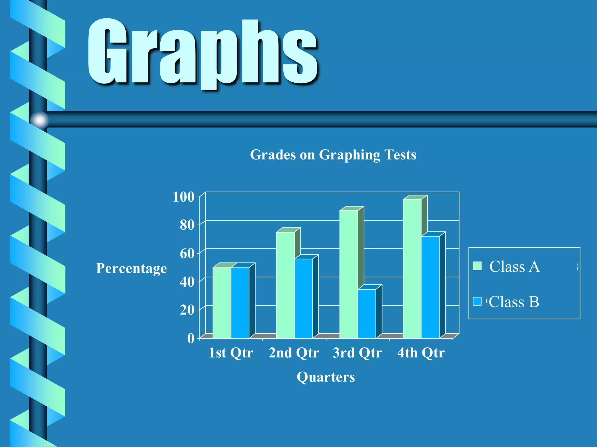
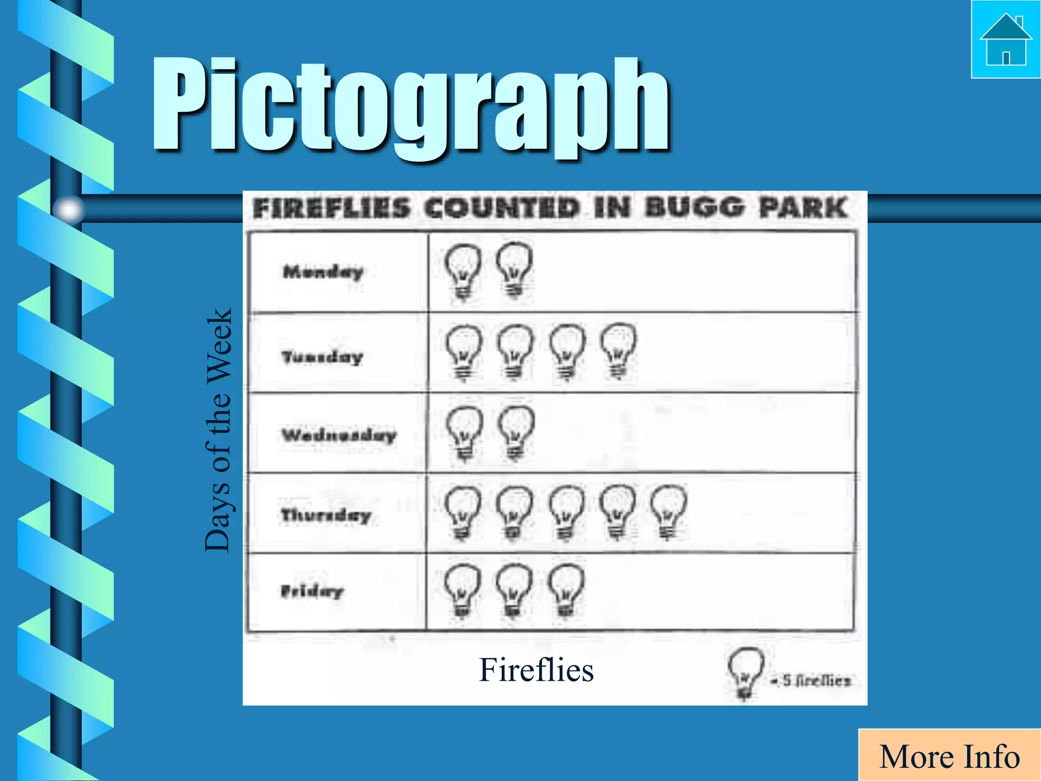
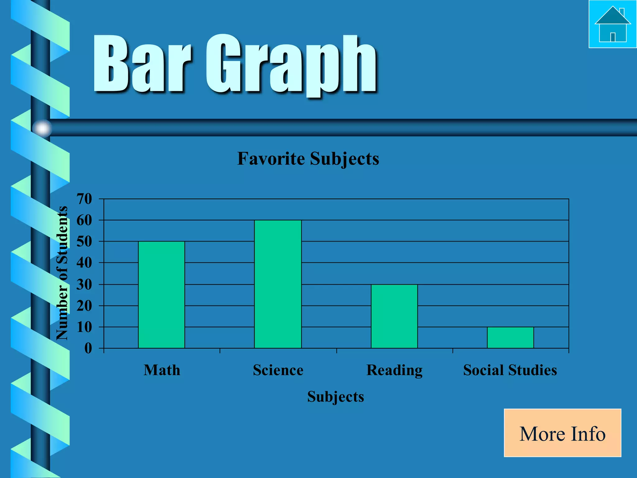
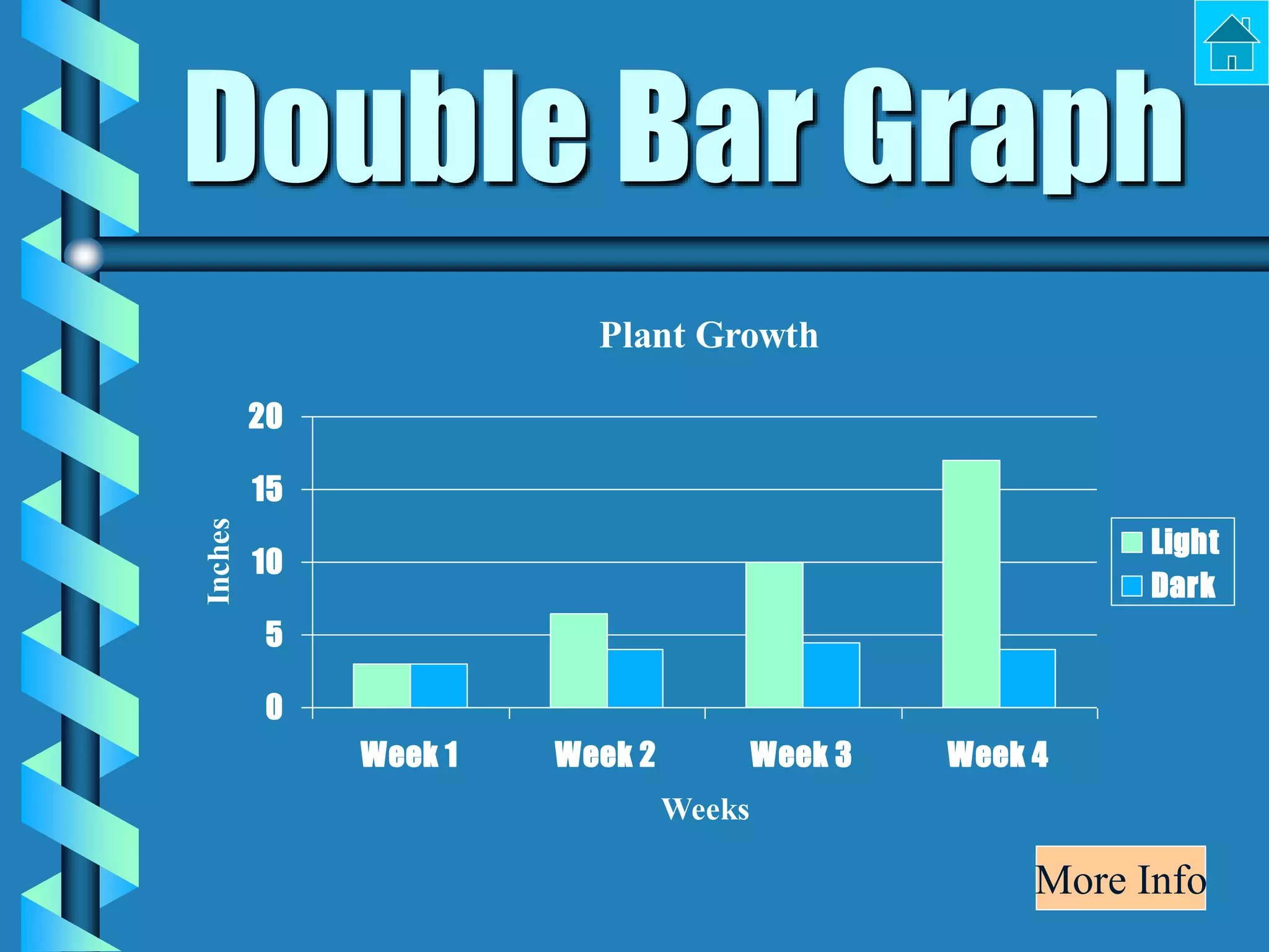
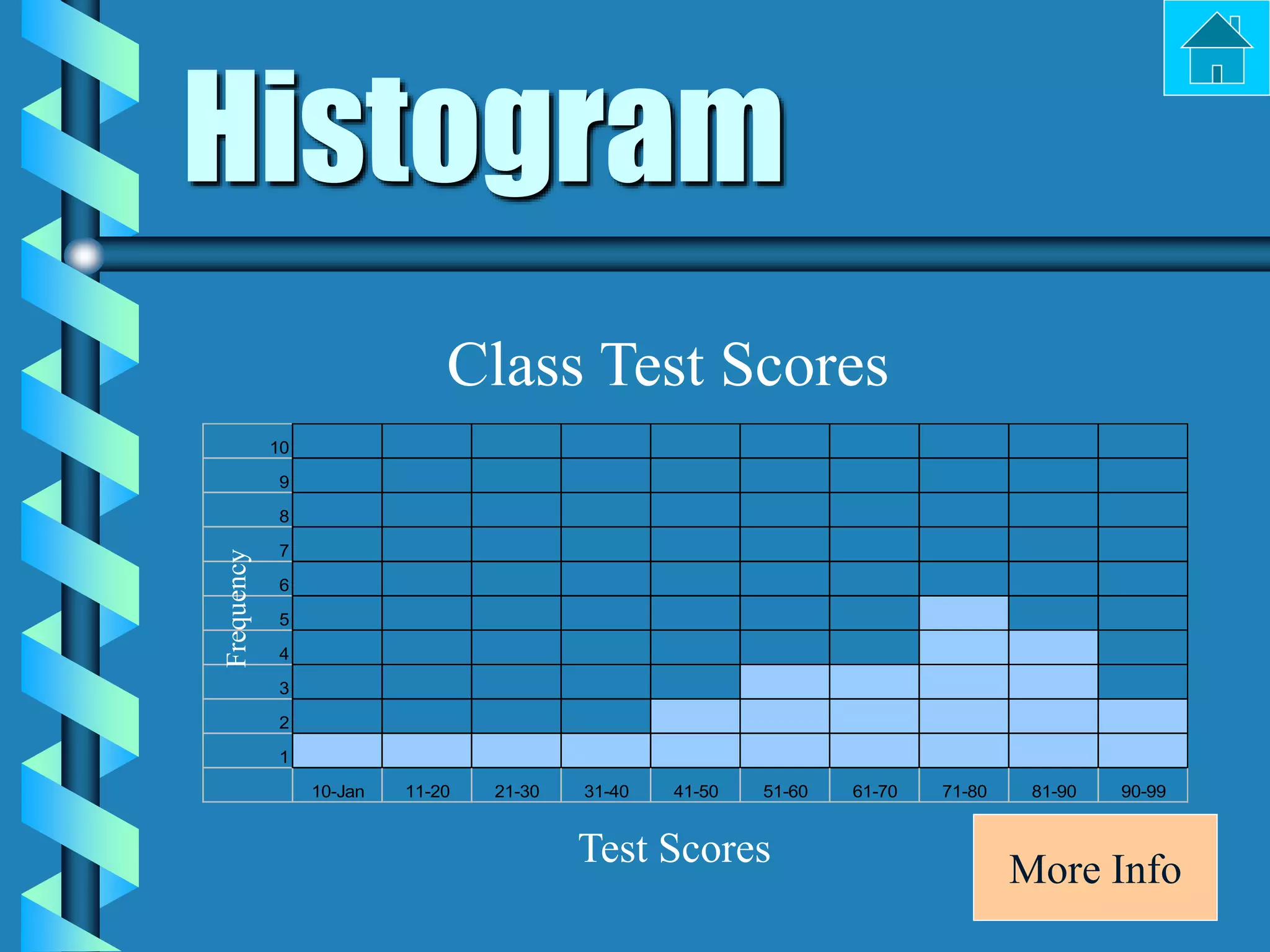
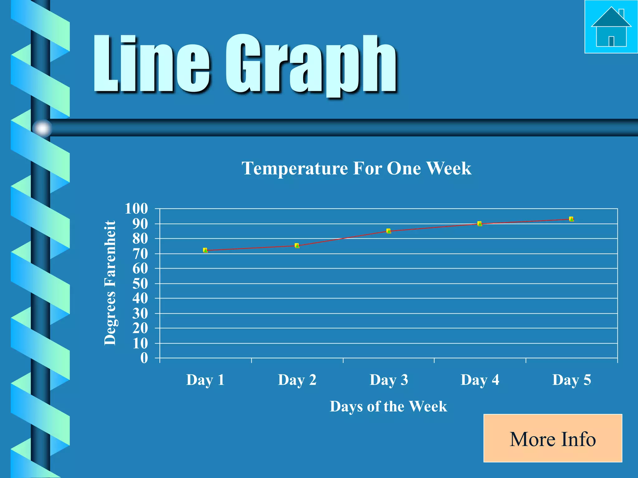
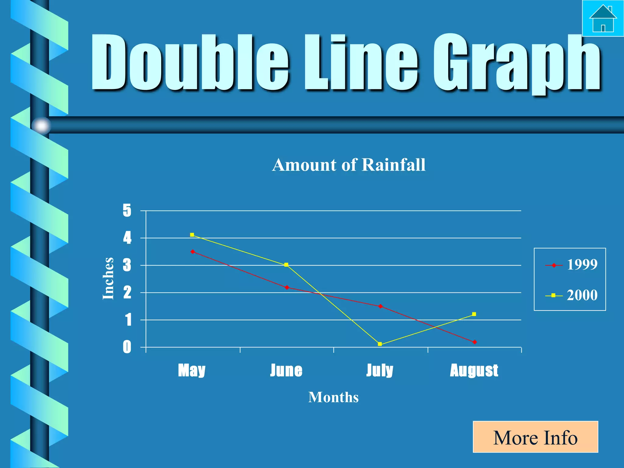
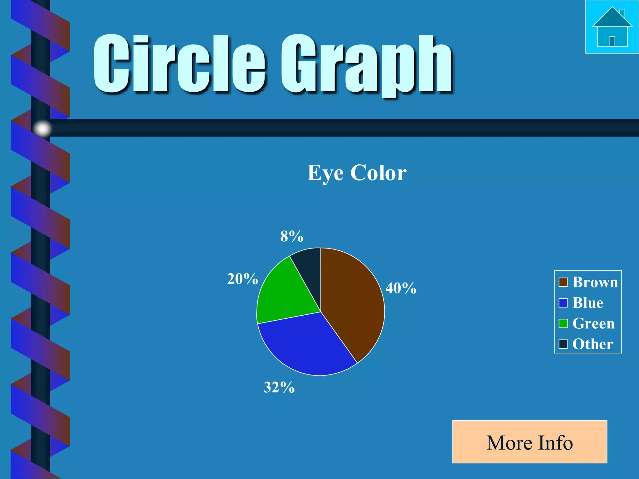
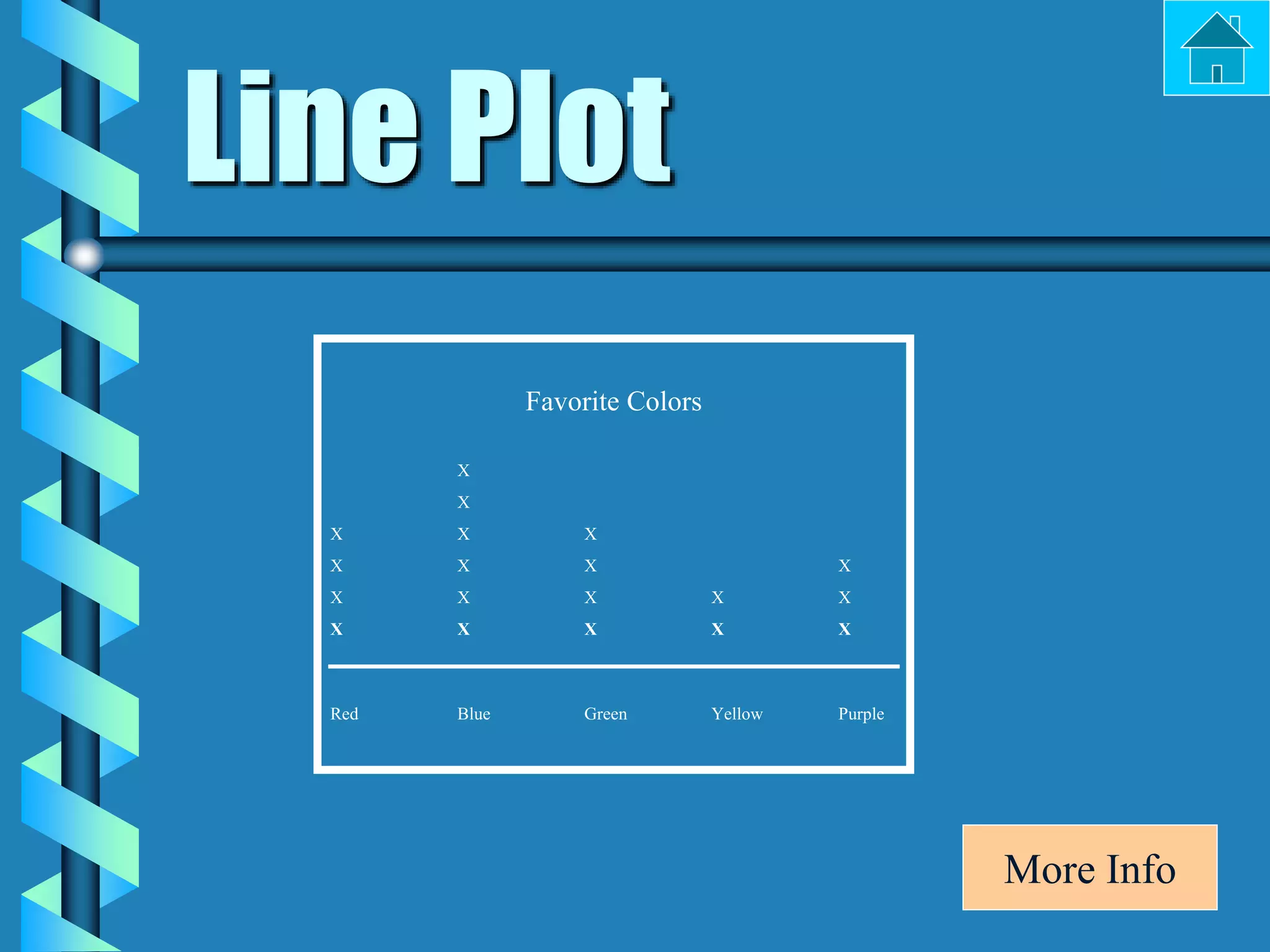
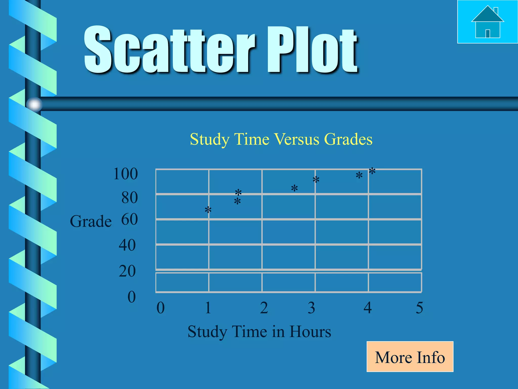
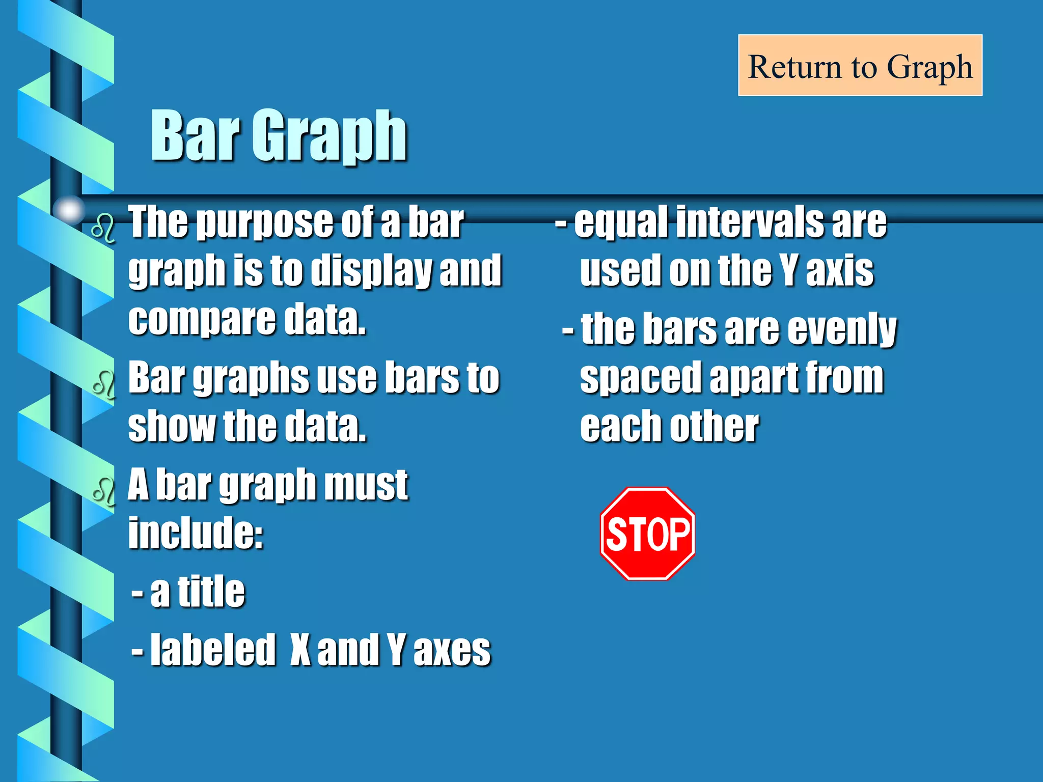
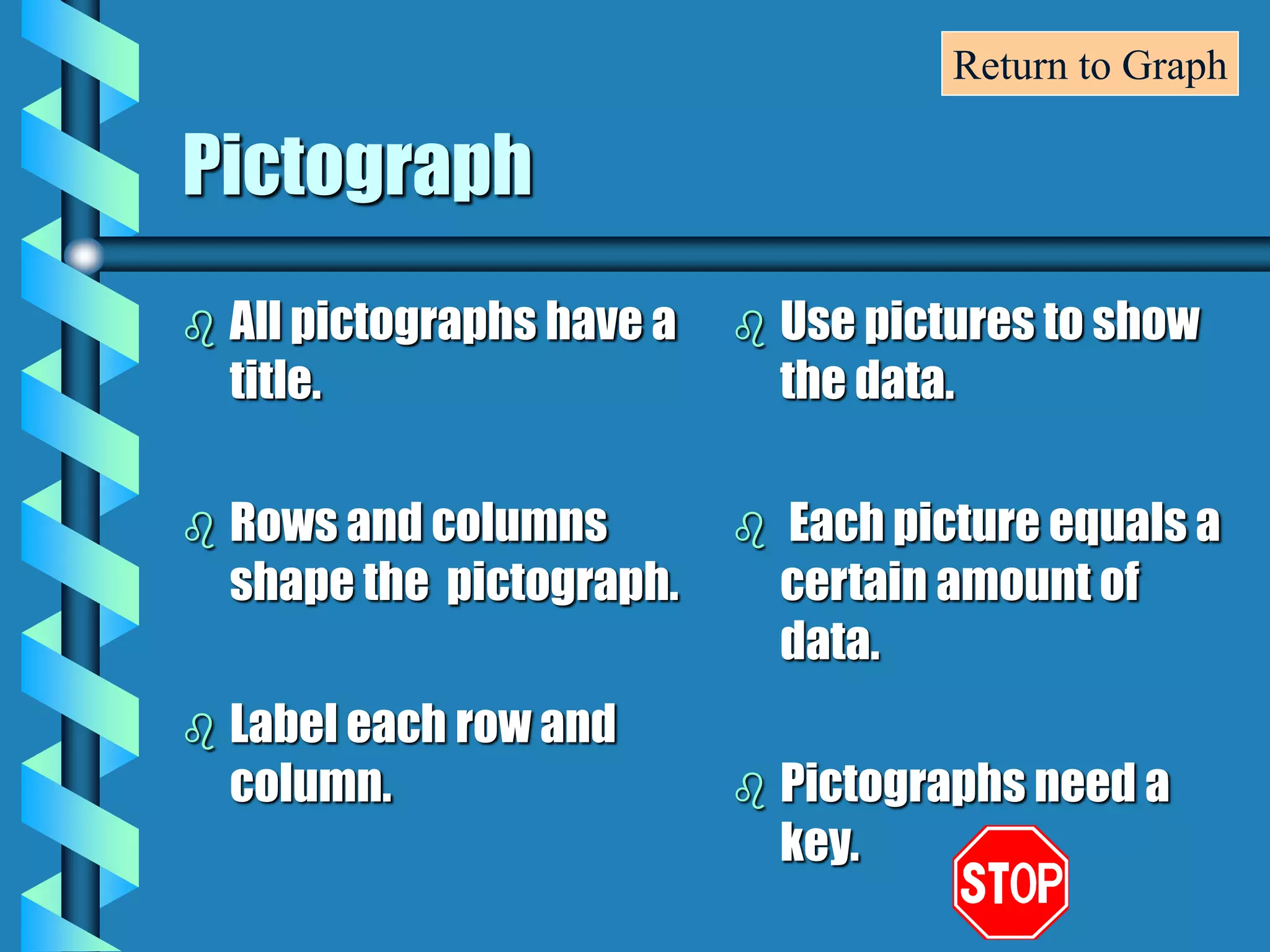
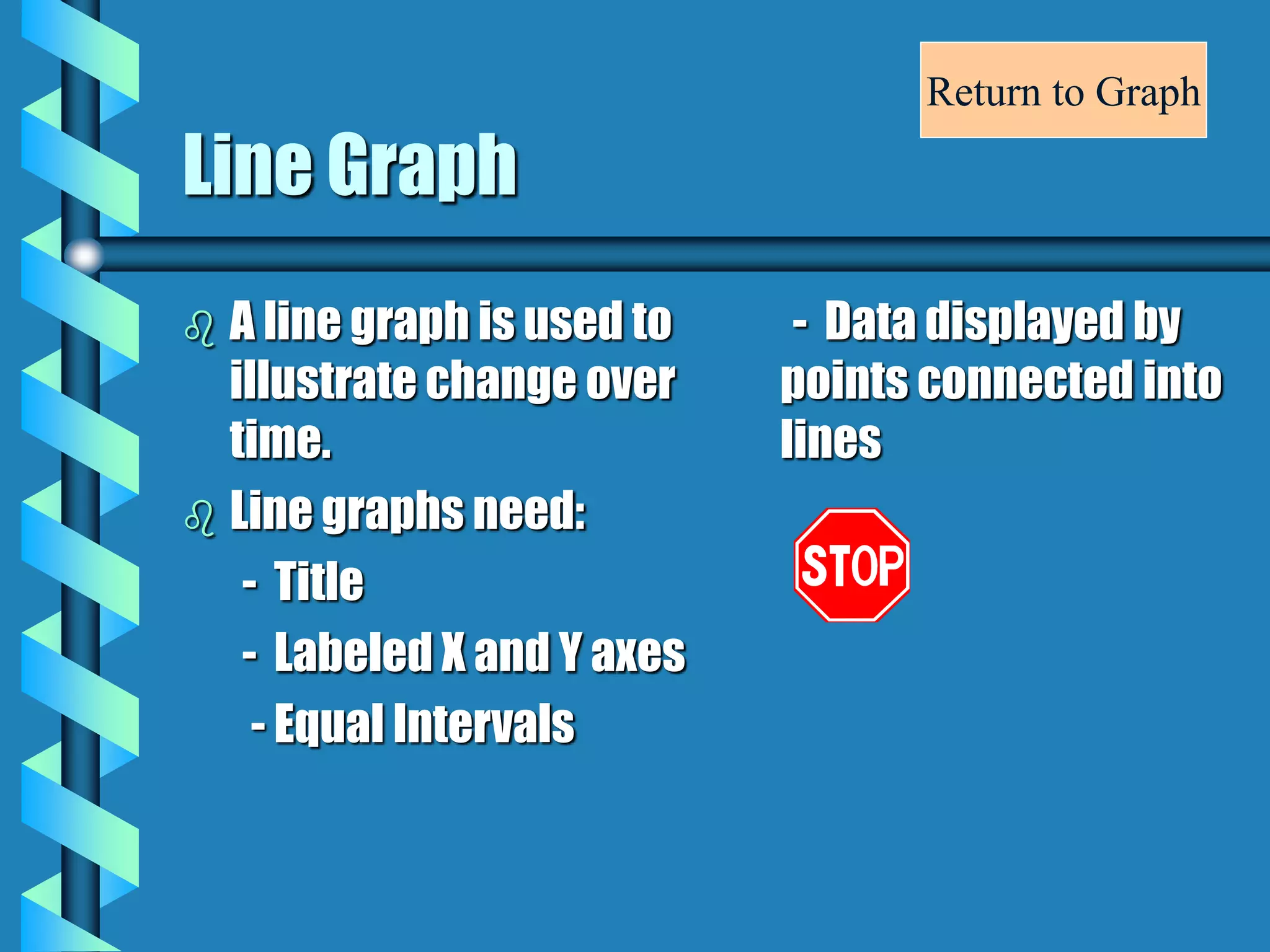
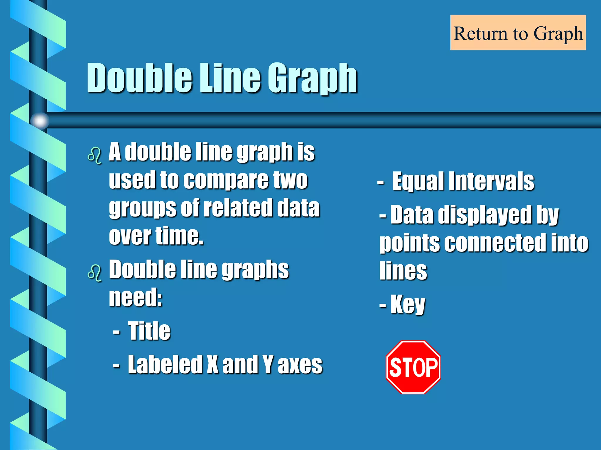
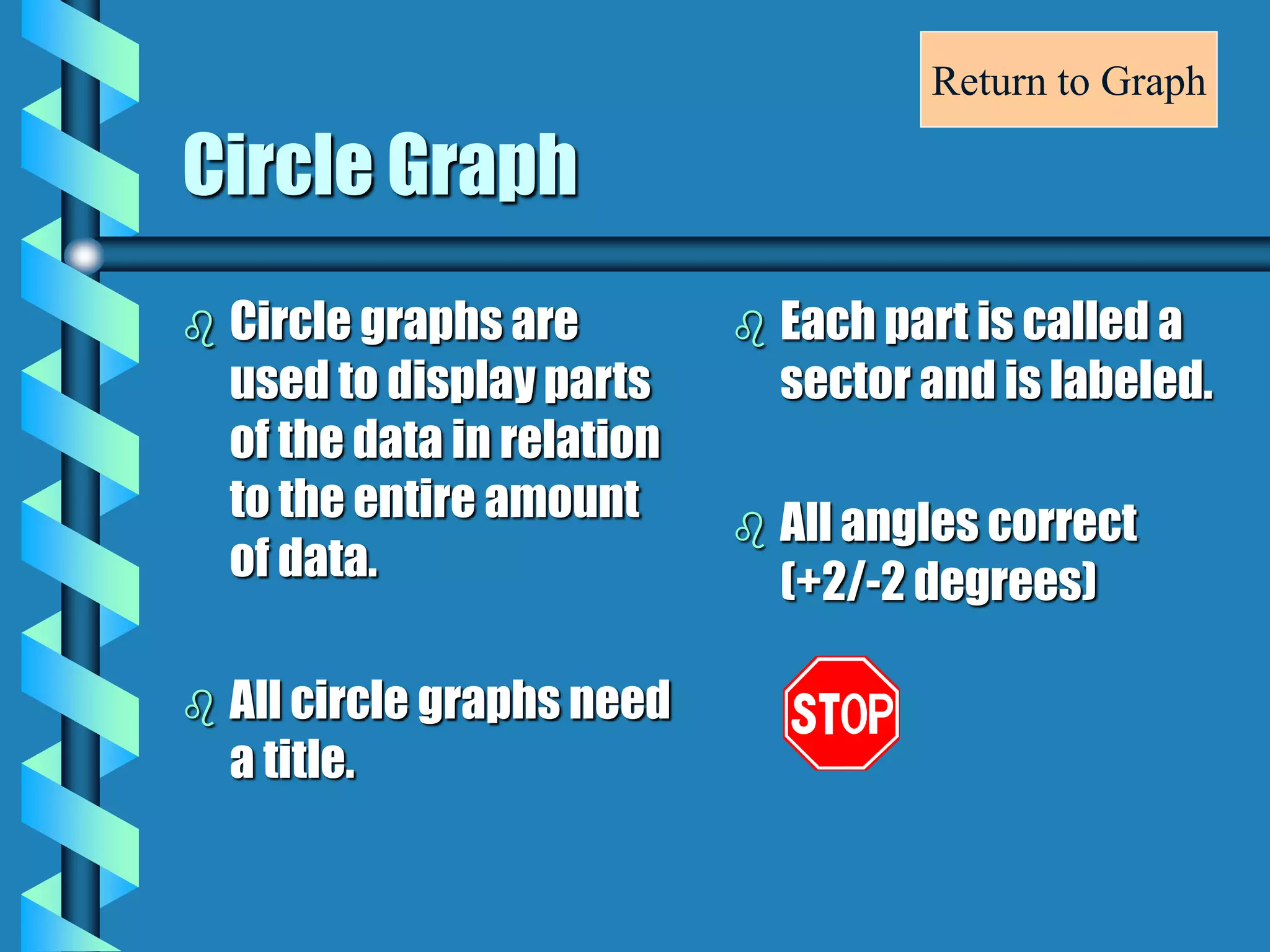
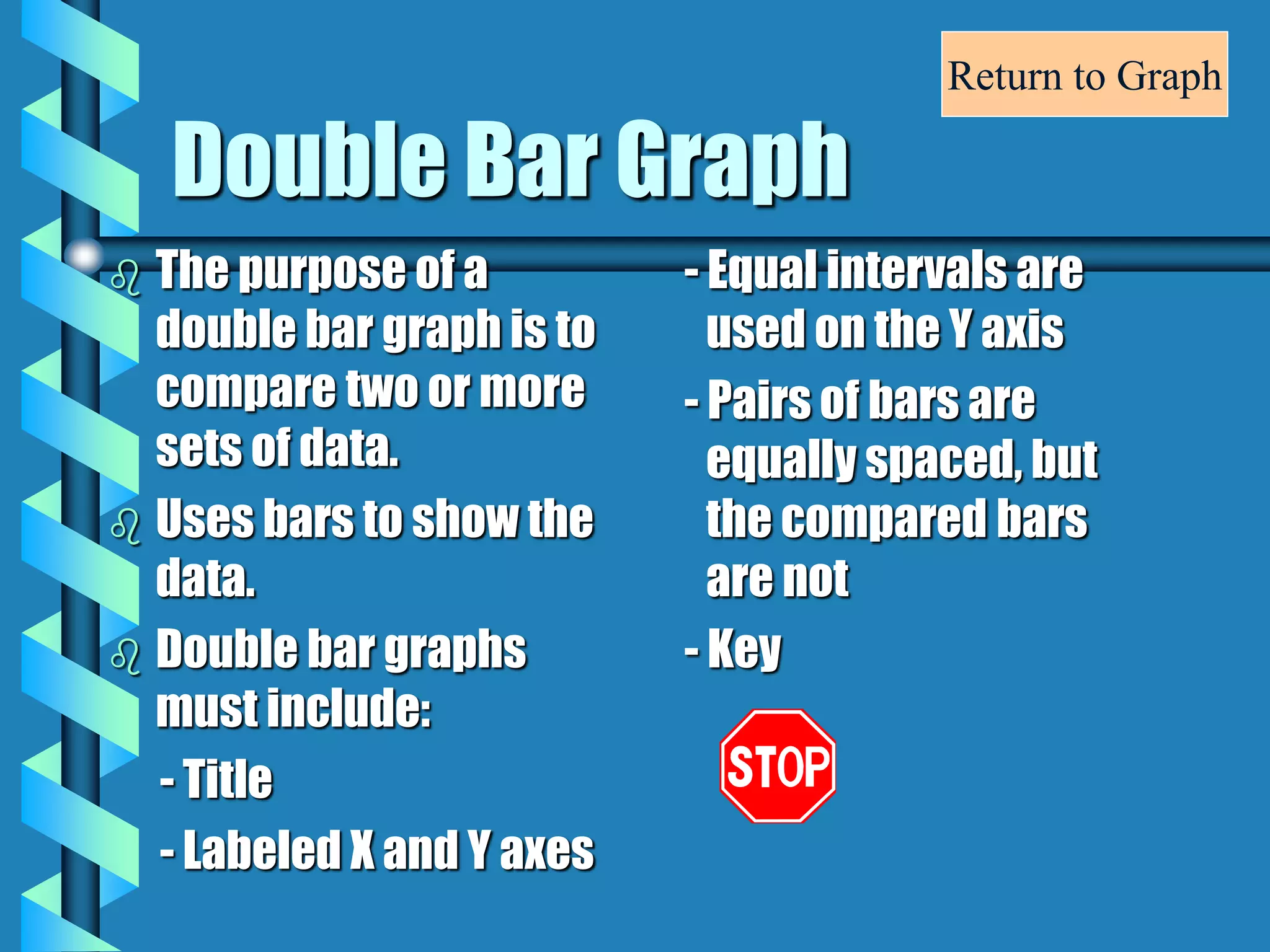
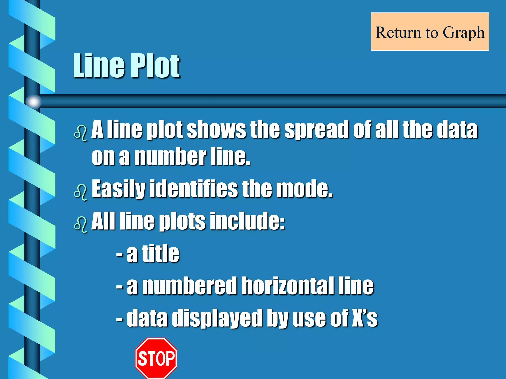
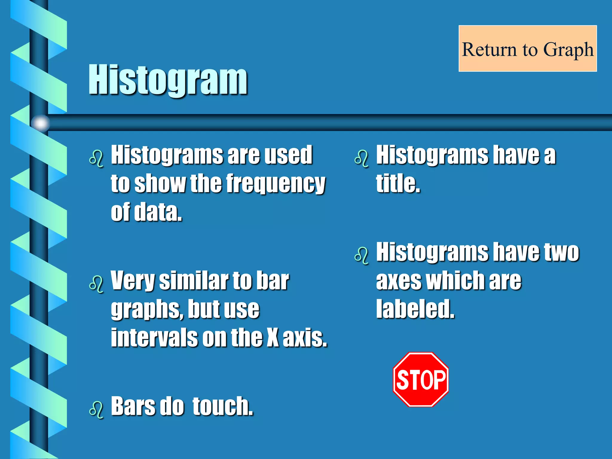
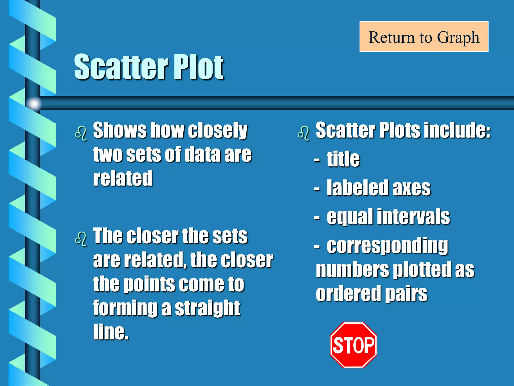
Graphs
0
20
40
60
80
100
Percentage
1st Qtr 2nd Qtr 3rd Qtr 4th Qtr
Quarters
Grades on Graphing Tests
Barnhart Kids
Other Kids
Class A
Class B
Pictograph
More Info
Fireflies
Bar Graph
Favorite Subjects
0
10
20
30
40
50
60
70
Math Science Reading Social Studies
Subjects
Number
of
Students
More Info
Double Bar Graph
Plant Growth
0
5
10
15
20
Week 1 Week 2 Week 3 Week 4
Weeks
Inches
Light
Dark
More Info
Histogram
10
9
8
7
6
5
4
3
2
1
10-Jan 11-20 21-30 31-40 41-50 51-60 61-70 71-80 81-90 90-99
Frequency
Test Scores
Class Test Scores
More Info
Line Graph
Temperature For One Week
0
10
20
30
40
50
60
70
80
90
100
Day 1 Day 2 Day 3 Day 4 Day 5
Days of the Week
Degrees
Farenheit
More Info
Double Line Graph
Amount of Rainfall
0
1
2
3
4
5
May June July August
Months
Inches
1999
2000
More Info
Circle Graph
Eye Color
40%
32%
20%
8%
Brown
Blue
Green
Other
More Info
Line Plot
Favorite Colors
X
X
X X X
X X X X
X X X X X
X X X X X
Red Blue Green Yellow Purple
More Info
Scatter Plot
Study Time Versus Grades
0
0
20
40
60
80
100
1 2 3 4
Study Time in Hours
Grade
*
*
* *
* * *
5
More Info
Bar Graph
 The purpose of a bar
graph is to display and
compare data.
 Bar graphs use bars to
show the data.
 A bar graph must
include:
- a title
- labeled X and Y axes
- equal intervals are
used on the Y axis
- the bars are evenly
spaced apart from
each other
Return to Graph
Pictograph
 All pictographs have a
title.
 Rows and columns
shape the pictograph.
 Label each row and
column.
 Use pictures to show
the data.
 Each picture equals a
certain amount of
data.
 Pictographs need a
key.
Return to Graph
Line Graph
 A line graph is used to
illustrate change over
time.
 Line graphs need:
- Title
- Labeled X and Y axes
- Equal Intervals
- Data displayed by
points connected into
lines
Return to Graph
Double Line Graph
 A double line graph is
used to compare two
groups of related data
over time.
 Double line graphs
need:
- Title
- Labeled X and Y axes
- Equal Intervals
- Data displayed by
points connected into
lines
- Key
Return to Graph
Circle Graph
 Circle graphs are
used to display parts
of the data in relation
to the entire amount
of data.
 All circle graphs need
a title.
 Each part is called a
sector and is labeled.
 All angles correct
(+2/-2 degrees)
Return to Graph
Double Bar Graph
 The purpose of a
double bar graph is to
compare two or more
sets of data.
 Uses bars to show the
data.
 Double bar graphs
must include:
- Title
- Labeled X and Y axes
- Equal intervals are
used on the Y axis
- Pairs of bars are
equally spaced, but
the compared bars
are not
- Key
Return to Graph
Line Plot
 A line plot shows the spread of all the data
on a number line.
 Easily identifies the mode.
 All line plots include:
- a title
- a numbered horizontal line
- data displayed by use of X’s
Return to Graph
Histogram
 Histograms are used
to show the frequency
of data.
 Very similar to bar
graphs, but use
intervals on the X axis.
 Bars do touch.
 Histograms have a
title.
 Histograms have two
axes which are
labeled.
Return to Graph
Scatter Plot
 Shows how closely
two sets of data are
related
 The closer the sets
are related, the closer
the points come to
forming a straight
line.
 Scatter Plots include:
- title
- labeled axes
- equal intervals
- corresponding
numbers plotted as
ordered pairs
Return to Graph

Graphs typesppt

  • 1.
    Graphs 0 20 40 60 80 100 Percentage 1st Qtr 2ndQtr 3rd Qtr 4th Qtr Quarters Grades on Graphing Tests Barnhart Kids Other Kids Class A Class B
  • 2.
  • 3.
    Bar Graph Favorite Subjects 0 10 20 30 40 50 60 70 MathScience Reading Social Studies Subjects Number of Students More Info
  • 4.
    Double Bar Graph PlantGrowth 0 5 10 15 20 Week 1 Week 2 Week 3 Week 4 Weeks Inches Light Dark More Info
  • 5.
    Histogram 10 9 8 7 6 5 4 3 2 1 10-Jan 11-20 21-3031-40 41-50 51-60 61-70 71-80 81-90 90-99 Frequency Test Scores Class Test Scores More Info
  • 6.
    Line Graph Temperature ForOne Week 0 10 20 30 40 50 60 70 80 90 100 Day 1 Day 2 Day 3 Day 4 Day 5 Days of the Week Degrees Farenheit More Info
  • 7.
    Double Line Graph Amountof Rainfall 0 1 2 3 4 5 May June July August Months Inches 1999 2000 More Info
  • 8.
  • 9.
    Line Plot Favorite Colors X X XX X X X X X X X X X X X X X X X Red Blue Green Yellow Purple More Info
  • 10.
    Scatter Plot Study TimeVersus Grades 0 0 20 40 60 80 100 1 2 3 4 Study Time in Hours Grade * * * * * * * 5 More Info
  • 11.
    Bar Graph  Thepurpose of a bar graph is to display and compare data.  Bar graphs use bars to show the data.  A bar graph must include: - a title - labeled X and Y axes - equal intervals are used on the Y axis - the bars are evenly spaced apart from each other Return to Graph
  • 12.
    Pictograph  All pictographshave a title.  Rows and columns shape the pictograph.  Label each row and column.  Use pictures to show the data.  Each picture equals a certain amount of data.  Pictographs need a key. Return to Graph
  • 13.
    Line Graph  Aline graph is used to illustrate change over time.  Line graphs need: - Title - Labeled X and Y axes - Equal Intervals - Data displayed by points connected into lines Return to Graph
  • 14.
    Double Line Graph A double line graph is used to compare two groups of related data over time.  Double line graphs need: - Title - Labeled X and Y axes - Equal Intervals - Data displayed by points connected into lines - Key Return to Graph
  • 15.
    Circle Graph  Circlegraphs are used to display parts of the data in relation to the entire amount of data.  All circle graphs need a title.  Each part is called a sector and is labeled.  All angles correct (+2/-2 degrees) Return to Graph
  • 16.
    Double Bar Graph The purpose of a double bar graph is to compare two or more sets of data.  Uses bars to show the data.  Double bar graphs must include: - Title - Labeled X and Y axes - Equal intervals are used on the Y axis - Pairs of bars are equally spaced, but the compared bars are not - Key Return to Graph
  • 17.
    Line Plot  Aline plot shows the spread of all the data on a number line.  Easily identifies the mode.  All line plots include: - a title - a numbered horizontal line - data displayed by use of X’s Return to Graph
  • 18.
    Histogram  Histograms areused to show the frequency of data.  Very similar to bar graphs, but use intervals on the X axis.  Bars do touch.  Histograms have a title.  Histograms have two axes which are labeled. Return to Graph
  • 19.
    Scatter Plot  Showshow closely two sets of data are related  The closer the sets are related, the closer the points come to forming a straight line.  Scatter Plots include: - title - labeled axes - equal intervals - corresponding numbers plotted as ordered pairs Return to Graph