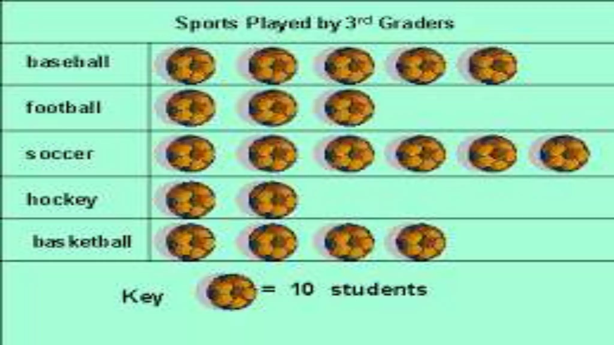
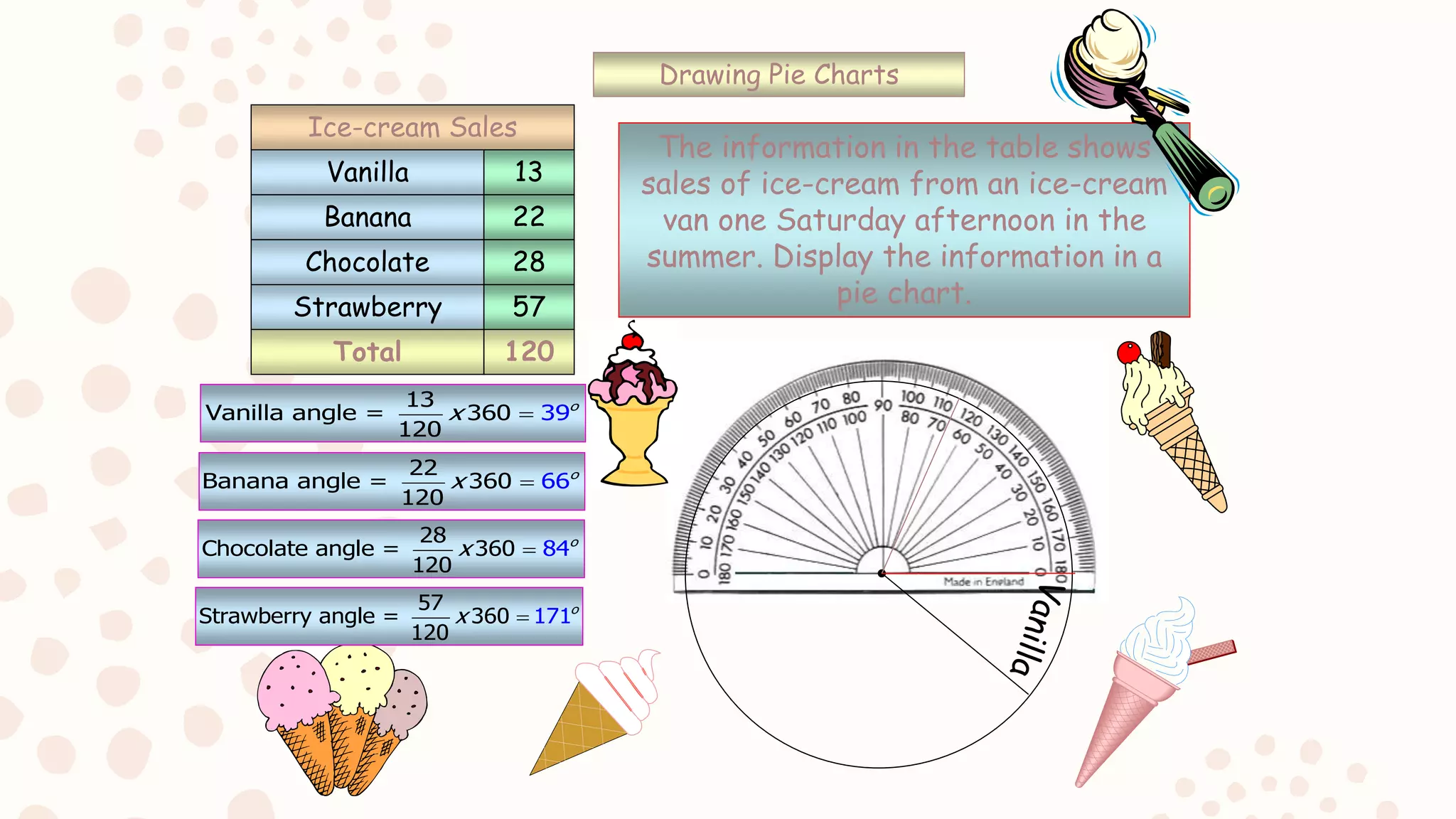
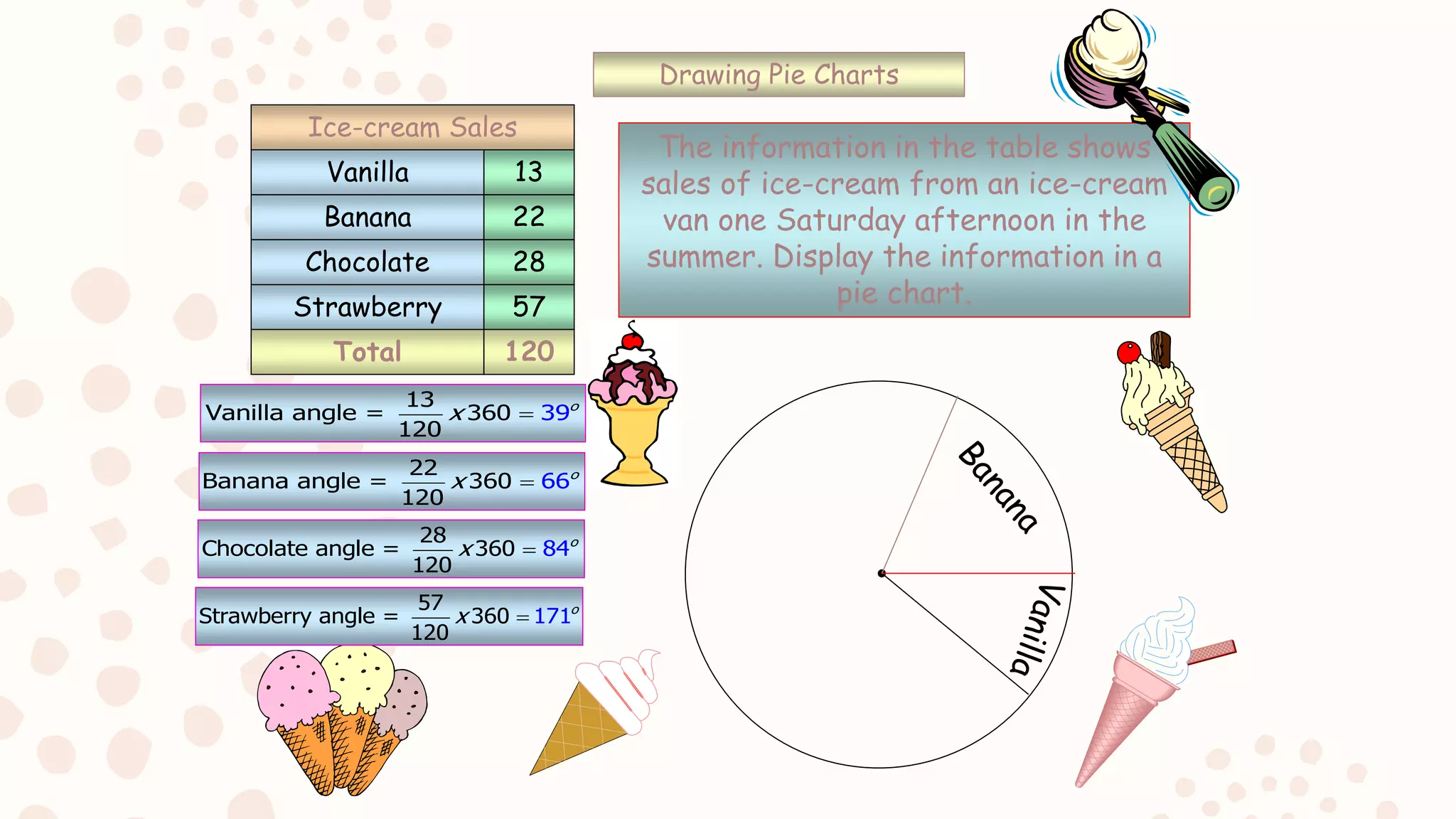
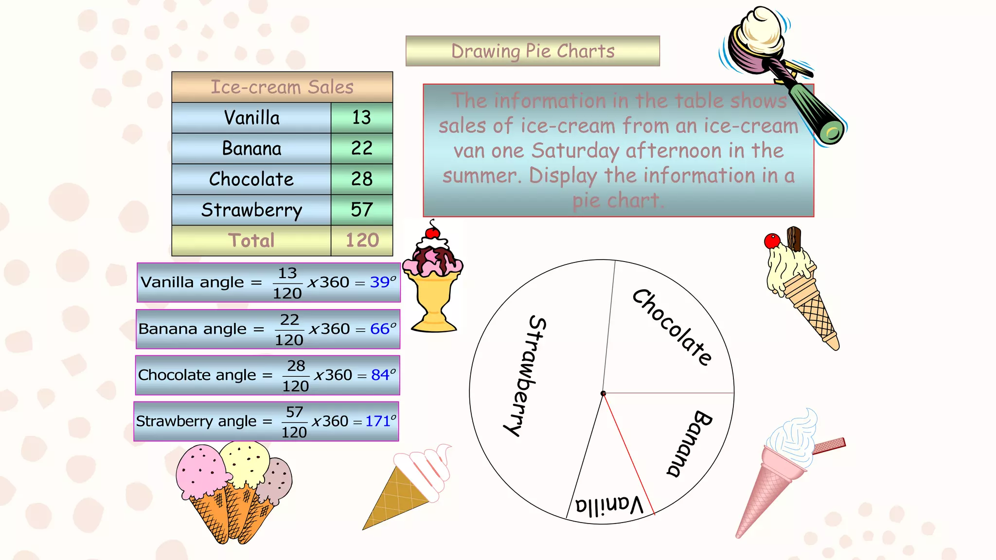
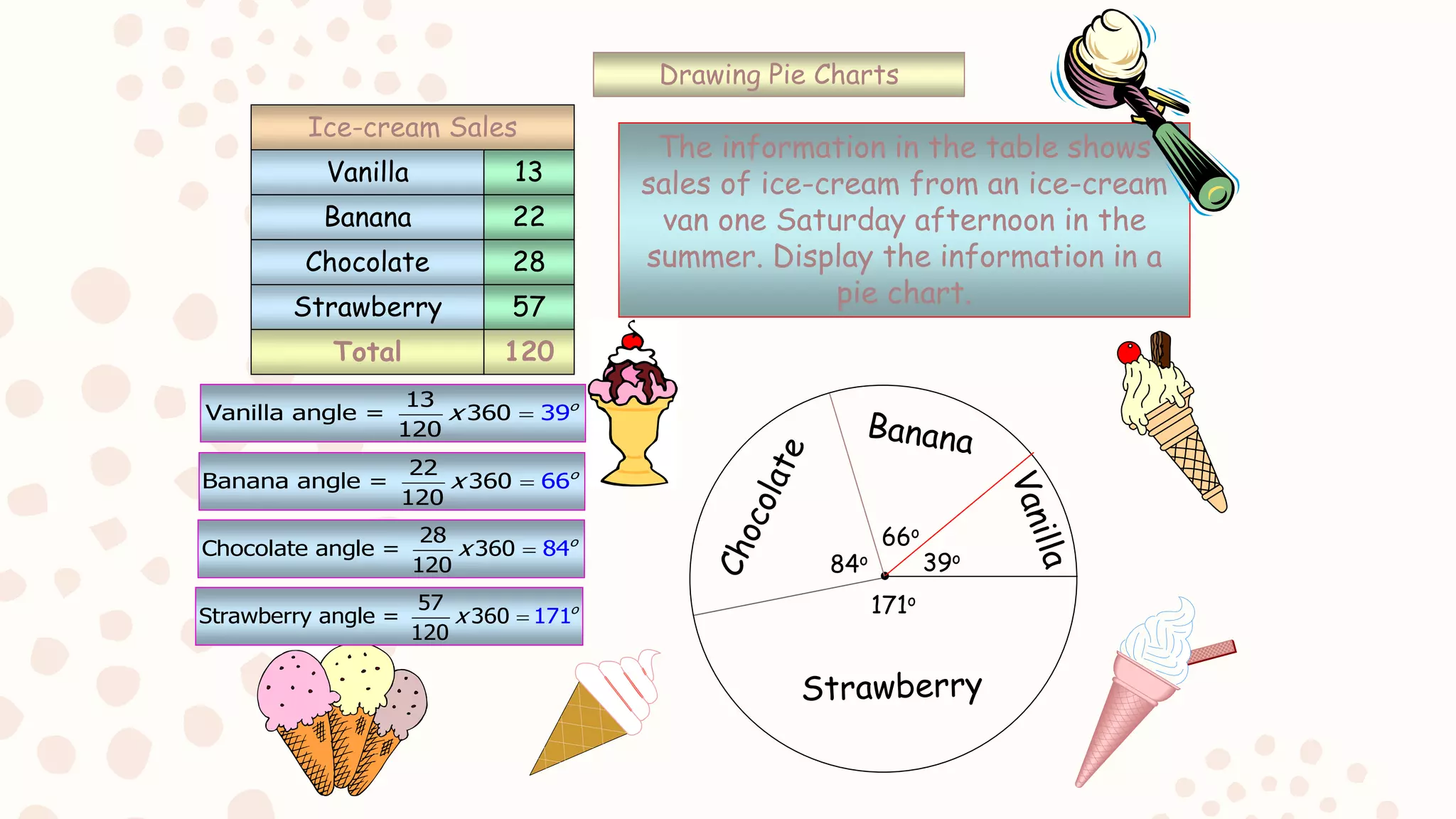
Graphical
Representation
In
Statistics.
Contributions:
• Anum Adil 3111
• Asmat Mukhtar 3369
• Ayesha Tassadaq Hussain 3076
• Mehreen Jabbar 3188
• Hafsa Mansoor 3370
INTRODUCTION
– Graphical Representation Of Data
• The transformation of data through visual methods like
graphs,diagrams,maps and charts is called representation of data.
• We use visualization techniques in order to gain better understanding
of problem.
• As pictures can convey an overall message much better than a list of
numbers .
• It helps to quantify sorts and present data in a method that is
understandable to a large variety of audience.
• The purpose is to provide a simple, visual aid that the reader
appreciate the important features of the data.
BAR DIAGRAM
 It is also called as columnar diagram. The bar diagrams are drawn through column
of equal width.
 A bar graph is a chart with rectangular bars with length proportional to the values
that they represent.
 A bar graphs will have two axes. One describe the type of categories compared and
other will have numerical values.
 Application in daily life
a) Used when we have categories of data e.g (types of movies ,music geners,or a dog
breeds).
b) Used when you want to compare things between different groups.
c) Used when you want to track a change over time as long as the changes are
significant e.g (centuries, decades).
d) Used if you have continuous data like peoples weight or IQ scores.
e) Used in representing discreet variable data..
Important rules to draw a graph
a)The width of all the bars or columns is similar.
b)All the bars should be placed on equal intervals/distance.
c) Bars are shaded with colors or patterns to make them
distinct and attractive.
TYPES OF BAR GRAPH AND ITS
APPLICATION
– There are two types of bar graph:
– Simple bar graph( consist of horizontal or vertical width of equal length proportional
to the values they represent).
– Multi bar graph( shows information about subgroups of main categories whose
length are proportional to the values they represent).
histogram
– A histogram is a graphical representation of the distribution of numerical data in
continuous form.
– Histogram are a useful way to illustrate the frequency distribution of continuous
data.
– Histograms are a great way to show results of continuous data, such as:
– Weight ,height ,how much time etc.
– The vertical axis of a histogram represents the class frequency.
– The horizontal axis of a histogram represents the given data in intervals.
intervals
frequency
Applications of Histogram
– to display large amounts of data values in a relatively
simple chart form.
– to tell relative frequency of occurrence.
– to easily see the distribution of the data.
– to see if there is variation in the data.
– to make future predictions based on the data.
– Uses in daily life.
o A line graph is a graphical display of information
that changes continuously over time. A line
graph may also be referred to a line chart.
o Within a line graph, there are points connecting
the data to show a continuous change. The line
in a graph can descend and ascend based on the
data.
o We can use a line graph to compare different
events, situations, and information. A line graph
has two axes
Check out this scenario! The summer is
here, and you are preparing for a trip to the
beach. Daily you track the amount of push-
ups you do to tone your bod for your trip.
Here is a line graph displaying the
information about the number of push-ups
you do each day.
Picto-Graph
What is a PictoGraph?
• a pictorial sign or symbol.
• a record consisting of pictorial symbols, as a
prehistoric cave drawing or a graph or chart
with symbolic figures representing a certain
number of people, cars, factories, etc.
How do we use a Picto-Graph?
• In graph theory , a pictograph is a graph that shows
numerical information by using picture symbols or
icons to represent data sets. The advantage of using
a pictograph is that it is easy to read.
• We represent our data in pictures. If we have to
show the amount of cars sold each year, we can
represent them by one car picture showing 10 cars
sold in that year.
• PictoGraph is a fun way to express data.
Pie Charts
– A type of graph in which a circle is divided into sectors that each represent a
proportion of the whole….
Every pie chart has…
– A title
– A key
– Sectors
Application of pie chart
15
Drawing Pie Charts
Total 120
13
Vanilla angle = 360 9
120
3 o
x 
Vanilla
Banana
Chocolate
Strawberry
13
22
28
57
Ice-cream Sales
The information in the table shows
sales of ice-cream from an ice-cream
van one Saturday afternoon in the
summer. Display the information in a
pie chart.
22
Banana angle = 360 6
120
6 o
x 
28
Chocolate angle = 360 4
120
8 o
x 
57
Strawberry angle = 360 1
12
7
0
1 o
x 
Drawing Pie Charts
Total 120
Vanilla
Banana
Chocolate
Strawberry
13
22
28
57
Ice-cream Sales
The information in the table shows
sales of ice-cream from an ice-cream
van one Saturday afternoon in the
summer. Display the information in a
pie chart.
13
Vanilla angle = 360 9
120
3 o
x 
22
Banana angle = 360 6
120
6 o
x 
28
Chocolate angle = 360 4
120
8 o
x 
57
Strawberry angle = 360 1
12
7
0
1 o
x 
Drawing Pie Charts
Total 120
Vanilla
Banana
Chocolate
Strawberry
13
22
28
57
Ice-cream Sales
The information in the table shows
sales of ice-cream from an ice-cream
van one Saturday afternoon in the
summer. Display the information in a
pie chart.
39o
66o
84o
171o
13
Vanilla angle = 360 9
120
3 o
x 
22
Banana angle = 360 6
120
6 o
x 
28
Chocolate angle = 360 4
120
8 o
x 
57
Strawberry angle = 360 1
12
7
0
1 o
x 
Graphical Representation In Statistics.

Graphical Representation In Statistics.

  • 1.
  • 2.
    Contributions: • Anum Adil3111 • Asmat Mukhtar 3369 • Ayesha Tassadaq Hussain 3076 • Mehreen Jabbar 3188 • Hafsa Mansoor 3370
  • 3.
    INTRODUCTION – Graphical RepresentationOf Data • The transformation of data through visual methods like graphs,diagrams,maps and charts is called representation of data. • We use visualization techniques in order to gain better understanding of problem. • As pictures can convey an overall message much better than a list of numbers . • It helps to quantify sorts and present data in a method that is understandable to a large variety of audience. • The purpose is to provide a simple, visual aid that the reader appreciate the important features of the data.
  • 4.
    BAR DIAGRAM  Itis also called as columnar diagram. The bar diagrams are drawn through column of equal width.  A bar graph is a chart with rectangular bars with length proportional to the values that they represent.  A bar graphs will have two axes. One describe the type of categories compared and other will have numerical values.  Application in daily life a) Used when we have categories of data e.g (types of movies ,music geners,or a dog breeds). b) Used when you want to compare things between different groups. c) Used when you want to track a change over time as long as the changes are significant e.g (centuries, decades). d) Used if you have continuous data like peoples weight or IQ scores. e) Used in representing discreet variable data..
  • 5.
    Important rules todraw a graph a)The width of all the bars or columns is similar. b)All the bars should be placed on equal intervals/distance. c) Bars are shaded with colors or patterns to make them distinct and attractive.
  • 6.
    TYPES OF BARGRAPH AND ITS APPLICATION – There are two types of bar graph: – Simple bar graph( consist of horizontal or vertical width of equal length proportional to the values they represent). – Multi bar graph( shows information about subgroups of main categories whose length are proportional to the values they represent).
  • 7.
    histogram – A histogramis a graphical representation of the distribution of numerical data in continuous form. – Histogram are a useful way to illustrate the frequency distribution of continuous data. – Histograms are a great way to show results of continuous data, such as: – Weight ,height ,how much time etc. – The vertical axis of a histogram represents the class frequency. – The horizontal axis of a histogram represents the given data in intervals. intervals frequency
  • 8.
    Applications of Histogram –to display large amounts of data values in a relatively simple chart form. – to tell relative frequency of occurrence. – to easily see the distribution of the data. – to see if there is variation in the data. – to make future predictions based on the data. – Uses in daily life.
  • 9.
    o A linegraph is a graphical display of information that changes continuously over time. A line graph may also be referred to a line chart. o Within a line graph, there are points connecting the data to show a continuous change. The line in a graph can descend and ascend based on the data. o We can use a line graph to compare different events, situations, and information. A line graph has two axes
  • 10.
    Check out thisscenario! The summer is here, and you are preparing for a trip to the beach. Daily you track the amount of push- ups you do to tone your bod for your trip. Here is a line graph displaying the information about the number of push-ups you do each day.
  • 11.
    Picto-Graph What is aPictoGraph? • a pictorial sign or symbol. • a record consisting of pictorial symbols, as a prehistoric cave drawing or a graph or chart with symbolic figures representing a certain number of people, cars, factories, etc.
  • 12.
    How do weuse a Picto-Graph? • In graph theory , a pictograph is a graph that shows numerical information by using picture symbols or icons to represent data sets. The advantage of using a pictograph is that it is easy to read. • We represent our data in pictures. If we have to show the amount of cars sold each year, we can represent them by one car picture showing 10 cars sold in that year. • PictoGraph is a fun way to express data.
  • 15.
    Pie Charts – Atype of graph in which a circle is divided into sectors that each represent a proportion of the whole…. Every pie chart has… – A title – A key – Sectors Application of pie chart 15
  • 16.
    Drawing Pie Charts Total120 13 Vanilla angle = 360 9 120 3 o x  Vanilla Banana Chocolate Strawberry 13 22 28 57 Ice-cream Sales The information in the table shows sales of ice-cream from an ice-cream van one Saturday afternoon in the summer. Display the information in a pie chart. 22 Banana angle = 360 6 120 6 o x  28 Chocolate angle = 360 4 120 8 o x  57 Strawberry angle = 360 1 12 7 0 1 o x 
  • 17.
    Drawing Pie Charts Total120 Vanilla Banana Chocolate Strawberry 13 22 28 57 Ice-cream Sales The information in the table shows sales of ice-cream from an ice-cream van one Saturday afternoon in the summer. Display the information in a pie chart. 13 Vanilla angle = 360 9 120 3 o x  22 Banana angle = 360 6 120 6 o x  28 Chocolate angle = 360 4 120 8 o x  57 Strawberry angle = 360 1 12 7 0 1 o x 
  • 18.
    Drawing Pie Charts Total120 Vanilla Banana Chocolate Strawberry 13 22 28 57 Ice-cream Sales The information in the table shows sales of ice-cream from an ice-cream van one Saturday afternoon in the summer. Display the information in a pie chart. 13 Vanilla angle = 360 9 120 3 o x  22 Banana angle = 360 6 120 6 o x  28 Chocolate angle = 360 4 120 8 o x  57 Strawberry angle = 360 1 12 7 0 1 o x 
  • 19.
    Drawing Pie Charts Total120 Vanilla Banana Chocolate Strawberry 13 22 28 57 Ice-cream Sales The information in the table shows sales of ice-cream from an ice-cream van one Saturday afternoon in the summer. Display the information in a pie chart. 13 Vanilla angle = 360 9 120 3 o x  22 Banana angle = 360 6 120 6 o x  28 Chocolate angle = 360 4 120 8 o x  57 Strawberry angle = 360 1 12 7 0 1 o x 
  • 20.
    Drawing Pie Charts Total120 Vanilla Banana Chocolate Strawberry 13 22 28 57 Ice-cream Sales The information in the table shows sales of ice-cream from an ice-cream van one Saturday afternoon in the summer. Display the information in a pie chart. 13 Vanilla angle = 360 9 120 3 o x  22 Banana angle = 360 6 120 6 o x  28 Chocolate angle = 360 4 120 8 o x  57 Strawberry angle = 360 1 12 7 0 1 o x 
  • 21.
    Drawing Pie Charts Total120 Vanilla Banana Chocolate Strawberry 13 22 28 57 Ice-cream Sales The information in the table shows sales of ice-cream from an ice-cream van one Saturday afternoon in the summer. Display the information in a pie chart. 13 Vanilla angle = 360 9 120 3 o x  22 Banana angle = 360 6 120 6 o x  28 Chocolate angle = 360 4 120 8 o x  57 Strawberry angle = 360 1 12 7 0 1 o x 
  • 22.
    Drawing Pie Charts Total120 Vanilla Banana Chocolate Strawberry 13 22 28 57 Ice-cream Sales The information in the table shows sales of ice-cream from an ice-cream van one Saturday afternoon in the summer. Display the information in a pie chart. 39o 66o 84o 171o 13 Vanilla angle = 360 9 120 3 o x  22 Banana angle = 360 6 120 6 o x  28 Chocolate angle = 360 4 120 8 o x  57 Strawberry angle = 360 1 12 7 0 1 o x 