The document provides guidance on recording and presenting data from scientific experiments. It emphasizes planning data collection before starting an experiment, organizing raw data in tables with independent variables on the left and dependent variables on the right, and processing the data to present it clearly in graphs and conclusions. Key points covered include choosing appropriate graph types based on continuous or discrete data, using titles, labels, and scales correctly in graphs, and identifying patterns in the data.
In this document
Powered by AI
Emphasizes recording data before experiments, the placement of variables, and avoiding unit labels in tables.
Distinguishes between quantitative (measurable data) and qualitative (descriptive data) types.
Defines continuous data (any value) versus discrete data (specific options), with examples.
Advises organizing raw data into tables, highlighting independent and dependent variables.
Displays an example of raw data regarding plant growth from different types of fertiliser.
Discusses processing raw data to find averages, percentages, and justification for chosen formulas.
Instructs on creating a new, smaller table for processed data needed for graphs and conclusions.
Presents processed data example for plant growth, showing average heights based on fertiliser type.
Explains the importance of graphing data to identify patterns and ensures accurate representation.
Details types of graphs suitable for different data, such as line graphs for continuous and bar graphs for discrete.
Describes the proper use of line graphs, including variable placement and visualizing trends over time.
Provides an example of chocolate milk sales data over different days of the week.
Introduces scatterplots, emphasizing their ability to show correlations with a line of best fit.
Outlines positive, negative, and no correlations using practical examples for each type.
Illustrates using comparative data to show relative changes among different groups in a graph.
Displays weekly sales data in a bar graph format for chocolate milk sales.
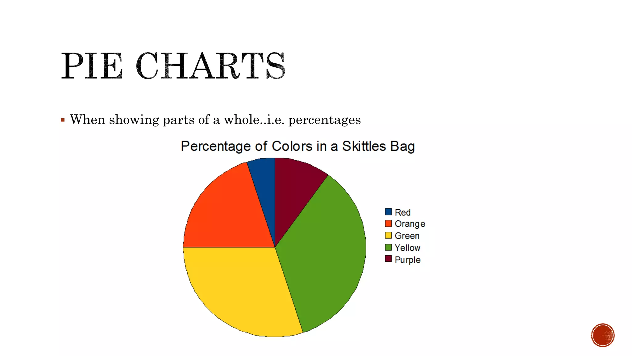
Describes the use of pie charts to represent parts of a whole, particularly with percentage data.
Presents days of chocolate milk sold with a question format to assess sales performance.
Engages with a question regarding the least chocolate milk sold, using data to illustrate.
Explores questions about the days with drops in sales, using accompanying data for context.
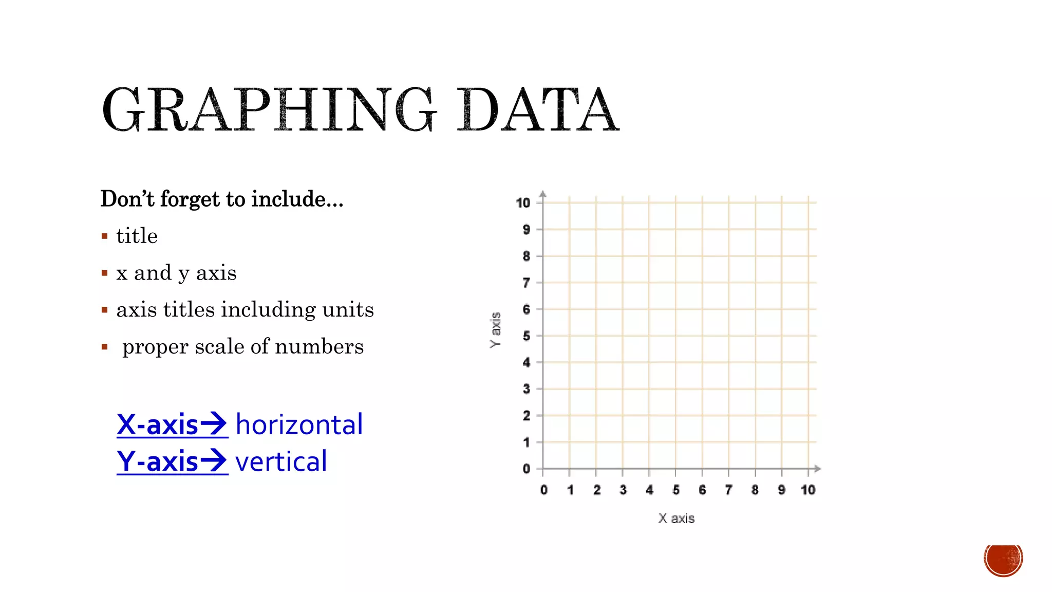
Lists essential elements to include in graphs: titles, axes labels, and scales.
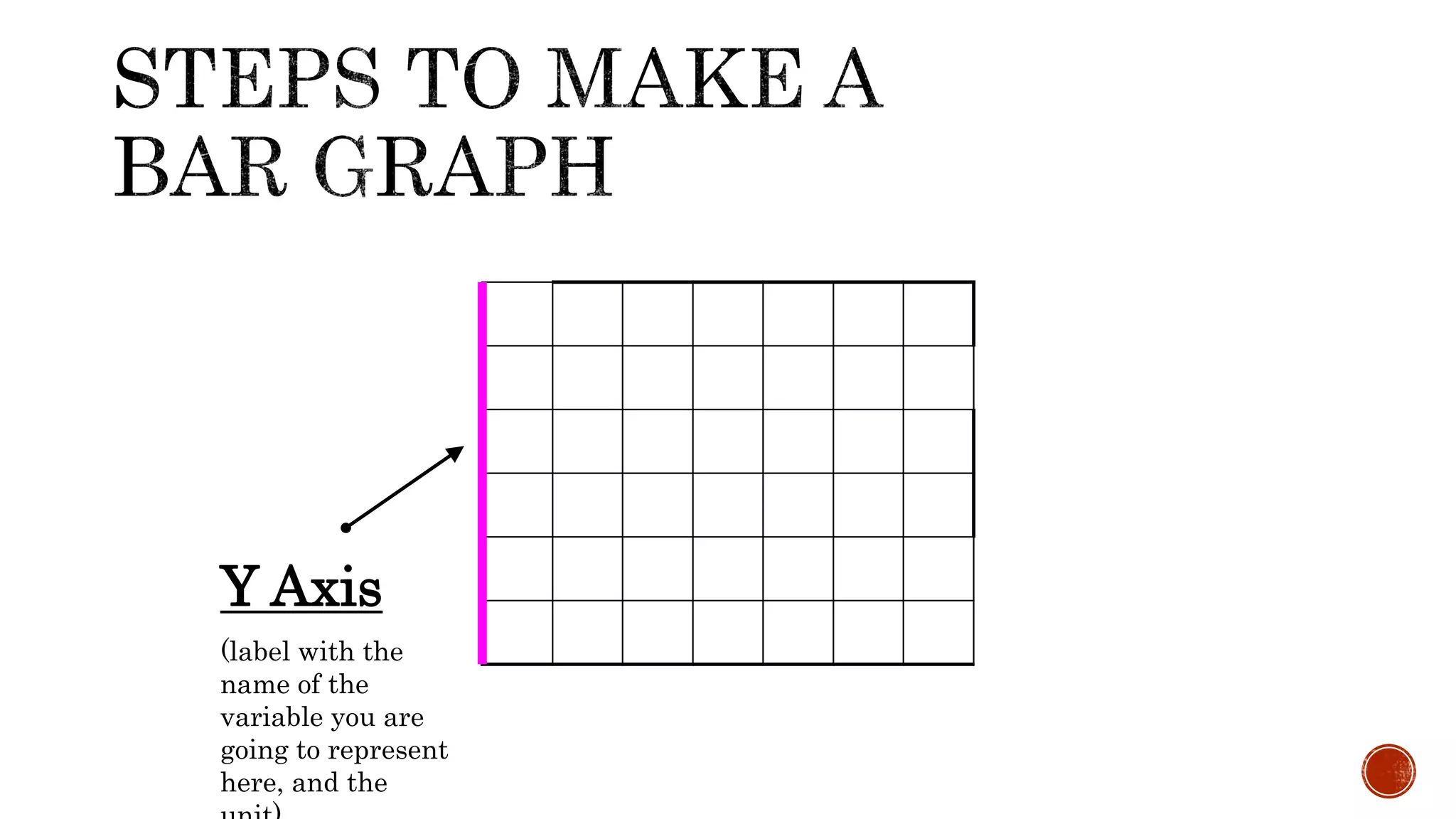
Focuses on labeling the y-axis of graphs to represent the dependent variable accurately.
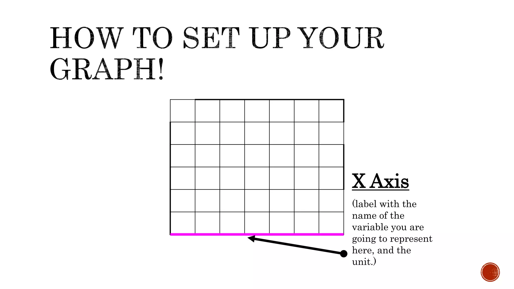
Covers the importance of labeling the x-axis of graphs for independent variable representation.
Stresses the necessity of including clear titles in graph representations for better understanding.
Introduces elements of graphs, focusing on the title and axis labeling.
Explains how to select scales for axes to maximize graph size and readability.
Guides on determining scales from the highest and lowest data values for effective graphing.
Describes how to choose intervals based on the defined scale for effective data representation.
Presents a framework for graphing, including Title, Axis, Scale, and Interval considerations.
Continues the graphing framework (TASI) structure focusing on axis labeling.
Emphasizes labeling bars or data points for clarity in graph representation.
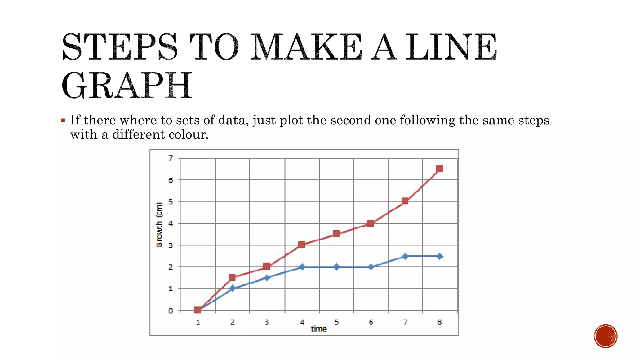
Shows collected data of plant growth over weeks, featuring root and stem growth measurements.
Outlines steps for graphing plant growth data, emphasizing title, axis, and scale.
Details the method of plotting root growth data points on the graph.
Instructs on connecting data points with a line to visualize growth trends.
Mentions plotting additional datasets using distinct colors for clarity.
Discusses identifying increasing, decreasing or constant patterns in data relationships.
Highlights key aspects to consider when interpreting graphs, including titles, scales, and units.
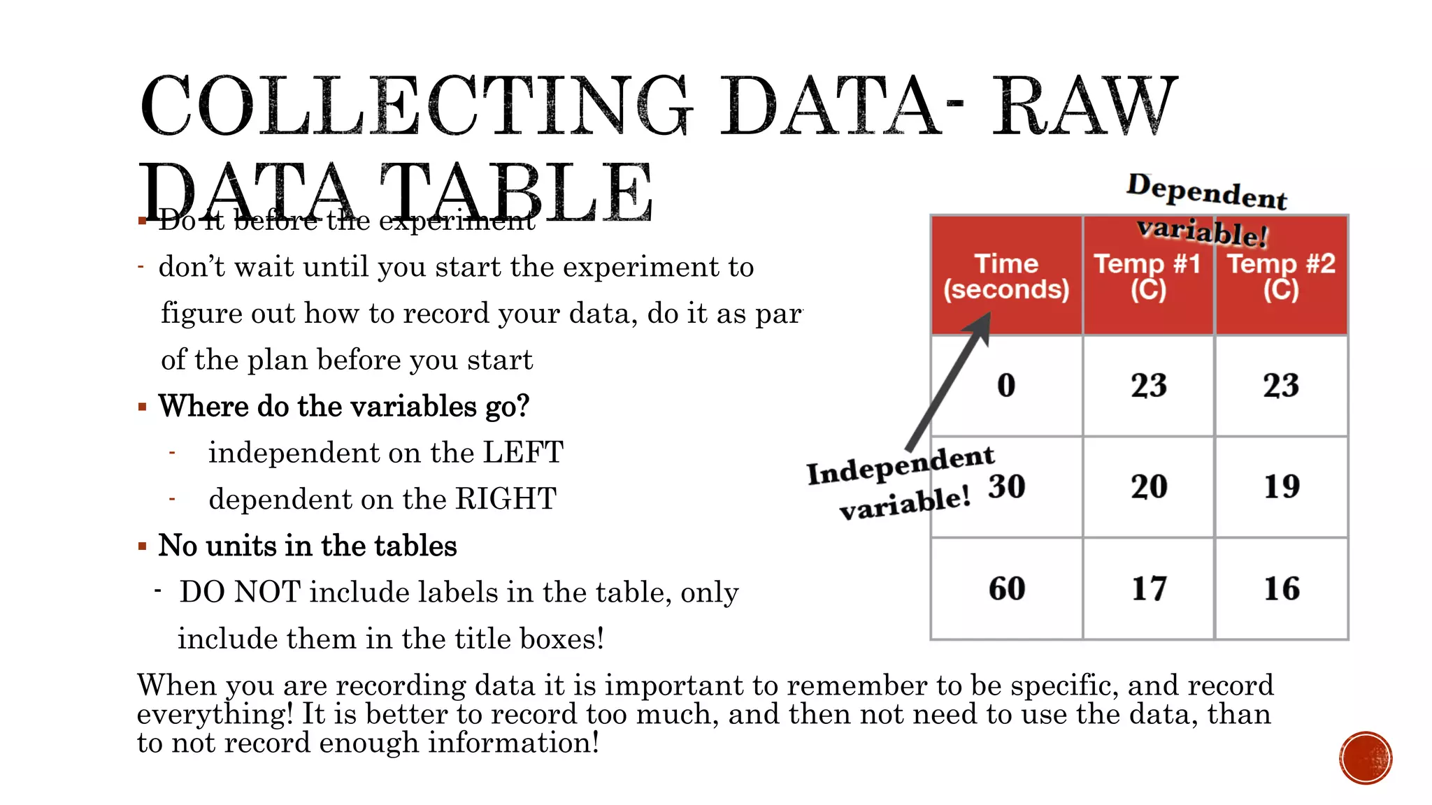
Do itbefore the experiment
- don’t wait until you start the experiment to
figure out how to record your data, do it as part
of the plan before you start
Where do the variables go?
- independent on the LEFT
- dependent on the RIGHT
No units in the tables
- DO NOT include labels in the table, only
include them in the title boxes!
When you are recording data it is important to remember to be specific, and record
everything! It is better to record too much, and then not need to use the data, than
to not record enough information!
3.
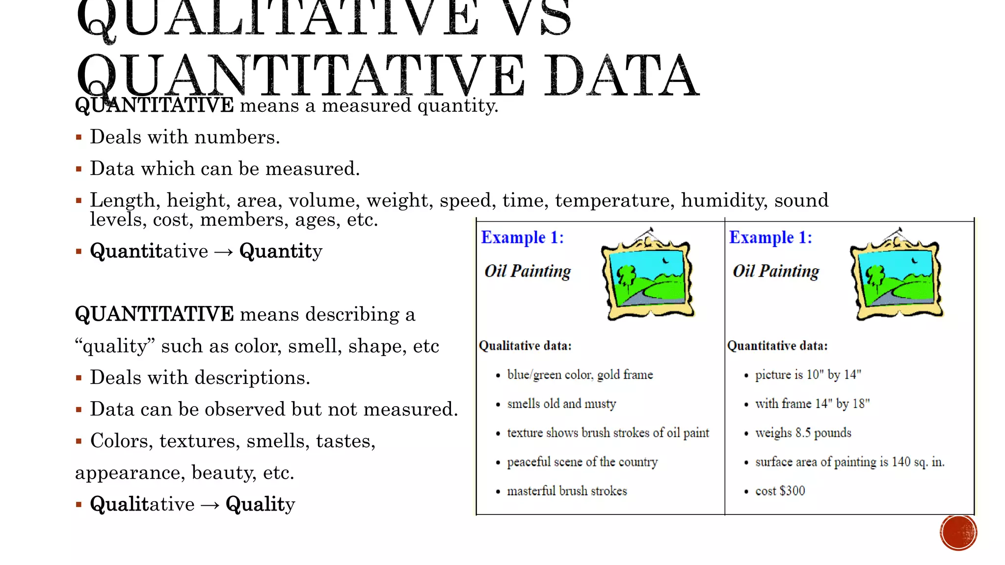
QUANTITATIVE means ameasured quantity.
Deals with numbers.
Data which can be measured.
Length, height, area, volume, weight, speed, time, temperature, humidity, sound
levels, cost, members, ages, etc.
Quantitative → Quantity
QUANTITATIVE means describing a
“quality” such as color, smell, shape, etc
Deals with descriptions.
Data can be observed but not measured.
Colors, textures, smells, tastes,
appearance, beauty, etc.
Qualitative → Quality
4.
Continuous data
datathat could be any number on a continuum
changes over time are usually continuous (imagine the slope of a hill)
Discreet data data that has only certain options (imagine a set of steps)
number of people, shoe size, type of exercise are all types of discreet data
whenever you create groups you create discreet data, i.e. - 0-5minutes, 6-
10minutes, 11-15minutes are discreet
groups even though time is usually continuous
5.
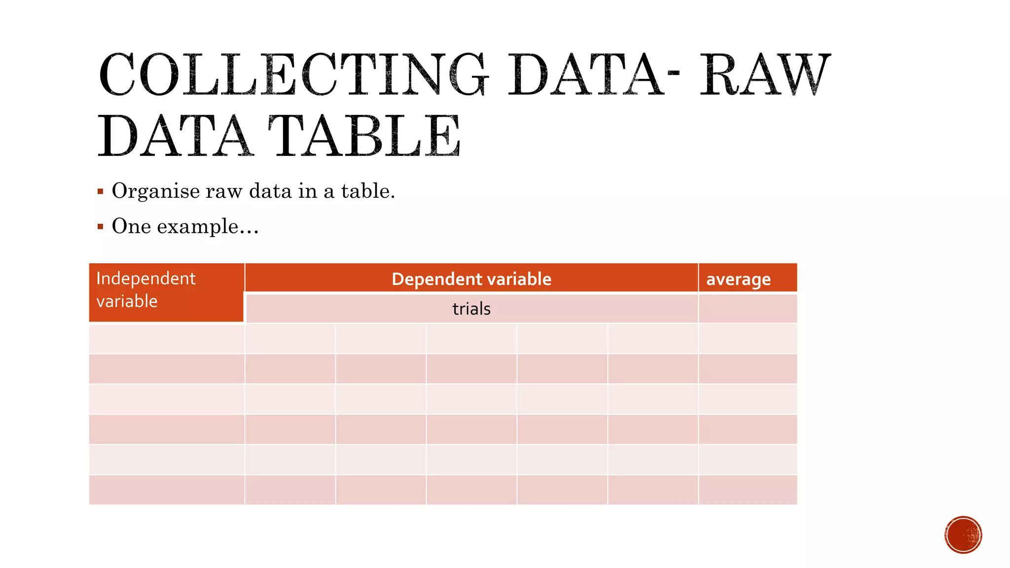
Organise rawdata in a table.
One example…
Independent
variable
Dependent variable average
trials
6.
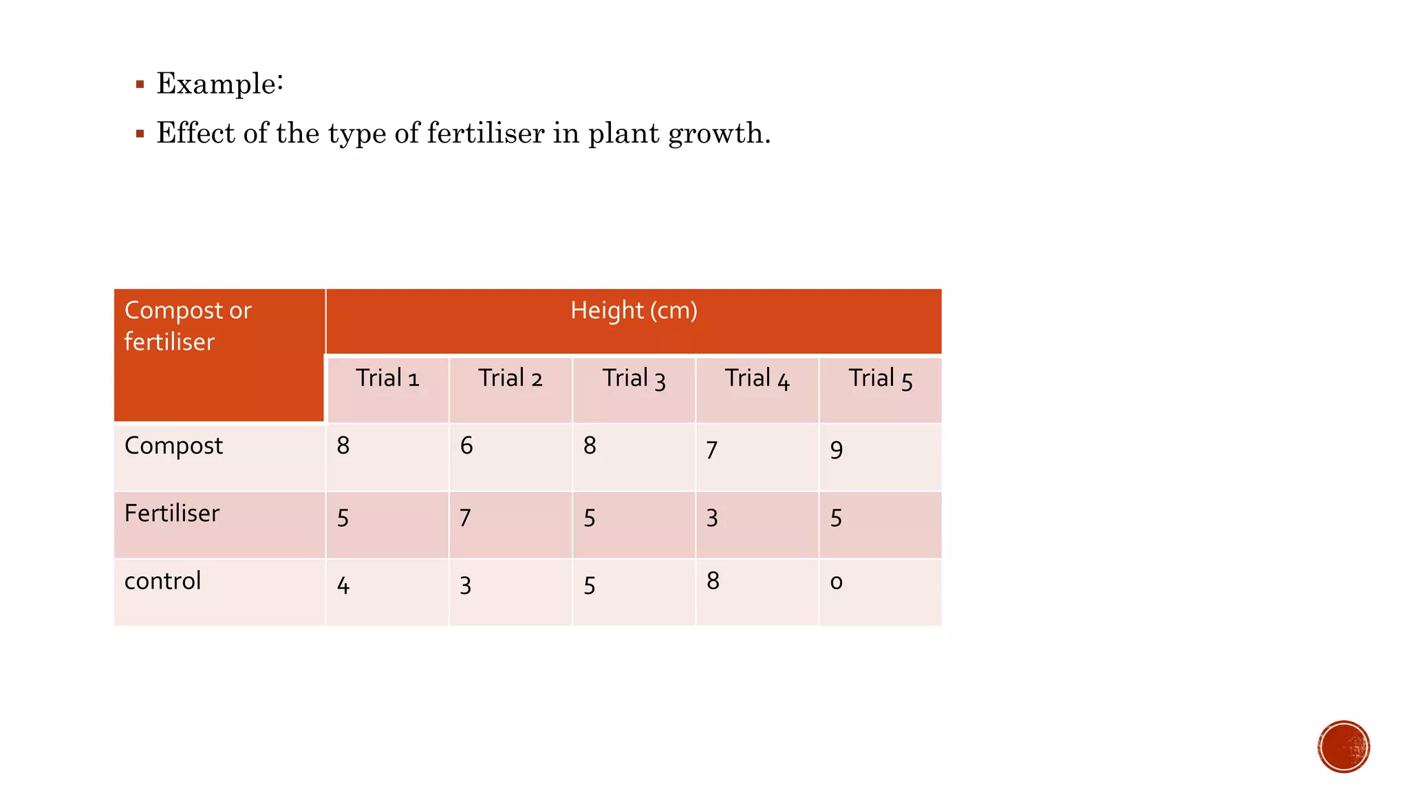
Example:
Effectof the type of fertiliser in plant growth.
Compost or
fertiliser
Height (cm)
Trial 1 Trial 2 Trial 3 Trial 4 Trial 5
Compost 8 6 8 7 9
Fertiliser 5 7 5 3 5
control 4 3 5 8 0
7.
After youhave completed your experiment you will need to process your raw data.
Do you need to find the average? Maybe a percentage, total, orvdifference is best?
It will depend on your data!
Explain in words
include a few written sentences to explain why you chose the formula you did don’t
just say, “because I have to process my data”!
8.
After you haveprocessed your data, you need to present it in a second table. This
will be the table that you use to make your graph, and your conclusion.
New table
- create a second table after your data processing section
Smaller table
- yes, it is going to be smaller than the raw data table
Variables
- independent variable in the left column
- dependent variable in the right column(s)
9.
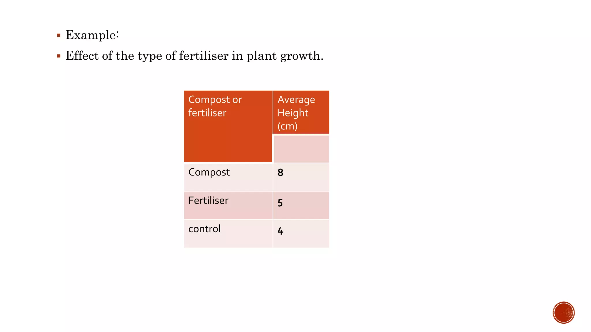
Example:
Effectof the type of fertiliser in plant growth.
Compost or
fertiliser
Average
Height
(cm)
Compost 8
Fertiliser 5
control 4
10.
We usedata collected in our experiments to make graphs.
To understand data better.
To identify patterns in data
A correct collection of data is essential to make correct graphs.
Sometimes data need to be manipulated. Average…
Use your processed data to create a graph that shows the results of your
experiment. It should be neat, including proper titles, and must be the proper type
of graph!
11.
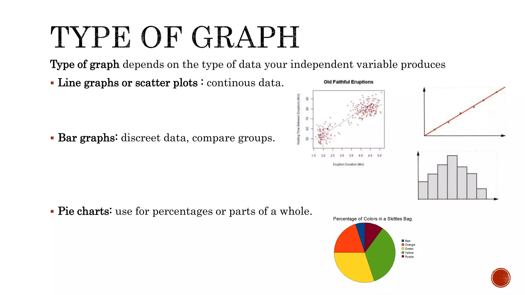
Type of graphdepends on the type of data your independent variable produces
Line graphs or scatter plots : continous data.
Bar graphs: discreet data, compare groups.
Pie charts: use for percentages or parts of a whole.
12.
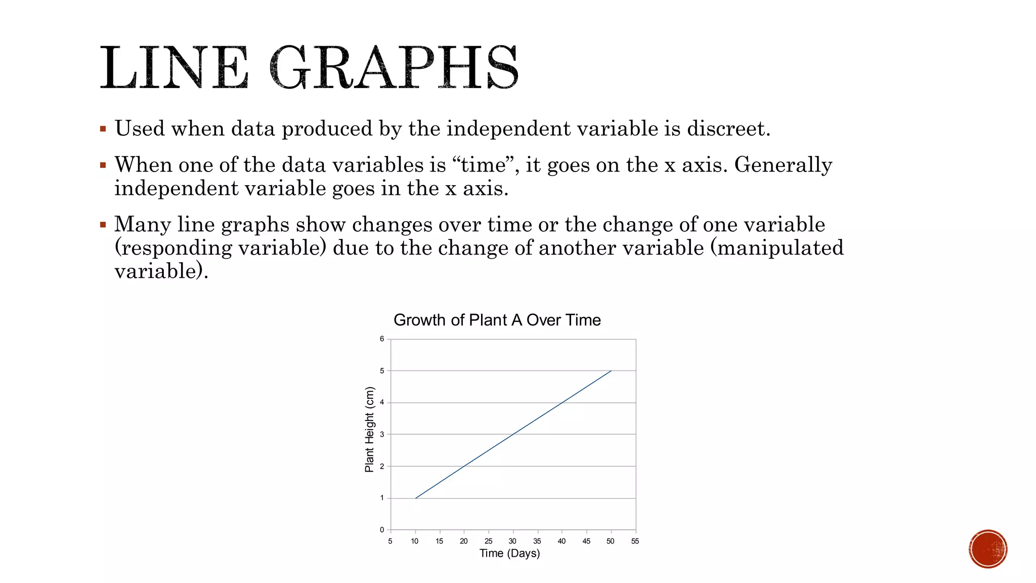
Used whendata produced by the independent variable is discreet.
When one of the data variables is “time”, it goes on the x axis. Generally
independent variable goes in the x axis.
Many line graphs show changes over time or the change of one variable
(responding variable) due to the change of another variable (manipulated
variable).
5 10 15 20 25 30 35 40 45 50 55
0
1
2
3
4
5
6
Growth of Plant A Over Time
Time (Days)
PlantHeight(cm)
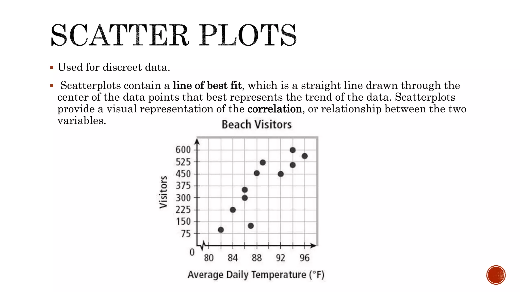
Used fordiscreet data.
Scatterplots contain a line of best fit, which is a straight line drawn through the
center of the data points that best represents the trend of the data. Scatterplots
provide a visual representation of the correlation, or relationship between the two
variables.
15.
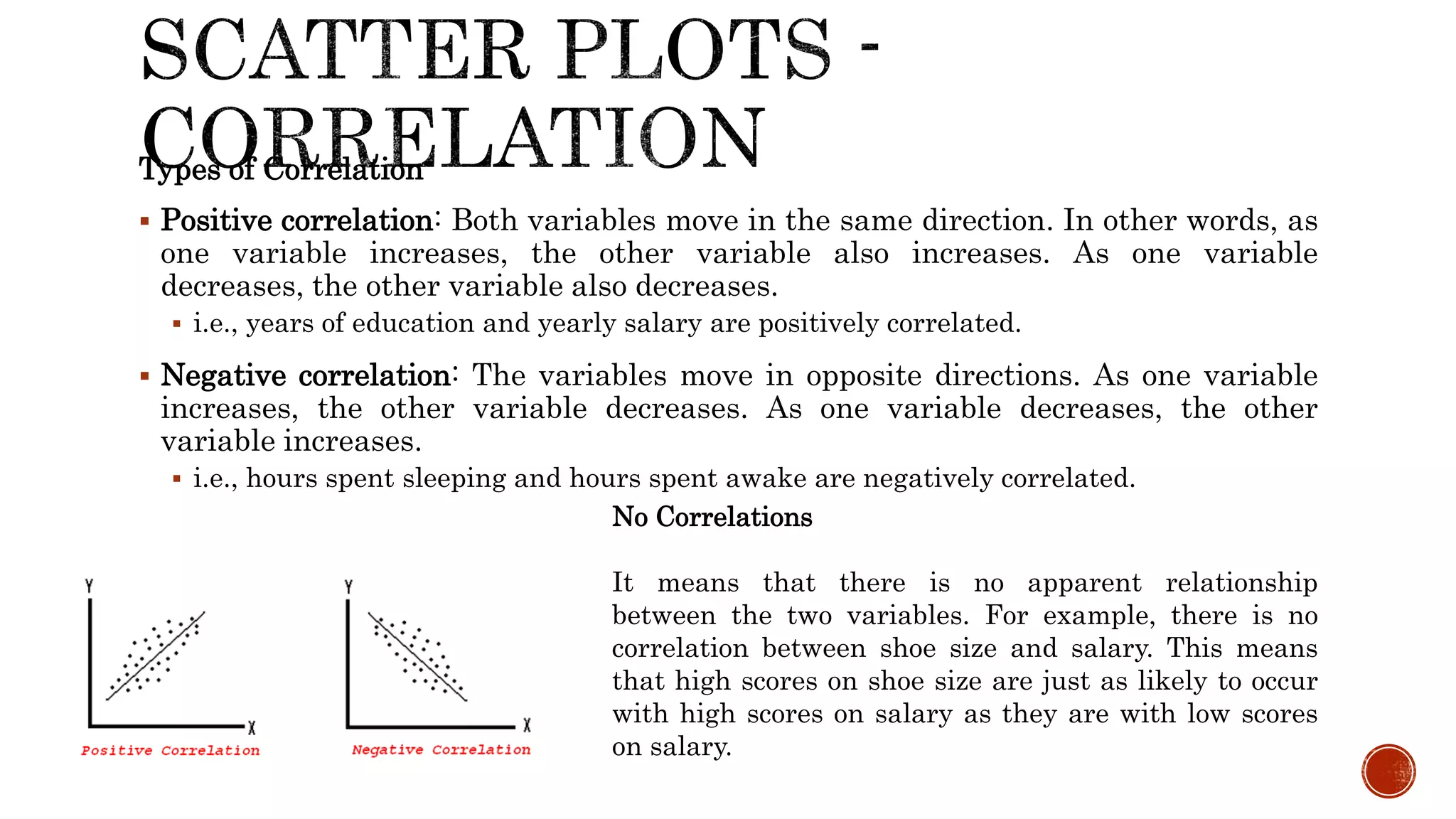
Types of Correlation
Positive correlation: Both variables move in the same direction. In other words, as
one variable increases, the other variable also increases. As one variable
decreases, the other variable also decreases.
i.e., years of education and yearly salary are positively correlated.
Negative correlation: The variables move in opposite directions. As one variable
increases, the other variable decreases. As one variable decreases, the other
variable increases.
i.e., hours spent sleeping and hours spent awake are negatively correlated.
No Correlations
It means that there is no apparent relationship
between the two variables. For example, there is no
correlation between shoe size and salary. This means
that high scores on shoe size are just as likely to occur
with high scores on salary as they are with low scores
on salary.
16.
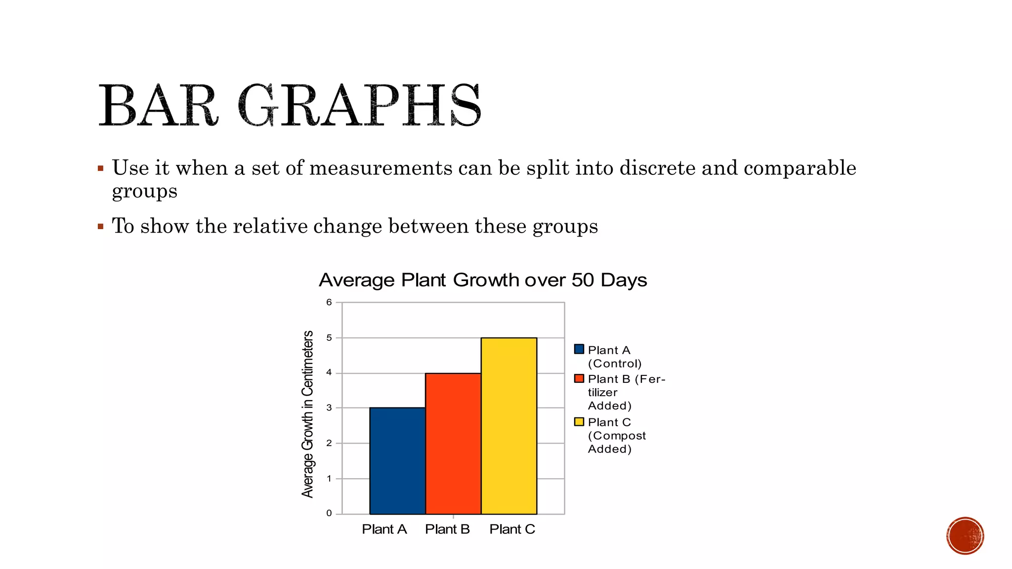
Use itwhen a set of measurements can be split into discrete and comparable
groups
To show the relative change between these groups
0
1
2
3
4
5
6
Average Plant Growth over 50 Days
Plant A
(Control)
Plant B (Fer-
tilizer
Added)
Plant C
(Compost
Added)
Plant A Plant B Plant C
AverageGrowthinCentimeters
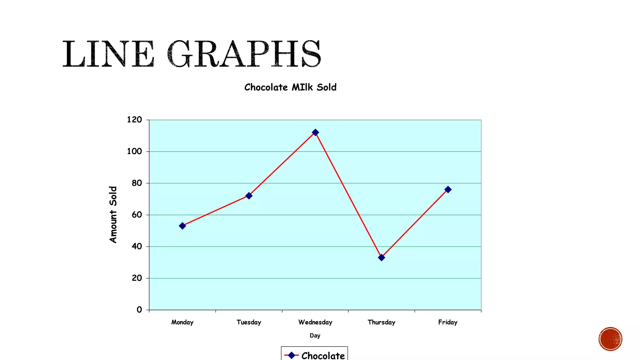
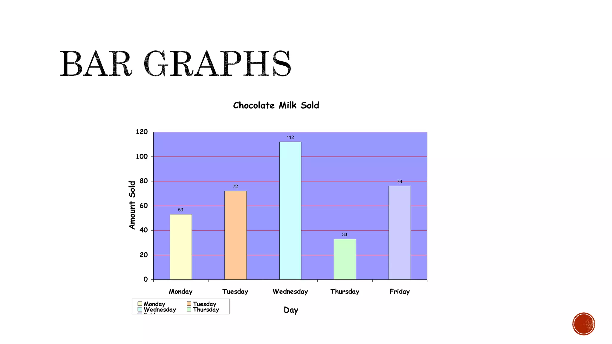
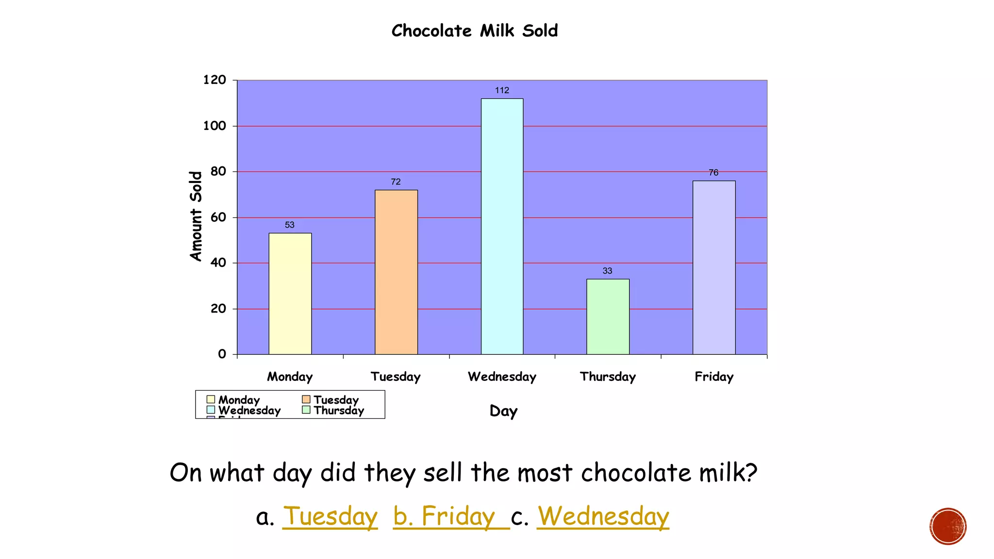
On what daydid they sell the most chocolate milk?
a. Tuesday b. Friday c. Wednesday
Chocolate Milk Sold
53
72
112
33
76
0
20
40
60
80
100
120
Monday Tuesday Wednesday Thursday Friday
Day
AmountSold
Monday Tuesday
Wednesday Thursday
Friday
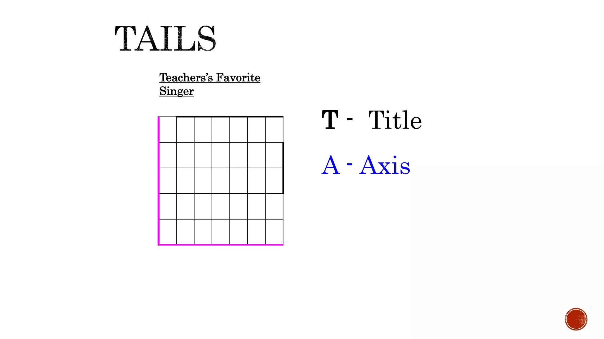
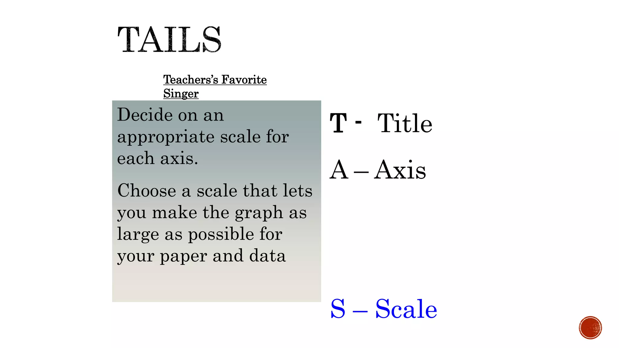
T - Title
A– Axis
S – Scale
Teachers’s Favorite
Singer
Decide on an
appropriate scale for
each axis.
Choose a scale that lets
you make the graph as
large as possible for
your paper and data
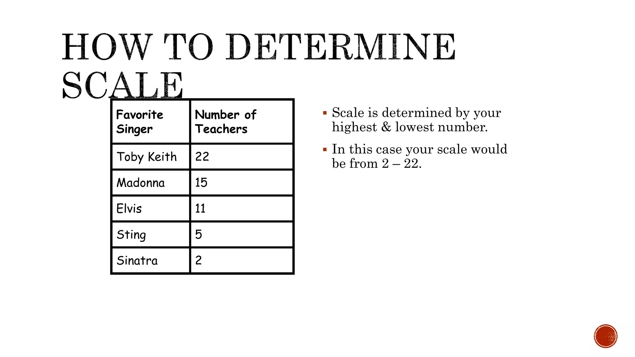
29.
Scale isdetermined by your
highest & lowest number.
In this case your scale would
be from 2 – 22.
Favorite
Singer
Number of
Teachers
Toby Keith 22
Madonna 15
Elvis 11
Sting 5
Sinatra 2
30.
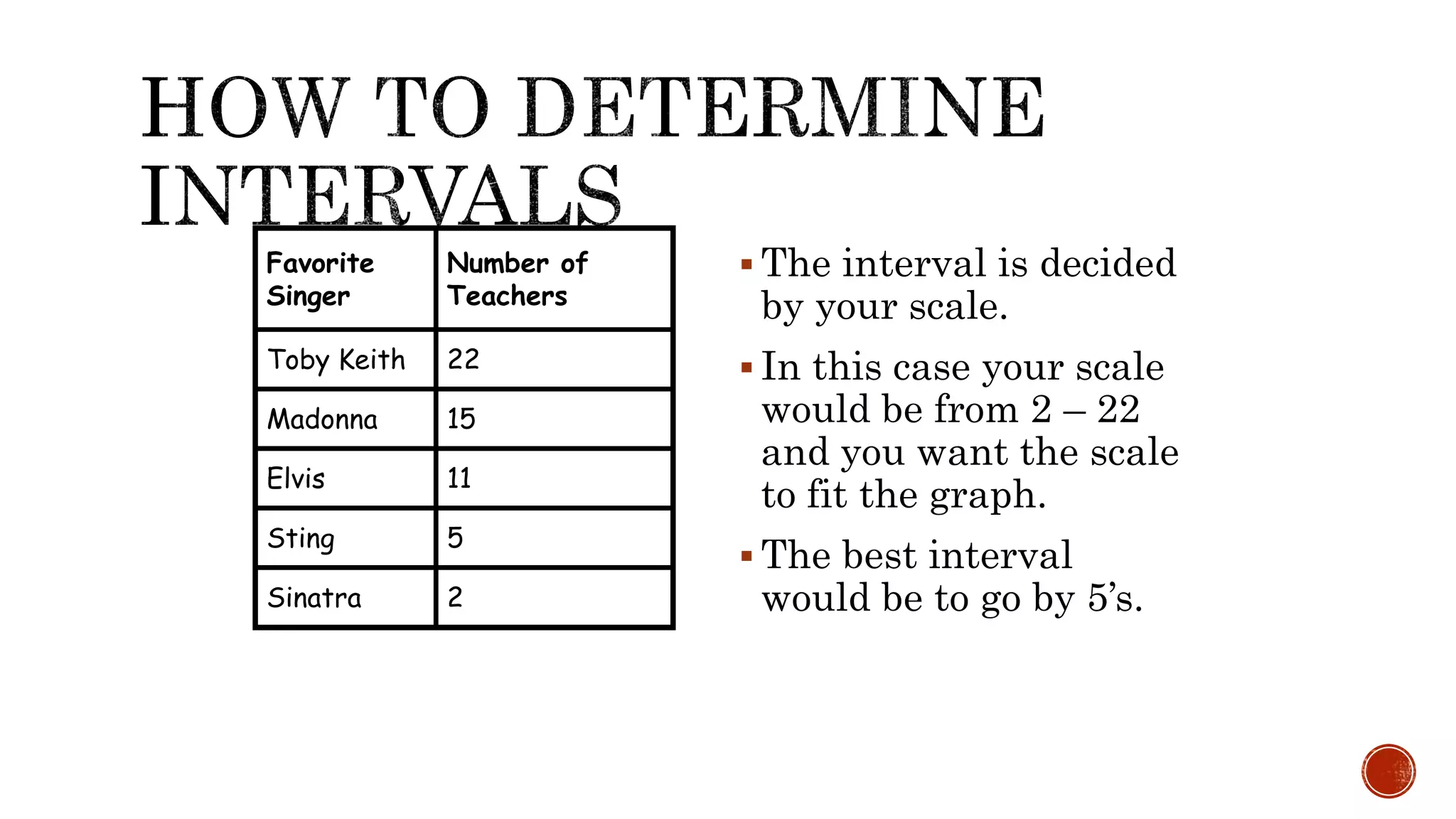
The intervalis decided
by your scale.
In this case your scale
would be from 2 – 22
and you want the scale
to fit the graph.
The best interval
would be to go by 5’s.
Favorite
Singer
Number of
Teachers
Toby Keith 22
Madonna 15
Elvis 11
Sting 5
Sinatra 2
31.
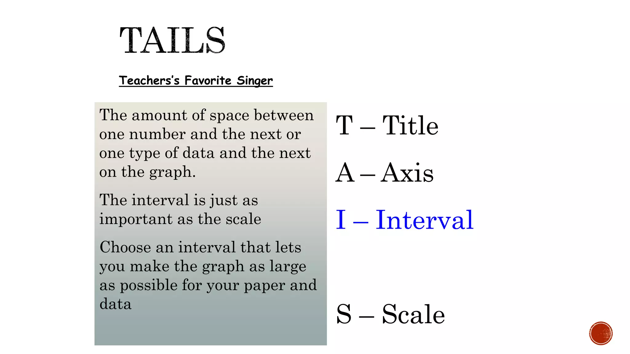
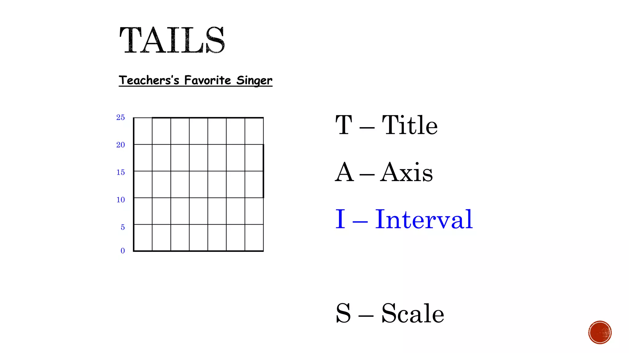
T – Title
A– Axis
I – Interval
S – Scale
Teachers’s Favorite Singer
The amount of space between
one number and the next or
one type of data and the next
on the graph.
The interval is just as
important as the scale
Choose an interval that lets
you make the graph as large
as possible for your paper and
data
32.
T – Title
A– Axis
I – Interval
S – Scale
Teachers’s Favorite Singer
0
5
10
15
20
25
33.
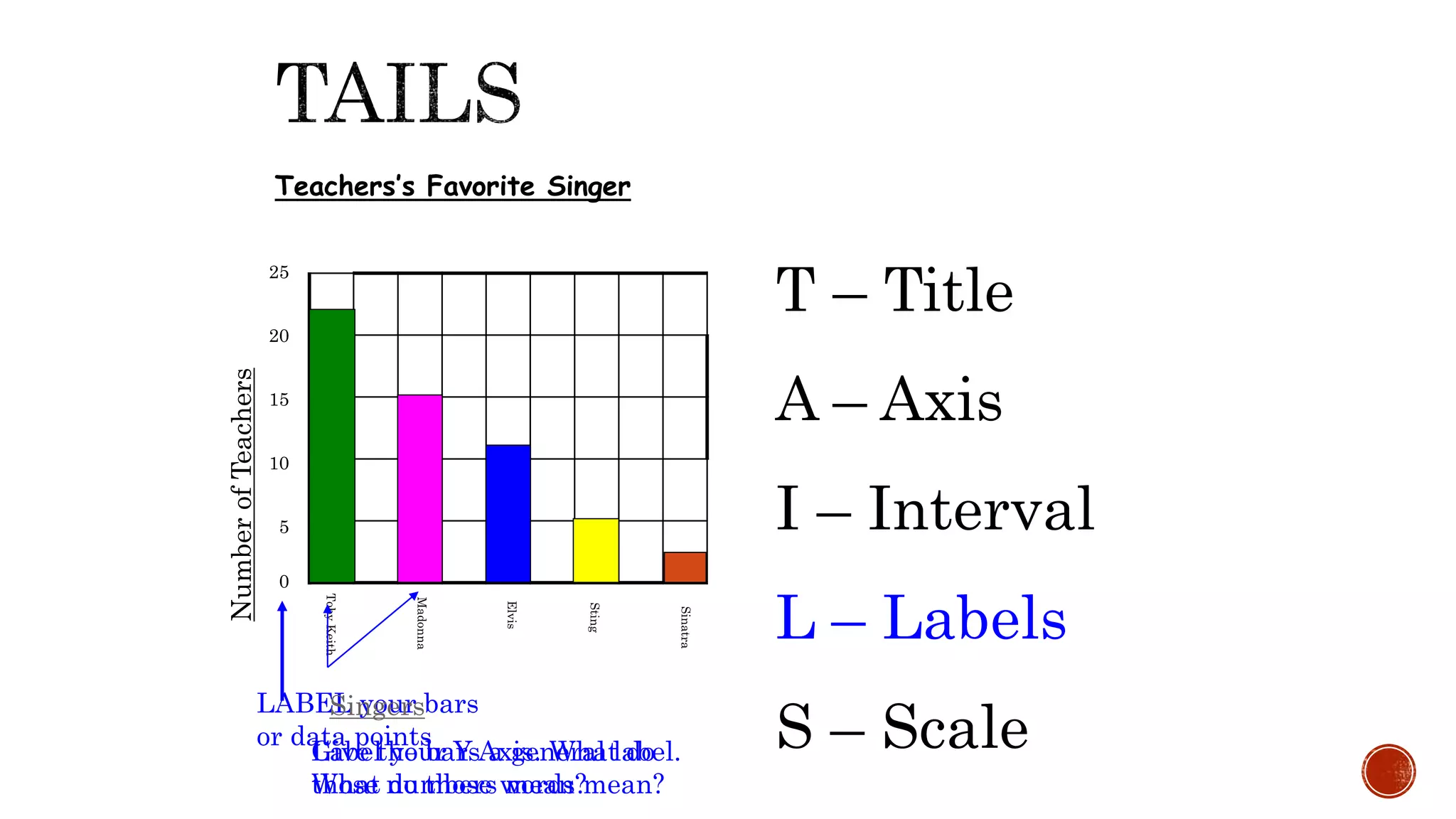
T – Title
A– Axis
I – Interval
L – Labels
S – Scale
Teachers’s Favorite Singer
0
5
10
15
20
25
LABEL your bars
or data points
Singers
Give the bars a general label.
What do those words mean?
NumberofTeachers
Label your Y Axis. What do
those numbers mean?
34.
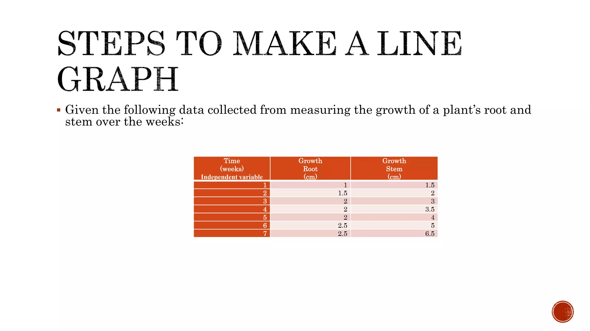
Given thefollowing data collected from measuring the growth of a plant’s root and
stem over the weeks:
Time
(weeks)
Independent variable
Growth
Root
(cm)
Growth
Stem
(cm)
1 1 1.5
2 1.5 2
3 2 3
4 2 3.5
5 2 4
6 2.5 5
7 2.5 6.5
35.
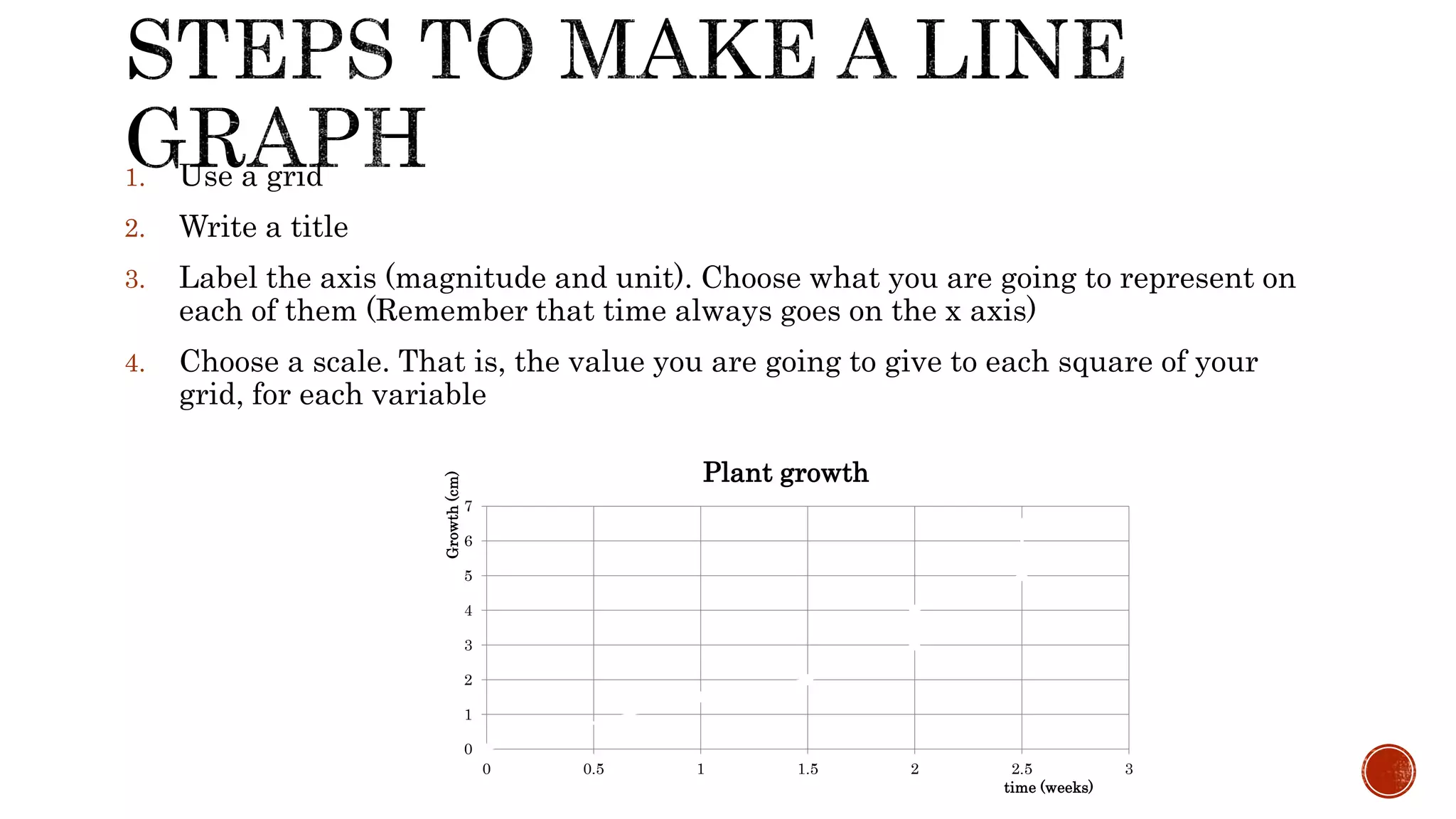
1. Use agrid
2. Write a title
3. Label the axis (magnitude and unit). Choose what you are going to represent on
each of them (Remember that time always goes on the x axis)
4. Choose a scale. That is, the value you are going to give to each square of your
grid, for each variable
0
1
2
3
4
5
6
7
0 0.5 1 1.5 2 2.5 3
Growth(cm)
time (weeks)
Plant growth
36.
Plot thefirst set of data (root growth) on the graph with dots.
0
1
2
3
4
5
6
7
0 0.5 1 1.5 2 2.5 3
Growth(cm)
time (weeks)
37.
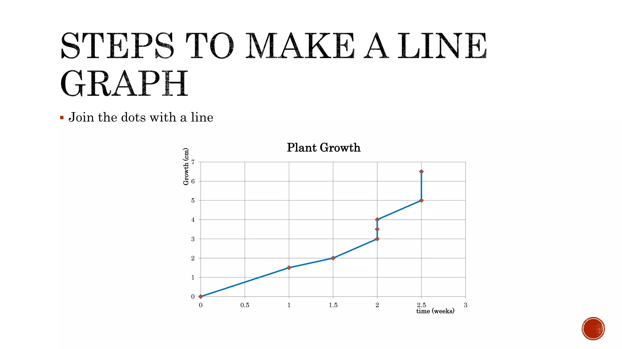
Join thedots with a line
0
1
2
3
4
5
6
7
0 0.5 1 1.5 2 2.5 3
Growth(cm)
time (weeks)
Plant Growth
38.
If therewhere to sets of data, just plot the second one following the same steps
with a different colour.
39.
PATTERNS
When makingyour conclusion you need to first identify the patterns in the data. Is the
dependent variable increasing or decreasing? Is there a linear relationship, or
exponential? How exactly are the variables related or not related?
Increase, decrease, or constant
data does not go “up”, it increases
data does not go “down”, it decreases
data does not stay the same, it is constant
sometimes data does 1, 2, or all 3 of these at different points
Relationships between variables
- direct = both increase, or both decrease
- indirect = they are opposite
40.
Recall thepurpose of the type of graph used and its advantages and disadvantages.
Read the TITLE . The TITLE briefly describes the data represented in the graph.
Read the footer or summary of the graph is included.
Read the labels of the axes. The independent or manipulated variable is usually on the
x axis and the dependent or responding variable on the y axis.
Read the units of the axes. Ensure you know the quantity measured and the multiple
or submultiple of the units used. Understanding the units used helps you to quantify
relationships between variables.
Read the scales of the axes.. Is the range a small or large one? Many students take in
the shape of the graph with out first considering the scale. This of course leads to
erroneous conclusions.
Examine the symbols and the Key/Legend used. Sometimes the curves or columns are
labelled.