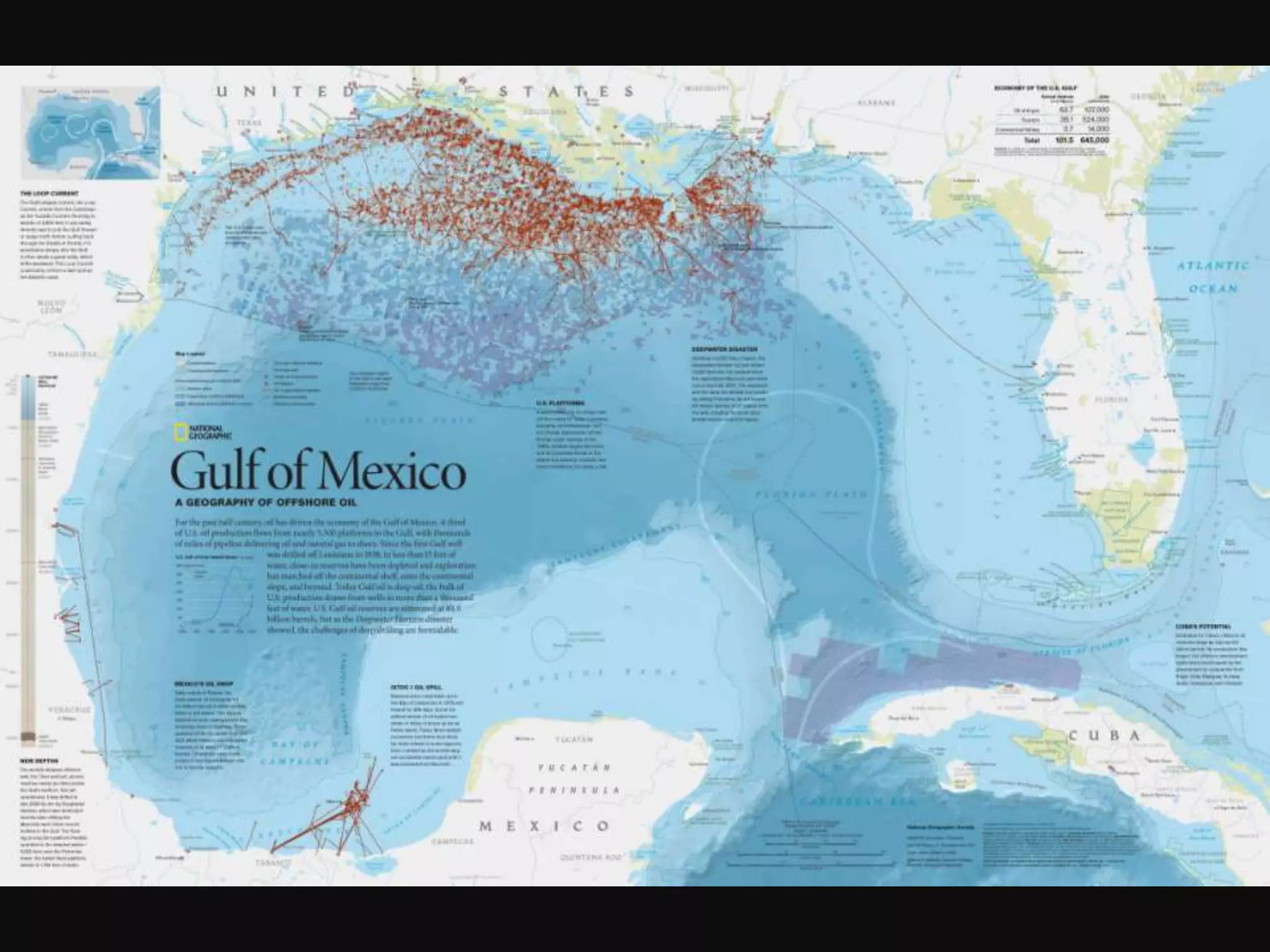
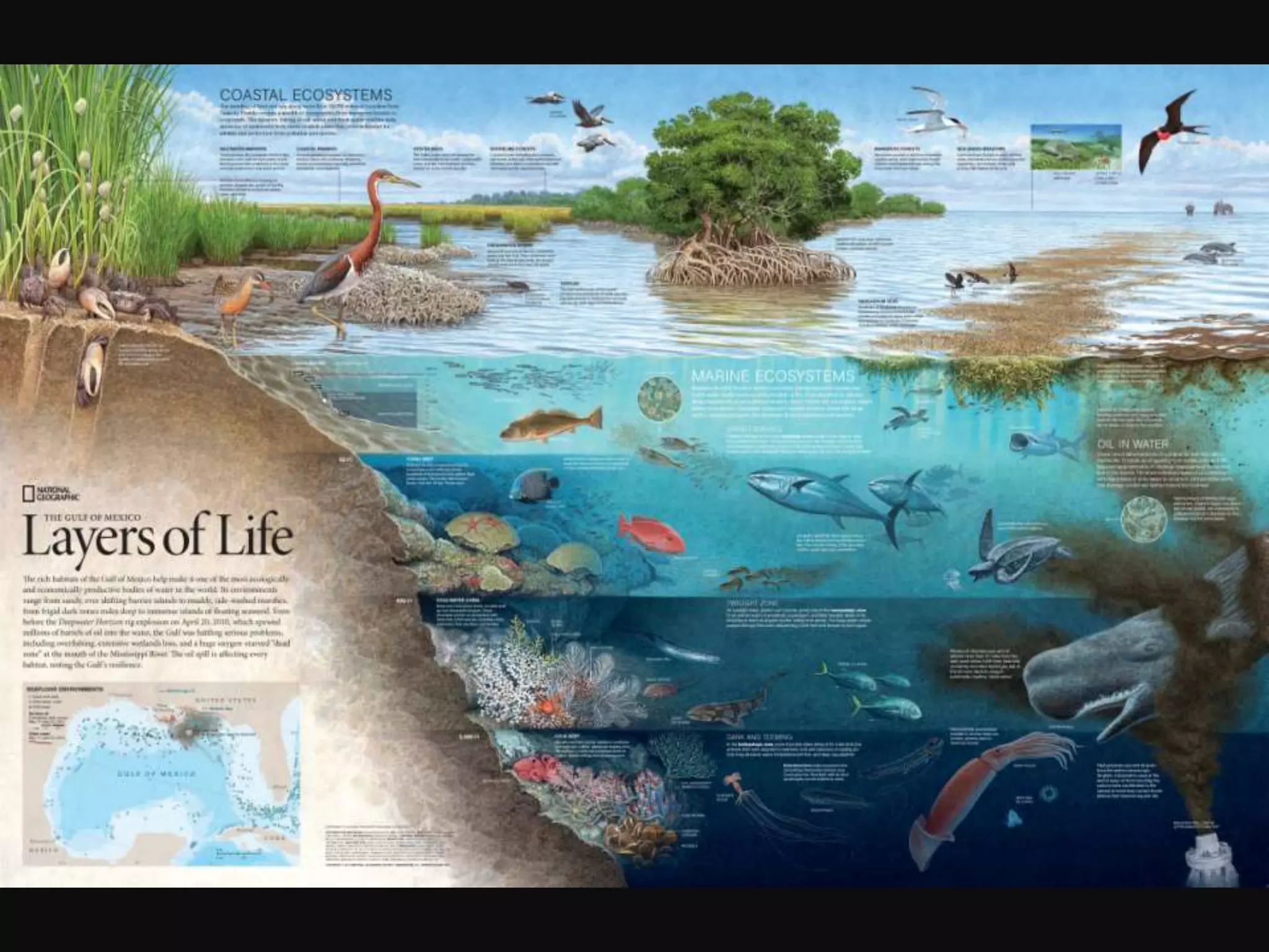
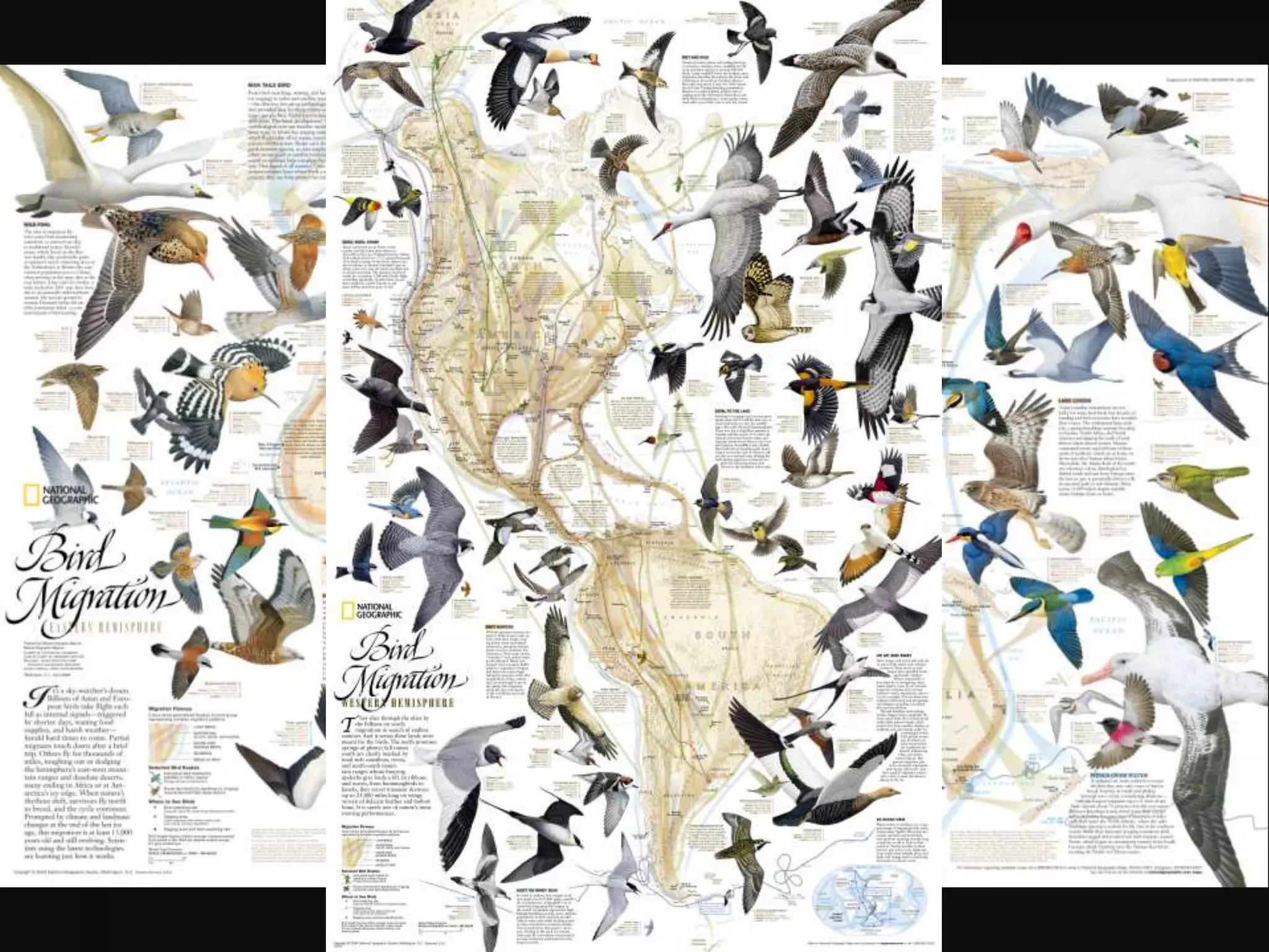
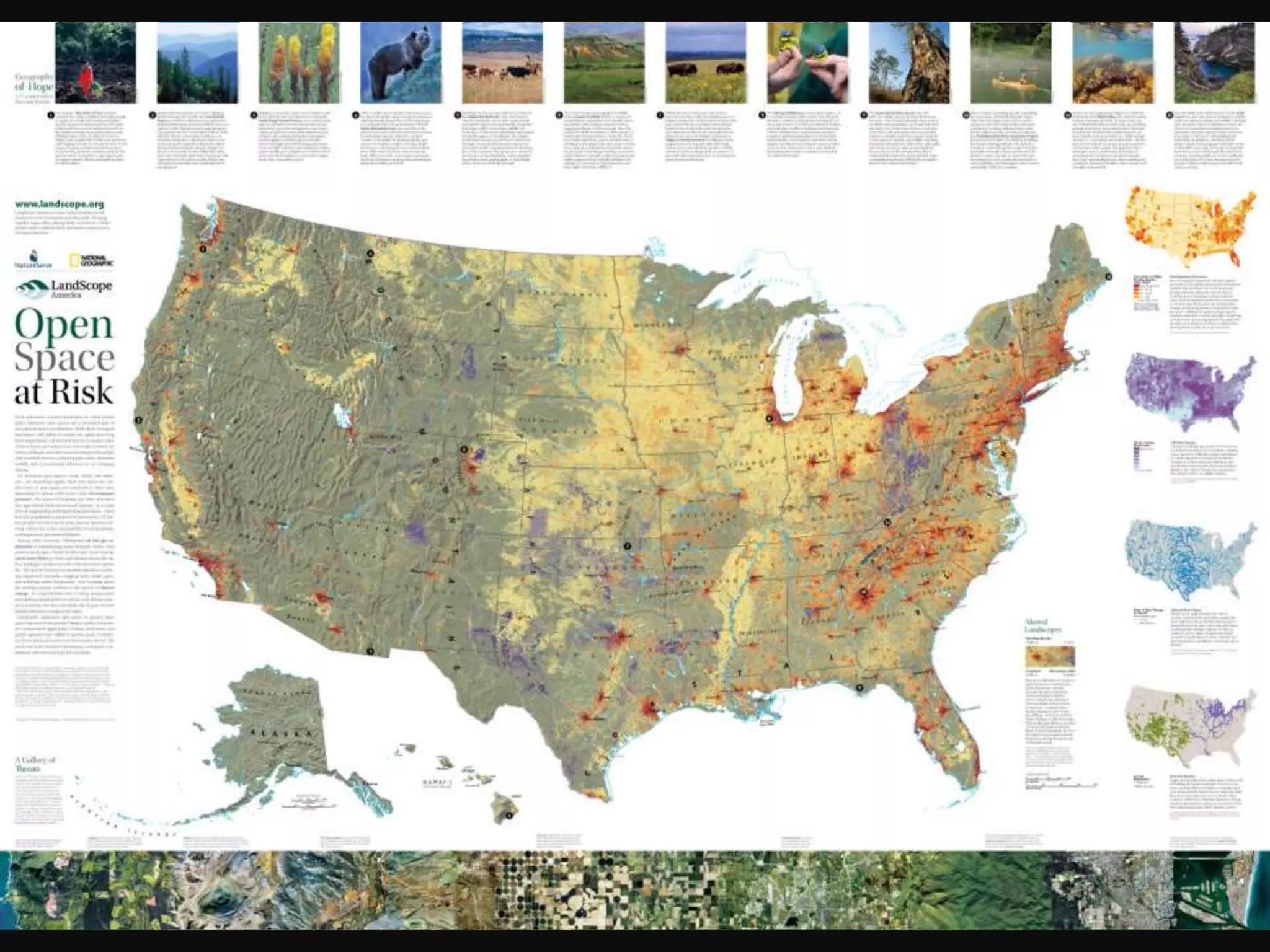
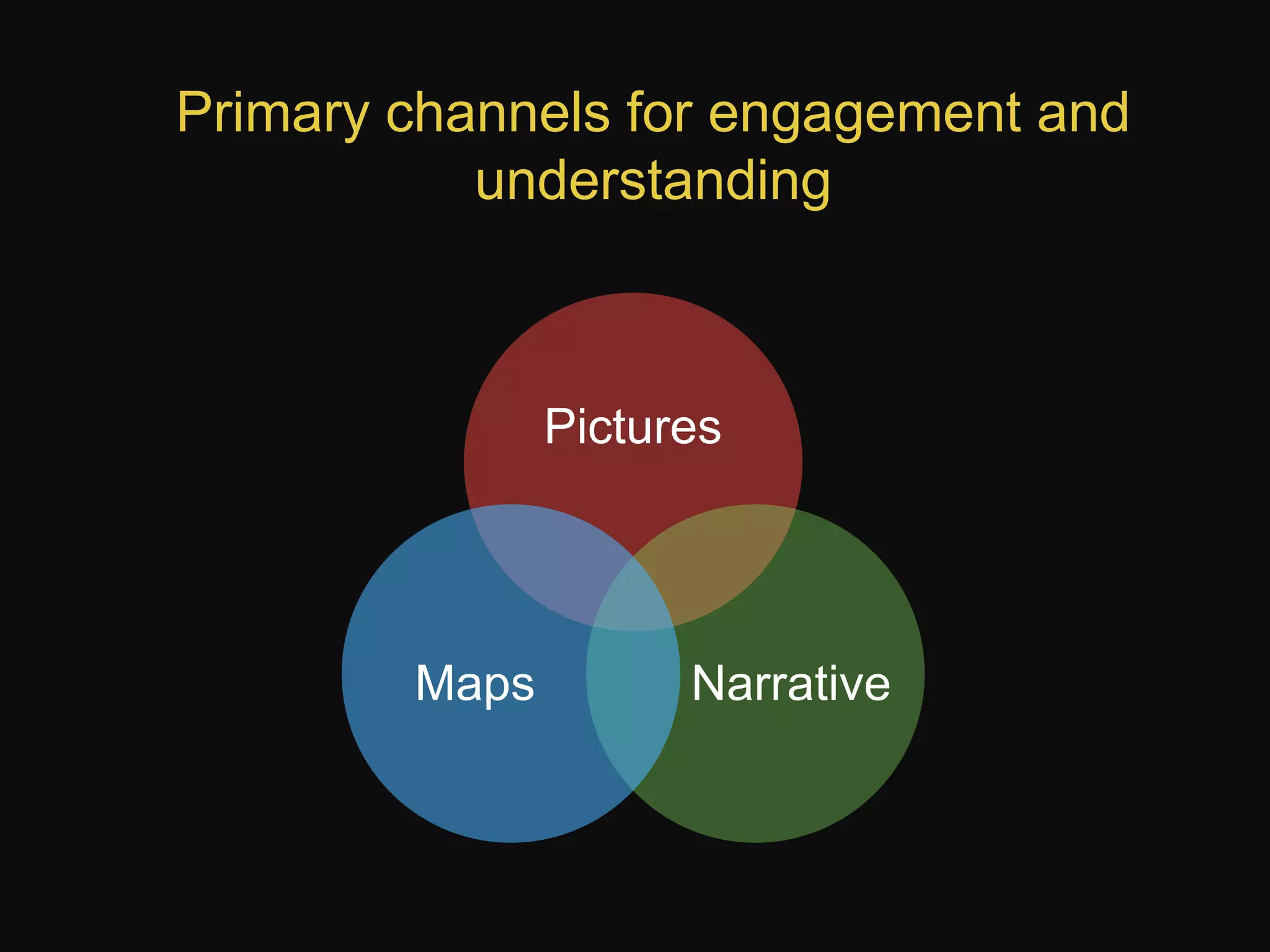
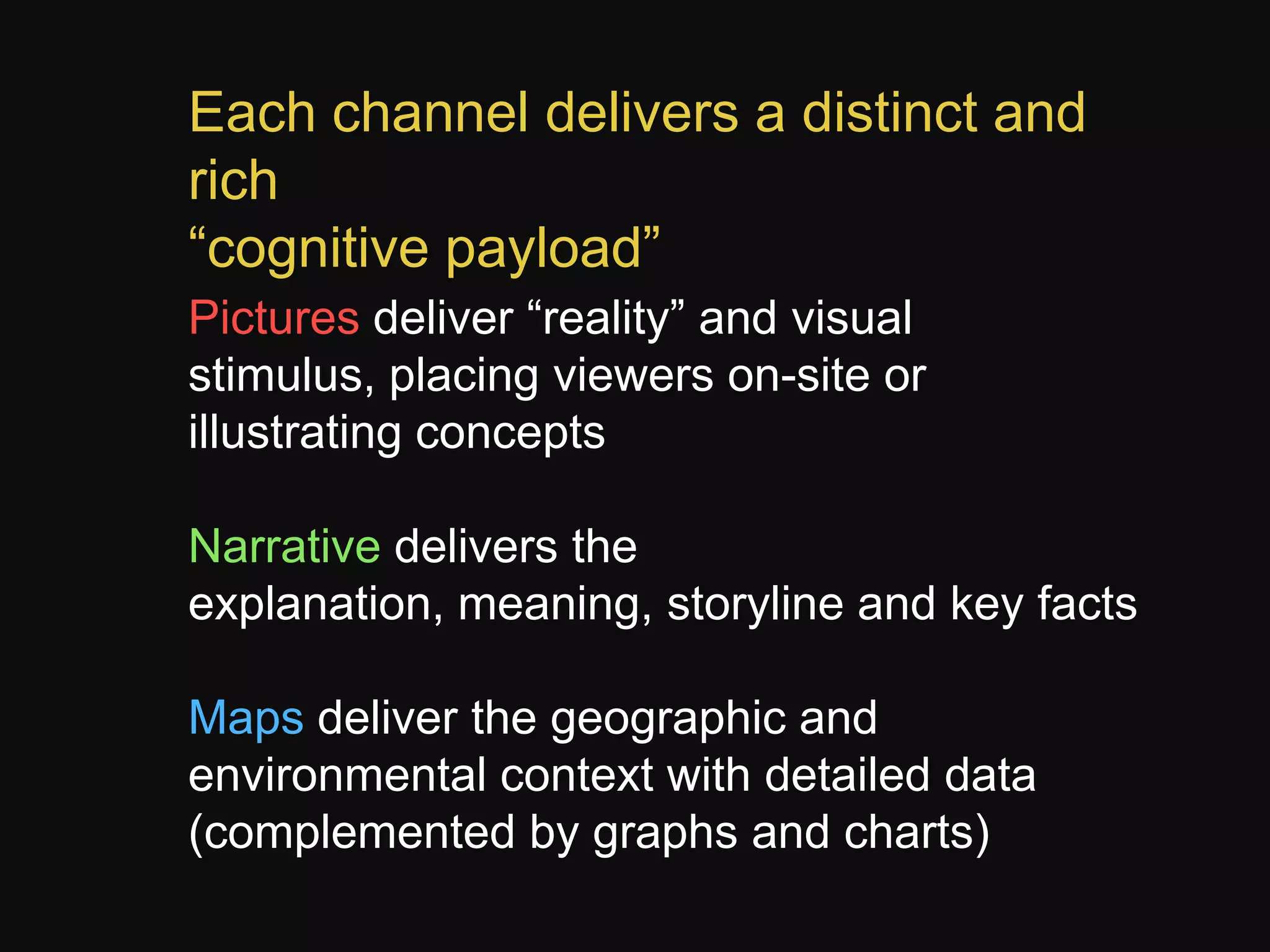
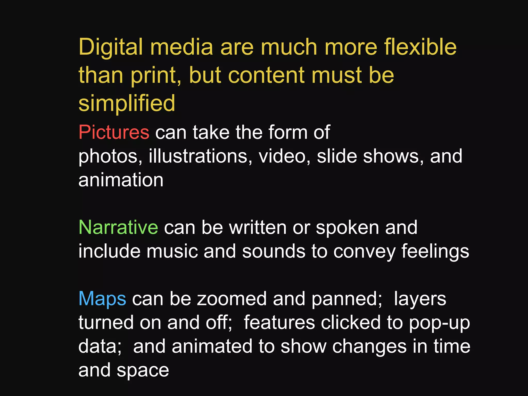
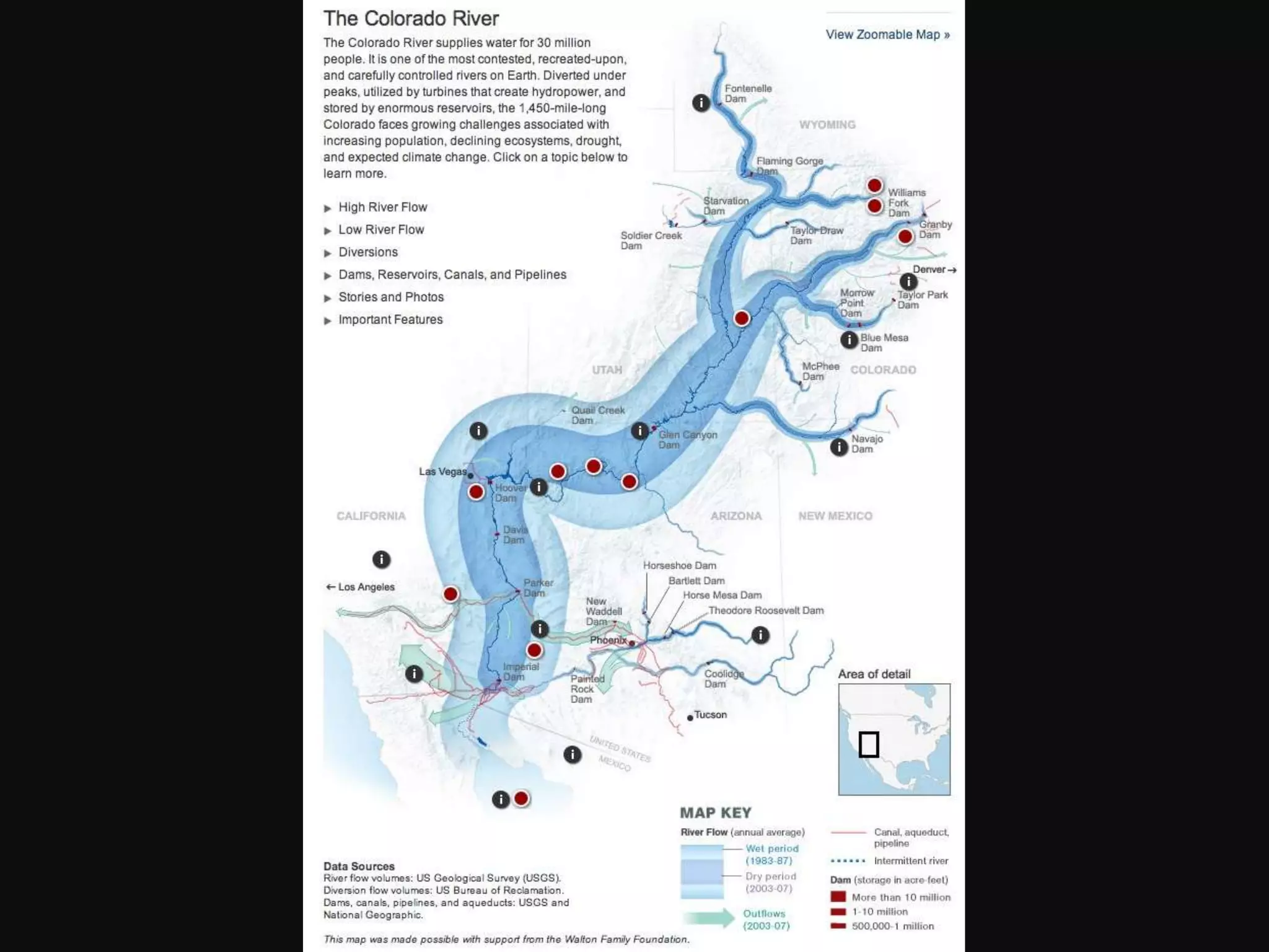
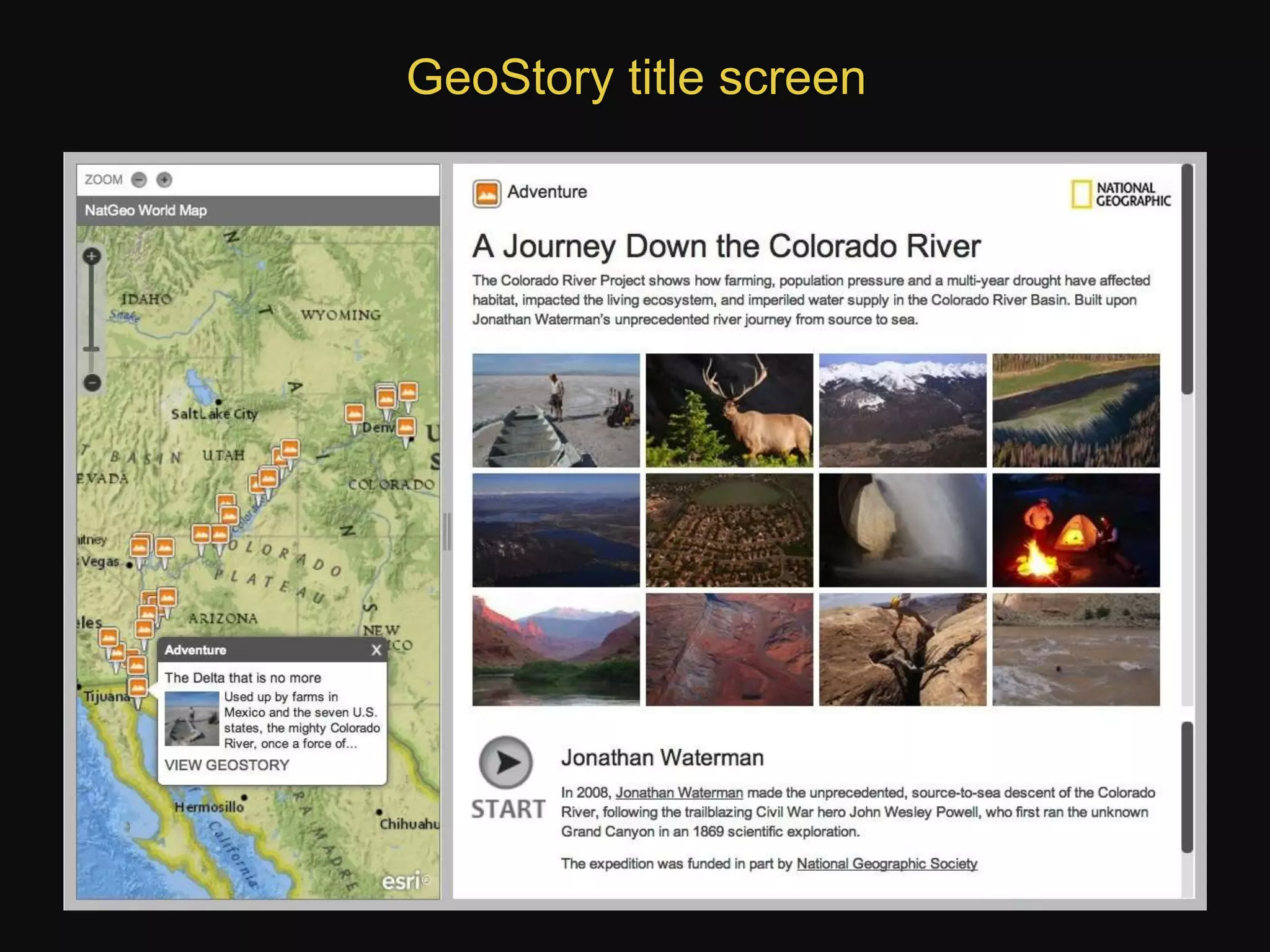
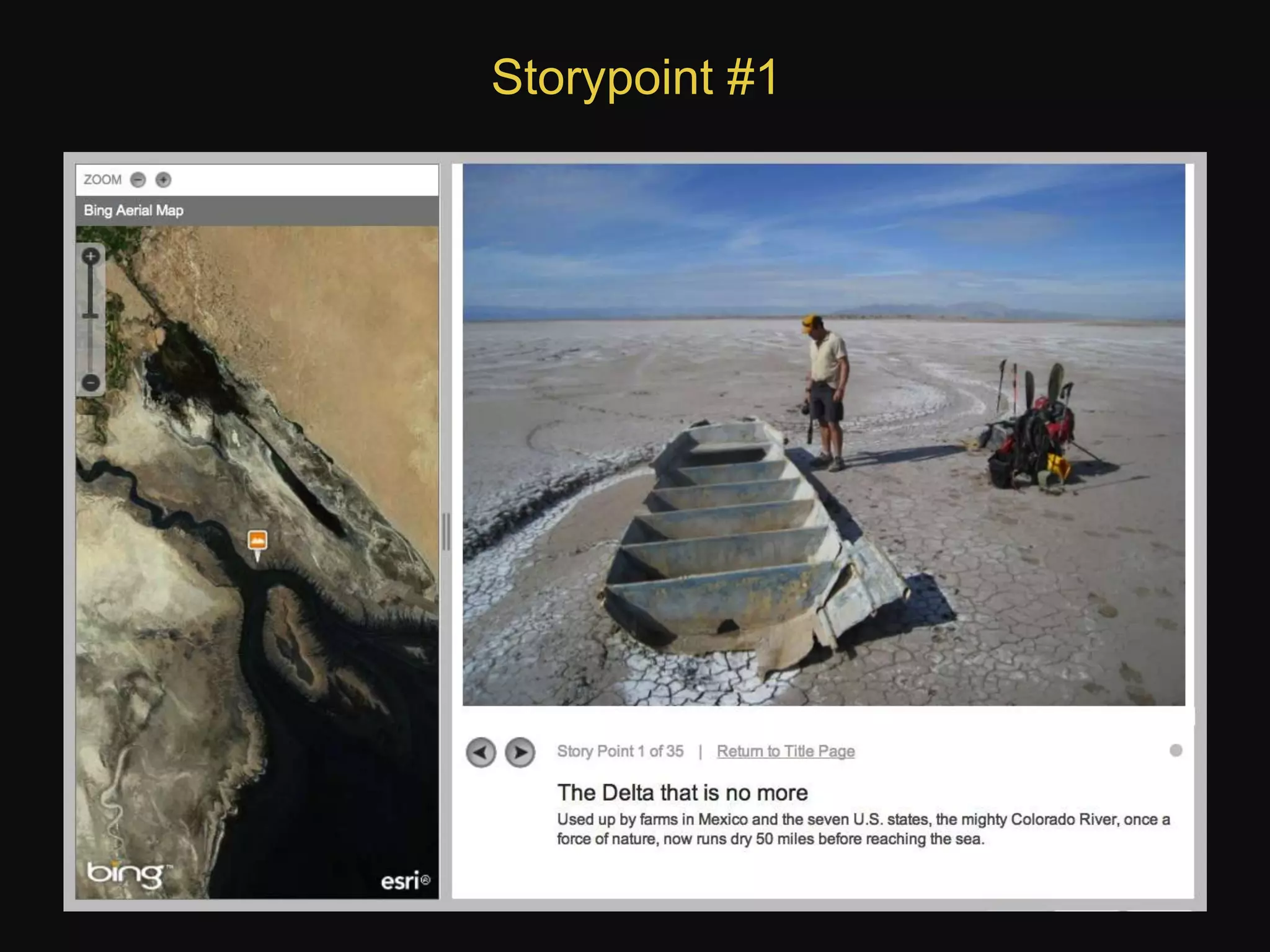
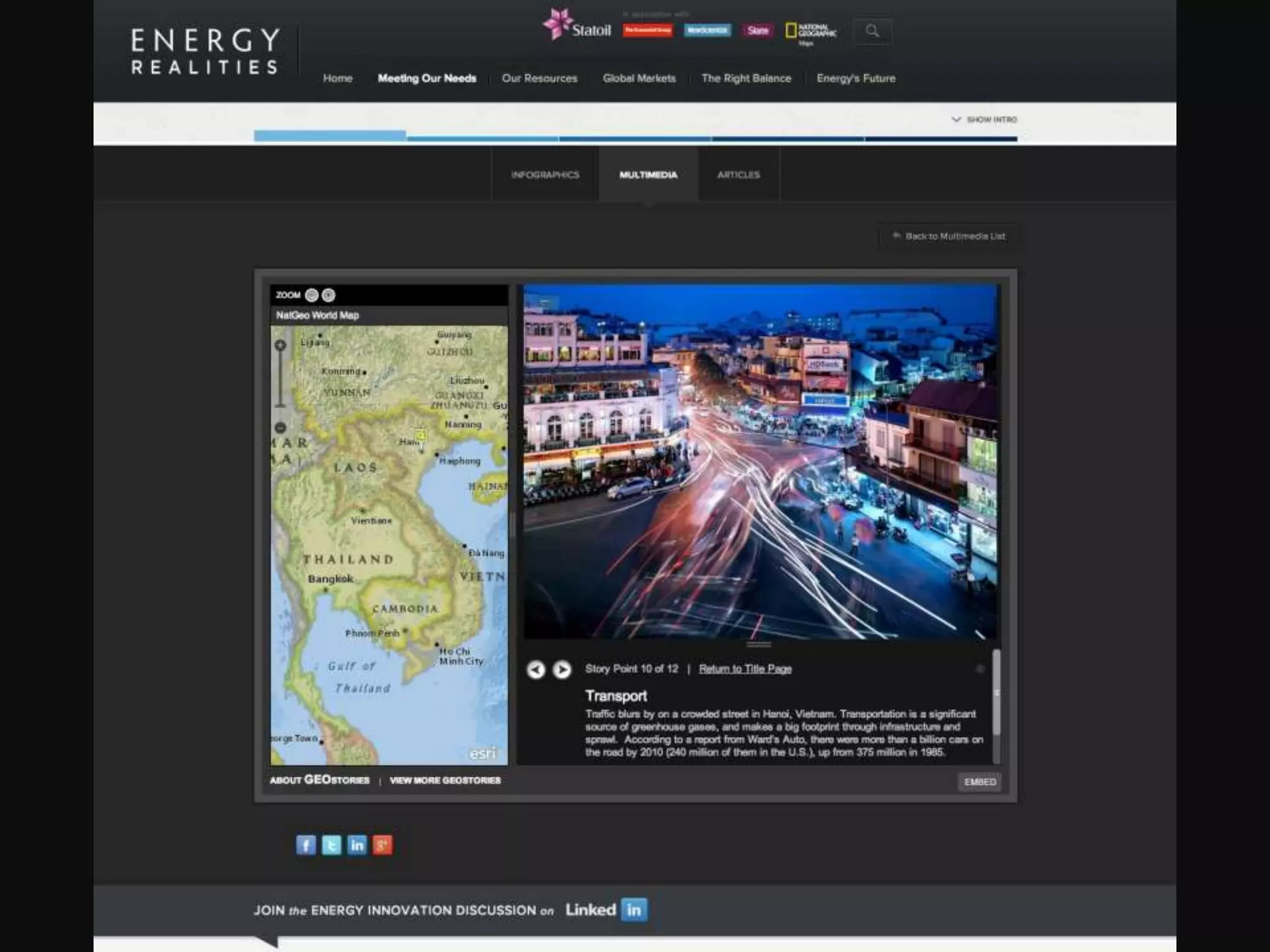
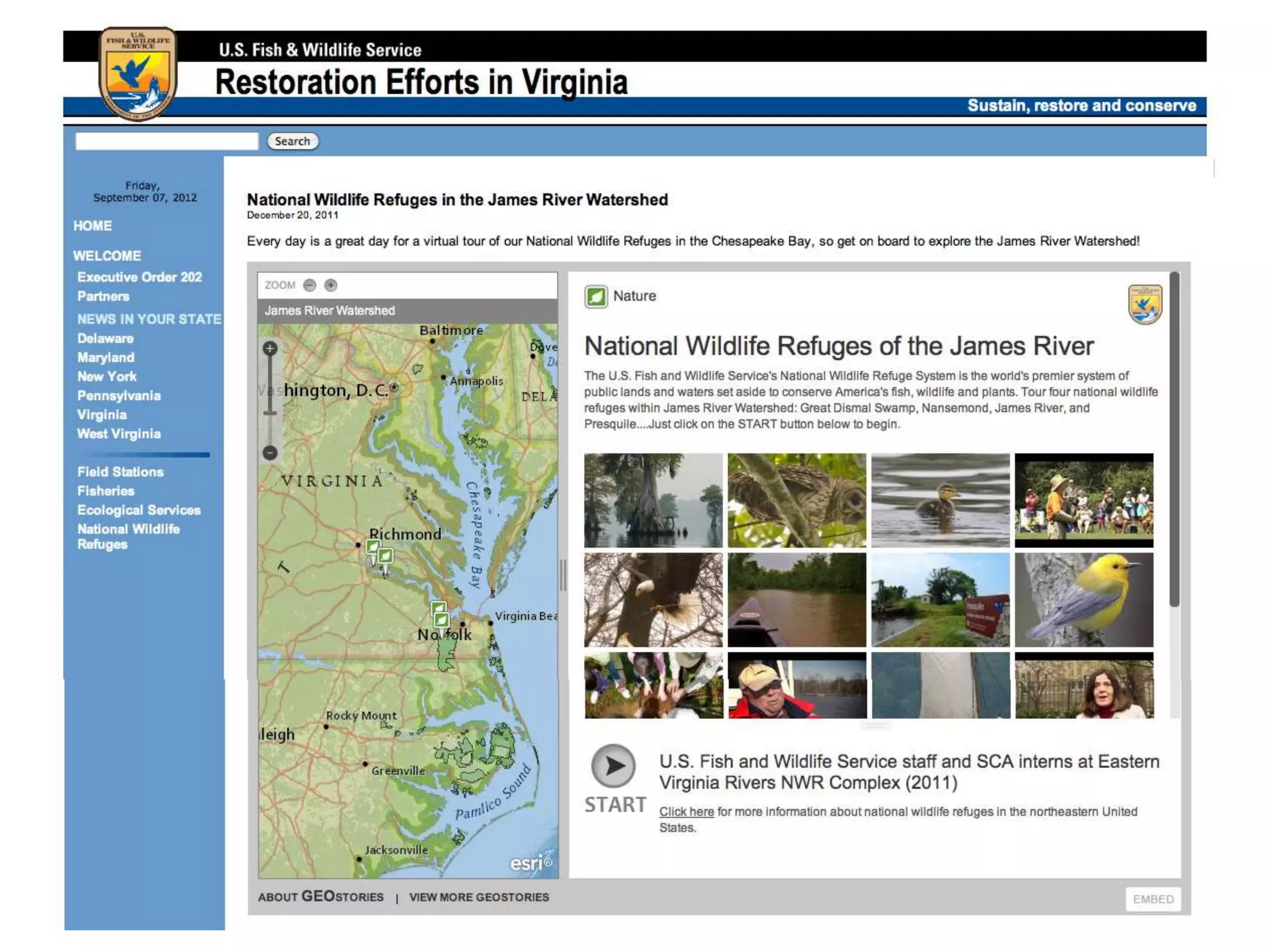
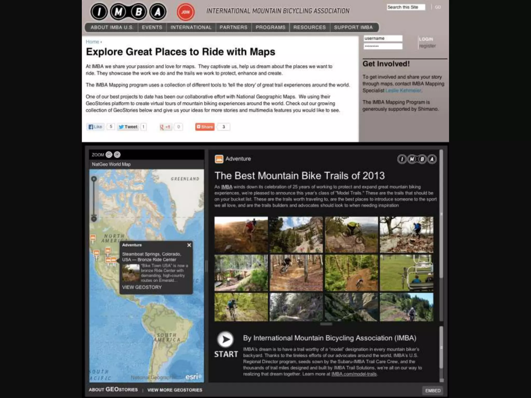
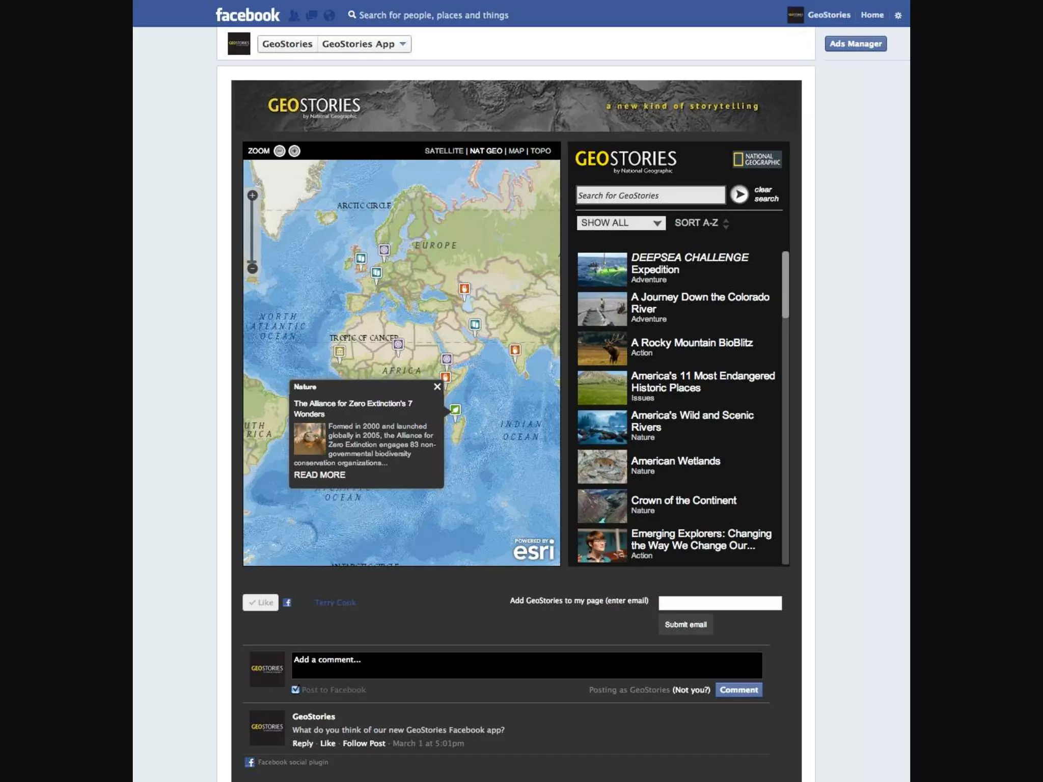
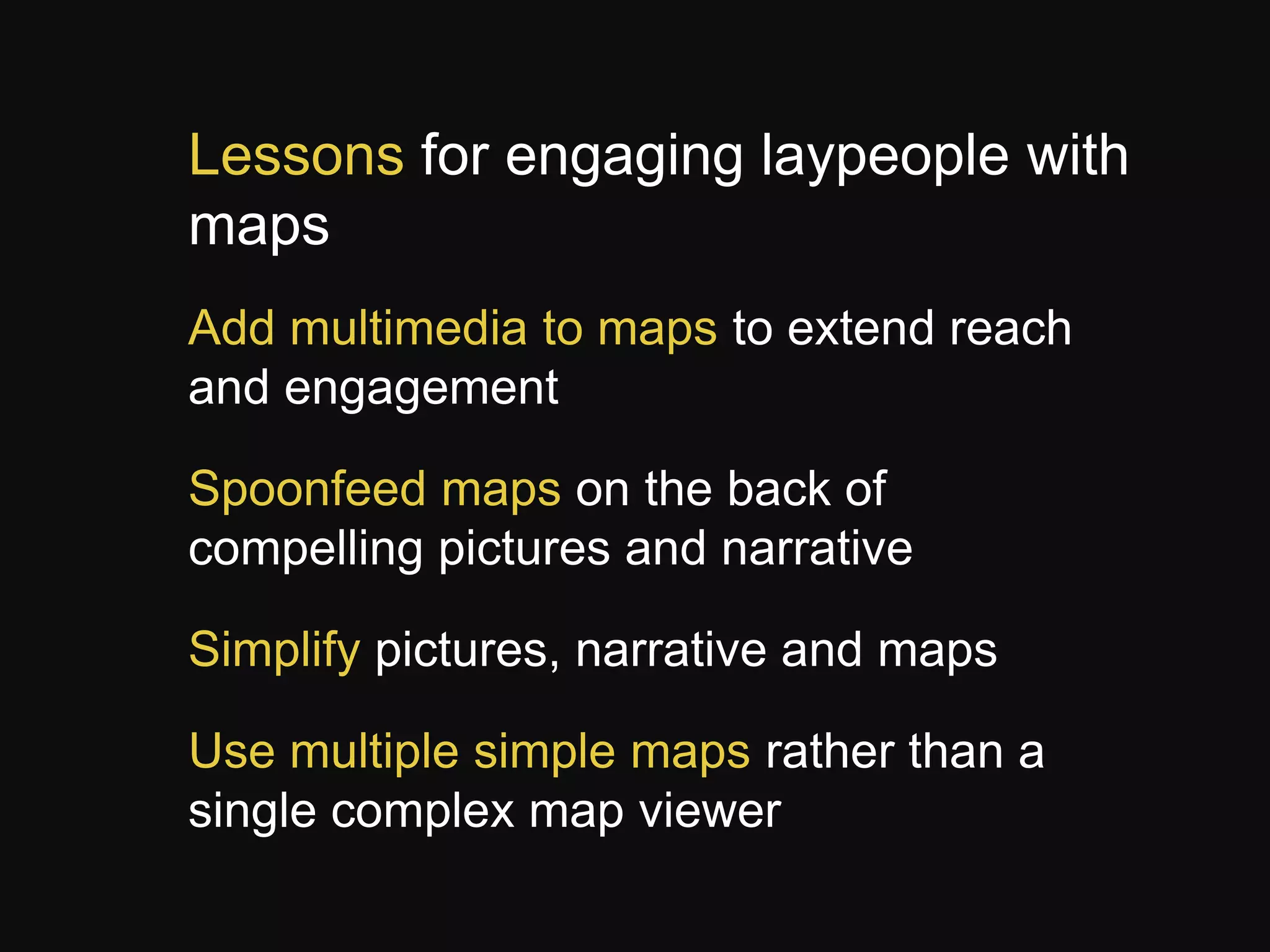
GEOSTORIES
Storytelling with geography in mind
the integration of digital media and maps

Jeremy Goldsmith
Frank Biasi
National Geographic Maps
@natgeomaps
Outline
• Channels of geographic storytelling
with print examples
• GeoStories & how it’s being utilized?
• Lessons Learned & Conclusion
Why should we use maps in
storytelling?
Maps are the primary language of
geography
Geography is a key factor in issues and
stories
Many people love maps, and many don’t
know the language
What makes a map universally
engaging?
1. Elegant, well-designed cartography
2. Concise, well-written notes and
captions
3. Beautiful, interesting pictures

1. A careful balance of those three
elements…
Primary channels for engagement and
understanding

Pictures

Maps

Narrative
Each channel delivers a distinct and
rich
“cognitive payload”
Pictures deliver “reality” and visual
stimulus, placing viewers on-site or
illustrating concepts
Narrative delivers the
explanation, meaning, storyline and key facts
Maps deliver the geographic and
environmental context with detailed data
(complemented by graphs and charts)
Digital media are much more flexible
than print, but content must be
simplified
Pictures can take the form of
photos, illustrations, video, slide shows, and
animation
Narrative can be written or spoken and
include music and sounds to convey feelings
Maps can be zoomed and panned; layers
turned on and off; features clicked to pop-up
data; and animated to show changes in time
and space
GeoStories are a new publishing
format to integrate maps and
multimedia
Embed multimedia stories in websites to tell
place-based stories
Combine maps, photos, video, and narrative
to take viewers on tours of places and topics
Basically a map-enabled slideshow that can
be easily embedded anywhere
GeoStory title screen
Storypoint #1
Storypoint with multiple pictures and sound
Storypoint with embedded video
Style and embed the player in multiple websites
Lessons for engaging laypeople with
maps
Add multimedia to maps to extend reach
and engagement

Spoonfeed maps on the back of
compelling pictures and narrative
Simplify pictures, narrative and maps
Use multiple simple maps rather than a
single complex map viewer
Questions?
GeoStories.org
Jeremy Goldsmith & Frank Biasi
National Geographic Maps
natgeomaps.com
@natgeomaps
jeremy@geostories.org - @jwgoldsmith
fbiasi@ngs.org - @fbiasi

GeoStories - Integration of Digital Media and Maps (GISCO Fall Meeting)

  • 1.
    GEOSTORIES Storytelling with geographyin mind the integration of digital media and maps Jeremy Goldsmith Frank Biasi National Geographic Maps @natgeomaps
  • 2.
    Outline • Channels ofgeographic storytelling with print examples • GeoStories & how it’s being utilized? • Lessons Learned & Conclusion
  • 5.
    Why should weuse maps in storytelling? Maps are the primary language of geography Geography is a key factor in issues and stories Many people love maps, and many don’t know the language
  • 6.
    What makes amap universally engaging? 1. Elegant, well-designed cartography 2. Concise, well-written notes and captions 3. Beautiful, interesting pictures 1. A careful balance of those three elements…
  • 10.
    Primary channels forengagement and understanding Pictures Maps Narrative
  • 11.
    Each channel deliversa distinct and rich “cognitive payload” Pictures deliver “reality” and visual stimulus, placing viewers on-site or illustrating concepts Narrative delivers the explanation, meaning, storyline and key facts Maps deliver the geographic and environmental context with detailed data (complemented by graphs and charts)
  • 12.
    Digital media aremuch more flexible than print, but content must be simplified Pictures can take the form of photos, illustrations, video, slide shows, and animation Narrative can be written or spoken and include music and sounds to convey feelings Maps can be zoomed and panned; layers turned on and off; features clicked to pop-up data; and animated to show changes in time and space
  • 15.
    GeoStories are anew publishing format to integrate maps and multimedia Embed multimedia stories in websites to tell place-based stories Combine maps, photos, video, and narrative to take viewers on tours of places and topics Basically a map-enabled slideshow that can be easily embedded anywhere
  • 16.
  • 17.
  • 18.
    Storypoint with multiplepictures and sound
  • 19.
  • 20.
    Style and embedthe player in multiple websites
  • 27.
    Lessons for engaginglaypeople with maps Add multimedia to maps to extend reach and engagement Spoonfeed maps on the back of compelling pictures and narrative Simplify pictures, narrative and maps Use multiple simple maps rather than a single complex map viewer
  • 28.
    Questions? GeoStories.org Jeremy Goldsmith &Frank Biasi National Geographic Maps natgeomaps.com @natgeomaps jeremy@geostories.org - @jwgoldsmith fbiasi@ngs.org - @fbiasi

Editor's Notes

  • #2 Hello,It is a pleasure to be here. My name is Jeremy Goldsmith and I’m a digital cartographic and multimedia consultant for National Geographic Maps here in Colorado. I support Frank Biasi, the director of digital development for National Geographic Maps on GeoStories.org, and a bevy of other digital products with partners around the globe. If you were at the GIS in the Rockies conference earlier this month, you have see some of this presentation, so please bare with me and thank you for having me. I’m pleased to present on GeoStories, storytelling with geography in mind with the purpose on extending the reach of the community through the integration of multimedia and maps.
  • #4 MAP Example of media and map integration (print form)So here we have an good example of what National Geographic does best:In 2010, during the environmental crisis that occurred in the gulf, we produced this supplement map showing and informing the public of what’s happening in the gulf, which most people didn’t really think much about. ](The oil and gas was coming from somewhere, and people probably weren’t actively connecting the inputs and outputs of the resource while turning on their furnace or starting their car.)So here we’re zooming in to the gulf of Mexico, and showing in red the active oil and gas wells and pipelines – and in purple and blue, the leases, that could potential be drilled as well. And as you can see, about half of the continental shelf their was exploited at this time.
  • #5 The other side of this map is where….(And this is something we’re doing now-a-days, is not as much adding pictures and images to the map side, we’re more or less keeping the map side fairly clean by focusing on the data and occasional chartswe depict pictures and illustrations, what we call the thematic content to support the map, and visa versa.So here is a beautiful illustration by Fernando Batista, showing the different layers of the ecosystem in the gulf. And what is at risk and what is at risk at that time. We may have gotten a little dramatic with the sperm whale swimming over the broken oil well. But sometimes you have to be a little dramatic. --- WHY SHOULD WE USE MAPS IN STORYTELLING – WHY SHOULD WE ADD MULTIMEDIA TO MAPS?----
  • #6 So why should we use maps in storytelling? Why should we add multimedia to maps?You know, maps are great on their own, they provide so much information, to people who know how to read them; they tell a story and explain issues.Of course geography, is a key factor in environmental and political issues and stories. And of course we all know maps are the primary language of geography.Some people like us love maps, but some people don’t; and they don’t know the language, of maps and of geography. And some people may get intimidated by it. Or some people don’t care much about them.Thus, the main reason to add and integrate multimedia to maps is to reach those people who don’t really know the language, who might be intimidated by them, and in someway, pull them in and spoonfeed the data and information to them.--- SO WHAT MAKES MAPS UNIVERSALLY ENGAGING?----
  • #7 What makes a map universally engaging?Elegant, well-designed cartography is critical. The colors and symbols, text, placements, and fonts is essential.Concise, well-written notes and captions – Interpret and explain what’s happening on the map, particularly for those who can’t infer that from the data on the mapBeautiful, interesting pictures and illustrations.A careful balance of those three elements…Here’s a coupleother examples of media and map integration on paper---BIRDS---So I’ll briefly show you some examples, some of which you probably have seen, of National Geographic’s work of universally engaging maps.
  • #8 Some more examples of universally engaging print mapsHere is an example of a cool map we did as a supplement. We did both hemispheres of bird migration and here you’re seeing the eastern hemisphere migration routes. Here you see the map, which is styled in a way where the illustrations actually take focus and the map takes a back-seat to the images of the birds, which comes from the National Geographic field guides of birds.This map and media combination gives the layperson a very good and thorough understanding of Bird Migration in the eastern hemisphere.
  • #9 Here we have map and media product that was created in 2007 in a partnership with Nature Serve.It is a two-sided map, as the previous examples, that tells a story about conservation and ecosystems across the United StatesSide one is the celebratory side. Parks, conservation and protected areas broken down by Federal, State, Local, Private. The map includes (eco-regions) ecological divisions as well- with images representing each region and pie charts showing the percentage of them remaining. At the bottom, a photomontage of different ecosystem pictures going from coast to coast.Down the right side, small-multiples of maps showing biodiversity and conservation themes. ---Side two is more of the threats map.It shows the generalized distribution of land use. Orange and red = urban and suburban areasGreen = Open spaceYellow = crop land and agriculturePurple = oil and gas wells
  • #11 We think that there are these three primary channels for understanding and engagement when geographically telling a story. And without all three channels, it is very difficult to completely provide a comprehensive story to the audience. And as it takes Red, Green, and Blue to make a full color picture:images, narrative and maps are the primary channels that help engage and audience to learn about issues, comprehend, and ultimately: share that story with their peers.
  • #12 Read slide
  • #13 Read slide through mapsBut a small caveat to digital maps is that they must first be simplified for ease-of-use in the beginning. And as the user gains more and more familiarity with that map, the more he or she will be inclined to dive deeper into the data, layers, and statistics. And as I’ll demonstrate later in this presentation, GeoStories enables the features and complements of digital-media (videos, images, audio, and more), with dynamic mapping capabilities to tell a story. With the flexibility of an integrated digital prism which influences the way our audiences hear stories, learn about issues, and ultimately share them with their peers…
  • #14 Here you see the print version of the Colorado River Basin map again.
  • #15 Here you see that same map, but in digital format with a lot of the details stripped and added into dynamic map notes, pop-ups, and through clickable actions
  • #16 What is GeoStories? Applicable to almost everyone, is a simplified version of our highly intricate wall maps (as you saw before).
  • #17 An overview of the entire story. The title screen allows the audience to gain a context of how spatially diverse (small or large scale) a story is, what they expect to see throughout the story, and a summary description of the story with hyperlinks pointing to original sources, eCommerce sites, and expansion of the story.
  • #24 National Geographic GranteeAlso embedded in NationalGeographic.com
  • #27 Flexible to be embedded in facebook page apps as well.
  • #30 Read first two points of slide.When you simplify pictures, narrative and maps, it provides an easy path for the user to travel, start to finish.Using multiple, simple maps rather than a single complex map viewer is critical for user-engagement, comprehension, attention spans, and sharing across their networks.