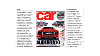
Generic codes and conventions
•Download as PPTX, PDF•
0 likes•459 views
Aidan Harding - AS Media Generic Codes and Conventions for Car Magazines.
Report
Share
Report
Share

Recommended
Magazine cover analysis
The magazine cover uses a photograph of a supercar and bright colors to emphasize that it is a car magazine. The cover keeps things simple to draw attention to what the magazine is about - cars. The target audience is likely car enthusiasts. Overall the cover straightforwardly conveys what the magazine contains through its visual design and imagery.
Analysing magazine contents pages
The document analyzes the contents page of the magazine "vibe". It notes that the contents page is designed to attract a younger audience as the magazine focuses on hip hop and urban culture. The masthead is in white font against a dark background to stand out. The main image features a woman posing seductively, using sexuality to attract both male and female readers. Each article title uses a different font to add visual interest while maintaining a professional look. Overall, the contents page aims to simplistically showcase the magazine's content and grab reader attention through images and design.
Codes and Conventions of Magazines
The document discusses conventions used in magazine design. It provides examples from magazine covers and interior pages. Some key conventions discussed include using a bold masthead font to identify the magazine, prominent cover images of celebrities related to the magazine's genre, and consistent color schemes throughout the magazine content and covers. Interior pages also employ techniques like quotes and large images of celebrities to draw reader attention, while keeping body text in an easy-to-read font. The consistent application of design elements and celebrities tied to the magazine's topic help create recognition and attract readership.
What are pugs and puffs on magazines
Pugs and puffs are short pieces of vital information placed on magazine covers. Pugs, located in the top corners, display the price, logo, and issue number to catch readers' eyes. Puffs are promotional stickers that make certain articles or contents stand out from the rest of the cover using shapes and text. They provide quick previews to entice readers and highlight articles inside the magazine.
Magazine Analysis (Front Cover)
1) The document outlines the key elements found on magazine front covers such as the masthead, price/issue details, main cover line, cover lines, plugs, and puffs.
2) It then analyzes an example front cover, noting how the large red masthead draws the eye to the featured photo and main cover line about an article.
3) Smaller cover lines below with accompanying photos advertise less important articles, and plugs on the bottom use puffs to attract attention in contrast to the small plain text of the plugs.
How to-draw-manga-super-deformed-1pdf
estilos, este se ve algo infantil, pero es util para desarrollar tu estilo, te ayuda a romper con la manera en que dibujas y encontrar una nueva
How to draw manga vol. 28 couples
This document provides guidance on drawing manga couples with different height differences. It discusses presenting couples kissing with both small and large height differences, such as the shorter person standing on their toes. It also covers differentiating same-sex couples and considering basic male and female body types. Reasons for varying the heights of male and female characters are explored.
Graphic media language magazine double page spread analysis
This document defines and describes various elements that may appear on a magazine page layout, including the standfirst, pull quote, credits, crosshead, header, caption, body copy, main image, additional images, gutter, and footer. It provides explanations for the purpose and typical formatting of each element.
codes and conventions of music magazines
Codes and conventions are textual elements that commonly appear in music magazines. This document analyzes the codes and conventions of the front covers, contents pages, and double page spreads of Q Magazine and NME Magazine. Some common elements across magazines include using large logos and headlines to catch readers' attention, pictures of artists looking at the reader to create connection, and column formatting and pull quotes in articles. The layouts, colors, and features aim to intrigue and guide readers through the magazines in accessible and engaging ways.
Codes and conventions of a double page spread
The document discusses codes and conventions commonly followed in double page spreads in music magazines. Some key elements include using a direct address celebrity image to entice readers, including quotes from interviews as headlines or within text, and bolding the celebrity's name. Introductions are provided for less recognizable celebrities. Text is usually 11pt aerial font in 2-4 columns. The main image is typically on the left page and relates to the article. Bylines credit photographers and writers. Headlines are short to intrigue readers while articles use an informal tone. Color schemes follow the magazine's style and may highlight celebrity names.
Rajesh jain hawala sharing basic drawing
This document provides biographies of several artists who contributed work to the book The Art of Basic Drawing, including Michael Butkus, Walter T. Foster, and Michele Maltseff. It also includes an overview of the tools and materials useful for basic drawing, such as pencils, erasers, and different types of paper. Finally, the document introduces basic concepts of perspective that are important for creating realistic drawings.
Media magazine cover, contents, double page spread analysis- complete, addi...
The front cover of Q magazine features singer Adele looking directly at the camera with her thumb against her lips in a slightly provocative pose. The large, bold "Q" masthead is prominently displayed against a striking red background at the top of the cover. Below Adele's image are the cover lines promoting other artists featured in the issue, such as Liam Gallagher. The issue number and tagline "Discover great music" also appear on the front cover. The layout, simple color scheme and fonts used project an image of Q as a sophisticated, music-focused publication targeting younger, affluent readers.
More how to_draw_manga_vol_1_the_basics (1)
This document provides guidance on drawing manga characters with pencil, including how to do under drawings, draw faces and figures, and create postcard-size illustrations. It discusses starting with rough sketches, building up characters with basic shapes, and maintaining proportions. Tips are also given for drawing different features like eyes, hair and clothing as well as drawing super-deformed characters.
Annotation of two magazines front cover’s
This document summarizes and compares the front covers of two student magazines. One magazine appears to target female students with feminine colors and articles on topics of interest to women. The other magazine seems aimed at more motivated students not focused on parties, using pastel colors and featuring a young graduate to appeal to higher-achieving students interested in their career. Overall, the magazines appear to have very different styles and target audiences based on their front cover designs and imagery.
How to draw manga vol. 5 dveloping shoujo manga techniques.r
This document contains instructions for developing skills in drawing shoujo manga techniques. It is composed of 4 volumes covering topics like drawing characters, backgrounds, perspectives, and creating stories. Each volume contains multiple chapters providing step-by-step guidance on technical manga skills with a focus on faces, bodies, clothing, buildings, nature elements, and more. The document aims to teach readers to skillfully depict the key visual elements in shoujo manga through practice and understanding of techniques.
Double page spreads for analysis
The document analyzes and compares the double page spreads from Q Magazine and NME Magazine.
The Q Magazine spread features Adele with a sophisticated black and white image and focuses on her achievements over the past year. It targets older audiences who listen to Adele's music.
The NME Magazine spread features Nicki Minaj with a bold, colorful pink image representing her pop music. It uses a lively design with different text sections and quotes to engage younger, female readers who are fans of Minaj.
The spreads show how magazine layout, images, colors and text are tailored to attract different target audiences for the featured artists.
Magazine Cover Analysis
The document analyzes several magazine covers:
- Harper's Bazaar is described as minimalistic with a large main image and little text as it is a high-profile magazine.
- LOVE magazine's cover features a colorful title across the top and a main image of Miley Cyrus to target her fans. Bright colors make it appealing to young people.
- ID magazine's sideways title is still visible from a distance. The iconic feature of models with one eye covered identifies it without reading the title. The main image of a young, alternative model suggests a target audience of girls aged 16+.
How to-draw-manga-vol-30-pen-tone-techniques
Yes, manga artists will often use different pen nibs for different parts of the character.
Some common practices include:
- Using a thinner nib like a maru pen for outlines and details
- Using a thicker nib like a kabura pen for larger areas like clothing
- Using a G-pen for things like crosshatching and textures
By using different nibs, the artist can vary the line thickness and quality to add definition and realism to different elements of the character design. The goal is to leverage the strengths of each tool for optimal rendering. It's about picking the right nib for the job.
How to-draw-manga-vol-29-putting-things-in-perspective
Here are a few key points about the vanishing point:
- It is the point on the horizon where parallel lines appear to converge as they recede into the distance.
- One-point perspective uses a single vanishing point to create the illusion of depth on a 2D surface. Parallel lines like the edges of buildings will converge at this point.
- Carefully placing the vanishing point is important for creating a realistic sense of perspective. The higher or lower it is placed will impact how steep or gradual the convergence of lines appears.
- Multiple vanishing points can be used in two-point and three-point perspective to add more depth and realism when drawing complex scenes.
GCSE Media Studies Magazine Production
The document analyzes and compares the key features of three magazines - ELLE, Cbeebies, and Q - including their target audiences, publishers, and design elements. It finds that ELLE targets women aged 18-35 with feminine colors and celebrity images, while Cbeebies targets children aged 2-6 with bright colors, pictures, and less text. Q magazine targets adults interested in music with red/black/white colors and images of music artists.
Codes and conventions of a magazine contents page
The document outlines the codes and conventions for magazine contents pages. Contents pages typically feature the magazine title in the largest text along with a main image. Sub-headings categorize articles and are usually in 14pt font. Articles are listed in chronological order with a brief description to entice readers. Contents pages have a simple white background for readability. The layout is usually single column or dog leg style and can include additional details like the issue date and cover photo credits.
Magazine Cover Key Features
The document describes the layout and design elements commonly found on the cover of a magazine. It lists graphical components such as the masthead, cover lines, main image, barcode, price, and date. It also mentions common stylistic elements like color themes, straplines in the form of quotes, banners, and puff text. The cover is designed to attract readers with prominent images and text that highlight the key stories and selling points of the issue.
Magazine Analysis
This document analyzes and summarizes several magazine covers and contents pages. For the BBC magazine analysis, it notes the masthead uses contrasting colors to attract readers. For the Top of the Pops analysis, it describes the Taylor Swift cover image inviting readers to learn about her style, and sub-images advertising fashion items. For the We Love Pop analysis, it highlights the neon colors and images promoting artists to entice readers.
More how to_draw_manga_vol_3_-_enhancing_a_cha
Vol. 3 of How to Draw Manga focuses on enhancing characters' sense of presence through tone work and shading. It discusses the purposes of tones, which are to add shading and suggest color. Seven panelization styles are identified that determine character size and closeness within panels. Tone values from #51 to #71 are commonly used for shadows on faces and bodies. The book then explores guidelines for applying tones and shadows to faces, hair, bodies and clothing to create a three-dimensional and visually engaging style.
How to draw manga. vol. 10. getting started
The document discusses the benefits of exercise for both physical and mental health. Regular exercise can improve cardiovascular health, reduce symptoms of depression and anxiety, enhance mood, and boost brain function. Staying physically active helps fight diseases and conditions, increases energy levels, and promotes better quality of life.
Annotations of double page spreads
This double page magazine spread features an interview with Taylor Swift. The layout uses four columns of text, a large headline, and a full-page image to appeal to its young target audience. The big title and image aim to catch readers' attention and make them want to learn more about Taylor Swift's love life and feel closer to her. The pink and purple color scheme and Taylor's youthful appearance also aim to appeal to the target audience of pre-teenage girls.
Fashion Magazine Audience Research
The document describes research conducted for a fashion magazine targeted at 16-18 year old females. A questionnaire was administered to gather data on demographics, interests, purchase habits and preferences. Results showed the target audience is interested in fashion articles, beauty, and celebrities. They prefer colorful layouts and would pay £3-4 for a magazine. The document concludes by profiling a typical 16 year old female member of the target audience.
How to draw manga vol. 6
The document provides guidance on techniques for drawing effective martial arts and combat scenes in manga, including how to use lighting, settings, sound effects, character designs, masks, and close-ups to create impact, drama, and the illusion of motion in fight sequences. It also offers tips for realistically depicting techniques from judo, karate, kendo, boxing, and street fighting through detailed illustrations and explanations.
Graphic elements analysis ii
This document provides design guidelines for magazine covers. It describes the purpose and design considerations for various elements of a magazine cover including the skyline, masthead, main image, additional images, cover lines, color scheme, fonts, and barcode/dateline. Elements like the masthead, main cover line, and main image should be designed to stand out and attract attention while other elements are positioned out of the way of the main content. Color schemes typically coordinate with the colors in the main image and are used contrasting colors like black, red, white and orange to make elements visually distinct.
More Related Content
What's hot
codes and conventions of music magazines
Codes and conventions are textual elements that commonly appear in music magazines. This document analyzes the codes and conventions of the front covers, contents pages, and double page spreads of Q Magazine and NME Magazine. Some common elements across magazines include using large logos and headlines to catch readers' attention, pictures of artists looking at the reader to create connection, and column formatting and pull quotes in articles. The layouts, colors, and features aim to intrigue and guide readers through the magazines in accessible and engaging ways.
Codes and conventions of a double page spread
The document discusses codes and conventions commonly followed in double page spreads in music magazines. Some key elements include using a direct address celebrity image to entice readers, including quotes from interviews as headlines or within text, and bolding the celebrity's name. Introductions are provided for less recognizable celebrities. Text is usually 11pt aerial font in 2-4 columns. The main image is typically on the left page and relates to the article. Bylines credit photographers and writers. Headlines are short to intrigue readers while articles use an informal tone. Color schemes follow the magazine's style and may highlight celebrity names.
Rajesh jain hawala sharing basic drawing
This document provides biographies of several artists who contributed work to the book The Art of Basic Drawing, including Michael Butkus, Walter T. Foster, and Michele Maltseff. It also includes an overview of the tools and materials useful for basic drawing, such as pencils, erasers, and different types of paper. Finally, the document introduces basic concepts of perspective that are important for creating realistic drawings.
Media magazine cover, contents, double page spread analysis- complete, addi...
The front cover of Q magazine features singer Adele looking directly at the camera with her thumb against her lips in a slightly provocative pose. The large, bold "Q" masthead is prominently displayed against a striking red background at the top of the cover. Below Adele's image are the cover lines promoting other artists featured in the issue, such as Liam Gallagher. The issue number and tagline "Discover great music" also appear on the front cover. The layout, simple color scheme and fonts used project an image of Q as a sophisticated, music-focused publication targeting younger, affluent readers.
More how to_draw_manga_vol_1_the_basics (1)
This document provides guidance on drawing manga characters with pencil, including how to do under drawings, draw faces and figures, and create postcard-size illustrations. It discusses starting with rough sketches, building up characters with basic shapes, and maintaining proportions. Tips are also given for drawing different features like eyes, hair and clothing as well as drawing super-deformed characters.
Annotation of two magazines front cover’s
This document summarizes and compares the front covers of two student magazines. One magazine appears to target female students with feminine colors and articles on topics of interest to women. The other magazine seems aimed at more motivated students not focused on parties, using pastel colors and featuring a young graduate to appeal to higher-achieving students interested in their career. Overall, the magazines appear to have very different styles and target audiences based on their front cover designs and imagery.
How to draw manga vol. 5 dveloping shoujo manga techniques.r
This document contains instructions for developing skills in drawing shoujo manga techniques. It is composed of 4 volumes covering topics like drawing characters, backgrounds, perspectives, and creating stories. Each volume contains multiple chapters providing step-by-step guidance on technical manga skills with a focus on faces, bodies, clothing, buildings, nature elements, and more. The document aims to teach readers to skillfully depict the key visual elements in shoujo manga through practice and understanding of techniques.
Double page spreads for analysis
The document analyzes and compares the double page spreads from Q Magazine and NME Magazine.
The Q Magazine spread features Adele with a sophisticated black and white image and focuses on her achievements over the past year. It targets older audiences who listen to Adele's music.
The NME Magazine spread features Nicki Minaj with a bold, colorful pink image representing her pop music. It uses a lively design with different text sections and quotes to engage younger, female readers who are fans of Minaj.
The spreads show how magazine layout, images, colors and text are tailored to attract different target audiences for the featured artists.
Magazine Cover Analysis
The document analyzes several magazine covers:
- Harper's Bazaar is described as minimalistic with a large main image and little text as it is a high-profile magazine.
- LOVE magazine's cover features a colorful title across the top and a main image of Miley Cyrus to target her fans. Bright colors make it appealing to young people.
- ID magazine's sideways title is still visible from a distance. The iconic feature of models with one eye covered identifies it without reading the title. The main image of a young, alternative model suggests a target audience of girls aged 16+.
How to-draw-manga-vol-30-pen-tone-techniques
Yes, manga artists will often use different pen nibs for different parts of the character.
Some common practices include:
- Using a thinner nib like a maru pen for outlines and details
- Using a thicker nib like a kabura pen for larger areas like clothing
- Using a G-pen for things like crosshatching and textures
By using different nibs, the artist can vary the line thickness and quality to add definition and realism to different elements of the character design. The goal is to leverage the strengths of each tool for optimal rendering. It's about picking the right nib for the job.
How to-draw-manga-vol-29-putting-things-in-perspective
Here are a few key points about the vanishing point:
- It is the point on the horizon where parallel lines appear to converge as they recede into the distance.
- One-point perspective uses a single vanishing point to create the illusion of depth on a 2D surface. Parallel lines like the edges of buildings will converge at this point.
- Carefully placing the vanishing point is important for creating a realistic sense of perspective. The higher or lower it is placed will impact how steep or gradual the convergence of lines appears.
- Multiple vanishing points can be used in two-point and three-point perspective to add more depth and realism when drawing complex scenes.
GCSE Media Studies Magazine Production
The document analyzes and compares the key features of three magazines - ELLE, Cbeebies, and Q - including their target audiences, publishers, and design elements. It finds that ELLE targets women aged 18-35 with feminine colors and celebrity images, while Cbeebies targets children aged 2-6 with bright colors, pictures, and less text. Q magazine targets adults interested in music with red/black/white colors and images of music artists.
Codes and conventions of a magazine contents page
The document outlines the codes and conventions for magazine contents pages. Contents pages typically feature the magazine title in the largest text along with a main image. Sub-headings categorize articles and are usually in 14pt font. Articles are listed in chronological order with a brief description to entice readers. Contents pages have a simple white background for readability. The layout is usually single column or dog leg style and can include additional details like the issue date and cover photo credits.
Magazine Cover Key Features
The document describes the layout and design elements commonly found on the cover of a magazine. It lists graphical components such as the masthead, cover lines, main image, barcode, price, and date. It also mentions common stylistic elements like color themes, straplines in the form of quotes, banners, and puff text. The cover is designed to attract readers with prominent images and text that highlight the key stories and selling points of the issue.
Magazine Analysis
This document analyzes and summarizes several magazine covers and contents pages. For the BBC magazine analysis, it notes the masthead uses contrasting colors to attract readers. For the Top of the Pops analysis, it describes the Taylor Swift cover image inviting readers to learn about her style, and sub-images advertising fashion items. For the We Love Pop analysis, it highlights the neon colors and images promoting artists to entice readers.
More how to_draw_manga_vol_3_-_enhancing_a_cha
Vol. 3 of How to Draw Manga focuses on enhancing characters' sense of presence through tone work and shading. It discusses the purposes of tones, which are to add shading and suggest color. Seven panelization styles are identified that determine character size and closeness within panels. Tone values from #51 to #71 are commonly used for shadows on faces and bodies. The book then explores guidelines for applying tones and shadows to faces, hair, bodies and clothing to create a three-dimensional and visually engaging style.
How to draw manga. vol. 10. getting started
The document discusses the benefits of exercise for both physical and mental health. Regular exercise can improve cardiovascular health, reduce symptoms of depression and anxiety, enhance mood, and boost brain function. Staying physically active helps fight diseases and conditions, increases energy levels, and promotes better quality of life.
Annotations of double page spreads
This double page magazine spread features an interview with Taylor Swift. The layout uses four columns of text, a large headline, and a full-page image to appeal to its young target audience. The big title and image aim to catch readers' attention and make them want to learn more about Taylor Swift's love life and feel closer to her. The pink and purple color scheme and Taylor's youthful appearance also aim to appeal to the target audience of pre-teenage girls.
Fashion Magazine Audience Research
The document describes research conducted for a fashion magazine targeted at 16-18 year old females. A questionnaire was administered to gather data on demographics, interests, purchase habits and preferences. Results showed the target audience is interested in fashion articles, beauty, and celebrities. They prefer colorful layouts and would pay £3-4 for a magazine. The document concludes by profiling a typical 16 year old female member of the target audience.
How to draw manga vol. 6
The document provides guidance on techniques for drawing effective martial arts and combat scenes in manga, including how to use lighting, settings, sound effects, character designs, masks, and close-ups to create impact, drama, and the illusion of motion in fight sequences. It also offers tips for realistically depicting techniques from judo, karate, kendo, boxing, and street fighting through detailed illustrations and explanations.
What's hot (20)
Media magazine cover, contents, double page spread analysis- complete, addi...
Media magazine cover, contents, double page spread analysis- complete, addi...
How to draw manga vol. 5 dveloping shoujo manga techniques.r
How to draw manga vol. 5 dveloping shoujo manga techniques.r
How to-draw-manga-vol-29-putting-things-in-perspective
How to-draw-manga-vol-29-putting-things-in-perspective
Viewers also liked
Graphic elements analysis ii
This document provides design guidelines for magazine covers. It describes the purpose and design considerations for various elements of a magazine cover including the skyline, masthead, main image, additional images, cover lines, color scheme, fonts, and barcode/dateline. Elements like the masthead, main cover line, and main image should be designed to stand out and attract attention while other elements are positioned out of the way of the main content. Color schemes typically coordinate with the colors in the main image and are used contrasting colors like black, red, white and orange to make elements visually distinct.
Deltec-booklet June2014
This document provides information about Deltec Homes, a manufacturer of prefabricated circular homes. It summarizes Deltec's mission to create durable, energy efficient homes through precision manufacturing. Key features highlighted include flexible floor plans, high wind resistance, low maintenance needs, and sustainability. The document encourages readers to contact Deltec for floor plans, pricing information, and to attend an informational seminar about the home building process.
Evaluation question 3
Bauer Media would be a suitable distributor for the magazine because they already own similar music magazines like Mojo that target older audiences, while this new magazine, Pulse, is aimed at a younger demographic of 16-24 year olds, filling a gap in the market rather than creating competition. As a large company, Bauer Media also has the resources and personnel needed to help produce the magazine.
Graphic elements analysis
AS Media Studies - Aidan Harding
Graphic Elements Analysis on Car Magazines
Music magazine survey results
We surveyed 500 readers of PULSE Magazine to understand music preferences and habits. Respondents most enjoyed pop and rock genres and spent an average of 10 hours per week listening to music. Streaming services were the most popular way to access music, with over 80% of respondents using Spotify, Apple Music or other platforms on a daily basis.
Media q5
The document discusses how color scheme and design were used to attract the audience for a magazine. An unconventional color scheme including orange, burgundy, and shades of grey was used to stand out but also work cohesively together. The minimalistic front cover focuses attention on the masthead and main image, drawing consumers in and implying the role model in the image will be featured in the magazine.
TRABAJO
Este documento resume los procesos digestivos y los sistemas del cuerpo involucrados en la digestión. Explica cómo los alimentos son digeridos y absorbidos, los nutrientes transportados a través del sistema circulatorio, y los desechos eliminados. También describe las características y funciones de los principales nutrientes y sistemas como el respiratorio y excretor. Finalmente, propone un plan de alimentación saludable y concluye resaltando la importancia de una nutrición balanceada para el bienestar.
DELTEC-sustainabilityreport2014web
This document is Deltec Homes' 2014 annual sustainability report. Some highlights include: shipping many unique, highly energy efficient homes ranging from tiny houses to net-zero projects; making progress in waste reduction efforts such as donating scrap materials; and implementing more energy efficient lighting that will reduce energy use by 67%. The report also provides case studies of three custom homes built in 2014 and recognizes Deltec being awarded "Green Business of the Year" by the local Sierra Club chapter.
El sistema excretor
El documento describe el sistema excretor y sus funciones. El sistema excretor elimina desechos del cuerpo a través de los riñones y mantiene la homeostasis. Los riñones filtran la sangre, eliminan desechos a través de la orina, y regulan los fluidos y electrolitos en el cuerpo. El documento también explica la pelvis renal, cálculos renales, nefrón y otras partes del riñón.
Viewers also liked (11)
Recently uploaded
How to Download & Install Module From the Odoo App Store in Odoo 17
Custom modules offer the flexibility to extend Odoo's capabilities, address unique requirements, and optimize workflows to align seamlessly with your organization's processes. By leveraging custom modules, businesses can unlock greater efficiency, productivity, and innovation, empowering them to stay competitive in today's dynamic market landscape. In this tutorial, we'll guide you step by step on how to easily download and install modules from the Odoo App Store.
A Visual Guide to 1 Samuel | A Tale of Two Hearts
These slides walk through the story of 1 Samuel. Samuel is the last judge of Israel. The people reject God and want a king. Saul is anointed as the first king, but he is not a good king. David, the shepherd boy is anointed and Saul is envious of him. David shows honor while Saul continues to self destruct.
Wound healing PPT
This document provides an overview of wound healing, its functions, stages, mechanisms, factors affecting it, and complications.
A wound is a break in the integrity of the skin or tissues, which may be associated with disruption of the structure and function.
Healing is the body’s response to injury in an attempt to restore normal structure and functions.
Healing can occur in two ways: Regeneration and Repair
There are 4 phases of wound healing: hemostasis, inflammation, proliferation, and remodeling. This document also describes the mechanism of wound healing. Factors that affect healing include infection, uncontrolled diabetes, poor nutrition, age, anemia, the presence of foreign bodies, etc.
Complications of wound healing like infection, hyperpigmentation of scar, contractures, and keloid formation.
BÀI TẬP BỔ TRỢ TIẾNG ANH LỚP 9 CẢ NĂM - GLOBAL SUCCESS - NĂM HỌC 2024-2025 - ...
BÀI TẬP BỔ TRỢ TIẾNG ANH LỚP 9 CẢ NĂM - GLOBAL SUCCESS - NĂM HỌC 2024-2025 - ...Nguyen Thanh Tu Collection
https://app.box.com/s/tacvl9ekroe9hqupdnjruiypvm9rdaneskeleton System.pdf (skeleton system wow)
🔥🔥🔥🔥🔥🔥🔥🔥🔥
إضغ بين إيديكم من أقوى الملازم التي صممتها
ملزمة تشريح الجهاز الهيكلي (نظري 3)
💀💀💀💀💀💀💀💀💀💀
تتميز هذهِ الملزمة بعِدة مُميزات :
1- مُترجمة ترجمة تُناسب جميع المستويات
2- تحتوي على 78 رسم توضيحي لكل كلمة موجودة بالملزمة (لكل كلمة !!!!)
#فهم_ماكو_درخ
3- دقة الكتابة والصور عالية جداً جداً جداً
4- هُنالك بعض المعلومات تم توضيحها بشكل تفصيلي جداً (تُعتبر لدى الطالب أو الطالبة بإنها معلومات مُبهمة ومع ذلك تم توضيح هذهِ المعلومات المُبهمة بشكل تفصيلي جداً
5- الملزمة تشرح نفسها ب نفسها بس تكلك تعال اقراني
6- تحتوي الملزمة في اول سلايد على خارطة تتضمن جميع تفرُعات معلومات الجهاز الهيكلي المذكورة في هذهِ الملزمة
واخيراً هذهِ الملزمة حلالٌ عليكم وإتمنى منكم إن تدعولي بالخير والصحة والعافية فقط
كل التوفيق زملائي وزميلاتي ، زميلكم محمد الذهبي 💊💊
🔥🔥🔥🔥🔥🔥🔥🔥🔥
A Free 200-Page eBook ~ Brain and Mind Exercise.pptx
(A Free eBook comprising 3 Sets of Presentation of a selection of Puzzles, Brain Teasers and Thinking Problems to exercise both the mind and the Right and Left Brain. To help keep the mind and brain fit and healthy. Good for both the young and old alike.
Answers are given for all the puzzles and problems.)
With Metta,
Bro. Oh Teik Bin 🙏🤓🤔🥰
Gender and Mental Health - Counselling and Family Therapy Applications and In...
A proprietary approach developed by bringing together the best of learning theories from Psychology, design principles from the world of visualization, and pedagogical methods from over a decade of training experience, that enables you to: Learn better, faster!
Leveraging Generative AI to Drive Nonprofit Innovation
In this webinar, participants learned how to utilize Generative AI to streamline operations and elevate member engagement. Amazon Web Service experts provided a customer specific use cases and dived into low/no-code tools that are quick and easy to deploy through Amazon Web Service (AWS.)
CHUYÊN ĐỀ ÔN TẬP VÀ PHÁT TRIỂN CÂU HỎI TRONG ĐỀ MINH HỌA THI TỐT NGHIỆP THPT ...
CHUYÊN ĐỀ ÔN TẬP VÀ PHÁT TRIỂN CÂU HỎI TRONG ĐỀ MINH HỌA THI TỐT NGHIỆP THPT ...Nguyen Thanh Tu Collection
https://app.box.com/s/qspvswamcohjtbvbbhjad04lg65waylfBossa N’ Roll Records by Ismael Vazquez.
Bossa N Roll Records presentation by Izzy Vazquez for Music Retail and Distribution class at Full Sail University
Temple of Asclepius in Thrace. Excavation results
The temple and the sanctuary around were dedicated to Asklepios Zmidrenus. This name has been known since 1875 when an inscription dedicated to him was discovered in Rome. The inscription is dated in 227 AD and was left by soldiers originating from the city of Philippopolis (modern Plovdiv).
How to Fix [Errno 98] address already in use
This slide will represent the cause of the error “[Errno 98] address already in use” and the troubleshooting steps to resolve this error in Odoo.
Jemison, MacLaughlin, and Majumder "Broadening Pathways for Editors and Authors"
Jemison, MacLaughlin, and Majumder "Broadening Pathways for Editors and Authors"National Information Standards Organization (NISO)
This presentation was provided by Racquel Jemison, Ph.D., Christina MacLaughlin, Ph.D., and Paulomi Majumder. Ph.D., all of the American Chemical Society, for the second session of NISO's 2024 Training Series "DEIA in the Scholarly Landscape." Session Two: 'Expanding Pathways to Publishing Careers,' was held June 13, 2024.How to Manage Reception Report in Odoo 17
A business may deal with both sales and purchases occasionally. They buy things from vendors and then sell them to their customers. Such dealings can be confusing at times. Because multiple clients may inquire about the same product at the same time, after purchasing those products, customers must be assigned to them. Odoo has a tool called Reception Report that can be used to complete this assignment. By enabling this, a reception report comes automatically after confirming a receipt, from which we can assign products to orders.
Recently uploaded (20)
How to Download & Install Module From the Odoo App Store in Odoo 17
How to Download & Install Module From the Odoo App Store in Odoo 17
BÀI TẬP BỔ TRỢ TIẾNG ANH LỚP 9 CẢ NĂM - GLOBAL SUCCESS - NĂM HỌC 2024-2025 - ...
BÀI TẬP BỔ TRỢ TIẾNG ANH LỚP 9 CẢ NĂM - GLOBAL SUCCESS - NĂM HỌC 2024-2025 - ...
A Free 200-Page eBook ~ Brain and Mind Exercise.pptx
A Free 200-Page eBook ~ Brain and Mind Exercise.pptx
Gender and Mental Health - Counselling and Family Therapy Applications and In...
Gender and Mental Health - Counselling and Family Therapy Applications and In...
Leveraging Generative AI to Drive Nonprofit Innovation
Leveraging Generative AI to Drive Nonprofit Innovation
CHUYÊN ĐỀ ÔN TẬP VÀ PHÁT TRIỂN CÂU HỎI TRONG ĐỀ MINH HỌA THI TỐT NGHIỆP THPT ...
CHUYÊN ĐỀ ÔN TẬP VÀ PHÁT TRIỂN CÂU HỎI TRONG ĐỀ MINH HỌA THI TỐT NGHIỆP THPT ...
NEWSPAPERS - QUESTION 1 - REVISION POWERPOINT.pptx
NEWSPAPERS - QUESTION 1 - REVISION POWERPOINT.pptx
Jemison, MacLaughlin, and Majumder "Broadening Pathways for Editors and Authors"
Jemison, MacLaughlin, and Majumder "Broadening Pathways for Editors and Authors"