Frutiger talk
•
1 like•550 views

The speaker was inspired to pursue type design after discovering Univers font in high school. He was fascinated by Adrian Frutiger's typeface designs and analytical approach to typeface design as presented in Frutiger's book "Type Sign Symbol". Frutiger had a significant influence on the speaker and other type designers through his pioneering work rationalizing type families and embracing new technology. The speaker feels Frutiger showed the value of the analytical approach to type design and its ability to improve communication.

Recommended
More Related Content
What's hot
Viewers also liked
Similar to Frutiger talk
Similar to Frutiger talk (20)
Frutiger talk
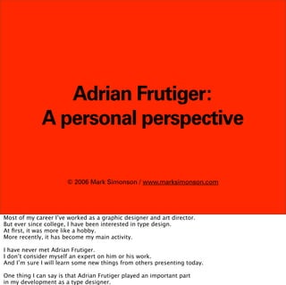
- 1. Adrian Frutiger: A personal perspective © 2006 Mark Simonson / www.marksimonson.com Most of my career I’ve worked as a graphic designer and art director. But ever since college, I have been interested in type design. At first, it was more like a hobby. More recently, it has become my main activity. I have never met Adrian Frutiger. I don’t consider myself an expert on him or his work. And I’m sure I will learn some new things from others presenting today. One thing I can say is that Adrian Frutiger played an important part in my development as a type designer.
- 2. In early 1973, during my junior year in high school, the staff of the school newspaper disbanded due to lack of interest. I offered to step in if they let me do my own thing with it.
- 3. Perhaps out of desperation, the newspaper advisor accepted my offer.
- 4. Inspired by things like Mad magazine and National Lampoon, I decided to turn it into a humor paper.
- 5. It was silly and sophomoric, but it was fun to do, and the other kids seemed to like it.
- 6. I wrote most of the articles, designed it, illustrated it,
- 7. and in the process learned to do paste up. One of the interesting things I learned was how they set headlines for the paper.
- 8. They used an inexpensive, low-tech system called FOTOTYPE.
- 9. The fonts, such as they were, consisted of pads of card stock with letters printed on them.
- 10. There was one pad for each character and the pad was cut to the width of each character.
- 11. The characters were printed on both sides-- non-repro blue on one side...
- 12. and black on the other. To set a headline,
- 13. you tore off a character from a pad
- 14. and assembled characters into words with the black side down on a sort of casting stick
- 15. When you finished a line, you put a piece of tape over the whole thing and took it out of the casting stick.
- 16. Flip it over and—voila— camera-ready artwork ready for paste up. The selection of fonts they had was small. A lot of the pads —the ones with the e’s, and t’s, and s’s— were used up or missing.
- 17. This meant that I got to order some new fonts from the FOTOTYPE catalog. (This is my own personalized copy.)
- 18. Most of the typefaces looked dated and old-fashioned.
- 19. What we now call “retro.”
- 20. But in one section, where they put the newest releases,
- 21. I saw this clean, sharp,
- 22. attractive sans serif face and decided: That’s what I want. There were no names in the catalog —just numbers— but I soon found out that it was called...
- 23. Univers Univers.
- 24. I also became aware of a similar typeface around the same time,
- 25. which I learned was called Helvetica.
- 26. Univers Helvetica It looked a lot like Univers. And at first,
- 27. Helvetica? Univers? it was not easy for me to tell them apart.
- 28. It was a bit like trying to tell apart the two actors
- 29. Bill Pullman Bill Paxton Bill Paxton and Bill Pullman. Hold on...
- 30. Bill Paxton Bill Pullman There we go. But soon...
- 31. aa Univers Helvetica I learned to tell which was which on sight. I was beginning to appreciate the subtle differences and details and I was getting more and more interested in type.
- 32. In college, I studied graphic design.
- 33. One of the required books was “Typopography” by Emil Ruder.
- 34. It seemed obvious that Emil loved Univers. That he thought it was the ideal typeface.
- 35. In the book, he explained how Univers had been rationally devised with a range of weights and widths for every purpose, each style with its own number, instead of old-fashioned, language-specific names like “bold” or “italic.”
- 36. The book contains page after page
- 37. of type layouts using
- 39. I thought: Wow. Here was a school of design
- 40. where the only typeface you needed
- 41. was Univers. Something I’ve wondered, though.
- 42. Univers Helvetica During the sixties and seventies, there was a kind of rivalry between Univers and Helvetica among graphic designers.
- 43. Helvetica By 1980, Helvetica seemed to have the upper hand.
- 44. Helvetica Times Courier Symbol and Adobe chose Helvetica as one of the core fonts in its PostScript page description language. But, what if things had turned out differently?
- 45. Univers Times Courier Symbol What if Univers had prevailed? And become one of the basic fonts we have on our computers, instead of Helvetica? I wonder:
- 46. ? Arial What Arial would look like?
- 47. Anyway. One day, during my second year studying graphic design,
- 48. I found pages of a tabloid-sized publication scattered around several of the art classrooms.
- 49. It seemed to be something about type.
- 50. I found as many pages as I could and reassembled most of the issue. It turned out to be something called
- 51. Upper and Lower Case. It was like a bolt of lightning to my interest in type at the time, and was a major factor leading to my interest in designing typefaces.
- 52. I dropped out of school the following year and took a job as a designer at a small advertising art studio in Minneapolis.
- 53. One of the things I soon discovered was that they regularly received issues of this Upper and Lower Case magazine from the local typesetting shops. They usually threw stuff like this away after a little while, so I saved them. After I left five months later...
- 54. I got my own subscription. Through Upper and Lower Case,
- 55. I learned more about the man who had designed Univers, Adrian Frutiger.
- 56. I learned more about the man who had designed Univers, Adrian Frutiger.
- 57. He seemed to pop up a lot in the publication.
- 58. He seemed to pop up a lot in the publication.
- 59. even though its sponsor, ITC,
- 60. even though its sponsor, ITC,
- 61. did not market any fonts designed by him.
- 62. did not market any fonts designed by him.
- 63. Just as often, he showed up in ads for Mergenthaler Linotype.
- 64. Just as often, he showed up in ads for Mergenthaler Linotype.
- 65. I found out that Univers was only one of the typefaces he had designed.
- 66. I found out that Univers was only one of the typefaces he had designed.
- 67. It seemed for a while like every issue of Upper and Lower Case contained ads for more of his fonts.
- 68. It seemed for a while like every issue of Upper and Lower Case contained ads for more of his fonts.
- 69. A new one was released around this time, originally designed for an airport in France. It seemed significant that it was named after Frutiger himself, tacitly acknowledging his stature as a type designer as well his confidence in the new design.
- 70. My own interest in designing typefaces was becoming more intense in the late seventies.
- 71. I discovered several books on the subject by Frederic Goudy.
- 72. I loved reading them. His writing and ideas were inspiring.
- 73. But the practical information about making type, which involved making cardboard patterns
- 74. and using specialized equipment, like pantographic punch cutters, was all about making metal foundry type
- 75. and didn’t seem very relevant in the era of phototypesetting and offset printing.
- 76. Nevertheless, I was inspired. I worked for four or five months on a typeface design in 1978...
- 77. and submitted it to the ITC Review Board.
- 78. I was disappointed when they rejected it, but looking back, I really can’t blame them. (I still had another fifteen years of work on that one.) I was discouraged, but not for long.
- 79. In the early eighties, there was a bookstore in Saint Paul called Odegard Books. It was a great place to find books about type.
- 80. One day I walked in and on the shelf I saw a book with a bright red cover and a spine reading the wrong way. Which, of course, meant that it was from Europe.
- 81. It was Type Sign Symbol by Adrian Frutiger.
- 82. As I paged through it, I got very excited.
- 83. Like the Goudy books, it was written by a type designer.
- 84. But, unlike them, it was by a type designer working in the modern world.
- 85. It seemed to hold within its pages the secrets of modern typeface design.
- 86. It seemed to hold within its pages the secrets of modern typeface design.
- 87. The price was $67.50, which was a lot of money for me to pay for a book at the time. But there was no way I could walk out of that store without it.
- 88. I showed it to a friend of mine who was also interested in type. She asked where I got it. It turned out that a friend of hers, a guy who was active in the small press scene in Minneapolis, had special-ordered it from Europe through the very same book store.
- 89. They had put it on the shelf maybe by mistake, or maybe he had waited too long to pick it up. He was not very happy when he found out I had it and tried to get me to sell it to him. This book, I thought, must really be special.
- 90. I kept it, of course, and have treasured it ever since. The chapters about symbols and signs were interesting, but the detailed stories of his typeface designs were pure gold to me.
- 91. What struck me was Frutiger’s analytical approach to typeface design. Where Goudy was intuitive and saw type design as a craft,
- 92. Frutiger was like a scientist or mathematician, meticulously dissecting letters to discover their hidden structures and geometry.
- 93. Here he shows how he plans out the different weights of a font— very similar to the way interpolation is done on a computer now.
- 94. He analyzed the distortion that happens when a shape is slanted and shows what to do about it.
- 95. And how to determine the proper proportions for a serif, depending on the weight and design.
- 96. He embraced new technology such as laser printing
- 97. and shows ways to work within its limitations.
- 98. As I read the book, it was clear to me that Frutiger was a modernist and saw the history of type
- 99. as a progression toward more perfect and universal forms. And that technology, particularly computers, would aid in that progression.
- 100. In Frutiger’s type designs, you see a consistency in thought from one to the next. There is a kind of deliberate underlying structure common to all his designs.
- 101. which he shows in this analysis where he has overlaid eight of his lowercase a’s on top of one another.
- 102. Throughout the book, it was clear that he saw the type designer as a kind of public servant,
- 103. improving the quality and utility of typography through scientific and analytical means,
- 104. to make the world a better place in which to live.
- 105. While modernism isn’t what it used to be, Frutiger’s influence on the practice of type design has been immense.
- 106. He showed that, to create a large and coherent type family, it’s best to do it all at once, not randomly, one or two styles at a time.
- 107. He showed the value of the analytical approach to type design.
- 108. He showed that technology does not have to make things uglier.
- 109. He showed that technology does not have to make things uglier.
- 110. That computers would be a powerful tool for the type designer
- 111. and pioneered the use of interpolation in the development of multiple-weight type families.
- 112. He provided a model for how to do a custom corporate font, to name just a few things.
- 113. He provided a model for how to do a custom corporate font, to name just a few things.
- 114. As a type designer,
- 115. I don’t share all of Adrian Frutiger’s philosophies or aesthetic sensibilities, and I certainly would not compare my own minor accomplishments to his in the field of type design.
- 116. But, if I am any good at it at all— and I’m sure other type designers would say this as well— a big part of it is because of things I learned from Adrian Frutiger through his writing and his example.
- 117. Thank you Thank you.