A empresa está enfrentando desafios financeiros devido à queda nas vendas e precisa cortar custos. Um plano de reestruturação será implementado para demitir funcionários e fechar lojas menos rentáveis para tentar voltar ao lucro.
This document provides style guidelines and recipes for recipe cards representing different cities. It includes:
1. Color schemes representing different cities that follow the country's flag but are tweaked for variety.
2. Silhouettes of famous landmarks from each city that will be placed at the top of cards to help identify the city.
3. Font options that are fun, modern, easy to read but provide more detail than basic fonts.
4. Three flat plan designs for the front and back of the cards including layouts with die cut silhouettes and city skylines.
5. Recipes from each city including ingredients and instructions, such as a Quorn sausage recipe from London and a black
The document discusses how a music magazine would attract and address its target teenage audience using uses and gratifications theory. It would provide information about artists, festivals, and their lifestyles to inspire and engage readers. It would also allow teenagers to relate to celebrities and find social interaction by discussing articles. Research found the audience prefers magazines with a larger ratio of large images over text, so the magazine is designed with more visuals than words to match the target audience's preferences.
Multiple exposures involve combining two or more images into a single photo. This can be done to create effects like ghosts or mirrors, or to merge elements like the moon into sky shots. It was originally an accidental film technique but can now be easily done digitally using Photoshop by layering photos and adjusting opacity. High speed photography captures fast movements invisible to the eye, allowing scientists to study physics and the military/athletes to analyze fast motions. It requires very short shutter speeds, large apertures, dark rooms, and high-powered flashes to illuminate subjects briefly. Both techniques generally require cameras, tripods, and possibly Photoshop for editing.
Os 50 maiores músicos de todos os temposGabriel Magno
This document lists the 50 greatest musicians of all time according to some source, ranking them from 50 to 1. It includes artists such as Janis Joplin, Radiohead, Coldplay, Pearl Jam, John Mayer, Charlie Parker, U2, The Doors, Creedence Clearwater Revival, Johnny Cash and many others spanning various genres such as rock, pop, blues, jazz, and Brazilian music. The Beatles are ranked as the number one greatest musician of all time.
La Unión Europea ha acordado un embargo petrolero contra Rusia en respuesta a la invasión de Ucrania. El embargo forma parte de un sexto paquete de sanciones y privará a Rusia de acceso a mercados clave. Sin embargo, Hungría, Eslovaquia y la República Checa recibirán exenciones temporales debido a su dependencia del petróleo ruso.
Mohd Dhiyauddin Assiddiq Bin Mohd Zaid has over 10 years of experience in supply chain management, logistics, and contracting. He currently works as a Service Delivery Manager at Petrofac Malaysia, where he manages tier 1 contracts and handles commercial disputes. Previously, he has held roles with increasing responsibility at several oil and gas companies. He has a Bachelor's degree in Accounting and is Green Belt certified in Six Sigma.
This document analyzes the target audience, images, words, colors, layout, and codes/conventions used in the music magazine Q. The target audience is males aged 32 on average with a high social economic status (73% ABC1). Images in Q are high quality photographs of popular artists to appeal to the affluent audience. Text is concise on the front cover but interviews inside provide in-depth information expected by the readership. A simple color scheme and layout make Q visually appealing and easy to read. Conventions include dark colors representing indie music and large photographs for posters, fitting the music magazine genre.
Kellogg's organized breakfast clubs in UK primary schools and village halls to promote eating breakfast and ensure existing clubs don't close. They created a communication plan to effectively promote the events. Kellogg's also targeted employees and stakeholders through an intranet and social media to communicate about the initiative. Positive publicity was gained by partnering with organizations like Netmums and inviting MPs to events. While promoting child nutrition, the campaign also provided benefits to Kellogg's brand and publicity. Kellogg's faced some product recalls that caused financial losses but sought to limit damage through responses that addressed consumer concerns without full apologies.
The document discusses different methods for profiling audiences, including quantitative, qualitative, socio-economic, psychographic, geodemographic, and age-based research. Quantitative research uses numbers and statistics to show things like how many people watch a TV show or buy a product. Qualitative research helps understand audiences through focus groups, questionnaires, and interviews to learn their likes, dislikes, and opinions. Socio-economic research examines income, education, and occupation to understand audiences' social and economic positions. Psychographic research analyzes interests, attitudes, activities, and personality to categorize people. Geodemographic research uses geographic data to target people in certain neighborhoods. Age profiling notes that people of similar ages often have shared interests due to
This document discusses the representation and target audiences of three music magazines: Q, NME, and Rolling Stone. It finds that:
- All three magazines target 16-25 year old audiences, primarily men interested in indie/rock music.
- They aim to appeal to this audience by featuring popular artists on the front covers.
- Representation of the target audiences varies - Q and NME portray them as fun-loving and rebellious through images and language, while Rolling Stone aims for a slightly older, more politically engaged audience.
- However, some aspects could promote negative stereotypes, like violence, drug/alcohol use, or over-sexualization of women on covers. Co
The survey received 74 responses from distributing the survey link on social media sites like Facebook and Twitter. Most respondents were female (79%) and between the ages of 17-24. The majority (75%) of respondents were vegetarian. Most people reported getting recipe cards from online sources or in supermarkets and 70% said they used recipe cards. Respondents preferred recipe cards with equal or more images than text, green color schemes, and main dish recipes.
Our recipe card design is based on cities around the world. We chose to lay out our design to show the city straight away through a die cut skyline or landmark on the front and back. This makes our cards stand out from typical recipe cards.
The front of the card features a large image of the finished product in the middle with basic information below. Keeping the front simple helps indicate what the recipe includes clearly. The back includes the ingredients on top of the country's flag and the method below. We tried to keep the layout simple while appealing to our target audience of busy professionals.
Researching existing vegetarian products influenced our design choices. We incorporated consistent design elements like using the color green and bold fonts
This document provides information about vegetarianism including definitions, demographics of vegetarians around the world, reasons people choose a vegetarian diet, companies that cater to vegetarians, and non-vegetarian products. Some key points include:
- A vegetarian does not eat meat or fish, while a vegan also avoids animal products like dairy and eggs.
- India has the highest percentage of vegetarians at 42% of the population, while the UK has the highest population of vegetarians in Europe at 3.5 million people.
- Animal welfare is the main reason cited for becoming vegetarian (54%), followed by environmental concerns and health reasons.
Дмитрий Крюков (Parallels): Мы привыкли к тому, что джанга это фулстек фреймворк, который диктует нам достаточно четкую проектную структуру, однако мы же всё же попробуем разрушить этот миф. Поиздеваемся над Django? Превратим его во бутылеподобный фреймворк (Flask, Bottle)? Даешь велосипеды!!!
This document outlines a campaign for a fictional mermaid tears organization targeted at children aged 4-9 and their parents. It details the logo, colors, fonts and inspiration for the campaign. It also includes drafts of a campaign poster and membership form as well as proposed merchandise like children's products and surf gear. Finally, it lists the software, browsers and personnel needed like a graphic designer, animator and teacher to implement the campaign.
Surfers Against Sewage (SAS) is an environmental charity established in 1990 to protect UK oceans, waves, and beaches. SAS campaigns on issues like marine litter, wave protection, water quality, climate change, and education. Their work includes influencing government policy, organizing volunteer cleanups, educating communities, and challenging industry standards. Through campaigns targeting plastic pellets, sewage overflows, and climate change impacts, SAS raises awareness and advocates for cleaner and safer seas.
The NHS Smoking Campaign aimed to stop smoking by raising awareness of the harms through gruesome images showing the effects on the inside of the body. The campaign achieved high awareness and many people took action to quit smoking.
The Politics Graffiti Campaign aimed to discourage voting for the Conservatives by altering their campaign posters to make the party leader look foolish. The altered posters became popular online.
The WWF Campaign used hands painted with animal faces and prints to raise awareness of endangered species and encourage donations to help conservation efforts. Extinction rates have fallen somewhat due to increased awareness and support over time.
The document provides style guidelines for recipe cards representing different cities. It discusses using colors that represent each city's flag and silhouettes of landmarks to identify the city. Potential fonts are presented that are fun, modern, easy to read but detailed. Three flat plan layouts for the cards are proposed, including images, ingredients, methods and other details. Example recipe cards for 8 cities are then provided with titles, ingredients lists and preparation methods for each dish.
The document discusses ethical guidelines for journalists produced by the National Union of Journalists (NUJ). It provides guidance on writing about topics like mental health, suicide, benefits, immigration, and minority groups in a way that avoids harm and discrimination. It emphasizes using respectful language and not defining people by attributes like health conditions. The NUJ aims to promote media freedom, accurate information, and ethical standards among its members.
The document discusses various camera settings that impact the look and quality of photographs, including aperture, shutter speed, ISO, white balance, and post-processing techniques. It explains that aperture affects depth of field, shutter speed controls motion blur, ISO impacts image noise, and white balance removes color casts. Examples are provided showing the effects of different settings on photos. Post-processing techniques like cropping, dodging, burning, color balance, and curves are also introduced.
The document compares campaign posters from Surfers Against Sewage (SAS) to posters designed for a younger audience. The SAS posters use dark colors and disturbing images to raise awareness about a serious issue, but the author feels they would be hard to distribute to children. The author's posters use brighter colors and a lighter tone to attract children's attention while still delivering a meaningful message. Both posters employ colorful fonts and layouts to make the text stand out, though the author's provides more information about an upcoming beach cleanup event. Overall, the document analyzes design choices between the SAS posters and the author's to evaluate which better suits different target audiences.
The document provides details on the design of a logo, campaign posters, and merchandise for a marine litter campaign by the organization Surfers Against Sewage. It includes mockups of the main logo, variations of the logo, two poster ideas and the final poster design. It also outlines plans for a range of merchandise including t-shirts, mugs, soft toys, beach equipment and more featuring the campaign characters and logo. Membership forms are proposed with different visual designs including images of the campaign characters and information on sign up details and membership packages.
This document provides ideas and plans for two marine litter awareness campaigns. The first focuses on the dangers of plastic bags to ocean life and aims to shock people into action through alarming images and text. The second targets children and aims to educate them about "mermaid tears" or plastic pellets through colorful, kid-friendly designs and school engagement activities. Both explore using merchandise sales to fund beach cleanups.
The WWF campaign aims to raise global awareness about endangered species and the threat of extinction. It uses simple but effective techniques like painting realistic animal faces and prints on human hands to represent how these animals need help from humans. The recognizable WWF logo gives the poster credibility. While the impact of WWF campaigns varies, extinction rates have been decreasing in recent years as more people work to save animals, though continued effort is still needed to further reduce rates.
Surfers Against Sewage (SAS) is an environmental charity that campaigns to protect UK oceans, waves, and beaches from issues like marine litter, sewage pollution, climate change, and toxic chemicals. SAS was founded in 1990 by surfers concerned about surfing in polluted waters. It works to influence government policy, educate communities, and challenge industries through campaigns targeting specific issues such as reducing plastic pellet pollution and improving water quality monitoring. SAS also publishes reports to raise awareness about threats like climate change and how to address them.
Surfers Against Sewage (SAS) is an environmental charity that campaigns to protect UK oceans, waves, and beaches from issues like marine litter, sewage pollution, climate change, and toxic chemicals. SAS was founded in 1990 by surfers concerned about surfing in polluted waters. It works to influence government policy, educate communities, and challenge industries through campaigns targeting specific issues such as reducing plastic pellet pollution and improving water quality monitoring. SAS also publishes reports to raise awareness about threats like climate change and how to address them.
This document summarizes various logos and merchandise from environmental organizations like Surfers Against Sewage (SAS). It describes the logos of SAS, WWF, Greenpeace, and the Green Party, noting design elements like colors, images, and fonts used. It then analyzes several merchandise items sold by SAS, including t-shirts, stickers, mugs, surf wax, surfboard bags, and baseball caps, explaining how their designs appeal to audiences like surfers and promote the SAS brand and mission.
The document discusses social action and community media production. It focuses on the work of social action organizations and their promotional materials, from posters to leaflets to websites. The purpose includes bringing about local, national, or global change; changing attitudes; raising awareness; challenging dominant representations; and more. Effective techniques used in media include images, color schemes, fonts, tone, and other elements. Case studies are provided on organizations like Compassion in World Farming and their impact in changing policies around sow stalls. [/SUMMARY]
Decene is a 22-year-old indie rock band from the UK releasing their debut album "Nothing But Sea". The objectives are to sell 2,000 copies in the UK and target 17-23 year olds interested in indie music and festivals through social media and radio play. Key goals include headlining a small tour, releasing special edition vinyls, and playing smaller stages at festivals. The band would use social media, posters, magazines, and radio to promote the album and connect with their target audience of 17-23 year old indie music fans.
This document compares the marketing strategies of four brands - Louis Vuitton, Primark, Aldi, and Marks & Spencer. It discusses how each brand uses photography, models, pricing, and messaging to target different audiences. Louis Vuitton appeals to wealthier customers by portraying an image of luxury and quality. Primark targets budget-conscious customers by emphasizing low prices. Aldi compares itself to branded products while highlighting its lower costs. Marks & Spencer focuses on portraying high quality ingredients and food preparation without mentioning price.
This document summarizes a leaflet advertising a zoo. It uses bright colours and images of animals and families to attract families with young children. The large, colourful headings and images make it appealing and help parents visualize the fun activities. The simple, clear language and table of information allow busy parents to find details quickly. Overall, the leaflet is targeted towards entertaining families rather than solely children.
The document discusses Melissa Storey's evaluation of her time management and technical skills during her journalism project. Regarding time management, she felt she used her time well and completed all work on deadline. She struggled when ill for two days but had buffered time. For technical skills, she initially used Photoshop but found InDesign better suited for layouts. Feedback from her tutor improved her interview format from question/answer to a more flowing style. Overall she met her goals but could improve future work by making it more biased towards fans and researching fanzine formats more.
This document discusses layout and design conventions for music magazine articles based on examples from NME magazine interviews of the Arctic Monkeys. Key points discussed include using a three-color scheme of black, white and red throughout articles to maintain the publication's house style. Images are typically edited to black and white and include small captions. Column layouts, drop quotes, sidebars with additional facts, and large headline images are employed to break up content and grab readers' attention.
This document discusses guidelines for responsible and ethical journalism from the National Union of Journalists (NUJ). It provides guidance on avoiding biased or harmful representations of groups in writing, and on sensitive topics like mental health, suicide, and immigration. It emphasizes using accurate, truthful language and considering alternative perspectives. Guidelines include avoiding offensive terms for mental illness, not defining people by their conditions, and describing suicide attempts factually rather than with value judgments. The NUJ aims to promote media freedom and ethical standards while protecting journalists' rights.
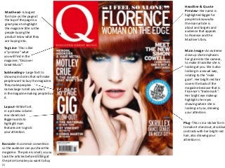
1. Headline & Quote
Masthead- Is largest Preview- Her name is
font size on the page at highlighted bigger for
the top of the page is a people to know who
great place to highlight the main article is
the magazine title so the about and targets and
people buying the audience that appeals
product know what they to Florence and the
are buying into. Machine’s fans.
Tag Line- This is like
a “promise” what
Main Image- An extreme
close up shot emphases
you will find in the
her glare into the camera,
magazine; “Discover
to make it look like she is
Great Music”.
looking at you. She is also
Subheadings- Large font to looking in a sexual way,
show main stories that will make relating to the “male
people want to buy the magazine. gaze”. Her bright red hair
They make peoples covers the back of the
names large to tell you who’s magazine because that is
in the magazine making people buy Florence’s “trade mark”.
it. Her bright eye makeup
highlights her eyes
showing where she is
Layout- White font looking- at you, drawing
in a preview column your attention.
row stands out.
Bigger words to
highlight main Plug- This is in a sticker form
features are to grab to make it stand out, also blue
your attention. contrasts with her bright red
hair, also drawing your
attention in.
Barcode- A common convention
so the audience can purchase the
magazine. The price is small, so you
look the articles before looking at
the price to make you want to buy
it.
2. Subheading- This is to make sure
the audiences know where to go if Issue Number- This tells you
they want to read about their how long the magazine has been
favourite band. It is an easier way to publishing for and how successful
structure and layout a contents page it is.
as the subheadings tell you what you
need to know and where. Having
the main subheading eg. Features, in
a block and in a different colour
makes it stand out and even the
page numbers are in the same set Splash Image & Caption- This is the
red. The bands or articles are in a largest image on the page showing a
bold black font, just like the ones main article to draw the audience in
on the front page, this is so you can and they can easily find it with this
see and look out for what you want large image and number marked in the
and quickly get to it. corner.
They look casual and laid back with
their hands in their pockets shows
they are not serious and making music
Kicker (Specials)- This contrasts with because they want to. Being in the
the “Every Month” heading as it is county side could tell you the genre of
something new in the magazine with their music; indie/country. Or where
a famous band which a lot of people they came from linking and inspiring to
know, framing to a larger audience people in the country.
scale.
“Review”- This tells people
what is in the charts and what
they should be listening to.
“Every Month”-Subheading Again the usual layout is used,
This is to tell you what you will red to highlight page numbers
expect in every issue. So you feel and bold black so you can quickly
comfortable with the magazine find the review you want. As it is
layout inside and know what you in its own box you can expect this
are expecting. to be in most issues and quite
important to the magazine because
the magazine statues it’s tagline;
“Discover Great Music”.
3. Column-The Headline-The headline is bold although it is not large in comparison to the “Review New
column on the left Albums”, this suggests they would rather sell new albums than Florence and the Machine as
is advertising other an artist herself. It could also show that because of the extremely large image on the opposite
artists like Florence page Florence has been advertised largely through this image.
and the Machine.
This links to the
target audience as
Q’s audience buy
the magazine to
listen to the “good”
music. This column
will make it easier
for people who like
Florence's unique
voice and for
people to expand
their music in this
specific genre.
Pull-Quote-A
quote in the middle
of the page in a
sticker box bring it
out and is a
common
convention in
articles which gets
your attention by
highlighting a
interesting part of
the interview
making people want
to read the rest of
the article. It is in a Main Image-The image takes up a whole page, this is effective as it shows who the article is about. Also
different colour to the colours of the image are warm reds and oranges to link with her signature hair colour. Red= passion,
also highlight it and love, fiery and warmth, this shows how Florence is in her personality. This links to intertextuality as her
make it stand out website as the images rolling on her own website are alike, linking together both this article and her
from the page, the website. Q readers treasure the Q photography with 97% saying it has the best interviews and award
box around it winning photography, explaining why the image is so large.
complements this
too.
4. Price and date- Subheadings- The sub-
The price relates to the heading is close to the
status of classes and who can afford Masthead showing how
to buy the magazine. The date shows they relate and it is easier
how often the magazine is out. for the audience to see
Masthead- Is behind the image what to expect inside.
because it is such a well known The names of the bands
magazine just the shaping of the are highlighted in the same
masthead you know what magazine red as the Masthead and
you are reading and picking up. It also Headline, this is to show
suggests that the same audience buy the link and brining it out
the same magazine each issue. The from the black font is
colour red is to highlight new bands effective as it stands out and
or existing bands, and having the Is easy for the audience to
masthead(NME) in the same red shows See and notice.
that you will expect new and existing
bands in the NME magazine. The sub-
masthead underneath “New Music” Headline- This is straight
even shows what you except in the across the middle of the
magazine. cover to grab attention
straight away. It is in a
Main Image- The band is set in a
bold red to stand out
traditional “band layout”- two in front,
from the cream and white
two behind. This is to show the will stick
colour scheme. Also the
together but also to show you who the
“of” is in a different font
band members are; drummer being at
to the rest of the fonts
the back, main guitarist/singer at
showing they are not
the front. The hand reaching out is
afraid to be different as
almost reaching out to you inviting you
their music is not like
to joining them; pulling you in. This is
many other bands but can
making you want to be with them and
still make it big being
Will make you buy the magazine so you
different; inspirational.
Can read about/with them.
Plug- This relates to the
audience in that would be interested Barcode- This is a
in V Festival as these people would common convention
be interested in the bands in NME. of magazines so
And it also has an article on the people can buy the
Festival telling you about the bands that will be playing. magazine.
5. Index- This column is in every Heading- This is a large font
to stand out but the thing
issue on NME so it is easier to
which stands out is the NME
find your favourite bands and
logo so people know and learn
article on them. This is a good
the logo instantly if they put it
selling point to the music
on most pages.
audience wanting to find out
more information on their
favourite bands.
Layout- Having the main Subheadings- Again
article in the middle of the this is a feature to make
page with a picture with it it easy for the audience
grabs your attention quickly to what they want
and the black, red and white quickly. NME readers are
colour scheme is to highlight mostly male(74%) so the
main information in the easy subheadings are
brighter colour(red) for quick and easy because
example band names or page they do not want to
numbers. Having headings and search everywhere in
an index is easier to find what the magazine, also NME
article you want to read. readers trust the
magazine and this layout
Main Article& Picture- The is in every issue so they
image is of the band playing can trust to find the
live which indicates to the bands and articles they
article will be about their tour. want easily. The large
The look like they are picture and ads attract
passionate in what they are the male readers as
doing. This links to the target stereotypical males
audience wanting to read the prefer to look at images
magazine, as they are having rather than text.
fun with what they are doing,
which is what teenagers want.
Advert- This is advertise for their Plug- drawing people
own magazine to subscribe and get in with information
the issue every week at a the “need” to know
discounted price. about No. 1 gigs in the
UK.
6. Blobs-The odd rectangle and square shapes placed around, under test and
Layout-The layout of this double page spread is over the image shows the band is quirky in their style of music and not afraid
simple with the colours and fonts standing out to be different. Also NME is targeted for a student audience so they need to
from each other making it easy to read, also it keep the audience interested by using a unique page design. Also the colours
looks like a simple page. The blue blobs stand out of these blobs are bright and do not apply to the usual NME colour scheme,
making the showing it is a special addition.
layout a bit more
interesting
and unique. The
text layout uses Pull-Quotes-
a plain article Pull quotes
layout but using are a good
light blue to way to attract
make some the audience
information by using an
stand out. interesting
part of the
article and
highlighting it
making the
reader want
to read about
the subject
more. These
are used a lot
in interviews
so you can
quickly see
what the
band are
saying.
Main Image-Is large taking up a whole page and quarter of the next page. This gets straight to the point of who the band is. The way they are holding their
guitars near their crotch is a symbol of male power. This can relate to the male audience as they want to be powerful and will look up to them, but it can also
attract the female audience using phallic symbolism as women want a power, strong man. Again they are looking straight into the camera, wanting something
from you, the audience. Although, because only two members of the band are holding the guitars it may show they are the main members of the band. But
relating to the article it tells us that The Vaccines are the “biggest guitar band of 2011” so the object of guitars is shown in the image to strengthen this point.
The tone of this image is dirty and dull showing the genre may be garage and rock and reflecting to their gritty sound.
7. Date and Price- The price
Masthead- The masthead is behind is the smallest font on the
Taylor Swifts image, this shows the page so you look at it last,
audience of Rolling Stone are regular after you have read the
buyers and know the recognisable logo, headlines and decided to buy
even behind the image. The bright red It.
stands out as it contrasts from the white
background making it easier to find in a Plug- “HOT” stands out
magazine rack in your local shop. making it eye catching
and people will want to
read it as they want to
aspire to celebrities like
Subheadings- The subheadings are in a Taylor Swift and will
preview and column, this is effective as want to read how they
the reader knows straight away what is do it and how they can
going to be in the magazine and if they themselves.
like or relate to this. Shocker words
make you want to read the magazine Headline- It is large and placed
more as it is gossip and gets your attention centre, but to the right so it is
quickly. not taking up the whole of the
image. This is because Taylor
Swift is a famous and talented
Main Image- Taylor Swift is known as a artist so lots of people know
good, county girl but the provocative pose who she is. Although it is in a
shows a different side to her. This links to different colour to the other
the plug on the other side, “Hot Stuff”. It fonts on the page, this is only to
relates to the theory, the Male Gaze as she make the main article headline
is posing in a way she would not normally. stand out so the audience know
The pose is sexy and the way she has her it is about “the heart break kid”
hand between her legs is a provocative pose. drawing people in with a direct
Her make up and hair looks messy and Quote as the strapline.
although she is a good girl, this can portray
her in the opposite. The county girl looks
almost opposite to her county outback
Barcode- A common
songs and lifestyle are. This gets peoples
convention needed
attention because they want to know why
to sell the magazine,
she is looking like this. But it relates to the
placed at the bottom
Male Gaze theory that men would want to
not taking up much room
look at her because she is looking sexy and
women aspire to be her.
8. Layout-The layout is
Images-The images are simple and is split into
presented in full blocks on the separate sections so it is
left side of the page with easy for the audience to
large page numbers in the find what they are looking
corner so it doesn’t take up for and also makes it look
the whole of the photography smart, to link to the older
but know where to go male audience. The bright
instantly. The images are all of headings and page
inspirational people from the numbers make it simple to
American president to Billie find what you are looking
Armstrong from Green Day. for but it doesn’t make it
This could show that the look too outstanding.
audience for the Rolling Stone A small box at the bottom
magazine is quite shows your what was on
sophisticated but also has a the front cover and where
lively side to them with the you can find the articles, I
rock bands. Rolling Stone is think this is useful as
targeted for a medium age of people mainly buy a
32 years old, one of the older magazine because of
range of music magazines. what’s on the cover.
The artists shown are older
artists which this target
audience will enjoy reading Font-The font is used to
about such as Bruce also represents an older
Springsteen. Although this audience as it is quite
magazine is made in America, sophisticated and not
represented by American flashing out in front of
politics and American bands it you. The way they
is sold in England and people highlight main details
in the UK will still buy an and information is by
American music magazine using a bright red which
because the American artists complements with the
shown are world wide known white and black., making
so people in the UK still want it stand out.
to read about their favourite
American bands.
9. Masthead-The masthead is large and in a the usual Main Image-The main image takes up a page and quarter of the
Rolling Stone red to link with the magazine set previous page, is because imagery of the band is important, also the main feature of this photograph
colours; red, black and white. It is large and at the is the colours and how it links to their new album. The front cover of their album is the same tone as
top of the page to let the reader know what the this photograph of the whole band linking to the intertextuality of the band advertising their album
interview is about; questionnaire interview. through a photo-shoot with Rolling Stone. They look laid-back looking straight into the camera and
maybe even
looking
desperate for
you to buy their
Headline-A big
new album
headline of the
linking to the
bands name
interview on the
gets straight to
other side of the
the point and
page.
tells you who
Linking back to
the interview is
the colours of
with. The Kings
the album and
Of Leon font is
this image and
the same font
also link to their
of the side of
tour, “Come
their albums
Around
linking to other
Sundown”,
media
which is what
advertising and
their album is
selling their
called, with the
products with
colours looking
the band name
like a sunset
fitting with the
linking to the
tone of the
“sundown”.
image both
linking to their
upcoming
album.
Text and Fonts-The introduction is written in a bold red to make it stand out
from the main interview, this is so the readers know what the interview is Layout-The text is spread into columns like a newspaper making it look
about and know when it is starting. A bold font is used to highlight the
official and so it is simple, but smart and easy to read. Having a large image
questions asked and answers from the band in a smaller font. A drop cap is
of the band promotes them quickly and with an male audience the
used at the start of the paragraph to show where the text and interview starts.
magazine wants to quickly get to the point so they don’t get bored.