Download as PDF, PPTX


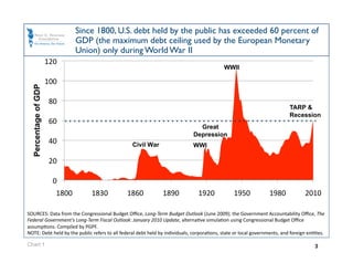
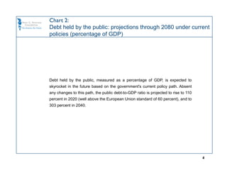
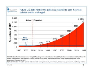
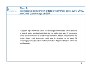
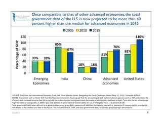
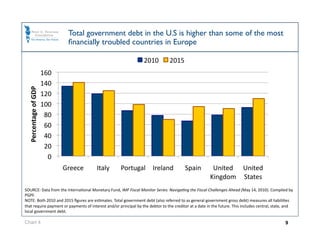
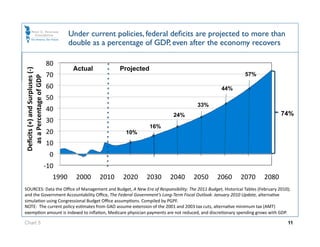


The document discusses the growing fiscal challenges facing the U.S. government based on selected charts from the Peter G. Peterson Foundation. It finds that absent reforms: 1) The U.S. public debt is projected to exceed 100% of GDP by 2020 and 300% by 2040, far surpassing levels seen since World War II. 2) U.S. debt levels will be over 40% higher than other advanced economies by 2015. 3) Federal budget deficits are projected to more than double between 2030-2040 even after the economy recovers. 4) Withdrawing troops from wars and eliminating Bush tax cuts would only address 15% of the long-term fiscal gap


