
Recommended
Recommended
More Related Content
Similar to excel_stats_handout_npl.pdf
Similar to excel_stats_handout_npl.pdf (20)
Recently uploaded
Recently uploaded (20)
excel_stats_handout_npl.pdf
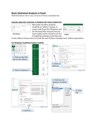
- 1. Basic Statistical Analysis in Excel NICAR 2016 Denver / Norm Lewis, University of Florida / nplewis@ufl.edu ENSURE ANALYSIS TOOLPAK IS ENABLED ON YOUR COMPUTER Microsoft considers Analysis TookPak an “add-in” feature. It comes with Excel (for Windows and for the latest Mac version) but you must enable it first. Check to see if it is loaded by clicking on the Data tab on the ribbon. If yours does not look like one of these examples here, follow steps below. For Windows: Enabling Analysis ToolPak Windows Apple 1. Click on the File tab on the ribbon. 2. Click on Options. 3. Click on Add-Ins. 4. Click Go … 5. Click box for Analysis ToolPak. 6. Click OK
- 2. Basic Statistical Analysis in Excel, NICAR 16, Norm Lewis / Page 2 For Macintosh: Installing Analysis ToolPak If you have the latest version (Office 365 or Office 2016), Microsoft has reinstated the ToolPak. For users of earlier versions, Microsoft removed it and referred Apple users to StatPlus:mac LE from AnalystSoft for free. Sorry, Mac People Hey, I’m one of you! But because the computers at the NICAR conference use Windows, the rest of this tutorial will show screenshots from the Windows version. The concepts, however apply equally to us Mac people. (Whew.) 1. Click on the Tools menu above the ribbon. 2. Select Add-Ins… 3. Click on Analysis ToolPak. 4. Click OK.
- 3. Basic Statistical Analysis in Excel, NICAR 16, Norm Lewis / Page 3 PART 1: AVERAGE The most common statistic journalists use is average. Average seeks to convey what is typical. Contrary to Excel nomenclature, “average” comes in three flavors: Type Excel Function How Calculated Usage Example Mean =AVERAGE(cells) Sum divided by number of items Commute time, water levels Median =MEDIAN(cells) Midpoint of list sorted low to high Salaries, home prices Mode =MODE(cells) Most frequent occurring number Donut variety, shoe size Mean is used so often it is the default. And it works for most of everyday life. But for numbers that have a potential for outliers such as salaries and houses, the mean overstates what is typical. In those cases, the median is better. Mode is rarely used in journalism. (It can be used, however, to determine the most popular pizza to order on election night.) Calculate Mean and Median Open the Faculty sheet. Go to the bottom. Leave a blank row. Write the word Mean. In the next cell, insert the formula =AVERAGE(e2:e1054) Write the word Median. In the next cell, insert the formula =MEDIAN(e2:e1054) You should get the data below. Which of these two figures should you use? The mean is higher because it is skewed by some big salaries. Thus, median is a better representation of a typical professor for this data set. PART 2: STANDARD DEVIATION But sometimes just knowing the average is not enough. Sometimes it helps to know the dispersion of these numbers. Are most around the mean? Or are they all spread out? An average alone won’t tell us the dispersion. What can? Analysis ToolPak to the rescue! But first, let’s use this picture to describe dispersion. The mean is the center point. The dark blue shade on either side of the mean covers 68 percent of all the numbers. This is 1 standard deviation. Its boundaries are set so that they always include 68 percent of the numbers. How are those boundaries determined? Analysis ToolPak will tell us. Mean 1 standard deviation
- 4. Basic Statistical Analysis in Excel, NICAR 16, Norm Lewis / Page 4 Computing Standard Deviation We can determine the boundaries of the standard deviation through Analysis ToolPak. 10. In the Output Range box, type G3 or click on the cell where you want the stats inserted. 1. Click on Data tab on the ribbon. 2. On the right, click on Data Analysis. 3. Click on Descriptive Statistics. 4. Click OK. 8. Click in the box beside Summary statistics. 5. Click in Input Range box. 6. Click on the Salary column heading. 7. Click in the box for Labels in First Row. 9. Activate Output Range button. 11. Click OK.
- 5. Basic Statistical Analysis in Excel, NICAR 16, Norm Lewis / Page 5 Let us now glean some key statistics from this output. 12. Adjust the columns for readability and to line up the decimal points. All three averages are provided. The min and max give us the range, which is another way to think about dispersion. The salaries are summed and counted. For this data, 1 standard deviation is $43,140. It is applied to both sides of the mean, like so: $101,367 + $43,140 = $144,507 $101,367 - $43,140 = $58,227 Thus, 68 percent of the salaries are between $58,277 and $144,507. Interpretation That is a large range, which means the salaries are widely dispersed. It means that average alone is insufficient to convey a “typical” salary. Standard deviation is a relative measure, so the interpretation depends on the underlying data.
- 6. Basic Statistical Analysis in Excel, NICAR 16, Norm Lewis / Page 6 PART 3: CORRELATION Correlation measures whether two things are related: whether they rise and fall together or in opposite directions. Consider height and weight as in the chart to the right. As people grow taller, they tend to weigh more. Shorter people tend to weigh less. Thus, height and weight are correlated. Further, this is a positive correlation: they rise together. Or think about the relationship between drinking alcohol and dexterity as shown in the chart to the left. As the number of drinks consumed increases, dexterity decreases. As one goes up, the other goes down. This is a negative correlation. Correlations vary between -1 and +1, like this: +1 Perfect positive correlation Two measures rise or fall together 0 No correlation The two measures have nothing in common -1 Perfect negative correlation As one measure increases, the other measure decreases In the physical world, perfect correlations are not uncommon. But when it comes to people, few things are correlated beyond -0.7 or +0.7. That’s because rarely is any one thing solely correlated with something else. Usually more than one factor is involved. Consider heredity and height. Heredity and Height Click on the Height sheet in the Excel data set. You’ll see two columns of data from 100 pairs of fathers and sons measuring their height in inches. The scatter chart of blue dots illustrates a messy relationship between the two. As dads get taller, sons do, too. Sort of. The chart shows the correlation coefficient is 0.527803, or 0.53. There’s no negative mark, so the number is positive by default. Interpretation This 0.53 means that for each inch of height a father gains, the son gains about half an inch. That means other factors account for the other 0.47, such as the mother’s height and nutrition during childhood.
- 7. Basic Statistical Analysis in Excel, NICAR 16, Norm Lewis / Page 7 Calculating Correlation (Hat tip to Professor Steve Doig of Arizona State University, who used a similar data set in a handout a few years ago.) Open the NFL sheet for the 2015 regular season, according to ESPN statistics. Click on the Data tab, and then on Data Analysis on the right-hand side. 1. Click on Correlation. 2. Click OK. 3. With cursor inside Input Range box, select all the columns with numbers. (Exclude Team because it is text.) 4. Click in Labels in first row box. 6. Click OK. 5. In the Output Range box, type J3 or click in the cell where you want the stats to appear.
- 8. Basic Statistical Analysis in Excel, NICAR 16, Norm Lewis / Page 8 The resulting data look like a triangle. The results are enlarged below. Interpretation The data here confirm what a sports fan knows: More points scored = more wins. And more points allowed = fewer wins. But the data also reveal other insights: Taking the ball away from the other team has a strong correlation with wins. Giving the ball away (fumbles, interceptions) is less damaging than takeaways. Yards gained don’t mean much. On offense, efficiency matters. Terminology Correlation does not always mean causation. Points scored do not “cause” wins. Instead, the two are associated. Here is an example of how you could write about this data: For NFL teams, the defensive statistic that is most closely associated with wins is not yards given up but takeaways – interceptions or recovering fumbles. But we can do an even better job of evaluating correlations with the next part, regression. This area is blank because it would repeat what is below the string of 1’s. These are 1 because they are perfect correlations: yards gained = yards gained. For this data, we care most about correlations with wins. The strongest correlation is between wins and points allowed: 0.79. It is negative. So the more points allowed, the fewer wins. Points scored has a strong correlation with wins: 0.77. It is positive. So the more points scored, the more wins.
- 9. Basic Statistical Analysis in Excel, NICAR 16, Norm Lewis / Page 9 PART 4: LINEAR REGRESSION AND STATISTICAL SIGNIFICANCE While social scientists use linear regression to predict, journalists use linear regression to determine the amount of change that can be attributed to one factor over others. Warning! Regression is a more complicated statistic than can be addressed here. It is powerful when used correctly. It is misleading when used incorrectly. If you really want to do linear regression, use something more powerful than Excel, such as SAS, SPSS, PSPP or R. Or, ask a statistician to help. The purpose here in explaining regression in Excel is to introduce two important concepts: statistical significance and variables. Statistical Significance Most of life is a combination of performance and chance. Statistics help differentiate the two – to tell us when something probably wasn’t just the luck of the draw. Note the weasel word probably. Certainty is illusive. It’s tough to know whether that cancer cluster has an environmental cause or is just bad luck, or whether the team improved because of a new coach or good luck. That uncertainty is why a common benchmark in evaluating differences is 5 percent. If the chance that luck was the cause is less than 5 percent, something else may be involved. This probability of less than 5 percent in often shown in statistical shorthand as p < .05. How it works can be a bit complicated, so let’s apply it to an example: school test scores. Pretend that Elm School used a new curriculum while Oak School kept the old one. At the end of the school year, test scores for the two are compared. The logic works like this: 1. First, presume that nothing happened. This is the null hypothesis. 2. Test scores are compared using a statistical measure such as a t-test or ANOVA. 3. If p < .05, the null hypothesis is rejected and the alternative hypothesis, that the new curriculum is associated with higher scores, is said to be supported. In other words, statistical significance determines if something is going on beyond chance. Variables A variable is, well, something that varies. That can be test scores, incidences of cancer, team wins, caffeine ingested on deadline – or just about anything that can change. Variables come in several flavors. All that matters at this point is to know that regression requires continuous variables such as temperature, weight and money. It does not work with categorical variables such as religion, ethnicity or birthplace.
- 10. Basic Statistical Analysis in Excel, NICAR 16, Norm Lewis / Page 10 Click on the NFL data sheet. Consider the column headers as variables. Yards gained, points, takeways, etc., all can vary. Dependent and Independent Variables The dependent variable is the variable we care most about. That could be school test scores, cancer rates or income. In this data set, Wins is the dependent variable, or DV for short. The independent variable is something that could influence or be associated with the DV. In this data set, everything besides Wins is an independent variable, or IV for short. Here’s a visual way to remember the difference between an independent variable (IV) and the dependent variable (DV), drawing from the medical shorthand for intravenous: IV. Further, this picture gives us the order. The IV comes first. It goes into the patient to deliver medicine and fluids. And if the IV works, the result is the patient gets better. Just as the medical IV comes first, so does X come first in the alphabet before Y. Thus, we will put the IVs in the X box for Excel. And the DV will go in the Y box. Variable Abb Excel Role Alternate name Independent Variable IV X Thing(s) that change the DV Predictor Variable Dependent Variable DV Y The thing that changes Criterion Variable The IV: Something that influences the patient (to get better, we hope!) The DV: The thing we care about – in this case, the patient
- 11. Basic Statistical Analysis in Excel, NICAR 16, Norm Lewis / Page 11 Linear Regression in Excel On the NFL sheet, click on the Data tab. On the far right, choose the Data Analysis option. When you do, you trigger this box. Scroll down until you get to regression. 1. Scroll down until you see Regression. 2. Select Regression. 3. Click OK. 4. In the Input Y Range box, use the mouse to select Wins, the DV. 5. In the Input X Range box, use the mouse to select all the other data columns (exclude Team) as IVs. 6. Click in the box for Labels. 7. The statistics can take up space, so retain the default of a new worksheet. 8. Click OK.
- 12. Basic Statistical Analysis in Excel, NICAR 16, Norm Lewis / Page 12 Column widths were stretched to make the contents more readable. We care most about these P-values, so let’s focus on this column and evaluate. Regression statistics speak to how well the regression model does in predicting the DV. ANOVA is Analysis of Variance. The relatively large F statistic says there is a pattern in this data beyond luck, or noise. This is scientific notation. The E- 11 means: move 11 decimal points to the left. Suffice to say that p < .05 has been met. Ignore Intercept, which has to do with building a regression equation. When these factors were entered into a regression equation, only two variables achieved statistical significance at p < .05. Interpretation Only points scored and points allowed were statistically significant. No other variable had a p-value of less than 0.05. One journalistic approach would be to remove the two points columns (they are, after all, rather obvious) and re- test for the remaining variables. Then we could write a story that reveals whether factors beyond points are associated with wins. Further, this regression equation is just for the variables selected. We might want to add in other variables such as the average team quarterback rating and the portion of the season starters missed due to injuries.