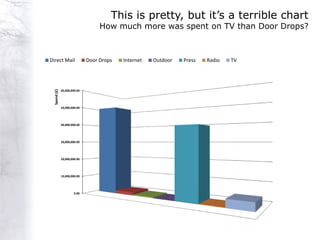
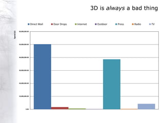
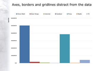
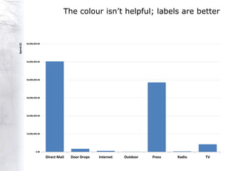
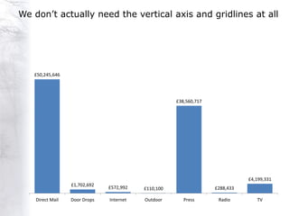
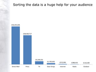
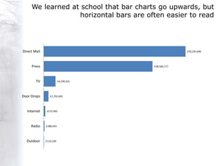
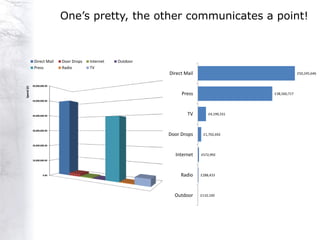
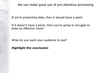
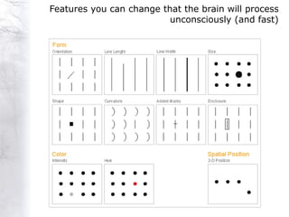
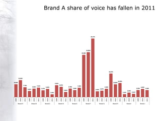
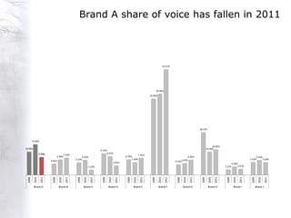
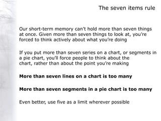
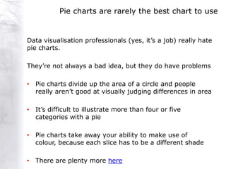
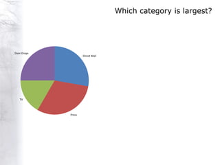
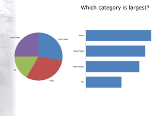
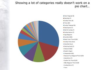
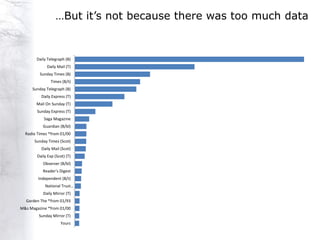
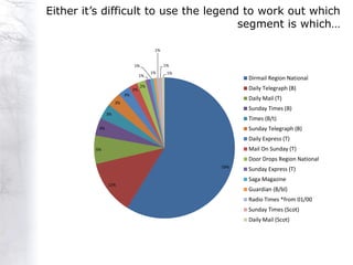
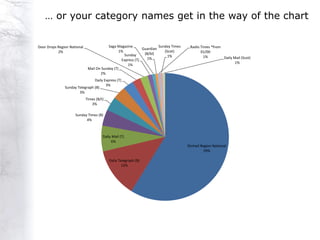
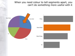
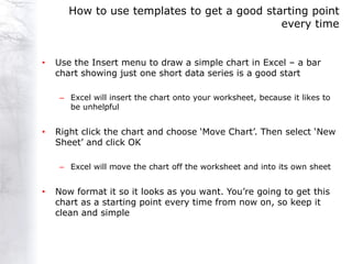
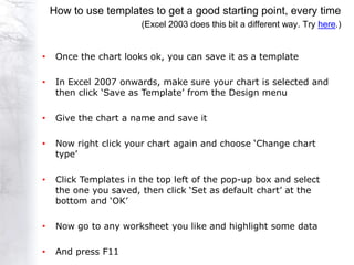
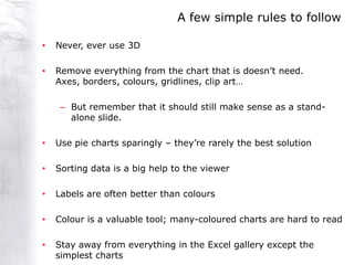
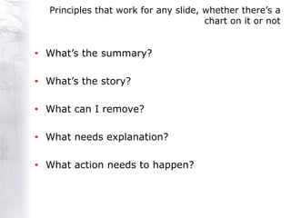
2. A quick guide to data visualisation for marketers…
communicating data effectively with charts
Charts can be a great help to putting across your
argument, or they can make life difficult and frustrating
for your audience
Effective charts aren‟t necessarily pretty charts; they‟re
functional - there‟s a huge difference between „pretty‟ and
„elegant‟
If you only want a chart to act as a picture on a slide and
people aren‟t actually supposed to try to read the
data, then making an effective chart matters less.
But why would you put a chart on a PowerPoint slide that
people aren‟t supposed to read? They‟ll try anyway.
3. Why are you drawing a chart?
It‟s an obvious question, but an important one.
You‟re trying to communicate a point and you use a chart
because the chart makes it easier and faster for your
audience to understand, than just writing down numbers.
Or it should be easier and faster to understand than just
writing down numbers, which leads to our first point.
Is a chart the best way to communicate your data?
4. Internet share of spend in 2010 was 24%
Cinema
1%
Direct Mail Door Drops
12% 1%
TV
29%
Internet
24%
Radio
4%
Outdoor
Press 5%
24%
5. Internet share of spend in 2010 was 24%
2010 Share of Spend
TV 29%
Internet 24%
Press 24%
Direct Mail 12%
Outdoor 5%
Radio 4%
Cinema 1%
Door Drops 1%
7. Edward Tufte introduced the „Data-Ink Ratio‟ in 1983,
when drawing a chart took a lot longer than it does now
He wasn‟t trying to save time – he was trying to draw
effective charts
The data-ink ratio is the amount
of ink you‟ve used to illustrate the
data, set against the total amount
of ink used to draw the chart
Ideally, every bit of ink used to
draw a chart should be necessary
to making that chart work.
9. Anything on your chart that isn‟t communicating data,
makes it harder to understand
“Chart Junk” that is unhelpful includes
• Gridlines
• 3D
• Borders
• Shading
• Clip art
• Different colours that don‟t change for a reason
• Prominent axes and titles
10. This is pretty, but it‟s a terrible chart
How much more was spent on TV than Door Drops?
Direct Mail Door Drops Internet Outdoor Press Radio TV
Spend (£)
60,000,000.00
50,000,000.00
40,000,000.00
30,000,000.00
20,000,000.00
10,000,000.00
0.00
11. 3D is always a bad thing
Direct Mail Door Drops Internet Outdoor Press Radio TV
Spend (£)
60,000,000.00
50,000,000.00
40,000,000.00
30,000,000.00
20,000,000.00
10,000,000.00
0.00
12. Axes, borders and gridlines distract from the data
Direct Mail Door Drops Internet Outdoor Press Radio TV
Spend (£)
60,000,000.00
50,000,000.00
40,000,000.00
30,000,000.00
20,000,000.00
10,000,000.00
0.00
13. The colour isn‟t helpful; labels are better
Spend (£)
60,000,000.00
50,000,000.00
40,000,000.00
30,000,000.00
20,000,000.00
10,000,000.00
0.00
Direct Mail Door Drops Internet Outdoor Press Radio TV
14. We don‟t actually need the vertical axis and gridlines at all
£50,245,646
£38,560,717
£4,199,331
£1,702,692
£572,992 £110,100 £288,433
Direct Mail Door Drops Internet Outdoor Press Radio TV
15. Sorting the data is a huge help for your audience
£50,245,646
£38,560,717
£4,199,331
£1,702,692
£572,992 £288,433 £110,100
Direct Mail Press TV Door Drops Internet Radio Outdoor
16. We learned at school that bar charts go upwards, but
horizontal bars are often easier to read
Direct Mail £50,245,646
Press £38,560,717
TV £4,199,331
Door Drops £1,702,692
Internet £572,992
Radio £288,433
Outdoor £110,100
17. One‟s pretty, the other communicates a point!
Direct Mail Door Drops Internet Outdoor
Press Radio TV
Direct Mail £50,245,646
60,000,000.00
Spend (£)
Press £38,560,717
50,000,000.00
40,000,000.00 TV £4,199,331
30,000,000.00
Door Drops £1,702,692
20,000,000.00
Internet £572,992
10,000,000.00
0.00 Radio £288,433
Outdoor £110,100
18. Going to extremes
The people we work with in marketing don‟t often have
maths and statistics backgrounds and you can take
simplification too far
A splash of colour that stops a slide looking like a maths
text-book is definitely a good thing!
Very often though, simpler visuals are easier for people who
don‟t like charts. You don‟t need to know how a dual axis line
chart works – you just read the data label next to the point
that you‟re interested in.
19. Our brains are much faster at pre-attentive processing
When you find yourself actually reading a chart to try to
understand what it says, that‟s attentive processing
Attentive processing happens in the conscious mind and
it‟s slow
If you can almost instantly read the data, that‟s pre-
attentive processing and it‟s very, very fast
22. We can make good use of pre-attentive processing
If we‟re presenting data, then it should have a point
If it doesn‟t have a point, then you‟re going to struggle to
draw an effective chart!
What do you want your audience to see?
Highlight the conclusion
23. Features you can change that the brain will process
unconsciously (and fast)
24. Brand A share of voice has fallen in 2011
45.57%
34.98%
32.90%
18.37%
13.26%
10.99%
10.06% 10.00%
9.32%
7.73% 8.07%
7.41% 7.34%
6.66% 6.45% 6.70% 6.56% 6.43%
5.37% 5.49% 5.53% 5.50%
4.81%
4.05% 4.55% 5.07%
3.59%
2.25% 2.37% 2.61%
2009
2010
2011
2009
2010
2011
2009
2010
2011
2009
2010
2011
2009
2010
2011
2009
2010
2011
2009
2010
2011
2009
2010
2011
2009
2010
2011
2009
2010
2011
Brand A Brand B Brand C Brand D Brand E Brand F Brand G Brand H Brand I Brand J
25. Brand A share of voice has fallen in 2011
45.57%
34.98%
32.90%
18.37%
13.26%
10.99%
10.06% 10.00%
9.32%
7.73% 8.07%
7.41% 7.34%
6.66% 6.45% 6.70% 6.56% 6.43%
5.37% 5.49% 5.53% 5.50%
4.81%
4.05% 4.55%5.07%
3.59%
2.25% 2.37% 2.61%
2009
2010
2011
2009
2010
2011
2009
2010
2011
2009
2010
2011
2009
2010
2011
2009
2010
2011
2009
2010
2011
2009
2010
2011
2009
2010
2011
2009
2010
2011
Brand A Brand B Brand C Brand D Brand E Brand F Brand G Brand H Brand I Brand J
26. The seven items rule
Our short-term memory can‟t hold more than seven things
at once. Given more than seven things to look at, you‟re
forced to think actively about what you‟re doing
If you put more than seven series on a chart, or segments in
a pie chart, you‟ll force people to think about the
chart, rather than about the point you‟re making
More than seven lines on a chart is too many
More than seven segments in a pie chart is too many
Even better, use five as a limit wherever possible
27. Pie charts are rarely the best chart to use
Data visualisation professionals (yes, it‟s a job) really hate
pie charts.
They‟re not always a bad idea, but they do have problems
• Pie charts divide up the area of a circle and people
really aren‟t good at visually judging differences in area
• It‟s difficult to illustrate more than four or five
categories with a pie
• Pie charts take away your ability to make use of
colour, because each slice has to be a different shade
• There are plenty more here
29. Which category is largest?
Press
Door Drops
Direct Mail
Direct Mail
Door Drops
TV
Press
TV
30. Showing a lot of categories really doesn‟t work on a
pie chart…
Daily Telegraph (B)
Daily Mail (T)
Sunday Times (B)
Times (B/t)
Sunday Telegraph (B)
Daily Express (T)
Mail On Sunday (T)
Sunday Express (T)
Saga Magazine
Guardian (B/bl)
Radio Times *from 01/00
Sunday Times (Scot)
Daily Mail (Scot)
Daily Exp (Scot) (T)
Observer (B/bl)
Reader's Digest
Independent (B/t)
National Trust Magazine*from 03/95
Daily Mirror (T)
Garden The *from 01/93
M&s Magazine *from 01/00
Sunday Mirror (T)
Yours
31. …But it‟s not because there was too much data
Daily Telegraph (B)
Daily Mail (T)
Sunday Times (B)
Times (B/t)
Sunday Telegraph (B)
Daily Express (T)
Mail On Sunday (T)
Sunday Express (T)
Saga Magazine
Guardian (B/bl)
Radio Times *from 01/00
Sunday Times (Scot)
Daily Mail (Scot)
Daily Exp (Scot) (T)
Observer (B/bl)
Reader's Digest
Independent (B/t)
National Trust…
Daily Mirror (T)
Garden The *from 01/93
M&s Magazine *from 01/00
Sunday Mirror (T)
Yours
32. Either it‟s difficult to use the legend to work out which
segment is which…
1%
1% 1%
1% 1%
1%
Dirmail Region National
2%
2% Daily Telegraph (B)
3%
Daily Mail (T)
3%
Sunday Times (B)
3%
Times (B/t)
4% Sunday Telegraph (B)
Daily Express (T)
6% Mail On Sunday (T)
Door Drops Region National
59%
Sunday Express (T)
Saga Magazine
12%
Guardian (B/bl)
Radio Times *from 01/00
Sunday Times (Scot)
Daily Mail (Scot)
33. … or your category names get in the way of the chart
Door Drops Region National Saga Magazine Sunday Times Radio Times *from
Guardian
2% 1% (Scot) 01/00
Sunday (B/bl)
1% 1% Daily Mail (Scot)
Express (T) 1%
1%
1%
Mail On Sunday (T)
2%
Daily Express (T)
3%
Sunday Telegraph (B)
3%
Times (B/t)
3%
Sunday Times (B)
4%
Daily Mail (T)
6%
Dirmail Region National
59%
Daily Telegraph (B)
12%
34. When you need colour to tell segments apart, you
can‟t do something more useful with it
Door Drops
Direct Mail Press
Direct Mail
TV
Door Drops
Press
TV
36. Excel makes life difficult
If you want to present data clearly and effectively, Excel
and PowerPoint aren‟t very helpful.
Excel improved with 2007, but it still encourages you to
draw bad charts and the default formatting is OK at best
In Excel 2003, the default chart formatting is appalling
We need to resist the temptation to use some of Excel‟s
more „exotic‟ charts.
38. How to use templates to get a good starting point
every time
• Use the Insert menu to draw a simple chart in Excel – a bar
chart showing just one short data series is a good start
– Excel will insert the chart onto your worksheet, because it likes to
be unhelpful
• Right click the chart and choose „Move Chart‟. Then select „New
Sheet‟ and click OK
– Excel will move the chart off the worksheet and into its own sheet
• Now format it so it looks as you want. You‟re going to get this
chart as a starting point every time from now on, so keep it
clean and simple
39. How to use templates to get a good starting point, every time
(Excel 2003 does this bit a different way. Try here.)
• Once the chart looks ok, you can save it as a template
• In Excel 2007 onwards, make sure your chart is selected and
then click „Save as Template‟ from the Design menu
• Give the chart a name and save it
• Now right click your chart again and choose „Change chart
type‟
• Click Templates in the top left of the pop-up box and select
the one you saved, then click „Set as default chart‟ at the
bottom and „OK‟
• Now go to any worksheet you like and highlight some data
• And press F11
40. A few simple rules to follow
• Never, ever use 3D
• Remove everything from the chart that is doesn‟t need.
Axes, borders, colours, gridlines, clip art…
– But remember that it should still make sense as a stand-
alone slide.
• Use pie charts sparingly – they‟re rarely the best solution
• Sorting data is a big help to the viewer
• Labels are often better than colours
• Colour is a valuable tool; many-coloured charts are hard to read
• Stay away from everything in the Excel gallery except the
simplest charts
41. Principles that work for any slide, whether there‟s a
chart on it or not
• What‟s the summary?
• What‟s the story?
• What can I remove?
• What needs explanation?
• What action needs to happen?
42. About the author
Neil Charles is Head of Econometrics at
Mediacom Leeds and has worked in marketing
as an economist and statistician for the past
twelve years, across a wide range of
businesses.
Econometricians use mathematical models to measure the
effectiveness of advertising and to improve the return on
investment of marketing budgets.
At Mediacom, we use complex mathematical models to
produce simple, straightforward insights into how hard
marketing budgets are working and to show how those
budgets can be used more effectively.
Introduction to econometrics