1. Draft Feedback 2
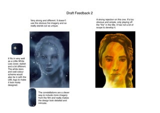
Very strong and different. It doesnʼt
use the obvious fire imagery and so
really stands out as unique.
It fits in very well
as a Little White
Lies cover, stylish
and a bit different.
The white stars
and cold colour
scheme would
also tie in with the
LWL logo to make
it look nicely
designed.
The constellations are a clever
way to include more imagery
from the film and really makes
the design look detailed and
intricate.
A strong rejection on this one. Itʼs too
obvious and simple, only playing off
the “fire” in the title. It has not a lot of
scope to develop it.