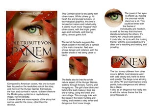
1. This German cover is less gritty then
other covers. Whilst others go for
harsh fire and grunge textures, or
technological graphics, this one is
focused on nature and individuality.
It seems much more “magical” then
other covers, with the bright green
eyes and red leafs, and flowing,
swirly, almost gothic font.
The red of the leafs suggests fire,
which is both in the title and a symbol
of the main character. Red also
shows danger and violence, with the
darker shade of red being close to
blood.
Compared to American covers, this one is much
less focused on the revolution side of the story,
and more on the Hunger Games themselves,
the hunt and survival in nature. It doesnʼt feature
the MockingJay symbol as a revolutionary
image, nor fire directly.
It shows there are more aspects of the story that
can be used for the cover, other then the
obvious.
The leafs also tie into the whole
nature aspect of the Hunger Games,
walking through forests, hunting and
foraging etc. The girlʼs face obscured
behind the leafs makes it look like
sheʼs hiding, using the forest and
camouflage. This strongly links with
the ideas in the book; hunting and
hiding, and creates a very tense and
dangerous front cover image.
The green of her eyes
is amped up, making
the one eye visible
stand out a lot. This
could be linked with
the theme of
individuality and freedom,
as well as the way that this hero
stands out among the others. Itʼs
making her unique and special.
It could also be to do with the hunting
theme; with the eyes picked out itʼs
clear sheʼs watching and waiting and
prowling.
The font is very different from other
covers. Whilst most designs used
with bold blocky text, here itʼs thine
and spindly. The large curve winding
out of the “N” and reaching two sharp
points, looks dangerous and almost
like a blade.
It also as an elegance that really ties
in with the nature theme that the
cover focuses on.