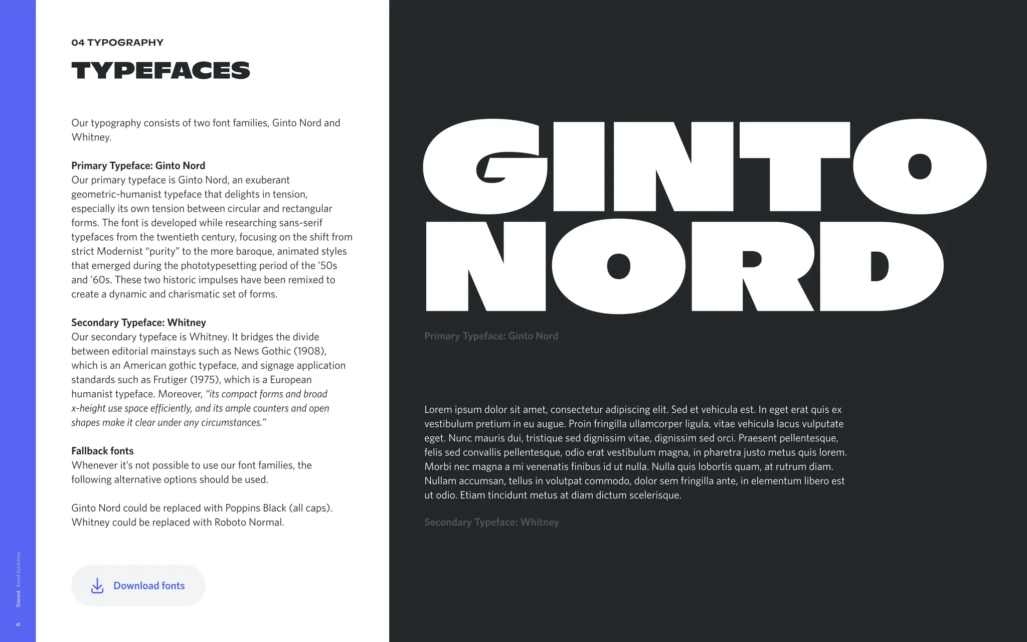
Please keep yourhands within the document at all time as we
guide you through the basic elements of our identity system and
explain how we use them to build our brand. Understanding and
adhering to these guidelines will be essential for maintaining a
consistent, unforgettable and meaningful experience of Discord.
Discord brand guidelines
Welcome to a
little place we
like to call The
Discord Brand
Guidelines.
Discord
5
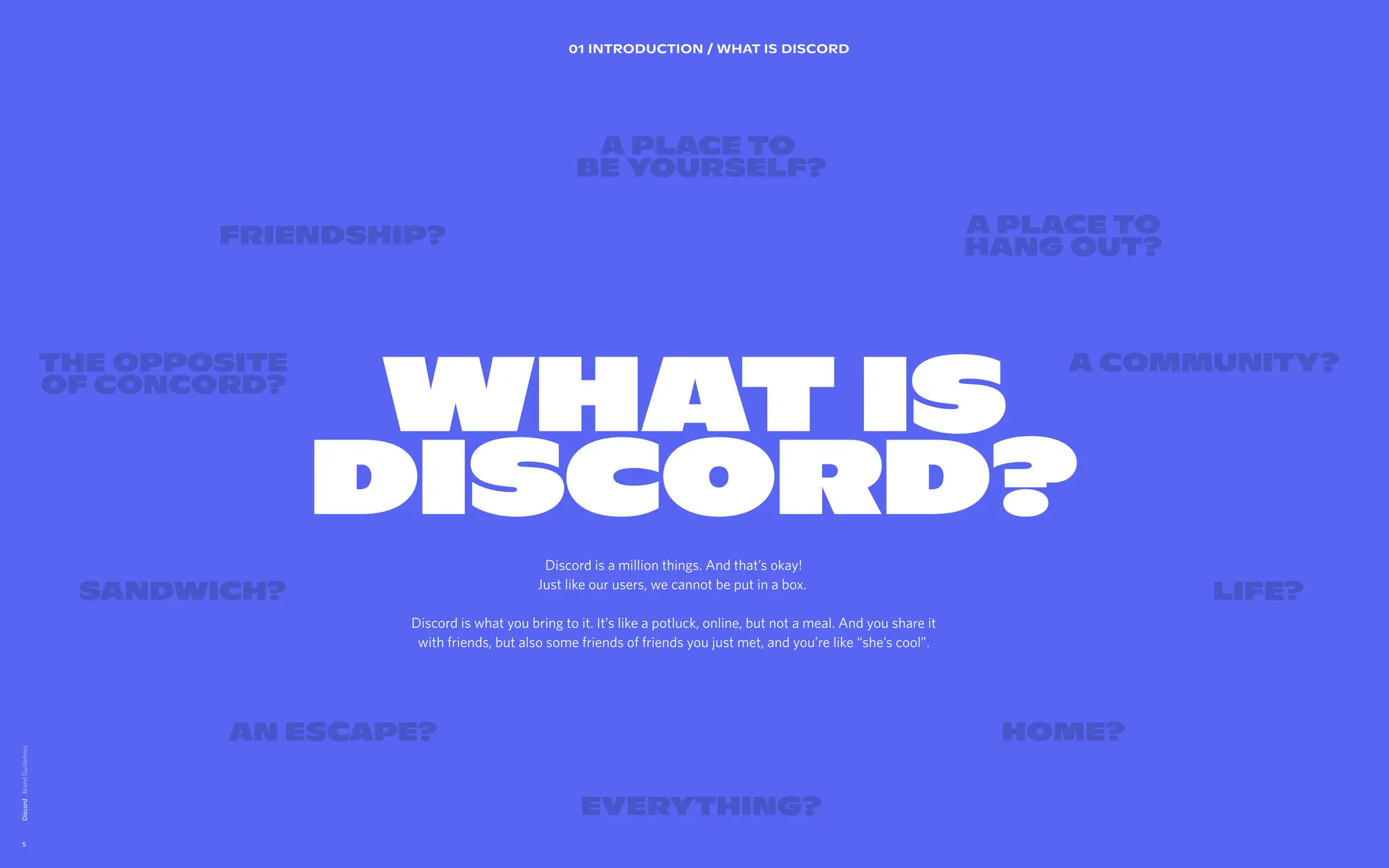
WHAT IS
DISCORD?
01 INTRODUCTION/ WHAT IS DISCORD
Life?
AN Escape? Home?
Sandwich?
A place to
hang out?
A place to
be yourself?
Friendship?
A Community?
THE OPPOSITE
OF CONCORD?
Discord is a million things. And that’s okay!
Just like our users, we cannot be put in a box.
Discord is what you bring to it. It’s like a potluck, online, but not a meal. And you share it
with friends, but also some friends of friends you just met, and you’re like “she’s cool”.
Everything?
6.
Discord
6
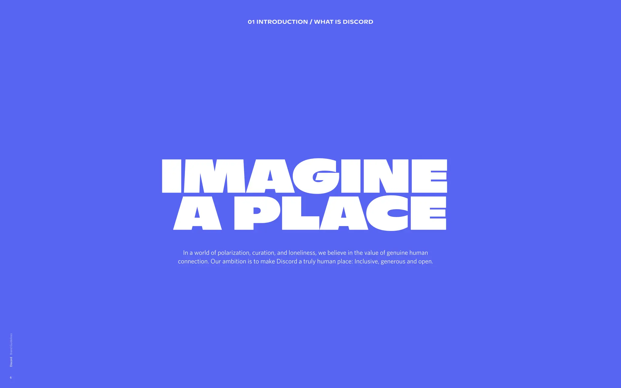
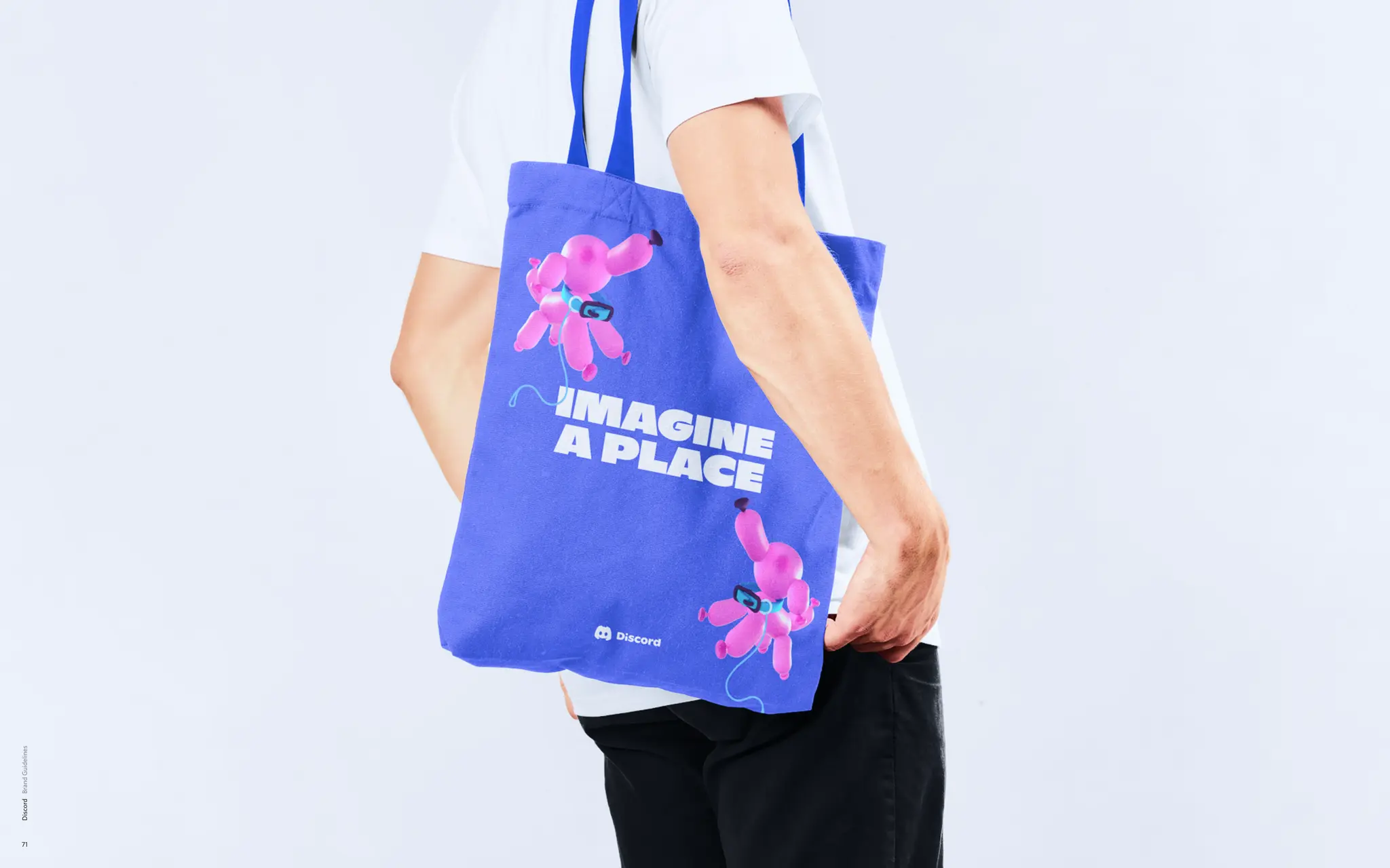
IMAGINE
A PLACE
IMAGINE
A PLACE
01 INTRODUCTION / WHAT IS DISCORD
In a world of polarization, curation, and loneliness, we believe in the value of genuine human
connection. Our ambition is to make Discord a truly human place: Inclusive, generous and open.
7.
02 BRAND DESIGNPRINCIPLES
A brand
design system
directly
inspired by the
product.
We’ve extracted the shapes from the product in order to set
guidance for how we visually create our communications.
Users can visually be articulated as a community when they
are presented in a group of profile pictures (circles). We also
want to make sure to take cues from platform to show the
state of the user in focus.
Bringing to life the vast diversity of communities on Discord.
The users are behind the content.
Lorem ipsum dolor sit amet, consectetur adipiscing elit. Sed
elementum diam malesuada sed feugiat sit id magna. Congue
laoreet aenean eleifend odio laoreet commodo. Et sem amet
rhoncus nam adipiscing tristique. Cras vulputate enim id
elementum sed vel.
Discord
7
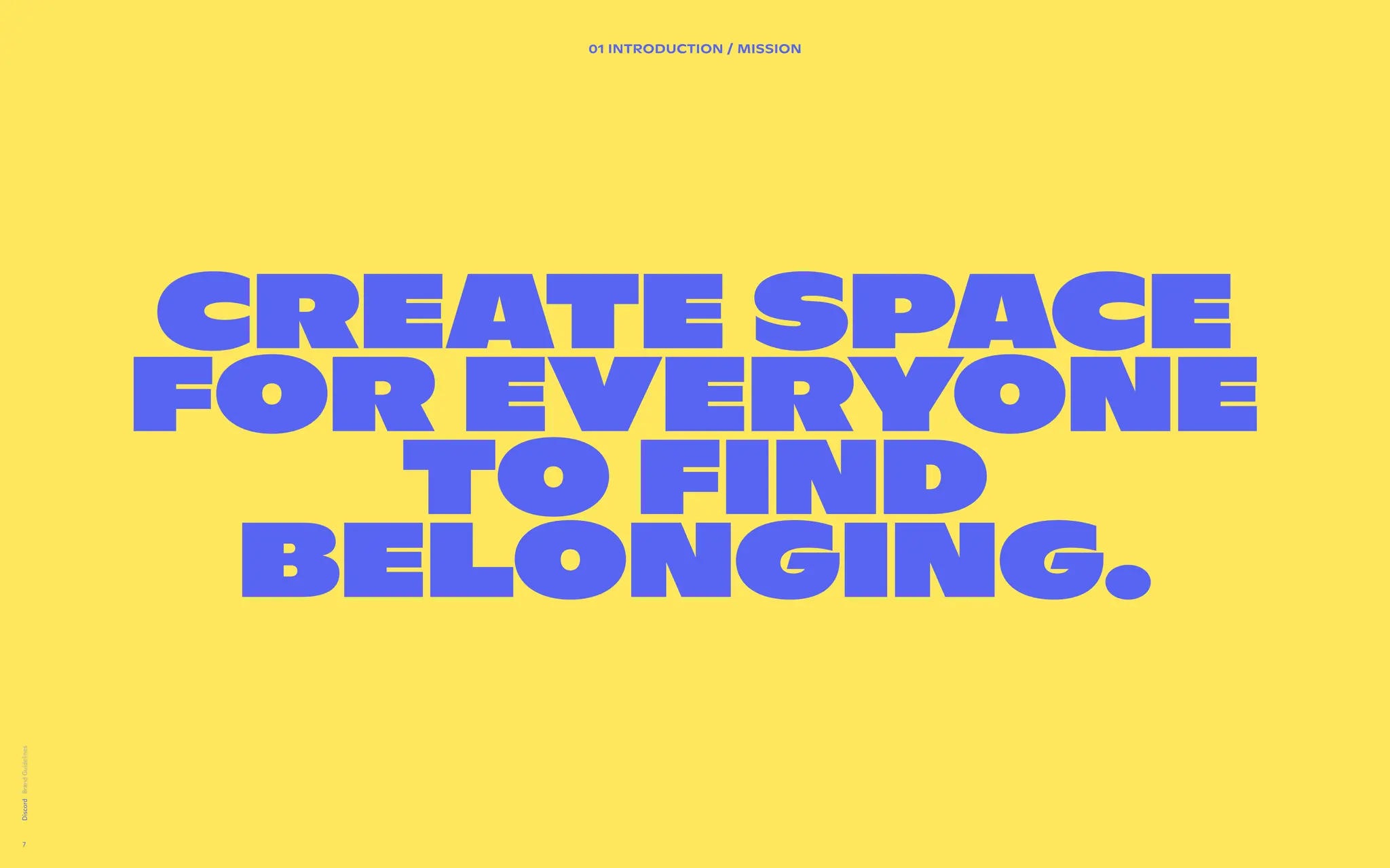
Create space
for everyone
to find
belonging.
01 INTRODUCTION / Mission
8.
02 BRAND DESIGNPRINCIPLES
A brand
design system
directly
inspired by the
product.
We’ve extracted the shapes from the product in order to set
guidance for how we visually create our communications.
Users can visually be articulated as a community when they
are presented in a group of profile pictures (circles). We also
want to make sure to take cues from platform to show the
state of the user in focus.
Bringing to life the vast diversity of communities on Discord.
The users are behind the content.
Lorem ipsum dolor sit amet, consectetur adipiscing elit. Sed
elementum diam malesuada sed feugiat sit id magna. Congue
laoreet aenean eleifend odio laoreet commodo. Et sem amet
rhoncus nam adipiscing tristique. Cras vulputate enim id
elementum sed vel.
Discord
8
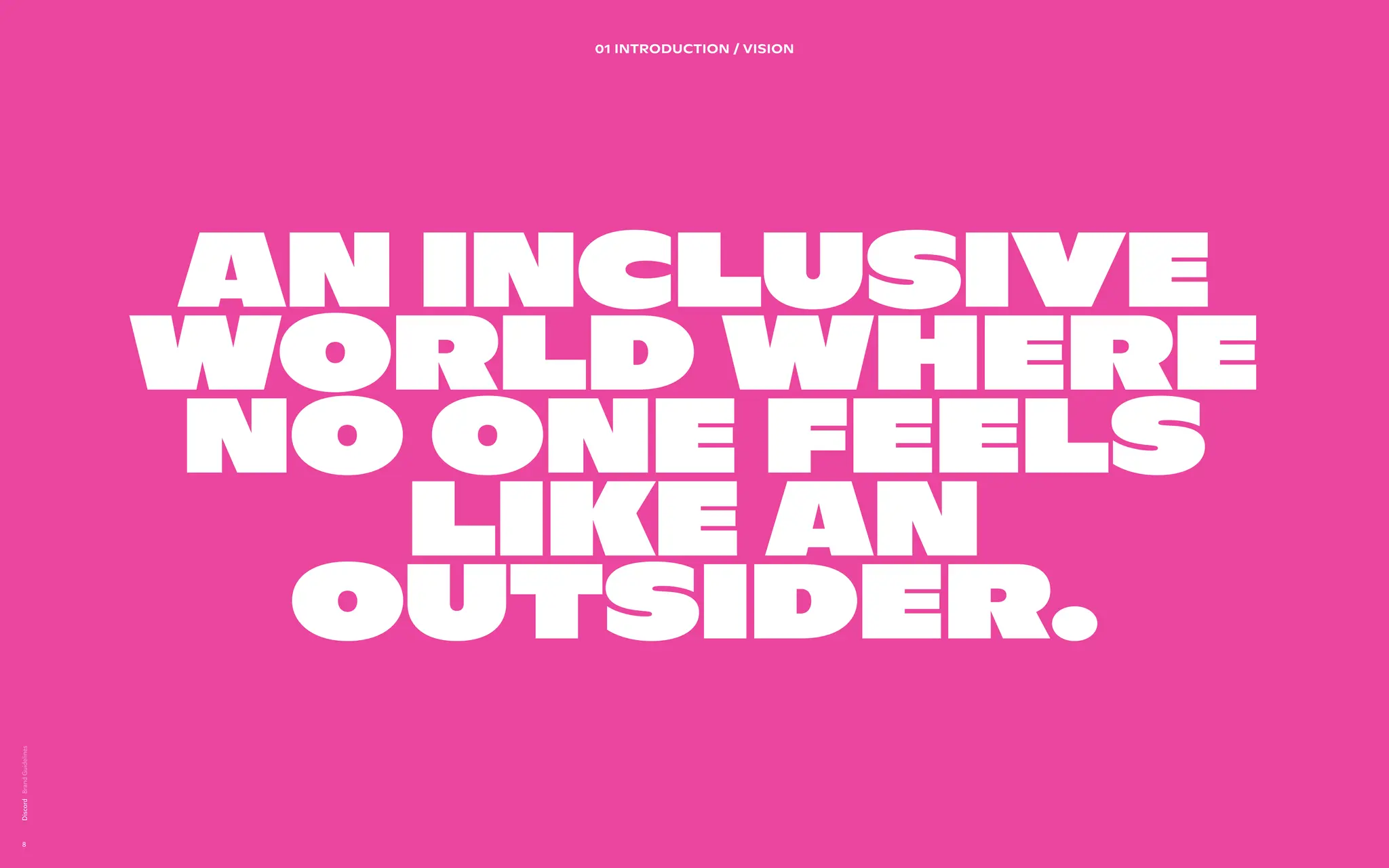
An inclusive
world where
no one feels
like an
outsider.
01 INTRODUCTION / Vision
9.
02 BRAND DESIGNPRINCIPLES
A brand
design system
directly
inspired by the
product.
We’ve extracted the shapes from the product in order to set
guidance for how we visually create our communications.
Users can visually be articulated as a community when they
are presented in a group of profile pictures (circles). We also
want to make sure to take cues from platform to show the
state of the user in focus.
Bringing to life the vast diversity of communities on Discord.
The users are behind the content.
Lorem ipsum dolor sit amet, consectetur adipiscing elit. Sed
elementum diam malesuada sed feugiat sit id magna. Congue
laoreet aenean eleifend odio laoreet commodo. Et sem amet
rhoncus nam adipiscing tristique. Cras vulputate enim id
elementum sed vel.
Discord
9
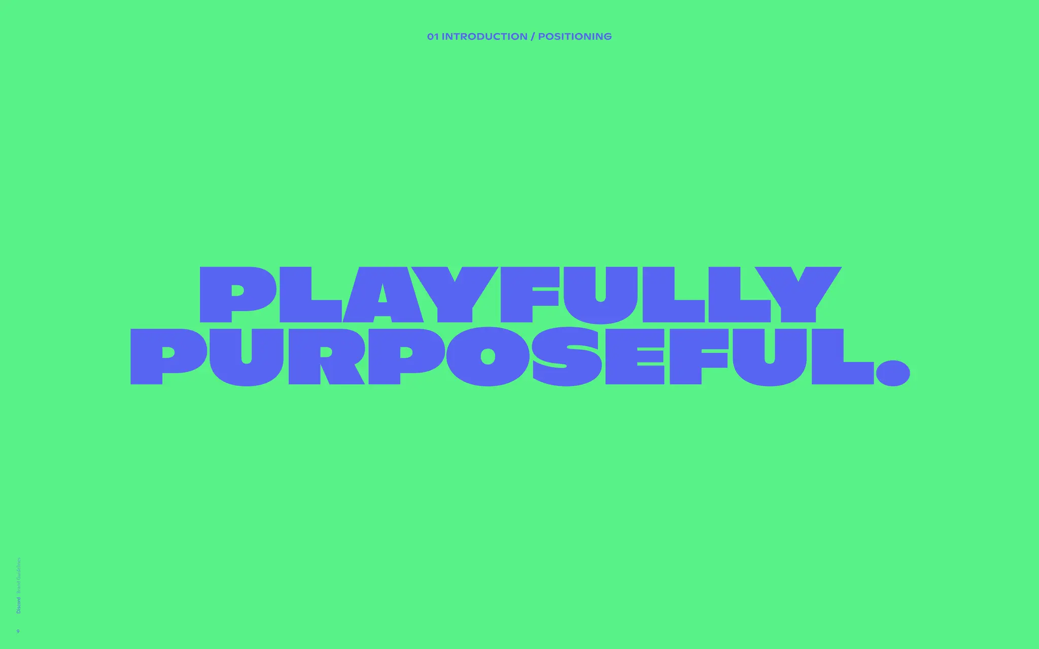
Playfully
purposeful.
01 INTRODUCTION / Positioning
10.
01 INTRODU TION/ TON OF VOICE
Ima ine a place
NARRAT D by us
Hello intrepid t veler on the r d to discovering Discord’s tone
and voice.
As you know D cord is an abs lutely awesome place. At any
given point, dis ussions range om whether a hotdog is a
sandwich, whi Pokémon wo d be the most likely to work at
the DMV, whe er or not men s are a real thing, if eating plain
toast is a sign being genius, regular old homework chat,
streaming gam play and long nvos over movies and
wholesome tal just about ev ything. There’s no place like it
on the internet nd there shou n’t be any place that sounds
like us either. It quite a challe ge and an honor.
Which is why hen we write, e should “Imagine a Place”
where copy fee as unique an interesting as the people,
convos, and ex eriences on Di ord.
But wait! There more. (That ould be read in a made for TV
ad voice).
Discord
10
Dow oad Messagin Guidelines
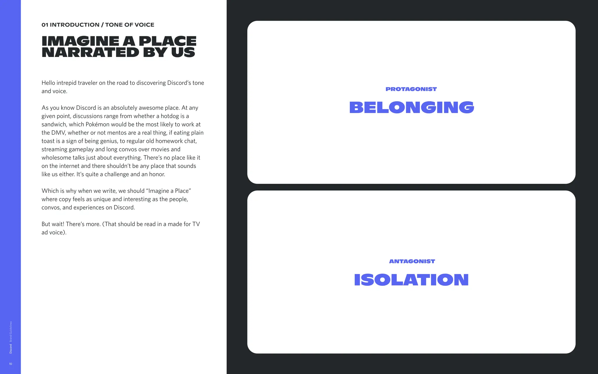
Belonging
Protagonist
Isolation
Antagonist
11.
01 INTRODUCTION /TONE OF VOICE
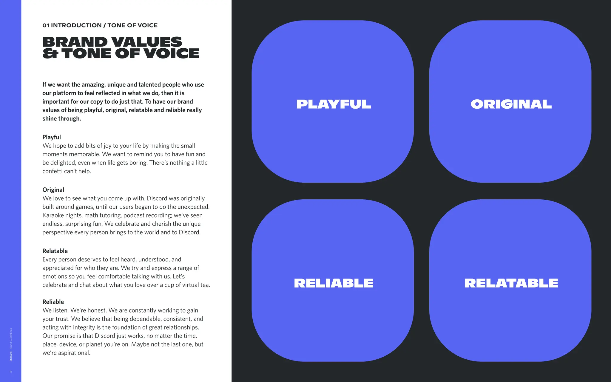
Brand Values
&Tone of voice
If we want the amazing, unique and talented people who use
our platform to feel reflected in what we do, then it is
important for our copy to do just that. To have our brand
values of being playful, original, relatable and reliable really
shine through.
Playful
We hope to add bits of joy to your life by making the small
moments memorable. We want to remind you to have fun and
be delighted, even when life gets boring. There’s nothing a little
confetti can’t help.
Original
We love to see what you come up with. Discord was originally
built around games, until our users began to do the unexpected.
Karaoke nights, math tutoring, podcast recording; we’ve seen
endless, surprising fun. We celebrate and cherish the unique
perspective every person brings to the world and to Discord.
Relatable
Every person deserves to feel heard, understood, and
appreciated for who they are. We try and express a range of
emotions so you feel comfortable talking with us. Let’s
celebrate and chat about what you love over a cup of virtual tea.
Reliable
We listen. We’re honest. We are constantly working to gain
your trust. We believe that being dependable, consistent, and
acting with integrity is the foundation of great relationships.
Our promise is that Discord just works, no matter the time,
place, device, or planet you’re on. Maybe not the last one, but
we’re aspirational.
Discord
11
PLAYFUL
RELIABLE
ORIGINAL
RELATABLE
12.
01 INTRODUCTION /TONE OF VOICE
MESSAGING
VARIATIONS
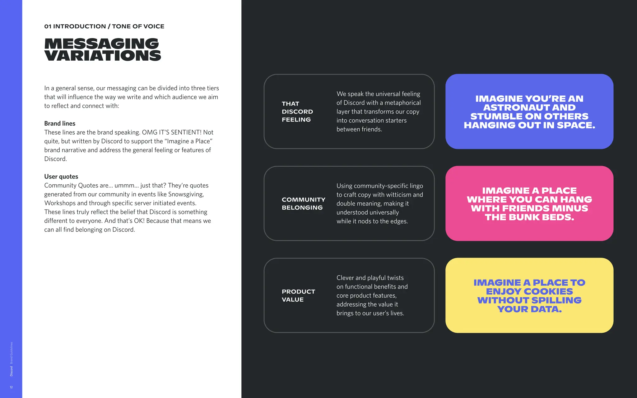
In a general sense, our messaging can be divided into three tiers
that will influence the way we write and which audience we aim
to reflect and connect with:
Brand lines
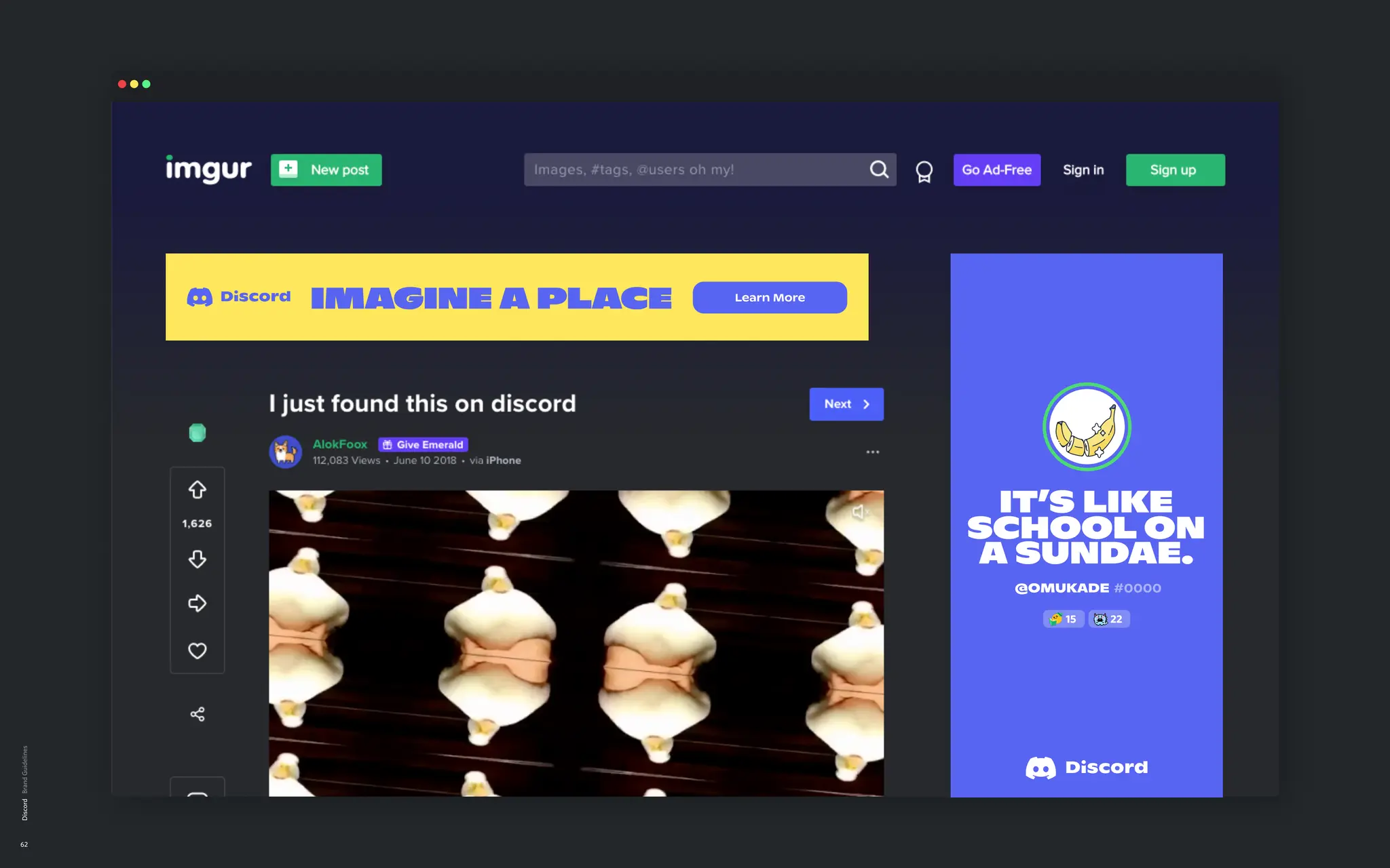
These lines are the brand speaking. OMG IT’S SENTIENT! Not
quite, but written by Discord to support the “Imagine a Place”
brand narrative and address the general feeling or features of
Discord.
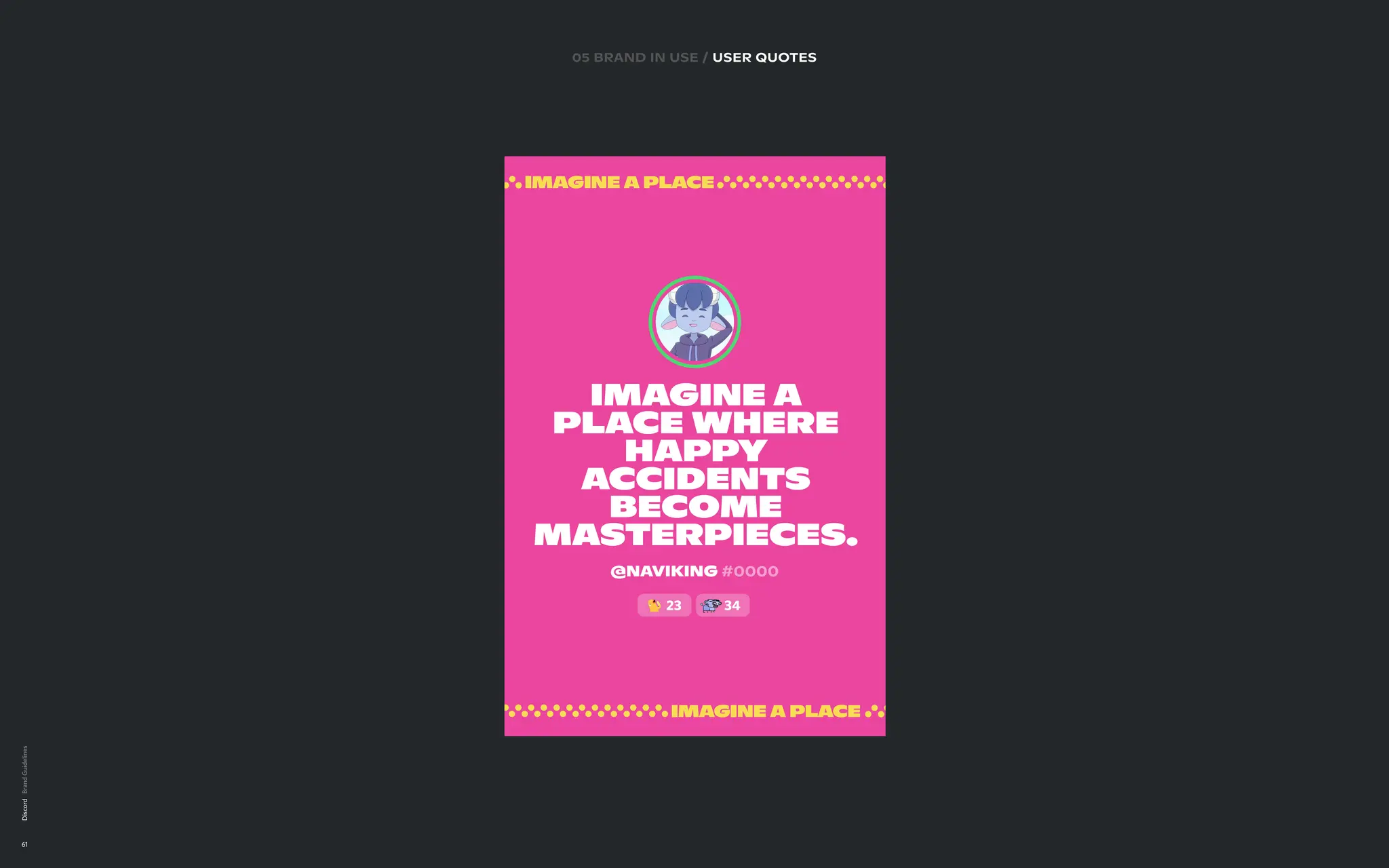
User quotes
Community Quotes are… ummm… just that? They’re quotes
generated from our community in events like Snowsgiving,
Workshops and through specific server initiated events.
These lines truly reflect the belief that Discord is something
different to everyone. And that’s OK! Because that means we
can all find belonging on Discord.
Discord
12
Download Messaging Guidelines
THAT
DISCORD
FEELING
Imagine you’re an
astronautand
stumble on others
hanging out in space.
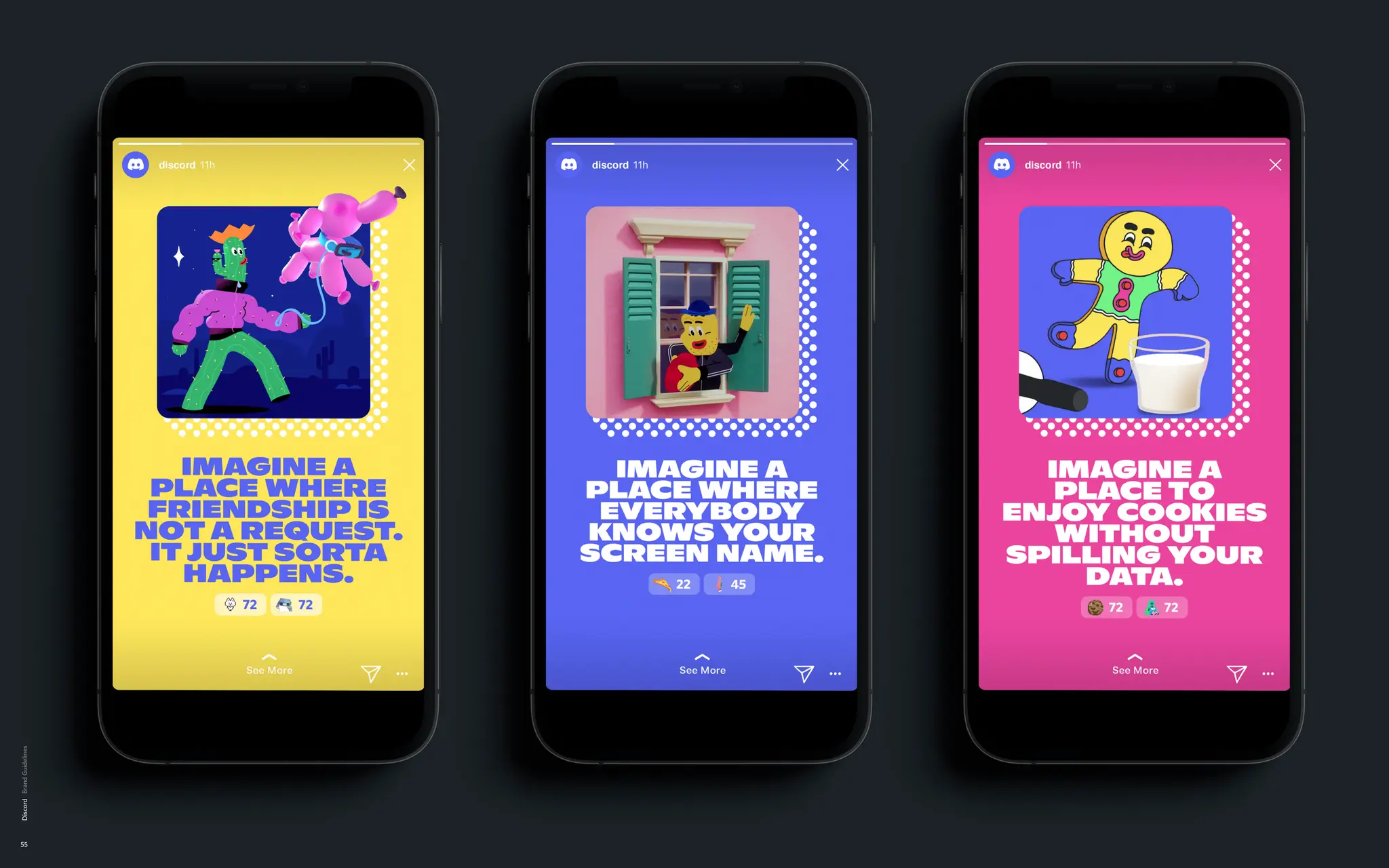
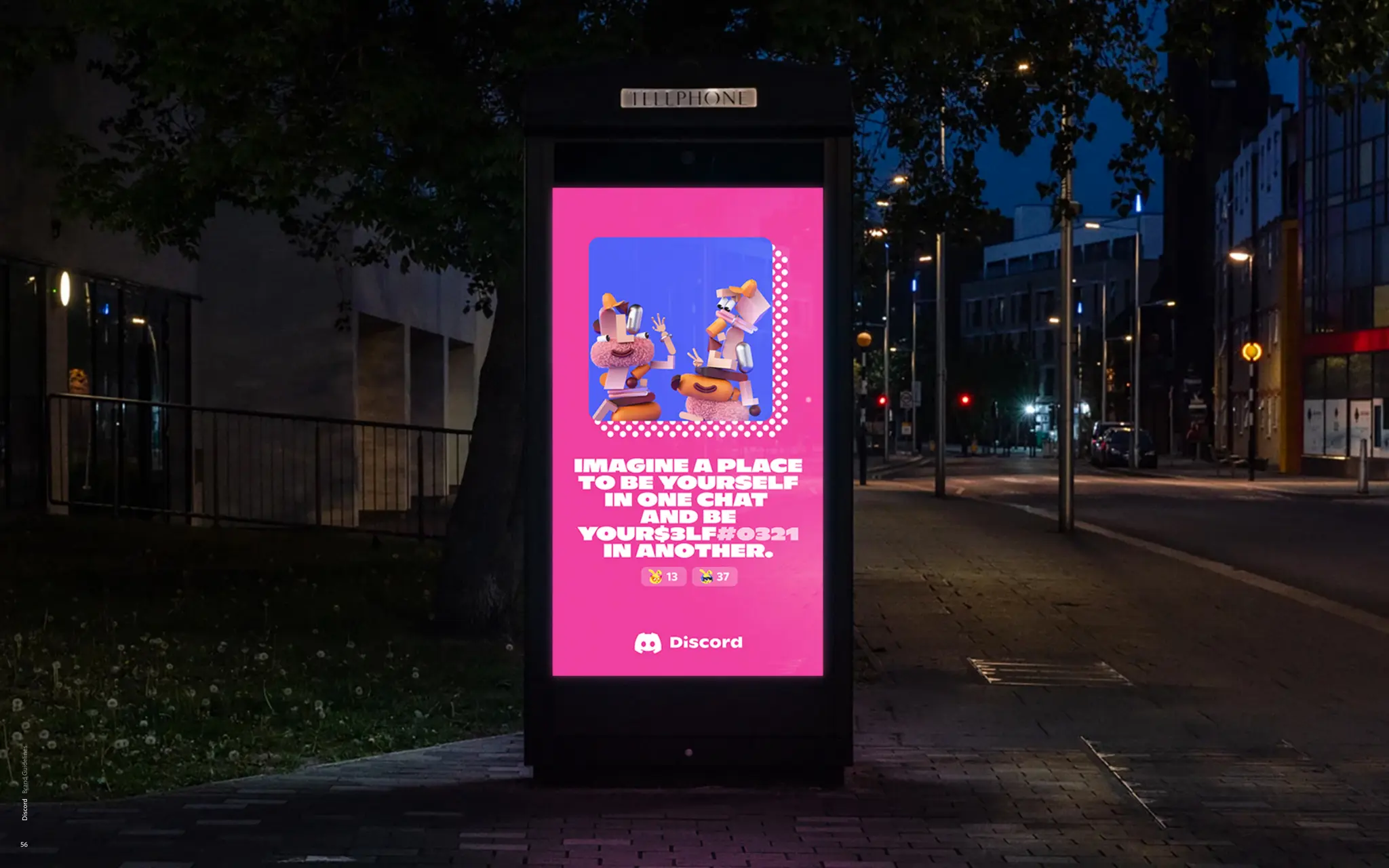
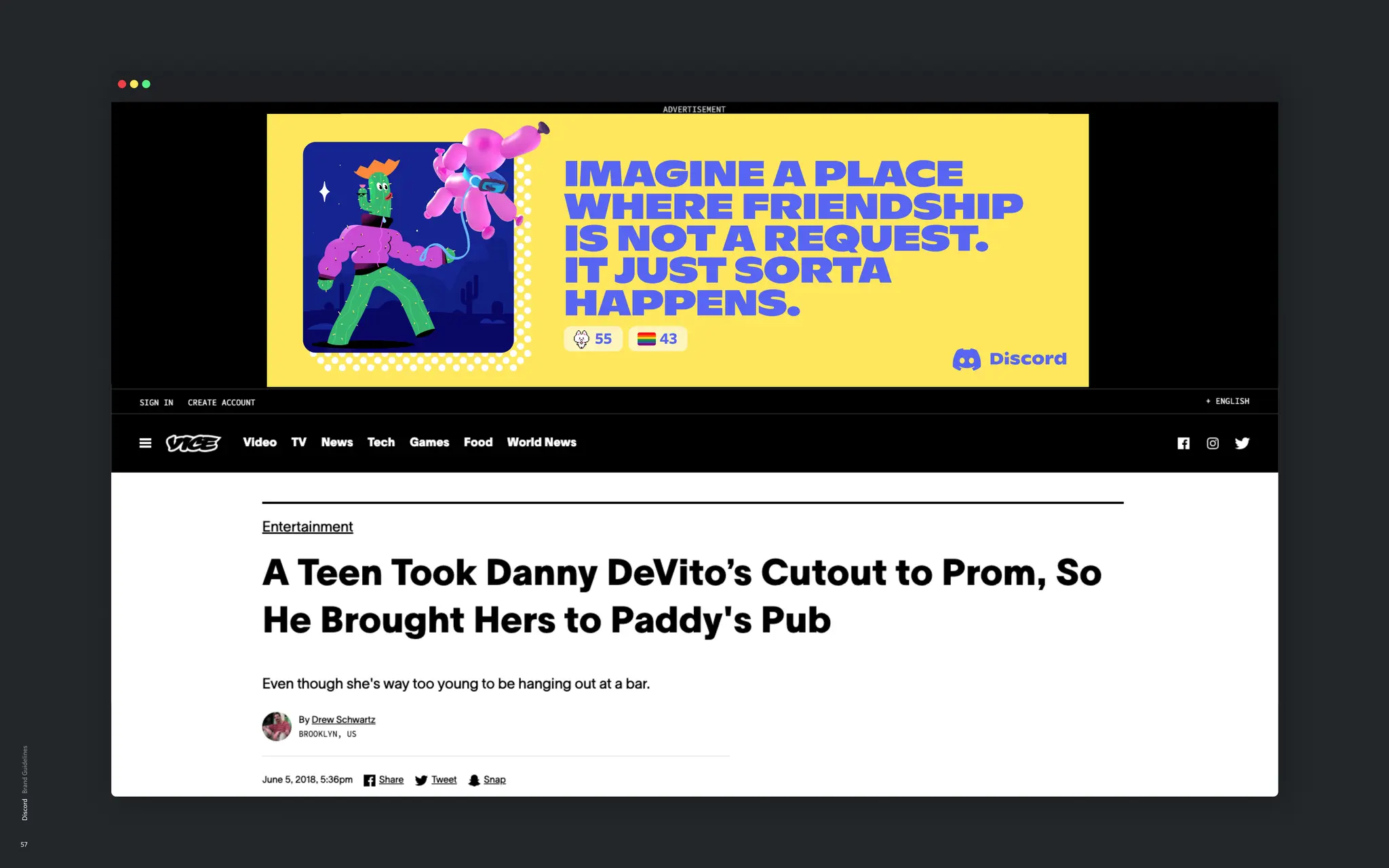
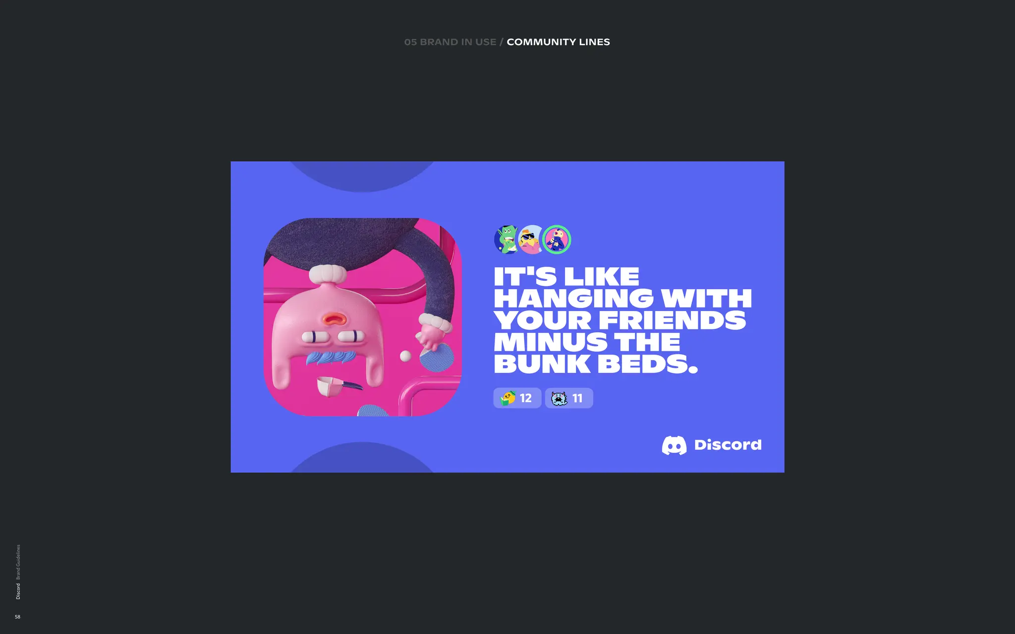
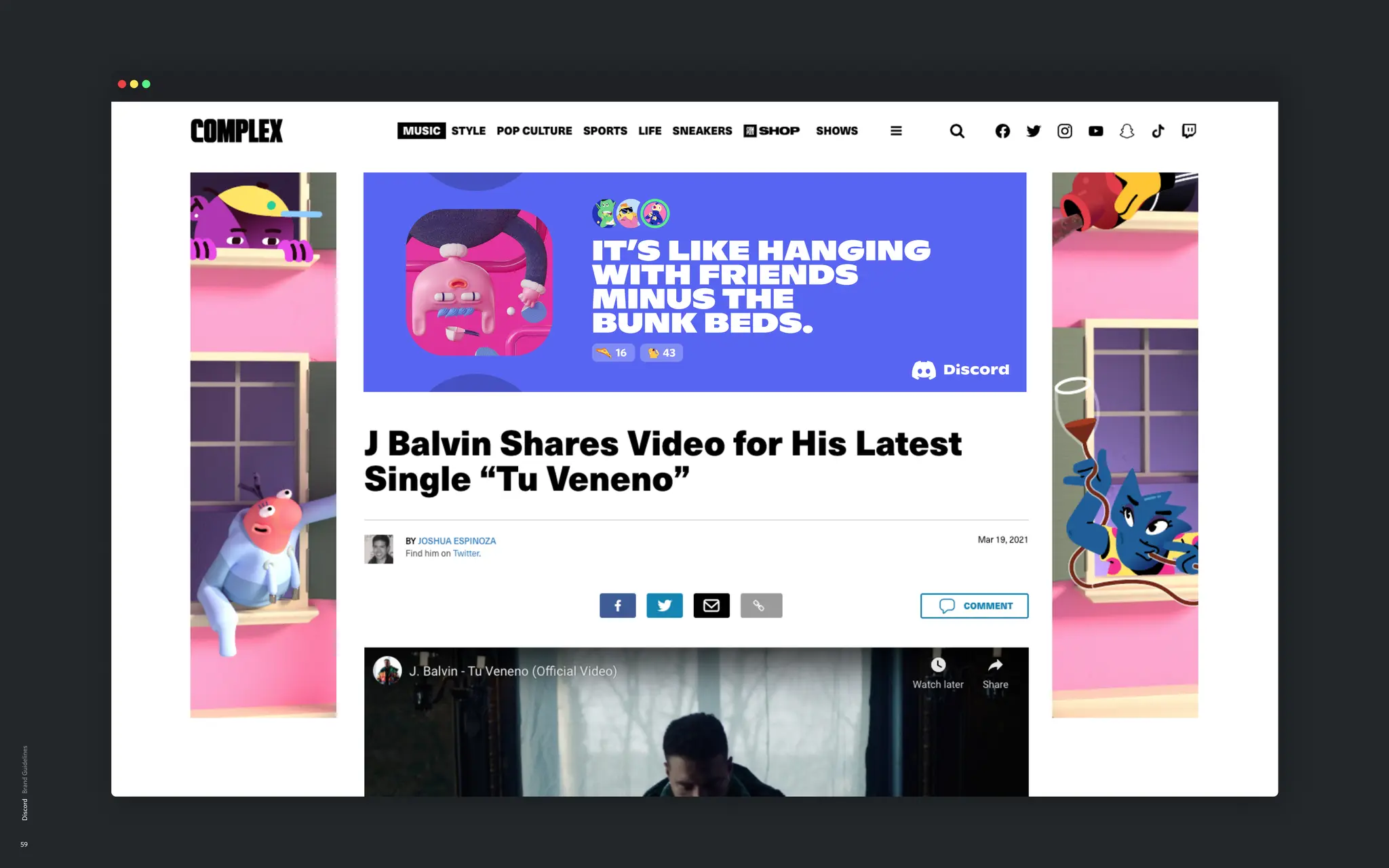
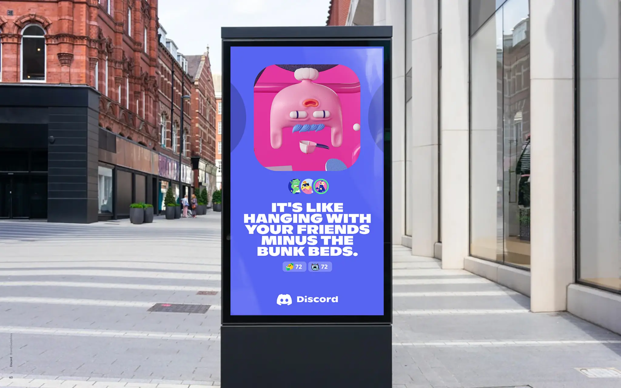
IMAGINE A PLACE
WHERE YOU CAN HANG
WITH FRIENDS MINUS
THE BUNK BEDS.
Imagine a place to
enjoy cookies
without spilling
your data.
COMMUNITY
BELONGING
PRODUCT
VALUE
We speak the universal feeling
of Discord with a metaphorical
layer that transforms our copy
into conversation starters
between friends.
Using community-specific lingo
to craft copy with witticism and
double meaning, making it
understood universally
while it nods to the edges.
Clever and playful twists
on functional benefits and
core product features,
addressing the value it
brings to our user’s lives.
02 logo, symbol,wordmark & tagline
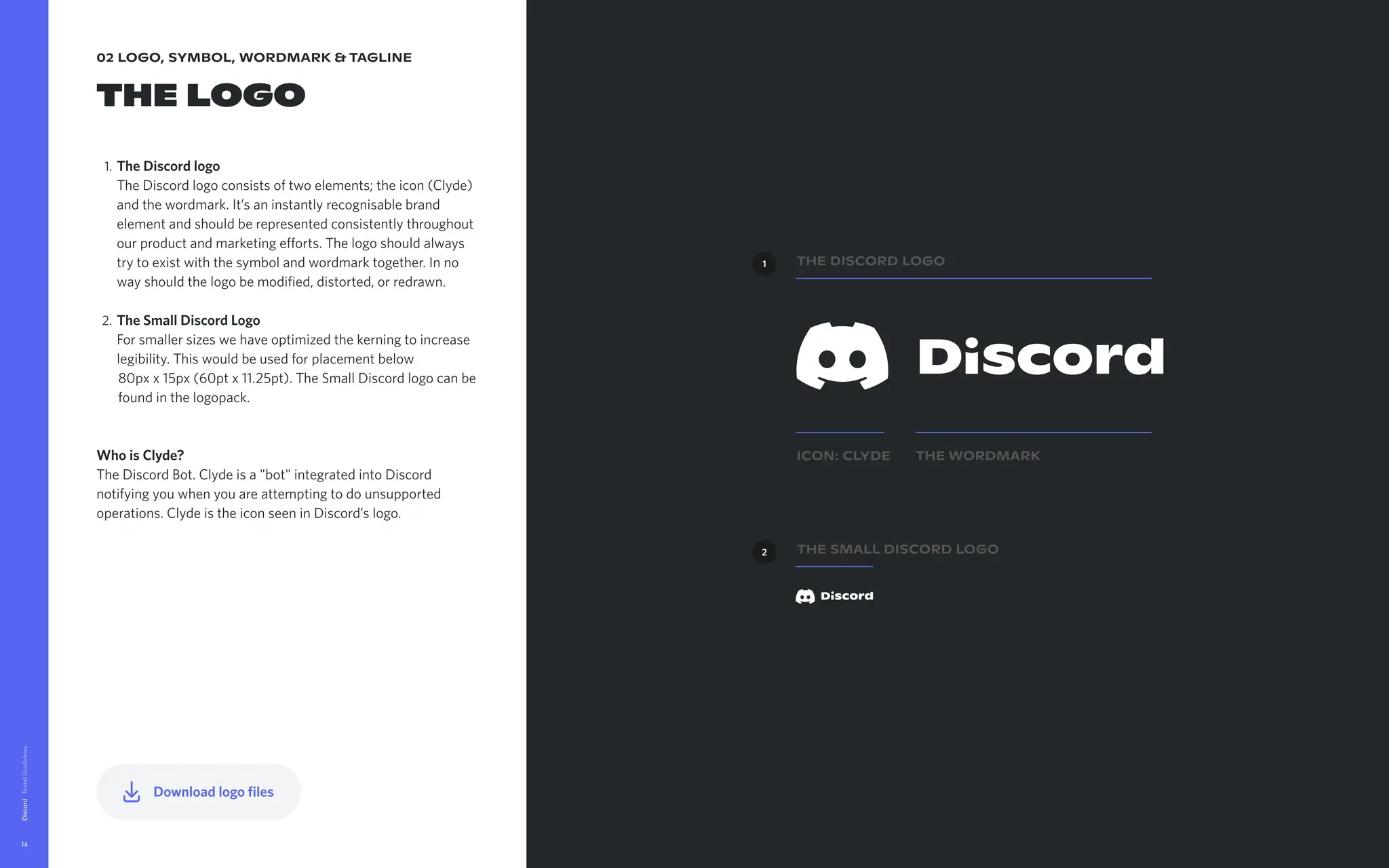
The logo
TheDiscordlogo
The Discord logo consists of two elements; the icon (Clyde)
and the wordmark. It’s an instantly recognisable brand
element and should be represented consistently throughout
our product and marketing efforts. The logo should always
try to exist with the symbol and wordmark together. In no
way should the logo be modified, distorted, or redrawn
TheSmallDiscordLogo
For smaller sizes we have optimized the kerning to increase
legibility. This would be used for placement below
80px x 15px (60pt x 11.25pt). The Small Discord logo can be
found in the logopack.
WhoisClyde?
The Discord Bot. Clyde is a "bot" integrated into Discord
notifying you when you are attempting to do unsupported
operations. Clyde is the icon seen in Discord’s logo.
Discord
14
ICON: Clyde The Wordmark
The Discord Logo
The Small Discord Logo
1
2
Downloadlogofiles
15.
02 logo, symbol,wordmark & tagline
Logo
Clear space
To ensure the right amount of breathing space around the
Discord logo the following process should be applied:
Step1
Pick the letter ‘o’
Step2
Rotate it 90 degrees
Step2
Duplicate it
Discord
15
x
x=
x/2
16.
02 logo, symbol,wordmark & tagline
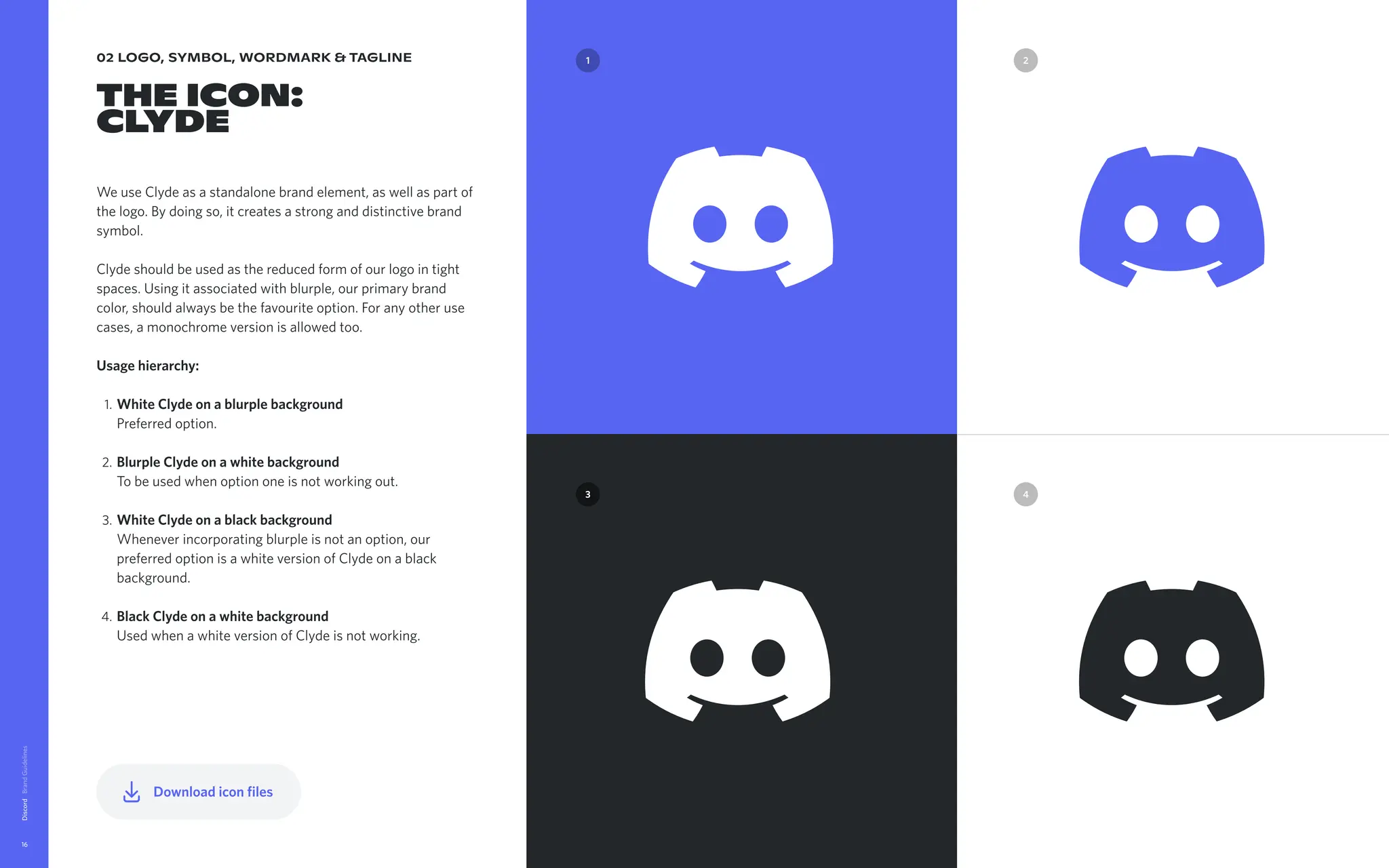
The Icon:
Clyde
We use Clyde as a standalone brand element, as well as part of
the logo. By doing so, it creates a strong and distinctive brand
symbol.
Clyde should be used as the reduced form of our logo in tight
spaces. Using it associated with blurple, our primary brand
color, should always be the favourite option. For any other use
cases, a monochrome version is allowed too.
Usagehierarchy
WhiteClydeonablurplebackground
Preferred option
BlurpleClydeonawhitebackground
To be used when option one is not working out
WhiteClydeonablackbackground
Whenever incorporating blurple is not an option, our
preferred option is a white version of Clyde on a black
background
BlackClydeonawhitebackground
Used when a white version of Clyde is not working.
Discord
16
4
3
2
1 2
1
3 4
Downloadiconfiles
17.
02 logo, symbol,wordmark & tagline
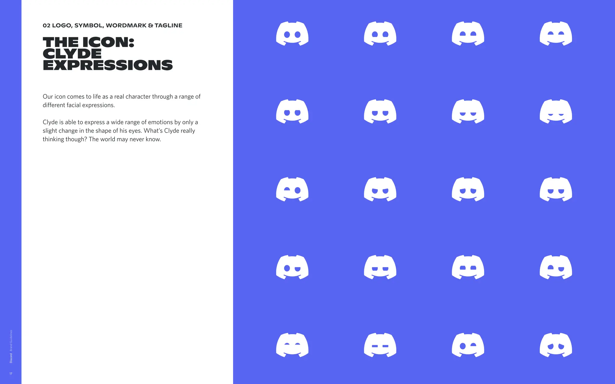
The Icon:
Clyde
expressions
Our icon comes to life as a real character through a range of
different facial expressions.
Clyde is able to express a wide range of emotions by only a
slight change in the shape of his eyes. What’s Clyde really
thinking though? The world may never know.
Discord
17
Downloadiconexpressionsfiles
18.
02 logo, symbol,wordmark & tagline
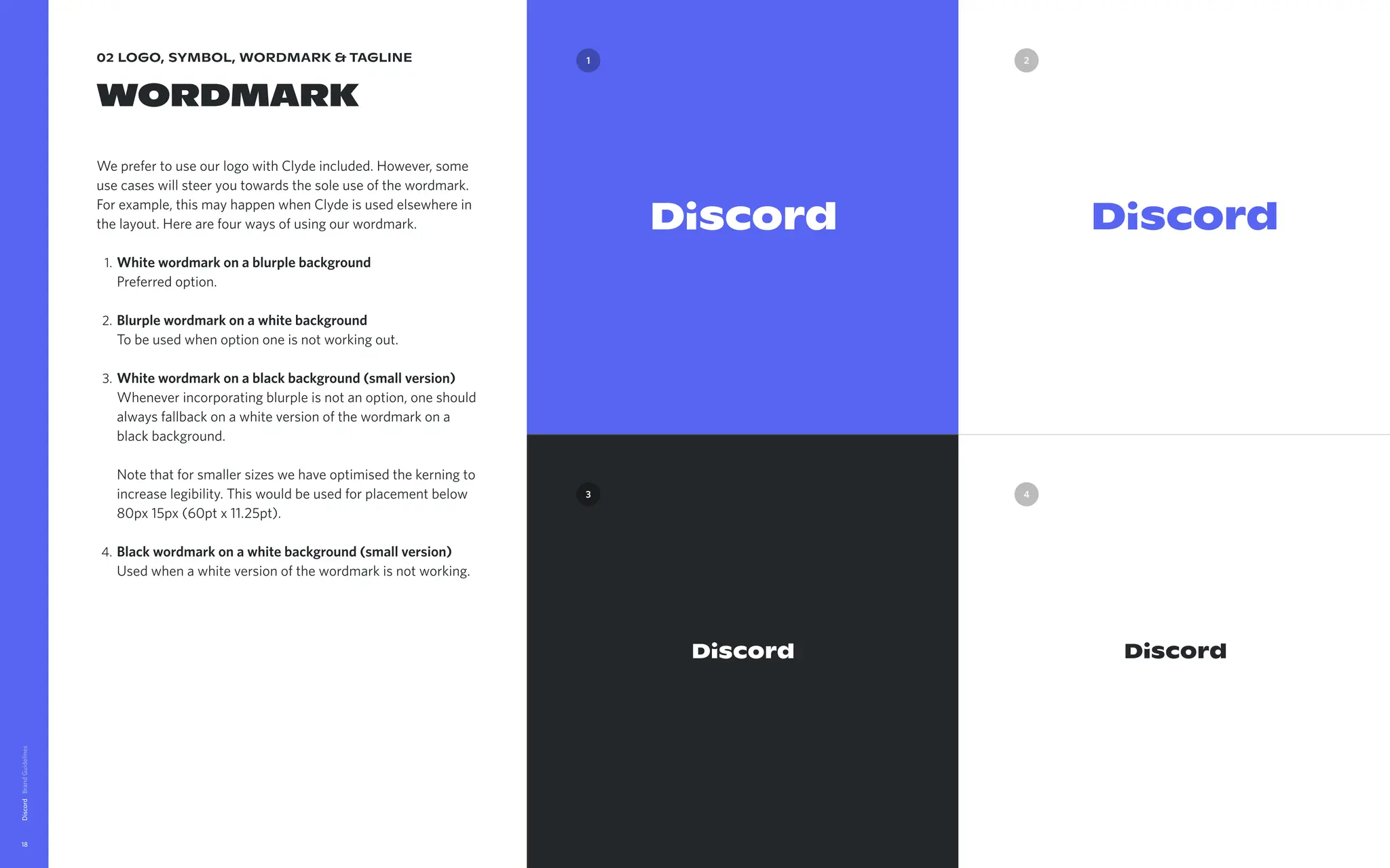
wordmark
We prefer to use our logo with Clyde included. However, some
use cases will steer you towards the sole use of the wordmark.
For example, this may happen when Clyde is used elsewhere in
the layout. Here are four ways of using our wordmark
Whitewordmarkonablurplebackground
Preferred option
Blurplewordmarkonawhitebackground
To be used when option one is not working out
Whitewordmarkonablackbackground(smallversion)
Whenever incorporating blurple is not an option, one should
always fallback on a white version of the wordmark on a
black background.
Note that for smaller sizes we have optimised the kerning to
increase legibility. This would be used for placement below
80px 15px (60pt x 11.25pt)
Blackwordmarkonawhitebackground(smallversion)
Used when a white version of the wordmark is not working.
Discord
18
Downloadwordmarkfiles
3
2
1
4
19.
02 logo, symbol,wordmark & tagline
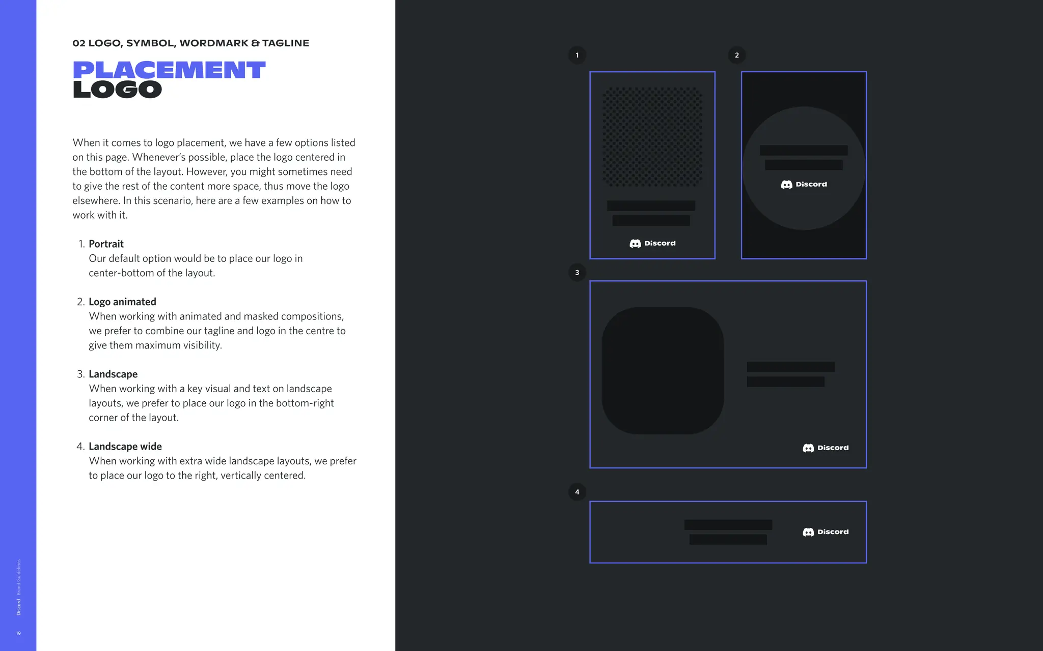
Placement
logo
When it comes to logo placement, we have a few options listed
on this page. Whenever’s possible, place the logo centered in
the bottom of the layout. However, you might sometimes need
to give the rest of the content more space, thus move the logo
elsewhere. In this scenario, here are a few examples on how to
work with it
Portrait
Our default option would be to place our logo in
center-bottom of the layout
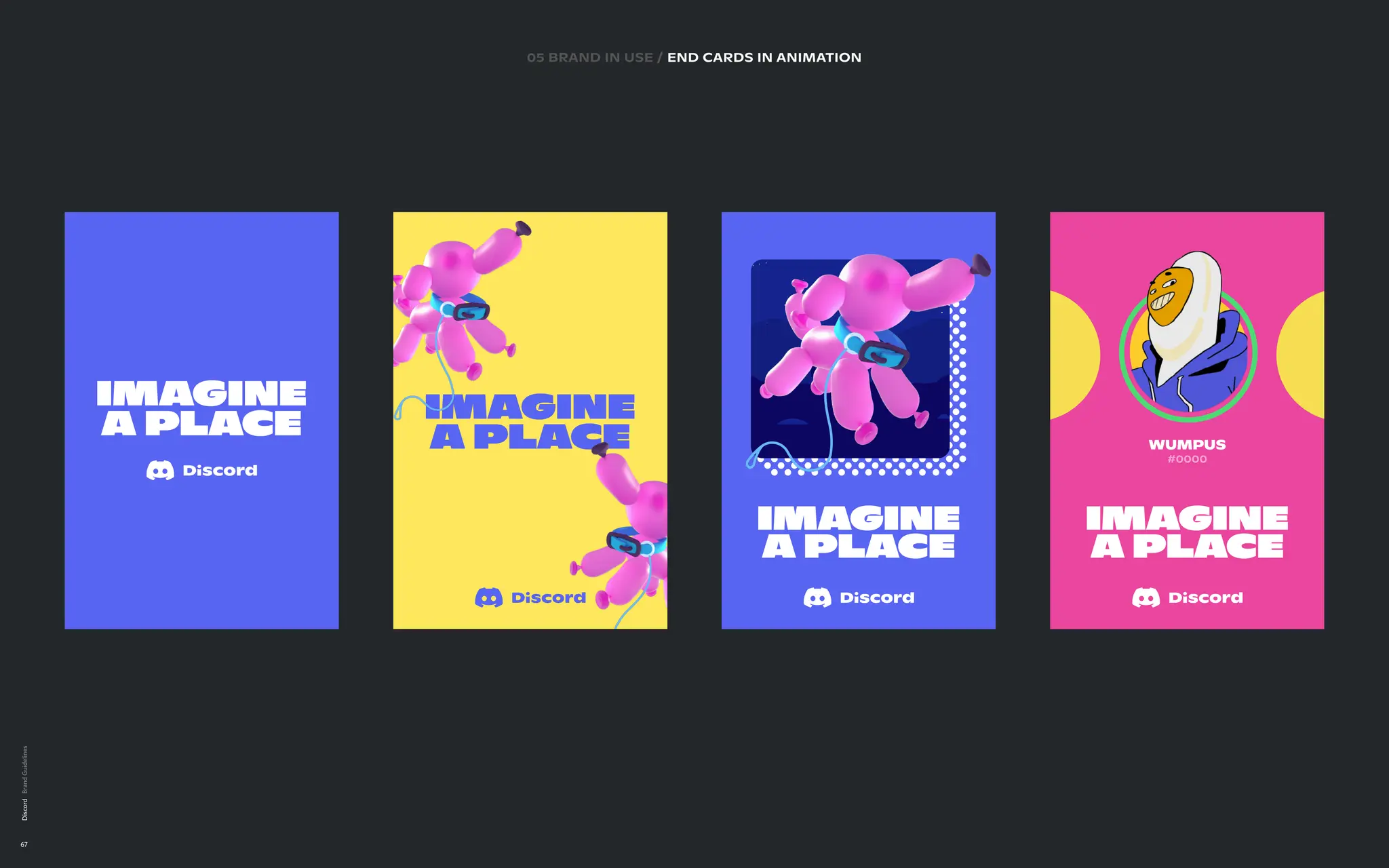
Logoanimated
When working with animated and masked compositions,
we prefer to combine our tagline and logo in the centre to
give them maximum visibility
Landscape
When working with a key visual and text on landscape
layouts, we prefer to place our logo in the bottom-right
corner of the layout
Landscapewide
When working with extra wide landscape layouts, we prefer
to place our logo to the right, vertically centered.
Discord
19
1 2
3
4
20.
02 logo, symbol,wordmark & tagline
Placement
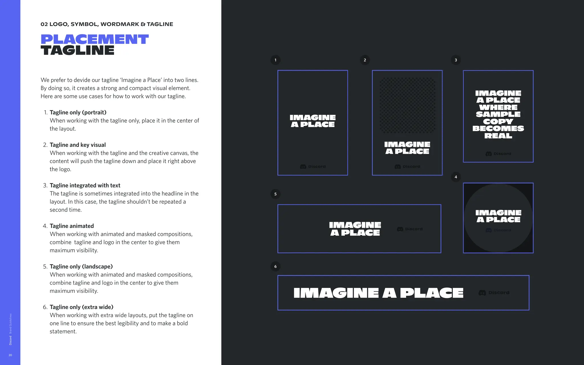
tagline
We prefer to devide our tagline ‘Imagine a Place’ into two lines.
By doing so, it creates a strong and compact visual element.
Here are some use cases for how to work with our tagline.
Taglineonly(portrait)
When working with the tagline only, place it in the center of
the layout
Taglineandkeyvisual
When working with the tagline and the creative canvas, the
content will push the tagline down and place it right above
the logo
Taglineintegratedwithtext
The tagline is sometimes integrated into the headline in the
layout. In this case, the tagline shouldn’t be repeated a
second time
Taglineanimated
When working with animated and masked compositions,
combine tagline and logo in the center to give them
maximum visibility
Taglineonly(landscape)
When working with animated and masked compositions,
combine tagline and logo in the center to give them
maximum visibility
Taglineonly(extrawide)
When working with extra wide layouts, put the tagline on
one line to ensure the best legibility and to make a bold
statement.
Discord
20
Imagine
a Place
Imagine
a Place
1
Imagine
a Place
5
Imagine a Place
6
2
Imagine
a Place
where
sample
copy
becomes
real
3
4
Imagine
a Place
21.
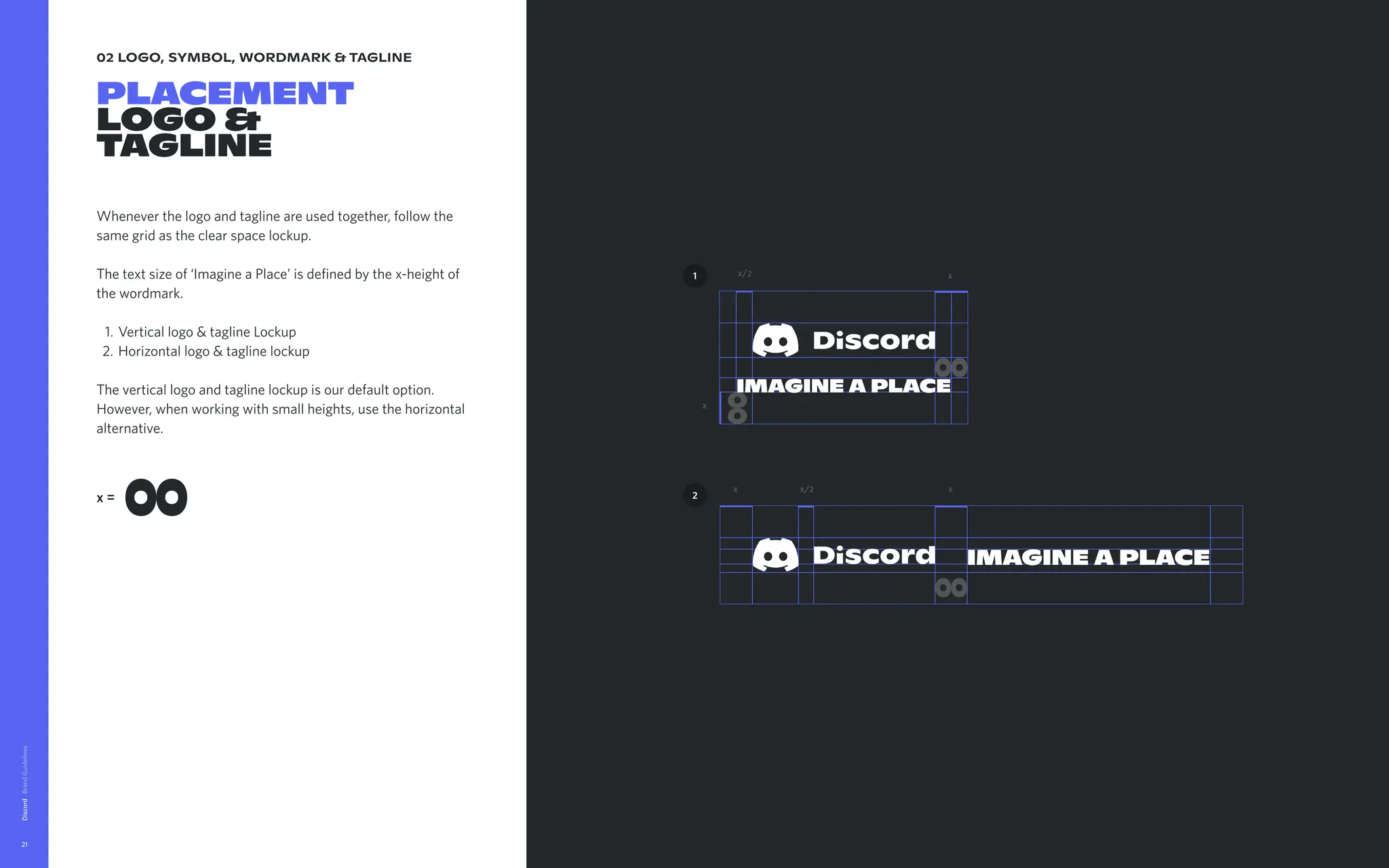
02 logo, symbol,wordmark & tagline
placement
logo &
tagline
Whenever the logo and tagline are used together, follow the
same grid as the clear space lockup.
The text size of ‘Imagine a Place’ is defined by the x-height of
the wordmark
Vertical logo & tagline Locku
Horizontal logo & tagline lockup
The vertical logo and tagline lockup is our default option.
However, when working with small heights, use the horizontal
alternative.
Discord
21
x=
x
x/2
IMAGINE A PLACE
x
2
1
IMAGINE A PLACE
x x
x/2
22.
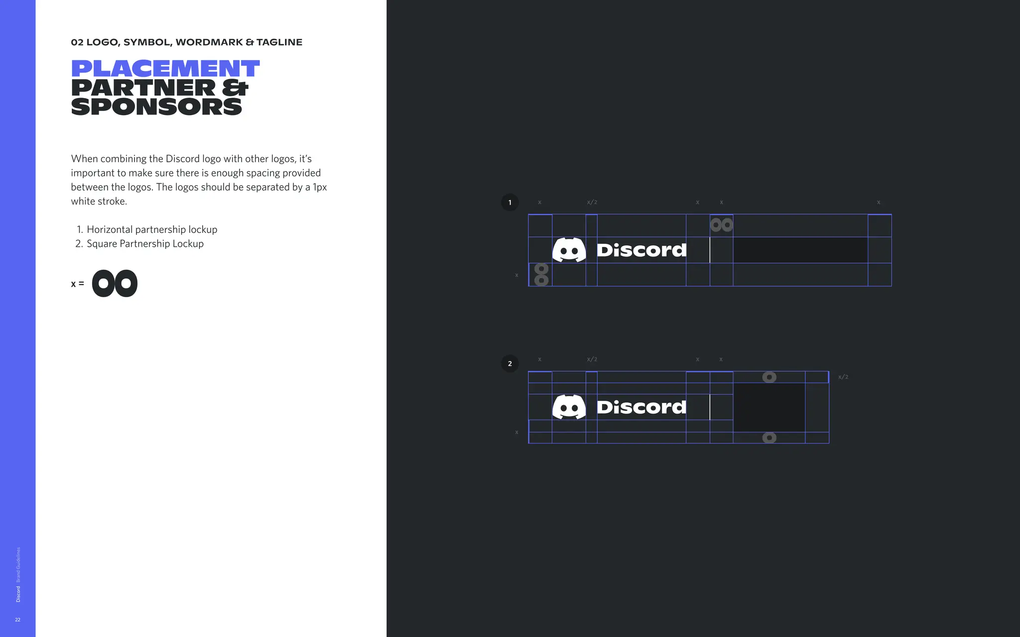
02 logo, symbol,wordmark & tagline
placement
partner &
sponsors
When combining the Discord logo with other logos, it’s
important to make sure there is enough spacing provided
between the logos. The logos should be separated by a 1px
white stroke
Horizontal partnership locku
Square Partnership Lockup
Discord
22
x=
x
x
x
x
x
x
x x
x
x/2
x/2
x/2
2
1
23.
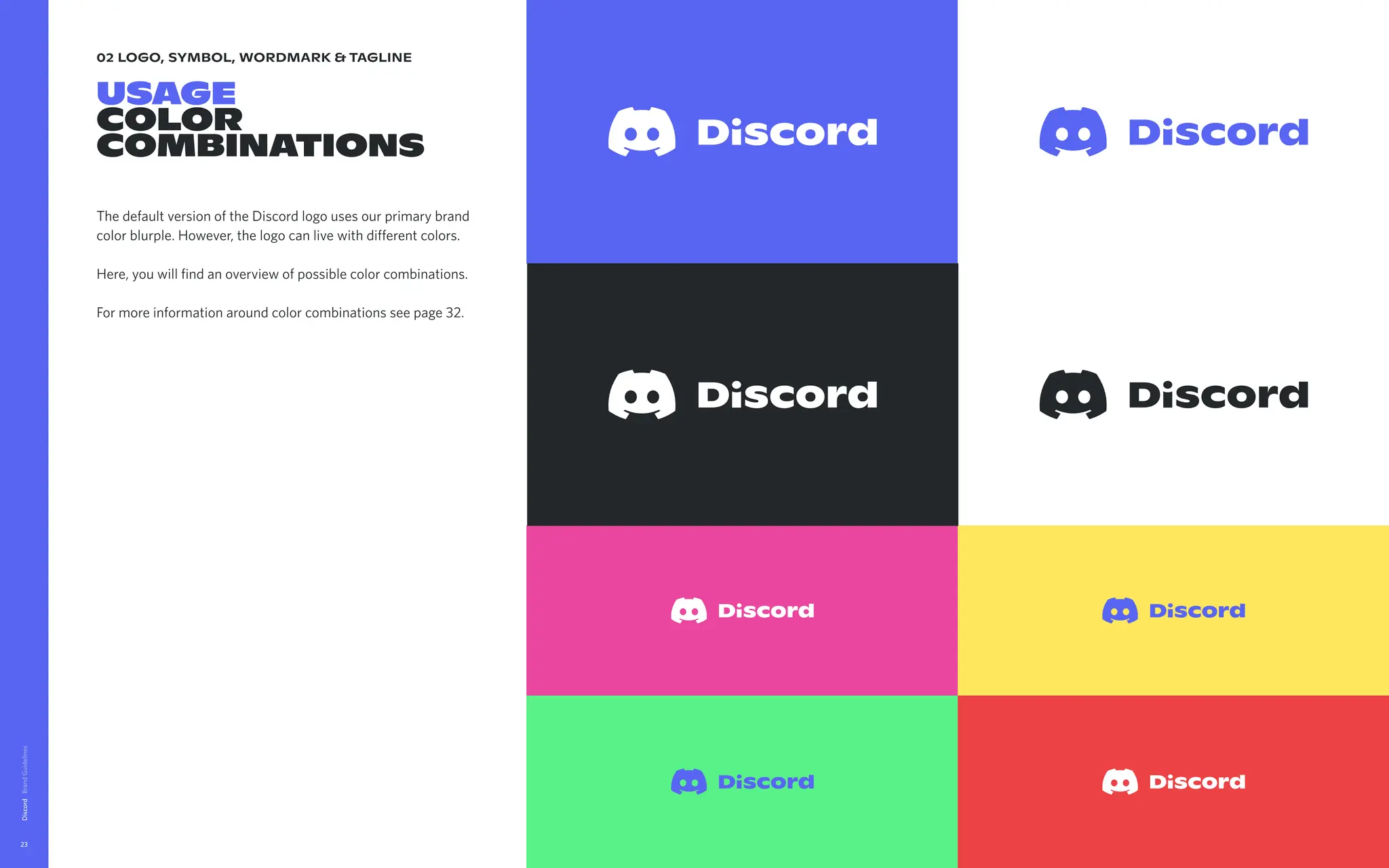
02 logo, symbol,wordmark & tagline
usage
color
combinations
The default version of the Discord logo uses our primary brand
color blurple. However, the logo can live with different colors.
Here, you will find an overview of possible color combinations.
For more information around color combinations see page 32.
Discord
23
24.
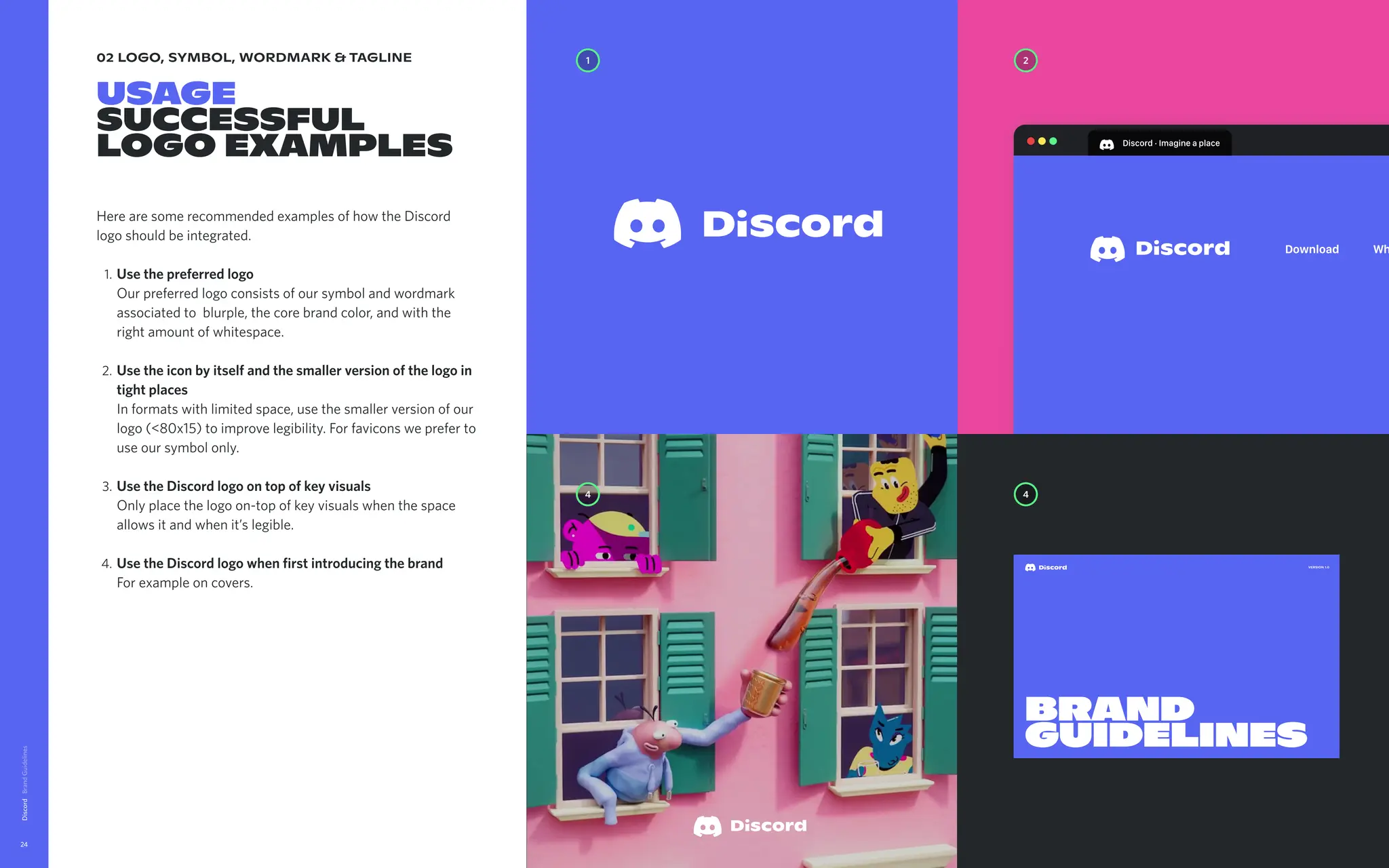
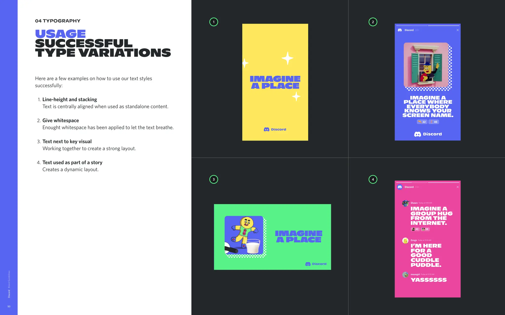
02 logo, symbol,wordmark & tagline
Usage
successful
logo examples
Here are some recommended examples of how the Discord
logo should be integrated
Usethepreferredlogo
Our preferred logo consists of our symbol and wordmark
associated to blurple, the core brand color, and with the
right amount of whitespace
Usetheiconbyitselfandthesmallerversionofthelogoin
tightplaces
In formats with limited space, use the smaller version of our
logo (<80x15) to improve legibility. For favicons we prefer to
use our symbol only
UsetheDiscordlogoontopofkeyvisuals
Only place the logo on-top of key visuals when the space
allows it and when it’s legible
UsetheDiscordlogowhenfirstintroducingthebrand
For example on covers.
Discord
24
Discord·Imagineaplace
Download Wh
1 2
4
4
Version 1.0
Brand
guidelines
25.
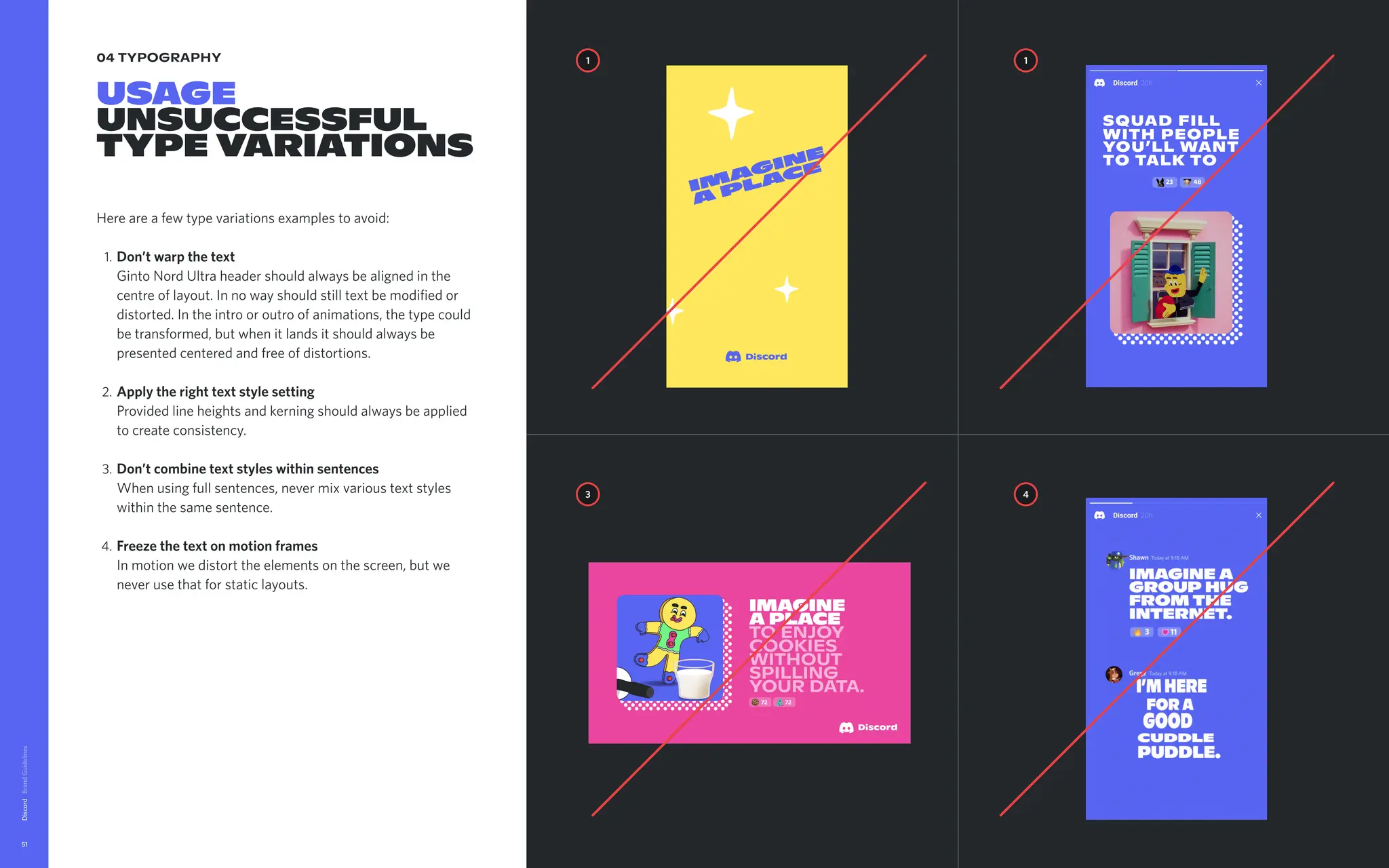
02 logo, symbol,wordmark & tagline
Usage
unsuccessful
logo examples
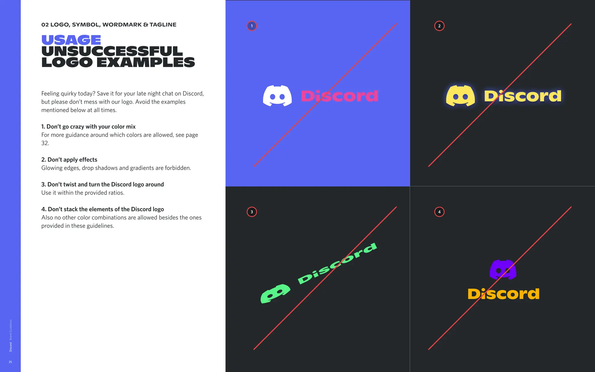
Feeling quirky today? Save it for your late night chat on Discord,
but please don’t mess with our logo. Avoid the examples
mentioned below at all times.
1.Don’tgocrazywithyourcolormix
For more guidance around which colors are allowed, see page
32.
2.Don’tapplyeffects
Glowing edges, drop shadows and gradients are forbidden.
3.Don’ttwistandturntheDiscordlogoaround
Use it within the provided ratios.
4.Don’tstacktheelementsoftheDiscordlogo
Also no other color combinations are allowed besides the ones
provided in these guidelines.
Discord
25
1 2
3 4
03 brand colors
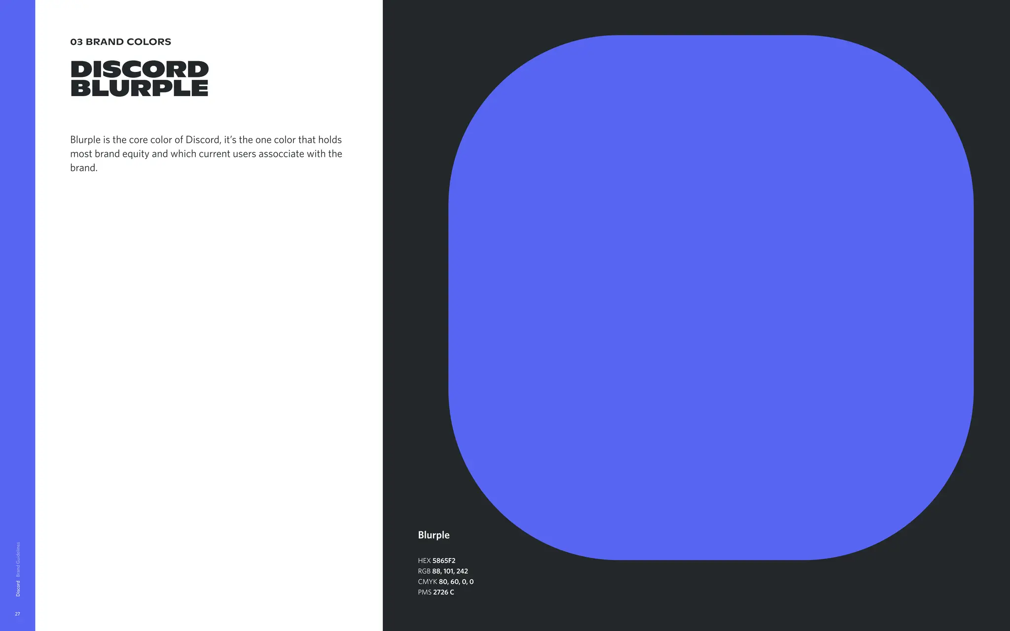
DISCORD
BLURPLE
Blurpleis the core color of Discord, it’s the one color that holds
most brand equity and which current users assocciate with the
brand.
Discord
27
Blurple
HEX 5865F2
RGB 88, 101, 242
CMYK 80, 60, 0, 0
PMS 2726 C
28.
03 brand colors
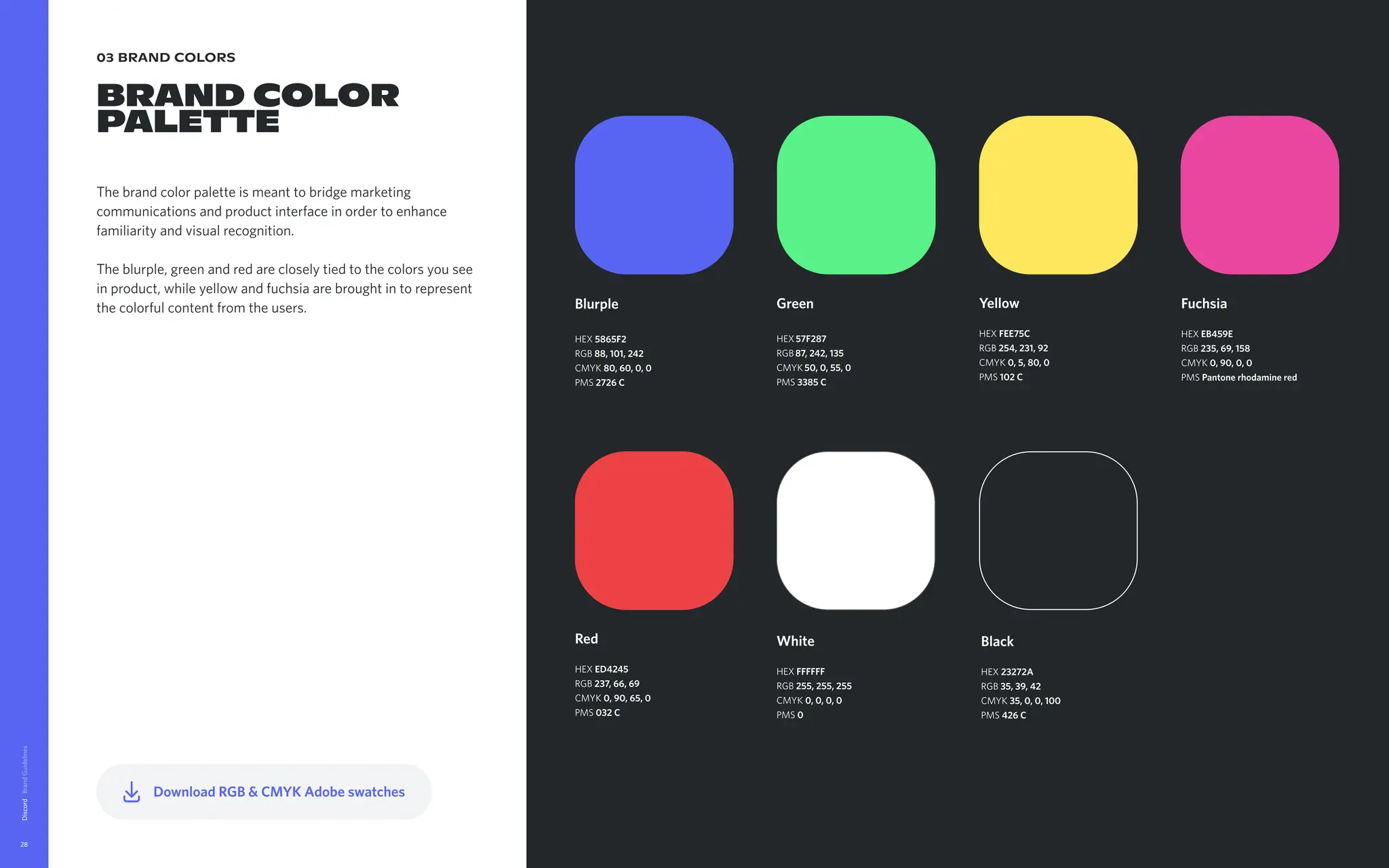
BRANDCOLOR
PALETTE
The brand color palette is meant to bridge marketing
communications and product interface in order to enhance
familiarity and visual recognition.
The blurple, green and red are closely tied to the colors you see
in product, while yellow and fuchsia are brought in to represent
the colorful content from the users.
Discord
28
Black
HEX 23272A
RGB 35, 39, 42
CMYK 35, 0, 0, 100
PMS 426 C
Yellow
HEX FEE75C
RGB 254, 231, 92
CMYK 0, 5, 80, 0
PMS 102 C
Fuchsia
HEX EB459E
RGB 235, 69, 158
CMYK 0, 90, 0, 0
PMS Pantone rhodamine red
White
HEX FFFFFF
RGB 255, 255, 255
CMYK 0, 0, 0, 0
PMS 0
Green
HEX57F287
RGB87, 242, 135
CMYK50, 0, 55, 0
PMS 3385 C
Red
HEX ED4245
RGB 237, 66, 69
CMYK 0, 90, 65, 0
PMS 032 C
Blurple
HEX 5865F2
RGB 88, 101, 242
CMYK 80, 60, 0, 0
PMS 2726 C
Download RGB & CMYK Adobe swatches
04 brand colors
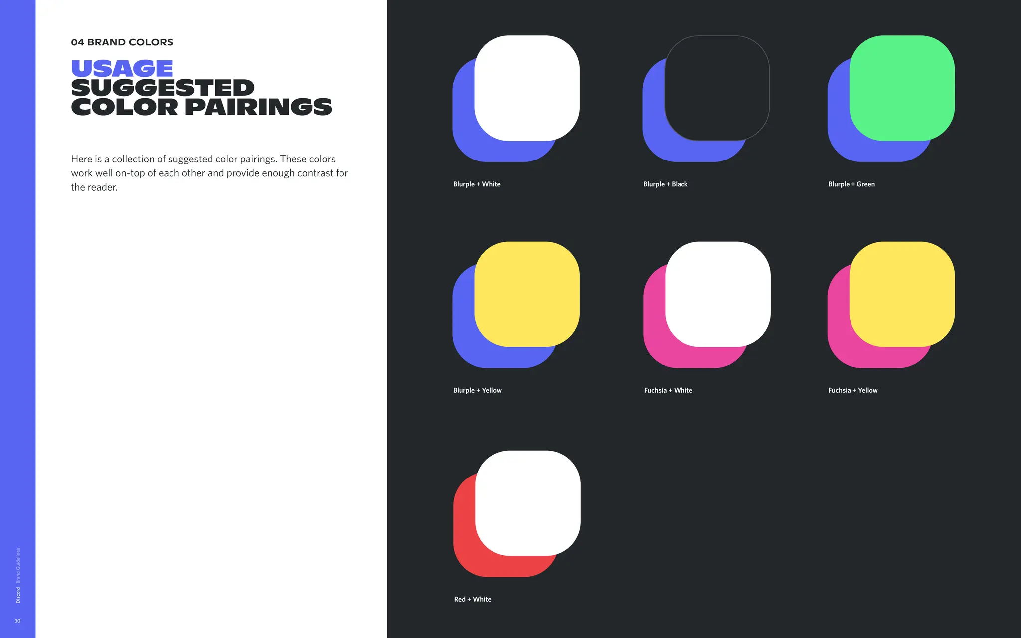
USAGE
Suggested
colorpairings
Here is a collection of suggested color pairings. These colors
work well on-top of each other and provide enough contrast for
the reader.
Discord
30
Fuchsia + Yellow
Red + White
Blurple + White Blurple + Black Blurple + Green
Blurple + Yellow Fuchsia + White
31.
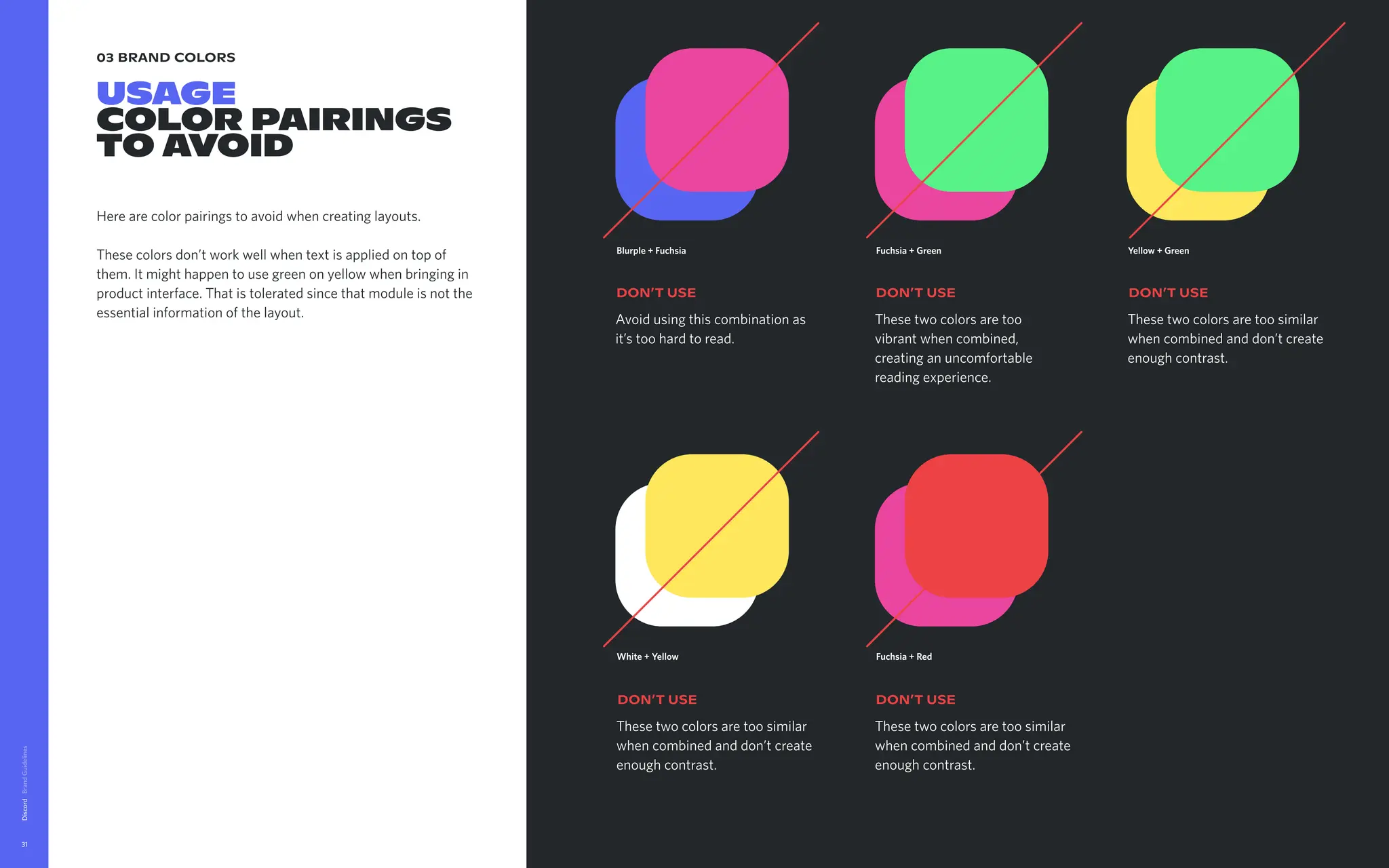
03 brand colors
USAGE
colorpairings
TO AVOID
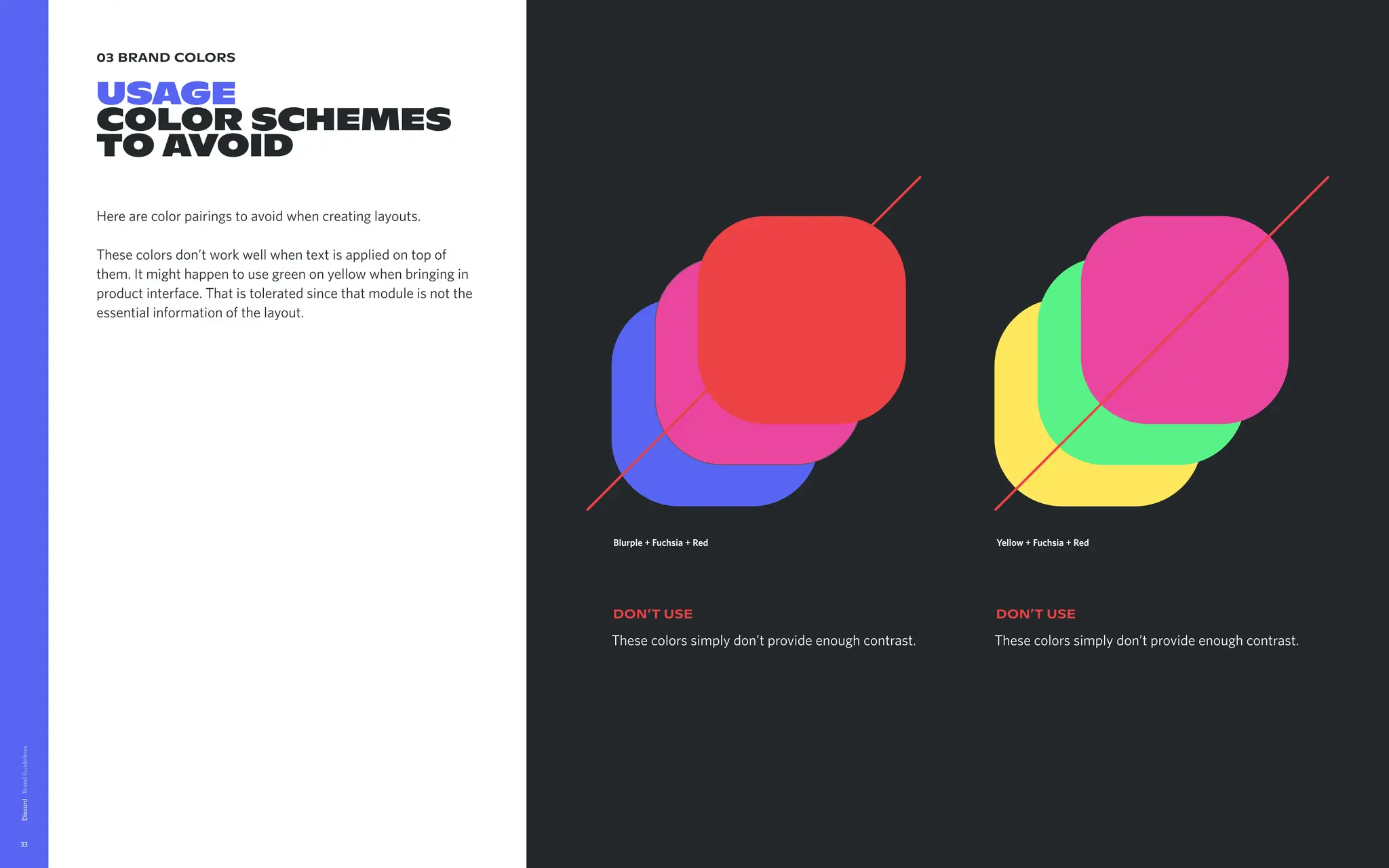
Here are color pairings to avoid when creating layouts.
These colors don’t work well when text is applied on top of
them. It might happen to use green on yellow when bringing in
product interface. That is tolerated since that module is not the
essential information of the layout.
Discord
31
White + Yellow
These two colors are too similar
when combined and don’t create
enough contrast.
DON’t USE
Fuchsia + Red
These two colors are too similar
when combined and don’t create
enough contrast.
DON’t USE
Blurple + Fuchsia
Avoid using this combination as
it’s too hard to read.
DON’t USE
Fuchsia + Green
These two colors are too
vibrant when combined,
creating an uncomfortable
reading experience.
DON’t USE
Yellow + Green
These two colors are too similar
when combined and don’t create
enough contrast.
DON’t USE
32.
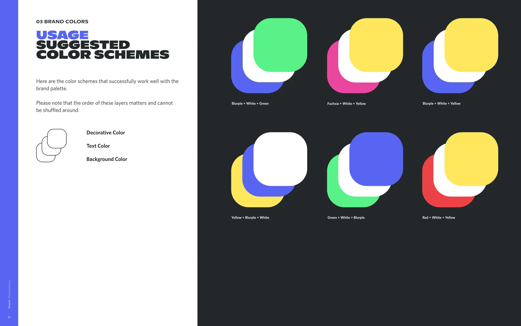
03 brand colors
USAGE
Suggested
colorSCHEMES
Here are the color schemes that successfully work well with the
brand palette.
Please note that the order of these layers matters and cannot
be shuffled around.
Discord
32
Blurple + White + Green Blurple + White + Yellow
Green + White + Blurple
Background Color
Text Color
Decorative Color
Yellow + Blurple + White Red + White + Yellow
Fuchsia + White + Yellow
33.
03 brand colors
USAGE
colorSchemes
TO AVOID
Here are color pairings to avoid when creating layouts.
These colors don’t work well when text is applied on top of
them. It might happen to use green on yellow when bringing in
product interface. That is tolerated since that module is not the
essential information of the layout.
Discord
33
These colors simply don’t provide enough contrast.
DON’t USE
Blurple + Fuchsia + Red
These colors simply don’t provide enough contrast.
DON’t USE
Yellow + Fuchsia + Red
34.
03 brand colors
USAGE
Howto pick a
color scheme
To pick the right color scheme can be a tricky task with all the
color options you might have. Here are a few rules that will
create a harmonious layout
For illustrations using many colors, here blurple, fuchsia
and green.
Do not use the same color for both the background of the
illustration and the background of the layout. Here, blurple
is out.
Keep an eye on the illustration elements breaking the frame
and overlapping the layout. Here, the balloon dog is in
fuchsia, so fuchsia can not be used as the layout
background.
If an illustration element if far from the edge, here the green
cactus, it doesn’t affect the color choice.
That leaves us with either yellow or green for the
background
For illustrations with one dominant color, here fuchsia.
In this illustration, fuchsia is clearly the main color used. Do
not use fuschia as the background colour of your layout, as
it will blend in with the illustration
For illustrations with many colors, here yellow, green and
blurple
In this illustration it’s best to use a color that gives enough
contrast with the background. Here, fuchsia or green would
be an option.
Discord
34
Yellow + White + Blurple
1
2
3
imagine a
place where
friendship is
nota request.
itjust sorta
happens.
81 14
→
→
→
Blurple + White + Yellow
Fuchsia + White + Yellow
imagine a
place to
enjoy cookies
without
spilling your
data.
72 72
35.
03 brand colors
USAGE
USERINTERFACE
COLORS
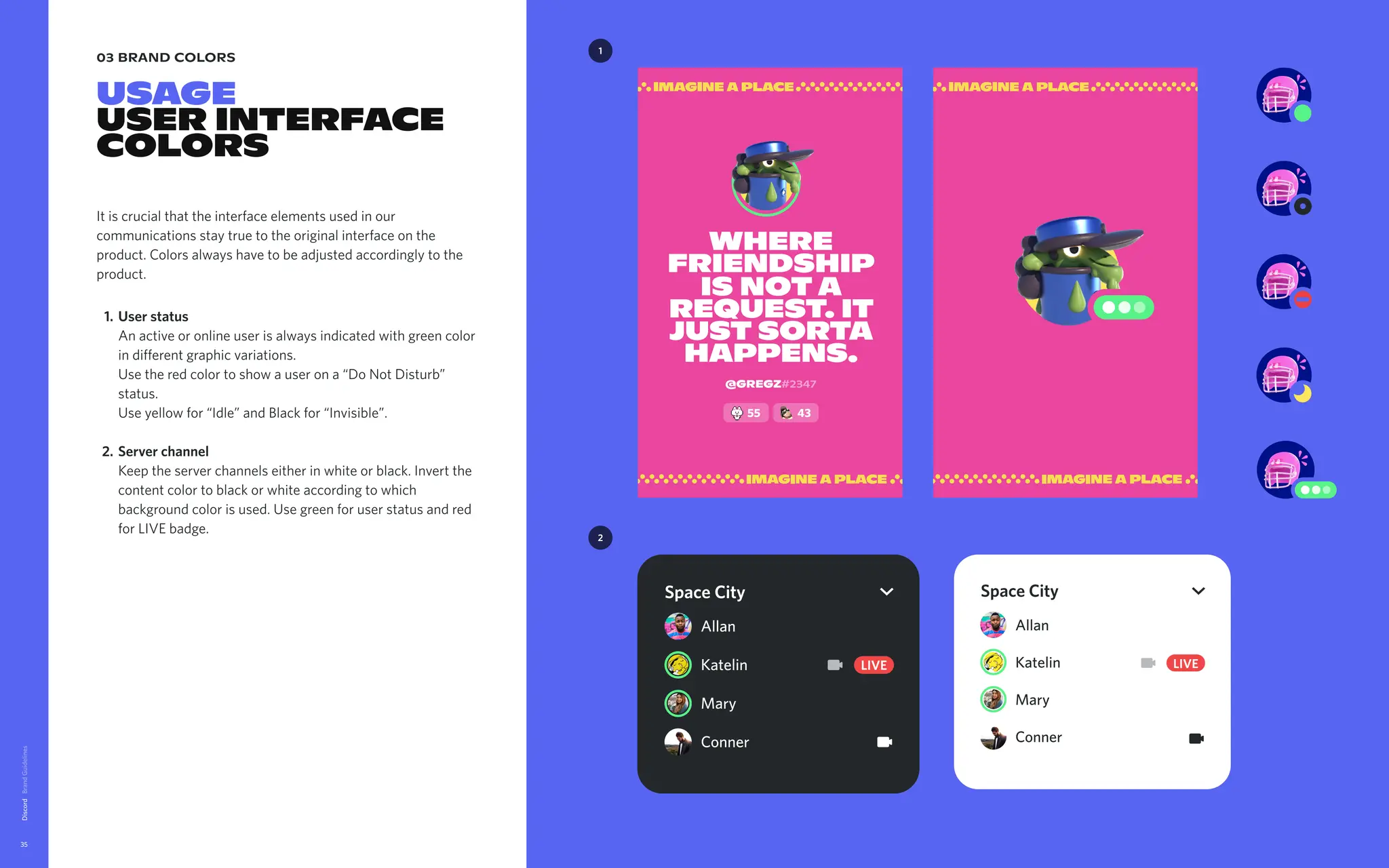
It is crucial that the interface elements used in our
communications stay true to the original interface on the
product. Colors always have to be adjusted accordingly to the
product
User status
An active or online user is always indicated with green color
in different graphic variations.
Use the red color to show a user on a “Do Not Disturb”
status.
Use yellow for “Idle” and Black for “Invisible”
Server channel
Keep the server channels either in white or black. Invert the
content color to black or white according to which
background color is used. Use green for user status and red
for LIVE badge.
Discord
35
1
Allan
Katelin
Mary
Conner
LIVE
Space City
Allan
Katelin
Mary
Conner
LIVE
Space City
2
where
friendship
is nota
request. It
just sorta
happens.
@Gregz#2347
55 43
36.
03 brand colors
USAGE
USERINTERFACE
COLORS
CONTinued
Discord
36
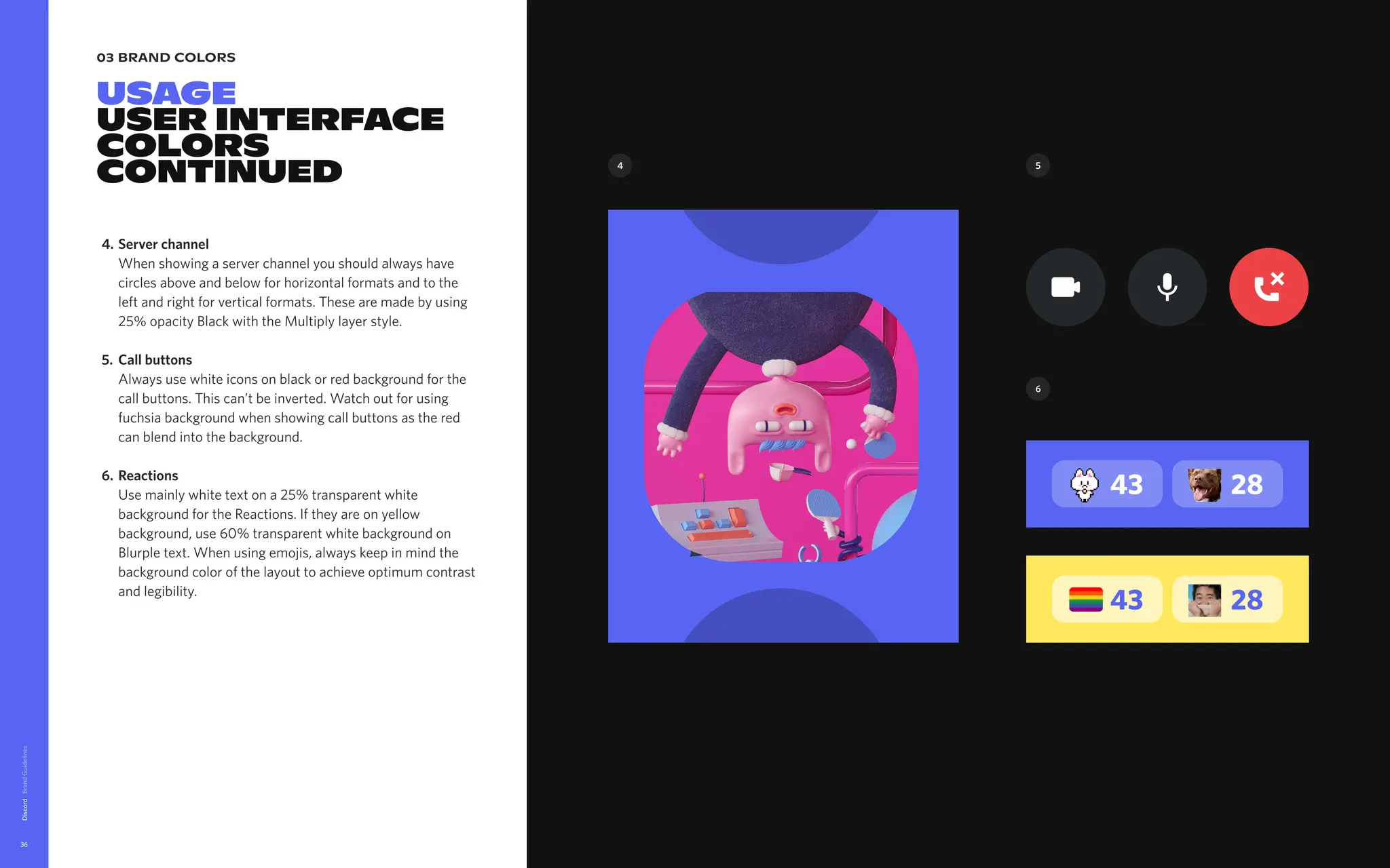
Server channel
When showing a server channel you should always have
circles above and below for horizontal formats and to the
left and right for vertical formats. These are made by using
25% opacity Black with the Multiply layer style
Call buttons
Always use white icons on black or red background for the
call buttons. This can’t be inverted. Watch out for using
fuchsia background when showing call buttons as the red
can blend into the background
Reactions
Use mainly white text on a 25% transparent white
background for the Reactions. If they are on yellow
background, use 60% transparent white background on
Blurple text. When using emojis, always keep in mind the
background color of the layout to achieve optimum contrast
and legibility.
4.
5.
6.
43 28
43 28
4 5
6
37.
03 brand colors
USAGE
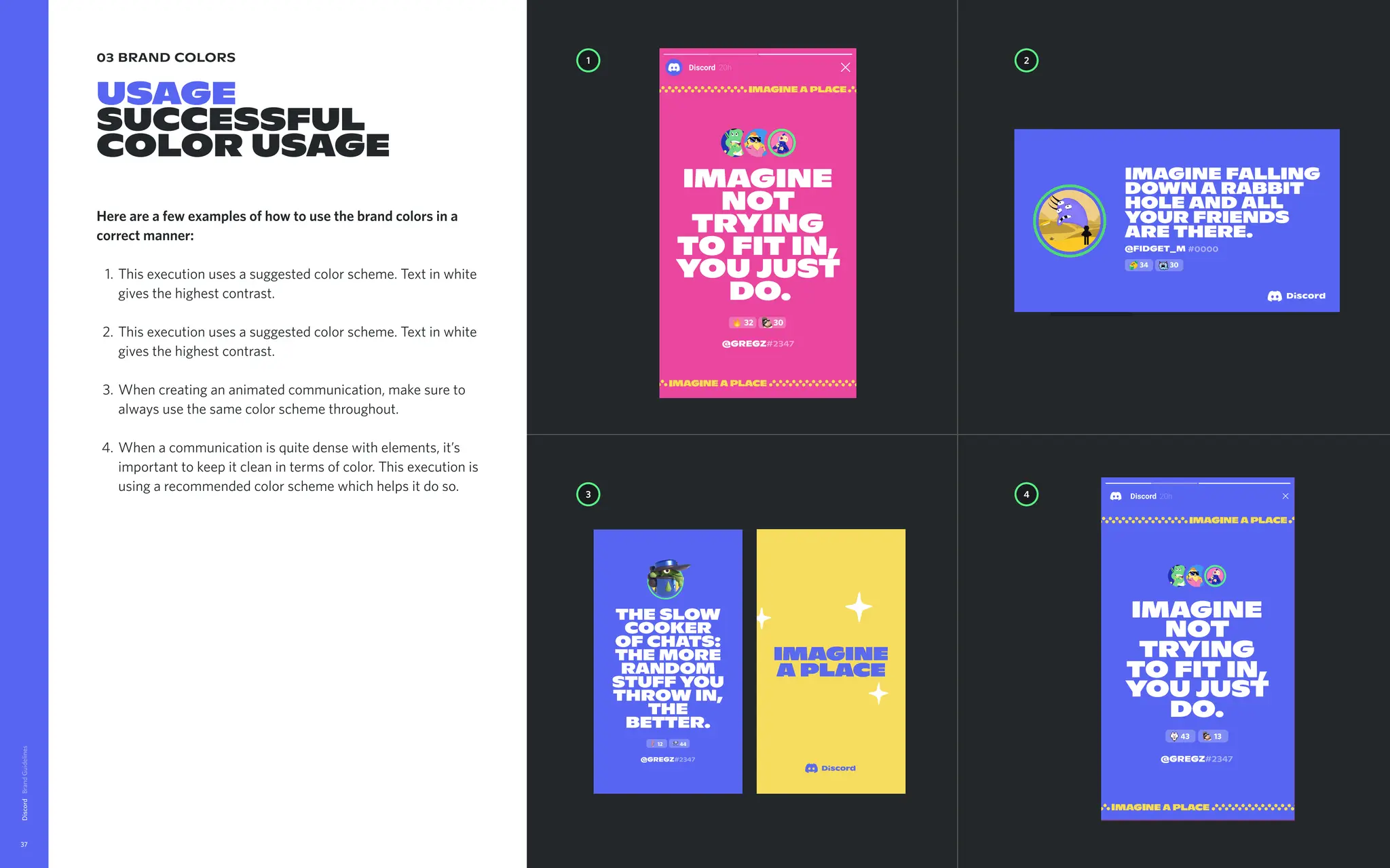
SUCCESSFUL
Colorusage
Here are a few examples of how to use the brand colors in a
correct manner
This execution uses a suggested color scheme. Text in white
gives the highest contrast
This execution uses a suggested color scheme. Text in white
gives the highest contrast
When creating an animated communication, make sure to
always use the same color scheme throughout
When a communication is quite dense with elements, it’s
important to keep it clean in terms of color. This execution is
using a recommended color scheme which helps it do so.
Discord
37
1 2
4
3
Imagine
not
trying
to fit in,
you just
do.
43 13
@Gregz#2347
@Gregz#2347
32 30
The slow
cooker
of chats:
the more
random
stuff you
throw in,
the
better.
12 44
@Gregz#2347
43 23
Imaginea
placewhere
friendshipis
notarequest.
Itjustsorta
happens.
imagine falling
down a rabbit
hole and all
your friends
are there.
#0000
@FIDGET_M
34 30
38.
03 brand colors
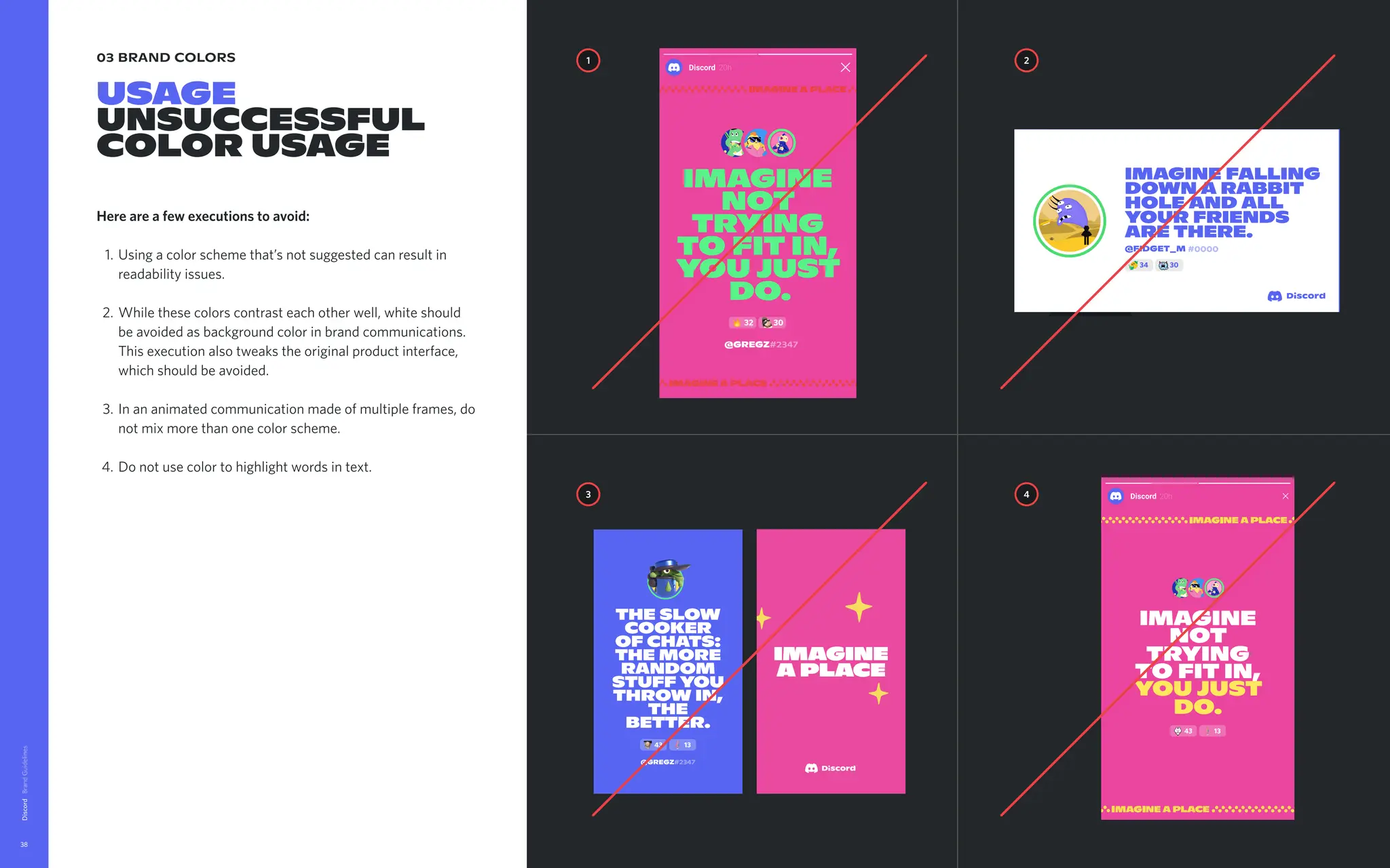
USAGE
UNSUCCESSFUL
colorusage
Here are a few executions to avoid
Using a color scheme that’s not suggested can result in
readability issues.
While these colors contrast each other well, white should
be avoided as background color in brand communications.
This execution also tweaks the original product interface,
which should be avoided
In an animated communication made of multiple frames, do
not mix more than one color scheme
Do not use color to highlight words in text.
Discord
38
@Gregz#2347
32 30
The slow
cooker
of chats:
the more
random
stuff you
throw in,
the
better.
43 13
@Gregz#2347
1 2
4
3
Imagine
not
trying
to fit in,
you just
do.
43 13
43 23
Imaginea
placewhere
friendshipis
notarequest.
Itjustsorta
happens.
FPO
43 23
Imaginea
placewhere
friendshipis
notarequest.
Itjustsorta
happens.
imagine falling
down a rabbit
hole and all
your friends
are there.
#0000
@FIDGET_M
34 30
39.
03 brand colors
USAGE
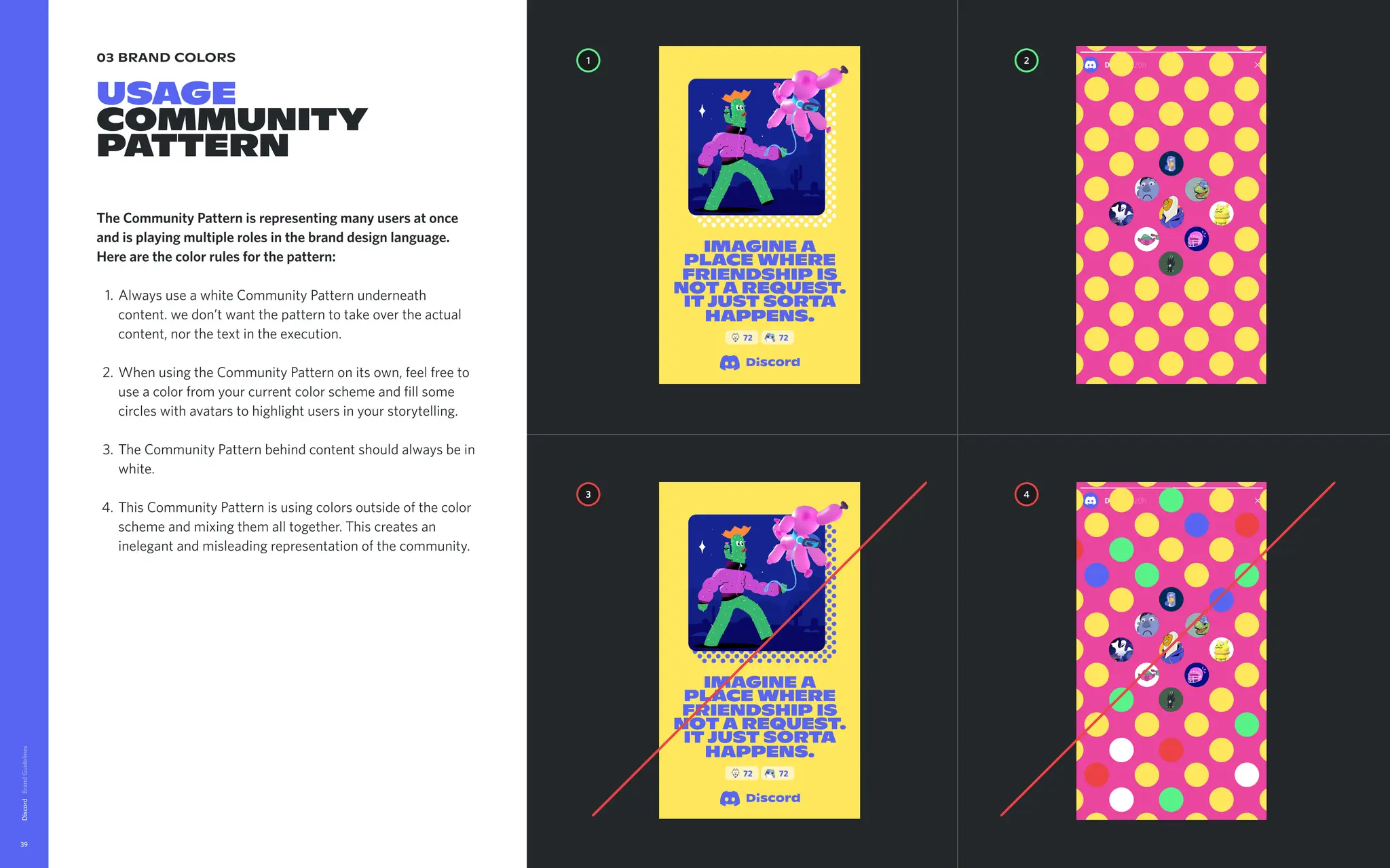
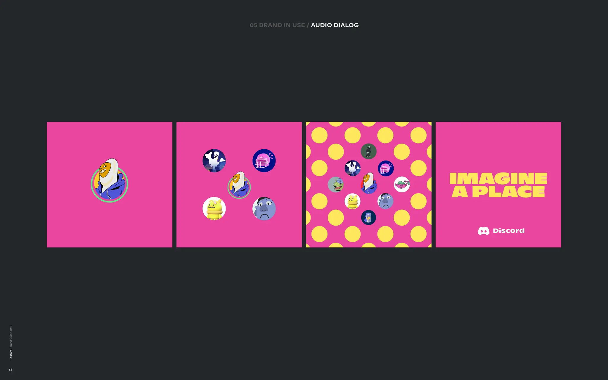
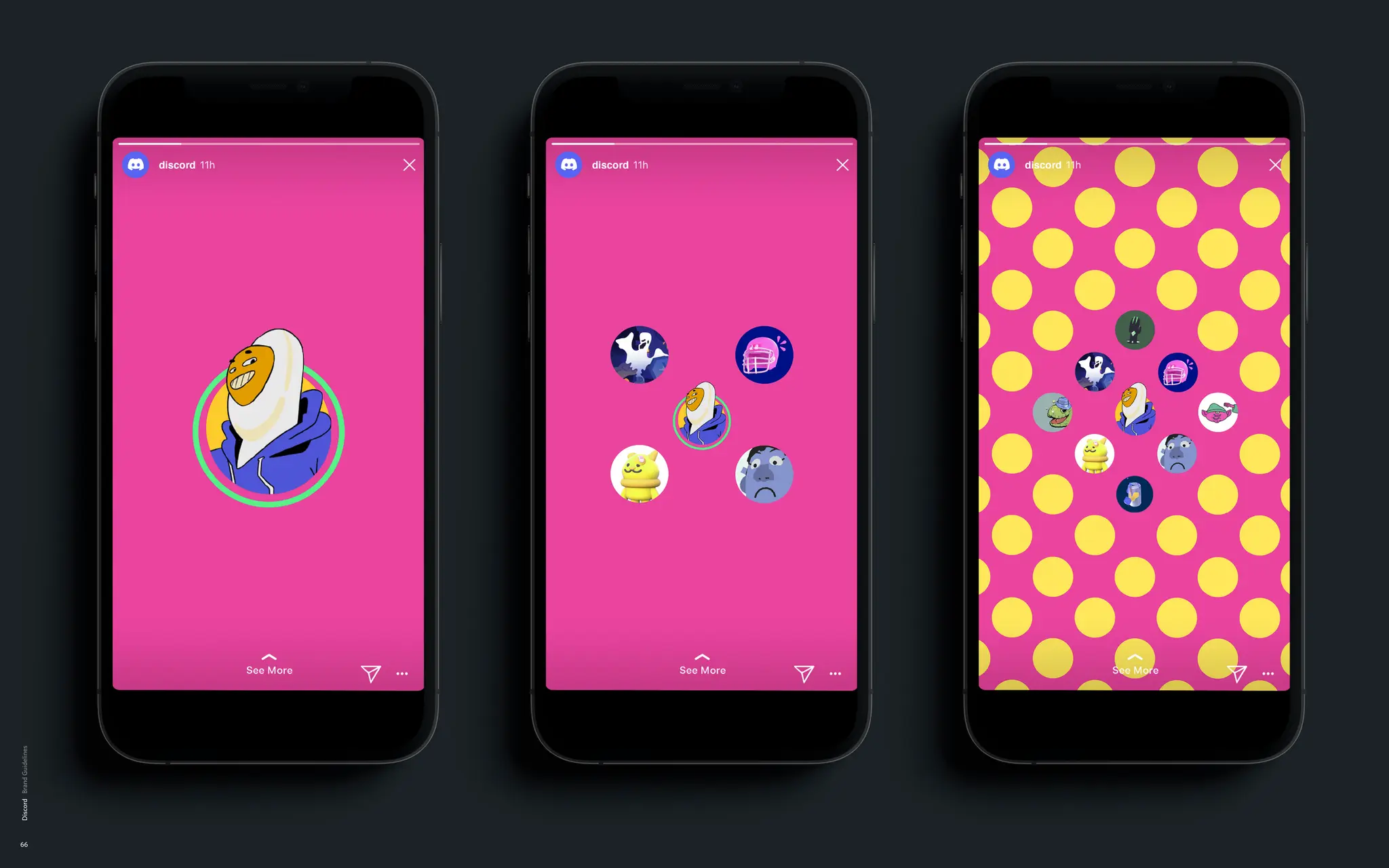
Community
pattern
TheCommunity Pattern is representing many users at once
and is playing multiple roles in the brand design language.
Here are the color rules for the pattern
Always use a white Community Pattern underneath
content. we don’t want the pattern to take over the actual
content, nor the text in the execution
When using the Community Pattern on its own, feel free to
use a color from your current color scheme and fill some
circles with avatars to highlight users in your storytelling
The Community Pattern behind content should always be in
white
This Community Pattern is using colors outside of the color
scheme and mixing them all together. This creates an
inelegant and misleading representation of the community.
Discord
39
imagine a
place where
friendship is
nota request.
itjust sorta
happens.
72 72
1 2
4
3
imagine a
place where
friendship is
nota request.
itjust sorta
happens.
72 72
Discord
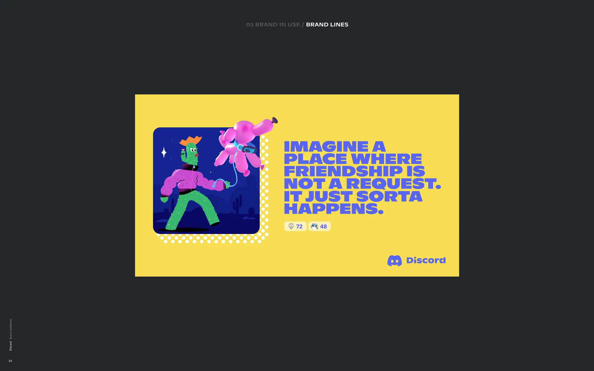
64
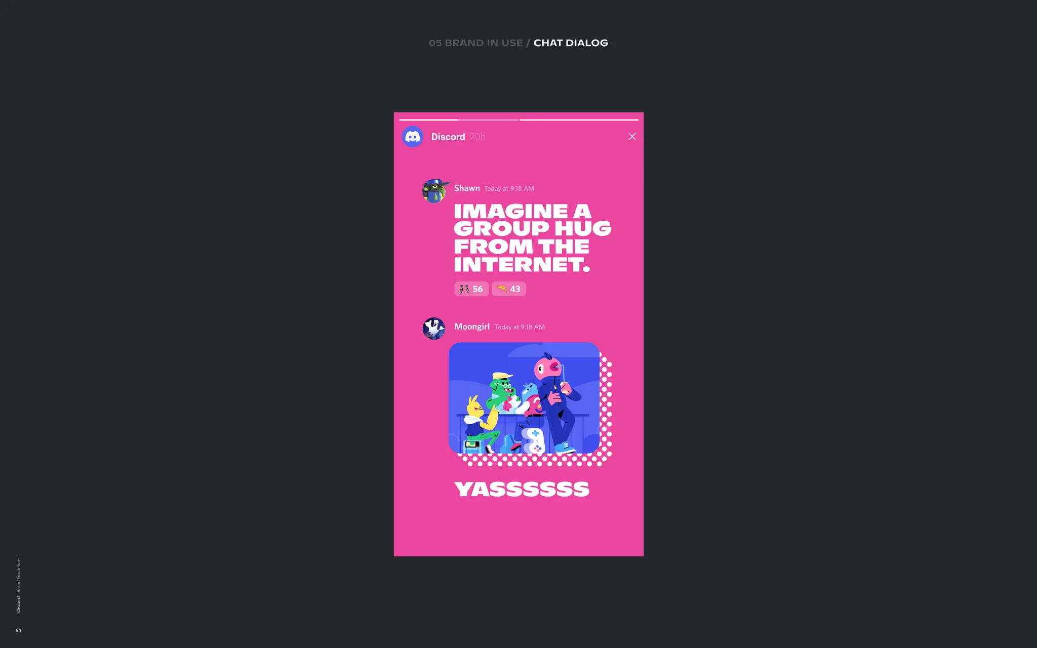
10 BRAND INUSE
CHAT DIALOG
EXECUTIONS
Lorem ipsum
05 brand in use / chat DIALOG
Shawn T
oday at 9:18 AM
Imagine a
group hug
from the
internet
.
56 43
Moongirl T
oday at 9:18 AM
y
assssss


![Number_Guessing_Game_Dsbsbssbzboc[1].pptx](https://cdn.slidesharecdn.com/ss_thumbnails/numberguessinggamedoc1-251206215042-a076fc05-thumbnail.jpg?width=640&height=640&fit=bounds)


