Download to read offline

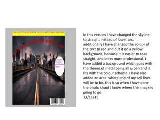
The document summarizes changes made to a front cover design. The skyline was changed from a lower arc to straight lines to look more professional. The text color was changed to red on a yellow background for better readability. A metal-themed urban background was added to fit the color scheme. An area was designated for a sell line from an upcoming photo shoot to know where the image will be placed.


