Design Principles
Task 5.1
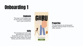
Onboarding 1
Proportion
The illustrations are all grouped
together, being similar in size and
color scheme.
Emphasis
The logo is the largest text
on the screen, drawing the
user's eye to that first.
Unity
The background color was
derived from one of the
illustration pieces. I did this to
keep the colors within the same
family, but still create contrast.
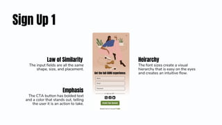
Sign Up 1
Heirarchy
The font sizes create a visual
hierarchy that is easy on the eyes
and creates an intuitive flow.
Emphasis
The CTA button has bolded text
and a color that stands out, telling
the user it is an action to take.
Law of Similarity
The input fields are all the same
shape, size, and placement.
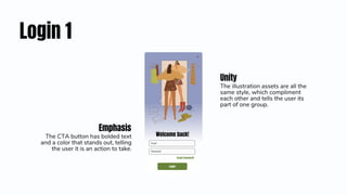
Login 1
Unity
The illustration assets are all the
same style, which compliment
each other and tells the user its
part of one group.
Emphasis
The CTA button has bolded text
and a color that stands out, telling
the user it is an action to take.

Design-Principles.pdf

  • 1.
  • 2.
    Onboarding 1 Proportion The illustrationsare all grouped together, being similar in size and color scheme. Emphasis The logo is the largest text on the screen, drawing the user's eye to that first. Unity The background color was derived from one of the illustration pieces. I did this to keep the colors within the same family, but still create contrast.
  • 3.
    Sign Up 1 Heirarchy Thefont sizes create a visual hierarchy that is easy on the eyes and creates an intuitive flow. Emphasis The CTA button has bolded text and a color that stands out, telling the user it is an action to take. Law of Similarity The input fields are all the same shape, size, and placement.
  • 4.
    Login 1 Unity The illustrationassets are all the same style, which compliment each other and tells the user its part of one group. Emphasis The CTA button has bolded text and a color that stands out, telling the user it is an action to take.