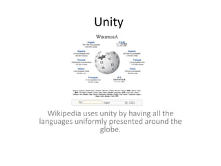
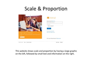
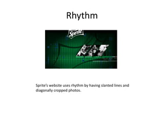
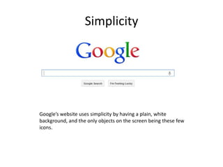
This document discusses principles of design including unity, variety, balance, scale and proportion, rhythm, emphasis, and simplicity. It provides examples of how Wikipedia, Facebook, Sprite, and Google utilize these principles on their websites through things like uniform global presentation, use of color and fonts, splitting content left and right, large graphics with small text, slanted lines and diagonal photos, emphasizing words, and plain backgrounds with few icons.