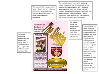
The newsletter has a low production value and uses recognizable Microsoft Word fonts, suggesting it was not expensive to produce. The main color is pink, meant to portray care for students, accompanied by a deeper pink that stands out for readability. Gold is used for "150th Anniversary!" to celebrate and signify importance and status for the school. The crest and globe logo imply the school is well-established and respected worldwide, originally run by nuns to enhance its religious aspect.


![College 2[1]](https://cdn.slidesharecdn.com/ss_thumbnails/college21-130219075037-phpapp01-thumbnail.jpg?width=640&height=640&fit=bounds)


