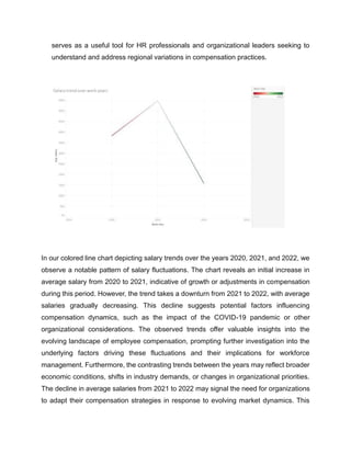
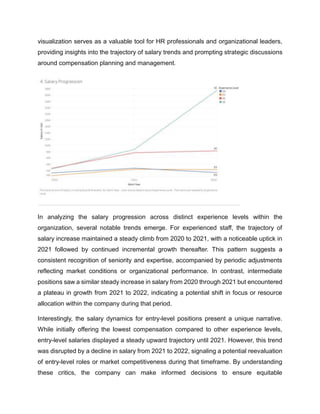
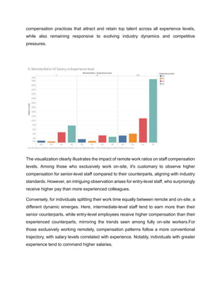
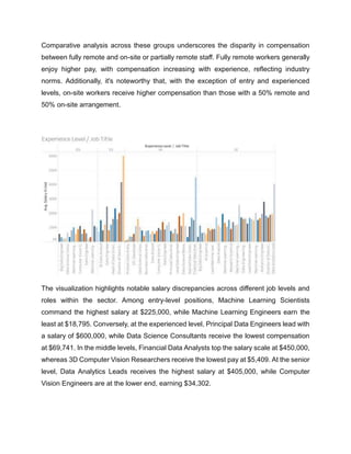
This project report explores employee salaries across various job roles, focusing on salary conversions to USD, the impact of remote work on compensation, and the relationship between employee size and salaries. The analysis aims to provide insights into the importance of job roles in different industries, particularly for those aspiring to succeed as ML Engineers, Data Scientists, or Data Analysts. The dataset offers a wealth of information for detailed analysis and uncovering key trends.
Data Visualization Report For Business Analytics.docx
1. Report By: Sadia Ahmed, Brian Moenga, Lasyasri Pilly
With Special Thanks To: Prof. Eyyub Kibis for providing valuable feedback, education and support.
Unveiling Work Dynamics: A Visual Journey Through Employment
Trends
3. Background:
In our exploration of the modern work landscape, Kaggle proved an invaluable resource,
offering a diverse array of datasets ripe for analysis. With a keen eye on variables like
experience levels, salary fluctuations, and remote work prevalence, we delved deep into
the nuances of employment dynamics.
Harnessing the visual power of data, we crafted compelling narratives that unveil the
intricate patterns shaping today's professional sphere. Our journey not only sheds light
on current trends but also ignites curiosity about the future of work.
Using data visualization, we aimed to reveal insights into modern employment trends. Our
journey showcases the power of data to tell compelling stories and guide our
understanding of the future of work.
Objectives:
Identify Trends: Look for patterns in the data to see what’s happening with things like
job experiences, salaries, and remote work.
Connect the Dots: See if there are any connections between distinct parts of the data,
like job titles and how much people get paid, to understand how they affect each other.
Show What We Found: Use pictures and graphs to make it easy for people to see the
important stuff you find in the data.
Learn about Remote Work: Figure out how many people are working remotely and how
it’s changing things for different types of jobs and places.
Check Out Salaries: See if salaries are going up or down and if there is a difference
based on things like where people work and how much experience they have.
Look at Companies: See if there are differences in how big companies are compared to
small ones, where they are located and what they do.
Give Useful Advice: Share what we find in a way that helps people make better decisions
about work, whether they are individuals, companies, or policymakers.
4. Synopsis:
Our project takes a deep dive into the ever-changing world of work, using data
visualization to understand its complexities. By studying a big dataset that includes vital
details like how long people have been working, what jobs they have, how much they
earn, and whether they work remotely, we can find interesting trends and patterns in
today’s professional world.
Using cool pictures and number-crunching, we are looking at how distinct parts of work
are connected. From whom gets paid how common remote work is in various places and
industries. We are shining a light on what’s happening in the job market. Our project paints
a full picture of how work is changing over time, offering helpful insights for people,
companies and decision-makers trying to navigate the twists and turns of the modern
workforce.
5. Introduction:
In the complex web of organizational dynamics, one thread stands out as a vital
determinant of workforce motivation, retention, and overall productivity: employee
salaries. The remuneration structure not only reflects an organization's commitment to
fair compensation but also serves as a barometer of its competitive stance in the labor
market. Understanding the intricacies of employee salaries across various job roles is
paramount for organizations striving to attract, retain and motivate top talent.
This report delves into the multifaceted landscape of employee compensation, offering a
comprehensive analysis of salary structures across different job roles. By exploring the
intricate interplay of factors influencing compensation decisions, this study aims to
provide valuable insights for HR practitioners, organizational leaders, and policymakers
alike.
We are looking into how salaries aren’t the same for everyone. They can vary a lot
depending on the job, the industry, where you work and even the company itself. Whether
you’re starting out or you are a top boss, your pay reflects what you do and how much it’s
worth to the company. That’s why managing salaries well is so important.
Employee salaries are influenced by many factors like how many people want a certain
skill, how well a company is doing financially, and what rules and expectations there are
in society. Understanding how all these things interact is important for deciding how much
to pay people.
Contemporary trends like remote work and the gig economy are making it even more
complicated. Companies are rethinking how they decide salaries, moving towards using
data and being more flexible in how they reward employees.
This report endeavors to shed light on the following key areas:
1. Occupational Income Distribution and Experience Levels: What are the salary
distributions across various occupations and levels of experience? This includes
6. exploring how salaries differ not only between professions but also within them,
considering the varying levels of experience that individuals bring to their roles.
2. Compensation Disparities Across Employment Types: How does pay differ
among full-time, part-time, and contractual roles? This inquiry looks to uncover the
differences in compensation structures and benefits between different types of
employment arrangements, and how they impact overall earning potential and job
security.
3. Salary Progression Across Career Stages: How does salary advancement vary
for entry-level, mid-career, and experienced professionals across different fields?
This involves tracking the trajectory of salary progression throughout an
individual's career, from starting out in the workforce to reaching senior positions
and understanding the factors influencing these salary milestones.
4. Geographic Influence on Pay: Is there a relationship between geographical
location, workplace, and salary levels? By analyzing regional disparities in pay, we
aim to determine whether factors such as cost of living, local economies, and
industry concentrations influence compensation levels across different locations.
5. Impact of Remote Work on Compensation: How does remote work affect overall
salary levels? With the rise of remote work arrangements, it's crucial to examine
how telecommuting impacts salary structures, including whether remote positions
offer comparable pay to traditional in-office roles and how remote work influences
cost-of-living adjustments.
6. Company Size and Employee Compensation: Is there a correlation between a
company's size and the salaries it offers to its employees? This investigation looks
to understand how company size, whether small, medium, or large, influences
compensation practices, including differences in salary scales, benefits packages,
and opportunities for advancement.
7. Data Set:
The dataset used for this report comprises comprehensive information on employee
salaries and related factors across diverse occupations, industries, and geographic
regions. It encompasses a wide range of variables essential for analyzing compensation
dynamics and workforce trends.
Key components of the dataset include:
Occupational Information: Descriptions of various job roles, including job titles, job
descriptions, and occupational classifications.
Salary Data: Salary information for different occupations, reflecting annual wages
in the different job titles with the corresponding level of experience.
Experience Levels: Data on the experience levels of individuals within each
occupation, ranging from entry-level to seasoned professionals, to examine how
experience influences salary progression.
Employment Types: Classification of employment types such as full-time, part-
time, contractual, temporary, and freelance positions, enabling analysis of
compensation disparities across different employment arrangements.
Geographic Data: Information on the geographic location of employment which
includes the company location and the location of the employees.
Company Characteristics: Details about the size, industry, and organizational
structure of employers, allowing for investigation into the relationship between
company attributes and employee compensation.
By using this dataset, the report aims to provide insights into the intricate dynamics of
employee compensation, shedding light on salary distributions, disparities, and trends
across various dimensions of the labor market.
8. Analysis:
Our analysis begins by examining the distribution of salaries across different job titles,
experience levels, and company sizes. Through visual representations like histograms
and box plots, we aim to understand how salaries vary within the workforce. Additionally,
we investigate the prevalence of remote work across various job roles and industries,
using pie charts or bar graphs to compare remote work ratios. This helps us identify trends
in remote work adoption and its impact on different segments of the workforce.
Next, we delve into geographical patterns by mapping company locations and analyzing
salary disparities based on location. By visualizing these data points, we can uncover any
regional differences in salary levels and remote work prevalence. Furthermore, we
explore correlations between salary, experience level, and company size using scatter
plots or correlation matrices. This allows us to identify any relationships between these
variables and gain insights into factors influencing compensation decisions. Through our
data analysis, we aim to offer valuable insights into the dynamics of the modern
workforce, informing strategic decision-making for organizations and policymakers alike.
Visualizations:
9. In our tree map visualization highlighting average salaries by job title, each rectangular
tile represents a specific job title within the organization. The size of each tile corresponds
to the average salary associated with that role, allowing viewers to quickly grasp salary
differentials across various positions. The legend going with the treemap provides a clear
range of average salary values, from $45,000 to $6,000,000, facilitating easy
interpretation of the salary scale. Remarkably, the tree map highlights the Head of
Machine Learning as the top-paid position, commanding an impressive average salary of
$600,000. This underscores the significant value placed on expertise in machine learning
within the organization. Following closely behind is the Machine Learning Engineer role,
with an average salary of $2,676,667, indicating substantial compensation for specialized
technical skills. Other notable positions include Big Data Analyst, Lead Data Scientist,
and Data Science Manager, all boasting average salaries well above the organization's
median. Our treemap visualization offers a visually striking representation of salary
differentials across key job titles within the organization. This visualization serves as a
powerful tool for HR professionals and organizational leaders seeking to understand and
benchmark compensation practices within the organization.
10. In our visualization we present a bar chart showcasing the average salary across four
employment types: Contract (CT), Freelance (FL), Full-time (FT), and Part-time (PT).
Each employment type is represented by a distinct color scheme, facilitating easy
comparison between categories. Notably, the bar corresponding to Full-time
employment demonstrates the highest average salary, followed by Contract, Part-
time, and Freelance in descending order. This clear delineation allows viewers to
quickly discern the salary hierarchy across different employment arrangements. The
color-coded bars not only enhance visual appeal but also serve a functional purpose
by aiding in the interpretation of the data. Viewers can easily identify each employment
type and compare their respective average salaries briefly. Additionally, the use of
vibrant colors adds an element of visual interest to the chart, capturing the viewer's
attention and encouraging engagement with the data presented. Furthermore, the
visualization provides valuable insights into the salary distribution within the workforce,
highlighting the disparities in average earnings across different employment types.
The prominence of Full-time employment in terms of average salary underscores its
significance as a preferred choice for individuals seeking higher remuneration.
Conversely, the comparatively lower average salaries associated with Contract, Part-
time, and Freelance employment may reflect variations in job security, benefits, and
work arrangements inherent to these categories. Overall, our bar chart offers a
concise yet informative snapshot of the average salary landscape across various
employment types, providing viewers with valuable insights into the dynamics of
compensation within the modern workforce.
11. This pie chart illustrates average salary across three categories of company sizes:
Large (L), Medium (M), and Small (S). Each bar represents the average salary within
a specific company size category, with the height of the bar indicating the average
salary level. The graph reveals notable differences in average salary levels across
company sizes, providing insights into how company size may influence
compensation practices. Interestingly, the bar corresponding to Large-sized
companies (L) exhibits the highest average salary, suggesting that employees within
larger organizations tend to receive higher compensation compared to their
counterparts in smaller companies. Conversely, the pie chart representing Medium-
sized (M), and Small-sized (S) companies display progressively lower average salary
levels, indicating a downward trend in average salaries as company size decreases.
Overall, our pie chart chart offers a clear and intuitive visualization of the relationship
between company size and average salary levels. It highlights the importance of
considering organizational factors, such as company size, when analyzing
compensation trends within the workforce. This graph provides valuable insights for
L, 23610113,
35%
M, 38111182,
56%
S, 6443512,
9%
Total
L
M
S
12. HR professionals, organizational leaders, and policymakers seeking to understand
and optimize compensation practices based on company size dynamics.
Our scatterplot visually represents the relationship between employee residence and
salary in USD, with each data point denoting an individual employee. The x-axis
represents the employee residence, indicating where each employee lives, while the
y-axis denotes the corresponding salary in USD. The scatterplot effectively illustrates
the dispersion of salaries across different employee residences, offering insights into
geographical variations in compensation levels. Notably, the scatterplot reveals
clusters of data points representing employees residing in specific geographical
locations, with varying salary ranges. This suggests that salary levels may be
influenced by factors such as regional cost of living, local economies, and industry
concentrations. Additionally, outliers within the scatterplot may highlight individuals
earning significantly higher or lower salaries compared to the average for their
respective locations. Our scatterplot provides a visual snapshot of the relationship
between employee residence and salary levels, offering valuable insights into
geographical disparities in compensation within the organization. This visualization
13. serves as a useful tool for HR professionals and organizational leaders seeking to
understand and address regional variations in compensation practices.
In our colored line chart depicting salary trends over the years 2020, 2021, and 2022, we
observe a notable pattern of salary fluctuations. The chart reveals an initial increase in
average salary from 2020 to 2021, indicative of growth or adjustments in compensation
during this period. However, the trend takes a downturn from 2021 to 2022, with average
salaries gradually decreasing. This decline suggests potential factors influencing
compensation dynamics, such as the impact of the COVID-19 pandemic or other
organizational considerations. The observed trends offer valuable insights into the
evolving landscape of employee compensation, prompting further investigation into the
underlying factors driving these fluctuations and their implications for workforce
management. Furthermore, the contrasting trends between the years may reflect broader
economic conditions, shifts in industry demands, or changes in organizational priorities.
The decline in average salaries from 2021 to 2022 may signal the need for organizations
to adapt their compensation strategies in response to evolving market dynamics. This
14. visualization serves as a valuable tool for HR professionals and organizational leaders,
providing insights into the trajectory of salary trends and prompting strategic discussions
around compensation planning and management.
In analyzing the salary progression across distinct experience levels within the
organization, several notable trends emerge. For experienced staff, the trajectory of
salary increase maintained a steady climb from 2020 to 2021, with a noticeable uptick in
2021 followed by continued incremental growth thereafter. This pattern suggests a
consistent recognition of seniority and expertise, accompanied by periodic adjustments
reflecting market conditions or organizational performance. In contrast, intermediate
positions saw a similar steady increase in salary from 2020 through 2021 but encountered
a plateau in growth from 2021 to 2022, indicating a potential shift in focus or resource
allocation within the company during that period.
Interestingly, the salary dynamics for entry-level positions present a unique narrative.
While initially offering the lowest compensation compared to other experience levels,
entry-level salaries displayed a steady upward trajectory until 2021. However, this trend
was disrupted by a decline in salary from 2021 to 2022, signaling a potential reevaluation
of entry-level roles or market competitiveness during that timeframe. By understanding
these critics, the company can make informed decisions to ensure equitable
15. compensation practices that attract and retain top talent across all experience levels,
while also remaining responsive to evolving industry dynamics and competitive
pressures.
The visualization clearly illustrates the impact of remote work ratios on staff compensation
levels. Among those who exclusively work on-site, it's customary to observe higher
compensation for senior-level staff compared to their counterparts, aligning with industry
standards. However, an intriguing observation arises for entry-level staff, who surprisingly
receive higher pay than more experienced colleagues.
Conversely, for individuals splitting their work time equally between remote and on-site, a
different dynamic emerges. Here, intermediate-level staff tend to earn more than their
senior counterparts, while entry-level employees receive higher compensation than their
experienced counterparts, mirroring the trends seen among fully on-site workers.For
those exclusively working remotely, compensation patterns follow a more conventional
trajectory, with salary levels correlated with experience. Notably, individuals with greater
experience tend to command higher salaries.
16. Comparative analysis across these groups underscores the disparity in compensation
between fully remote and on-site or partially remote staff. Fully remote workers generally
enjoy higher pay, with compensation increasing with experience, reflecting industry
norms. Additionally, it's noteworthy that, with the exception of entry and experienced
levels, on-site workers receive higher compensation than those with a 50% remote and
50% on-site arrangement.
The visualization highlights notable salary discrepancies across different job levels and
roles within the sector. Among entry-level positions, Machine Learning Scientists
command the highest salary at $225,000, while Machine Learning Engineers earn the
least at $18,795. Conversely, at the experienced level, Principal Data Engineers lead with
a salary of $600,000, while Data Science Consultants receive the lowest compensation
at $69,741. In the middle levels, Financial Data Analysts top the salary scale at $450,000,
whereas 3D Computer Vision Researchers receive the lowest pay at $5,409. At the senior
level, Data Analytics Leads receives the highest salary at $405,000, while Computer
Vision Engineers are at the lower end, earning $34,302.
17. An intriguing observation arises regarding the compensation of 3D Computer Vision
Researchers in the intermediate level, who receive lower pay than entry-level staff,
indicating a significant anomaly. This disparity warrants further investigation to verify its
accuracy and ensure consistency within the dataset, as such a deviation from the norm
is uncommon and could potentially be attributed to an outlier value.
The visualization reveals a clear pattern in salary discrepancies among companies across
different regions. Notably, companies in the United States emerge as the highest payers,
followed closely by those in Great Britain, with Canadian firms offering competitive but
comparatively lower salaries. However, at the opposite end of the spectrum, companies
based in Ireland and Vietnam exhibit the lowest compensation levels, mirroring each other
at the same tier. This disparity underscores the influence of regional economic factors
and cost-of-living variations on salary structures. While the United States maintains its
position as a leader in remuneration due to its robust economy, other countries such as
Great Britain and Canada offer relatively attractive compensation packages. Conversely,
companies in Ireland and Vietnam face challenges in providing competitive salaries, likely
due to differing economic conditions and market dynamics. This analysis underscores the
18. importance for organizations to tailor their compensation strategies according to regional
contexts to remain competitive in attracting and retaining top talent globally.
Job Title 2020 2021 2022 Gain
%
Gain
Data Analyst 7 17 73 66 90%
Data Engineer 11 32 89 78 88%
Data Scientist 21 45 77 56 73%
Machine Learning
Engineer 5 18 18 13 72%
Among the four notable job titles with the largest workforce, it appears that the role of
data analyst has experienced significant prominence growth over the years. In 2022,
there was a remarkable 90% increase in the number of staff holding this position
compared to 2020. Following closely behind, data engineers experienced an 88%
increase in prominence, trailed by data scientists and machine learning engineers at 73%
and 72% respectively.
0
10
20
30
40
50
60
70
80
90
100
1 2 3
Occupation Popularity
Data Analyst Data Engineer
Data Scientist Machine Learning Engineer
19. Conclusion:
In wrapping up our data visualization project, we've uncovered some fascinating insights
into how people work and get paid. By looking at factors like work experience, job titles,
and where people live, we've seen how salaries can vary a lot. We've also spotted
trends over time, like how salaries went up from 2020 to 2021 but then dipped in 2022.
Our project highlights the importance of understanding these trends for companies. For
example, knowing which jobs pay more or how remote work impacts salaries can help
companies make better decisions about hiring and keeping their employees happy.
Ultimately, this project shows the power of using data to paint a clearer picture of how
we work and how companies can make smarter choices for their teams.
Source:
Project Name : Employee Salaries Analysis for Different Job Roles
Dataset : Link to the dataset on Kaggle
Source: https://www.kaggle.com/datasets/inductiveanks/employee-salaries-for-
different-job-roles
Data collected: 2020,2021,2022.