Download free for 30 days
Sign in
Upload
Language (EN)
Support
Business
Mobile
Social Media
Marketing
Technology
Art & Photos
Career
Design
Education
Presentations & Public Speaking
Government & Nonprofit
Healthcare
Internet
Law
Leadership & Management
Automotive
Engineering
Software
Recruiting & HR
Retail
Sales
Services
Science
Small Business & Entrepreneurship
Food
Environment
Economy & Finance
Data & Analytics
Investor Relations
Sports
Spiritual
News & Politics
Travel
Self Improvement
Real Estate
Entertainment & Humor
Health & Medicine
Devices & Hardware
Lifestyle
Change Language
Language
English
Español
Português
Français
Deutsche
Cancel
Save
Submit search
EN
Uploaded by
Kazunari Hara
4,401 views
CSS3 Design Recipe
Technology
◦
Education
◦
Read more
10
Save
Share
Embed
Embed presentation
Download
Downloaded 23 times
1
/ 74
2
/ 74
3
/ 74
4
/ 74
5
/ 74
6
/ 74
7
/ 74
8
/ 74
9
/ 74
10
/ 74
11
/ 74
12
/ 74
13
/ 74
14
/ 74
15
/ 74
16
/ 74
17
/ 74
18
/ 74
19
/ 74
20
/ 74
21
/ 74
22
/ 74
23
/ 74
24
/ 74
25
/ 74
26
/ 74
27
/ 74
28
/ 74
29
/ 74
30
/ 74
31
/ 74
32
/ 74
33
/ 74
34
/ 74
35
/ 74
36
/ 74
37
/ 74
38
/ 74
39
/ 74
40
/ 74
41
/ 74
42
/ 74
43
/ 74
44
/ 74
45
/ 74
46
/ 74
47
/ 74
48
/ 74
49
/ 74
50
/ 74
51
/ 74
52
/ 74
53
/ 74
54
/ 74
55
/ 74
56
/ 74
57
/ 74
58
/ 74
59
/ 74
60
/ 74
61
/ 74
62
/ 74
63
/ 74
64
/ 74
65
/ 74
66
/ 74
67
/ 74
68
/ 74
69
/ 74
70
/ 74
71
/ 74
72
/ 74
73
/ 74
74
/ 74
More Related Content
PDF
Css preprocessorの始めかた
by
Hiroki Shibata
PDF
マークアップ講座 02 CSS
by
eiji sekiya
ZIP
実践Sass 後編
by
kosei27
ZIP
実践Sass 前編
by
Azusa Tomita
PDF
ネストを覚えた人のためのSassの便利な使い方
by
Hiroki Shibata
PDF
⑰jQueryをおぼえよう!その3
by
Nishida Kansuke
PDF
Inline Layout
by
Takazudo
PDF
WebデザイナーのためのSass/Compass入門 先生:石本 光司
by
schoowebcampus
Css preprocessorの始めかた
by
Hiroki Shibata
マークアップ講座 02 CSS
by
eiji sekiya
実践Sass 後編
by
kosei27
実践Sass 前編
by
Azusa Tomita
ネストを覚えた人のためのSassの便利な使い方
by
Hiroki Shibata
⑰jQueryをおぼえよう!その3
by
Nishida Kansuke
Inline Layout
by
Takazudo
WebデザイナーのためのSass/Compass入門 先生:石本 光司
by
schoowebcampus
Similar to CSS3 Design Recipe
PDF
Sass(SCSS)について
by
Kazufumi Miyamoto
PDF
CSS Design and Programming
by
Taku AMANO
PDF
Movable Typeセミナー 2010年4月5日 アイデアマンズ
by
Kunihiko Miyanaga
PDF
なんでCSSすぐ死んでしまうん
by
Hayato Mizuno
PPTX
Css3
by
Goro Ide
PDF
Movable Typeセミナー2011年4月20日 in 名古屋 アイデアマンズ
by
Kunihiko Miyanaga
PDF
Css
by
SD Labo
PDF
今更ながらCSS3を試してみた
by
Takao Sumitomo
PDF
jQuery Performance Tips – jQueryにおける高速化 -
by
Hayato Mizuno
PDF
Firefox OSアプリ 「ModeView」
by
Hideki Akiba
PDF
メディア芸術基礎 Ⅰ 第4回:CSS入門 情報の形を視覚化する
by
Atsushi Tadokoro
PDF
リファクタリングHTML/CSS ~レガシー世界を超えて~ #scripty03
by
Yahoo!デベロッパーネットワーク
PPT
CSS勉強会
by
Chisa Youzaka
PDF
background-(image|size) の深みへようこそ
by
Shota Kubota
PDF
CSS3の最新事情
by
Makoto Kato
PDF
2017: A CSS Design Odyssey
by
Kenjiro Kubota
PDF
CSS の歩き方
by
Seiichiro Mishiba
PDF
マルチデバイス対応のコーディング・マークアップのポイント
by
Masayuki Maekawa
PDF
更に進化するCSSの表現力と新しいWebツール (アドビセッション @HTML5 Conference 2012)
by
Keisuke Todoroki
PDF
大阪Node学園八時限目 「コーディングのためのless - 基礎編 -」
by
Shunsuke Watanabe
Sass(SCSS)について
by
Kazufumi Miyamoto
CSS Design and Programming
by
Taku AMANO
Movable Typeセミナー 2010年4月5日 アイデアマンズ
by
Kunihiko Miyanaga
なんでCSSすぐ死んでしまうん
by
Hayato Mizuno
Css3
by
Goro Ide
Movable Typeセミナー2011年4月20日 in 名古屋 アイデアマンズ
by
Kunihiko Miyanaga
Css
by
SD Labo
今更ながらCSS3を試してみた
by
Takao Sumitomo
jQuery Performance Tips – jQueryにおける高速化 -
by
Hayato Mizuno
Firefox OSアプリ 「ModeView」
by
Hideki Akiba
メディア芸術基礎 Ⅰ 第4回:CSS入門 情報の形を視覚化する
by
Atsushi Tadokoro
リファクタリングHTML/CSS ~レガシー世界を超えて~ #scripty03
by
Yahoo!デベロッパーネットワーク
CSS勉強会
by
Chisa Youzaka
background-(image|size) の深みへようこそ
by
Shota Kubota
CSS3の最新事情
by
Makoto Kato
2017: A CSS Design Odyssey
by
Kenjiro Kubota
CSS の歩き方
by
Seiichiro Mishiba
マルチデバイス対応のコーディング・マークアップのポイント
by
Masayuki Maekawa
更に進化するCSSの表現力と新しいWebツール (アドビセッション @HTML5 Conference 2012)
by
Keisuke Todoroki
大阪Node学園八時限目 「コーディングのためのless - 基礎編 -」
by
Shunsuke Watanabe
More from Kazunari Hara
PDF
アメブロ2016 アメブロフロント刷新にみる ひかりとつらみ
by
Kazunari Hara
PDF
俺はMETAだ!
by
Kazunari Hara
PDF
俺の、プレゼン構築法
by
Kazunari Hara
PDF
Watch the Time
by
Kazunari Hara
PDF
CA流 フロントエンドエンジニアの働きかた
by
Kazunari Hara
PDF
Amebaプラットフォームの作りかた
by
Kazunari Hara
PDF
スマートフォン時代のWeb制作術 Vol.2
by
Kazunari Hara
PDF
スマートフォン時代のWeb制作術 Vol.1
by
Kazunari Hara
PDF
速くなければスマフォじゃない - インターンバージョン-
by
Kazunari Hara
PDF
Native x Webでいいとこどり開発 ~ピグトーク~
by
Kazunari Hara
PDF
速くなければスマフォじゃない
by
Kazunari Hara
KEY
Hybrid appのすすめ
by
Kazunari Hara
アメブロ2016 アメブロフロント刷新にみる ひかりとつらみ
by
Kazunari Hara
俺はMETAだ!
by
Kazunari Hara
俺の、プレゼン構築法
by
Kazunari Hara
Watch the Time
by
Kazunari Hara
CA流 フロントエンドエンジニアの働きかた
by
Kazunari Hara
Amebaプラットフォームの作りかた
by
Kazunari Hara
スマートフォン時代のWeb制作術 Vol.2
by
Kazunari Hara
スマートフォン時代のWeb制作術 Vol.1
by
Kazunari Hara
速くなければスマフォじゃない - インターンバージョン-
by
Kazunari Hara
Native x Webでいいとこどり開発 ~ピグトーク~
by
Kazunari Hara
速くなければスマフォじゃない
by
Kazunari Hara
Hybrid appのすすめ
by
Kazunari Hara
CSS3 Design Recipe
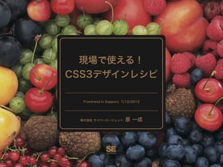
1.
現場で使える! CSS3デザインレシピ Frontrend in Sapporo
7/12/2013 株式会社 サイバーエージェント 原 一成
2.
イントロ 原 一成 Hara Kazunari Web
Developer CyberAgent, Inc.
3.
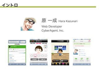
イントロ 原 一成 Hara Kazunari Web
Developer CyberAgent, Inc.
4.
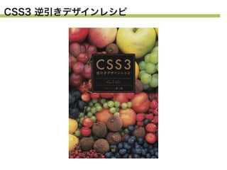
CSS3 逆引きデザインレシピ
5.
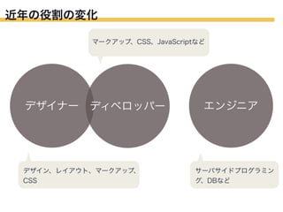
近年の役割の変化 マークアップ、CSS、JavaScriptなど デザイナー ディベロッパー デザイン、レイアウト、マークアップ、 CSS エンジニア サーバサイドプログラミン グ、DBなど
6.
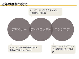
近年の役割の変化 マークアップ、インタラクション、 ハイパフォーマンス デザイナー ディベロッパー エンジニア デザイン、ユーザー体験デザイン、 高度なイラストレーション サーバサイドプログラミン グ、API作成、データスト ア
7.
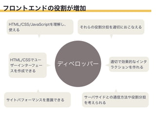
フロントエンドの役割が増加 HTML/CSS/JavaScriptを理解し、 使える HTML/CSSでユー ザーインターフェー スを作成できる それらの役割分担を適切におこなえる ディベロッパー サイトパフォーマンスを意識できる 適切で効果的なインタ ラクションを作れる サーバサイドとの通信方法や役割分担 を考えられる
8.
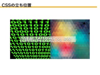
CSSの立ち位置 「技術」と「デザイン」の間
9.
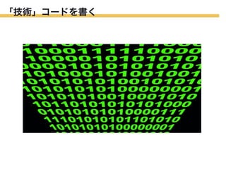
「技術」コードを書く
10.
「わかりやすい」コードを 「わかりやすい」
11.
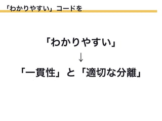
「わかりやすい」コードを 「わかりやすい」 ↓ 「一貫性」と「適切な分離」
12.
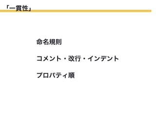
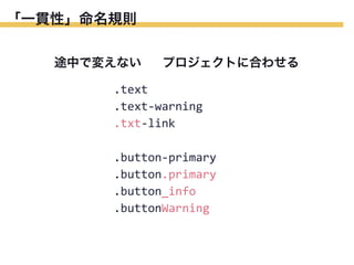
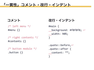
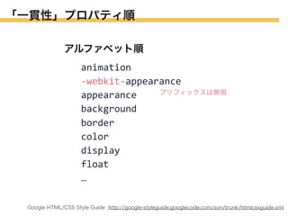
「一貫性」 命名規則 コメント・改行・インデント プロパティ順
13.
「一貫性」命名規則 途中で変えない プロジェクトに合わせる .text .text-‐warning .txt-‐link .button-‐primary .button.primary .button_info .buttonWarning
14.
「一貫性」コメント・改行・インデント コメント 改行・インデント /* left menu
*/ #menu {} #main { __background: #f8f8f8; ↵ __width: 90%; } /* right contents */ #contents {} /* button module */ .button {} .quote::before,↵ .quote::after { __content: “”; }
15.
「一貫性」プロパティ順 アルファベット順 animation -‐webkit-‐appearance プリフィックスは無視 appearance background border color display float … Google HTML/CSS Style
Guide http://google-styleguide.googlecode.com/svn/trunk/htmlcssguide.xml
16.
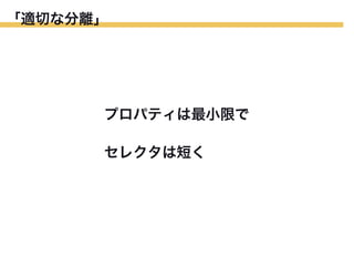
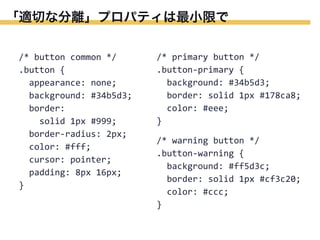
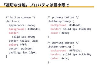
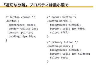
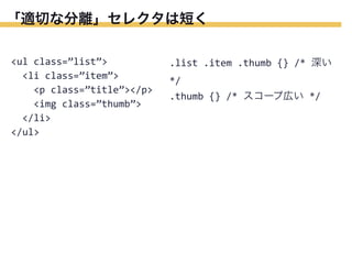
「適切な分離」 プロパティは最小限で セレクタは短く
17.
「適切な分離」プロパティは最小限で /* button common
*/ .button { appearance: none; background: #34b5d3; border: solid 1px #999; border-‐radius: 2px; color: #fff; cursor: pointer; padding: 8px 16px; } /* primary button */ .button-‐primary { background: #34b5d3; border: solid 1px #178ca8; color: #eee; } /* warning button */ .button-‐warning { background: #ff5d3c; border: solid 1px #cf3c20; color: #ccc; }
18.
「適切な分離」プロパティは最小限で /* button common
*/ .button { appearance: none; background: #34b5d3; border: solid 1px #999; border-‐radius: 2px; color: #fff; cursor: pointer; padding: 8px 16px; } /* primary button */ .button-‐primary { background: #34b5d3; border: solid 1px #178ca8; color: #eee; } /* warning button */ .button-‐warning { background: #ff5d3c; border: solid 1px #cf3c20; color: #ccc; }
19.
「適切な分離」プロパティは最小限で /* button common
*/ .button { appearance: none; border-‐radius: 2px; cursor: pointer; padding: 8px 16px; } /* normal button */ .button-‐normal { background: #34b5d3; border: solid 1px #999; color: #fff; } /* primary button */ .button-‐primary { background: #34b5d3; border: solid 1px #178ca8; color: #eee; }
20.
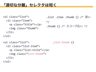
「適切な分離」セレクタは短く <ul class=”list”>
<li class=”item”> <p class=”title”></p> <img class=”thumb”> </li> </ul> .list .item .thumb {} /* 深い */ .thumb {} /* スコープ広い */
21.
「適切な分離」セレクタは短く <ul class=”list”>
<li class=”item”> <p class=”title”></p> <img class=”thumb”> </li> </ul> .list .item .thumb {} /* 深い */ .thumb {} /* スコープ広い */ <ul class=”list”> <li class=”list-‐item”> <p class=”list-‐title”></p> <img class=”list-‐thumb”> </li> </ul> .list-‐thumb {}
22.
「デザイン」デザインを表現する
23.
CSS3 デザインレシピ よく使うプロパティ
24.
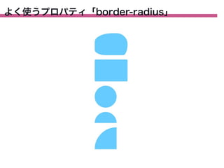
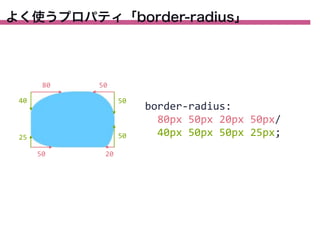
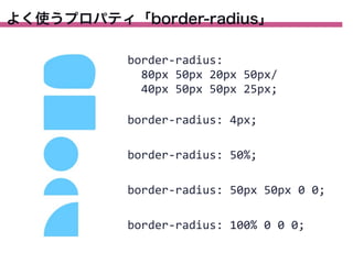
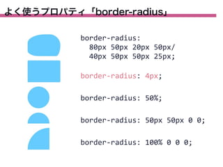
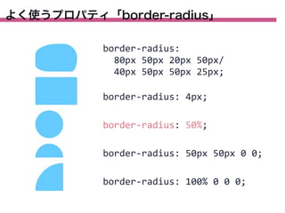
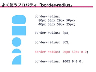
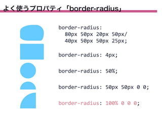
よく使うプロパティ「border-radius」
25.
よく使うプロパティ「border-radius」 80 50 40 50 25 50 50 20 border-‐radius: 80px
50px 20px 50px/ 40px 50px 50px 25px;
26.
よく使うプロパティ「border-radius」 border-‐radius: 80px
50px 20px 50px/ 40px 50px 50px 25px; border-‐radius: 4px; border-‐radius: 50%; border-‐radius: 50px 50px 0 0; border-‐radius: 100% 0 0 0;
27.
よく使うプロパティ「border-radius」 border-‐radius: 80px
50px 20px 50px/ 40px 50px 50px 25px; border-‐radius: 4px; border-‐radius: 50%; border-‐radius: 50px 50px 0 0; border-‐radius: 100% 0 0 0;
28.
よく使うプロパティ「border-radius」 border-‐radius: 80px
50px 20px 50px/ 40px 50px 50px 25px; border-‐radius: 4px; border-‐radius: 50%; border-‐radius: 50px 50px 0 0; border-‐radius: 100% 0 0 0;
29.
よく使うプロパティ「border-radius」 border-‐radius: 80px
50px 20px 50px/ 40px 50px 50px 25px; border-‐radius: 4px; border-‐radius: 50%; border-‐radius: 50px 50px 0 0; border-‐radius: 100% 0 0 0;
30.
よく使うプロパティ「border-radius」 border-‐radius: 80px
50px 20px 50px/ 40px 50px 50px 25px; border-‐radius: 4px; border-‐radius: 50%; border-‐radius: 50px 50px 0 0; border-‐radius: 100% 0 0 0;
31.
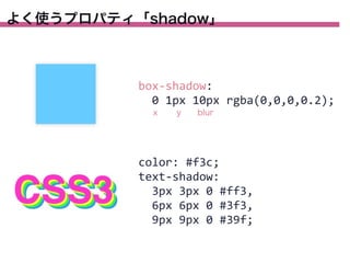
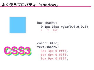
よく使うプロパティ「shadow」 box-‐shadow: 0
1px 10px rgba(0,0,0,0.2); x y blur color: #f3c; text-‐shadow: 3px 3px 0 #ff3, 6px 6px 0 #3f3, 9px 9px 0 #39f;
32.
よく使うプロパティ「shadow」 box-‐shadow: 0
1px 10px rgba(0,0,0,0.2); x y blur color: #f3c; text-‐shadow: 3px 3px 0 #ff3, 6px 6px 0 #3f3, 9px 9px 0 #39f;
33.
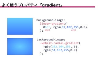
よく使うプロパティ「gradient」 background-‐image: linear-‐gradient(
#6cf, rgba(51,102,255,0.8) end ); start background-‐image: -‐webkit-‐radial-‐gradient( rgba(102,204,255,.6), rgba(51,102,255,0.8) );
34.
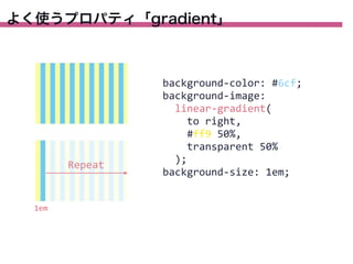
よく使うプロパティ「gradient」 Repeat 1em background-‐color: #6cf; background-‐image:
linear-‐gradient( to right, #ff9 50%, transparent 50% ); background-‐size: 1em;
35.
よく使うプロパティ「gradient」 background-‐color: #6cf; background-‐image:
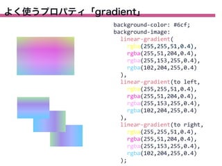
linear-‐gradient( rgba(255,255,51,0.4), rgba(255,51,204,0.4), rgba(255,153,255,0.4), rgba(102,204,255,0.4) ), linear-‐gradient(to left, rgba(255,255,51,0.4), rgba(255,51,204,0.4), rgba(255,153,255,0.4), rgba(102,204,255,0.4) ), linear-‐gradient(to right, rgba(255,255,51,0.4), rgba(255,51,204,0.4), rgba(255,153,255,0.4), rgba(102,204,255,0.4) );
36.
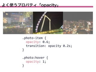
よく使うプロパティ「opacity」 .photo-‐item {
opacity: 0.6; transition: opacity 0.2s; } .photo:hover { opacity: 1; }
37.
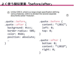
よく使う擬似要素「before/after」 .quote::before, .quote::after {
background: #ccc; border-‐radius: 50%; color: #666; position: absolute; … } .quote::before { content: “201C”; left: 0; top: 0; } .quote::after { bottom: 0; content: “201D”; right: 0; }
38.
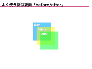
よく使う擬似要素「before/after」
39.
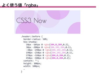
よく使う値「rgba」 .header::before {
border-‐radius: 50%; box-‐shadow: 10px -‐105px 0 rgba(204,0,204,0.2), 30px -‐200px 0 rgba(204,102,204,0.1), -‐30px -‐290px 0 rgba(204,102,204,0.1), 190px -‐250px 0 rgba(204,102,204,0.1), 270px -‐320px 0 rgba(204,0,204,0.2), 450px -‐100px 0 rgba(204,0,204,0.2); content: ‘’; height: 100px; width: 100px; … }
40.
CSS3 デザインレシピ デザインサンプル
41.
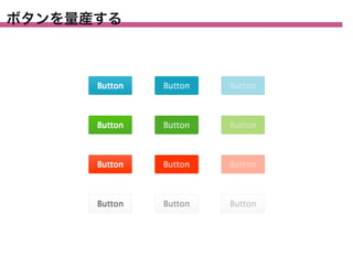
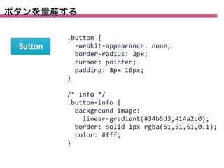
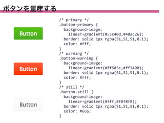
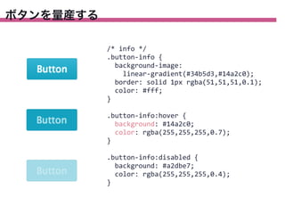
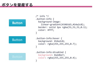
ボタンを量産する
42.
ボタンを量産する .button {
-‐webkit-‐appearance: none; border-‐radius: 2px; cursor: pointer; padding: 8px 16px; } /* info */ .button-‐info { background-‐image: linear-‐gradient(#34b5d3,#14a2c0); border: solid 1px rgba(51,51,51,0.1); color: #fff; }
43.
ボタンを量産する /* primary */ .button-‐primary
{ background-‐image: linear-‐gradient(#55c40d,#4dac26); border: solid 1px rgba(51,51,51,0.1); color: #fff; } /* warning */ .button-‐warning { background-‐image: linear-‐gradient(#ff5d3c,#ff3400); border: solid 1px rgba(51,51,51,0.1); color: #fff; } /* still */ .button-‐still { background-‐image: linear-‐gradient(#fff,#f8f8f8); border: solid 1px rgba(51,51,51,0.1); color: #666; }
44.
ボタンを量産する /* info */ .button-‐info
{ background-‐image: linear-‐gradient(#34b5d3,#14a2c0); border: solid 1px rgba(51,51,51,0.1); color: #fff; } .button-‐info:hover { background: #14a2c0; color: rgba(255,255,255,0.7); } .button-‐info:disabled { background: #a2dbe7; color: rgba(255,255,255,0.4); }
45.
ボタンを量産する /* info */ .button-‐info
{ background-‐image: linear-‐gradient(#34b5d3,#14a2c0); border: solid 1px rgba(51,51,51,0.1); color: #fff; } .button-‐info:hover { background: #14a2c0; color: rgba(255,255,255,0.7); } .button-‐info:disabled { background: #a2dbe7; color: rgba(255,255,255,0.4); }
46.
スタイルガイド
47.
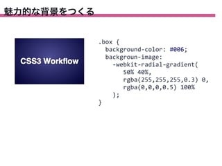
魅力的な背景をつくる .box {
background-‐color: #006; backgroun-‐image: -‐webkit-‐radial-‐gradient( 50% 40%, rgba(255,255,255,0.3) 0, rgba(0,0,0,0.5) 100% ); }
48.
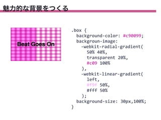
魅力的な背景をつくる .box {
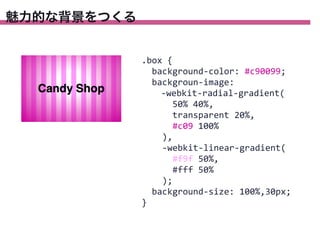
background-‐color: #c90099; backgroun-‐image: -‐webkit-‐radial-‐gradient( 50% 40%, transparent 20%, #c09 100% ), -‐webkit-‐linear-‐gradient( left, #f9f 50%, #fff 50% ); background-‐size: 30px,100%; }
49.
魅力的な背景をつくる .box {
background-‐color: #c90099; backgroun-‐image: -‐webkit-‐radial-‐gradient( 50% 40%, transparent 20%, #c09 100% ), -‐webkit-‐linear-‐gradient( #f9f 50%, #fff 50% ); background-‐size: 100%,30px; }
50.
いろんなテイストの文字をつくる .text {
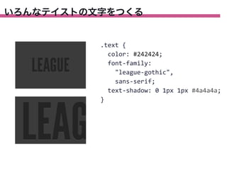
color: #242424; font-‐family: "league-‐gothic", sans-‐serif; text-‐shadow: 0 1px 1px #4a4a4a; }
51.
いろんなテイストの文字をつくる .text {
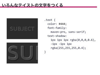
color: #444; font-‐family: maven-‐pro, sans-‐serif; text-‐shadow: 1px 1px 1px rgba(0,0,0,0.6), -‐1px -‐1px 1px rgba(255,255,255,0.4); }
52.
いろんなテイストの文字をつくる .text {
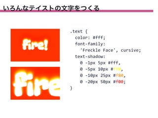
color: #fff; font-‐family: 'Freckle Face', cursive; text-‐shadow: 0 -‐1px 5px #fff, 0 -‐5px 10px #ff0, 0 -‐10px 25px #f80, 0 -‐20px 50px #f00; }
53.
いろんなテイストの文字をつくる .text {
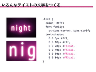
color: #fff; font-‐family: pt-‐sans-‐narrow, sans-‐serif; text-‐shadow: 0 0 5px #fff, 0 0 10px #fff, 0 0 20px #ff3ba1, 0 0 40px #ff3ba1, 0 0 50px #ff3ba1, 0 0 80px #ff3ba1; }
54.
いろんなテイストの文字をつくる .icon-‐star {
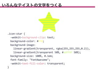
-‐webkit-‐background-‐clip: text; background-‐color: #ff0; background-‐image: linear-‐gradient(transparent, rgba(255,255,255,0.2)), linear-‐gradient(transparent 50%, #adff4f 50%); background-‐size: 100%, 0.1em; font-‐family: "FontAwesome"; -‐webkit-‐text-‐fill-‐color: transparent; }
55.
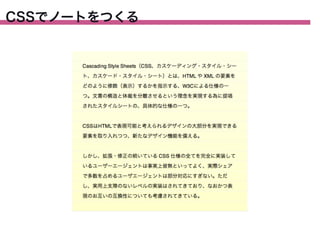
CSSでノートをつくる
56.
CSSでノートをつくる .note {
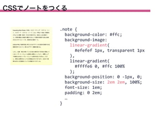
background-‐color: #ffc; background-‐image: linear-‐gradient( #efefef 1px, transparent 1px ), linear-‐gradient( #ffffe6 0, #ffc 100% ); background-‐position: 0 -‐1px, 0; background-‐size: 2em 2em, 100%; font-‐size: 1em; padding: 0 2em; … }
57.
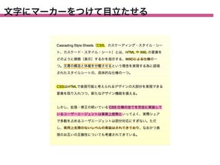
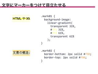
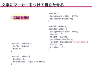
文字にマーカーをつけて目立たせる
58.
文字にマーカーをつけて目立たせる .mark01 {
background-‐image: linear-‐gradient( transparent 31%, #ff3 31%, #ff3 61%, transparent 61% ); } .mark02 { border-‐bottom: 2px solid #f90; border-‐top: 2px solid #f90; }
59.
文字にマーカーをつけて目立たせる .mark03 {
background-‐color: #f9c; position: relative; } .mark03::before { left: -‐0.2em; top: 0; } .mark03::after { bottom: 0; box-‐shadow: -‐2px 0 0 #f9c; } .mark03::before, .mark03::after { background-‐color: #f9c; content: ''; height: 1.1em; position: absolute; -‐webkit-‐transform: skew(10deg); width: 1em; z-‐index: -‐1; }
60.
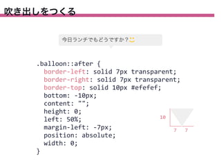
吹き出しをつくる .balloon::after {
border-‐left: solid 7px transparent; border-‐right: solid 7px transparent; border-‐top: solid 10px #efefef; bottom: -‐10px; content: ""; height: 0; 10 left: 50%; margin-‐left: -‐7px; 7 position: absolute; width: 0; } 7
61.
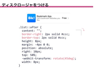
ディスクロージャをつける .list::after {
content: ""; border-‐right: 2px solid #ccc; border-‐top: 2px solid #ccc; height: 8px; margin: -‐4px 0 0; position: absolute; right: 10px; top: 50%; -‐webkit-‐transform: rotate(45deg); width: 8px; }
62.
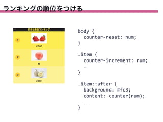
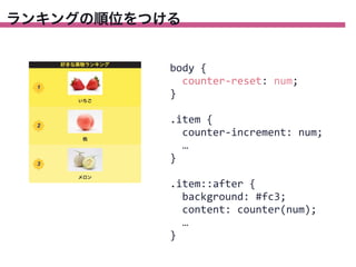
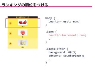
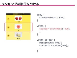
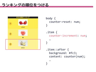
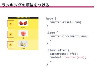
ランキングの順位をつける body {
counter-‐reset: num; } .item { counter-‐increment: num; … } .item::after { background: #fc3; content: counter(num); … }
63.
ランキングの順位をつける body {
counter-‐reset: num; } .item { counter-‐increment: num; … } .item::after { background: #fc3; content: counter(num); … }
64.
ランキングの順位をつける body {
counter-‐reset: num; } .item { counter-‐increment: num; … } .item::after { background: #fc3; content: counter(num); … }
65.
ランキングの順位をつける body {
counter-‐reset: num; } .item { counter-‐increment: num; … } .item::after { background: #fc3; content: counter(num); … }
66.
ランキングの順位をつける body {
counter-‐reset: num; } .item { counter-‐increment: num; … } .item::after { background: #fc3; content: counter(num); … }
67.
ランキングの順位をつける body {
counter-‐reset: num; } .item { counter-‐increment: num; … } .item::after { background: #fc3; content: counter(num); … }
68.
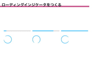
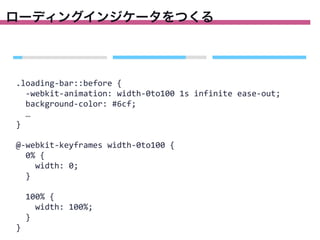
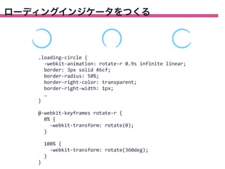
ローディングインジケータをつくる
69.
ローディングインジケータをつくる .loading-‐bar::before {
-‐webkit-‐animation: width-‐0to100 1s infinite ease-‐out; background-‐color: #6cf; … } @-‐webkit-‐keyframes width-‐0to100 { 0% { width: 0; } 100% { width: 100%; } }
70.
ローディングインジケータをつくる .loading-‐circle {
-‐webkit-‐animation: rotate-‐r 0.9s infinite linear; border: 3px solid #6cf; border-‐radius: 50%; border-‐right-‐color: transparent; border-‐right-‐width: 1px; … } @-‐webkit-‐keyframes rotate-‐r { 0% { -‐webkit-‐transform: rotate(0); } 100% { -‐webkit-‐transform: rotate(360deg); } }
71.
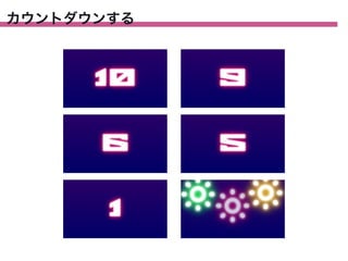
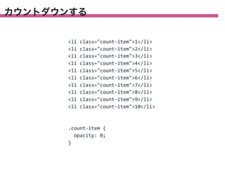
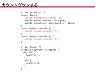
カウントダウンする
72.
カウントダウンする <li class="count-‐item">1</li> <li class="count-‐item">2</li> <li
class="count-‐item">3</li> <li class="count-‐item">4</li> <li class="count-‐item">5</li> <li class="count-‐item">6</li> <li class="count-‐item">7</li> <li class="count-‐item">8</li> <li class="count-‐item">9</li> <li class="count-‐item">10</li> .count-‐item { opacity: 0; }
73.
カウントダウンする /* set animation
*/ .count-‐item { -‐webkit-‐animation-‐duration: 1s; -‐webkit-‐animation-‐name: disappear; -‐webkit-‐animation-‐timing-‐function: linear; } .count-‐item:nth-‐child(9) { -‐webkit-‐animation-‐delay: 1s; } .count-‐item:nth-‐child(8) { -‐webkit-‐animation-‐delay: 2s; } /* key frames */ @-‐webkit-‐keyframes disappear { 0%, 50% { opacity: 1; } 100% { opacity: 0; } }
74.
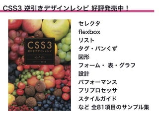
CSS3 逆引きデザインレシピ 好評発売中! セレクタ flexbox リスト タグ・パンくず 図形 フォーム・
表・グラフ 設計 パフォーマンス プリプロセッサ スタイルガイド など 全81項目のサンプル集
Download