Download free for 30 days
Sign in
Upload
Language (EN)
Support
Business
Mobile
Social Media
Marketing
Technology
Art & Photos
Career
Design
Education
Presentations & Public Speaking
Government & Nonprofit
Healthcare
Internet
Law
Leadership & Management
Automotive
Engineering
Software
Recruiting & HR
Retail
Sales
Services
Science
Small Business & Entrepreneurship
Food
Environment
Economy & Finance
Data & Analytics
Investor Relations
Sports
Spiritual
News & Politics
Travel
Self Improvement
Real Estate
Entertainment & Humor
Health & Medicine
Devices & Hardware
Lifestyle
Change Language
Language
English
Español
Português
Français
Deutsche
Cancel
Save
EN
MK
Uploaded by
Masahiro Kobayashi
1,709 views
壊れやすいCSS
2015.02.24 第9回HTML5ビギナーズ CSSとCSS設計について学ぼう! で使用したスライドです
Engineering
◦
Read more
2
Save
Share
Embed
Embed presentation
Download
Download to read offline
1
/ 59
2
/ 59
3
/ 59
4
/ 59
5
/ 59
6
/ 59
7
/ 59
8
/ 59
9
/ 59
10
/ 59
11
/ 59
12
/ 59
13
/ 59
14
/ 59
15
/ 59
16
/ 59
17
/ 59
18
/ 59
19
/ 59
20
/ 59
21
/ 59
22
/ 59
23
/ 59
24
/ 59
25
/ 59
26
/ 59
27
/ 59
28
/ 59
29
/ 59
30
/ 59
31
/ 59
32
/ 59
33
/ 59
34
/ 59
35
/ 59
36
/ 59
37
/ 59
38
/ 59
39
/ 59
40
/ 59
41
/ 59
42
/ 59
43
/ 59
44
/ 59
45
/ 59
46
/ 59
47
/ 59
48
/ 59
49
/ 59
50
/ 59
51
/ 59
52
/ 59
53
/ 59
54
/ 59
55
/ 59
56
/ 59
57
/ 59
58
/ 59
59
/ 59
More Related Content
PDF
なんでCSSすぐ死んでしまうん
by
Hayato Mizuno
PDF
今必要なCSSアーキテクチャ
by
Mayu Kimura
PDF
大規模サイトにおける本当は怖いCSSの話
by
井上 誠
PDF
CSS の歩き方
by
Seiichiro Mishiba
PDF
今からハジメるHTML5マークアップ
by
SwapSkills
PDF
悩まないコーディングをしよう! OOCSS,SMACSSを用いた、読みやすくてメンテナブルなCSS設計(Sass対応)
by
Horiguchi Seito
PDF
HTML5マークアップの心得と作法
by
Futomi Hatano
PPTX
2016年版 フロントエンド開発フォーマット
by
Kenya Kodaira
なんでCSSすぐ死んでしまうん
by
Hayato Mizuno
今必要なCSSアーキテクチャ
by
Mayu Kimura
大規模サイトにおける本当は怖いCSSの話
by
井上 誠
CSS の歩き方
by
Seiichiro Mishiba
今からハジメるHTML5マークアップ
by
SwapSkills
悩まないコーディングをしよう! OOCSS,SMACSSを用いた、読みやすくてメンテナブルなCSS設計(Sass対応)
by
Horiguchi Seito
HTML5マークアップの心得と作法
by
Futomi Hatano
2016年版 フロントエンド開発フォーマット
by
Kenya Kodaira
What's hot
PDF
今からハジメるHTML5プログラミング
by
SwapSkills
PDF
HTML5, きちんと。
by
Masataka Yakura
PDF
情報編集(Web) HTML5とは何か? HTML5、はじめの一歩
by
Atsushi Tadokoro
PDF
Polymerで作る次世代ウェブサイト
by
Eiji Kitamura
PPTX
jQuery Mobile入門
by
Shumpei Shiraishi
PPT
it研修講座
by
annulus
PPT
it研修講座 aki
by
annulus
PPT
itkensyukouza2008
by
annulus
PPT
京都 IT講座 9月
by
annulus
PPT
it研修講座
by
annulus
PPT
It01
by
chibicoo
PPT
kyoto IT
by
annulus
PPT
京都 IT講座 9月
by
annulus
PPT
京都IT研修講座
by
annulus
PDF
⑯jQueryをおぼえよう!その2
by
Nishida Kansuke
PDF
LDD'12/Summer in KITAMI Opening Slide
by
ohotech
PDF
WordPress を使いこなそう
by
Wataru OKAMOTO
PDF
CSSの光と闇
by
Shuma Mizuno
PDF
【第2回】デザイナーがコードから読み解く、Androidアプリのデザインの幅を広げるコツとTips
by
Chihiro Tomita
今からハジメるHTML5プログラミング
by
SwapSkills
HTML5, きちんと。
by
Masataka Yakura
情報編集(Web) HTML5とは何か? HTML5、はじめの一歩
by
Atsushi Tadokoro
Polymerで作る次世代ウェブサイト
by
Eiji Kitamura
jQuery Mobile入門
by
Shumpei Shiraishi
it研修講座
by
annulus
it研修講座 aki
by
annulus
itkensyukouza2008
by
annulus
京都 IT講座 9月
by
annulus
it研修講座
by
annulus
It01
by
chibicoo
kyoto IT
by
annulus
京都 IT講座 9月
by
annulus
京都IT研修講座
by
annulus
⑯jQueryをおぼえよう!その2
by
Nishida Kansuke
LDD'12/Summer in KITAMI Opening Slide
by
ohotech
WordPress を使いこなそう
by
Wataru OKAMOTO
CSSの光と闇
by
Shuma Mizuno
【第2回】デザイナーがコードから読み解く、Androidアプリのデザインの幅を広げるコツとTips
by
Chihiro Tomita
Viewers also liked
PPTX
Research proposal: an overview
by
nagu00018
PPTX
Storyboard
by
Natashagregory1
PPTX
Radio funding
by
Natashagregory1
PPTX
Analysis of websites
by
Natashagregory1
DOCX
Doc1
by
SarwarDrigh
PDF
Strategiarbete i byggbranschen uppsats fulltext
by
Pontus Nilsson
PPTX
Intangible heritage walpeup lake l honman
by
Louise Honman
DOCX
Mangesh_Kadam
by
Mangesh Kadam
PPTX
El doble significado de las palabras
by
Ramón Santorio Santorio
PDF
PresCare Woollam Constructions Charity Golf Classic Brisbane_Registration Form
by
Brett Holdway
PDF
Let's Try SVG Sprite
by
Masahiro Kobayashi
PPTX
Music Labels
by
Natashagregory1
PPTX
Digipak analysis
by
Natashagregory1
PPTX
The History of Music Videos
by
Natashagregory1
PPTX
Electronic health records
by
rendevilla
PPT
духовно мистецька сутність вишивок Марії Савчин
by
OlgaVladychko
Research proposal: an overview
by
nagu00018
Storyboard
by
Natashagregory1
Radio funding
by
Natashagregory1
Analysis of websites
by
Natashagregory1
Doc1
by
SarwarDrigh
Strategiarbete i byggbranschen uppsats fulltext
by
Pontus Nilsson
Intangible heritage walpeup lake l honman
by
Louise Honman
Mangesh_Kadam
by
Mangesh Kadam
El doble significado de las palabras
by
Ramón Santorio Santorio
PresCare Woollam Constructions Charity Golf Classic Brisbane_Registration Form
by
Brett Holdway
Let's Try SVG Sprite
by
Masahiro Kobayashi
Music Labels
by
Natashagregory1
Digipak analysis
by
Natashagregory1
The History of Music Videos
by
Natashagregory1
Electronic health records
by
rendevilla
духовно мистецька сутність вишивок Марії Савчин
by
OlgaVladychko
Similar to 壊れやすいCSS
ZIP
実践Sass 前編
by
Azusa Tomita
PPT
CSS勉強会
by
Chisa Youzaka
PDF
使いやすいWordPressのためのCSSのつくりかた
by
Hiroshi Urabe
PDF
ネストを覚えた人のためのSassの便利な使い方
by
Hiroki Shibata
PDF
HTML/CSSを効率的にする メタ言語とツールのアレコレ
by
知己 久保
PDF
メディア芸術基礎 Ⅰ 第4回:CSS入門 情報の形を視覚化する
by
Atsushi Tadokoro
PDF
今更ながらCSS3を試してみた
by
Takao Sumitomo
PDF
gulp + sass で目指せ倍速コーディング(東区フロントエンド勉強会 2015年 第1回) 本編
by
Toshimichi Suekane
PDF
Sass(SCSS)について
by
Kazufumi Miyamoto
PDF
マークアップ講座 02 CSS
by
eiji sekiya
PDF
First sass
by
Toshiaki Sasaki
PPTX
Cssによるレイアウト
by
Tomoko Takashima
PDF
リファクタリングHTML/CSS ~レガシー世界を超えて~ #scripty03
by
Yahoo!デベロッパーネットワーク
PDF
まだ間に合う「CSS設計」ことはじめ。CSSの闇に飲み込まれないための考え方。
by
Hiroshi Urabe
PDF
Css拡張言語のコトハジメ
by
regret raym
PDF
Sass introduction (jscafe 10)
by
Ryuma Tsukano
PDF
1202css
by
Yoshinaga Kazutaka
PDF
CSS Design and Programming
by
Taku AMANO
PPTX
Css3
by
Goro Ide
PDF
コーディングがラクになる!? “自分仕様”のさくさくコーディング法
by
Rico Sengan
実践Sass 前編
by
Azusa Tomita
CSS勉強会
by
Chisa Youzaka
使いやすいWordPressのためのCSSのつくりかた
by
Hiroshi Urabe
ネストを覚えた人のためのSassの便利な使い方
by
Hiroki Shibata
HTML/CSSを効率的にする メタ言語とツールのアレコレ
by
知己 久保
メディア芸術基礎 Ⅰ 第4回:CSS入門 情報の形を視覚化する
by
Atsushi Tadokoro
今更ながらCSS3を試してみた
by
Takao Sumitomo
gulp + sass で目指せ倍速コーディング(東区フロントエンド勉強会 2015年 第1回) 本編
by
Toshimichi Suekane
Sass(SCSS)について
by
Kazufumi Miyamoto
マークアップ講座 02 CSS
by
eiji sekiya
First sass
by
Toshiaki Sasaki
Cssによるレイアウト
by
Tomoko Takashima
リファクタリングHTML/CSS ~レガシー世界を超えて~ #scripty03
by
Yahoo!デベロッパーネットワーク
まだ間に合う「CSS設計」ことはじめ。CSSの闇に飲み込まれないための考え方。
by
Hiroshi Urabe
Css拡張言語のコトハジメ
by
regret raym
Sass introduction (jscafe 10)
by
Ryuma Tsukano
1202css
by
Yoshinaga Kazutaka
CSS Design and Programming
by
Taku AMANO
Css3
by
Goro Ide
コーディングがラクになる!? “自分仕様”のさくさくコーディング法
by
Rico Sengan
壊れやすいCSS
1.
壊れやすいCSS 小林 正弘
2.
小林 正弘 Frontend Engineer
3.
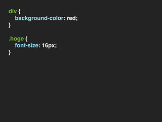
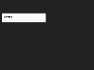
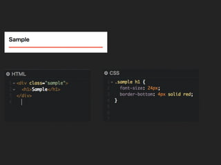
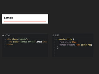
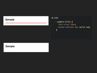
div { background-color: red; } .hoge
{ font-size: 16px; }
4.
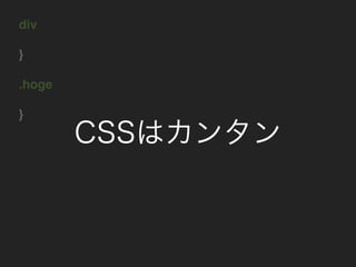
div } .hoge } CSSはカンタン
5.
ゆえに壊れやすい
6.
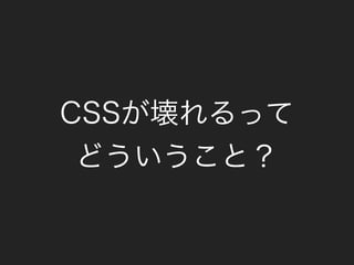
CSSが壊れるって どういうこと?
7.
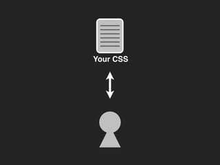
Your CSS
8.
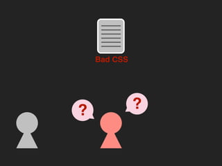
Bad CSS ??
9.
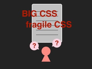
?? BIG CSS fragile CSS
10.
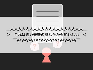
?? _人人人人人人人人人人人人人人人人人人人_ > これは近い未来のあなたかも知れない <  ̄Y^Y^Y^Y^Y^Y^Y^Y^Y^Y^Y^Y^Y ̄
11.
htmlの構造に依存しすぎない
15.
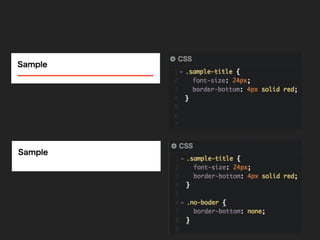
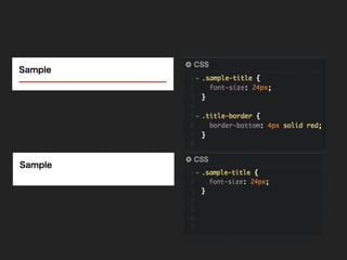
スタイルの打ち消しを多用
20.
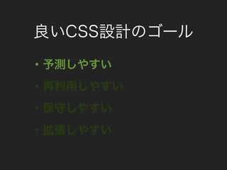
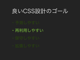
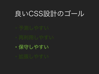
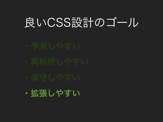
良いCSS設計のゴール
21.
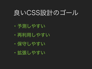
良いCSS設計のゴール ・予測しやすい ・再利用しやすい ・保守しやすい ・拡張しやすい
22.
良いCSS設計のゴール ・予測しやすい ・再利用しやすい ・保守しやすい ・拡張しやすい
23.
良いCSS設計のゴール ・予測しやすい ・再利用しやすい ・保守しやすい ・拡張しやすい
24.
良いCSS設計のゴール ・予測しやすい ・再利用しやすい ・保守しやすい ・拡張しやすい
25.
良いCSS設計のゴール ・予測しやすい ・再利用しやすい ・保守しやすい ・拡張しやすい
31.
??
32.
.item { overflow: hidden;
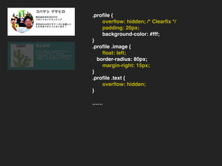
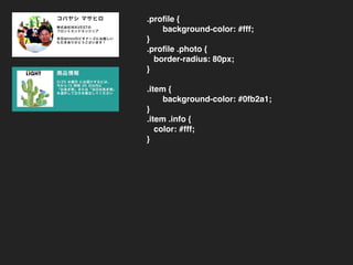
/* Clearfix */ padding: 15px; background-color: #eee; } .item .photo { float: left; margin-right: 15px; } .item .info { overflow: hidden; } …… .profile { overflow: hidden; /* Clearfix */ padding: 20px; background-color: #fff; } .profile .image { float: left; border-radius: 80px; margin-right: 15px; } .profile .text { overflow: hidden; } ……
33.
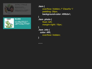
.item { overflow: hidden;
/* Clearfix */ padding: 15px; background-color: #eee; } .item .photo { float: left; margin-right: 15px; } .item .info { overflow: hidden; } …… .item { overflow: hidden; /* Clearfix */ padding: 20px; background-color: #0fb2a1; } .item .photo { float: left; margin-right: 15px; } .item .info { color: #fff; overflow: hidden; } ……
34.
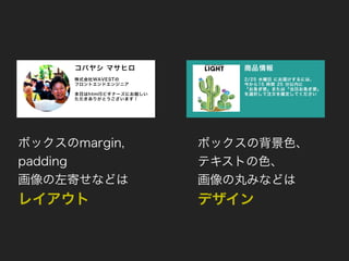
ボックスのmargin, padding 画像の左寄せなどは レイアウト ボックスの背景色、 テキストの色、 画像の丸みなどは デザイン
35.
.sample-block { overflow: hidden;
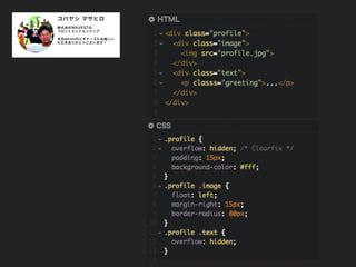
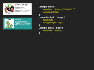
/* Clearfix */ padding: 15px; } . sample-block__image { float: left; margin-right: 15px; } . sample-block__body { overflow: hidden; } …… .sample-block { overflow: hidden; /* Clearfix */ padding: 20px; } . sample-block__image { float: left; margin-right: 15px; } .sample-block__body { overflow: hidden; } ……
36.
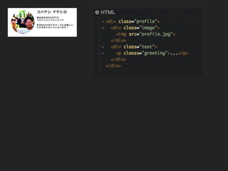
<div class="sample-block profile"> <div
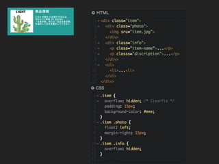
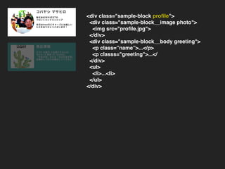
class="sample-block__image"> <img src="profile.jpg"> </div> <div class="sample-block__body"> <p classs="discription">...</p> </div> <ul> <li>...<li> </ul> </div> <div class="sample-block profile"> <div class="sample-block__image photo"> <img src="profile.jpg"> </div> <div class="sample-block__body greeting"> <p class=”name”>...</p> <p classs="greeting">...</ </div> <ul> <li>...<li> </ul> </div>
37.
<div class="sample-block item"> <div
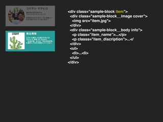
class="sample-block__image cover"> <img src="item.jpg"> </div> <div class="sample-block__body info"> <p class=”item_name”>...</p> <p classs="item_discription">...</ </div> <ul> <li>...<li> </ul> </div>
38.
.profile { background-color: #fff; } .profile
.photo { border-radius: 80px; } .item { background-color: #0fb2a1; } .item .info { color: #fff; }
39.
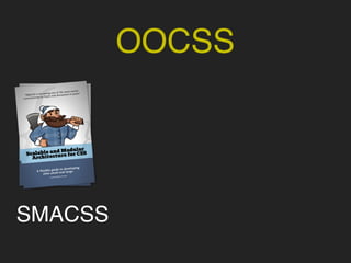
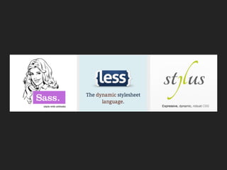
OOCSS
40.
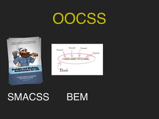
OOCSS SMACSS
41.
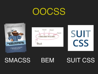
OOCSS SMACSS BEM
42.
OOCSS SMACSS BEM SUIT
CSS
43.
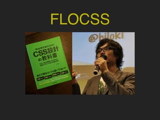
FLOCSS
44.
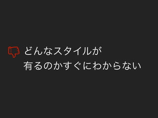
どんなスタイルが 有るのかすぐにわからない
45.
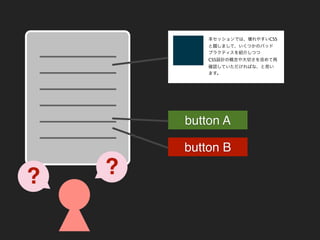
?? 本セッションでは、壊れやすいCSS と題しまして、いくつかのバッド プラクティスを紹介しつつ CSS設計の概念や大切さを改めて再 確認していただければな、と思い ます。 button A button B
46.
/* ## Headings and
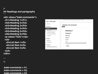
paragraphs ``` <div class="kalei-comments"> <h1>Heading 1</h1> <h2>Heading 2</h2> <h3>Heading 3</h3> <h4>Heading 4</h4> <h5>Heading 5</h5> <h6>Heading 6</h6> <p class="fixie"></p> <ul> <li>List Item 1</li> <li>List Item 2</li> <li>List Item 3</li> </ul> </div> ``` */ .kalei-comments > h1, .kalei-comments > h2, .kalei-comments > h3,
47.
Nice Communication!
48.
CSSプリプロセッサの 落とし穴
50.
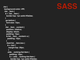
.list { background-color: #fff; .list__item
{ & + .list__item { border-top: 1px solid #f3e2ee; } .go:before { font-size: 12px; } .list__item__content { position: relative; display: block; padding: 15px; &.list__item__content--s { padding: 10px; } .feed-list__item.box { & + .box { margin-top: 20px; } .side__ranking-list-item { padding: 10px; & + .side__ranking-list-item { border-top: 1px solid #f3e2ee; SASS
51.
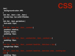
.list { background-color: #fff; } .list
.list__item + .list__item { border-top: 1px solid #f3e2ee; } .list .list__item .go:before { font-size: 12px; } .list .list__item .list__item__content { position: relative; display: block; padding: 15px; } .list .list__item .list__item__content.list__item__content--s { padding: 10px; } .list .list__item .list__item__content .feed-list__item.box + .box { margin-top: 20px; } .list .list__item .list__item__content .feed-list__item.box .side__ranking-list- item { padding: 10px; CSS
52.
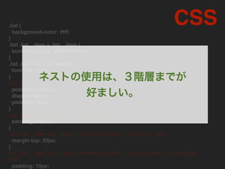
.list { background-color: #fff; } .list
.list__item + .list__item { border-top: 1px solid #f3e2ee; } .list .list__item .go:before { font-size: 12px; } .list .list__item .list__item__content position: relative; display: block; padding: 15px; } .list .list__item .list__item__content.list__item__content--s padding: 10px; } .list .list__item .list__item__content .feed-list__item.box + .box margin-top: 20px; } .list .list__item .list__item__content .feed-list__item.box .side__ranking-list- item padding: 10px; CSS ネストの使用は、3階層までが 好ましい。
53.
.clearfix:before, .clearfix:after { content: ''; display:
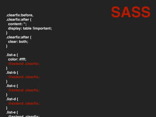
table !important; } .clearfix:after { clear: both; } .list-a { color: #fff; @extend .clearfix; } .list-b { @extend .clearfix; } .list-c { @extend .clearfix; } .list-d { @extend .clearfix; } .list-e { SASS
54.
.clearfix:before, .list-a:before, .list-b:before,
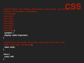
.list-c:before, .list-d:before, .list- e:before, .list-f:before, .list-g:before, .clearfix:after, .list-a:after, .list-b:after, .list-c:after, .list-d:after, .list-e:after, .list-f:after, .list-g:after { content: ''; display: table !important; } .clearfix:after, .list-a:after, .list-b:after, .list-c:after, .list-d:after, .list- e:after, .list-f:after, .list-g:after { clear: both; } .list-a { color: #fff; } CSS
55.
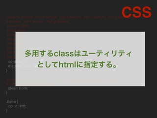
.clearfix:before, .list-a:before, .list-b:before,
.list-c:before, .list-d:before, .list- e:before, .list-f:before, .list-g:before, .clearfix:after, .list-a:after, .list-b:after, .list-c:after, .list-d:after, .list-e:after, .list-f:after, .list-g:after content: ''; display: table !important; } .clearfix:after, .list-a:after, .list-b:after, .list-c:after, .list-d:after, .list- e:after, .list-f:after, .list-g:after clear: both; } .list-a { color: #fff; } CSS 多用するclassはユーティリティ としてhtmlに指定する。
56.
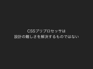
CSSプリプロセッサは 設計の難しさを解決するものではない
57.
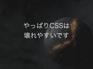
やっぱりCSSは 壊れやすいです
58.
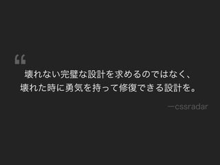
壊れない完璧な設計を求めるのではなく、 壊れた時に勇気を持って修復できる設計を。 ーcssradar
59.
Thank You!
Download