Rebranding Cirrus Owners and Pilots Association
•
1 like•347 views

The COPA board sought to modernize and simplify their visual identity to attract more members and convey their core values of flight education and safety. An agency conducted research including member interviews to understand COPA's purpose and members' characteristics. They developed three logo concepts incorporating a simplified Cirrus aircraft silhouette and safety themes. After iterations, the selected design features a top-down Cirrus shape within a circle representing the community and parachute safety. It was accompanied by branding guidelines to consistently implement the new visual identity across COPA communications.

Recommended
More Related Content
Recently uploaded
Recently uploaded (20)
Featured
Featured (20)
Rebranding Cirrus Owners and Pilots Association
- 1. FLIGHT & SAFETY Rebranding Cirrus Owners and Pilots Association
- 2. 2 The Task The COPA board sought a modern, memorable and distinctive visual identity system. Its goal is to support COPA efforts to attract more members, convey core brand values, stand out from other similar organizations, and have a greater influence on the next generation of owners and pilots. It had to incorporate the organization’s main thrusts while simplifying its appearance. The board refined their vision for COPA by also taking a broad scope as “the place to be for the Cirrus community.” Cirrus Owners and Pilots Association (COPA) is a community of owners and pilots of certified aircraft manufactured by Cirrus Design. With more than 3000 members worldwide, the association approached us to refresh their visual identity. Significant organizational changes coincided with the need of a new brand look.
- 3. 3 Discovering the Brand We kicked the project off with a comprehensive study of the COPA organization. We began by interviewing a selected cross-section of key board members and regular club members, aiming to define the brand mission, characters and behaviours. They mentioned Angelina Jolie flies a Cirrus SR22, but unfortunately did not let us interview her :( We identified the main characteristics of the COPA members that underpin the ethos of the brand itself: • The Maven: Safe, Professional, Authoritative, Intelligent • The Modern Pilot: Leading, Successful, Adventurous, Empowered • The Community Activist: Collaborative, Responsive, Vibrant, Engaging The interviews helped us understand COPA’s primary purpose - promote flight education and safety. The association provides social activities that attract like-minded people passionate about flying and Cirrus aircrafts in particular. 4,000 members around the world in 52 countries. COPA is the most modern aviation community.
- 4. 4 The Design Process The generated findings allowed us to build a map of concepts, visual themes, and representations of the community values. We set the mood and gathered imagery that represented the brand vision and essence. These also served as inspiration for the identity itself. The main safety benefit we focused on is the Cirrus ballistic parachute, the key feature that makes these aircrafts some of the safest in general aviation. We then continued with explorations of the aircraft’s silhouette. Our goal was to find how it could be simplified, yet remain recognisable and still represent the shape of a Cirrus aircraft. We experimented with two main perspectives, front and top. We left the top point of view as the primary one, as we felt it best represents a Cirrus aircraft and provides better scalability. During the digitising phase, we continued to evolve our concepts. We explored additional options that came to mind when working in a digital environment. There were many different directions.
- 5. 5 After an internal selection, we presented three initial design concepts. They provided an opportunity for the COPA members to review how well they matched their self-image: Option 1 featured a modern restyled version of the existing logo. It incorporates the values of the organization, while simplifying the mark. Option 2 was a subtle representation of flight and safety. We created an abstract symbol that would support the brand’s future evolution and expansion. Option 3 presents a symbol that illustrates the process from being just an owner of a Cirrus aircraft to becoming a pilot. Knowledge and a lot of flying is what it takes for one to become skilled and a safe pilot.
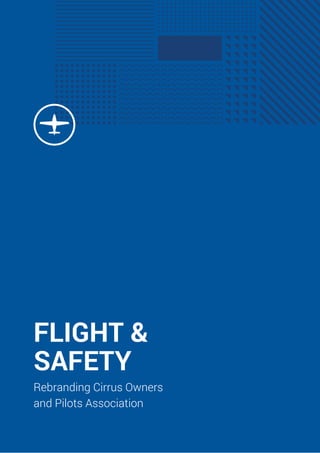
- 6. 6 After discussions with the COPA board of directors and a few iterations, we refined the concepts into the new COPA visual identity. The basic building block comes from a redesigned circular design. The old logo depicted a propeller plane, such as the iconic Cirrus SR22. With the introduction of the Cirrus Vision Jet SF50, the aircraft takes on a different profile and COPA expects new members who fly the jet. The top-down silhouette shows a distinctive Cirrus shape that blends the prop and jet aircraft planforms moving the brand mark into a new level. The circle represents both the COPA community and the safety of the parachute. The palette for design consists of three colours - primary blue foreground, secondary darker blue background and a call-to- action fresh green. We used deep blue because of its association to safety, freedom, trust and the sky.
- 7. 7 To complete the identity, we also created a background pattern for use in large applications. An abstract representation of a bird’s eye view of nature, it reminds of the good times we have while flying. Finally, we delivered a detailed brand guideline that enables COPA to consistently implement their visual assets across communications and applications.
- 8. THANK YOU FOR THE ATTENTION. www.kickflipx.com hi@kickflipx.com Victor Hugo 3, ap. 4b, 1124, Sofia, Bulgaria “The Kickflip team did a tough job in a clear, convincing and defensible way. Greater resistance to the new brand look was expected, but the thoroughness of the applied process and the comprehensive communications really helped.” Rick Beach, Member of COPA Board of Directors