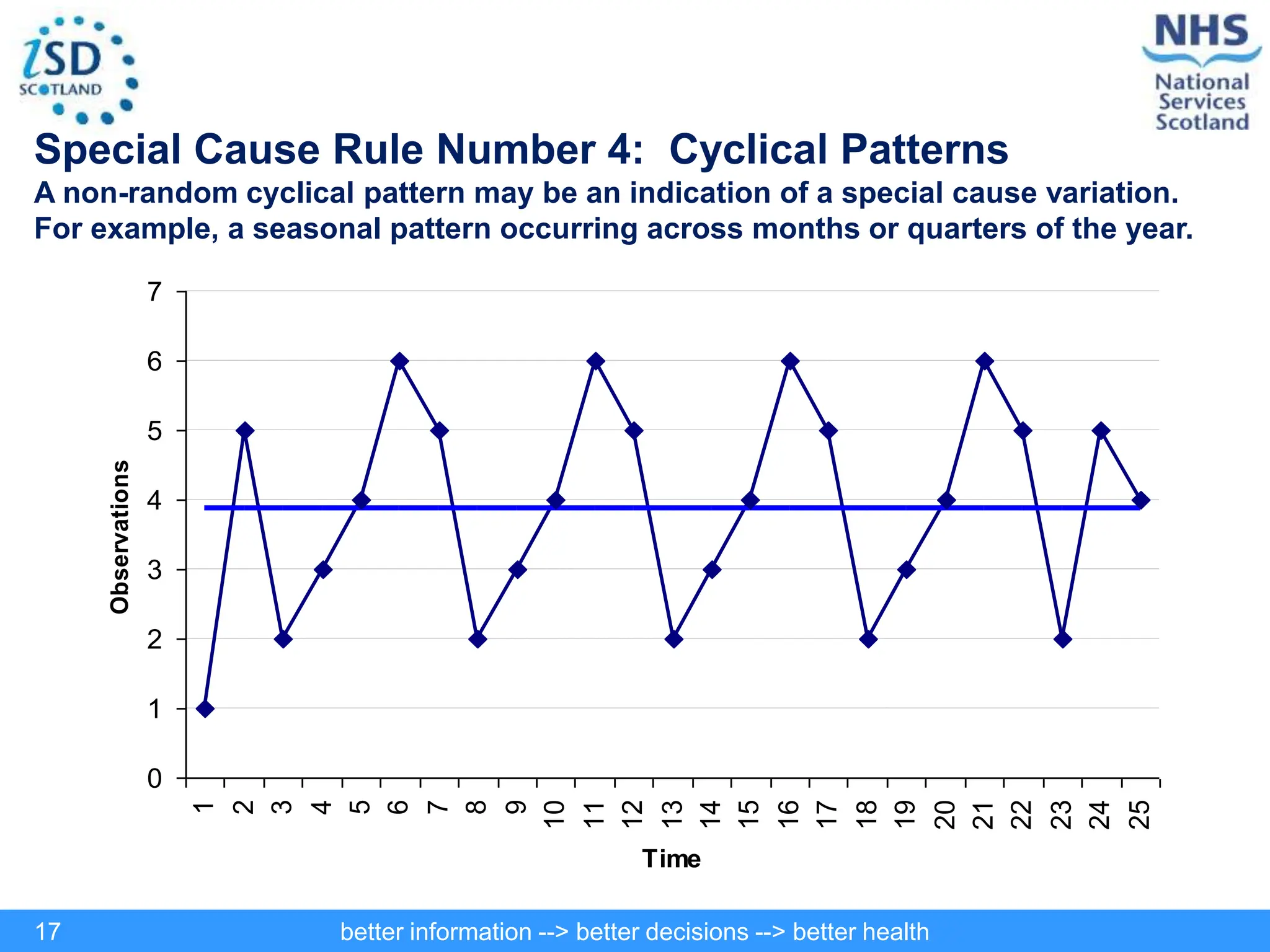
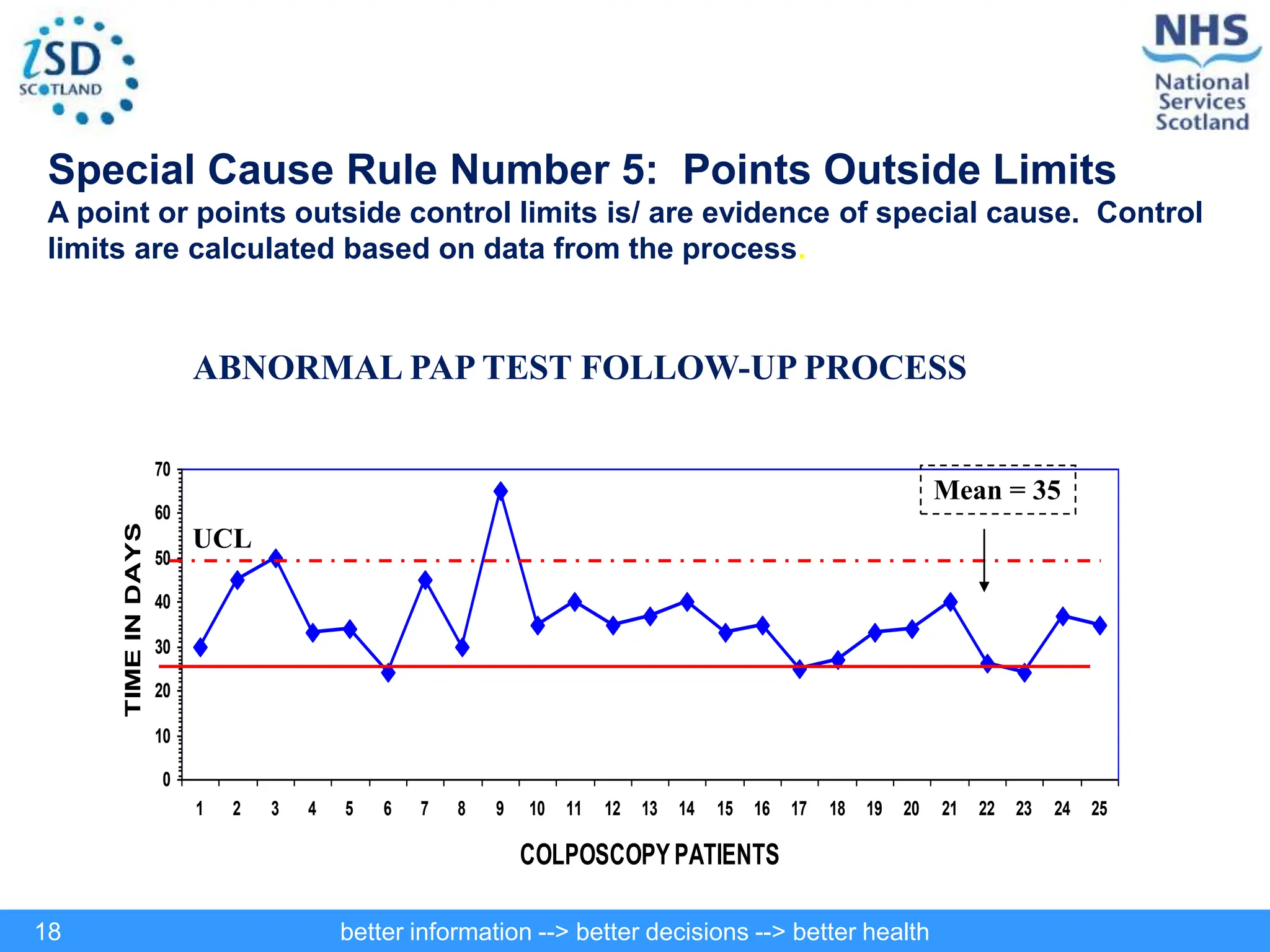
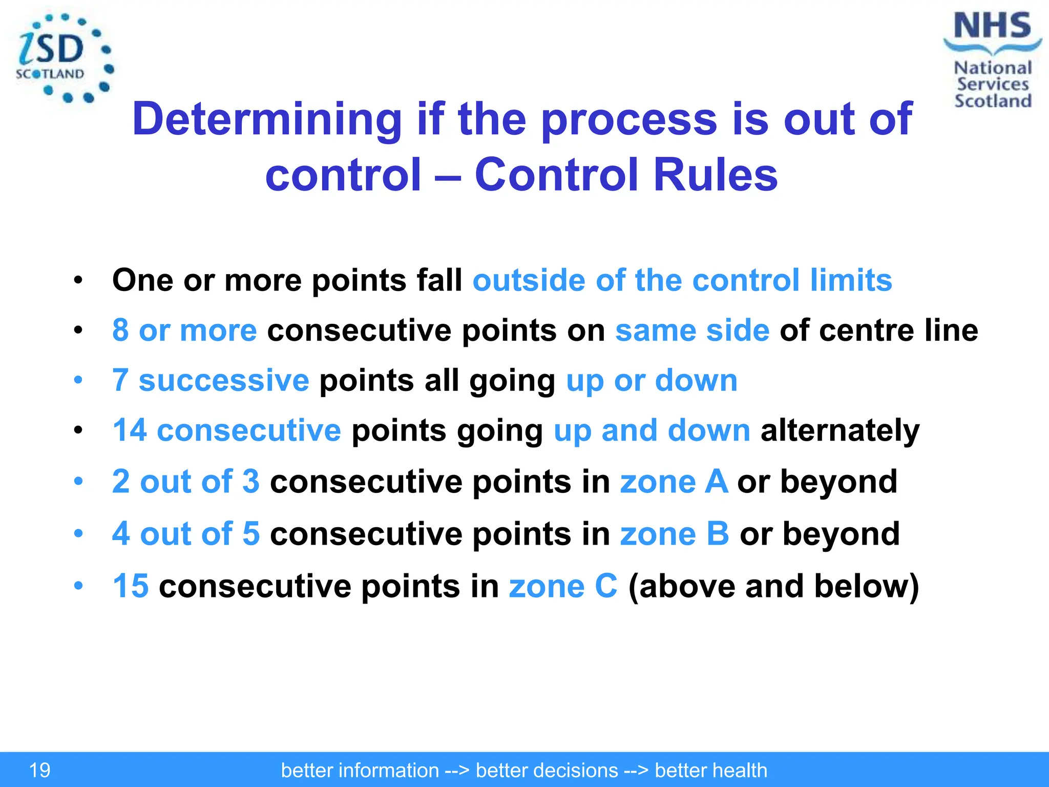
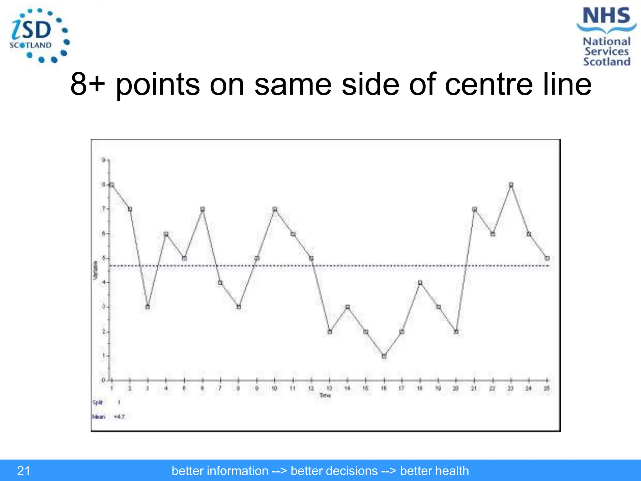
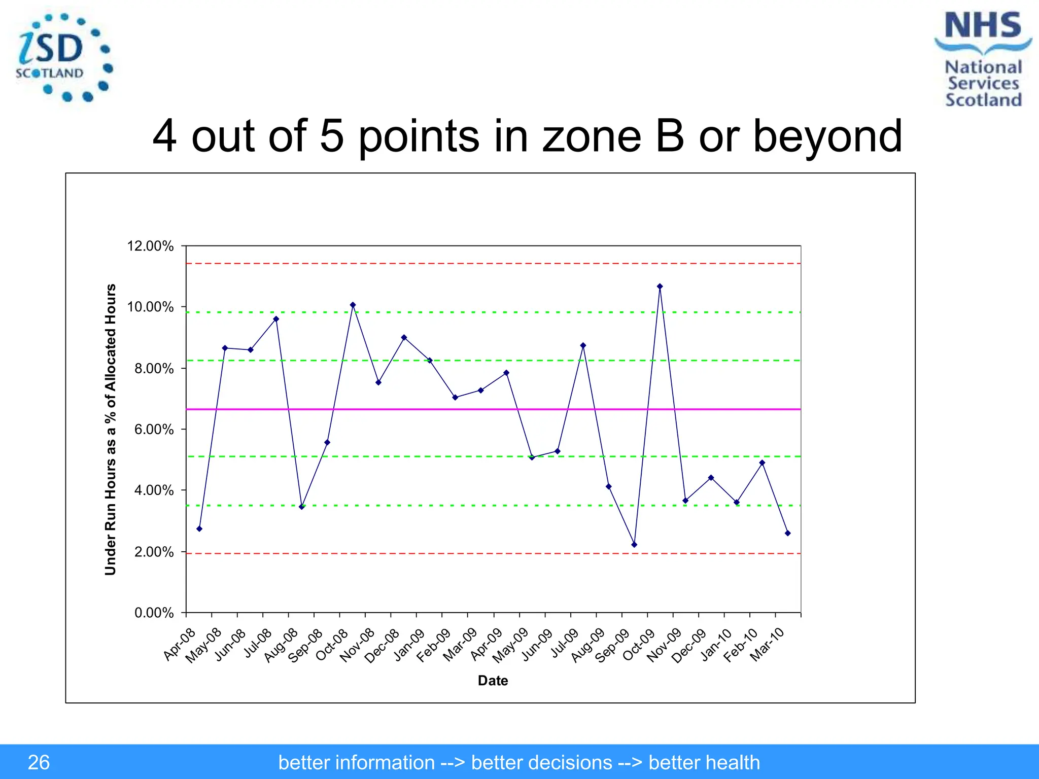
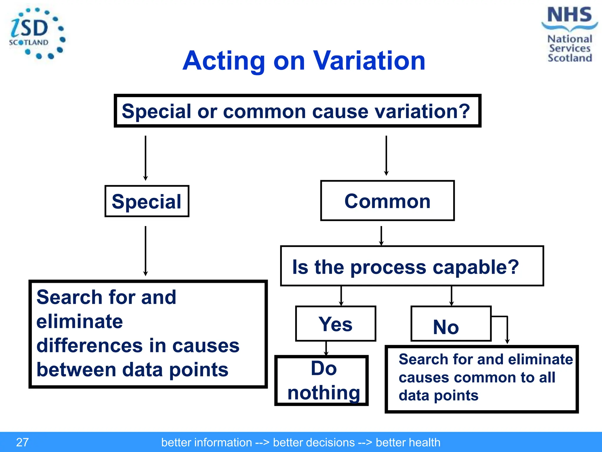
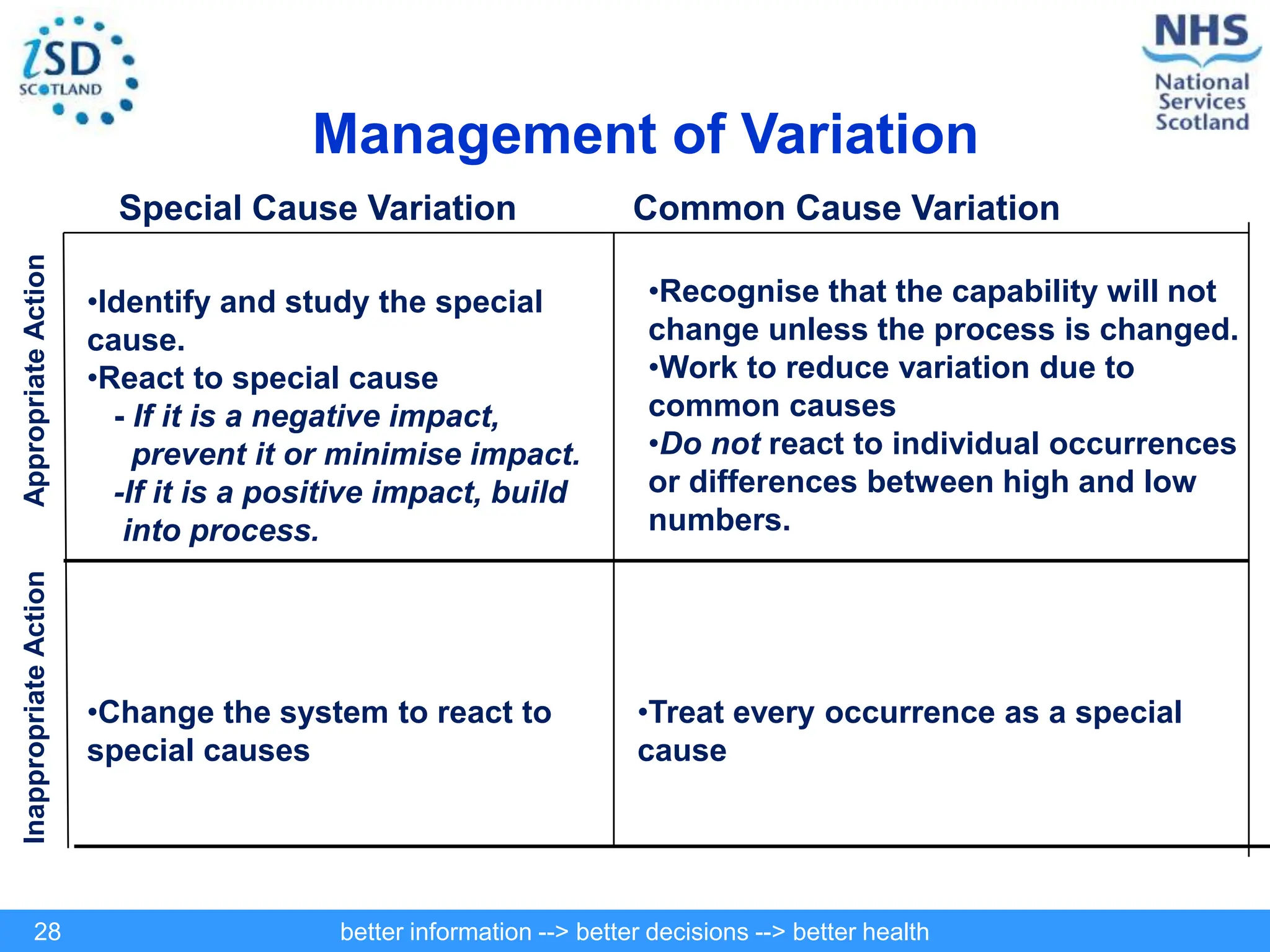
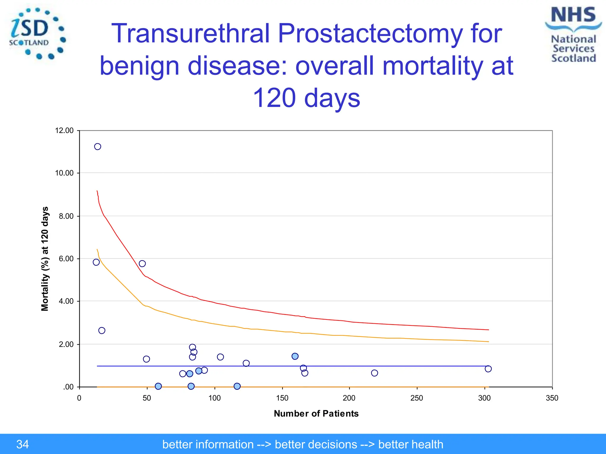
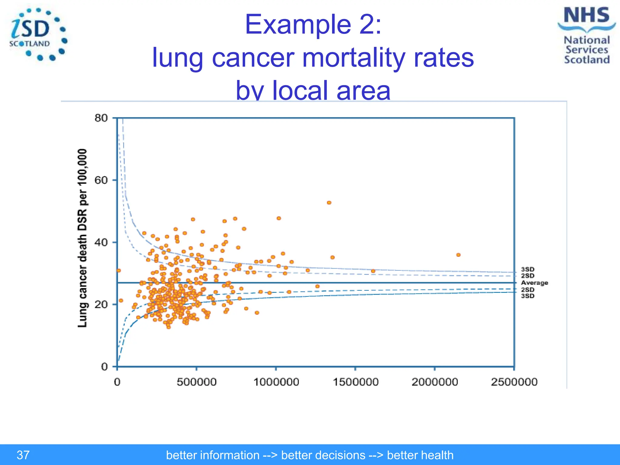
better information --> better decisions --> better health
1
Statistical Process Control – An Overview
Public Health Intelligence Training Course – March 2011
better information --> better decisions --> better health
2
Introduction
• Public health practice commonly makes comparisons between areas,
groups or institutions.
• Methods based on ranking, e.g. league tables, percentiles, have a number
of flaws.
• Ranking makes the assumption that differences between organisations are
the results of better or poorer performance. It takes no account of inherent
system differences.
• Just because institutions produce different values for an indicator, and we
naturally tend to rank these values, doesn’t mean we are observing
variation in performance.
• All systems within which institutions operate, no matter how stable, will
produce variable outcomes due to natural variation.
better information --> better decisions --> better health
3
Introduction
• The questions we need to answer are:
– Is the observed variation more or less than we would normally expect?
– Are there genuine outliers?
– Are there exceptionally good performers?
– What reasons might there be for excess variation?
• Alternative methods based on understanding variation may be more
appropriate.
• Statistical process control is one such method and helps to answer these
questions through the use of control charts.
better information --> better decisions --> better health
4
Why use control charts?
Control charts are used to monitor, control, and improve
system or process performance over time by studying variation and its
source.
What do control charts do?
• Focus attention on detecting and monitoring process variation over time
• Distinguishes special from common causes of variation, as a guide to local
or management action.
• Serves as a tool for ongoing control of a process
• Helps improve a process to perform consistently and predictably
Introduction to Control Charts
better information --> better decisions --> better health
5
Types of Variation
1. Common-cause or process variation is variation that is completely random;
special-cause or extra-process variation is non-random i.e. is the result of an
event or action.
2. Special cause variation can be exhibited within or outwith control limits i.e trends,
step functions, drift etc.
3. In any system variation is to be expected. Using statistical techniques we define
the limits of variation (control limits and zones). Interpretation of the data relative
to these limits or zones identifies points that are worthy of investigation.
better information --> better decisions --> better health
6
Definitions
• A process is said to be ‘in control’ if it
exhibits only “common cause” variation.
– This process is completely stable and predictable.
• A process is said to be ‘out of control’ if it
exhibits “special cause” variation.
– This process is unstable.
better information --> better decisions --> better health
7
Basic control chart layout
Centre line
(usually mean
or median)
0.00%
2.00%
4.00%
6.00%
8.00%
10.00%
12.00%
14.00%
Apr-
08
May-
08
Jun-
08
Jul-
08
Aug-
08
Sep-
08
Oct-
08
Nov-
08
Dec-
08
Jan-
09
Feb-
09
Mar-
09
Apr-
09
May-
09
Jun-
09
Jul-
09
Aug-
09
Sep-
09
Oct-
09
Nov-
09
Dec-
09
Jan-
10
Feb-
10
Mar-
10
Date
Under
Run
Hours
as
a
%
of
Allocated
Hours
Zone A
Zone B
Zone C
Zone A
Zone B
Zone C
Upper control
limit
Lower control limit
Warning zones
better information --> better decisions --> better health
8
Types of control charts
• Control charts are plots of the data with lines indicating the target value
(mean, median) and control limits superimposed.
• The common types are based on statistical distributions:
– Poisson distribution for counts, rates and ratios; e.g number of violent
crimes, number of serious accidents
– Binomial distribution for proportions; e.g where the response is a
category such as success, failure, response, non-response
– Normal distribution for continuous data e.g measures such as height,
weight, blood pressure
better information --> better decisions --> better health
9
Types of control charts
1. Conventional control charts (run charts)
– The indicator of interest is plotted on the y-axis, against time or the
unit of analysis on the x-axis.
– Control charts can be plotted with small numbers of data points
although their power is increased with more data.
2. Funnel plots
– A type of chart where the indicator of interest is plotted against the
denominator or sample size.
– This gives it the characteristic funnel shape
better information --> better decisions --> better health
10
Using control charts and SPC methods
• Control charts can help us to present and interpret our information more
intelligently.
• They can be used
– To detect unusual or outlying patterns, e.g. poor performance,
outbreaks or unusual patterns of disease
– In health profiling and assessing levels of performance
– To decide whether or not targets are being met
– In assessing health inequalities
better information --> better decisions --> better health
11
Examples – Run Charts & Control Charts
Run Charts:
• Display of data points plotted in chronological order
• Ideally 25 data points are required
• Centre line (mean or median) is included to identify types of variation
Control Charts:
• A Run chart plus control limits and warning limits (optional)
• Control limits are set at 3 standard deviations above and below the mean
Warning limits are set at 2 standard deviations above and below the mean
• These limits provide an additional tool for detecting special cause variation
better information --> better decisions --> better health
12
Run chart – Time to work
08:24
08:38
08:52
09:07
09:21
09:36
Mon
Tues
Wed
Thurs
Fri
Mon
Tues
Wed
Thurs
Fri
Mon
Tues
Wed
Thurs
Fri
Mon
Tues
Wed
Thurs
Fri
Mon
Tues
Wed
Thurs
Fri
Time
arrived
at
work
better information --> better decisions --> better health
13
Run Chart – Out of control
08:24
08:38
08:52
09:07
09:21
09:36
09:50
10:04
10:19
10:33
10:48
Mon
Tues
Wed
Thurs
Fri
Mon
Tues
Wed
Thurs
Fri
Mon
Tues
Wed
Thurs
Fri
Mon
Tues
Wed
Thurs
Fri
Mon
Tues
Wed
Thurs
Fri
Time
arrived
at
work
better information --> better decisions --> better health
14
Special Cause Rule Number 1: Shifts
For detecting shifts in the middle value, look for eight or more consecutive points
either above of below the center line. Values on the center line are ignored, they
do not break a run, and are not counted as points in the run.
0.2
0.7
1.2
1.7
2.2
1 2 3 4 5 6 7 8 9 10 11 12 13 14 15 16 17 18 19 20 21 22 23 24 25
Blood Samples
Micrograms/ML
SERUM GENTAMICIN LEVELS - TROUGH
better information --> better decisions --> better health
15
ADVERSE DRUG REACTIONS
Special Cause Rule Number 2: Trends
For Detecting trends, look for six lines between seven consecutive points all going
up or all going down. If the value of two or more consecutive points is the same,
ignore the lines connecting those values when counting. Like values do not make or
break a trend.
0
1
2
3
4
5
1 2 3 4 5 6 7 8 9 10 11 12 13 14 15 16 17 18 19 20 21 22 23 24 25
Week Number
Number
of
Adverse
Drug
Reactions
better information --> better decisions --> better health
16
75
80
85
90
95
100
105
110
115
120
1 2 3 4 5 6 7 8 9 10 11 12 13 14 15 16 17 18 19 20 21 22 23 24 25
INDIVIDUAL PATIENT READINGS
MEASUREMENT
DIASTOLIC BLOOD PRESSURE
Special Cause Rule Number 3: Zig-Zag Patterns
Any non-random pattern may be an indication of a special cause variation. A
general rule is to investigate where 14 consecutive points go up and down
alternately.
better information --> better decisions --> better health
17
Special Cause Rule Number 4: Cyclical Patterns
A non-random cyclical pattern may be an indication of a special cause variation.
For example, a seasonal pattern occurring across months or quarters of the year.
0
1
2
3
4
5
6
7
1
2
3
4
5
6
7
8
9
10
11
12
13
14
15
16
17
18
19
20
21
22
23
24
25
Time
Observations
better information --> better decisions --> better health
18
Special Cause Rule Number 5: Points Outside Limits
A point or points outside control limits is/ are evidence of special cause. Control
limits are calculated based on data from the process.
0
10
20
30
40
50
60
70
1 2 3 4 5 6 7 8 9 10 11 12 13 14 15 16 17 18 19 20 21 22 23 24 25
COLPOSCOPYPATIENTS
TIME
IN
DAYS
Mean = 35
ABNORMAL PAP TEST FOLLOW-UP PROCESS
UCL
better information --> better decisions --> better health
19
Determining if the process is out of
control – Control Rules
• One or more points fall outside of the control limits
• 8 or more consecutive points on same side of centre line
• 7 successive points all going up or down
• 14 consecutive points going up and down alternately
• 2 out of 3 consecutive points in zone A or beyond
• 4 out of 5 consecutive points in zone B or beyond
• 15 consecutive points in zone C (above and below)
better information --> better decisions --> better health
20
Answers to Handout
better information --> better decisions --> better health
21
8+ points on same side of centre line
better information --> better decisions --> better health
22
16 points going up and down
better information --> better decisions --> better health
23
Common cause
better information --> better decisions --> better health
24
Common cause
better information --> better decisions --> better health
25
7 points decreasing
better information --> better decisions --> better health
26
4 out of 5 points in zone B or beyond
0.00%
2.00%
4.00%
6.00%
8.00%
10.00%
12.00%
A
p
r
-
0
8
M
a
y
-
0
8
J
u
n
-
0
8
J
u
l
-
0
8
A
u
g
-
0
8
S
e
p
-
0
8
O
c
t
-
0
8
N
o
v
-
0
8
D
e
c
-
0
8
J
a
n
-
0
9
F
e
b
-
0
9
M
a
r
-
0
9
A
p
r
-
0
9
M
a
y
-
0
9
J
u
n
-
0
9
J
u
l
-
0
9
A
u
g
-
0
9
S
e
p
-
0
9
O
c
t
-
0
9
N
o
v
-
0
9
D
e
c
-
0
9
J
a
n
-
1
0
F
e
b
-
1
0
M
a
r
-
1
0
Date
Under
Run
Hours
as
a
%
of
Allocated
Hours
better information --> better decisions --> better health
27
Acting on Variation
Special or common cause variation?
Common
Special
Is the process capable?
Yes No
Search for and
eliminate
differences in causes
between data points Do
nothing
Search for and eliminate
causes common to all
data points
better information --> better decisions --> better health
28
Management of Variation
Special Cause Variation Common Cause Variation
•Identify and study the special
cause.
•React to special cause
- If it is a negative impact,
prevent it or minimise impact.
-If it is a positive impact, build
into process.
•Recognise that the capability will not
change unless the process is changed.
•Work to reduce variation due to
common causes
•Do not react to individual occurrences
or differences between high and low
numbers.
•Change the system to react to
special causes
•Treat every occurrence as a special
cause
Inappropriate
Action
Appropriate
Action
better information --> better decisions --> better health
29
Summary
• Understanding the causes of variation has reformed
industry
• Application to healthcare has provided important insight
to inform improvement
• Effectively highlights areas meriting further investigation
through simple data presentation
better information --> better decisions --> better health
30
Chart Instability
Instability is defined as:
No. of control rule violations
Total no. of points entered
• Charts can be ranked according to their instability
• Good way of prioritising the charts to investigate
• Can be used as an ‘Early Warning System’ to identify
problem charts before they become a real issue
better information --> better decisions --> better health
31
Funnel plots
• Conventional control charts are used for
count data, proportions and continuous
variables
• Funnel plots are used for discrete/count data
(e.g. deaths and hospital admissions)
– Can be used for proportions, directly standardised
rates, indirectly standardised rates and ratios, and
rate ratios.
better information --> better decisions --> better health
32
Example 1: rate of mortality at 120 days
following admission to a surgical specialty
• In this example each data point is a hospital (all hospitals in NHS
Board X are shaded blue).
• The number of people admitted to a surgical specialty is represented
on the horizontal axis, which essentially means that smaller hospitals
appear towards the left hand side of the graph and larger hospitals
towards the right.
• The proportion of people who died within 120 days of admission to
hospital is represented on the vertical axis – the higher up the data
point, the higher the rate of mortality would appear to be.
• The funnel formed by the control limits (and from which the graph gets
its name) is wider towards the left hand side. This is simply so the level
of activity (in this case, the number of admissions) is taken into
account when identifying ‘outliers’ (i.e. the larger the denominator, the
most stable the data points are).
better information --> better decisions --> better health
33
Elective admissions to any surgical
specialty: overall mortality at 120 days
.00
.50
1.00
1.50
2.00
2.50
3.00
0 2,000 4,000 6,000 8,000 10,000 12,000 14,000 16,000 18,000
Number of Patients
Mortality
rate(%)
at
120
days
better information --> better decisions --> better health
34
Transurethral Prostactectomy for
benign disease: overall mortality at
120 days
.00
2.00
4.00
6.00
8.00
10.00
12.00
0 50 100 150 200 250 300 350
Number of Patients
Mortality
(%)
at
120
days
better information --> better decisions --> better health
35
Issues with control charts
• In the “any surgical specialty” example, there are many
areas which lie outside the control limits
• Such a large number of points outside the control limits
is known as overdispersion
• It arises when there are large numbers of events, and
case-mix or other risk factors (e.g. deprivation) are not
accounted for
• In this example, the overdispersion is probably due to
the variation in procedures covered and different uptake
of these procedures across the Scottish hospitals.
better information --> better decisions --> better health
36
How to handle overdispersion?
• In performance management, we try to identify differences that can
be attributed to differences in organisational performance.
• In this case it’s usual to adjust the control limits or the data to
eliminate potential sources of variation, such as case-mix and
demography.
• This has the effect of creating a ‘level playing field’.
• In public health practice, we are likely to be interested in such
sources of variation for their own sake (lung cancer example).
• Rather than eliminate them, we want to draw attention to them and
understand the reasons behind them.
• We tend not to alter control limits, and display the variation as it
actually is.
better information --> better decisions --> better health
37
Example 2:
lung cancer mortality rates
by local area
better information --> better decisions --> better health
38
Further information
http://www.indicators.scot.
nhs.uk/SPC/Main.html
http://www.apho.org.uk/
resource/item.aspx?RID
=39445

Control charts-Statstical Quality control

  • 1.
    better information -->better decisions --> better health 1 Statistical Process Control – An Overview Public Health Intelligence Training Course – March 2011
  • 2.
    better information -->better decisions --> better health 2 Introduction • Public health practice commonly makes comparisons between areas, groups or institutions. • Methods based on ranking, e.g. league tables, percentiles, have a number of flaws. • Ranking makes the assumption that differences between organisations are the results of better or poorer performance. It takes no account of inherent system differences. • Just because institutions produce different values for an indicator, and we naturally tend to rank these values, doesn’t mean we are observing variation in performance. • All systems within which institutions operate, no matter how stable, will produce variable outcomes due to natural variation.
  • 3.
    better information -->better decisions --> better health 3 Introduction • The questions we need to answer are: – Is the observed variation more or less than we would normally expect? – Are there genuine outliers? – Are there exceptionally good performers? – What reasons might there be for excess variation? • Alternative methods based on understanding variation may be more appropriate. • Statistical process control is one such method and helps to answer these questions through the use of control charts.
  • 4.
    better information -->better decisions --> better health 4 Why use control charts? Control charts are used to monitor, control, and improve system or process performance over time by studying variation and its source. What do control charts do? • Focus attention on detecting and monitoring process variation over time • Distinguishes special from common causes of variation, as a guide to local or management action. • Serves as a tool for ongoing control of a process • Helps improve a process to perform consistently and predictably Introduction to Control Charts
  • 5.
    better information -->better decisions --> better health 5 Types of Variation 1. Common-cause or process variation is variation that is completely random; special-cause or extra-process variation is non-random i.e. is the result of an event or action. 2. Special cause variation can be exhibited within or outwith control limits i.e trends, step functions, drift etc. 3. In any system variation is to be expected. Using statistical techniques we define the limits of variation (control limits and zones). Interpretation of the data relative to these limits or zones identifies points that are worthy of investigation.
  • 6.
    better information -->better decisions --> better health 6 Definitions • A process is said to be ‘in control’ if it exhibits only “common cause” variation. – This process is completely stable and predictable. • A process is said to be ‘out of control’ if it exhibits “special cause” variation. – This process is unstable.
  • 7.
    better information -->better decisions --> better health 7 Basic control chart layout Centre line (usually mean or median) 0.00% 2.00% 4.00% 6.00% 8.00% 10.00% 12.00% 14.00% Apr- 08 May- 08 Jun- 08 Jul- 08 Aug- 08 Sep- 08 Oct- 08 Nov- 08 Dec- 08 Jan- 09 Feb- 09 Mar- 09 Apr- 09 May- 09 Jun- 09 Jul- 09 Aug- 09 Sep- 09 Oct- 09 Nov- 09 Dec- 09 Jan- 10 Feb- 10 Mar- 10 Date Under Run Hours as a % of Allocated Hours Zone A Zone B Zone C Zone A Zone B Zone C Upper control limit Lower control limit Warning zones
  • 8.
    better information -->better decisions --> better health 8 Types of control charts • Control charts are plots of the data with lines indicating the target value (mean, median) and control limits superimposed. • The common types are based on statistical distributions: – Poisson distribution for counts, rates and ratios; e.g number of violent crimes, number of serious accidents – Binomial distribution for proportions; e.g where the response is a category such as success, failure, response, non-response – Normal distribution for continuous data e.g measures such as height, weight, blood pressure
  • 9.
    better information -->better decisions --> better health 9 Types of control charts 1. Conventional control charts (run charts) – The indicator of interest is plotted on the y-axis, against time or the unit of analysis on the x-axis. – Control charts can be plotted with small numbers of data points although their power is increased with more data. 2. Funnel plots – A type of chart where the indicator of interest is plotted against the denominator or sample size. – This gives it the characteristic funnel shape
  • 10.
    better information -->better decisions --> better health 10 Using control charts and SPC methods • Control charts can help us to present and interpret our information more intelligently. • They can be used – To detect unusual or outlying patterns, e.g. poor performance, outbreaks or unusual patterns of disease – In health profiling and assessing levels of performance – To decide whether or not targets are being met – In assessing health inequalities
  • 11.
    better information -->better decisions --> better health 11 Examples – Run Charts & Control Charts Run Charts: • Display of data points plotted in chronological order • Ideally 25 data points are required • Centre line (mean or median) is included to identify types of variation Control Charts: • A Run chart plus control limits and warning limits (optional) • Control limits are set at 3 standard deviations above and below the mean Warning limits are set at 2 standard deviations above and below the mean • These limits provide an additional tool for detecting special cause variation
  • 12.
    better information -->better decisions --> better health 12 Run chart – Time to work 08:24 08:38 08:52 09:07 09:21 09:36 Mon Tues Wed Thurs Fri Mon Tues Wed Thurs Fri Mon Tues Wed Thurs Fri Mon Tues Wed Thurs Fri Mon Tues Wed Thurs Fri Time arrived at work
  • 13.
    better information -->better decisions --> better health 13 Run Chart – Out of control 08:24 08:38 08:52 09:07 09:21 09:36 09:50 10:04 10:19 10:33 10:48 Mon Tues Wed Thurs Fri Mon Tues Wed Thurs Fri Mon Tues Wed Thurs Fri Mon Tues Wed Thurs Fri Mon Tues Wed Thurs Fri Time arrived at work
  • 14.
    better information -->better decisions --> better health 14 Special Cause Rule Number 1: Shifts For detecting shifts in the middle value, look for eight or more consecutive points either above of below the center line. Values on the center line are ignored, they do not break a run, and are not counted as points in the run. 0.2 0.7 1.2 1.7 2.2 1 2 3 4 5 6 7 8 9 10 11 12 13 14 15 16 17 18 19 20 21 22 23 24 25 Blood Samples Micrograms/ML SERUM GENTAMICIN LEVELS - TROUGH
  • 15.
    better information -->better decisions --> better health 15 ADVERSE DRUG REACTIONS Special Cause Rule Number 2: Trends For Detecting trends, look for six lines between seven consecutive points all going up or all going down. If the value of two or more consecutive points is the same, ignore the lines connecting those values when counting. Like values do not make or break a trend. 0 1 2 3 4 5 1 2 3 4 5 6 7 8 9 10 11 12 13 14 15 16 17 18 19 20 21 22 23 24 25 Week Number Number of Adverse Drug Reactions
  • 16.
    better information -->better decisions --> better health 16 75 80 85 90 95 100 105 110 115 120 1 2 3 4 5 6 7 8 9 10 11 12 13 14 15 16 17 18 19 20 21 22 23 24 25 INDIVIDUAL PATIENT READINGS MEASUREMENT DIASTOLIC BLOOD PRESSURE Special Cause Rule Number 3: Zig-Zag Patterns Any non-random pattern may be an indication of a special cause variation. A general rule is to investigate where 14 consecutive points go up and down alternately.
  • 17.
    better information -->better decisions --> better health 17 Special Cause Rule Number 4: Cyclical Patterns A non-random cyclical pattern may be an indication of a special cause variation. For example, a seasonal pattern occurring across months or quarters of the year. 0 1 2 3 4 5 6 7 1 2 3 4 5 6 7 8 9 10 11 12 13 14 15 16 17 18 19 20 21 22 23 24 25 Time Observations
  • 18.
    better information -->better decisions --> better health 18 Special Cause Rule Number 5: Points Outside Limits A point or points outside control limits is/ are evidence of special cause. Control limits are calculated based on data from the process. 0 10 20 30 40 50 60 70 1 2 3 4 5 6 7 8 9 10 11 12 13 14 15 16 17 18 19 20 21 22 23 24 25 COLPOSCOPYPATIENTS TIME IN DAYS Mean = 35 ABNORMAL PAP TEST FOLLOW-UP PROCESS UCL
  • 19.
    better information -->better decisions --> better health 19 Determining if the process is out of control – Control Rules • One or more points fall outside of the control limits • 8 or more consecutive points on same side of centre line • 7 successive points all going up or down • 14 consecutive points going up and down alternately • 2 out of 3 consecutive points in zone A or beyond • 4 out of 5 consecutive points in zone B or beyond • 15 consecutive points in zone C (above and below)
  • 20.
    better information -->better decisions --> better health 20 Answers to Handout
  • 21.
    better information -->better decisions --> better health 21 8+ points on same side of centre line
  • 22.
    better information -->better decisions --> better health 22 16 points going up and down
  • 23.
    better information -->better decisions --> better health 23 Common cause
  • 24.
    better information -->better decisions --> better health 24 Common cause
  • 25.
    better information -->better decisions --> better health 25 7 points decreasing
  • 26.
    better information -->better decisions --> better health 26 4 out of 5 points in zone B or beyond 0.00% 2.00% 4.00% 6.00% 8.00% 10.00% 12.00% A p r - 0 8 M a y - 0 8 J u n - 0 8 J u l - 0 8 A u g - 0 8 S e p - 0 8 O c t - 0 8 N o v - 0 8 D e c - 0 8 J a n - 0 9 F e b - 0 9 M a r - 0 9 A p r - 0 9 M a y - 0 9 J u n - 0 9 J u l - 0 9 A u g - 0 9 S e p - 0 9 O c t - 0 9 N o v - 0 9 D e c - 0 9 J a n - 1 0 F e b - 1 0 M a r - 1 0 Date Under Run Hours as a % of Allocated Hours
  • 27.
    better information -->better decisions --> better health 27 Acting on Variation Special or common cause variation? Common Special Is the process capable? Yes No Search for and eliminate differences in causes between data points Do nothing Search for and eliminate causes common to all data points
  • 28.
    better information -->better decisions --> better health 28 Management of Variation Special Cause Variation Common Cause Variation •Identify and study the special cause. •React to special cause - If it is a negative impact, prevent it or minimise impact. -If it is a positive impact, build into process. •Recognise that the capability will not change unless the process is changed. •Work to reduce variation due to common causes •Do not react to individual occurrences or differences between high and low numbers. •Change the system to react to special causes •Treat every occurrence as a special cause Inappropriate Action Appropriate Action
  • 29.
    better information -->better decisions --> better health 29 Summary • Understanding the causes of variation has reformed industry • Application to healthcare has provided important insight to inform improvement • Effectively highlights areas meriting further investigation through simple data presentation
  • 30.
    better information -->better decisions --> better health 30 Chart Instability Instability is defined as: No. of control rule violations Total no. of points entered • Charts can be ranked according to their instability • Good way of prioritising the charts to investigate • Can be used as an ‘Early Warning System’ to identify problem charts before they become a real issue
  • 31.
    better information -->better decisions --> better health 31 Funnel plots • Conventional control charts are used for count data, proportions and continuous variables • Funnel plots are used for discrete/count data (e.g. deaths and hospital admissions) – Can be used for proportions, directly standardised rates, indirectly standardised rates and ratios, and rate ratios.
  • 32.
    better information -->better decisions --> better health 32 Example 1: rate of mortality at 120 days following admission to a surgical specialty • In this example each data point is a hospital (all hospitals in NHS Board X are shaded blue). • The number of people admitted to a surgical specialty is represented on the horizontal axis, which essentially means that smaller hospitals appear towards the left hand side of the graph and larger hospitals towards the right. • The proportion of people who died within 120 days of admission to hospital is represented on the vertical axis – the higher up the data point, the higher the rate of mortality would appear to be. • The funnel formed by the control limits (and from which the graph gets its name) is wider towards the left hand side. This is simply so the level of activity (in this case, the number of admissions) is taken into account when identifying ‘outliers’ (i.e. the larger the denominator, the most stable the data points are).
  • 33.
    better information -->better decisions --> better health 33 Elective admissions to any surgical specialty: overall mortality at 120 days .00 .50 1.00 1.50 2.00 2.50 3.00 0 2,000 4,000 6,000 8,000 10,000 12,000 14,000 16,000 18,000 Number of Patients Mortality rate(%) at 120 days
  • 34.
    better information -->better decisions --> better health 34 Transurethral Prostactectomy for benign disease: overall mortality at 120 days .00 2.00 4.00 6.00 8.00 10.00 12.00 0 50 100 150 200 250 300 350 Number of Patients Mortality (%) at 120 days
  • 35.
    better information -->better decisions --> better health 35 Issues with control charts • In the “any surgical specialty” example, there are many areas which lie outside the control limits • Such a large number of points outside the control limits is known as overdispersion • It arises when there are large numbers of events, and case-mix or other risk factors (e.g. deprivation) are not accounted for • In this example, the overdispersion is probably due to the variation in procedures covered and different uptake of these procedures across the Scottish hospitals.
  • 36.
    better information -->better decisions --> better health 36 How to handle overdispersion? • In performance management, we try to identify differences that can be attributed to differences in organisational performance. • In this case it’s usual to adjust the control limits or the data to eliminate potential sources of variation, such as case-mix and demography. • This has the effect of creating a ‘level playing field’. • In public health practice, we are likely to be interested in such sources of variation for their own sake (lung cancer example). • Rather than eliminate them, we want to draw attention to them and understand the reasons behind them. • We tend not to alter control limits, and display the variation as it actually is.
  • 37.
    better information -->better decisions --> better health 37 Example 2: lung cancer mortality rates by local area
  • 38.
    better information -->better decisions --> better health 38 Further information http://www.indicators.scot. nhs.uk/SPC/Main.html http://www.apho.org.uk/ resource/item.aspx?RID =39445