Download as PDF, PPTX
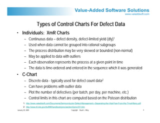
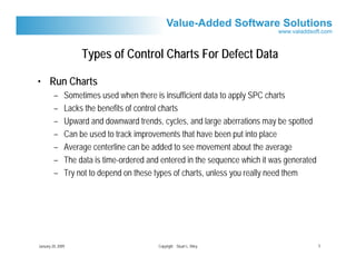
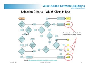
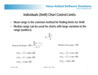
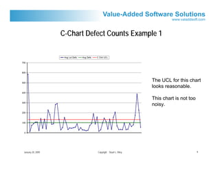
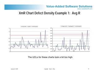
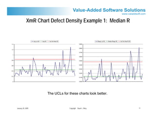
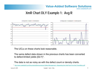
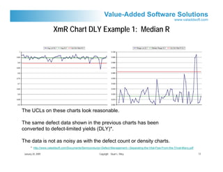
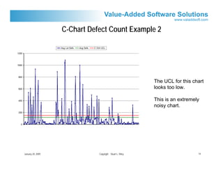
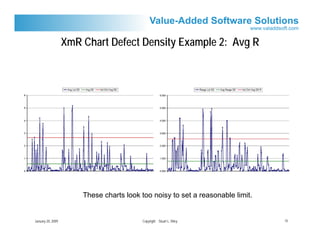
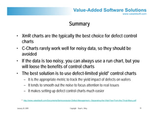

The document discusses using different types of control charts for semiconductor defect data, including XmR charts, C-charts, and run charts. It provides examples of applying these charts to defect count, density, and defect-limited yield data. The summary concludes that XmR charts are generally best for defect control and that using defect-limited yield data tends to produce the smoothest charts for setting control limits.


