Citrrus Brand Identity - Rebrand Part 1
•
0 likes•64 views

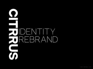
Citrrus has created a new brand identity and brand book in 2014. They have redesigned their logo to be more iconic and symbolic to define who they are as a company that specializes in mobile technology and innovation. Their colors of orange and white are meant to stand out and be memorable. They value a collaborative design process focused on user needs and business requirements to develop practical solutions through inquiry and analysis.

Recommended
Recommended
More Related Content
Similar to Citrrus Brand Identity - Rebrand Part 1
Similar to Citrrus Brand Identity - Rebrand Part 1 (20)
Recently uploaded
Recently uploaded (20)
Citrrus Brand Identity - Rebrand Part 1
- 1. CITRRUS | BRAND BOOK | 1.0 2014 CHAPTER
- 2. CITRRUS | BRAND BOOK | 1.0 2014 WHO ARE WE? It's 2014 and we have a new brand identity! Throughout our process of rebranding, we've had to ask ourselves fundamental questions about who we are and why we exist. So, what does Citrrus do? Why do we do it? Why do we love it? How do we want to be recognized? How are we relevant in the world today? We want our visual identity to be confident, and flow freely though all parts of our business. Integrating our visual identity into each company element is integral to our public perception and the way we view ourselves. This year, we've created a signature that we love, a style and voice of our own.
- 3. CITRRUS | BRAND BOOK | 1.0 2014 IDENTITY We are mobile experts working on the cutting edge of technology. We are innovative and value exploration. We strive for quality and excellence in our execution. We believe that form and function work together, and we prioritize both equally. We are known for our keen understanding of business requirements and User needs. We are proud of our iterative and agile design + development process. We are remembered for our dedication and collaboration.
- 4. CITRRUS | BRAND BOOK | 1.0 2014 VOICE COMPREHENSIVE ELOQUENT ADEPT INTREPID TRANSPARENT AMBITIOUS DEVOTED PERCEPTIVE FAITHFUL OPPORTUNISTIC ADHERENT RESOURCEFUL TERSE DEXTEROUS HONED EXPLORATIVE INFLUENTIAL DIE-HARD CLEVER GENUINE INSPIRING CURRENT PRECISE SAVVY RELEVANT UNAMBIGUOUS ARTFUL DEDICATED DEVOTED OPTIMISTIC SPICY STEADFAST EXPRESSIVE THOROUGH UNMISTAKABLE CONFIDENT UNAFRAID MINIMAL TACTFUL CUTTING-EDGE
- 5. CITRRUS | BRAND BOOK | 1.0 2014 DESIGN Our work is driven by our iterative, collaborative design and development process. Our design is based on systematic inquiry and today's industry standards. We develop a deeper understanding of design problems through comprehensive and responsive methods of investigation and creative analysis. Through this process of inquiry and critical thinking we are able to produce informed and practical solutions to complex problems.
- 6. CITRRUS | BRAND BOOK | 1.0 2014 Karl Gerstner, Designing Programmes "To come to a problem’s solution, the designer must be able to describe and understand the problem."
- 7. CITRRUS | BRAND BOOK | 1.0 2014 LOGO A logo can be a solution to a complex problem. A logo can define, embody, and command. Our new logo is iconic and symbolic. By looking at our logo, you will know who we are and the principles on which we've built our foundation. Our new logo is memorable, simple, timeless, distinct, and relevant.
- 8. CITRRUS | BRAND BOOK | 1.0 2014 COLOR Color can be subjective, and personal preference, experience, and culture may impact how one perceives and reacts to our brand colors. Within the group of elements that make up our visual identity, color and shape are perceptually different and stand out. It's with color and shape that we hope one will most often gain a first impression of our brand. Our tonic colors - orange and white - are a splash of personality, they are unique and unforgettable.
- 9. CITRRUS | BRAND BOOK | 1.0 2014 Van Dam, G., Peeck, J., Brinkerink, M., & Gorter, U. (1974). The isolation effect in free recall and recognition. The American Journal of Psychology, 87(3), 497–504. https://doi.org/ 10.2307/1421391 von Restorff, H. Über die Wirkung von Bereichsbildungen im Spurenfeld. Psychol. Forsch. 18, 299–342 (1933). https://doi.org/10.1007/BF02409636 English translation PDF: https://psychology.olemiss.edu/reed-hunt The Von Restorff "Isolation" Effect A psychological principle within the Gestalt framework that predicts the influence of stimuli on memory. Specifically, when multiple homogeneous stimuli are presented, the stimulus that differs or stands out from the rest is more likely to be remembered.
- 10. CITRRUS | BRAND BOOK | 1.0 2014 CURRENT LOGO
- 11. CITRRUS | BRAND BOOK | 1.0 2014 NEW ITERATIONS
- 12. CITRRUS | BRAND BOOK | 1.0 2014
- 13. CITRRUS | BRAND BOOK | 1.0 2014 THANK YOU