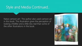
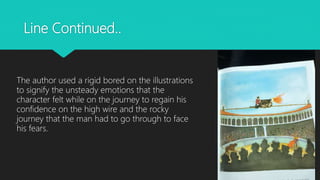
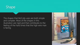
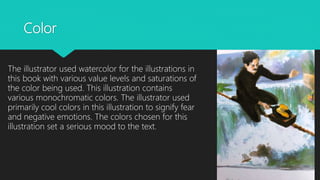
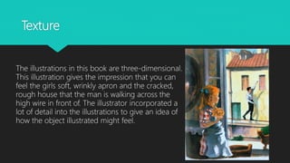
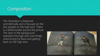
Taylor Michael
MIRETTE ON THE HIGH WIRE
Written and illustrated by Emily Arnold
McCully
Background Information
Mirette on the High Wire is a children’s book written in 1992 about
a child that helps a man regain his confidence on the high wire.
Shortly after being published in 1992, the book was awarded the
Caldecott Medal in 1993. This book takes place in Paris in the 19th
century and watercolors are used to portray a realistic and
cartoon art look.
Style and Media
Emily Arnold McCully’s artistic styles in this book
are realism and naïve cartoon art.
Style and Media Continued..
Realism- The illustration of the man looking out
the window was made to look realistic. The shutters
on the window and all of the surrounding objects
around the window are made with precise detail to look
just as these things would in real life.
Style and Media Continued..
Naïve cartoon art- The author also used cartoon art
in this book. This illustration gives the perception of
looking childlike and a little less real than some of
the other illustrations in the book.
Line
The author used straight lines for the checkered floor
to set a serious mood in the book.
Line Continued..
The author used a rigid bored on the illustrations
to signify the unsteady emotions that the
character felt while on the journey to regain his
confidence on the high wire and the rocky
journey that the man had to go through to face
his fears.
Shape
The shapes that McCully uses are both simple
and complex. Most of the shapes in this
illustration are rigid and that contributes to the
feeling of the hard times that the high wire man
is facing.
Color
The illustrator used watercolor for the illustrations in
this book with various value levels and saturations of
the color being used. This illustration contains
various monochromatic colors. The illustrator used
primarily cool colors in this illustration to signify fear
and negative emotions. The colors chosen for this
illustration set a serious mood to the text.
Texture
The illustrations in this book are three-dimensional.
This illustration gives the impression that you can
feel the girls soft, wrinkly apron and the cracked,
rough house that the man is walking across the
high wire in front of. The illustrator incorporated a
lot of detail into the illustrations to give an idea of
how the object illustrated might feel.
Composition
This illustration is balanced
symmetrically and is focused on the
two people on the high wire. There
is a white border around the picture.
The stars in the background
represent the high wire man finally
overcoming his fears and getting
back on the high wire.

Caldecott analysis

  • 1.
    Taylor Michael MIRETTE ONTHE HIGH WIRE Written and illustrated by Emily Arnold McCully
  • 2.
    Background Information Mirette onthe High Wire is a children’s book written in 1992 about a child that helps a man regain his confidence on the high wire. Shortly after being published in 1992, the book was awarded the Caldecott Medal in 1993. This book takes place in Paris in the 19th century and watercolors are used to portray a realistic and cartoon art look.
  • 3.
    Style and Media EmilyArnold McCully’s artistic styles in this book are realism and naïve cartoon art.
  • 4.
    Style and MediaContinued.. Realism- The illustration of the man looking out the window was made to look realistic. The shutters on the window and all of the surrounding objects around the window are made with precise detail to look just as these things would in real life.
  • 5.
    Style and MediaContinued.. Naïve cartoon art- The author also used cartoon art in this book. This illustration gives the perception of looking childlike and a little less real than some of the other illustrations in the book.
  • 6.
    Line The author usedstraight lines for the checkered floor to set a serious mood in the book.
  • 7.
    Line Continued.. The authorused a rigid bored on the illustrations to signify the unsteady emotions that the character felt while on the journey to regain his confidence on the high wire and the rocky journey that the man had to go through to face his fears.
  • 8.
    Shape The shapes thatMcCully uses are both simple and complex. Most of the shapes in this illustration are rigid and that contributes to the feeling of the hard times that the high wire man is facing.
  • 9.
    Color The illustrator usedwatercolor for the illustrations in this book with various value levels and saturations of the color being used. This illustration contains various monochromatic colors. The illustrator used primarily cool colors in this illustration to signify fear and negative emotions. The colors chosen for this illustration set a serious mood to the text.
  • 10.
    Texture The illustrations inthis book are three-dimensional. This illustration gives the impression that you can feel the girls soft, wrinkly apron and the cracked, rough house that the man is walking across the high wire in front of. The illustrator incorporated a lot of detail into the illustrations to give an idea of how the object illustrated might feel.
  • 11.
    Composition This illustration isbalanced symmetrically and is focused on the two people on the high wire. There is a white border around the picture. The stars in the background represent the high wire man finally overcoming his fears and getting back on the high wire.