1. Brokerage Executive Dashboard
…a consolidated view of brokerage metrics for the executive user.
A USER EXPERIENCE SERIES CASE STUDY
Reams of data, an inbox full of reports, and a desk covered with last week’s
spreadsheets. That was the challenge faced by brokerage executives at one of
the world’s largest financial services companies. Timely insight into trade activity
meant the difference between success, and falling behind the competition.
www.axistechnologyllc.com Boston | Dallas | Charlotte | New York
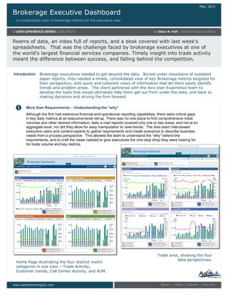
Home Page illustrating the four distinct metric
categories in one view – Trade Activity,
Customer trends, Call Center Activity, and AUM.
Trade area, showing the four
data perspectives.
Brokerage executives needed to get beyond the data. Buried under mountains of outdated
paper reports, they needed a timely, consolidated view of key Brokerage metrics targeted for
their perspective, with quick and coherent views of information that let them easily identify
trends and problem areas. The client partnered with the Axis User Experience team to
develop the tools that would ultimately help them get out from under the data, and back to
making decisions and driving the firm forward.
More than Requirements – Understanding the “why”
Although the firm had extensive financial and operational reporting capabilities, there were critical gaps
in key daily metrics at an executive-level roll-up. There was no one place to find comprehensive trade
volumes and other desired information; daily e-mail reports covered only one or two areas, and not at an
aggregate level, nor did they allow for easy manipulation to view trends. The Axis team interviewed
executive users and content experts to gather requirements and create scenarios to describe business
needs from a process perspective. This allowed the team to understand the “why” behind the
requirements, and to craft the views needed to give executives the one-stop shop they were looking for
for trade volume and key metrics.
Introduction
2. Brokerage Executive Dashboard
A USER EXPERIENCE SERIES CASE STUDY
…Brokerage metrics for the executive
www.axistechnologyllc.com Boston | Dallas | Charlotte | New York
Using scenarios as a guidepost, the Axis team
designed an intuitive dashboard that highlights daily
operational metrics for the brokerage leadership
community. It provides executives with graphically
formatted, multidimensional information to help them
monitor and analyze their business. With robust
charting features that allow comparison and trend
analysis, as well as click-through navigation to deeper
levels of detail, the dashboard allows executives to
make thoughtful and informed strategic decisions
based on substantive data.
Ability to change chart types and functionality for
trending and comparative analysis.
Easy to use and
understand drill-down
capability is provided
The Axis User Experience team delivered the tools the client needed to understand their own
data. Following the client’s SDLC methodology, and leveraging in-place technologies as well
as client development resources, the Axis team delivered and tested the first release of the
Brokerage Dashboard in 2006. Ongoing enhancements include additional metric categories
and enhanced functionality. Today, the dashboard powers Brokerage leadership at the highest
level, informing business decisions and allowing executives to focus on guiding
the company and growing the business. (And their desks are less cluttered, too.)
In Closing
Making it happen – vision becomes reality