Recommended

Recommended
More Related Content
Viewers also liked
Viewers also liked (13)
Similar to Barrett_Cahn_ZipClinicAccess_Poster_CPHHDmeeting
Similar to Barrett_Cahn_ZipClinicAccess_Poster_CPHHDmeeting (20)
Barrett_Cahn_ZipClinicAccess_Poster_CPHHDmeeting
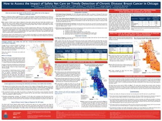
- 1. a. Ineligible for MUA status (12 ZIP codes) b. Composed mostly of MUA designated tracts (20 ZIP codes) c. Composed mostly of MUA eligible, but not designated tracts (6 ZIP codes) d. Mixed areas that are composed of no dominant MUA type (14 ZIP codes) Independent Variables Late Stage at Diagnosis: The percent of breast cancer cases diagnosed at stages three and four from the Illinois State Cancer Registry public dataset by ZIP code. Table 1 below shows how ZIP codes are distributed across the four types of MUAs and the estimated FQHC and other clinic patients as a percent of the population < 150 percent of the poverty level. The last column to the right estimates coverage of poor patients by safety net clinics. The highest patient coverage (57.3%) is in mostly MUA ZIP codes, and the lowest coverage (37.5%) is in ZIP codes ineligible for MUA. FQHCs had a significant penetration into mostly eligible but not designated ZIP codes (38.0%), but other clinic patients (family planning, public and free clinics) served a significant portion of all patients (17.2%) in this area. Table 1: Chicago ZIP Codes and Patient Primary Care Safety Net Coverage by MUA Classification Table 2 shows that Chicago’s large network of primary care safety net providers do not serve a majority of patients close to where they are located. FQHCs draw a higher proportion of patients residing in the same ZIP code as the clinic than do public and Planned Parenthood’s network of family planning clinics. In 2010 FQHCs served an average of 31% of patients from within the ZIP codes where their sites are located, compared to less than 25% by the Chicago Department of Public Health and the Cook County Health and Hospitals Systems’ sites. Since ZIP Codes are larger than MUAs, this suggests that FQHCs provide services well beyond the boundaries of the MUAs in which they are located. „„ We found first that the mostly eligible, but not designated MUA ZIP codes contain the highest proportion of breast cancers that were diagnosed at late stages (10.44%), a result consistent with Barrett et al. (under review) for survey data on Chicago breast cancer patients. „„ Mostly MUA ZIP codes have a higher proportion of late stage diagnosed breast cancers (8.72%) than the mixed MUA ZIP codes (6.96%). „„ ZIP codes ineligible for MUA have the lowest percentage of late stage cases. „„ Chart 1 presents the two variables represented on Map 2 as a scattergram across ZIP codes. If the percent of patients in poverty served by safety net clinics reflected the level of need for which there are healthcare resources in a ZIP code, all the dots would be on a vertical line at that percent. Instead, the relationship is curvilinear. Chart 1: Percent of Zip Code Area Population (>150% of poverty level) by Percent of Poverty Population Served by Safety Net Clinics 0 10 20 30 40 50 60 70 0 10 20 30 40 50 60 70 80 90 100 110 Percent in Poverty Served by Clinics Percent in Poverty Zip Code Poly. (Zip Code) Type of Area No. of Zip Codes Percent Late Stage Cancer (Stage 3 & 4) Ineligible for MUA 12 6.42 Mainly MUA 20 8.72 Eligible for MUA 6 10.44 Mixed 14 6.96 City Total 52 7.99 Dependent Variable Chart 1: Percent of ZIP Code Area Population (>150% of poverty level) by Percent of Poverty Population Served by Saftey Net Clinics How do we assess the impact of the primary care safety net on the stage at diagnosis of breast cancer? „„ There is conflicting evidence regarding access to safety net facilities, particularly designation of an area as a Medically Underserved Area (MUA) as a proxy variable, and whether it results in the early detection of breast cancer. Across U.S. cities, access to federally qualified health centers (FQHCs) improves access to care (Brown et al., 2004). „„ Past studies of breast cancer stage at diagnosis using cancer registry data have shown that residence in an MUA did not result in earlier diagnosis (Barry and Breen, 2002; Barry, Breen and Barrett, 2008, Polodnak, 2000). However, these studies did not measure whether a community health center existed in these MUAs, the extent of patient access, or utilization by the population. „„ In our ongoing study of breast cancer patients in Chicago neighborhoods, differences in late stage at diagnosis were observed among patients residing in MUAs when compared with those residing in areas eligible but not designated as MUAs (Barrett, et al., under review). However, a survey of safety net clinics in Chicago found that patients in these eligible but not designated MUAs use nearby safety net providers and generally have equal access to breast cancer screening (Darnell, 2012). The questions raised in the literature and in our own research encouraged us to explore alternative methods of evaluating the impact of access to primary care safety net clinics on late stage breast cancer diagnosis by examining clinic location and utilization patterns in Chicago. ! ! ! ! ! ! ! !! ! ! ! ! ! ! ! ! ! !! ! !! ! ! ! ! ! ! ! ! ! ! ! ! ! ! ! ! ! ! ! ! ! ! ! ! ! ! ! ! !( !( !( !( !( !( !( !( !( !( !( !( !( !( !( !( !( !( !( !( !( !( !( !( !( !( !( !( !( !(!( !( !(!( !( !( !( !( !( !( !( !( !( !( !( !( !( !( !( !( !( !( !( !( !( !( !( !( !( !( !( !( !( !( !( !( !( !(!( !( !( !( !( !( !( !( !( !( !( !( !( !( !( !( !( !( !( !( !( !( !( !( !(!( !( !( !( !( !( !( !( !( !( !( !( !(!( !( !( !( !( !( !( !( !( !( !( !( !( !( !( !( !( !( !( !( !( !( !( 6060560607 60608 60609 60611 60612 60613 60614 60615 60616 60617 60618 60619 60620 60621 60622 60623 60624 60625 60626 60628 60629 60630 60631 60632 60633 60634 60636 60637 60638 60639 60640 60641 60642 60643 60644 60645 60646 60647 60649 60651 60652 60653 60655 60656 60657 60659 60660 60707 60601 60602 60603 60604 60606 60661 60610 60654 Map 2: Percent of Population under 150% of the Poverty Level Served by Safety Net Clinics With Percent Poverty by Zip Code 0 63 Miles I Percent Poor Served by Clinics Population under 150% of Poverty Level Safety Net Clinic The service level in the Loop (Zips 60601- 04) exceeds 1000% and so is not represented. !( 45% - 67% No Data 0% - 11% 12% - 21% 22% - 32% 33% - 44% ! 3.1% - 14.8% ! 14.9% - 33.1% ! 33.2% - 51.6% ! 51.7% - 71.4% ! 71.5% - 106.3% University of Illinois at Chicago Institute for Health Research and Policy Health Policy Research Center (MC 275) 1747 W. Roosevelt Rd. Source: IHRP Primary Care Clinic Survey & IL State Cancer Registry Data, UDS Zip Code Data, Geolytics Demographic Data Authors: Heather Pauls & Adam Jentleson Date Created: 30 May 2012 Projection: NAD 1983 StatePlane Illinois East FIPS 1201 Feet ! ! ! ! ! ! ! ! ! ! ! ! ! ! ! ! ! ! ! ! ! ! ! ! ! ! ! ! ! ! ! ! ! ! ! ! ! ! ! ! ! ! ! ! ! ! ! ! ! ! ! !( !( !( !( !( !( !( !( !( !( !( !( !( !( !( !( !( !( !( !( !( !( !( !( !( !( !( !( !( !(!( !( !(!( !( !( !( !( !( !( !( !( !( !( !( !( !( !( !( !( !( !( !( !( !( !( !( !( !( !( !( !( !( !( !( !( !( !(!( !( !( !( !( !( !( !( !( !( !( !( !( !( !( !( !( !( !( !( !( !( !( !( !(!( !( !( !( !( !( !( !( !( !( !( !( !(!( !( !( !( !( !( !( !( !( !( !( !( !( !( !( !( !( !( !( !( !( !( !( 6060560607 60608 60609 60611 60612 60613 60614 60615 60616 60617 60618 60619 60620 60621 60622 60623 60624 60625 60626 60628 60629 60630 60631 60632 60633 60634 60636 60637 60638 60639 60640 60641 60642 60643 60644 60645 60646 60647 60649 60651 60652 60653 60655 60656 60657 60659 60660 60707 60601 60602 60603 60604 60606 60661 60610 60654 Map 3: Percent of Late Stage Breast Cancer Cases by Percent of Poverty Population (Under 150%) Served by Safety Net Clinics University of Illinois at Chicago Institute for Health Research and Policy Health Policy Research Center (MC 275) 1747 W. Roosevelt Rd. Source: IHRP Primary Care Clinic Survey & IL State Cancer Registry Data, UDS Zip Code Data, Geolytics Demographic Data Authors: Heather Pauls & Adam Jentleson Date Created: 30 May 2012 Projection: NAD 1983 StatePlane Illinois East FIPS 1201 Feet 0 63 Miles I Percent Poor Served by Clinics Safety Net Clinic The service level in the Loop (Zips 60601- 04) exceeds 1000% and so is not represented. !( No Data Percent Late Stage Diagnosis* ! 0% - 3.7% ! 3.8% - 6.7% ! 6.8% - 8.5% ! 8.6% - 11.6% ! 11.7% - 15.8% *Late stage diagnosis is the proportion of all cases that are stage 3 or 4, 2004- 2008 3.1% - 14.8% 14.9% - 33.1% 33.2% - 51.6% 51.7% - 71.4% 71.5% - 106.3% Chicago’s Primary Care Safety Net and Local Health Geography Chicago has an extensive system of federally qualified health centers (FQHCs); FQHC look- alikes; and family planning, public and free clinics, which consist of 20 networks with more than one site and 8 single-site providers. There are a total of 128 primary care safety net delivery sites. MUAs in Chicago Map 1 shows the areas of Chicago that are covered by MUAs (in orange) established between 1984 and 2008. Of Chicago’s 870 census tracts, 390 or 45% of Chicago census tracts with a population of 1.4 million received the federal MUA designation Chicago’sareasthatareeligiblebutnotdesignated as MUAs (in light red) are clustered on the south side of Chicago. These 62 tracts include about 200,000 people. A key problem in determining access to health care for the poor is how to find meaningful local units of analysis. Designation and eligibility are determined at a tract level, but the data are reported at the ZIP code level. ZIP codes can include areas that are eligible but not designated, designated, ineligible, or any combination of the three. A New Approach to Estimating the Utilization of Primary Care Safety Net Facilities We obtained 2010 Uniform Data System (UDS) reports of the number of Chicago FQHC patients by ZIP code (if n>10) from the Health Resources and Services Administration (HRSA) for all HRSA grantees. We aggregated these data to calculate the number of patients served by each provider in all 52 City of Chicago ZIP codes (including 3 groupings of ZIP codes) to obtain an estimate of CHC primary care health care coverage. We surveyed all primary care safety net providers in Chicago. The 32-question survey replicated many UDS questions. The survey obtained these data on patients by ZIP code from public, family planning, and free clinics not available in HRSA’s UDS files. Population demographic estimates for Chicago’s 52 ZIP codes were compiled at the ZIP code level from Geolytics 2010 data. We used Geolytics data on poverty to estimate the population of each ZIP code that is at or below 150 percent of the poverty level. This estimate is the target population for primary care safety net clinics. Map 2 shows the spatial relationship between poverty and clinic utilization. Each ZIP code is shaded by the percent of the population below 150 percent of the poverty level (in blue) while the percent of patients using safety net clinics as a proportion of the poverty population is represented with orange circles of different sizes. „„ If medical resources were rationally distributed so that all poor people had equal access to care, the orange circles in Map 2 would be the same size because the ratio of safety net patients to population under 150 percent of the poverty level would be fairly even across ZIP codes. „„ The degree of access ranges from ratios of 3.1% to 106.3%. Patients living in ZIP codes with very high ratios (the larger orange circles) probably include safety net clinic patients with incomes over 150 percent of the poverty level. „„ The best access to safety net clinics (51.4-71.4% and 71.5%-106.3%) is estimated to be among residents of ZIP codes with moderate levels of overall poverty. Patients living in very poor and wealthier ZIP codes have less access to primary care safety net clinics as demonstrated in Chart 1. Table 3 compares the percent of all late stage diagnoses (stages 3 & 4) for 2004-08 by MUA Classification of the ZIP code of residents. We measured the number of safety net patients across ZIP codes and created indicators of the ratio of coverage by these sources of care and the poor population. We found that CHCs serve patients in larger areas than their MUA service areas, confirming the findings of several single-clinic studies (Bazemore et al. (2010), Dulin et al. (2010), and Rankin (2008)). There is a relationship between the MUA classification of ZIP codes and late stage diagnosis for breast cancer. ZIP codes have no exact match to MUAs (see Map 1). The state cancer registry data on breast cancer incidence and stage by ZIP code do not allow cases to be assigned to the MUA and non-MUA parts of these ZIP codes. None of these data sets permit us to measure where individual women received their primary and/or breast cancer care or diagnoses. Some of the patients reported in these data sets may have received care from multiple providers and/or sites. UDS Patients/Poverty Population: The 2010 UDS patient data from FQHCs on patients in Chicago ZIP codes were summed for each ZIP code and divided by the population of each ZIP code at or below 150 percent of the poverty level. (Data Sources 1 & 3) Other Clinic Patients/Poverty Population: Data from the UIC Survey of Chicago Primary Care Safety Net Clinics (UIC Survey) was used to estimate the number of patients served by public, family planning and free clinics in each Chicago ZIP code. This estimate was also divided by the population of each ZIP code that was at or below 150 percent of the poverty level. (Data Sources 2 & 3) Total Safety Net Patients/Poverty Population: The UDS and UIC Survey data were summed to estimate the proportion of the population of each ZIP code at or below 150 percent of the poverty level that was served by the primary care safety net. (Data sources 1, 2 & 3) MUA Service Area Classification: Each of the 52 ZIP code areas were classified by number of component census tracts based on their MUA designation. There are four classifications: 60605 60607 60608 60609 60611 60612 60613 60614 60615 60616 60617 60618 60619 60620 60621 60622 60623 60624 60625 60626 60628 60629 60630 60631 60632 60633 60634 60636 60637 60638 60639 60640 60641 60642 60643 60644 60645 60646 60647 60649 60651 60652 60653 60655 60656 60657 60659 60660 60707 60601 60602 60603 60604 60606 60661 60610 60654 Map 1: Chicago Zip Codes by Medically Underserved Area Status I 0 63 Miles University of Illinois at Chicago Institute for Health Research and Policy Health Policy Research Center (MC 275) 1747 W. Roosevelt Rd. Source: HRSA Authors: Heather Pauls & Adam Jentleson Date Created: 30 May 2012 Projection: NAD 1983 StatePlane Illinois East FIPS 1201 Feet Census Tract Designated MUA/MUP Eligible MUA/MUP ZIPCODE PROBLEM BACKGROUND DATA SOURCES Safety Net Coverage of the Poor Discussion and ConclusionS Does the type of ZIP code area make a difference in percent of late stage breast cancer diagnosis? VARIABLES FOR ANALYSIS Susan Cahn* MA, MHS , Richard E. Barrett** PhD , Heather Pauls BA , Adam Jentleson MUPP , Julie Darnell* MPP, PhD , Ganga Vijayasiri PhD , Richard B. Warnecke* PhD All associated with the Center for Population Health and Health Disparities, University of Illinois at Chicago; and *School of Public Health, UIC; **Sociology Department, UIC How to Assess the Impact of Safety Net Care on Timely Detection of Chronic Disease: Breast Cancer in Chicago Type of Area Number of ZIP Codes FQHC Patients as a Percent of Population <150% of Poverty Other Clinic Patients as a Percent of Population <150% of Poverty Total Patients as a Percent of the Population 150% of Poverty Ineligible for MUA 12 29.9 7.6 37.5 Mostly MUA 20 46.9 10.4 57.3 Mostly Eligible but Not Designated MUA 6 38.0 17.2 55.2 Mixed 14 28.5 10.2 38.5 Chicago Total 52 11.0 11.0 51.3 We thank the Health Research and Services Administration, Geolytics, and the respondents to our survey for their assistance. Funding was provided by the National Cancer Institute through Grant P-50 (P50 CA106743) and Supplemental Grant (P50 CA106743S1). Data on Breast Cancer Stage at Diagnosis for ZIP Codes The Illinois State Cancer Registry (ISCR) provides a public-access data set on cancer incidence and stage for numerous cancers and years by ZIP code. We used the most recent Illinois data (2004-8) for breast cancer to compute the proportion of late stage cases (stages 3 and 4 combined) for the 52 ZIP codes in the City of Chicago as our measure of late stage diagnosis. The states of New York, New Jersey and Washington have similar public datasets. 1. 2. 3. 1. 2. 3. 4. Chicago’s Primary Care Safety Net Organizations: Sites and Span of Coverage by ZIP Code References: Barrett, R., Cho,Y., Weaver, K., Ryu, K., Campbell, R., Dolecek, T., & Warnecke, R. (2008). Neighborhood Change and Distant Metastasis at Diagnosis of Breast Cancer. Annals of Epidemiology 18(1): 43-47. Barrett, Richard, Richard B. Warnecke, under review. Breast Cancer Stage-at-Diagnosis Patterns in an Urban Setting: Are They Related to Medically Underserved Area Designation? Barry, J., & Breen, N. (2005). The importance of place of residence in predicting late-stage diagnosis of breast or cervical cancer. Health & Place 11(1): 15-29. Barry, J., Breen, N. and Barrett, M. (2012) Significance of Increasing Poverty Levels for Determining Late-Stage Breast Cancer Diagnosis in 1990 and 2000. Journal of Urban Health DOI: 10.1007/s11524-011-9660-8. Bazemore, A., Phillips, R., & Miyoshi,T. (2010). Harnessing Geographic Information Systems (GIS) to enable community-oriented primary care. Journal of the American Board of Fam- ily Medicine 23(1):22-31. Brown, R., Davidson, P., Andersen, R., Yu, H., Wyn, R., Becerra, L. Razack, N.(2004) Effects of Community Factors on Access to Ambulatory Care for Lower-income Adults in Large Urban Communities. Inquiry 41:39-56. Darnell, J., Health Disparities at the Community Level: The Role of Chicago’s Primary Care Safety Net. Presentation at the 4th Annual Minority Health in the Midwest Conference, Chicago, IL, Febr uary 24, 2012. Dulin, M. F., Ludden, T., Trapp, H., Urquieta de Hernandez, B., Smith, H. and Furuseth, O. (2010) Journal of the American Board of Family Medicine 23(1):13-21. Polednak, A. (2000). Later-stage cancer in relation to medically underserved areas in Connecticut. Journal of Health Care for the Poor and Underserved 11(3): 301-309. Rankin, J. (2008) The Multiple Location Time Weighted Index: Using patient activity spaces to calculate primary care service areas. Unpublished doctoral dissertation, University of Texas Health Information Sciences at Houston. Type of Clinic Organizations/ Grantees * Delivery Sites** Average % of Patients from ZIP Codes with a Delivery Site FQHC 17 95 31.0% Public 2 16 21.6% Family Planning 1 7 11.0% Free/Other/ Private 8 10 n/a Table 2: Characteristics of Chicago’s Primary Care Safety Net and the Average Percent of Patients from ZIP Codes with Delivery Sites Source: UDS and Survey of Chicago Primary Safety Net Clinics and Breast Cancer Services *Excludes Heartland Health Outreach, Inc. grantee for the FQHC Healthcare for the Homeless program. ** Excludes school-based health centers. Table 3: Percent of Late Stage Diagnosis of Breast Cancer by ZIP Code of Residents. Primary care safety net utilization by the poor can be measured at the ZIP code level using UDS data. These data can be compiled geographically and matched with data on MUA designation to evaluate the impact of the nation’s primary safety net policy on chronic disease outcomes, in this case using breast cancer. The resulting analysis and maps show the disparities in access to primary care safety net providers in Chicago. Most clinics draw the majority of their patients from beyond their MUA boundaries. Although FQHC patients are more likely to draw patients from their local area, these patients comprise only one-third of their total patients; thus, MUA designation may be a poor proxy for access to care. The impact of access to the primary care safety net and its interaction with quality linkages within the local health care environment and individual behavior is complex and requires further analysis. The expansion of FQHCs since 2000, demographic changes in US cities (Barrett et al. 2008) and the key role of FQHCs in ongoing health care reform all show the need for better analysis of local access to care. 1. 2. 3. 4. 5. Conclusions