Download as PPSX, PPTX
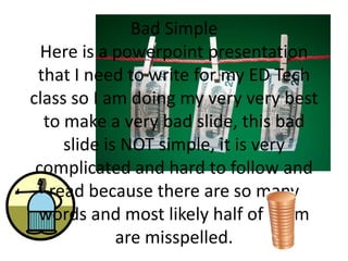
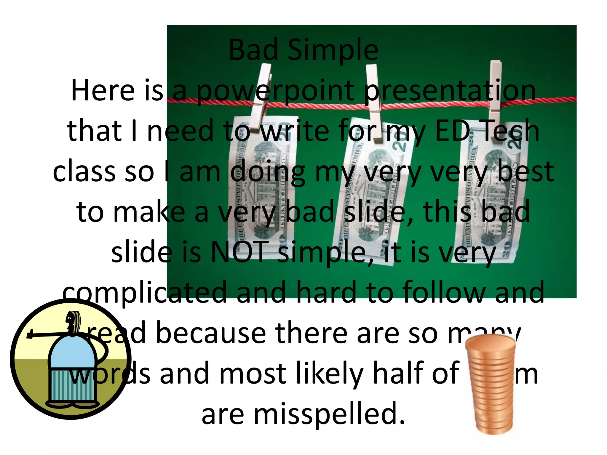
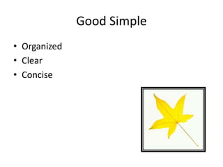
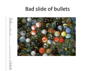


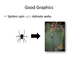
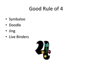

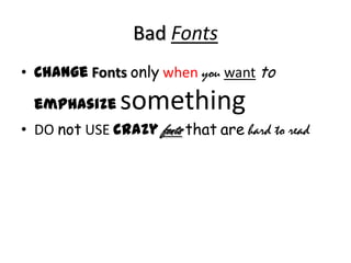
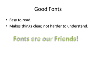
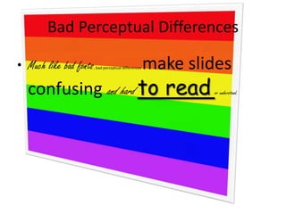
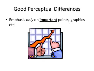

The document contrasts examples of "bad" and "good" presentation slides. The "bad" slides contain excessive words, bullets, backgrounds, colors and fonts that make the slides hard to follow and understand. The "good" slides are organized, clear, concise, use simple bullets, justified text, appropriate backgrounds, readable colors and fonts, and emphasize key points through graphics and perceptual differences.


