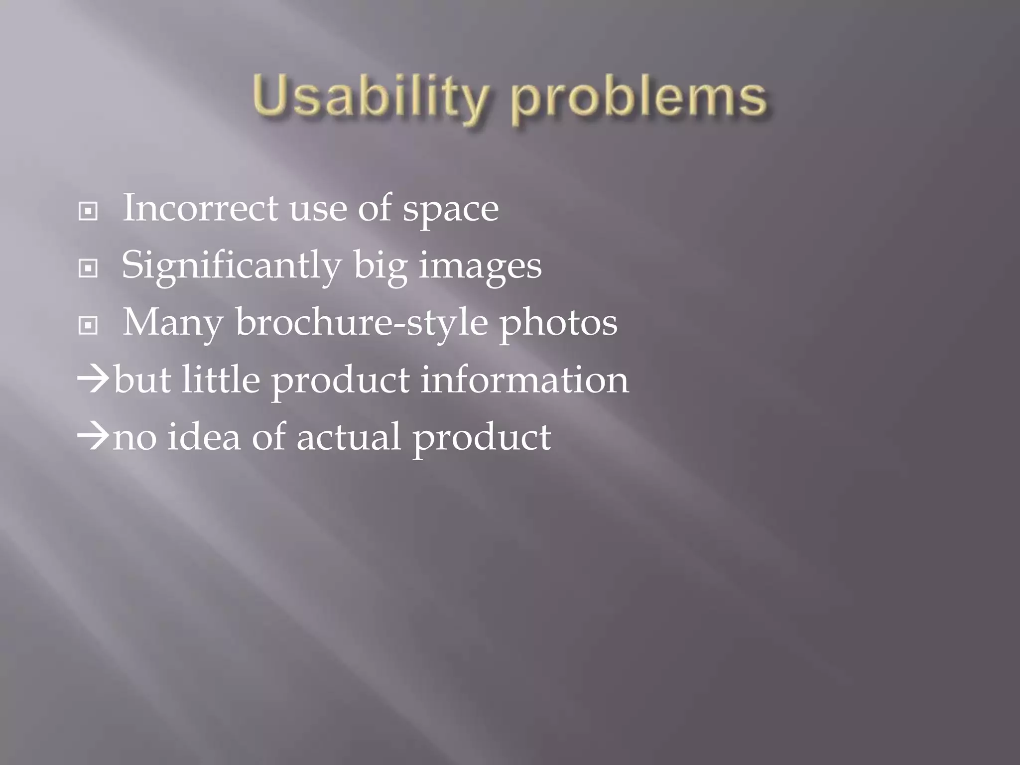
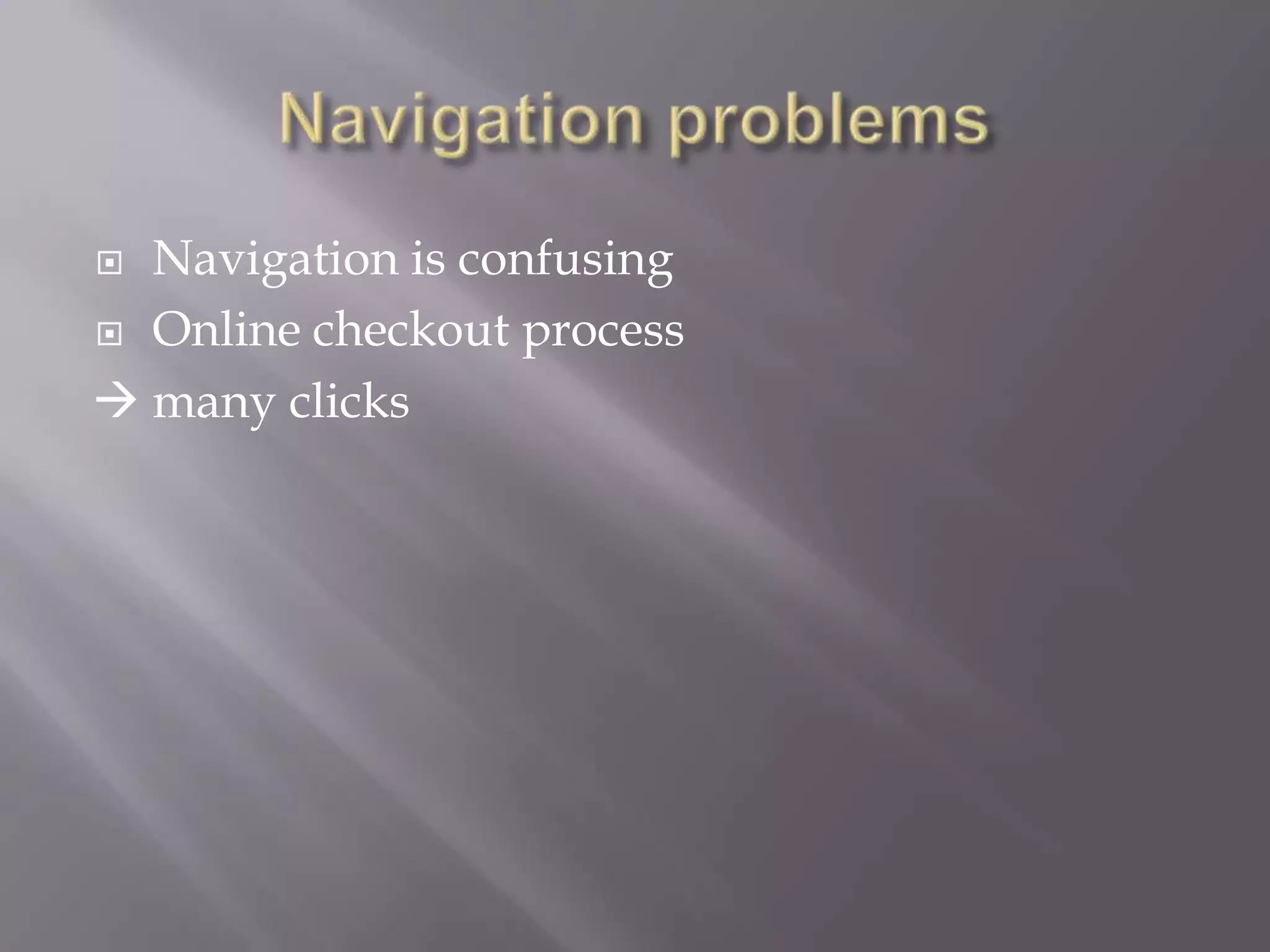
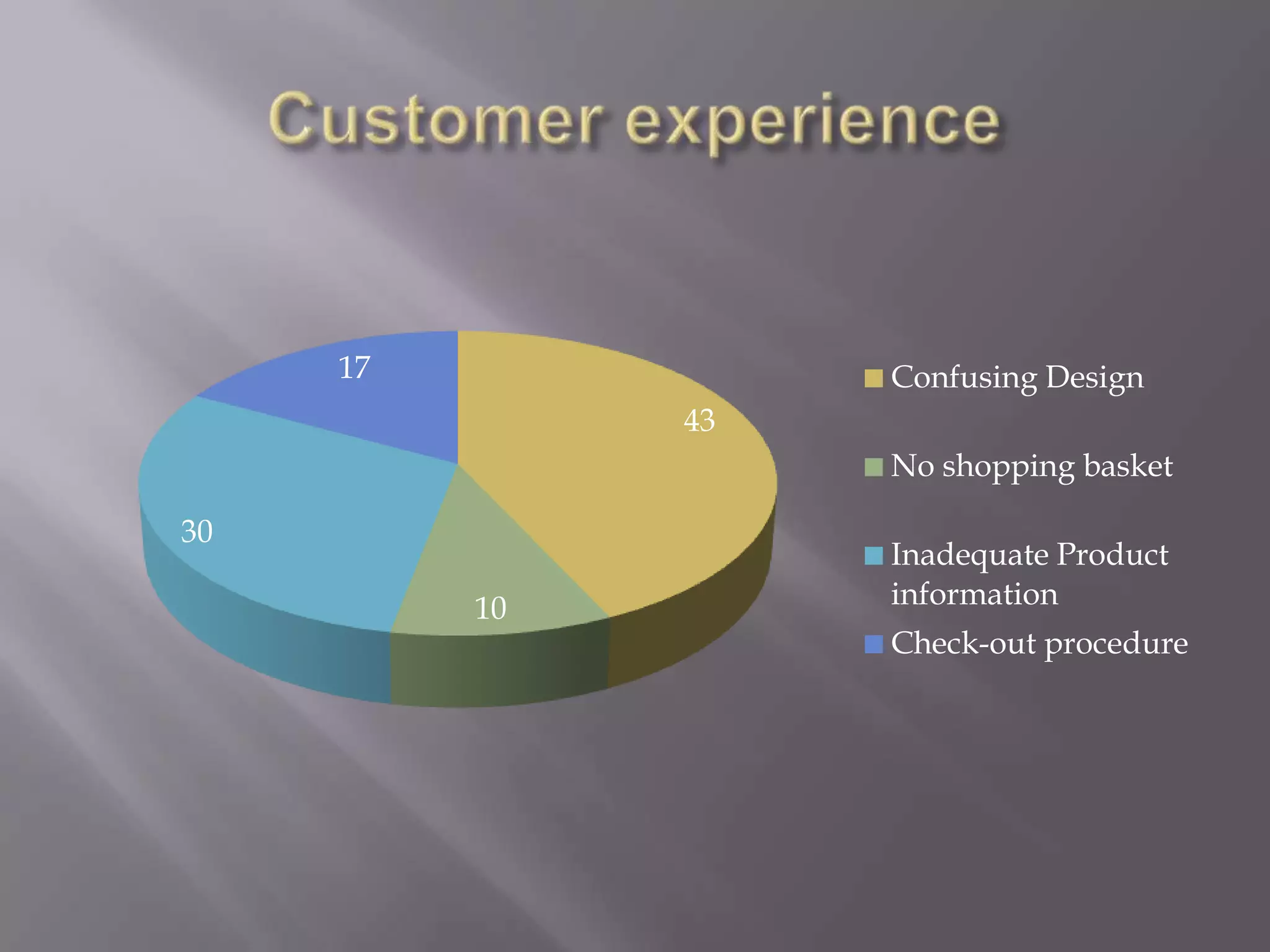
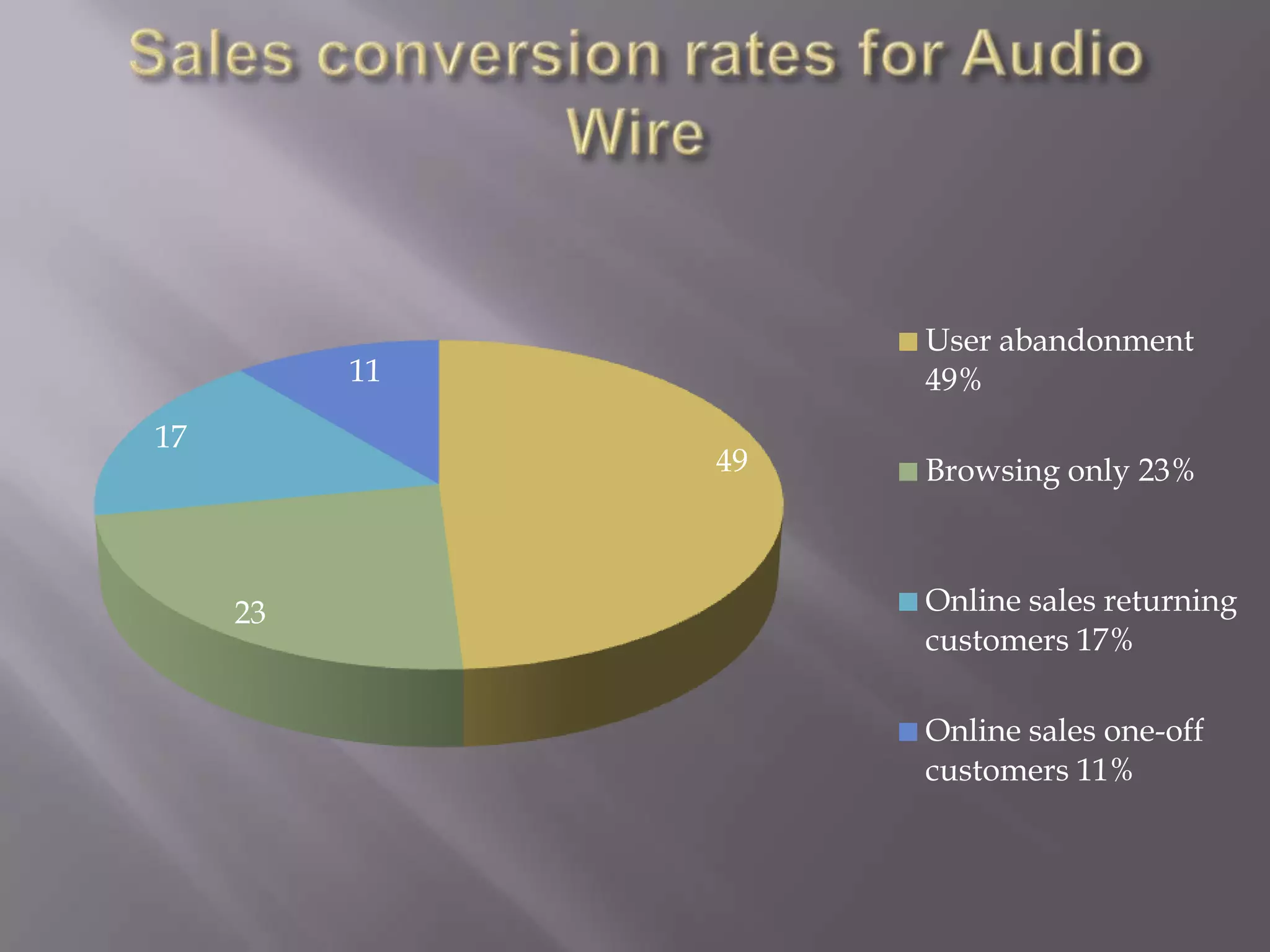
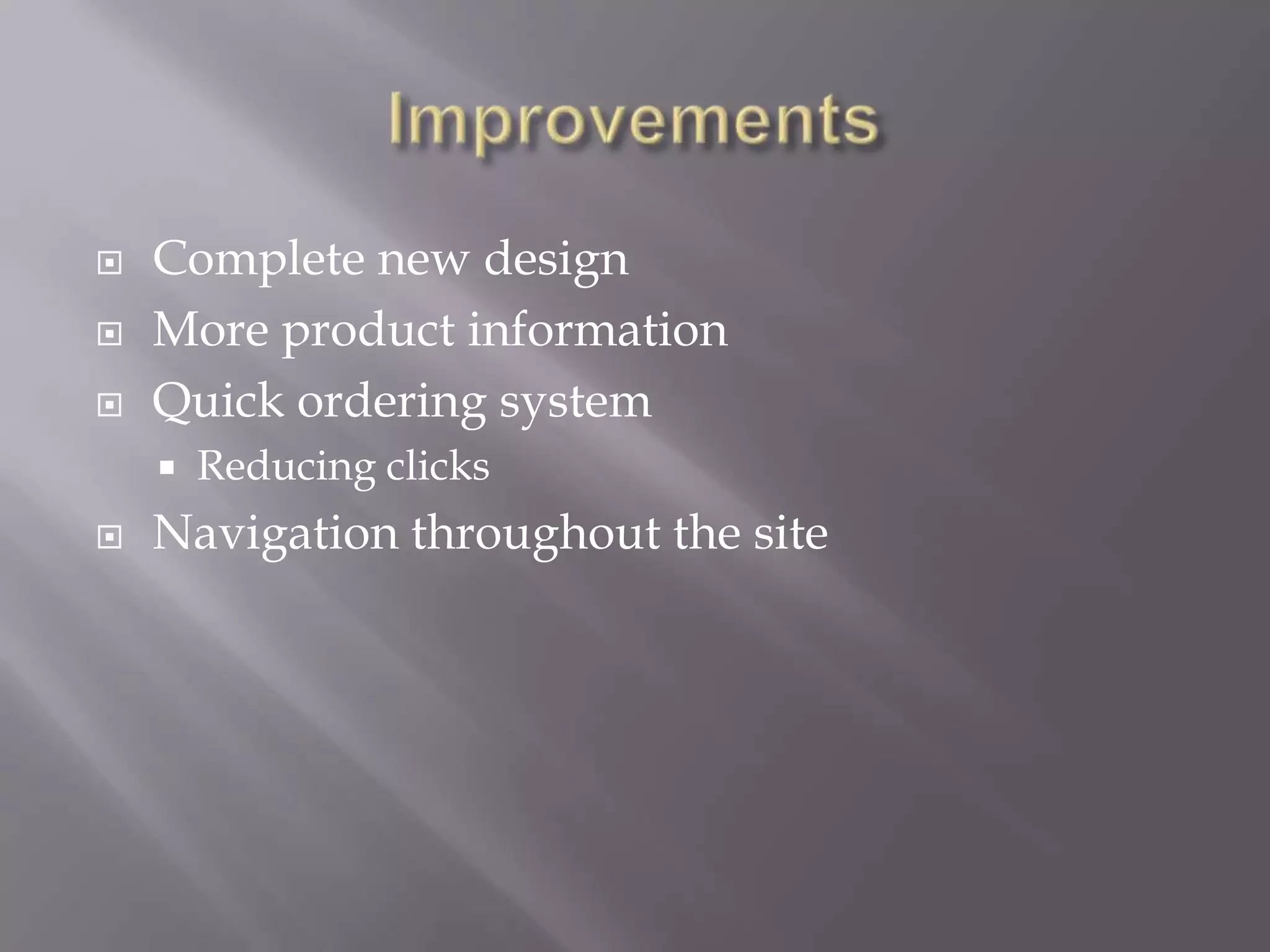
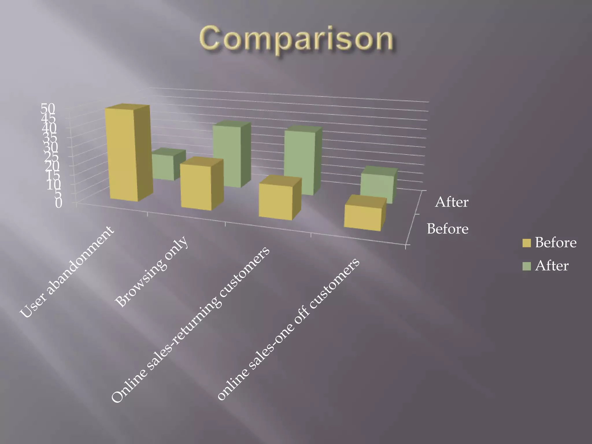
Jascha Schoeber
 Fabian Zenke
   Problems
   Sales conversion rates
   Improvements
   Customer experience & Web Design
   Future trends
 Incorrect use of space
 Significantly big images

 Many brochure-style photos

but little product information
no idea of actual product
 Navigation is confusing
 Online checkout process

 many clicks
17             Confusing Design
               43
                    No shopping basket

30
                    Inadequate Product
          10        information
                    Check-out procedure
User abandonment
          11        49%
17
               49   Browsing only 23%


     23             Online sales returning
                    customers 17%

                    Online sales one-off
                    customers 11%
   Complete new design
   More product information
   Quick ordering system
       Reducing clicks
   Navigation throughout the site
   Too complicated
   No demand for registration
   One-click purchase
   Summarize history and current shopping
    basket
   Keep it simple
    Cut unneccesary elements out
    Implement galery function
   Effective use of colours
   Simplify navigation
User abandonment 15%

Browsing only 35%

Online sales-returning
customers 35%
Online sales one-off
customers 15%
50
45
40
35
30
25
 20
 15
 10
  5
  0    After
      Before
               Before
               After
   Improve overall layout
   Improve Navigation
   Implement quick ordering system
Audio wire presentation

Audio wire presentation

  • 1.
  • 2.
    Problems  Sales conversion rates  Improvements  Customer experience & Web Design  Future trends
  • 3.
     Incorrect useof space  Significantly big images  Many brochure-style photos but little product information no idea of actual product
  • 4.
     Navigation isconfusing  Online checkout process  many clicks
  • 5.
    17 Confusing Design 43 No shopping basket 30 Inadequate Product 10 information Check-out procedure
  • 6.
    User abandonment 11 49% 17 49 Browsing only 23% 23 Online sales returning customers 17% Online sales one-off customers 11%
  • 7.
    Complete new design  More product information  Quick ordering system  Reducing clicks  Navigation throughout the site
  • 8.
    Too complicated  No demand for registration  One-click purchase  Summarize history and current shopping basket
  • 9.
    Keep it simple   Cut unneccesary elements out   Implement galery function  Effective use of colours  Simplify navigation
  • 10.
    User abandonment 15% Browsingonly 35% Online sales-returning customers 35% Online sales one-off customers 15%
  • 11.
    50 45 40 35 30 25 20 15 10 5 0 After Before Before After
  • 12.
    Improve overall layout  Improve Navigation  Implement quick ordering system