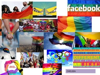
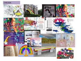
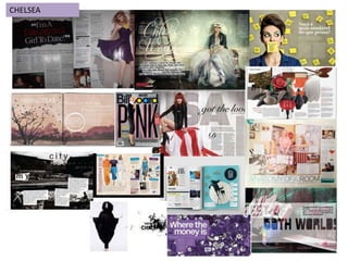
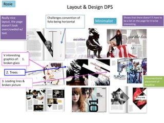
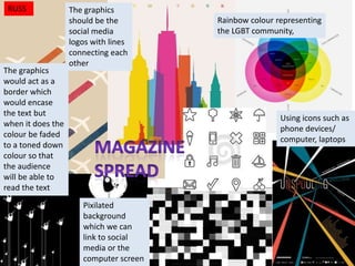
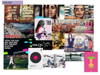
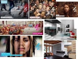
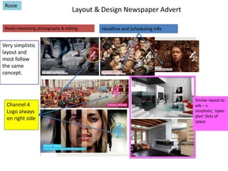
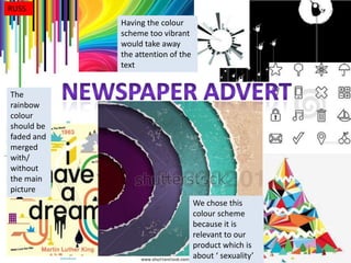
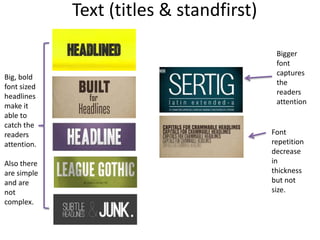
This document provides summaries and feedback from four students - Chelsea, Rosie, Russ, and Marisha - on moodboard assignments. Chelsea's double page spread layout challenges conventions by being horizontal. Rosie praises the simple yet interesting layout and graphics on Chelsea's page. Russ proposes using social media icons and logos with connecting lines for graphics. Chelsea's newspaper advertisement uses bold headlines and fonts that decrease slightly in thickness. Rosie comments the advertisement layout is simple yet not boring. Russ suggests fading the rainbow color scheme on his page to not take attention from the text.