This document analyzes the layout and design of a magazine double page spread and newspaper advertisement.
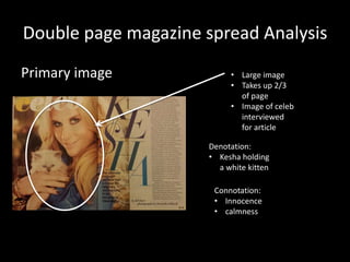
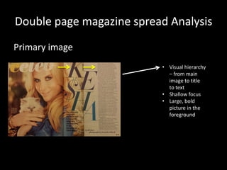
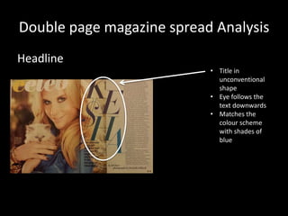
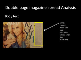
The magazine spread analysis notes that the large central celebrity image takes up most of the page with shallow focus, drawing the eye to the headline below in an unconventional shape. Simple black text runs down the side column.
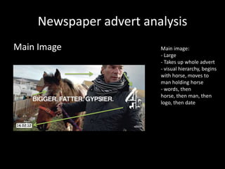
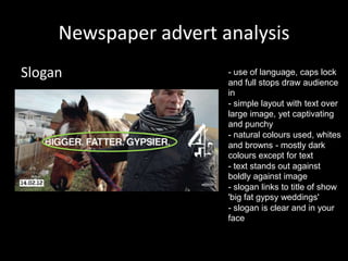
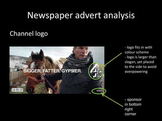
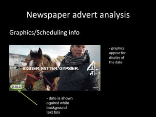
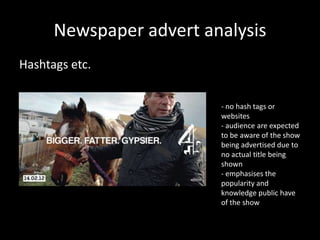
The newspaper ad analysis describes a large central image taking the visual hierarchy, with words, horse, man, and logo placed over it. The slogan is in caps and punctuation to engage the audience, using natural dark colors for the text against the image. Scheduling information and the channel logo fit with the color scheme while avoiding overpowering the image and slogan.