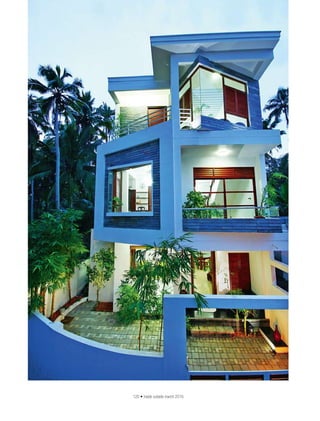
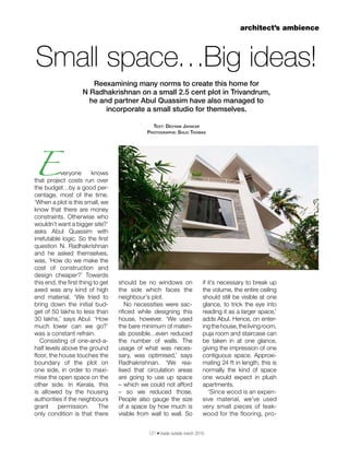
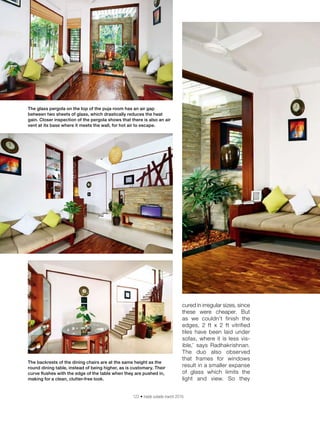
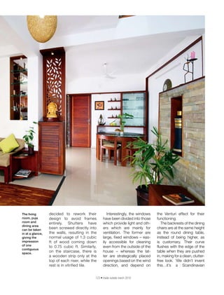
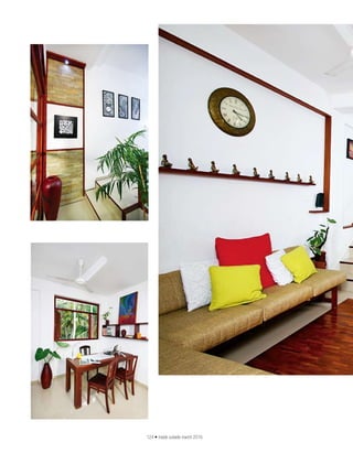
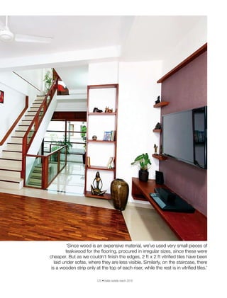
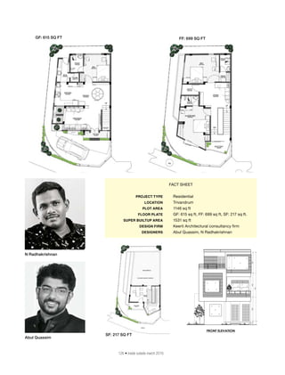
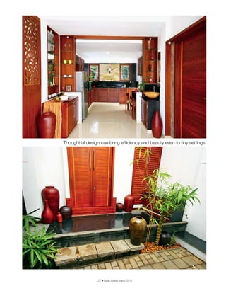
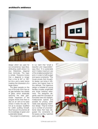
RNI No. 31940/77 Reg. No. MCS/124/2015-17 Date of Publication: 1st of every month. Posted at Patrika Channel Sorting office, Mumbai-400001 on the last two days of every month
THE INDIAN DESIGN MAGAZINE www.insideoutside.in ISSUE 367 march 2016 `100
Husna Rahaman designs a
charming penthouse in Bengaluru
120 • inside outside march 2016
121 • inside outside march 2016
architect’s ambience
Everyone knows
that project costs run over
the budget…by a good per-
centage, most of the time.
‘When a plot is this small, we
know that there are money
constraints. Otherwise who
wouldn’t want a bigger site?’
asks Abul Quassim with
irrefutable logic. So the first
question N. Radhakrishnan
and he asked themselves,
was, ‘How do we make the
cost of construction and
design cheaper?’ Towards
this end, the first thing to get
axed was any kind of high
end material. ‘We tried to
bring down the initial bud-
get of 50 lakhs to less than
30 lakhs,’ says Abul. ‘How
much lower can we go?’
was a constant refrain.
Consisting of one-and-a-
half levels above the ground
floor, the house touches the
boundary of the plot on
one side, in order to maxi-
mise the open space on the
other side. In Kerala, this
is allowed by the housing
authorities if the neighbours
grant permission. The
only condition is that there
Small space…Big ideas!
Reexamining many norms to create this home for
N Radhakrishnan on a small 2.5 cent plot in Trivandrum,
he and partner Abul Quassim have also managed to
incorporate a small studio for themselves.
Text: Devyani Jayakar
Photographs: Shijo Thomas
should be no windows on
the side which faces the
neighbour’s plot.
No necessities were sac-
rificed while designing this
house, however. ‘We used
the bare minimum of materi-
als possible…even reduced
the number of walls. The
usage of what was neces-
sary, was optimised,’ says
Radhakrishnan. ‘We rea-
lised that circulation areas
are going to use up space
– which we could not afford
– so we reduced those.
People also gauge the size
of a space by how much is
visible from wall to wall. So
if it’s necessary to break up
the volume, the entire ceiling
should still be visible at one
glance, to trick the eye into
reading it as a larger space,’
adds Abul. Hence, on enter-
ingthehouse,thelivingroom,
puja room and staircase can
be taken in at one glance,
giving the impression of one
contiguous space. Approxi-
mating 24 ft in length, this is
normally the kind of space
one would expect in plush
apartments.
‘Since wood is an expen-
sive material, we’ve used
very small pieces of teak-
wood for the flooring, pro-
122 • inside outside march 2016
cured in irregular sizes, since
these were cheaper. But
as we couldn’t finish the
edges, 2 ft x 2 ft vitrified
tiles have been laid under
sofas, where it is less vis-
ible,’ says Radhakrishnan.
The duo also observed
that frames for windows
result in a smaller expanse
of glass which limits the
light and view. So they
The glass pergola on the top of the puja room has an air gap
between two sheets of glass, which drastically reduces the heat
gain. Closer inspection of the pergola shows that there is also an air
vent at its base where it meets the wall, for hot air to escape.
The backrests of the dining chairs are at the same height as the
round dining table, instead of being higher, as is customary. Their
curve flushes with the edge of the table when they are pushed in,
making for a clean, clutter-free look.
123 • inside outside march 2016
decided to rework their
design to avoid frames
entirely. Shutters have
been screwed directly into
the walls, resulting in the
normal usage of 1.3 cubic
ft of wood coming down
to 0.75 cubic ft. Similarly,
on the staircase, there is
a wooden strip only at the
top of each riser, while the
rest is in vitrified tile.
Interestingly, the windows
have been divided into those
which provide light and oth-
ers which are mainly for
ventilation. The former are
large, fixed windows – eas-
ily accessible for cleaning
even from the outside of the
house – whereas the lat-
ter are strategically placed
openings based on the wind
direction, and depend on
the Venturi effect for their
functioning.
The backrests of the dining
chairs are at the same height
as the round dining table,
instead of being higher, as
is customary. Their curve
flushes with the edge of the
table when they are pushed
in, making for a clean, clutter-
free look. ‘We didn’t invent
this…it’s a Scandinavian
The living
room, puja
room and
dining area
can be taken
in at a glance,
giving the
impression
of one
contiguous
space.
124 • inside outside march 2016
125 • inside outside march 2016
‘Since wood is an expensive material, we’ve used very small pieces of
teakwood for the flooring, procured in irregular sizes, since these were
cheaper. But as we couldn’t finish the edges, 2 ft x 2 ft vitrified tiles have been
laid under sofas, where they are less visible. Similarly, on the staircase, there
is a wooden strip only at the top of each riser, while the rest is in vitrified tiles.’
126 • inside outside march 2016
FACT SHEET
	 PROJECT TYPE	 Residential
	 LOCATION	 Trivandrum
	 PLOT AREA	 1146 sq ft
	 FLOOR PLATE	 GF: 615 sq ft, FF: 699 sq ft, SF: 217 sq ft.
	 SUPER BUILTUP AREA	 1531 sq ft
	 DESIGN FIRM	 Keerti Architectural consultancy firm
	 DESIGNERS	 Abul Quassim, N Radhakrishnan
Abul Quassim
N Radhakrishnan
GF: 615 SQ FT FF: 699 SQ FT
SF: 217 SQ FT
127 • inside outside march 2016
Thoughtful design can bring efficiency and beauty even to tiny settings.
128 • inside outside march 2016
design which we used for
our convenience,’ says Abul,
attributing credit where it is
due. Elsewhere, diagonal
lines dominate. The logic
is simple. ‘Everyone knows
that a diagonal is longer
than a line at 90° or 180°
(on the x and y axis), hence
creating the impression of a
larger space.’
The glass pergola on the
top of the puja room has an
air gap between two sheets
of glass, which drastically
reducing the heat gain.
Closer inspection of the
pergola shows that there is
also an air vent at its base
where it meets the wall, for
hot air to escape. Qualified
for LEED auditing himself,
Abul has put into practice all
his knowledge of green and
sustainable design.
‘Our project is a testimony
to our claim that “small is
beautiful and responsible”,’
says Abul. ‘It is sustainable
and it makes maximum use
of the smallest possible foot-
print, in order to fulfil budget
and space constraints.’ This
house proves that thought-
ful design can bring in effi-
ciency and beauty even to
tiny settings. The ingenious
design is suitable for young
families, couples, single folks
and those entering retire-
ment. The designers dili-
gently used the concepts of
borrowed view and daylight,
multipurpose spaces and
pockets for privacy, while
neatly side stepping match-
box design. They’ve trotted
out a number of unconven-
tional ideas that have dis-
guised the constraints of
the space, as they ‘watched
every penny.’
architect’s ambience
IO

article published

  • 1.
    RNI No. 31940/77Reg. No. MCS/124/2015-17 Date of Publication: 1st of every month. Posted at Patrika Channel Sorting office, Mumbai-400001 on the last two days of every month THE INDIAN DESIGN MAGAZINE www.insideoutside.in ISSUE 367 march 2016 `100 Husna Rahaman designs a charming penthouse in Bengaluru
  • 2.
    120 • insideoutside march 2016
  • 3.
    121 • insideoutside march 2016 architect’s ambience Everyone knows that project costs run over the budget…by a good per- centage, most of the time. ‘When a plot is this small, we know that there are money constraints. Otherwise who wouldn’t want a bigger site?’ asks Abul Quassim with irrefutable logic. So the first question N. Radhakrishnan and he asked themselves, was, ‘How do we make the cost of construction and design cheaper?’ Towards this end, the first thing to get axed was any kind of high end material. ‘We tried to bring down the initial bud- get of 50 lakhs to less than 30 lakhs,’ says Abul. ‘How much lower can we go?’ was a constant refrain. Consisting of one-and-a- half levels above the ground floor, the house touches the boundary of the plot on one side, in order to maxi- mise the open space on the other side. In Kerala, this is allowed by the housing authorities if the neighbours grant permission. The only condition is that there Small space…Big ideas! Reexamining many norms to create this home for N Radhakrishnan on a small 2.5 cent plot in Trivandrum, he and partner Abul Quassim have also managed to incorporate a small studio for themselves. Text: Devyani Jayakar Photographs: Shijo Thomas should be no windows on the side which faces the neighbour’s plot. No necessities were sac- rificed while designing this house, however. ‘We used the bare minimum of materi- als possible…even reduced the number of walls. The usage of what was neces- sary, was optimised,’ says Radhakrishnan. ‘We rea- lised that circulation areas are going to use up space – which we could not afford – so we reduced those. People also gauge the size of a space by how much is visible from wall to wall. So if it’s necessary to break up the volume, the entire ceiling should still be visible at one glance, to trick the eye into reading it as a larger space,’ adds Abul. Hence, on enter- ingthehouse,thelivingroom, puja room and staircase can be taken in at one glance, giving the impression of one contiguous space. Approxi- mating 24 ft in length, this is normally the kind of space one would expect in plush apartments. ‘Since wood is an expen- sive material, we’ve used very small pieces of teak- wood for the flooring, pro-
  • 4.
    122 • insideoutside march 2016 cured in irregular sizes, since these were cheaper. But as we couldn’t finish the edges, 2 ft x 2 ft vitrified tiles have been laid under sofas, where it is less vis- ible,’ says Radhakrishnan. The duo also observed that frames for windows result in a smaller expanse of glass which limits the light and view. So they The glass pergola on the top of the puja room has an air gap between two sheets of glass, which drastically reduces the heat gain. Closer inspection of the pergola shows that there is also an air vent at its base where it meets the wall, for hot air to escape. The backrests of the dining chairs are at the same height as the round dining table, instead of being higher, as is customary. Their curve flushes with the edge of the table when they are pushed in, making for a clean, clutter-free look.
  • 5.
    123 • insideoutside march 2016 decided to rework their design to avoid frames entirely. Shutters have been screwed directly into the walls, resulting in the normal usage of 1.3 cubic ft of wood coming down to 0.75 cubic ft. Similarly, on the staircase, there is a wooden strip only at the top of each riser, while the rest is in vitrified tile. Interestingly, the windows have been divided into those which provide light and oth- ers which are mainly for ventilation. The former are large, fixed windows – eas- ily accessible for cleaning even from the outside of the house – whereas the lat- ter are strategically placed openings based on the wind direction, and depend on the Venturi effect for their functioning. The backrests of the dining chairs are at the same height as the round dining table, instead of being higher, as is customary. Their curve flushes with the edge of the table when they are pushed in, making for a clean, clutter- free look. ‘We didn’t invent this…it’s a Scandinavian The living room, puja room and dining area can be taken in at a glance, giving the impression of one contiguous space.
  • 6.
    124 • insideoutside march 2016
  • 7.
    125 • insideoutside march 2016 ‘Since wood is an expensive material, we’ve used very small pieces of teakwood for the flooring, procured in irregular sizes, since these were cheaper. But as we couldn’t finish the edges, 2 ft x 2 ft vitrified tiles have been laid under sofas, where they are less visible. Similarly, on the staircase, there is a wooden strip only at the top of each riser, while the rest is in vitrified tiles.’
  • 8.
    126 • insideoutside march 2016 FACT SHEET PROJECT TYPE Residential LOCATION Trivandrum PLOT AREA 1146 sq ft FLOOR PLATE GF: 615 sq ft, FF: 699 sq ft, SF: 217 sq ft. SUPER BUILTUP AREA 1531 sq ft DESIGN FIRM Keerti Architectural consultancy firm DESIGNERS Abul Quassim, N Radhakrishnan Abul Quassim N Radhakrishnan GF: 615 SQ FT FF: 699 SQ FT SF: 217 SQ FT
  • 9.
    127 • insideoutside march 2016 Thoughtful design can bring efficiency and beauty even to tiny settings.
  • 10.
    128 • insideoutside march 2016 design which we used for our convenience,’ says Abul, attributing credit where it is due. Elsewhere, diagonal lines dominate. The logic is simple. ‘Everyone knows that a diagonal is longer than a line at 90° or 180° (on the x and y axis), hence creating the impression of a larger space.’ The glass pergola on the top of the puja room has an air gap between two sheets of glass, which drastically reducing the heat gain. Closer inspection of the pergola shows that there is also an air vent at its base where it meets the wall, for hot air to escape. Qualified for LEED auditing himself, Abul has put into practice all his knowledge of green and sustainable design. ‘Our project is a testimony to our claim that “small is beautiful and responsible”,’ says Abul. ‘It is sustainable and it makes maximum use of the smallest possible foot- print, in order to fulfil budget and space constraints.’ This house proves that thought- ful design can bring in effi- ciency and beauty even to tiny settings. The ingenious design is suitable for young families, couples, single folks and those entering retire- ment. The designers dili- gently used the concepts of borrowed view and daylight, multipurpose spaces and pockets for privacy, while neatly side stepping match- box design. They’ve trotted out a number of unconven- tional ideas that have dis- guised the constraints of the space, as they ‘watched every penny.’ architect’s ambience IO