AMIT MANGAR Data Analytics Portfolio - World Life Expectancy Trends
1.
World Life ExpectancyTrends.
I was scavenging and foraging around in Kaggle.com in a bid to find an opensource datasets a bit nerdy than the ‘YouTube data for Analytics’
dataset I used in MS-Excel slide deck. The ‘Life Expectancy Analysis’ dataset presented just that. The dataset is very clean, presenting multiple
variables that influence life expectancy for a number of countries. The countries are categorized through an assigned Status of ‘Developed’ or
‘Developing’ which was helpful in comparative trend analysis.
Although the dataset covers 2000 to 2015, the data for 2000 through 2004 is patchy and scant, and for 2015, data is largely incomplete. Data for
many countries was randomly missing for many Hence, data for these years have been filtered out in my analysis to avoid skewing the picture.
This dataset contained 1649 rows, which come down to 1241 rows after filtering out the years 2015 and 2000 through 2004 - A loss of 408 rows
accounting for about a quarter of the rows. The data is still robust enough to reveal some expected trends, differences and probable factors
influencing life expectancy around the world.
The dataset covers a lot of countries but it does not cover all countries of the world. There is no data at all on United States of America, United
Kingdom, Japan, many African, European, Middle Eastern and South East Asian, and a few South American countries. The next slide presents the
world map visual covering this aspect in more detail. Let’s dive in……….
One World
One Humanity
One Family
P.S.: Unfortunately, due to technical issues the Power BI visualizations on following slides are static pictures than with interactive slicers I wanted them to be.
2.
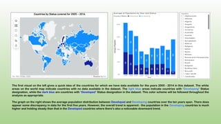
The first visualon the left gives a quick idea of the countries for which we have data available for the years 2005 - 2014 in this dataset. The white
areas on the world map indicate countries with no data available in the dataset. The light blue areas indicate countries with ‘Developing’ Status
designation, while the dark blue are countries with ‘Developed’ Status designation in the dataset. This color scheme will be followed throughout the
analysis as appropriate.
The graph on the right shows the average population distribution between Developed and Developing countries over the ten years span. There does
appear some discrepancy in data for the first five years. However, the overall trend is apparent - the population in the Developing countries is much
higher and holding steady than that in the Developed countries where there’s also a noticeable downward trend.
3.
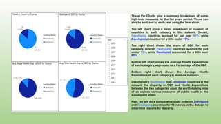
These Pie Chartsgive a summary breakdown of some
high-level measures for the ten years period. These can
also be analyzed by each year using the Year slicer.
Top left chart gives a basic breakdown of number of
countries in each category in this dataset. Overall,
Developing countries account for just over 85%, while
Developed accounted for a little under 15%.
Top right chart shows the share of GDP for each
category. Overall, Developing countries account for just
under 15%, while Developed accounted for a little over
85%.
Bottom left chart shows the Average Health Expenditure
of each category, expressed as a Percentage of the GDP.
Bottom right chart shows the Average Health
Expenditure of each category in absolute numbers.
Despite more Developing than Developed countries in the
dataset, the disparity in GDP and Health Expenditure
between the two categories could be worth making note
of as explore various measures of public health in the
subsequent slides.
Next, we will do a comparative study between Developed
and Developing countries for 14 metrics in the dataset to
determine reasons for diaparity.
4.
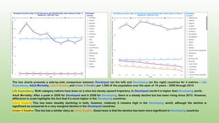
The two chartspresents a side-by-side comparison between Developed (on the left) and Developing (on the right) countries for 4 metrics – Life
Expectancy, Adult Mortality, Infant Deaths, and Under-5 Deaths per 1,000 of the population over the span of 10 years – 2005 through 2014.
Life Expectancy: Both category nations have been on a slow but steady upward trajectory. In Developed world it is higher than Developing world.
Adult Mortality: After a peak in 2006 for Developed and in 2008 for Developing, there is a steady decline but has been rising since 2013. However,
difference in scale highlights the fact that it’s much higher in the Developing countries.
Infant Deaths: This has been steadily declining in both, however, relatively it remains high in the Developing world, although the decline is
significant as compared to a very marginal decline in the Developed countries.
Under-5 Deaths: This too has a similar story as Infant Deaths. Good news is that the decline has been more significant in Developing countries
5.
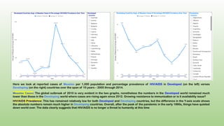
Here we lookat reported cases of Measles per 1,000 population and percentage prevalence of HIV/AIDS in Developed (on the left) verses
Developing (on the right) countries over the span of 10 years – 2005 through 2014.
Measles Cases: The global outbreak of 2010 is very evident in the two graphs, nonetheless the numbers in the Developed world remained much
lower than those in the Developing world where cases are rising again since 2012. Growing resistance to immunization or is it availability issue?
HIV/AIDS Prevalence: This has remained relatively low for both Developed and Developing countries, but the difference in the Y-axis scale shows
the absolute numbers remain much higher in Developing countries. Overall, after the peak of the pandemic in the early 1990s, things have quieted
down world over. The data clearly suggests that HIV/AIDS is no longer a threat to humanity at this time
6.
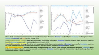
These charts presentsdata on immunization coverage for three major diseases in Developed (on the left) and Developing (on the right) countries –
Diphtheria, Hepatitis B, and Polio for 2005 through 2014.
Diphtheria Immunization Coverage: While the progress has been steady and high for Developed nations it has been rather checkered and much
lower for Developing nations with a significantly downward trend in 2014.
Hepatitis B Immunization Coverage: Trends for here are quite parallel to Diphtheria immunization in Developed countries. For Developing countries,
the trends are mildly checkered but are on the uptick since 2012, but remains lower than Developed nations overall.
Polio Immunization Coverage: After the overall surge in immunizations 2005 through 2008, there has been a decline worldwide. Developing world
bottomed out in 2010 and started bouncing back with some hiccups. Developed countries appear to show a similar trajectory, although disparity in
numbers still remains a cause of concern.
7.
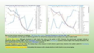
Now we lookat three measures of wellness – BMI (Body Mass Index), Thinness Prevalence in 5-9 Year Olds, and Thinness Prevalence in 1-19 Year
Olds in the population over the span of 2005 through 2014. For all the three measures lower numbers are a sign of better health
BMI (Body Mass Index): Although checkered in both charts this index on the uptick in 2015. However, the year-to-year averages indicate a
significant obesity problem (BMI > 30) for Developed countries. Average BMI in Developing countries remains higher than obesity threshold of 30,
but is significantly lower than those observed in Developed countries.
Thinness Prevalence in 5-9 Year Olds: The steady drop in this measure in both charts is good news, however, the sudden uptick for Developing
countries in 2015 is a cause of concern.
Thinness Prevalence in 1-19 Year Olds: Fortunately, this measure with a steady decline on both charts is very encouraging.
8.
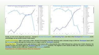
Finally, we lookat two disparate measures – changes in Alcohol Consumption, and Schooling Years over time in the Developed vs Developing world.
Interestingly, we see similar trends in both charts.
Alcohol Consumption: After a mini peak in 2007, Alcohol Consumption has been declining with a dramatic drops in 2013 for Developed and in 2011
for Developing world, although the numbers are on a higher scale for Developed countries.
Schooling Years : This graph seems quite identical in both charts with a characteristic dip in 2007 followed by a strong rise in both. However, the
number of years are much higher for Developed than for Developing countries. The highest in 2014 stands at little over 16 years of schooling in
Developed nations verses a little over 12 years in the Developing countries.
Could there be a correlation between these two measures?
9.
While it ishard to pin point singular factors influencing Life Expectancy, there are some trends that are encouraging and some that are a cause of
concern. Here are some key take-aways for world powers, politicians, policy makers, and health program administrators to consider:
Decline of overall population in the Developed world could be a cause of concern. Is it due to lower birth rates?
Lower GDP in Developing countries could be a barrier for adequate Health Expenditure, limiting quality and access to Health Care for the
masses in each country.
High mortality rates at all levels in the Developing world remains high lending to lower Life Expectancy.
Though not directly correlated with Life Expectancy, high cases of Measles throughout the world is a cause of concern and warrants better
vaccination drives.
General trend of resisting immunization, especially Polio, is discouraging. Perhaps availability, access, outreach, and education needs attention.
Access to quality and quantity of nutrition is getting better in Developing world but needs more work to potentially increase Life Expectancy.
Decrease in Alcohol Consumption world over is a positive sign and could be indicative of reduction in addictions in general.
Increase in Schooling Years is also a very positive sign. This trend could be leveraged to increase awareness and education for other negative
factors discussed above, especially in context to Developing countries.
Putting It All Together


![Hacking-Uncovered-How-People-Get-Hacked-and-How-to-Stay-Safe[1].pptx](https://cdn.slidesharecdn.com/ss_thumbnails/hacking-uncovered-how-people-get-hacked-and-how-to-stay-safe1-260130170011-4883a9c7-thumbnail.jpg?width=640&height=640&fit=bounds)


