
Report
Share

Recommended
Evaluation task 3
1) The document describes the process used to create images for a graphic novel, including hand drawing images, scanning them, adjusting thresholds to show solid lines, and using tools to add color.
2) Backgrounds were created using tools to map out panels, then the paint tool to add details like ground lines, textures for sky and grass, and rotoscoped elements like trees and mountains.
3) Text is limited, used only when needed to explain images, such as adding text to a message to make its meaning clear. Speech bubbles are also used to show character and dialogue.
Pro forma for all work
The document summarizes the design process for an advertisement promoting an energy drink called Mezameru. The advertisement is designed to have a Japanese aesthetic style with bold graphics and text. Key elements include the Japanese word for "Mezameru" in a stylized font, the iconic Japanese art print "The Great Wave of Kanagawa", and a silhouette of a drink can. The designer experiments with different layouts and effects to refine the advertisement design to have a clean, unified look consistent with typical Japanese advertisements.
Idea development pro forma
The document discusses initial ideas for vegetarian recipe cards, including quick meals for students, fancy dinner party recipes, and packed lunches. Feedback is provided on making the ideas more developed by providing more design details and specifics. The ideas are then assessed on their suitability for the audience, client needs, appeal, production feasibility, costs, and other factors.
Mood board and mindmap
The document provides guidance on creating a mood board and mind map. A mood board is a visual representation using colors, textures, images and words to convey a specific mood, theme or concept. A mind map organizes information in a radial, graphical manner around a central key word or idea that branches out into major themes which are then further divided.
Graphic narrative schedule
This document outlines a 6 day work schedule for a comic book project. Each day is divided into morning and afternoon sessions with tasks listed such as drawing images, scanning, making panels in Photoshop, and adding text. The progress made on each task is tracked as completed or not. Contingency time at the end of days 2, 3, 5, and 6 was used for tweaking drawings rather than new work since tasks were finished ahead of schedule.
Idea development pro forma
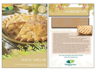
The final recipe card idea focuses on the theme of spring using greens and earthy browns resembling bark and foliage. The recipe will feature green vegetables and brightly colored fruits for a salad or main course. The target audience is females aged 18-34, using clear bold colors and simple instructions. Production methods utilize recycled and biodegradable vegetable inks for laminated protection. The idea also incorporates suggesting a vegetarian wine pairing to complement the meal. This idea was selected as it strongest embodied the spring theme while allowing addition of the wine pairing concept from another initial idea.
Analysis
This document analyzes several factual writing pieces including a breastfeeding information leaflet, photography how-to guides, instructions for origami, and a journalistic news article. Key analysis points made about each piece include their use of visual elements like images and formatting to draw attention to information, inclusion of evidence and perspectives to support arguments, and language choices to establish tone and make information clear and accessible. Permission for using any copyrighted content is also noted as an essential part of publishing factual writing.
Digital graphics pro form a new
Here is a summary of the peer feedback I received on my t-shirt design project and my thoughts on the responses:
- Strengths mentioned were the simplicity of the design and how eye-catching the use of different colours are. I agree these are strengths as keeping the design clean and focused helps it appeal to a wide audience. The strategic use of colour helps draw the eye.
- An area for improvement mentioned was adding more detail or texture. I disagree with this as I think too much detail could clutter the design and distract from the key elements. More simplicity allows the design elements to stand out.
- It was noted the content choice of Egyptian cats and Hand of Fatima imagery fits the trendy mystical style.
Recommended
Evaluation task 3
1) The document describes the process used to create images for a graphic novel, including hand drawing images, scanning them, adjusting thresholds to show solid lines, and using tools to add color.
2) Backgrounds were created using tools to map out panels, then the paint tool to add details like ground lines, textures for sky and grass, and rotoscoped elements like trees and mountains.
3) Text is limited, used only when needed to explain images, such as adding text to a message to make its meaning clear. Speech bubbles are also used to show character and dialogue.
Pro forma for all work
The document summarizes the design process for an advertisement promoting an energy drink called Mezameru. The advertisement is designed to have a Japanese aesthetic style with bold graphics and text. Key elements include the Japanese word for "Mezameru" in a stylized font, the iconic Japanese art print "The Great Wave of Kanagawa", and a silhouette of a drink can. The designer experiments with different layouts and effects to refine the advertisement design to have a clean, unified look consistent with typical Japanese advertisements.
Idea development pro forma
The document discusses initial ideas for vegetarian recipe cards, including quick meals for students, fancy dinner party recipes, and packed lunches. Feedback is provided on making the ideas more developed by providing more design details and specifics. The ideas are then assessed on their suitability for the audience, client needs, appeal, production feasibility, costs, and other factors.
Mood board and mindmap
The document provides guidance on creating a mood board and mind map. A mood board is a visual representation using colors, textures, images and words to convey a specific mood, theme or concept. A mind map organizes information in a radial, graphical manner around a central key word or idea that branches out into major themes which are then further divided.
Graphic narrative schedule
This document outlines a 6 day work schedule for a comic book project. Each day is divided into morning and afternoon sessions with tasks listed such as drawing images, scanning, making panels in Photoshop, and adding text. The progress made on each task is tracked as completed or not. Contingency time at the end of days 2, 3, 5, and 6 was used for tweaking drawings rather than new work since tasks were finished ahead of schedule.
Idea development pro forma
The final recipe card idea focuses on the theme of spring using greens and earthy browns resembling bark and foliage. The recipe will feature green vegetables and brightly colored fruits for a salad or main course. The target audience is females aged 18-34, using clear bold colors and simple instructions. Production methods utilize recycled and biodegradable vegetable inks for laminated protection. The idea also incorporates suggesting a vegetarian wine pairing to complement the meal. This idea was selected as it strongest embodied the spring theme while allowing addition of the wine pairing concept from another initial idea.
Analysis
This document analyzes several factual writing pieces including a breastfeeding information leaflet, photography how-to guides, instructions for origami, and a journalistic news article. Key analysis points made about each piece include their use of visual elements like images and formatting to draw attention to information, inclusion of evidence and perspectives to support arguments, and language choices to establish tone and make information clear and accessible. Permission for using any copyrighted content is also noted as an essential part of publishing factual writing.
Digital graphics pro form a new
Here is a summary of the peer feedback I received on my t-shirt design project and my thoughts on the responses:
- Strengths mentioned were the simplicity of the design and how eye-catching the use of different colours are. I agree these are strengths as keeping the design clean and focused helps it appeal to a wide audience. The strategic use of colour helps draw the eye.
- An area for improvement mentioned was adding more detail or texture. I disagree with this as I think too much detail could clutter the design and distract from the key elements. More simplicity allows the design elements to stand out.
- It was noted the content choice of Egyptian cats and Hand of Fatima imagery fits the trendy mystical style.
Is censorship a good or a bad idea
Censorship of media is debated, as it aims to protect audiences but can restrict freedom. Television censorship focuses on protecting children from adult content by enforcing watersheds after 9PM. Breaching watershed rules can result in fines. Advertising is also regulated to prevent exploiting children's susceptibility. Books are sometimes censored for reasons like preventing crime inspiration, though banning books rarely stops determined criminals and restricts ideas. Internet censorship is controversial as it can justifyably block pornography or terrorism but also oppressively limit political ideas or free speech. Overall censorship aims to protect but must avoid going too far in restricting freedoms.
On going evaluations
The document is a student's reflection on several experimental photography projects using photomontage techniques. For each project, the student evaluates how well their ideas were realized, the aesthetic qualities of the final images, and aspects that could have been improved. The student used an automatic camera mode and Photoshop features like the collage and threshold tools to manipulate multiple photos into surreal composite images exploring themes of the urban environment. Overall, the student was pleased with the results but felt taking additional photos from different angles could have improved the projects.
On going evaluations
This document summarizes and evaluates a series of experimental photography projects. In the first project, the photographer created a photomontage of a college building using disrupted structural elements and different angles. They were pleased with how the strong lines and mismatched alignments added complexity. In subsequent projects, the photographer continued experimenting with photomontage techniques, manipulating photos in Photoshop and including human subjects to represent the urban environment theme. Across projects, they found the surreal effects of disrupted lines and angles to be aesthetically interesting but sought to improve inclusion of subjects and balancing post-production adjustments.
Jonah
The student created recipe cards for VegSoc that were designed to appeal to a target audience of middle-aged, middle-class people, mainly women. Key design elements included stock photographs of dishes, a repeated foliage graphic chosen for its connotations of nature and health, and a balanced use of color picked from the photographs. Feedback from peers helped improve elements like making the VegSoc logo more prominent. Overall, the technical quality of the final products is strong as they form a cohesive set while still allowing for individual color schemes on each card. The design reflects the brief's request for "interesting and creative designs" and matches the typical aesthetic of vegetarian products through its use of natural colors and nature imagery.
Test pages slideshow
Tester cards are used to validate credit card transactions. They contain fake credit card numbers that are used to test if a merchant's payment system correctly processes transactions without actually charging real customers. Tester cards allow companies to test payments without risking real funds.
Idea devel mindmaps
This document outlines concepts and target audiences for three different energy drink products:
1. A pre-workout drink targeted at serious male bodybuilders seeking maximum energy and fuel. It would contain caffeine, taurine, and pre-workout supplements.
2. A club energy drink aimed at clubgoers and dance music fans ages 18-25. It would market the drink as fuel to keep customers dancing until late night club closings.
3. A healthier energy drink alternative for health-conscious consumers ages 25-45. It would position itself as a more natural option compared to high-caffeine brands like Relentless and Monster. One proposed name is "Mezameru," meaning "to
Existing product research
This recipe card uses a sans serif font throughout that is simple and clean, making the instructions easy to understand. A large title font draws the reader's eye. The colour scheme is simple, using only shades of red and white, which relates back to the recipe ingredients of beetroot and rhubarb. A wide-aperture photo takes up most of the front, focusing attention on the food and enticing the reader. The writing style is formal but avoids long words to ensure accessibility. The two-column, two-row layout separates ingredients from instructions neatly.
Tyrone lebon&irvine penn
Tyrone Lebon is a London-based photographer and filmmaker who started taking photos and making films in his teens. Since completing his MA in 2005, he has created various film and photography projects that have been shown internationally. His clients include Adidas, Nike, and Stussy. One photo shows a subject's upside down head with a "Stussy" logo drawn on it in bright pink against duller colors. Only the head is in focus, giving the image a surreal effect. Another photo shows a model in a customized school uniform with an expressive, defiant look, reflecting the customized uniform. The background is blurred, making the model stand out. Irving Penn was an influential American fashion and portrait photographer
Tyrone lebon&irvine penn
Tyrone Lebon is a London-based photographer and filmmaker who has worked on various projects since 2005 that have been shown internationally. His work includes fashion portraits that experiment with perspective, focus, and unusual backgrounds or modifications to clothing to make the images striking. Irving Penn was an influential American fashion and portrait photographer known for his work with Vogue magazine and portraits of celebrities. His portraits used passive, artificial studio backdrops and high-key lighting to draw attention to the centered subjects.
Task 3
This document discusses experimental techniques and includes 3 items: Task 3, More experimental techniques, and the names Jonah Adshead, Scanography, and Harris Shutter.
Top 10 Facts
This document outlines 10 facts about the benefits Britain receives from being part of the European Union. It notes that British businesses have free access to sell to 500 million EU consumers, over 3 million UK jobs are linked to trade with Europe, and leaving the EU would significantly hurt the UK economy and result in spending cuts of £36 billion. Additional benefits highlighted include export opportunities with EU countries, investment from Europe, cheaper travel costs, educational exchanges, worker protections, and law enforcement cooperation through the European Arrest Warrant. Sources from government agencies and universities are provided to support the facts presented.
Evaluation task 3
1) The author hand drew images for their graphic novel and scanned them into the computer. They used tools like the threshold and fill tool to give the images a hand drawn look while making them crisp.
2) For backgrounds, the author used tools like squares, lines, and paintbrushes to add textures like grass and clouds. They also rotoscoped details like blossom trees and mountains.
3) The author tries to limit text and uses speech bubbles and symbolsim to convey meaning, such as using red for dangerous dragons and gold for royalty.
Evaluation of gnarrative
The document summarizes and analyzes a graphic novel story using various narrative theories. It applies Vladimir Propp's character archetypes and plot functions to analyze the story elements. It also uses theories from Todorov, Levi-Strauss and others to examine the story's structure, including its equilibrium disruptions, binary oppositions, and use of a single, linear narrative thread. The story involves a dragon kidnapping a princess and a hero's quest to rescue her, making it an anti-realistic fantasy narrative.
Task 5 proforma
The document outlines a photography experiment to create photomontages using architectural features in Harrogate, UK. Locations that will be photographed include an angel statue surrounded by Victorian streetlamps, the Winter Gardens, Betty's Tea Rooms, and The Cenotaph. Photographs will be taken in a grid pattern from different angles and perspectives. The images will then be combined into photomontages using Photoshop on a Mac computer. The goal is to showcase familiar buildings in unfamiliar ways that people may have never seen before.
Existing photos sources from evaluation
This document provides 3 links to artworks: a digital artwork titled "Mother and me" by Kulka, a cubist painting titled "Cubist Maisonneuve II" by Joe Rotindo, and a photo titled "I Sometimes Pretend to be The Captain of the Starship" by Mon Quixote.
Task 6 evaluation
- The document discusses an experimental photography project involving photomontages created by the author.
- For one photomontage, the author used photos of metal girders and concrete pillars that did not align properly, achieving a desired mismatched effect. However, the author's arm was not prominently featured as intended.
- The author analyzed influences like David Hockney and Mon Quixote who include their bodies in photomontages, and discusses techniques used like different camera settings between photos and Photoshop effects.
Task 4 mboard mmap
This mind map and mood board explores themes of strange perspectives, repetition, and famous monuments through images that depict vehicles, night to day transitions, and strangely shaped or squared images. It also considers whether to make the images bright and colorful with depictions of movement, smoke, and water.
Task 3 research
Scanography involves capturing images of objects or body parts placed on a photocopier scanner, which can distort the images in interesting ways, such as squashing faces or leaving trails if things are moved during scanning. Harris Shutter is a technique using three images of the same scene on a tripod, where the color channels are manipulated in Photoshop to isolate the colors of moving objects across the images, creating interesting composite results with potential for experimentation. Originally, Harris Shutter was achieved using film and color filters rather than the modern digital method.
More Related Content
Viewers also liked
Is censorship a good or a bad idea
Censorship of media is debated, as it aims to protect audiences but can restrict freedom. Television censorship focuses on protecting children from adult content by enforcing watersheds after 9PM. Breaching watershed rules can result in fines. Advertising is also regulated to prevent exploiting children's susceptibility. Books are sometimes censored for reasons like preventing crime inspiration, though banning books rarely stops determined criminals and restricts ideas. Internet censorship is controversial as it can justifyably block pornography or terrorism but also oppressively limit political ideas or free speech. Overall censorship aims to protect but must avoid going too far in restricting freedoms.
On going evaluations
The document is a student's reflection on several experimental photography projects using photomontage techniques. For each project, the student evaluates how well their ideas were realized, the aesthetic qualities of the final images, and aspects that could have been improved. The student used an automatic camera mode and Photoshop features like the collage and threshold tools to manipulate multiple photos into surreal composite images exploring themes of the urban environment. Overall, the student was pleased with the results but felt taking additional photos from different angles could have improved the projects.
On going evaluations
This document summarizes and evaluates a series of experimental photography projects. In the first project, the photographer created a photomontage of a college building using disrupted structural elements and different angles. They were pleased with how the strong lines and mismatched alignments added complexity. In subsequent projects, the photographer continued experimenting with photomontage techniques, manipulating photos in Photoshop and including human subjects to represent the urban environment theme. Across projects, they found the surreal effects of disrupted lines and angles to be aesthetically interesting but sought to improve inclusion of subjects and balancing post-production adjustments.
Jonah
The student created recipe cards for VegSoc that were designed to appeal to a target audience of middle-aged, middle-class people, mainly women. Key design elements included stock photographs of dishes, a repeated foliage graphic chosen for its connotations of nature and health, and a balanced use of color picked from the photographs. Feedback from peers helped improve elements like making the VegSoc logo more prominent. Overall, the technical quality of the final products is strong as they form a cohesive set while still allowing for individual color schemes on each card. The design reflects the brief's request for "interesting and creative designs" and matches the typical aesthetic of vegetarian products through its use of natural colors and nature imagery.
Test pages slideshow
Tester cards are used to validate credit card transactions. They contain fake credit card numbers that are used to test if a merchant's payment system correctly processes transactions without actually charging real customers. Tester cards allow companies to test payments without risking real funds.
Idea devel mindmaps
This document outlines concepts and target audiences for three different energy drink products:
1. A pre-workout drink targeted at serious male bodybuilders seeking maximum energy and fuel. It would contain caffeine, taurine, and pre-workout supplements.
2. A club energy drink aimed at clubgoers and dance music fans ages 18-25. It would market the drink as fuel to keep customers dancing until late night club closings.
3. A healthier energy drink alternative for health-conscious consumers ages 25-45. It would position itself as a more natural option compared to high-caffeine brands like Relentless and Monster. One proposed name is "Mezameru," meaning "to
Existing product research
This recipe card uses a sans serif font throughout that is simple and clean, making the instructions easy to understand. A large title font draws the reader's eye. The colour scheme is simple, using only shades of red and white, which relates back to the recipe ingredients of beetroot and rhubarb. A wide-aperture photo takes up most of the front, focusing attention on the food and enticing the reader. The writing style is formal but avoids long words to ensure accessibility. The two-column, two-row layout separates ingredients from instructions neatly.
Tyrone lebon&irvine penn
Tyrone Lebon is a London-based photographer and filmmaker who started taking photos and making films in his teens. Since completing his MA in 2005, he has created various film and photography projects that have been shown internationally. His clients include Adidas, Nike, and Stussy. One photo shows a subject's upside down head with a "Stussy" logo drawn on it in bright pink against duller colors. Only the head is in focus, giving the image a surreal effect. Another photo shows a model in a customized school uniform with an expressive, defiant look, reflecting the customized uniform. The background is blurred, making the model stand out. Irving Penn was an influential American fashion and portrait photographer
Tyrone lebon&irvine penn
Tyrone Lebon is a London-based photographer and filmmaker who has worked on various projects since 2005 that have been shown internationally. His work includes fashion portraits that experiment with perspective, focus, and unusual backgrounds or modifications to clothing to make the images striking. Irving Penn was an influential American fashion and portrait photographer known for his work with Vogue magazine and portraits of celebrities. His portraits used passive, artificial studio backdrops and high-key lighting to draw attention to the centered subjects.
Task 3
This document discusses experimental techniques and includes 3 items: Task 3, More experimental techniques, and the names Jonah Adshead, Scanography, and Harris Shutter.
Top 10 Facts
This document outlines 10 facts about the benefits Britain receives from being part of the European Union. It notes that British businesses have free access to sell to 500 million EU consumers, over 3 million UK jobs are linked to trade with Europe, and leaving the EU would significantly hurt the UK economy and result in spending cuts of £36 billion. Additional benefits highlighted include export opportunities with EU countries, investment from Europe, cheaper travel costs, educational exchanges, worker protections, and law enforcement cooperation through the European Arrest Warrant. Sources from government agencies and universities are provided to support the facts presented.
Viewers also liked (15)
More from Jonah Adshead
Evaluation task 3
1) The author hand drew images for their graphic novel and scanned them into the computer. They used tools like the threshold and fill tool to give the images a hand drawn look while making them crisp.
2) For backgrounds, the author used tools like squares, lines, and paintbrushes to add textures like grass and clouds. They also rotoscoped details like blossom trees and mountains.
3) The author tries to limit text and uses speech bubbles and symbolsim to convey meaning, such as using red for dangerous dragons and gold for royalty.
Evaluation of gnarrative
The document summarizes and analyzes a graphic novel story using various narrative theories. It applies Vladimir Propp's character archetypes and plot functions to analyze the story elements. It also uses theories from Todorov, Levi-Strauss and others to examine the story's structure, including its equilibrium disruptions, binary oppositions, and use of a single, linear narrative thread. The story involves a dragon kidnapping a princess and a hero's quest to rescue her, making it an anti-realistic fantasy narrative.
Task 5 proforma
The document outlines a photography experiment to create photomontages using architectural features in Harrogate, UK. Locations that will be photographed include an angel statue surrounded by Victorian streetlamps, the Winter Gardens, Betty's Tea Rooms, and The Cenotaph. Photographs will be taken in a grid pattern from different angles and perspectives. The images will then be combined into photomontages using Photoshop on a Mac computer. The goal is to showcase familiar buildings in unfamiliar ways that people may have never seen before.
Existing photos sources from evaluation
This document provides 3 links to artworks: a digital artwork titled "Mother and me" by Kulka, a cubist painting titled "Cubist Maisonneuve II" by Joe Rotindo, and a photo titled "I Sometimes Pretend to be The Captain of the Starship" by Mon Quixote.
Task 6 evaluation
- The document discusses an experimental photography project involving photomontages created by the author.
- For one photomontage, the author used photos of metal girders and concrete pillars that did not align properly, achieving a desired mismatched effect. However, the author's arm was not prominently featured as intended.
- The author analyzed influences like David Hockney and Mon Quixote who include their bodies in photomontages, and discusses techniques used like different camera settings between photos and Photoshop effects.
Task 4 mboard mmap
This mind map and mood board explores themes of strange perspectives, repetition, and famous monuments through images that depict vehicles, night to day transitions, and strangely shaped or squared images. It also considers whether to make the images bright and colorful with depictions of movement, smoke, and water.
Task 3 research
Scanography involves capturing images of objects or body parts placed on a photocopier scanner, which can distort the images in interesting ways, such as squashing faces or leaving trails if things are moved during scanning. Harris Shutter is a technique using three images of the same scene on a tripod, where the color channels are manipulated in Photoshop to isolate the colors of moving objects across the images, creating interesting composite results with potential for experimentation. Originally, Harris Shutter was achieved using film and color filters rather than the modern digital method.
Task 2 experiments
The document summarizes Jonah Adshead's experiments with experimental photography techniques. Some of the techniques explored include capturing movement with slow shutter speeds, capturing movement trails of people with a stationary camera, "barrel rolling" the camera zoom while the shutter is open to create a warped effect, taking blurred photos by adjusting shutter speed, capturing reflections, and creating photomontages by taking multiple photos and merging them. For each technique, Jonah discusses the methods used, effects achieved, and ideas for further experiments.
Digital graphics pro forma
The document provides information on different types of digital graphics file formats including raster graphics, vector graphics, JPEG, TIFF, PSD, AI, 3DS, and their uses and advantages/disadvantages.
Raster graphics use pixels to form images and are resolution dependent, making them better for computer displays. Vector graphics use mathematical formulas to describe shapes and can be scaled without quality loss, making them better for printing.
JPEG is best for photographs due to its compatibility and small file sizes but results in some quality loss from compression. TIFF allows lossless compression and is a standard printing format. PSD preserves layers and transparency for graphic design work in Photoshop. AI creates high quality vector graphics in Illustrator. 3
Considerations 131104045840-phpapp01
The document discusses the costs, resources, quantity, audience, quality factors, codes of practice, regulation, copyright, and ethical issues related to creating a graphic novel based on a Chinese folk tale for the Chinese New Year celebration. The main costs will be for art supplies, and the college can provide paper and computer programs. Around 100 copies will be made to ensure exclusivity while utilizing a small print company to save money. The target audience will be those interested in Chinese folk tales, manga, and graphic novels between 15-25 years old. Quality will be ensured through research, feedback, and allowing sufficient time. Codes of practice require delivering a high quality manuscript on time and not publishing anything illegal or defamatory. Health and
Graphic narrative health and safety handout
This document outlines several health and safety issues that can arise from computer use and provides recommendations to prevent related injuries:
1) RSI can result from prolonged uncomfortable postures, tasks without breaks, and a poor work environment. Proper ergonomics like correct keyboard/mouse placement and regular breaks can prevent RSI.
2) Loose wires should be tucked away to avoid tripping hazards, especially long scanner wires. Taping wires to the floor can prevent trips if laying flat isn't possible.
3) Bags left behind chairs in high-traffic areas can cause trips if not properly stored under chairs. Extra care is needed in crowded classrooms.
4) Prolonged screen use risks
Evaluation version 2
The document provides a critical evaluation of photographs taken by Jonah for a fashion photography assignment. Jonah discusses various techniques used such as plain backdrops to focus attention on the subject, high apertures to blur backgrounds, and black and white editing to further simplify images. Jonah also comments on the intentions to create natural-looking photos inspired by streetwear brands and to showcase clothing trends. Areas for improvement include using natural light and further editing highlights and shadows.
Photography book pro forma
This photograph was taken for aesthetic purposes and shows the symmetrical cityscape when looking directly upwards. The buildings and lamp posts almost line up perfectly. The photographer has captured the view of the city in a way that many people will not have seen before by shooting the photograph while looking straight up, showing the structures from an unusual perspective. This architectural photography was not taken for surveying or practical purposes but rather to appreciate the symmetry and shapes of the urban environment.
Canon getting started guide --
The document provides information about various camera settings that impact the look and quality of photographs, including aperture, shutter speed, ISO, white balance, and post-processing techniques. It discusses how aperture affects depth of field, shutter speed affects motion blur, ISO impacts image noise, and white balance corrects color casts. Examples are given showing the effects of different settings combinations on photos. Post-processing techniques like cropping, levels, dodging and burning, and color curves are also briefly introduced.
Finals
This document contains information about finals. It includes a cover page titled "Finals" by Jonah Adshead and sections called "Final Cover" and "Final inner pages".
Extra lil plan bits
The document discusses mind maps and mood boards created by Jonah Adshead for a surfing campaign. It includes a merchandise mind map and mood board showing potential merchandise items like mugs, bags, caps and clothing. The merchandise that most interested Jonah were surfing-related items like board bags, vinyls and leashes that would appeal to surfers. Beach wear and accessories were also considered. Jonah reviewed membership forms from other organizations to design forms for SAS that would attract new members.
Imperium design 1
This document summarizes the development of concepts for two energy drink ideas - Imperium and Mezameru. For Imperium, which targets bodybuilders, the document discusses the target audience, concept, potential names, slogans, fonts and packaging design ideas. For Mezameru, a healthier energy drink, it outlines the target audience, concept, potential names, slogans, fonts, packaging designs and an advertising concept. Both concepts include rationale for design decisions and ideas for further development.
Henry jonah pre production techniques pro-forma
This document discusses pre-production techniques for a project creating recipe cards for the Vegetarian Society. It will likely be client financed by the Vegetarian Society as they have commissioned the project. A schedule with contingency time will be created to ensure deadlines are met despite potential issues. The team will consist of 2-4 people with roles in graphic design, photography, and editing. Legal requirements around photography releases, copyright, food labeling, and advertising standards will need to be considered.
Development for d4 a
Jonah Adshead is developing mood boards for two energy drink ideas:
1) A pre-workout drink inspired by Ancient Greece with colors of yellow, red, white, and black and imagery of muscular Greek gods and soldiers.
2) A healthier alternative inspired by Asian culture using bright colors and oriental fonts to convey vibrancy while contrasting perceptions of energy drinks as unhealthy. Simple designs with large blocks of color and emphasis on typography will be used.
Working to a brief pro forma recipe cards
This document discusses different types of briefs that media companies may receive from clients when working on projects. It defines and compares the advantages and disadvantages of contractual briefs, formal briefs, informal briefs, co-operative briefs, negotiated briefs, commission briefs, and tender briefs. The key aspects covered include the level of obligation, flexibility, communication needs, and risk factors associated with each brief type.