
Recommended
More Related Content
What's hot
What's hot (20)
Similar to Afghan Girl Case Study - Portrait Photography
Similar to Afghan Girl Case Study - Portrait Photography (20)
More from DanielScottArnauld
More from DanielScottArnauld (8)
Recently uploaded
Recently uploaded (20)
Afghan Girl Case Study - Portrait Photography
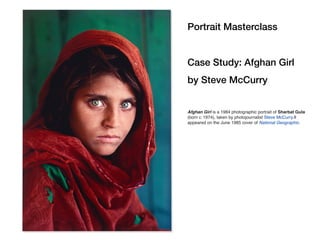
- 1. Portrait Masterclass Case Study: Afghan Girl by Steve McCurry Afghan Girl is a 1984 photographic portrait of Sharbat Gula (born c. 1974), taken by photojournalist Steve McCurry.It appeared on the June 1985 cover of National Geographic.
- 2. The aspect ratio is 4 x 6 (Ruler is used to show ratio, not the actual size of the image in inches)
- 3. Here we are less interested in Rule of Thirds and more interested in ratio of space used in the frame. The head is divided in half by the eyes. This leaves the expressive half at the bottom. Yet there is equal space for the unexpressive forehead and hair.
- 4. The head is divided in half by the eyes. This leaves the expressive half at the bottom. Yet there is equal space for the unexpressive forehead and hair.
- 5. The eyes are placed above the center line. The expressive half of her face takes only 1/3 of total composition. Note her forehead, hair and head scarf take up as much space as her expressive half. And there is negative space at the top for the green wall.
- 6. If the expressive half of the face takes up 1/3 of the frame and the forehead and hair take up 1/3, the that leaves 1/3 to show neck and clothing. I direct models to elongate the neck. The viewer can infer the model’s body type by seeing the neck and clavicles. That is usually where to crop.
- 7. The nose is placed right of the center line. Notice how one eye is placed on the vertical dividing line (2). One Eye Placement in center
- 8. You will begin see many portraits use this placement. In this ratio her expressive face takes up only 1/4 of the image (2-3 across left to right) This leaves negative space for placing her in an environment. It is a more dynamic composition than a perfectly center weighted face.
- 9. Color Green and red are complementary colors. They vibrate in the cones of the human eye causing energy and contrast. Simultaneous contrast is most intense when two complementary colors are juxtaposed directly next to each other. For example, red placed directly next to a green, if you concentrate on the edge you will see a slight vibration.
- 10. Negative Space Figure/Ground The wall in the Negative Space or the Ground. Note the ratio of Ground to Figure. How much color and texture do you need to give a sense of place and design? The more Ground you include the less emphasis you put on the expressive face.
- 11. Negative Space Figure/Ground Negative Space, in art, is the space around and between the subject of an image. Figure/Ground organization is a type of perceptual grouping that is a vital necessity for recognizing objects through vision. In Gestalt psychology it is known as identifying a figure from the background.
- 12. Chiaroscuro The light comes from the right and creates a strong contrast delineating the right cheek. The left cheek has information in the shadow, meaning both skin texture and tonal variation. Too much contrast in the dynamic range would have destroyed the subtle molding of her bone structure and lost the texture.
- 13. Chiaroscuro Subtle shadows fall off Strong contrast light/dark draws the eye
- 14. Chiaroscuro is the use of strong contrasts between light and dark, usually bold contrasts affecting a whole composition. It is also a technical term used by artists and art historians for the use of contrasts of light to achieve a sense of volume in modeling three-dimensional objects and figures. Similar effects in cinema and photography also are called chiaroscuro.
- 15. Chiaroscuro The underlying principle is that solidity of form is best achieved by the light falling against it. Artists known for developing the technique include Leonardo da Vinci, Caravaggio and Rembrandt. Shadows give the form depth. Our brains need Visual Clues to interpret a flat photograph as a three- dimensional object. Humans have complicated forms and that is why working with shadows is important.
- 17. Chiaroscuro CENTER LIGHT The area that faces most directly towards the light source FORM LIGHT The part that receives direct light TERMINATOR This divides form light and form shadow REFLECTED LIGHT This brightens the form shadow OCCLUSION SHADOWS Where two surface get close to each other, these are created OCCLUSION SHADOWS Where two surface get close to each other, these are created HALFTONES Form light is divided into halftones that darken as the form turns away from the light source FORM SHADOW This is the part in shadow
- 18. Hierarchy of Attention 1. Eyes 2. Contrast 3. 3-6 Complimentar Color Knowing psychology and perception lets you guide the viewer’s eyes through the frame. It is human nature to look at the eyes. We judge a person’s intention, emotional availability and health from information in the eyes. This is the ‘entry point’ to the composition. Strong contrast of highlight against darkness is almost as powerful for drawing attention. The viewer will follow the line of contrast down her cheek. The last element the moves over is the juxtaposition of complimentary colors red against green. 1 2 3 4 5 6
- 19. Portrait Masterclass Case Study: Afghan Girl by Steve McCurry Eye Placement Ratio Expressive half of face vs Unexpressive forehead + hair Complementary colors give contrast and energy Figure/Ground balance to emphasize face while showing environment Chiaroscuro highlights and shadows are visual clues about depth. Gives modeling to the face structure.
- 20. Join us for a Dallas, TX Photography workshop on: https://www.meetup.com/StreetPhotographyUniversity