Download as PDF, PPTX

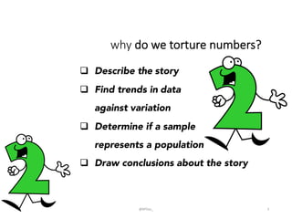
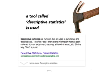
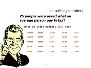

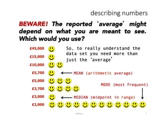
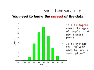
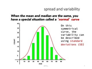
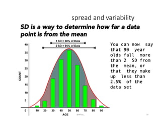
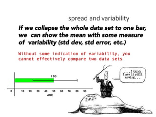
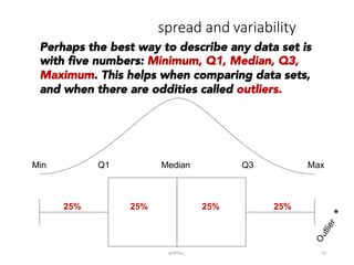
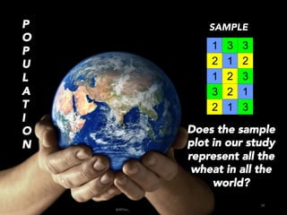
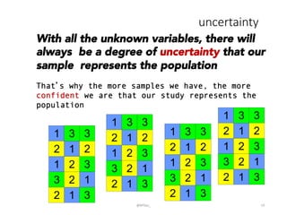
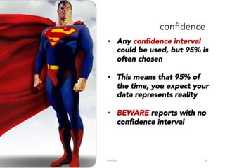
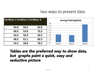

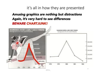
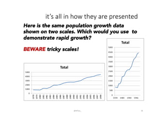
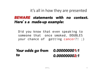

This document provides an introduction to descriptive statistics and how numbers can be used to describe data patterns but also be misused or misrepresented. It discusses how descriptive statistics are used to describe data distributions, find trends, determine if samples represent populations, and draw conclusions. However, it cautions that averages, variability, sample size, potential outliers, and confidence intervals must be considered to properly understand data. Graphs can also distort data if scales are manipulated or too much "chartjunk" is used. Skepticism is advised toward conclusions from data that lack appropriate context and statistical significance.


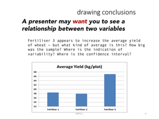
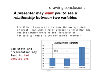
![제 23회 보아즈(BOAZ) 빅데이터 컨퍼런스 - [MBOAX] : ABSA를 활용한 소비자 반응 분석 기반 운영 효율화 대시보드 설계](https://cdn.slidesharecdn.com/ss_thumbnails/3-1boaz23rdconferencemboax-260203102709-9d519923-thumbnail.jpg?width=640&height=640&fit=bounds)


