10 Genius Call to Action Examples Everyone Clicks
www.virtualemployee.com sales@virtualemployee.com (+1)8776978006
Introduction
• A CTA (Call to action) button can make or break your marketing campaign
• It is a significant contributor to conversion rates
• US marketers spend billions on digital ads.
• Call to actions for email marketing are well strategized and banked
upon for sales
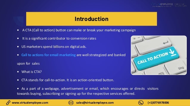
• What is CTA?
• CTA stands for call-to-action. It is an action-oriented button.
• As a part of a webpage, advertisement or email, which encourages or directs visitors
towards buying, subscribing or signing up for the respective services offered.
● Compelling CTAs nudge a visitor/prospective buyer towards the next
step of the buying process.
● It is absolutely imperative in the digital space to have a CTA button that
outshines the content on your page and attracts visitors’ attention.
● Companies go to lengths to create the perfect CTA for their webpage.
They understand a consumer’s thought process by studying previous
CTAs conversion rates.
● This helps them identify the kind of CTA that would work best for their
product/service.
● Types of CTAs which are commonly used are – Sign up, Subscribe, Get
started, Learn more, Join us, etc.
www.virtualemployee.com sales@virtualemployee.com (+1)8776978006
Based on analysis and research, here are 10
genius call to action examples everyone
clicks
1. Hubspot – Hubspot uses a ‘Slide in’ button as a CTA. It is placed in the
middle of the article which prompts readers to click and avail of a wealth of
free resources they have to offer. This slide-in CTA offers a free resource that
is directly related to the topic of the article it appears on. Readers can finish
the article and then download the guide with templates to get started on a
marketing kit of their own.
2. Budgetnista – It is an integrated platform for personal finance run by a
financial educator and author. Apart from providing informative content on
her webpage, she uses creative and compelling CTA. For Example, the
newsletter subscription says – Sign up for weekly goodies. It works because
of the friendly, enticing and creative language.
www.virtualemployee.com sales@virtualemployee.com (+1)8776978006
3. Hotjar – They use a simple Sign-up button as their CTA but it is directly
integrated with the prospect’s Gmail account. This makes the process
seamless and short for the visitor and increases the possibility of
conversions.
4. Zara – Zara takes a rather strategic and subtle approach to ensure that
the user reaches from top of the funnel – homepage, to bottom of the
funnel - product page swiftly. They use a ‘View’ button which takes
potential buyers to their latest clothing line.
5. Netflix – Netflix uses Try 30 days for free CTA for new potential
subscribers. This is effective because 30 days is good amount of time for
users to learn, browse and use the platform for entertainment. At the end
of the one-month trial, most subscribers are hooked and they don’t mind
buying a subscription. Additionally, a red CTA button increases the
conversion rates by 21%.
www.virtualemployee.com sales@virtualemployee.com (+1)8776978006
6. Etsy – The e-commerce giant goes all out when it comes to their CTAs.
They use flexible, unconventional and creative copies like a ‘Shop for the
stars’ button or ‘Make them smile’ option under their products. There is a
positive tone to such messages, which attracts user’s attention instantly.
7. Yoga International – They use two unique ways to increase engagement
and conversion rates. Firstly, they offer a 30-day trial offer with a ‘GET
STARTED’ CTA button and they also use additional content right above it,
which mentions that the users can cancel their trial any time. It eases
potential customers and makes them feel free to choose and drop as they
prefer. Second is the use of a Pop-Up page as their CTA which appears after
the user opens the webpage and includes all the necessary info on the free
trial and offers
www.virtualemployee.com sales@virtualemployee.com (+1)8776978006
8. Nike - Nike uses action phrases in marketing emails along with a
product image. An attractive product image along with a Shop Now
button, which stands out from all the descriptive content. It is an
impactful way of grabbing attention and urging the target consumer to
click on the CTA.
9. Air BNB – They send their regular email subscribers’ information on the
available discounts and offers with a sense of urgency and concern. They
use a Redeem Now button to encourage customers to avail and use the
discount before it expires. Most consumers want to make the most out of
the offers and discounts available and will click on such an emailer.
10. Facebook – The social media giant is an expert when it comes to
effective CTAs. They use small videos which showcase various features the
platform has to offer. However, they tactfully only give enough
information that will make the viewer want to know more. They have a
learn more button, which most potential users are likely to click on out of
curiosity.
8
www.virtualemployee.com sales@virtualemployee.com (+1)8776978006
Contact Us
Virtual Employee
www.virtualemployee.com
Breakwater Marketplace, 91 Camden Street,
Suite 312, Rockland, ME, USA
(+1) 877-697-8006
sales@virtualemployee.com
www.virtualemployee.com sales@virtualemployee.com (+1)8776978006
Thank You

10 Genius Call-To-Action Examples Everyone Clicks.pptx

  • 1.
    10 Genius Callto Action Examples Everyone Clicks
  • 2.
    www.virtualemployee.com sales@virtualemployee.com (+1)8776978006 Introduction •A CTA (Call to action) button can make or break your marketing campaign • It is a significant contributor to conversion rates • US marketers spend billions on digital ads. • Call to actions for email marketing are well strategized and banked upon for sales • What is CTA? • CTA stands for call-to-action. It is an action-oriented button. • As a part of a webpage, advertisement or email, which encourages or directs visitors towards buying, subscribing or signing up for the respective services offered.
  • 3.
    ● Compelling CTAsnudge a visitor/prospective buyer towards the next step of the buying process. ● It is absolutely imperative in the digital space to have a CTA button that outshines the content on your page and attracts visitors’ attention. ● Companies go to lengths to create the perfect CTA for their webpage. They understand a consumer’s thought process by studying previous CTAs conversion rates. ● This helps them identify the kind of CTA that would work best for their product/service. ● Types of CTAs which are commonly used are – Sign up, Subscribe, Get started, Learn more, Join us, etc. www.virtualemployee.com sales@virtualemployee.com (+1)8776978006
  • 4.
    www.virtualemployee.com sales@virtualemployee.com (+1)8776978006 Basedon analysis and research, here are 10 genius call to action examples everyone clicks 1. Hubspot – Hubspot uses a ‘Slide in’ button as a CTA. It is placed in the middle of the article which prompts readers to click and avail of a wealth of free resources they have to offer. This slide-in CTA offers a free resource that is directly related to the topic of the article it appears on. Readers can finish the article and then download the guide with templates to get started on a marketing kit of their own. 2. Budgetnista – It is an integrated platform for personal finance run by a financial educator and author. Apart from providing informative content on her webpage, she uses creative and compelling CTA. For Example, the newsletter subscription says – Sign up for weekly goodies. It works because of the friendly, enticing and creative language.
  • 5.
    www.virtualemployee.com sales@virtualemployee.com (+1)8776978006 3.Hotjar – They use a simple Sign-up button as their CTA but it is directly integrated with the prospect’s Gmail account. This makes the process seamless and short for the visitor and increases the possibility of conversions. 4. Zara – Zara takes a rather strategic and subtle approach to ensure that the user reaches from top of the funnel – homepage, to bottom of the funnel - product page swiftly. They use a ‘View’ button which takes potential buyers to their latest clothing line. 5. Netflix – Netflix uses Try 30 days for free CTA for new potential subscribers. This is effective because 30 days is good amount of time for users to learn, browse and use the platform for entertainment. At the end of the one-month trial, most subscribers are hooked and they don’t mind buying a subscription. Additionally, a red CTA button increases the conversion rates by 21%.
  • 6.
    www.virtualemployee.com sales@virtualemployee.com (+1)8776978006 6.Etsy – The e-commerce giant goes all out when it comes to their CTAs. They use flexible, unconventional and creative copies like a ‘Shop for the stars’ button or ‘Make them smile’ option under their products. There is a positive tone to such messages, which attracts user’s attention instantly. 7. Yoga International – They use two unique ways to increase engagement and conversion rates. Firstly, they offer a 30-day trial offer with a ‘GET STARTED’ CTA button and they also use additional content right above it, which mentions that the users can cancel their trial any time. It eases potential customers and makes them feel free to choose and drop as they prefer. Second is the use of a Pop-Up page as their CTA which appears after the user opens the webpage and includes all the necessary info on the free trial and offers
  • 7.
    www.virtualemployee.com sales@virtualemployee.com (+1)8776978006 8.Nike - Nike uses action phrases in marketing emails along with a product image. An attractive product image along with a Shop Now button, which stands out from all the descriptive content. It is an impactful way of grabbing attention and urging the target consumer to click on the CTA. 9. Air BNB – They send their regular email subscribers’ information on the available discounts and offers with a sense of urgency and concern. They use a Redeem Now button to encourage customers to avail and use the discount before it expires. Most consumers want to make the most out of the offers and discounts available and will click on such an emailer. 10. Facebook – The social media giant is an expert when it comes to effective CTAs. They use small videos which showcase various features the platform has to offer. However, they tactfully only give enough information that will make the viewer want to know more. They have a learn more button, which most potential users are likely to click on out of curiosity.
  • 8.
    8 www.virtualemployee.com sales@virtualemployee.com (+1)8776978006 ContactUs Virtual Employee www.virtualemployee.com Breakwater Marketplace, 91 Camden Street, Suite 312, Rockland, ME, USA (+1) 877-697-8006 sales@virtualemployee.com
  • 9.