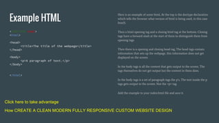
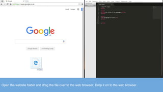
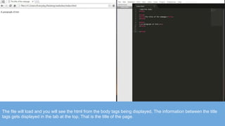
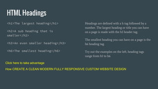
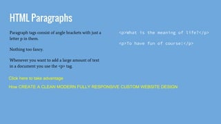
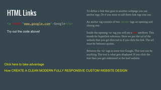
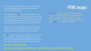
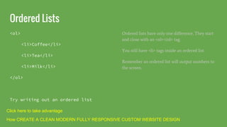
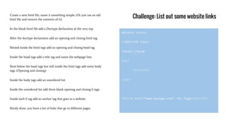
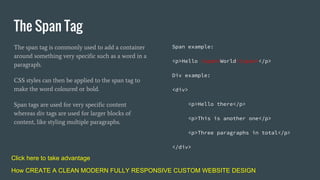
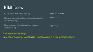
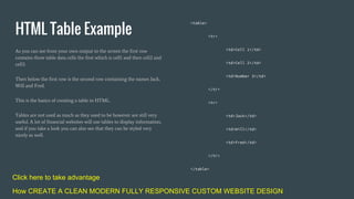
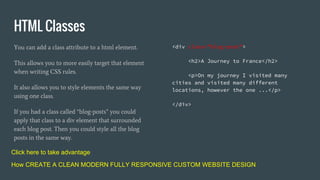
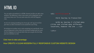
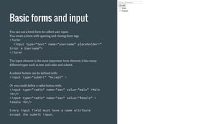
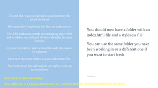
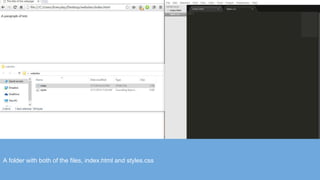
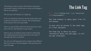
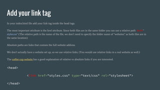
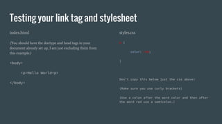
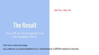
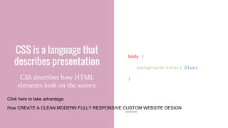
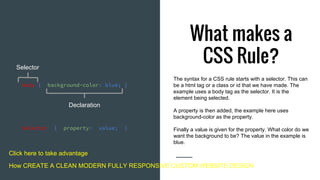
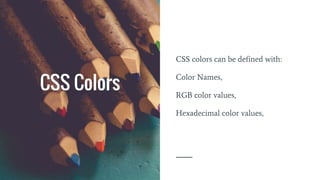
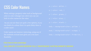
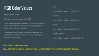
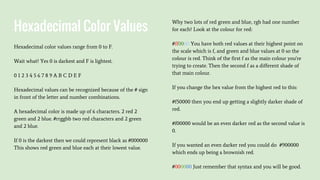
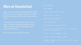
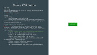
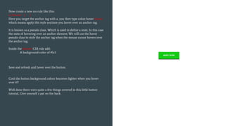
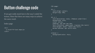
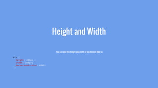
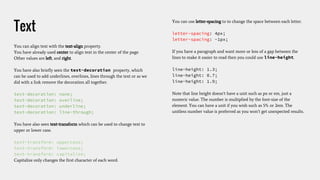
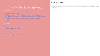
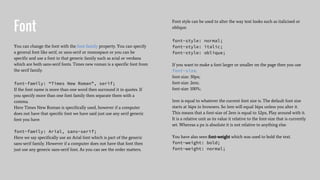
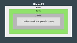
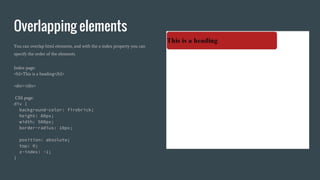
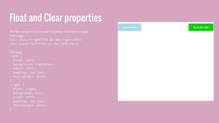
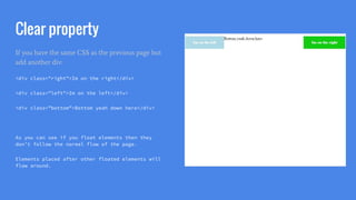
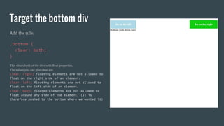
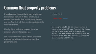
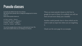
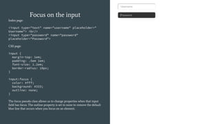
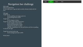
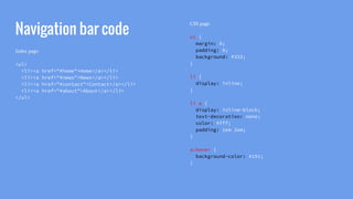
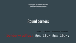
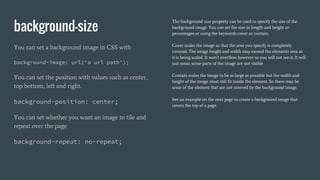
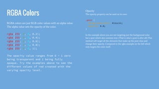
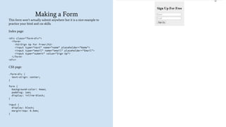
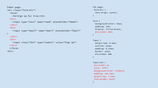
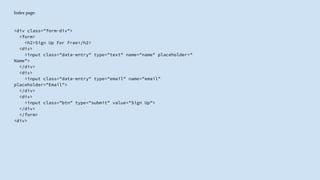
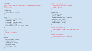
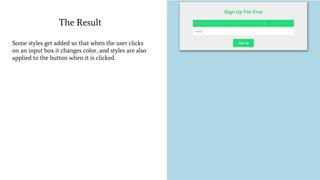
SlideShare a Scribd company logo
1 of 107
Download to read offline
Learn HTML and CSS
Learn to build a website with HTML and CSS
Hey Thank you for checking out my book!
For more free tutorials and guides
Sign up at my website below:
http://learnBuildCode.com
Downloading your tools
The only tool you will need is sublime text, a text
editor used for programming/coding.
You don’t want to use a word processor as this
saves files in rich text format and we want plain
text format.
Go to the sublime text website to download the
editor.
Click here to take advantage
How CREATE A CLEAN MODERN FULLY RESPONSIVE CUSTOM WEBSITE DESIGN
Open Your Tools
You will need sublime text open and
a web browser open.
I recommend google chrome but feel
free to use what you want.
On your desktop create a folder
named websites.
Then in sublime text click file, then
new file, then save as and save the file
as index.html and save it in your
website folder.
Google chrome web browser on the left and sublime text on the right.
Click here to take advantage
How CREATE A CLEAN MODERN FULLY RESPONSIVE CUSTOM WEBSITE DESIGN
Example HTML
<!DOCTYPE html>
<html>
<head>
<title>The title of the webpage</title>
</head>
<body>
<p>A paragraph of text.</p>
</body>
</html>
Here is an example of some html, At the top is the doctype declaration
which tells the browser what version of html is being used, in this case
html5.
Then a html opening tag and a closing html tag at the bottom. Closing
tags have a forward slash at the start of them to distinguish them from
opening tags.
Then there is a opening and closing head tag, The head tags contain
information that sets up the webpage, this information does not get
displayed on the screen.
In the body tags is all the content that gets output to the screen. The
tags themselves do not get output but the content in them does.
In the body tags is a set of paragraph tags the p’s, The text inside the p
tags gets output to the screen. Not the <p> tag.
Add the example to your index.html file and save it.
Click here to take advantage
How CREATE A CLEAN MODERN FULLY RESPONSIVE CUSTOM WEBSITE DESIGN
Open the website folder and drag the file over to the web browser, Drop it on to the web browser.
The file will load and you will see the html from the body tags being displayed, The information between the title
tags gets displayed in the tab at the top, That is the title of the page.
What Is HTML?
HTML stands for Hyper Text Markup Language
Click here to take advantage
How CREATE A CLEAN MODERN FULLY RESPONSIVE CUSTOM WEBSITE DESIGN
HTML is a language for
describing web pages
A HTML document is made up of
HTML tags.
Every HTML tag describes a certain
piece of the document/page content.
Markup language is just a set of
tags.
Parts of a HTML Document
The doctype declaration at the top tells the
browser what version of html is being used And
helps to display the page correctly.
The <head> tags are where you add information
about the web page, such as importing styles.
The <body> tags show any visible information or
content.
Every document must be between an opening and
closing <html> tag.
The <title> tag is used to give the document a title.
The <h1> tag can be used for a web page heading,
and the <p> tag can be used to describe a
paragraph.
Click here to take advantage
How CREATE A CLEAN MODERN FULLY RESPONSIVE CUSTOM WEBSITE DESIGN
What makes up a tag?
A tag is made up of a word or letter such as body,
and is surrounded by angular brackets.
HTML tags usually come in pairs, however not
always. The first tag is an opening tag, and the
second tag with a forward slash at the beginning is
a closing tag.
<body></body>
<tagName>Content</tagName>
Click here to take advantage
How CREATE A CLEAN MODERN FULLY RESPONSIVE CUSTOM WEBSITE DESIGN
HTML
The Basics
HTML Headings
<h1>The largest heading</h1>
<h2>A sub heading that is
smaller</h2>
<h3>An even smaller heading</h3>
<h6>The smallest heading</h6>
Headings are defined with a h tag followed by a
number. The largest heading or title you can have
on a page is made with the h1 header tag.
The smallest heading you can have on a page is the
h6 heading tag.
Try out the examples on the left, heading tags
range from h1 to h6.
Click here to take advantage
How CREATE A CLEAN MODERN FULLY RESPONSIVE CUSTOM WEBSITE DESIGN
HTML Paragraphs
Paragraph tags consist of angle brackets with just a
letter p in them.
Nothing too fancy.
Whenever you want to add a large amount of text
in a document you use the <p> tag.
<p>What is the meaning of life?</p>
<p>To have fun of course!</p>
Click here to take advantage
How CREATE A CLEAN MODERN FULLY RESPONSIVE CUSTOM WEBSITE DESIGN
HTML Links
<a href=”www.google.com”>Google</a>
Try out the code above!
To define a link that goes to another webpage you use
anchor tags, Or if you want to call them link tags you can.
An anchor tag consists of two <a></a> tags an opening and
closing one.
Inside the opening <a> tag you will see a href attribute. This
stands for hyperlink reference. Here we put the url of the
website that you get directed to if you click the link. The url
must be between quotes.
Between the <a> tags is some text Google, This text can be
anything. The text is what gets displayed. If you click the
text then you get redirected to the href website.
Click here to take advantage
How CREATE A CLEAN MODERN FULLY RESPONSIVE CUSTOM WEBSITE DESIGN
HTML Images
The image tag is a bit different, it is just one tag. It doesn’t
have an opening and closing tag, it is self closing and
consists of a single img tag.
The image tag has an src attribute which stands for source.
This attribute should contain a url of the path to the image
file. If you look at the url in the example you can see it goes
to the publicdomainarchive website then at the end you can
see it ends in jpg format which is a type of image format.
These types of url’s are called absolute url’s as they define
the path exactly. If you changed one character/letter then
the url would break. We will cover relative url’s later.
The alt attribute is text that gets displayed when you hover
over the image, it is a descriptive snippet of information.
The text will also get displayed if the image can’t be loaded
or it will get read by a screen reader if one is being used.
<img src=”http://publicdomainarchive.
com/wp-content/uploads/2014/03/public-
domain-images-archive-high-quality-
resolution-free-download-0036-1080x675.
jpg” alt=”An image of a bike” >
Click here to take advantage
How CREATE A CLEAN MODERN FULLY RESPONSIVE CUSTOM WEBSITE DESIGN
HTML Attributes
Html tags can have attributes
They provide more information to a
tag
Attributes
Attributes are a way of providing more
information to a tag, you have seen them already.
An attribute always goes inside the opening tag.
Attributes have a name such as href and then an =
sign and finally a value Which should be wrapped
in quotes “google.com”.
You have seen attributes with the <a> tag and the href
attribute:
<a href=”www.google.com”>A Link</a>
The href attribute provides a url destination that you will
end up at.
The img tag has the source attribute:
<img src=”an_image.jpg” >
You also have the alt attribute to display alternative text
when an image can’t be loaded:
<img src=”an_image.jpg” alt=”An Image” >
Click here to take advantage
How CREATE A CLEAN MODERN FULLY RESPONSIVE CUSTOM WEBSITE DESIGN
HTML lists
You can have an ordered list or an
unordered list
An ordered list will have numbers
next to it, an unordered list will have
bullet points.
Unordered lists are most frequently
used and CSS is used to remove the
bullet points.
Unordered Lists
Unordered lists have an opening and closing
<ul></ul> tag. Inside the unordered list you have
list items which are defined with the <li></li> tags.
For every new item you put in the unordered list
you must use an <li> tag.
<ul>
<li>Coffee</li>
<li>Tea</li>
<li>Milk</li>
</ul>
Try writing out a list
Click here to take advantage
How CREATE A CLEAN MODERN FULLY RESPONSIVE CUSTOM WEBSITE DESIGN
Ordered Lists
<ol>
<li>Coffee</li>
<li>Tea</li>
<li>Milk</li>
</ol>
Try writing out an ordered list
Ordered lists have only one difference, They start
and close with an <ol></ol> tag.
You still have <li> tags inside an ordered list.
Remember an ordered list will output numbers to
the screen.
Click here to take advantage
How CREATE A CLEAN MODERN FULLY RESPONSIVE CUSTOM WEBSITE DESIGN
Challenge: List out some website links
Create a new html file, name it something simple. (Or just use an old
html file and remove the contents of it).
In the blank html file add a Doctype declaration at the very top.
After the doctype declaration add an opening and closing html tag.
Nested inside the html tags add an opening and closing head tag.
Inside the head tags add a title tag and name the webpage lists.
Next below the head tags but still inside the html tags add some body
tags. (Opening and closing).
Inside the body tags add an unordered list.
Inside the unordered list add three blank opening and closing li tags.
Inside each li tag add an anchor tag that goes to a website.
Nicely done, you have a list of links that go to different pages.
Helpful Hints:
<!DOCTYPE html>
<head></head>
<ul>
<li></li>
</ul>
<li><a href=”www.mypage.com” >My Page</a></li>
The div Tag
The div element is used for
separating code or if you like,
dividing it up
<div><p>Hello</p></div>
The div element is used as a container for other elements. Here it surrounds a paragraph element.
If you try this example you will see that the only thing on the screen is the text “Hello”.
This is because you will need to add css styles to the div element in order to see it.
Divs are commonly used to style a certain block of content.
Hello
Click here to take advantage
How CREATE A CLEAN MODERN FULLY RESPONSIVE CUSTOM WEBSITE DESIGN
The Span Tag
The span tag is commonly used to add a container
around something very specific such as a word in a
paragraph.
CSS styles can then be applied to the span tag to
make the word coloured or bold.
Span tags are used for very specific content
whereas div tags are used for larger blocks of
content, like styling multiple paragraphs.
Span example:
<p>Hello <span>World</span></p>
Div example:
<div>
<p>Hello there</p>
<p>This is another one</p>
<p>Three paragraphs in total</p>
</div>
Click here to take advantage
How CREATE A CLEAN MODERN FULLY RESPONSIVE CUSTOM WEBSITE DESIGN
HTML Tables
HTML tables start with a table tag.
The table is then divided into horizontal rows with
the table row tags.
Then to create a cell a table data tag is placed
inside the tr tag.
<table></table>
<tr></tr>
<td></td>
Click here to take advantage
How CREATE A CLEAN MODERN FULLY RESPONSIVE CUSTOM WEBSITE DESIGN
HTML Table Example
As you can see from your own output to the screen the first row
contains three table data cells the first which is cell1 and then cell2 and
cell3.
Then below the first row is the second row containing the names Jack,
Will and Fred.
This is the basics of creating a table in HTML.
Tables are not used as much as they used to be however are still very
useful. A lot of financial websites will use tables to display information,
and if you take a look you can also see that they can be styled very
nicely as well.
<table>
<tr>
<td>Cell 1</td>
<td>Cell 2</td>
<td>Number 3</td>
</tr>
<tr>
<td>Jack</td>
<td>Will</td>
<td>Fred</td>
</tr>
</table>
Click here to take advantage
How CREATE A CLEAN MODERN FULLY RESPONSIVE CUSTOM WEBSITE DESIGN
HTML Classes
You can add a class attribute to a html element.
This allows you to more easily target that element
when writing CSS rules.
It also allows you to style elements the same way
using one class.
If you had a class called “blog-posts” you could
apply that class to a div element that surrounded
each blog post. Then you could style all the blog
posts in the same way.
<div class=”blog-post”>
<h2>A Journey to France</h2>
<p>On my journey I visited many
cities and visited many different
locations, however the one ...</p>
</div>
Click here to take advantage
How CREATE A CLEAN MODERN FULLY RESPONSIVE CUSTOM WEBSITE DESIGN
HTML ID
You can add an id attribute to a HTML element just like you add a class
attribute. The difference is that a class name such as blog-posts can be
used many times over. You can name many divs with the blog-post
class.
An id is for naming something once. If you giv a div tag an id of first-
post then no other id attribute can be named the same thing.
Id attributes are another way to style something very specifically. If you
want all blog posts to have white text and black backgrounds but want
the first blog post to be red and white then you can give the first blog
post an id attribute as well.
<div id=”first-post”>
<h2>A Journey to France</h2>
<p>On my journey I visited many
cities and visited many different
locations, however the one ...</p>
</div>
Click here to take advantage
How CREATE A CLEAN MODERN FULLY RESPONSIVE CUSTOM WEBSITE DESIGN
Basic forms and input
You can use a html form to collect user input,
You create a form with opening and closing form tags
<form>
<input type=”text” name=”username” placeholder=”
Enter a Username”>
</form>
The input element is the most important form element, it has many
different types such as text and radio and submit.
A submit button can be defined with:
<input type=”submit” “Accept” >
Or you could define a radio button with:
<input type=”radio” name=”sex” value=”male” >Male
<br/>
<input type="radio" name="sex" value="female" >
Female <br/>
Every input field must have a name attribute
except the submit input.
Adding Style To Your
Webpage
Adding CSS Styles
To add styles you are going to need another file
called styles.css
The name isn’t important but the .css extension is.
The CSS extension stands for cascading style sheet
and is where you will put all the style rules for your
website.
In your text editor, open a new file and then save it
as styles.css
Save it in the same folder as your index.html file.
The index.html file will import the styles from the
css stylesheet.
You should now have a folder with an
index.html file and a styles.css file
You can use the same folder you have
been working in or a different one if
you want to start fresh
Click here to take advantage
How CREATE A CLEAN MODERN FULLY RESPONSIVE CUSTOM WEBSITE DESIGN
A folder with both of the files, index.html and styles.css
The Link Tag
The link tag is used to create a link between a document
and another resource. In this case we want our html page to
link to our stylesheet.
The link tag is self closing it is a single tag.
It has a href attribute which just like the anchor tag is used
to point to the location of a resource. The example points
to the styles.css file in the same folder.
There is a type attribute which lets the browser know what
type of file it is, the stylesheet is type text/css.
There is also a rel attribute which stands for relationship.
The relationship between the index and css document is
that again the file is a stylesheet.
You can use a link tag many times to import many different
files if you want to. The link tag goes in the head tag at the
top of the page.
<link href="styles.css" type="text/css"
rel="stylesheet">
The link element is empty apart from its
attributes.
It must only be placed in the head tags
of a html document.
The head tag is where we place
information about the web page, it will
not get displayed.
Add your link tag
In your index.html file add your link tag inside the head tags.
The most important attribute is the href attribute. Since both files are in the same folder you can use a relative path href=”
styles.css” (The relative path is the name of the file, we don’t need to specify the folder name of “websites” as both files are in
the same location).
Absolute paths are links that contain the full website address.
We don’t actually have a website set up, so we use relative links. (You would use relative links in a real website as well.)
The coffee cup website has a good explanation of relative vs absolute links if you are interested.
<head>
<link href="styles.css" type="text/css" rel="stylesheet">
</head>
CSS example
On the next page is a css example,
update your index.html and styles.css
files and save them.
Then reload the browser to see the
result.
Testing your link tag and stylesheet
index.html
(You should have the doctype and head tags in your
document already set up, I am just excluding them from
this example.)
<body>
<p>Hello World<p>
</body>
styles.css
p {
color: red;
}
Don’t copy this below just the css above:
(Make sure you use curly brackets)
(Use a colon after the word color and then after
the word red use a semicolon.)
The Result
Hello World
You will see the paragraph text
has changed colour.
Click here to take advantage
How CREATE A CLEAN MODERN FULLY RESPONSIVE CUSTOM WEBSITE DESIGN
CSS is a language that
describes presentation
CSS describes how HTML
elements look on the screen.
body {
background-color: blue;
}
Click here to take advantage
How CREATE A CLEAN MODERN FULLY RESPONSIVE CUSTOM WEBSITE DESIGN
What makes a
CSS Rule?
body { background-color: blue; }
Selector { property: value; }
Selector
Declaration
The syntax for a CSS rule starts with a selector. This can
be a html tag or a class or id that we have made. The
example uses a body tag as the selector. It is the
element being selected.
A property is then added, the example here uses
background-color as the property.
Finally a value is given for the property. What color do we
want the background to be? The value in the example is
blue.
Click here to take advantage
How CREATE A CLEAN MODERN FULLY RESPONSIVE CUSTOM WEBSITE DESIGN
CSS Colors
CSS colors can be defined with:
Color Names,
RGB color values,
Hexadecimal color values,
CSS Color Names
When setting a property value such as background-
color or color (changes text color) you can use
built in color names for the value.
As you can see there are quite a few options, if you
can think of a colour then it is quite likely there is
a color name.
Color names are however restricting, using one of
the methods covered next gives you a lot more
flexibility.
p { color: white; }
p { color: red; }
p { color: green; }
p { color: blue; }
p { color: black; }
body { background-color: yellow; }
body { background-color: orange; }
body { background-color: firebrick; }
Click here to take advantage
How CREATE A CLEAN MODERN FULLY RESPONSIVE CUSTOM WEBSITE DESIGN
RGB Color Values
rgb(red, green, blue)
The rgb color scale runs from 0 to 255.
255 is the strongest and 0 weakest. You can use the scale to
make any combination of colours by specifying different
levels for the red, green and blue.
Try experimenting with the colours you can make. You
don’t need to remember the values as you can google an
rgb color you are after.
Red:
p { color: rgb(255,0,0); }
Green:
p { color: rgb(0,255,0); }
Blue:
p { color: rgb(0,0,255); }
Light grey:
p { color: rgb(200,200,200); }
Click here to take advantage
How CREATE A CLEAN MODERN FULLY RESPONSIVE CUSTOM WEBSITE DESIGN
Hexadecimal Color Values
Hexadecimal color values range from 0 to F.
Wait what? Yes 0 is darkest and F is lightest.
0 1 2 3 4 5 6 7 8 9 A B C D E F
Hexadecimal values can be recognized because of the # sign
in front of the letter and number combinations.
A hexadecimal color is made up of 6 characters. 2 red 2
green and 2 blue. #rrggbb two red characters and 2 green
and 2 blue.
If 0 is the darkest then we could represent black as #000000
This shows red green and blue each at their lowest value.
Why two lots of red green and blue, rgb had one number
for each? Look at the colour for red:
#ff0000 You have both red values at their highest point on
the scale which is f, and green and blue values at 0 so the
colour is red. Think of the first f as the main colour you're
trying to create. Then the second f as a different shade of
that main colour.
If you change the hex value from the highest red to this:
#f50000 then you end up getting a slightly darker shade of
red.
#f00000 would be an even darker red as the second value is
0.
If you wanted an even darker red you could do #900000
which ends up being a brownish red.
#000000 Just remember that syntax and you will be good.
More on Hexadecimal
Again don’t worry about memorizing colour values
there is no need, just google a colour such as light
blue hex value and you will be able to get what you
need.
It does help if you understand how hex values
work, Try experimenting with making a colour
lighter or darker and then eventually trying to
create certain colours.
Here are some more examples to help:
Green: #00ff00
Blue: #0000ff
Yellow: #ffff00 (red and green)
Shade of green: #77AA77
Shade of purple: #992299
Light grey: #eeeeee
Also light grey: #eee (same colour)
The value of e is all the same so the three letter
version is the shorthand.
#ffffff -> #fff or #000000 -> #000
#CC22AA -> #C2A or #AABBCC -> #ABC
#CD0066 -> #CD06 will not work, only if all values
are 2 of a kind.
Challenge
Recreate what you see on the right.
Index page:
Add a h1 tag and add some text.
CSS page:
Target the body tag and change the background color to lightblue.
Target the h1 tag and:
Change the color to white,
Change the background to red,
Change the text to align center using: text-align: center;
Click here to take advantage
How CREATE A CLEAN MODERN FULLY RESPONSIVE CUSTOM WEBSITE DESIGN
Borders
You can have a wide variety of borders, the values
allowed are solid, dashed, dotted, groove, inset,
outset, hidden, double, ridge and none.
The ones you will most likely require however are
solid, dotted, and none.
The shorthand border property is:
p {
border: 2px solid green;
}
The properties you are specifying in the shorthand
are:
border: width style color;
The width in the example is specified in pixels
which is an absolute unit. Try changing each
property about. 50px or dotted for the style and
change the colour using hexadecimal values.
You can also specify a single border if you wish:
border-top: 2px solid green;
border-bottom: 5px dotted #eee;
border-left: 1px outset red;
border-right: 2px double orange;
Challenge
Recreate what you see:
Index page:
Add a h2 tag with some text inside it
CSS page:
Target the h2 tag and:
Change the color to green,
Change the text align to center,
Add a top border that is 4px wide, double for the style and
coloured green,
Add a bottom border that is 4px wide, solid for the style and
coloured light grey.
Click here to take advantage
How CREATE A CLEAN MODERN FULLY RESPONSIVE CUSTOM WEBSITE DESIGN
CSS Margin
Margin sets the amount of whitespace around the border.
The margins you can set are:
Margin-top
Margin-right
Margin-bottom
Margin-left
To make something move downward on a page you would
use margin-top as you are pushing away from the top of the
screen.
To make something move away from the left side of the
screen you guessed it, margin-left. If you use a negative
margin then things can be moved off the page.
Margin shorthand property is
Margin: 100px 50px 100px 50px;
That would be 100px top margin, 50px right margin, 100px
bottom margin, and 50px left margin. As you can see the
list on the left goes clockwise and is important to
remember.
You could think of margin as a picture frame on a wall. If
you want to move the frame down then add some margin-
top to increase the whitespace above it.
Click here to take advantage
How CREATE A CLEAN MODERN FULLY RESPONSIVE CUSTOM WEBSITE DESIGN
Challenge
Index page:
Add a paragraph with the text “normal paragraph”
Add another paragraph below with the text “margin paragraph”, Add a
class to the margin paragraph called margin-paragraph.
<p class=”margin-paragraph” >
CSS page:
Target the second paragraph with the margin-paragraph class.
Do this by placing a dot/period/full stop in front of the class name.
.margin-paragraph { }
The dot is the syntax we use to target a html class in our CSS stylesheets.
Give the paragraph a 1px border, solid that has a colour of
firebrick.
Give the paragraph a margin-top of 50px.
Margin can be set to auto
Index page:
Add a div tag and inside add the text “A div container with auto margin”
CSS page:
Target the div tag and:
Add a solid border that is 1px wide and coloured red,
Refresh the page,
Now change the width to 500px, width: 500px;
Finally set the margin to auto.
CSS Padding
Padding is the space arount an element. Padding is the
space between the element and the border. If you have a
paragraph with a border and you want the border to be
further away you would use padding to pad it out.
If your paragraph has a background color then the padding
will also be that color.
Just like margin you have:
Padding-top
Padding-right
Padding-bottom
padding-left
Padding shorthand is just like margin shorthand:
padding : 50px 100px 50px 100px;
That is 50px of padding on the top, 100px on the right,
50px on the bottom and 100px of padding on the left.
So a simple explanation could be if you want to move
something around on the page use margin, and if you want
to make something bigger then use padding.
Challenge
Index page:
Add a paragraph with some text in it.
CSS page:
Target the paragraph tag:
Give the paragraph a 1px border coloured green and make it
solid,
Save and refresh the page.
Next add some top padding of 50px,
Save and refresh again to see the changes,
Add a background-color of lightblue to the paragraph,
Add 50px of padding-bottom
Save & Refresh,
Add 100px of padding-left.
Cool hopefully you are starting to see how margin and padding work.
Make a CSS button
Index page:
Add a div tag,
Inside that div tag add an anchor tag with the text “Join Now”, give the anchor tags href
attribute a value of “#” like this:
<a href="#">Join Now</a>
CSS page:
Target the div tag:
Make the text align to center in the div tag,
Give the div tag a margin-top of 50%, - This shifts the div tag down 50% of its
parent container. What is the parent container? For this div tag it is the page(body tags) for
the anchor tag the parent is the div tag.
Target the anchor tag inside the div tag like this:
div a { } - A space between the word div and anchor means
target all anchor tags inside div tags. Look at your anchor
tag, it is inside the div tag. Check your html if you need more
clarification.
(save & refresh after each step to help understanding)
Set the text-decoration to none,
Give it a background color of #191,
Change the text color to white,
Add padding of 1em top, 2em right 1em bottom and 2em left,
em is another unit, it is a relative unit.
Use text-transform and set it to uppercase,
Use font-weight and set it to bold,
Set a bottom border 4px wide that is solid and coloured #333,
Now create a new css rule like this:
a:hover { }
Here you target the anchor tag with a, you then type colon hover :hover
which means apply this style anytime you hover over an anchor tag.
It is known as a pseudo class, Which is used to define a state, In this case
the state of hovering over an anchor element. We will use the hover
pseudo class to style the anchor tag when the mouse cursor hovers over
the anchor tag.
Inside the a:hover CSS rule add:
A background-color of #1c1
Save and refresh and hover over the button.
Cool the button background colour becomes lighter when you hover
over it!!
Well done there were quite a few things covered in this little button
tutorial, Give yourself a pat on the back.
Button challenge code
If you got really stuck here is the way I coded the
button, Note that there are many ways to achieve
the same result.
Index page:
<div>
<a href="#">Join Now</a>
</div>
CSS page:
div {
text-align: center;
margin-top: 50%;
}
div a {
text-decoration: none; /*Remove underline*/
background: #191;
color: white;
padding: 1em 2em 1em 2em;
text-transform: uppercase; /*upcase the text*/
font-weight: bold; /*Bold the text*/
border-bottom: 4px solid #333;
}
a:hover {
background-color: #1c1;
}
Height and Width
You can add the height and width of an element like so:
div {
height: 200px ;
width: 200px;
background-color: #999;
}
Height and Width
Index page:
<div>Make me a box</div>
<div>Me too</div>
CSS page:
div {
height: 200px;
width: 200px;
background-color: green;
margin: 25px; /*25px of margin on every side */
}
The margin is shorthand for equal amounts on all
sides.
Max Width
Index page:
<div>50% please</div>
CSS page:
div {
border: 2px solid green;
max-width: 50%;
}
The div gets set to a maximum of 50% of the page, as that is the parent
of the div. Look at your html and you will see the div nested inside the
body tags.
If you resize the page the div will also resize, never getting wider than
50% of the page size.
If you have a width property in your CSS rule and a max-width property
then the max-width will override the width property. It has a higher
specificity.
Min Width
Index page:
<div>Welcome Visitor</div>
CSS page:
div {
color: white;
background: #f59;
text-align: center;
padding: 20px;
min-width: 500px;
}
If you add a min-width property then resize the screen so that it is
smaller, the element won’t keep getting smaller and resizing to the page.
Once it reaches the minimum width value the page can get smaller but
the size of the element will not decrease anymore. You will get a
scrollbar at the bottom of the page to scroll along with.
Text and Fonts
Text
You can align text with the text-align property.
You have already used center to align text in the center of the page.
Other values are left, and right.
You have also briefly seen the text-decoration property, which
can be used to add underlines, overlines, lines through the text or as we
did with a link remove the decoration all together.
text-decoration: none;
text-decoration: overline;
text-decoration: underline;
text-decoration: line-through;
You have also seen text-transform which can be used to change text to
upper or lower case.
text-transform: uppercase;
text-transform: lowercase;
text-transform: capitalize;
Capitalize only changes the first character of each word.
You can use letter-spacing to to change the space between each letter.
letter-spacing: 4px;
letter-spacing: -1px;
If you have a paragraph and want more or less of a gap between the
lines to make it easier to read then you could use line-height.
line-height: 1.3;
line-height: 0.7;
line-height: 1.9;
Note that line height doesn’t have a unit such as px or em, just a
numeric value. The number is multiplied by the font-size of the
element. You can have a unit if you wish such as 5% or 2em. The
unitless number value is preferred as you won’t get unexpected results.
Line height, Letter spacing
Index page:
<h1>Click Here</h1>
<p>Lots of text here Lots of text here Lots of
text here Lots of text here Lots of text here Lots
of text here Lots of text here Lots of text
here</p>
CSS page:
h1 {
letter-spacing: 5px;
}
p {
line-height: 1.9;
}
Font
You can change the font with the font-family property. You can specify
a general font like serif, or sans-serif or monospace or you can be
specific and use a font in that generic family such as arial or verdana
which are both sans-serif fonts. Times new roman is a specific font from
the serif family.
font-family: “Times New Roman”, serif;
If the font name is more than one word then surround it in quotes. If
you specify more than one font family then separate them with a
comma.
Here Times New Roman is specifically used, however if a computer
does not have that specific font we have said just use any serif generic
font you have.
font-family: Arial, sans-serif;
Here we say specifically use an Arial font which is part of the generic
sans-serif family. However if a computer does not have that font then
just use any generic sans-serif font. As you can see the order matters.
Font style can be used to alter the way text looks such as italicised or
oblique.
font-style: normal;
font-style: italic;
font-style: oblique;
If you want to make a font larger or smaller on the page then you use
font-size.
font-size: 30px;
font-size: 2em;
font-size: 100%;
1em is equal to whatever the current font size is. The default font size
starts at 16px in browsers. So 1em will equal 16px unless you alter it.
This means that a font-size of 2em is equal to 32px, Play around with it.
It is a relative unit as its value it relative to the font-size that is currently
set. Whereas a px is absolute it is not relative to anything else.
You have also seen font-weight which was used to bold the text.
font-weight: bold;
font-weight: normal;
I am the content, a paragraph for example.
Box Model
Padding
Border
Margin
The box model is a visualisation of what you are actually doing
when you add padding, a border, and margin.
Essentially every html element can be thought of as a box. The box model is just a box that wraps around every element and you
have been doing it this whole time. The box is made up of a combination of the content, the padding, the border and the margin.
Padding is the area around the content.
Border is the bit that goes around the padding and content.
The margin is the amount of space between the border and other elements on the page.
CSS Layout
How elements are displayed on a page
Display Property
Add a div to your page and give it a border. Now
look at it, it stretches the entire width of the page,
and if you added another div they would not line
up next to each other, This means by default it is a
block level element.
Think of a block, it takes up all the space given to
it. Every block element will begin on a new line on
the page.
Now add an anchor element to your page, And another
short one. So you have two links..
Look at how they sit together one after another on the
same line. They are inline elements. It sits inline (on the
same line) and does not take up all the space.
These are the default display values. Every html element
has a default display value. Next time you add an element
to a page try to guess what its default display value is.
The most common default display values are either block
or inline.
Display: none
You can set the display property to none to make
something not show up on the page.
Try adding a paragraph to your html file.
Now target the paragraph in your CSS file and add the line:
display: none;
This will change the default value from inline-block to
none and the paragraph will not be displayed.
The page is displayed as if the element is not even there.
If you want to hide something but have it still affect the
layout then you could use the visibility property and give it
a value of hidden.
visibility: hidden;
The element will take up the same amount of space on the
page as before, it will just be hidden, so it will affect the
page layout.
The page will render as if it were there.
Challenge Menu
Index page:
Add an unordered list with some li tags inside it, Then in each li tag add
an anchor link:
<ul>
<li><a href="#">HOME</a></li>
<li><a href="#">ABOUT</a></li>
<li><a href="#">CONTACT</a></li>
</ul>
CSS page:
Target the li tag and change the display to inline.
Target the ul tag and change the text-align to center
Target the anchor tag and change the text-decoration to none
Change the anchor background color to lightblue
Give the anchor top and bottom padding of 1em and left and
right of 2em
Menu Code
Index page:
<ul>
<li><a href="#">HOME</a></li>
<li><a href="#">ABOUT</a></li>
<li><a href="#">CONTACT</a></li>
</ul>
CSS page:
ul {
text-align: center;
}
li {
display: inline;
}
a {
background: lightblue;
padding: 1em 2em;
text-decoration: none;
}
Inline-block
Another display value is inline-block.
Inline block elements are like inline elements but you can give them a width and a
height. Think of it as combining the inline value and the block value.
The element gets treated as if it were a block level element so you can then decide how
much space you want it to take up, but it can act as an inline element and have other
elements next to it!
COOL!
Position Property - relative
An element can be positioned in four ways.
Static, relative, fixed or absolute.
Once the position property has been set you can then use the top,
bottom, left and right position properties. Depending on what position
value you use the outcome will be different.
By default html elements are positioned static.
position: static;
If an element has a static position then it will not be affected by the top,
bottom, left and right properties.
Static position is not special, elements are just placed onto the page in
the normal flow, one after another.
The relative position means an element is displayed relative to its
normal position. If you set the left property to a value of 50px then the
element will be pushed 50px to the right from where it would have
otherwise been.
It is positioned relatively, it is 30px away from where it would have
been. There will be a gap from where you pushed the element, into its
new position, no other element will fill this gap that has been left.
Other elements will not move out of the way either. So you could
overlap elements.
try :
Index page:
<div>Hello There</div>
CSS page:
div {
position: relative;
left: 50px;
border: 1px solid red;
}
Position Property - fixed
If you set the position property to fixed then it will be positioned in
relation to the viewport, It will stay in exactly the same place even if the
screen is scrolled.
Think of a website whee you have scrolled down but a menu is always
there at the top of the page. That is fixed positioning. Or a menu on the
side of a webpage that has social media icons, As you scroll it is always
in the same place, That is fixed positioning. Very useful stuff.
Remember relative positioning? The element would leave a gap where
it would have been.
Fixed positioning does not leave a gap where the element would have
been, The page flow remains normal.
With fixed positioning set you can use the top, bottom, left and right
properties to position an element on the page. If you want something
right at the very top of the page you can set top to 0. This means there
are 0 pixels or any unit between the element and the top of the page.
If you want the element to be fixed to the right side of the page then
give it a width and give the right property a value of 0, or maybe 20px if
you want a gap between the page and the element.
Try out the example on the next page.
Fixed position footer
Index page:
<h2>Fix that down the bottom!</h2>
<div>
setting a fixed position;
</div>
CSS page:
div {
position: fixed;
bottom: 0;
right: 0;
left: 0;
text-align: center;
border: 5px dotted lightblue;
}
Position Absolute
Absolute positioning can be a little more confusing. An element that has absolute positioning is positioned relative to the nearest positioned
element.
If there is no other positioned element then the absolute positioned element is relative to the document body.
So if you have a div positioned relative, Then inside that div you add another div but position it absolute. If you set the absolute positioned divs
right and bottom values to 0 it will position that div relative to the outside div.
This example will demonstrate.
Position Absolute
Index page:
Add two divs and give them a class name:
<div class="relative-div">Relative div
<div class="absolute-div">absolute div</div>
</div>
CSS page:
Target each div with a specific class:
div.relative-div {
position: relative;
width: 500px;
height: 250px;
border: 5px solid red;
}
div.absolute-div {
position: absolute;
bottom: 0;
right: 0;
width: 50%;
height: 100px;
border: 1px dotted blue;
}
Overlapping elements
You can overlap html elements, and with the z-index property you can
specify the order of the elements.
Index page:
<h1>This is a heading</h1>
<div></div>
CSS page:
div {
background-color: firebrick;
height: 80px;
width: 500px;
border-radius: 10px;
position: absolute;
top: 0;
z-index: -1;
}
Float and Clear properties
The float property can be used to position elements on a page.
Index page:
<div class="right">Im on the right</div>
<div class="left">Im on the left</div>
CSS page:
.left {
float: left;
background: lightblue;
color: #fff;
padding: 1em 2em;
font-weight: bold;
}
.right {
float: right;
background: #1c1;
color: #fff;
padding: 1em 2em;
font-weight: bold;
}
Clear property
If you have the same CSS as the previous page but
add another div:
<div class="right">Im on the right</div>
<div class="left">Im on the left</div>
<div class=”bottom”>Bottom yeah down here</div>
As you can see if you float elements then they
don’t follow the normal flow of the page.
Elements placed after other floated elements will
flow around.
Target the bottom div
Add the rule:
.bottom {
clear: both;
}
This clears both of the divs with float properties.
The values you can give clear are:
clear: right; floating elements are not allowed to
float on the right side of an element.
clear: left; floating elements are not allowed to
float on the left side of an element.
clear: both; floated elements are not allowed to
float around any side of the element. (It is
therefore pushed to the bottom where we wanted it)
Common float property problems
If you have one element that is a set height, and
then another element in it that is taller, so an
element that is taller than its containing element
and you float it, it will then overflow outside of the
container element.
Usually this is undesired however there is a
common solution that people use.
You can create a class called clearfix or clear or
anything you wish and then set the overflow
property to auto.
.clearfix {
overflow: auto;
}
An example would be an image inside a
containing div, if you floated the image
to the right then the div would not
adjust, so the overflow property can be
used to make the div correctly surround
the elements within it.
Pseudo classes
A pseudo class defines the state of an element.
We used the hover pseudo class to change the background of a button
earlier on.
Some anchor pseudo classes are:
a:link {color: blue;}
a:visited {color: purple;}
a:hover {color: orange;}
a:active {color: yellow;}
Try out the examples above to help you understand each state. The
active state would be when you are clicking on an element.
There are many pseudo classes so feel free to
google for more of them. It is unlikely you will use
them all and more likely just a handful.
Another useful pseudo class is :focus which can be
used to style an input box when you are targetting
it.
Check out the next page for an example.
Focus on the input
Index page:
<input type="text" name="username" placeholder="
Username"> <br/>
<input type="password" name="password"
placeholder="Password">
CSS page:
input {
margin-top: 1em;
padding: .5em 1em;
font-size: 1.2em;
border-radius: 10px;
}
input:focus {
color: #fff;
background: #333;
outline: none;
}
The focus pseudo class allows us to change properties when that input
field has focus. The outline property is set to none to remove the default
blue line that occurs when you focus on an element.
Navigation bar challenge
Index page:
Add an unordered list
In the ul add some li tags and add an anchor element inside each list
item.
CSS page:
Target the ul:
Set the padding and margin each to 0,
Set the background to #333,
Target the li:
Set the display to inline,
Target the anchor tags inside the list items:
Set the display to inline-block,
Set the text decoration to none,
Change the text color to white,
Add 1em of padding on the top and bottom and 2em of padding
on the left and right.
Target the hovered anchor tag:
Set the background color to #191
Nicely Done!
Navigation bar code
Index page:
<ul>
<li><a href="#home">Home</a></li>
<li><a href="#news">News</a></li>
<li><a href="#contact">Contact</a></li>
<li><a href="#about">About</a></li>
</ul>
CSS page:
ul {
margin: 0;
padding: 0;
background: #333;
}
li {
display: inline;
}
li a {
display: inline-block;
text-decoration: none;
color: #fff;
padding: 1em 2em;
}
a:hover {
background-color: #191;
}
CSS3 the newest standard
The new features
Round corners
border-radius: 5px 10px 5px 10px;
I’m pretty sure you have seen this before,
Round the corners of any element.
Top-left Top-right Bottom-right Bottom-left
background-size
You can set a background image in CSS with
background-image: url(‘a url path’);
You can set the position with values such as center,
top bottom, left and right.
background-position: center;
You can set whether you want an image to tile and
repeat over the page
background-repeat: no-repeat;
The background-size property can be used to specify the size of the
background image. You can set the size in length and height or
percentages or using the keywords cover or contain.
Cover scales the image so that the area you specify is completely
covered. The image height and width may exceed the elements area as
it is being scaled. It won’t overflow however so you will not see it. It will
just mean some parts of the image are not visible.
Contain scales the image to be as large as possible but the width and
height of the image must still fit inside the element. So there may be
areas of the element that are not covered by the background image.
See an example on the next page to create a background image that
covers the top of a page.
Background image
Find an image url you can use or add an image to your website's folder.
CSS page:
Taget the html tag (at a minimum it will always be the screen height):
html {
background: url('landscape.jpg');
background-repeat: no-repeat;
background-position: center center; /*horizontal
and vertically centered*/
background-size: cover;
min-height: 100%;
}
Set the background image with background and the url. Then set the
repeat to none. Set the position to center vertically and horizontally. Set
the size to scale and cover the area, in this case the html tags which are
as large as the whole page. Notice some of the image will be missing as it
has been scaled. Set the minimum height to be 100% of the html tag
height. Otherwise the image will not cover the whole screen.
A shorthand is:
background: url('image_url') no-repeat center center fixed;
background-size: cover;
RGBA Colors
RGBA colors are just RGB color values with an alpha value.
The alpha value sets the opacity of the color.
rgba(255, 0, 0, 0.2);
rgba(255, 0, 0, 0.4);
rgba(255, 0, 0, 0.6);
rgba(255, 0, 0, 0.8);
rgba(255, 0, 0, 1);
The opacity value ranges from 0 - 1 zero
being transparent and 1 being fully
opaque. Try the examples above to see the
different values of red created with the
varying opacity level.
Opacity
The opacity property can be used on its own:
.post {
background-color: #11cc11;
opacity: 0.8;
}
In the example above you are not targeting just the background color
but a post which also contains text. (That is what a post is after all) This
method will target all the elements that make up the post class and
change their opacity. Compared to the rgba example on the left which
only targets the color itself.
Text shadow
text-shadow: horizontal vertical blur color;
Box shadow
box-shadow: horizontal vertical blur color;
Text Shadows
You can add shadows to elements with css. You can add a text shadow to
any piece of text or use a box shadow to apply a shadow to the actual
element.
The text shadow has a horizontal shadow and a vertical shadow, you
then specify the colour you want the shadow to be:
h2 {
text-shadow: 2px 2px green;
}
You can also add a blur to the text shadow, It will be the third value,
here a 5px blur is added.
h2 {
text-shadow: 2px 2px 5px green;
}
Box Shadows
The box shadow has a horizontal value and a vertical value for the box
shadow, You also specify the color of the shadow.
div {
width: 300px;
height: 300px;
background-color: lightblue;
box-shadow: 10px 10px slategrey;
}
You can also add a blur to the shadow, This will be the third value. Here
I will add a 10px blur.
div {
width: 300px;
height: 300px;
background-color: lightblue;
box-shadow: 10px 10px 10px slategrey;
}
Inset box shadow
Just add the keyword inset and the shadow gets applied inside the
element.
<button>Normal Button</button>
<button class="button">Button</button>
Add some styles:
.button {
background-color: lightblue;
border: none;
color: white;
padding: 1.3em 4em;
display: inline-block;
text-decoration: none;
font-size: 1em;
outline: none;
box-shadow: 0px 1px 5px #333;
}
.button:active {
box-shadow: inset 0px 3px 5px #333;
}
When you click on the button the active pseudo class is triggered and
the inset box shadow gets applied.
Making a Form
This form won’t actually submit anywhere but it is a nice example to
practice your html and css skills.
Index page:
<div class="form-div">
<form>
<h2>Sign Up For Free</h2>
<input type="text" name="name" placeholder="Name">
<input type="email" name="email" placeholder="Email">
<input type="submit" value="Sign Up">
</form>
<div>
CSS page:
.form-div {
text-align: center;
}
form {
background-color: #eee;
padding: 1em;
display: inline-block;
}
input {
display: block;
margin-top: 0.5em;
}
Index page:
<div class="form-div">
<form>
<h2>Sign Up For Free</h2>
<div>
<input type="text" name="name" placeholder="Name">
</div>
<div>
<input type="email" name="email" placeholder="Email"
>
</div>
<div>
<input class="btn" type="submit" value="Sign Up">
</div>
</form>
<div>
CSS page:
.form-div {
text-align: center;
}
form {
background-color: #eee;
padding: 1em;
display: inline-block;
min-width: 80%;
}
input {
margin-top: 0.5em;
outline: none;
padding: 0.75em;
border: none;
min-width: 80%
}
input.btn {
min-width: 0;
color: #fff;
background-color: #22de7a;
padding: 1em 2em;
margin-top: 1.5em;
font-weight: bold;
}
The result so far
Index page:
<div class="form-div">
<form>
<h2>Sign Up For Free</h2>
<div>
<input class="data-entry" type="text" name="name" placeholder="
Name">
</div>
<div>
<input class="data-entry" type="email" name="email"
placeholder="Email">
</div>
<div>
<input class="btn" type="submit" value="Sign Up">
</div>
</form>
<div>
CSS page:
body {font-family: sans-serif; background-color:
lightblue;}
.form-div {
text-align: center;
}
form {
background-color: #eee;
padding: 1em;
display: inline-block;
min-width: 80%;
box-shadow: 2px 4px 15px #555;
}
h2 {
color: #22de7a;
}
input {
margin-top: 0.5em;
outline: none;
padding: 0.75em;
border: none;
min-width: 80%
}
.data-entry:focus {
background-color: #22de7a;
color: #fff;
}
input.btn {
min-width: 0;
color: #fff;
background-color: #22de7a;
padding: 1em 2em;
margin-top: 1.5em;
font-weight: bold;
}
input.btn:active {
box-shadow: inset 1px 1px 5px #333;
}
input.btn:hover {
background-color: #22fe7a;
}
The Result
Some styles get added so that when the user clicks
on an input box it changes color, and styles are also
applied to the button when it is clicked.
If you liked the html and css guide then feel free to check out my
website and sign up for more tutorials.
http://LearnBuildCode.com
Learn to build websites with
my free tutorials
Learn Build Code
Learning to build beautiful looking websites doesn’t have to be
hard, Follow along and get learning!
I hope you really enjoyed this book and most of all
learned something from it!
Feel free to leave a review on amazon and let me
know what you think of it.
Thanks again
Harry
Good luck on your Website
building journey!

More Related Content

Similar to Learn HTML and CSS_ Learn to build a website with HTML and CSS

Similar to Learn HTML and CSS_ Learn to build a website with HTML and CSS (20)

Html - Tutorial
Html - TutorialHtml - Tutorial
Html - Tutorial
 
Introduction to HTML
Introduction to HTML Introduction to HTML
Introduction to HTML
 
Basic HTML Tutorial For Beginners
Basic HTML Tutorial For BeginnersBasic HTML Tutorial For Beginners
Basic HTML Tutorial For Beginners
 
Introduction to HTML.pptx
Introduction to HTML.pptxIntroduction to HTML.pptx
Introduction to HTML.pptx
 
HTML.pptx
HTML.pptxHTML.pptx
HTML.pptx
 
Tm 1st quarter - 1st meeting
Tm   1st quarter - 1st meetingTm   1st quarter - 1st meeting
Tm 1st quarter - 1st meeting
 
Basic Html Notes
Basic Html NotesBasic Html Notes
Basic Html Notes
 
HTML Bootcamp
HTML BootcampHTML Bootcamp
HTML Bootcamp
 
Html Workshop
Html WorkshopHtml Workshop
Html Workshop
 
Web development Training in Ambala ! Batra Computer Centre
Web development Training in Ambala ! Batra Computer CentreWeb development Training in Ambala ! Batra Computer Centre
Web development Training in Ambala ! Batra Computer Centre
 
Html basics
Html basicsHtml basics
Html basics
 
Html basics
Html basicsHtml basics
Html basics
 
Html basics
Html basicsHtml basics
Html basics
 
Html basic file
Html basic fileHtml basic file
Html basic file
 
Html basics
Html basicsHtml basics
Html basics
 
Html BASICS
Html BASICSHtml BASICS
Html BASICS
 
Html basics 1
Html basics 1Html basics 1
Html basics 1
 
Html basics
Html basicsHtml basics
Html basics
 
Html basics
Html basicsHtml basics
Html basics
 
HTML_Basics.pdf
HTML_Basics.pdfHTML_Basics.pdf
HTML_Basics.pdf
 

Recently uploaded

Lucknow 💋 Call Girls Adil Nagar | ₹,9500 Pay Cash 8923113531 Free Home Delive...
Lucknow 💋 Call Girls Adil Nagar | ₹,9500 Pay Cash 8923113531 Free Home Delive...Lucknow 💋 Call Girls Adil Nagar | ₹,9500 Pay Cash 8923113531 Free Home Delive...
Lucknow 💋 Call Girls Adil Nagar | ₹,9500 Pay Cash 8923113531 Free Home Delive...anilsa9823
 
Call Girls In Andheri East Call 9892124323 Book Hot And Sexy Girls,
Call Girls In Andheri East Call 9892124323 Book Hot And Sexy Girls,Call Girls In Andheri East Call 9892124323 Book Hot And Sexy Girls,
Call Girls In Andheri East Call 9892124323 Book Hot And Sexy Girls,Pooja Nehwal
 
定制(UI学位证)爱达荷大学毕业证成绩单原版一比一
定制(UI学位证)爱达荷大学毕业证成绩单原版一比一定制(UI学位证)爱达荷大学毕业证成绩单原版一比一
定制(UI学位证)爱达荷大学毕业证成绩单原版一比一ss ss
 
(MEGHA) Hinjewadi Call Girls Just Call 7001035870 [ Cash on Delivery ] Pune E...
(MEGHA) Hinjewadi Call Girls Just Call 7001035870 [ Cash on Delivery ] Pune E...(MEGHA) Hinjewadi Call Girls Just Call 7001035870 [ Cash on Delivery ] Pune E...
(MEGHA) Hinjewadi Call Girls Just Call 7001035870 [ Cash on Delivery ] Pune E...ranjana rawat
 
如何办理(Adelaide毕业证)阿德莱德大学毕业证成绩单Adelaide学历认证真实可查
如何办理(Adelaide毕业证)阿德莱德大学毕业证成绩单Adelaide学历认证真实可查如何办理(Adelaide毕业证)阿德莱德大学毕业证成绩单Adelaide学历认证真实可查
如何办理(Adelaide毕业证)阿德莱德大学毕业证成绩单Adelaide学历认证真实可查awo24iot
 
VIP Call Girl Saharanpur Aashi 8250192130 Independent Escort Service Saharanpur
VIP Call Girl Saharanpur Aashi 8250192130 Independent Escort Service SaharanpurVIP Call Girl Saharanpur Aashi 8250192130 Independent Escort Service Saharanpur
VIP Call Girl Saharanpur Aashi 8250192130 Independent Escort Service SaharanpurSuhani Kapoor
 
如何办理萨省大学毕业证(UofS毕业证)成绩单留信学历认证原版一比一
如何办理萨省大学毕业证(UofS毕业证)成绩单留信学历认证原版一比一如何办理萨省大学毕业证(UofS毕业证)成绩单留信学历认证原版一比一
如何办理萨省大学毕业证(UofS毕业证)成绩单留信学历认证原版一比一ga6c6bdl
 
FULL ENJOY - 8264348440 Call Girls in Hauz Khas | Delhi
FULL ENJOY - 8264348440 Call Girls in Hauz Khas | DelhiFULL ENJOY - 8264348440 Call Girls in Hauz Khas | Delhi
FULL ENJOY - 8264348440 Call Girls in Hauz Khas | Delhisoniya singh
 
哪里办理美国宾夕法尼亚州立大学毕业证(本硕)psu成绩单原版一模一样
哪里办理美国宾夕法尼亚州立大学毕业证(本硕)psu成绩单原版一模一样哪里办理美国宾夕法尼亚州立大学毕业证(本硕)psu成绩单原版一模一样
哪里办理美国宾夕法尼亚州立大学毕业证(本硕)psu成绩单原版一模一样qaffana
 
WhatsApp 9892124323 ✓Call Girls In Khar ( Mumbai ) secure service - Bandra F...
WhatsApp 9892124323 ✓Call Girls In Khar ( Mumbai ) secure service -  Bandra F...WhatsApp 9892124323 ✓Call Girls In Khar ( Mumbai ) secure service -  Bandra F...
WhatsApp 9892124323 ✓Call Girls In Khar ( Mumbai ) secure service - Bandra F...Pooja Nehwal
 
Call Girls in Thane 9892124323, Vashi cAll girls Serivces Juhu Escorts, powai...
Call Girls in Thane 9892124323, Vashi cAll girls Serivces Juhu Escorts, powai...Call Girls in Thane 9892124323, Vashi cAll girls Serivces Juhu Escorts, powai...
Call Girls in Thane 9892124323, Vashi cAll girls Serivces Juhu Escorts, powai...Pooja Nehwal
 
Alambagh Call Girl 9548273370 , Call Girls Service Lucknow
Alambagh Call Girl 9548273370 , Call Girls Service LucknowAlambagh Call Girl 9548273370 , Call Girls Service Lucknow
Alambagh Call Girl 9548273370 , Call Girls Service Lucknowmakika9823
 
定制加拿大滑铁卢大学毕业证(Waterloo毕业证书)成绩单(文凭)原版一比一
定制加拿大滑铁卢大学毕业证(Waterloo毕业证书)成绩单(文凭)原版一比一定制加拿大滑铁卢大学毕业证(Waterloo毕业证书)成绩单(文凭)原版一比一
定制加拿大滑铁卢大学毕业证(Waterloo毕业证书)成绩单(文凭)原版一比一zul5vf0pq
 
(ZARA) Call Girls Jejuri ( 7001035870 ) HI-Fi Pune Escorts Service
(ZARA) Call Girls Jejuri ( 7001035870 ) HI-Fi Pune Escorts Service(ZARA) Call Girls Jejuri ( 7001035870 ) HI-Fi Pune Escorts Service
(ZARA) Call Girls Jejuri ( 7001035870 ) HI-Fi Pune Escorts Serviceranjana rawat
 
9004554577, Get Adorable Call Girls service. Book call girls & escort service...
9004554577, Get Adorable Call Girls service. Book call girls & escort service...9004554577, Get Adorable Call Girls service. Book call girls & escort service...
9004554577, Get Adorable Call Girls service. Book call girls & escort service...Pooja Nehwal
 
如何办理(UCLA毕业证书)加州大学洛杉矶分校毕业证成绩单留信学历认证原版一比一
如何办理(UCLA毕业证书)加州大学洛杉矶分校毕业证成绩单留信学历认证原版一比一如何办理(UCLA毕业证书)加州大学洛杉矶分校毕业证成绩单留信学历认证原版一比一
如何办理(UCLA毕业证书)加州大学洛杉矶分校毕业证成绩单留信学历认证原版一比一ga6c6bdl
 
Gaya Call Girls #9907093804 Contact Number Escorts Service Gaya
Gaya Call Girls #9907093804 Contact Number Escorts Service GayaGaya Call Girls #9907093804 Contact Number Escorts Service Gaya
Gaya Call Girls #9907093804 Contact Number Escorts Service Gayasrsj9000
 
Thane Escorts, (Pooja 09892124323), Thane Call Girls
Thane Escorts, (Pooja 09892124323), Thane Call GirlsThane Escorts, (Pooja 09892124323), Thane Call Girls
Thane Escorts, (Pooja 09892124323), Thane Call GirlsPooja Nehwal
 
VVIP Pune Call Girls Balaji Nagar (7001035870) Pune Escorts Nearby with Compl...
VVIP Pune Call Girls Balaji Nagar (7001035870) Pune Escorts Nearby with Compl...VVIP Pune Call Girls Balaji Nagar (7001035870) Pune Escorts Nearby with Compl...
VVIP Pune Call Girls Balaji Nagar (7001035870) Pune Escorts Nearby with Compl...Call Girls in Nagpur High Profile
 
Call Girls in Nagpur Bhavna Call 7001035870 Meet With Nagpur Escorts
Call Girls in Nagpur Bhavna Call 7001035870 Meet With Nagpur EscortsCall Girls in Nagpur Bhavna Call 7001035870 Meet With Nagpur Escorts
Call Girls in Nagpur Bhavna Call 7001035870 Meet With Nagpur Escortsranjana rawat
 

Recently uploaded (20)

Lucknow 💋 Call Girls Adil Nagar | ₹,9500 Pay Cash 8923113531 Free Home Delive...
Lucknow 💋 Call Girls Adil Nagar | ₹,9500 Pay Cash 8923113531 Free Home Delive...Lucknow 💋 Call Girls Adil Nagar | ₹,9500 Pay Cash 8923113531 Free Home Delive...
Lucknow 💋 Call Girls Adil Nagar | ₹,9500 Pay Cash 8923113531 Free Home Delive...
 
Call Girls In Andheri East Call 9892124323 Book Hot And Sexy Girls,
Call Girls In Andheri East Call 9892124323 Book Hot And Sexy Girls,Call Girls In Andheri East Call 9892124323 Book Hot And Sexy Girls,
Call Girls In Andheri East Call 9892124323 Book Hot And Sexy Girls,
 
定制(UI学位证)爱达荷大学毕业证成绩单原版一比一
定制(UI学位证)爱达荷大学毕业证成绩单原版一比一定制(UI学位证)爱达荷大学毕业证成绩单原版一比一
定制(UI学位证)爱达荷大学毕业证成绩单原版一比一
 
(MEGHA) Hinjewadi Call Girls Just Call 7001035870 [ Cash on Delivery ] Pune E...
(MEGHA) Hinjewadi Call Girls Just Call 7001035870 [ Cash on Delivery ] Pune E...(MEGHA) Hinjewadi Call Girls Just Call 7001035870 [ Cash on Delivery ] Pune E...
(MEGHA) Hinjewadi Call Girls Just Call 7001035870 [ Cash on Delivery ] Pune E...
 
如何办理(Adelaide毕业证)阿德莱德大学毕业证成绩单Adelaide学历认证真实可查
如何办理(Adelaide毕业证)阿德莱德大学毕业证成绩单Adelaide学历认证真实可查如何办理(Adelaide毕业证)阿德莱德大学毕业证成绩单Adelaide学历认证真实可查
如何办理(Adelaide毕业证)阿德莱德大学毕业证成绩单Adelaide学历认证真实可查
 
VIP Call Girl Saharanpur Aashi 8250192130 Independent Escort Service Saharanpur
VIP Call Girl Saharanpur Aashi 8250192130 Independent Escort Service SaharanpurVIP Call Girl Saharanpur Aashi 8250192130 Independent Escort Service Saharanpur
VIP Call Girl Saharanpur Aashi 8250192130 Independent Escort Service Saharanpur
 
如何办理萨省大学毕业证(UofS毕业证)成绩单留信学历认证原版一比一
如何办理萨省大学毕业证(UofS毕业证)成绩单留信学历认证原版一比一如何办理萨省大学毕业证(UofS毕业证)成绩单留信学历认证原版一比一
如何办理萨省大学毕业证(UofS毕业证)成绩单留信学历认证原版一比一
 
FULL ENJOY - 8264348440 Call Girls in Hauz Khas | Delhi
FULL ENJOY - 8264348440 Call Girls in Hauz Khas | DelhiFULL ENJOY - 8264348440 Call Girls in Hauz Khas | Delhi
FULL ENJOY - 8264348440 Call Girls in Hauz Khas | Delhi
 
哪里办理美国宾夕法尼亚州立大学毕业证(本硕)psu成绩单原版一模一样
哪里办理美国宾夕法尼亚州立大学毕业证(本硕)psu成绩单原版一模一样哪里办理美国宾夕法尼亚州立大学毕业证(本硕)psu成绩单原版一模一样
哪里办理美国宾夕法尼亚州立大学毕业证(本硕)psu成绩单原版一模一样
 
WhatsApp 9892124323 ✓Call Girls In Khar ( Mumbai ) secure service - Bandra F...
WhatsApp 9892124323 ✓Call Girls In Khar ( Mumbai ) secure service -  Bandra F...WhatsApp 9892124323 ✓Call Girls In Khar ( Mumbai ) secure service -  Bandra F...
WhatsApp 9892124323 ✓Call Girls In Khar ( Mumbai ) secure service - Bandra F...
 
Call Girls in Thane 9892124323, Vashi cAll girls Serivces Juhu Escorts, powai...
Call Girls in Thane 9892124323, Vashi cAll girls Serivces Juhu Escorts, powai...Call Girls in Thane 9892124323, Vashi cAll girls Serivces Juhu Escorts, powai...
Call Girls in Thane 9892124323, Vashi cAll girls Serivces Juhu Escorts, powai...
 
Alambagh Call Girl 9548273370 , Call Girls Service Lucknow
Alambagh Call Girl 9548273370 , Call Girls Service LucknowAlambagh Call Girl 9548273370 , Call Girls Service Lucknow
Alambagh Call Girl 9548273370 , Call Girls Service Lucknow
 
定制加拿大滑铁卢大学毕业证(Waterloo毕业证书)成绩单(文凭)原版一比一
定制加拿大滑铁卢大学毕业证(Waterloo毕业证书)成绩单(文凭)原版一比一定制加拿大滑铁卢大学毕业证(Waterloo毕业证书)成绩单(文凭)原版一比一
定制加拿大滑铁卢大学毕业证(Waterloo毕业证书)成绩单(文凭)原版一比一
 
(ZARA) Call Girls Jejuri ( 7001035870 ) HI-Fi Pune Escorts Service
(ZARA) Call Girls Jejuri ( 7001035870 ) HI-Fi Pune Escorts Service(ZARA) Call Girls Jejuri ( 7001035870 ) HI-Fi Pune Escorts Service
(ZARA) Call Girls Jejuri ( 7001035870 ) HI-Fi Pune Escorts Service
 
9004554577, Get Adorable Call Girls service. Book call girls & escort service...
9004554577, Get Adorable Call Girls service. Book call girls & escort service...9004554577, Get Adorable Call Girls service. Book call girls & escort service...
9004554577, Get Adorable Call Girls service. Book call girls & escort service...
 
如何办理(UCLA毕业证书)加州大学洛杉矶分校毕业证成绩单留信学历认证原版一比一
如何办理(UCLA毕业证书)加州大学洛杉矶分校毕业证成绩单留信学历认证原版一比一如何办理(UCLA毕业证书)加州大学洛杉矶分校毕业证成绩单留信学历认证原版一比一
如何办理(UCLA毕业证书)加州大学洛杉矶分校毕业证成绩单留信学历认证原版一比一
 
Gaya Call Girls #9907093804 Contact Number Escorts Service Gaya
Gaya Call Girls #9907093804 Contact Number Escorts Service GayaGaya Call Girls #9907093804 Contact Number Escorts Service Gaya
Gaya Call Girls #9907093804 Contact Number Escorts Service Gaya
 
Thane Escorts, (Pooja 09892124323), Thane Call Girls
Thane Escorts, (Pooja 09892124323), Thane Call GirlsThane Escorts, (Pooja 09892124323), Thane Call Girls
Thane Escorts, (Pooja 09892124323), Thane Call Girls
 
VVIP Pune Call Girls Balaji Nagar (7001035870) Pune Escorts Nearby with Compl...
VVIP Pune Call Girls Balaji Nagar (7001035870) Pune Escorts Nearby with Compl...VVIP Pune Call Girls Balaji Nagar (7001035870) Pune Escorts Nearby with Compl...
VVIP Pune Call Girls Balaji Nagar (7001035870) Pune Escorts Nearby with Compl...
 
Call Girls in Nagpur Bhavna Call 7001035870 Meet With Nagpur Escorts
Call Girls in Nagpur Bhavna Call 7001035870 Meet With Nagpur EscortsCall Girls in Nagpur Bhavna Call 7001035870 Meet With Nagpur Escorts
Call Girls in Nagpur Bhavna Call 7001035870 Meet With Nagpur Escorts
 

Learn HTML and CSS_ Learn to build a website with HTML and CSS

  • 1. Learn HTML and CSS Learn to build a website with HTML and CSS
  • 2. Hey Thank you for checking out my book! For more free tutorials and guides Sign up at my website below: http://learnBuildCode.com
  • 3. Downloading your tools The only tool you will need is sublime text, a text editor used for programming/coding. You don’t want to use a word processor as this saves files in rich text format and we want plain text format. Go to the sublime text website to download the editor. Click here to take advantage How CREATE A CLEAN MODERN FULLY RESPONSIVE CUSTOM WEBSITE DESIGN
  • 4. Open Your Tools You will need sublime text open and a web browser open. I recommend google chrome but feel free to use what you want. On your desktop create a folder named websites. Then in sublime text click file, then new file, then save as and save the file as index.html and save it in your website folder.
  • 5. Google chrome web browser on the left and sublime text on the right. Click here to take advantage How CREATE A CLEAN MODERN FULLY RESPONSIVE CUSTOM WEBSITE DESIGN
  • 6. Example HTML <!DOCTYPE html> <html> <head> <title>The title of the webpage</title> </head> <body> <p>A paragraph of text.</p> </body> </html> Here is an example of some html, At the top is the doctype declaration which tells the browser what version of html is being used, in this case html5. Then a html opening tag and a closing html tag at the bottom. Closing tags have a forward slash at the start of them to distinguish them from opening tags. Then there is a opening and closing head tag, The head tags contain information that sets up the webpage, this information does not get displayed on the screen. In the body tags is all the content that gets output to the screen. The tags themselves do not get output but the content in them does. In the body tags is a set of paragraph tags the p’s, The text inside the p tags gets output to the screen. Not the <p> tag. Add the example to your index.html file and save it. Click here to take advantage How CREATE A CLEAN MODERN FULLY RESPONSIVE CUSTOM WEBSITE DESIGN
  • 7. Open the website folder and drag the file over to the web browser, Drop it on to the web browser.
  • 8. The file will load and you will see the html from the body tags being displayed, The information between the title tags gets displayed in the tab at the top, That is the title of the page.
  • 9. What Is HTML? HTML stands for Hyper Text Markup Language Click here to take advantage How CREATE A CLEAN MODERN FULLY RESPONSIVE CUSTOM WEBSITE DESIGN
  • 10. HTML is a language for describing web pages A HTML document is made up of HTML tags. Every HTML tag describes a certain piece of the document/page content. Markup language is just a set of tags.
  • 11. Parts of a HTML Document The doctype declaration at the top tells the browser what version of html is being used And helps to display the page correctly. The <head> tags are where you add information about the web page, such as importing styles. The <body> tags show any visible information or content. Every document must be between an opening and closing <html> tag. The <title> tag is used to give the document a title. The <h1> tag can be used for a web page heading, and the <p> tag can be used to describe a paragraph. Click here to take advantage How CREATE A CLEAN MODERN FULLY RESPONSIVE CUSTOM WEBSITE DESIGN
  • 12. What makes up a tag? A tag is made up of a word or letter such as body, and is surrounded by angular brackets. HTML tags usually come in pairs, however not always. The first tag is an opening tag, and the second tag with a forward slash at the beginning is a closing tag. <body></body> <tagName>Content</tagName> Click here to take advantage How CREATE A CLEAN MODERN FULLY RESPONSIVE CUSTOM WEBSITE DESIGN
  • 14. HTML Headings <h1>The largest heading</h1> <h2>A sub heading that is smaller</h2> <h3>An even smaller heading</h3> <h6>The smallest heading</h6> Headings are defined with a h tag followed by a number. The largest heading or title you can have on a page is made with the h1 header tag. The smallest heading you can have on a page is the h6 heading tag. Try out the examples on the left, heading tags range from h1 to h6. Click here to take advantage How CREATE A CLEAN MODERN FULLY RESPONSIVE CUSTOM WEBSITE DESIGN
  • 15. HTML Paragraphs Paragraph tags consist of angle brackets with just a letter p in them. Nothing too fancy. Whenever you want to add a large amount of text in a document you use the <p> tag. <p>What is the meaning of life?</p> <p>To have fun of course!</p> Click here to take advantage How CREATE A CLEAN MODERN FULLY RESPONSIVE CUSTOM WEBSITE DESIGN
  • 16. HTML Links <a href=”www.google.com”>Google</a> Try out the code above! To define a link that goes to another webpage you use anchor tags, Or if you want to call them link tags you can. An anchor tag consists of two <a></a> tags an opening and closing one. Inside the opening <a> tag you will see a href attribute. This stands for hyperlink reference. Here we put the url of the website that you get directed to if you click the link. The url must be between quotes. Between the <a> tags is some text Google, This text can be anything. The text is what gets displayed. If you click the text then you get redirected to the href website. Click here to take advantage How CREATE A CLEAN MODERN FULLY RESPONSIVE CUSTOM WEBSITE DESIGN
  • 17. HTML Images The image tag is a bit different, it is just one tag. It doesn’t have an opening and closing tag, it is self closing and consists of a single img tag. The image tag has an src attribute which stands for source. This attribute should contain a url of the path to the image file. If you look at the url in the example you can see it goes to the publicdomainarchive website then at the end you can see it ends in jpg format which is a type of image format. These types of url’s are called absolute url’s as they define the path exactly. If you changed one character/letter then the url would break. We will cover relative url’s later. The alt attribute is text that gets displayed when you hover over the image, it is a descriptive snippet of information. The text will also get displayed if the image can’t be loaded or it will get read by a screen reader if one is being used. <img src=”http://publicdomainarchive. com/wp-content/uploads/2014/03/public- domain-images-archive-high-quality- resolution-free-download-0036-1080x675. jpg” alt=”An image of a bike” > Click here to take advantage How CREATE A CLEAN MODERN FULLY RESPONSIVE CUSTOM WEBSITE DESIGN
  • 18. HTML Attributes Html tags can have attributes They provide more information to a tag
  • 19. Attributes Attributes are a way of providing more information to a tag, you have seen them already. An attribute always goes inside the opening tag. Attributes have a name such as href and then an = sign and finally a value Which should be wrapped in quotes “google.com”. You have seen attributes with the <a> tag and the href attribute: <a href=”www.google.com”>A Link</a> The href attribute provides a url destination that you will end up at. The img tag has the source attribute: <img src=”an_image.jpg” > You also have the alt attribute to display alternative text when an image can’t be loaded: <img src=”an_image.jpg” alt=”An Image” > Click here to take advantage How CREATE A CLEAN MODERN FULLY RESPONSIVE CUSTOM WEBSITE DESIGN
  • 20. HTML lists You can have an ordered list or an unordered list An ordered list will have numbers next to it, an unordered list will have bullet points. Unordered lists are most frequently used and CSS is used to remove the bullet points.
  • 21. Unordered Lists Unordered lists have an opening and closing <ul></ul> tag. Inside the unordered list you have list items which are defined with the <li></li> tags. For every new item you put in the unordered list you must use an <li> tag. <ul> <li>Coffee</li> <li>Tea</li> <li>Milk</li> </ul> Try writing out a list Click here to take advantage How CREATE A CLEAN MODERN FULLY RESPONSIVE CUSTOM WEBSITE DESIGN
  • 22. Ordered Lists <ol> <li>Coffee</li> <li>Tea</li> <li>Milk</li> </ol> Try writing out an ordered list Ordered lists have only one difference, They start and close with an <ol></ol> tag. You still have <li> tags inside an ordered list. Remember an ordered list will output numbers to the screen. Click here to take advantage How CREATE A CLEAN MODERN FULLY RESPONSIVE CUSTOM WEBSITE DESIGN
  • 23. Challenge: List out some website links Create a new html file, name it something simple. (Or just use an old html file and remove the contents of it). In the blank html file add a Doctype declaration at the very top. After the doctype declaration add an opening and closing html tag. Nested inside the html tags add an opening and closing head tag. Inside the head tags add a title tag and name the webpage lists. Next below the head tags but still inside the html tags add some body tags. (Opening and closing). Inside the body tags add an unordered list. Inside the unordered list add three blank opening and closing li tags. Inside each li tag add an anchor tag that goes to a website. Nicely done, you have a list of links that go to different pages. Helpful Hints: <!DOCTYPE html> <head></head> <ul> <li></li> </ul> <li><a href=”www.mypage.com” >My Page</a></li>
  • 24. The div Tag The div element is used for separating code or if you like, dividing it up
  • 25. <div><p>Hello</p></div> The div element is used as a container for other elements. Here it surrounds a paragraph element. If you try this example you will see that the only thing on the screen is the text “Hello”. This is because you will need to add css styles to the div element in order to see it. Divs are commonly used to style a certain block of content. Hello Click here to take advantage How CREATE A CLEAN MODERN FULLY RESPONSIVE CUSTOM WEBSITE DESIGN
  • 26. The Span Tag The span tag is commonly used to add a container around something very specific such as a word in a paragraph. CSS styles can then be applied to the span tag to make the word coloured or bold. Span tags are used for very specific content whereas div tags are used for larger blocks of content, like styling multiple paragraphs. Span example: <p>Hello <span>World</span></p> Div example: <div> <p>Hello there</p> <p>This is another one</p> <p>Three paragraphs in total</p> </div> Click here to take advantage How CREATE A CLEAN MODERN FULLY RESPONSIVE CUSTOM WEBSITE DESIGN
  • 27. HTML Tables HTML tables start with a table tag. The table is then divided into horizontal rows with the table row tags. Then to create a cell a table data tag is placed inside the tr tag. <table></table> <tr></tr> <td></td> Click here to take advantage How CREATE A CLEAN MODERN FULLY RESPONSIVE CUSTOM WEBSITE DESIGN
  • 28. HTML Table Example As you can see from your own output to the screen the first row contains three table data cells the first which is cell1 and then cell2 and cell3. Then below the first row is the second row containing the names Jack, Will and Fred. This is the basics of creating a table in HTML. Tables are not used as much as they used to be however are still very useful. A lot of financial websites will use tables to display information, and if you take a look you can also see that they can be styled very nicely as well. <table> <tr> <td>Cell 1</td> <td>Cell 2</td> <td>Number 3</td> </tr> <tr> <td>Jack</td> <td>Will</td> <td>Fred</td> </tr> </table> Click here to take advantage How CREATE A CLEAN MODERN FULLY RESPONSIVE CUSTOM WEBSITE DESIGN
  • 29. HTML Classes You can add a class attribute to a html element. This allows you to more easily target that element when writing CSS rules. It also allows you to style elements the same way using one class. If you had a class called “blog-posts” you could apply that class to a div element that surrounded each blog post. Then you could style all the blog posts in the same way. <div class=”blog-post”> <h2>A Journey to France</h2> <p>On my journey I visited many cities and visited many different locations, however the one ...</p> </div> Click here to take advantage How CREATE A CLEAN MODERN FULLY RESPONSIVE CUSTOM WEBSITE DESIGN
  • 30. HTML ID You can add an id attribute to a HTML element just like you add a class attribute. The difference is that a class name such as blog-posts can be used many times over. You can name many divs with the blog-post class. An id is for naming something once. If you giv a div tag an id of first- post then no other id attribute can be named the same thing. Id attributes are another way to style something very specifically. If you want all blog posts to have white text and black backgrounds but want the first blog post to be red and white then you can give the first blog post an id attribute as well. <div id=”first-post”> <h2>A Journey to France</h2> <p>On my journey I visited many cities and visited many different locations, however the one ...</p> </div> Click here to take advantage How CREATE A CLEAN MODERN FULLY RESPONSIVE CUSTOM WEBSITE DESIGN
  • 31. Basic forms and input You can use a html form to collect user input, You create a form with opening and closing form tags <form> <input type=”text” name=”username” placeholder=” Enter a Username”> </form> The input element is the most important form element, it has many different types such as text and radio and submit. A submit button can be defined with: <input type=”submit” “Accept” > Or you could define a radio button with: <input type=”radio” name=”sex” value=”male” >Male <br/> <input type="radio" name="sex" value="female" > Female <br/> Every input field must have a name attribute except the submit input.
  • 32. Adding Style To Your Webpage Adding CSS Styles
  • 33. To add styles you are going to need another file called styles.css The name isn’t important but the .css extension is. The CSS extension stands for cascading style sheet and is where you will put all the style rules for your website. In your text editor, open a new file and then save it as styles.css Save it in the same folder as your index.html file. The index.html file will import the styles from the css stylesheet. You should now have a folder with an index.html file and a styles.css file You can use the same folder you have been working in or a different one if you want to start fresh Click here to take advantage How CREATE A CLEAN MODERN FULLY RESPONSIVE CUSTOM WEBSITE DESIGN
  • 34. A folder with both of the files, index.html and styles.css
  • 35. The Link Tag The link tag is used to create a link between a document and another resource. In this case we want our html page to link to our stylesheet. The link tag is self closing it is a single tag. It has a href attribute which just like the anchor tag is used to point to the location of a resource. The example points to the styles.css file in the same folder. There is a type attribute which lets the browser know what type of file it is, the stylesheet is type text/css. There is also a rel attribute which stands for relationship. The relationship between the index and css document is that again the file is a stylesheet. You can use a link tag many times to import many different files if you want to. The link tag goes in the head tag at the top of the page. <link href="styles.css" type="text/css" rel="stylesheet"> The link element is empty apart from its attributes. It must only be placed in the head tags of a html document. The head tag is where we place information about the web page, it will not get displayed.
  • 36. Add your link tag In your index.html file add your link tag inside the head tags. The most important attribute is the href attribute. Since both files are in the same folder you can use a relative path href=” styles.css” (The relative path is the name of the file, we don’t need to specify the folder name of “websites” as both files are in the same location). Absolute paths are links that contain the full website address. We don’t actually have a website set up, so we use relative links. (You would use relative links in a real website as well.) The coffee cup website has a good explanation of relative vs absolute links if you are interested. <head> <link href="styles.css" type="text/css" rel="stylesheet"> </head>
  • 37. CSS example On the next page is a css example, update your index.html and styles.css files and save them. Then reload the browser to see the result.
  • 38. Testing your link tag and stylesheet index.html (You should have the doctype and head tags in your document already set up, I am just excluding them from this example.) <body> <p>Hello World<p> </body> styles.css p { color: red; } Don’t copy this below just the css above: (Make sure you use curly brackets) (Use a colon after the word color and then after the word red use a semicolon.)
  • 39. The Result Hello World You will see the paragraph text has changed colour. Click here to take advantage How CREATE A CLEAN MODERN FULLY RESPONSIVE CUSTOM WEBSITE DESIGN
  • 40. CSS is a language that describes presentation CSS describes how HTML elements look on the screen. body { background-color: blue; } Click here to take advantage How CREATE A CLEAN MODERN FULLY RESPONSIVE CUSTOM WEBSITE DESIGN
  • 41. What makes a CSS Rule? body { background-color: blue; } Selector { property: value; } Selector Declaration The syntax for a CSS rule starts with a selector. This can be a html tag or a class or id that we have made. The example uses a body tag as the selector. It is the element being selected. A property is then added, the example here uses background-color as the property. Finally a value is given for the property. What color do we want the background to be? The value in the example is blue. Click here to take advantage How CREATE A CLEAN MODERN FULLY RESPONSIVE CUSTOM WEBSITE DESIGN
  • 42. CSS Colors CSS colors can be defined with: Color Names, RGB color values, Hexadecimal color values,
  • 43. CSS Color Names When setting a property value such as background- color or color (changes text color) you can use built in color names for the value. As you can see there are quite a few options, if you can think of a colour then it is quite likely there is a color name. Color names are however restricting, using one of the methods covered next gives you a lot more flexibility. p { color: white; } p { color: red; } p { color: green; } p { color: blue; } p { color: black; } body { background-color: yellow; } body { background-color: orange; } body { background-color: firebrick; } Click here to take advantage How CREATE A CLEAN MODERN FULLY RESPONSIVE CUSTOM WEBSITE DESIGN
  • 44. RGB Color Values rgb(red, green, blue) The rgb color scale runs from 0 to 255. 255 is the strongest and 0 weakest. You can use the scale to make any combination of colours by specifying different levels for the red, green and blue. Try experimenting with the colours you can make. You don’t need to remember the values as you can google an rgb color you are after. Red: p { color: rgb(255,0,0); } Green: p { color: rgb(0,255,0); } Blue: p { color: rgb(0,0,255); } Light grey: p { color: rgb(200,200,200); } Click here to take advantage How CREATE A CLEAN MODERN FULLY RESPONSIVE CUSTOM WEBSITE DESIGN
  • 45. Hexadecimal Color Values Hexadecimal color values range from 0 to F. Wait what? Yes 0 is darkest and F is lightest. 0 1 2 3 4 5 6 7 8 9 A B C D E F Hexadecimal values can be recognized because of the # sign in front of the letter and number combinations. A hexadecimal color is made up of 6 characters. 2 red 2 green and 2 blue. #rrggbb two red characters and 2 green and 2 blue. If 0 is the darkest then we could represent black as #000000 This shows red green and blue each at their lowest value. Why two lots of red green and blue, rgb had one number for each? Look at the colour for red: #ff0000 You have both red values at their highest point on the scale which is f, and green and blue values at 0 so the colour is red. Think of the first f as the main colour you're trying to create. Then the second f as a different shade of that main colour. If you change the hex value from the highest red to this: #f50000 then you end up getting a slightly darker shade of red. #f00000 would be an even darker red as the second value is 0. If you wanted an even darker red you could do #900000 which ends up being a brownish red. #000000 Just remember that syntax and you will be good.
  • 46. More on Hexadecimal Again don’t worry about memorizing colour values there is no need, just google a colour such as light blue hex value and you will be able to get what you need. It does help if you understand how hex values work, Try experimenting with making a colour lighter or darker and then eventually trying to create certain colours. Here are some more examples to help: Green: #00ff00 Blue: #0000ff Yellow: #ffff00 (red and green) Shade of green: #77AA77 Shade of purple: #992299 Light grey: #eeeeee Also light grey: #eee (same colour) The value of e is all the same so the three letter version is the shorthand. #ffffff -> #fff or #000000 -> #000 #CC22AA -> #C2A or #AABBCC -> #ABC #CD0066 -> #CD06 will not work, only if all values are 2 of a kind.
  • 47. Challenge Recreate what you see on the right. Index page: Add a h1 tag and add some text. CSS page: Target the body tag and change the background color to lightblue. Target the h1 tag and: Change the color to white, Change the background to red, Change the text to align center using: text-align: center; Click here to take advantage How CREATE A CLEAN MODERN FULLY RESPONSIVE CUSTOM WEBSITE DESIGN
  • 48. Borders You can have a wide variety of borders, the values allowed are solid, dashed, dotted, groove, inset, outset, hidden, double, ridge and none. The ones you will most likely require however are solid, dotted, and none. The shorthand border property is: p { border: 2px solid green; } The properties you are specifying in the shorthand are: border: width style color; The width in the example is specified in pixels which is an absolute unit. Try changing each property about. 50px or dotted for the style and change the colour using hexadecimal values. You can also specify a single border if you wish: border-top: 2px solid green; border-bottom: 5px dotted #eee; border-left: 1px outset red; border-right: 2px double orange;
  • 49. Challenge Recreate what you see: Index page: Add a h2 tag with some text inside it CSS page: Target the h2 tag and: Change the color to green, Change the text align to center, Add a top border that is 4px wide, double for the style and coloured green, Add a bottom border that is 4px wide, solid for the style and coloured light grey. Click here to take advantage How CREATE A CLEAN MODERN FULLY RESPONSIVE CUSTOM WEBSITE DESIGN
  • 50. CSS Margin Margin sets the amount of whitespace around the border. The margins you can set are: Margin-top Margin-right Margin-bottom Margin-left To make something move downward on a page you would use margin-top as you are pushing away from the top of the screen. To make something move away from the left side of the screen you guessed it, margin-left. If you use a negative margin then things can be moved off the page. Margin shorthand property is Margin: 100px 50px 100px 50px; That would be 100px top margin, 50px right margin, 100px bottom margin, and 50px left margin. As you can see the list on the left goes clockwise and is important to remember. You could think of margin as a picture frame on a wall. If you want to move the frame down then add some margin- top to increase the whitespace above it. Click here to take advantage How CREATE A CLEAN MODERN FULLY RESPONSIVE CUSTOM WEBSITE DESIGN
  • 51. Challenge Index page: Add a paragraph with the text “normal paragraph” Add another paragraph below with the text “margin paragraph”, Add a class to the margin paragraph called margin-paragraph. <p class=”margin-paragraph” > CSS page: Target the second paragraph with the margin-paragraph class. Do this by placing a dot/period/full stop in front of the class name. .margin-paragraph { } The dot is the syntax we use to target a html class in our CSS stylesheets. Give the paragraph a 1px border, solid that has a colour of firebrick. Give the paragraph a margin-top of 50px.
  • 52. Margin can be set to auto Index page: Add a div tag and inside add the text “A div container with auto margin” CSS page: Target the div tag and: Add a solid border that is 1px wide and coloured red, Refresh the page, Now change the width to 500px, width: 500px; Finally set the margin to auto.
  • 53. CSS Padding Padding is the space arount an element. Padding is the space between the element and the border. If you have a paragraph with a border and you want the border to be further away you would use padding to pad it out. If your paragraph has a background color then the padding will also be that color. Just like margin you have: Padding-top Padding-right Padding-bottom padding-left Padding shorthand is just like margin shorthand: padding : 50px 100px 50px 100px; That is 50px of padding on the top, 100px on the right, 50px on the bottom and 100px of padding on the left. So a simple explanation could be if you want to move something around on the page use margin, and if you want to make something bigger then use padding.
  • 54. Challenge Index page: Add a paragraph with some text in it. CSS page: Target the paragraph tag: Give the paragraph a 1px border coloured green and make it solid, Save and refresh the page. Next add some top padding of 50px, Save and refresh again to see the changes, Add a background-color of lightblue to the paragraph, Add 50px of padding-bottom Save & Refresh, Add 100px of padding-left. Cool hopefully you are starting to see how margin and padding work.
  • 55. Make a CSS button Index page: Add a div tag, Inside that div tag add an anchor tag with the text “Join Now”, give the anchor tags href attribute a value of “#” like this: <a href="#">Join Now</a> CSS page: Target the div tag: Make the text align to center in the div tag, Give the div tag a margin-top of 50%, - This shifts the div tag down 50% of its parent container. What is the parent container? For this div tag it is the page(body tags) for the anchor tag the parent is the div tag. Target the anchor tag inside the div tag like this: div a { } - A space between the word div and anchor means target all anchor tags inside div tags. Look at your anchor tag, it is inside the div tag. Check your html if you need more clarification. (save & refresh after each step to help understanding) Set the text-decoration to none, Give it a background color of #191, Change the text color to white, Add padding of 1em top, 2em right 1em bottom and 2em left, em is another unit, it is a relative unit. Use text-transform and set it to uppercase, Use font-weight and set it to bold, Set a bottom border 4px wide that is solid and coloured #333,
  • 56. Now create a new css rule like this: a:hover { } Here you target the anchor tag with a, you then type colon hover :hover which means apply this style anytime you hover over an anchor tag. It is known as a pseudo class, Which is used to define a state, In this case the state of hovering over an anchor element. We will use the hover pseudo class to style the anchor tag when the mouse cursor hovers over the anchor tag. Inside the a:hover CSS rule add: A background-color of #1c1 Save and refresh and hover over the button. Cool the button background colour becomes lighter when you hover over it!! Well done there were quite a few things covered in this little button tutorial, Give yourself a pat on the back.
  • 57. Button challenge code If you got really stuck here is the way I coded the button, Note that there are many ways to achieve the same result. Index page: <div> <a href="#">Join Now</a> </div> CSS page: div { text-align: center; margin-top: 50%; } div a { text-decoration: none; /*Remove underline*/ background: #191; color: white; padding: 1em 2em 1em 2em; text-transform: uppercase; /*upcase the text*/ font-weight: bold; /*Bold the text*/ border-bottom: 4px solid #333; } a:hover { background-color: #1c1; }
  • 58. Height and Width You can add the height and width of an element like so: div { height: 200px ; width: 200px; background-color: #999; }
  • 59. Height and Width Index page: <div>Make me a box</div> <div>Me too</div> CSS page: div { height: 200px; width: 200px; background-color: green; margin: 25px; /*25px of margin on every side */ } The margin is shorthand for equal amounts on all sides.
  • 60. Max Width Index page: <div>50% please</div> CSS page: div { border: 2px solid green; max-width: 50%; } The div gets set to a maximum of 50% of the page, as that is the parent of the div. Look at your html and you will see the div nested inside the body tags. If you resize the page the div will also resize, never getting wider than 50% of the page size. If you have a width property in your CSS rule and a max-width property then the max-width will override the width property. It has a higher specificity.
  • 61. Min Width Index page: <div>Welcome Visitor</div> CSS page: div { color: white; background: #f59; text-align: center; padding: 20px; min-width: 500px; } If you add a min-width property then resize the screen so that it is smaller, the element won’t keep getting smaller and resizing to the page. Once it reaches the minimum width value the page can get smaller but the size of the element will not decrease anymore. You will get a scrollbar at the bottom of the page to scroll along with.
  • 63. Text You can align text with the text-align property. You have already used center to align text in the center of the page. Other values are left, and right. You have also briefly seen the text-decoration property, which can be used to add underlines, overlines, lines through the text or as we did with a link remove the decoration all together. text-decoration: none; text-decoration: overline; text-decoration: underline; text-decoration: line-through; You have also seen text-transform which can be used to change text to upper or lower case. text-transform: uppercase; text-transform: lowercase; text-transform: capitalize; Capitalize only changes the first character of each word. You can use letter-spacing to to change the space between each letter. letter-spacing: 4px; letter-spacing: -1px; If you have a paragraph and want more or less of a gap between the lines to make it easier to read then you could use line-height. line-height: 1.3; line-height: 0.7; line-height: 1.9; Note that line height doesn’t have a unit such as px or em, just a numeric value. The number is multiplied by the font-size of the element. You can have a unit if you wish such as 5% or 2em. The unitless number value is preferred as you won’t get unexpected results.
  • 64. Line height, Letter spacing Index page: <h1>Click Here</h1> <p>Lots of text here Lots of text here Lots of text here Lots of text here Lots of text here Lots of text here Lots of text here Lots of text here</p> CSS page: h1 { letter-spacing: 5px; } p { line-height: 1.9; }
  • 65. Font You can change the font with the font-family property. You can specify a general font like serif, or sans-serif or monospace or you can be specific and use a font in that generic family such as arial or verdana which are both sans-serif fonts. Times new roman is a specific font from the serif family. font-family: “Times New Roman”, serif; If the font name is more than one word then surround it in quotes. If you specify more than one font family then separate them with a comma. Here Times New Roman is specifically used, however if a computer does not have that specific font we have said just use any serif generic font you have. font-family: Arial, sans-serif; Here we say specifically use an Arial font which is part of the generic sans-serif family. However if a computer does not have that font then just use any generic sans-serif font. As you can see the order matters. Font style can be used to alter the way text looks such as italicised or oblique. font-style: normal; font-style: italic; font-style: oblique; If you want to make a font larger or smaller on the page then you use font-size. font-size: 30px; font-size: 2em; font-size: 100%; 1em is equal to whatever the current font size is. The default font size starts at 16px in browsers. So 1em will equal 16px unless you alter it. This means that a font-size of 2em is equal to 32px, Play around with it. It is a relative unit as its value it relative to the font-size that is currently set. Whereas a px is absolute it is not relative to anything else. You have also seen font-weight which was used to bold the text. font-weight: bold; font-weight: normal;
  • 66. I am the content, a paragraph for example. Box Model Padding Border Margin
  • 67. The box model is a visualisation of what you are actually doing when you add padding, a border, and margin. Essentially every html element can be thought of as a box. The box model is just a box that wraps around every element and you have been doing it this whole time. The box is made up of a combination of the content, the padding, the border and the margin. Padding is the area around the content. Border is the bit that goes around the padding and content. The margin is the amount of space between the border and other elements on the page.
  • 68. CSS Layout How elements are displayed on a page
  • 69. Display Property Add a div to your page and give it a border. Now look at it, it stretches the entire width of the page, and if you added another div they would not line up next to each other, This means by default it is a block level element. Think of a block, it takes up all the space given to it. Every block element will begin on a new line on the page. Now add an anchor element to your page, And another short one. So you have two links.. Look at how they sit together one after another on the same line. They are inline elements. It sits inline (on the same line) and does not take up all the space. These are the default display values. Every html element has a default display value. Next time you add an element to a page try to guess what its default display value is. The most common default display values are either block or inline.
  • 70. Display: none You can set the display property to none to make something not show up on the page. Try adding a paragraph to your html file. Now target the paragraph in your CSS file and add the line: display: none; This will change the default value from inline-block to none and the paragraph will not be displayed. The page is displayed as if the element is not even there. If you want to hide something but have it still affect the layout then you could use the visibility property and give it a value of hidden. visibility: hidden; The element will take up the same amount of space on the page as before, it will just be hidden, so it will affect the page layout. The page will render as if it were there.
  • 71. Challenge Menu Index page: Add an unordered list with some li tags inside it, Then in each li tag add an anchor link: <ul> <li><a href="#">HOME</a></li> <li><a href="#">ABOUT</a></li> <li><a href="#">CONTACT</a></li> </ul> CSS page: Target the li tag and change the display to inline. Target the ul tag and change the text-align to center Target the anchor tag and change the text-decoration to none Change the anchor background color to lightblue Give the anchor top and bottom padding of 1em and left and right of 2em
  • 72. Menu Code Index page: <ul> <li><a href="#">HOME</a></li> <li><a href="#">ABOUT</a></li> <li><a href="#">CONTACT</a></li> </ul> CSS page: ul { text-align: center; } li { display: inline; } a { background: lightblue; padding: 1em 2em; text-decoration: none; }
  • 73. Inline-block Another display value is inline-block. Inline block elements are like inline elements but you can give them a width and a height. Think of it as combining the inline value and the block value. The element gets treated as if it were a block level element so you can then decide how much space you want it to take up, but it can act as an inline element and have other elements next to it! COOL!
  • 74. Position Property - relative An element can be positioned in four ways. Static, relative, fixed or absolute. Once the position property has been set you can then use the top, bottom, left and right position properties. Depending on what position value you use the outcome will be different. By default html elements are positioned static. position: static; If an element has a static position then it will not be affected by the top, bottom, left and right properties. Static position is not special, elements are just placed onto the page in the normal flow, one after another. The relative position means an element is displayed relative to its normal position. If you set the left property to a value of 50px then the element will be pushed 50px to the right from where it would have otherwise been. It is positioned relatively, it is 30px away from where it would have been. There will be a gap from where you pushed the element, into its new position, no other element will fill this gap that has been left. Other elements will not move out of the way either. So you could overlap elements. try : Index page: <div>Hello There</div> CSS page: div { position: relative; left: 50px; border: 1px solid red; }
  • 75. Position Property - fixed If you set the position property to fixed then it will be positioned in relation to the viewport, It will stay in exactly the same place even if the screen is scrolled. Think of a website whee you have scrolled down but a menu is always there at the top of the page. That is fixed positioning. Or a menu on the side of a webpage that has social media icons, As you scroll it is always in the same place, That is fixed positioning. Very useful stuff. Remember relative positioning? The element would leave a gap where it would have been. Fixed positioning does not leave a gap where the element would have been, The page flow remains normal. With fixed positioning set you can use the top, bottom, left and right properties to position an element on the page. If you want something right at the very top of the page you can set top to 0. This means there are 0 pixels or any unit between the element and the top of the page. If you want the element to be fixed to the right side of the page then give it a width and give the right property a value of 0, or maybe 20px if you want a gap between the page and the element. Try out the example on the next page.
  • 76. Fixed position footer Index page: <h2>Fix that down the bottom!</h2> <div> setting a fixed position; </div> CSS page: div { position: fixed; bottom: 0; right: 0; left: 0; text-align: center; border: 5px dotted lightblue; }
  • 77. Position Absolute Absolute positioning can be a little more confusing. An element that has absolute positioning is positioned relative to the nearest positioned element. If there is no other positioned element then the absolute positioned element is relative to the document body. So if you have a div positioned relative, Then inside that div you add another div but position it absolute. If you set the absolute positioned divs right and bottom values to 0 it will position that div relative to the outside div. This example will demonstrate.
  • 78. Position Absolute Index page: Add two divs and give them a class name: <div class="relative-div">Relative div <div class="absolute-div">absolute div</div> </div> CSS page: Target each div with a specific class: div.relative-div { position: relative; width: 500px; height: 250px; border: 5px solid red; } div.absolute-div { position: absolute; bottom: 0; right: 0; width: 50%; height: 100px; border: 1px dotted blue; }
  • 79. Overlapping elements You can overlap html elements, and with the z-index property you can specify the order of the elements. Index page: <h1>This is a heading</h1> <div></div> CSS page: div { background-color: firebrick; height: 80px; width: 500px; border-radius: 10px; position: absolute; top: 0; z-index: -1; }
  • 80. Float and Clear properties The float property can be used to position elements on a page. Index page: <div class="right">Im on the right</div> <div class="left">Im on the left</div> CSS page: .left { float: left; background: lightblue; color: #fff; padding: 1em 2em; font-weight: bold; } .right { float: right; background: #1c1; color: #fff; padding: 1em 2em; font-weight: bold; }
  • 81. Clear property If you have the same CSS as the previous page but add another div: <div class="right">Im on the right</div> <div class="left">Im on the left</div> <div class=”bottom”>Bottom yeah down here</div> As you can see if you float elements then they don’t follow the normal flow of the page. Elements placed after other floated elements will flow around.
  • 82. Target the bottom div Add the rule: .bottom { clear: both; } This clears both of the divs with float properties. The values you can give clear are: clear: right; floating elements are not allowed to float on the right side of an element. clear: left; floating elements are not allowed to float on the left side of an element. clear: both; floated elements are not allowed to float around any side of the element. (It is therefore pushed to the bottom where we wanted it)
  • 83. Common float property problems If you have one element that is a set height, and then another element in it that is taller, so an element that is taller than its containing element and you float it, it will then overflow outside of the container element. Usually this is undesired however there is a common solution that people use. You can create a class called clearfix or clear or anything you wish and then set the overflow property to auto. .clearfix { overflow: auto; } An example would be an image inside a containing div, if you floated the image to the right then the div would not adjust, so the overflow property can be used to make the div correctly surround the elements within it.
  • 84. Pseudo classes A pseudo class defines the state of an element. We used the hover pseudo class to change the background of a button earlier on. Some anchor pseudo classes are: a:link {color: blue;} a:visited {color: purple;} a:hover {color: orange;} a:active {color: yellow;} Try out the examples above to help you understand each state. The active state would be when you are clicking on an element. There are many pseudo classes so feel free to google for more of them. It is unlikely you will use them all and more likely just a handful. Another useful pseudo class is :focus which can be used to style an input box when you are targetting it. Check out the next page for an example.
  • 85. Focus on the input Index page: <input type="text" name="username" placeholder=" Username"> <br/> <input type="password" name="password" placeholder="Password"> CSS page: input { margin-top: 1em; padding: .5em 1em; font-size: 1.2em; border-radius: 10px; } input:focus { color: #fff; background: #333; outline: none; } The focus pseudo class allows us to change properties when that input field has focus. The outline property is set to none to remove the default blue line that occurs when you focus on an element.
  • 86. Navigation bar challenge Index page: Add an unordered list In the ul add some li tags and add an anchor element inside each list item. CSS page: Target the ul: Set the padding and margin each to 0, Set the background to #333, Target the li: Set the display to inline, Target the anchor tags inside the list items: Set the display to inline-block, Set the text decoration to none, Change the text color to white, Add 1em of padding on the top and bottom and 2em of padding on the left and right. Target the hovered anchor tag: Set the background color to #191 Nicely Done!
  • 87. Navigation bar code Index page: <ul> <li><a href="#home">Home</a></li> <li><a href="#news">News</a></li> <li><a href="#contact">Contact</a></li> <li><a href="#about">About</a></li> </ul> CSS page: ul { margin: 0; padding: 0; background: #333; } li { display: inline; } li a { display: inline-block; text-decoration: none; color: #fff; padding: 1em 2em; } a:hover { background-color: #191; }
  • 88. CSS3 the newest standard The new features
  • 89. Round corners border-radius: 5px 10px 5px 10px; I’m pretty sure you have seen this before, Round the corners of any element. Top-left Top-right Bottom-right Bottom-left
  • 90. background-size You can set a background image in CSS with background-image: url(‘a url path’); You can set the position with values such as center, top bottom, left and right. background-position: center; You can set whether you want an image to tile and repeat over the page background-repeat: no-repeat; The background-size property can be used to specify the size of the background image. You can set the size in length and height or percentages or using the keywords cover or contain. Cover scales the image so that the area you specify is completely covered. The image height and width may exceed the elements area as it is being scaled. It won’t overflow however so you will not see it. It will just mean some parts of the image are not visible. Contain scales the image to be as large as possible but the width and height of the image must still fit inside the element. So there may be areas of the element that are not covered by the background image. See an example on the next page to create a background image that covers the top of a page.
  • 91. Background image Find an image url you can use or add an image to your website's folder. CSS page: Taget the html tag (at a minimum it will always be the screen height): html { background: url('landscape.jpg'); background-repeat: no-repeat; background-position: center center; /*horizontal and vertically centered*/ background-size: cover; min-height: 100%; } Set the background image with background and the url. Then set the repeat to none. Set the position to center vertically and horizontally. Set the size to scale and cover the area, in this case the html tags which are as large as the whole page. Notice some of the image will be missing as it has been scaled. Set the minimum height to be 100% of the html tag height. Otherwise the image will not cover the whole screen. A shorthand is: background: url('image_url') no-repeat center center fixed; background-size: cover;
  • 92. RGBA Colors RGBA colors are just RGB color values with an alpha value. The alpha value sets the opacity of the color. rgba(255, 0, 0, 0.2); rgba(255, 0, 0, 0.4); rgba(255, 0, 0, 0.6); rgba(255, 0, 0, 0.8); rgba(255, 0, 0, 1); The opacity value ranges from 0 - 1 zero being transparent and 1 being fully opaque. Try the examples above to see the different values of red created with the varying opacity level. Opacity The opacity property can be used on its own: .post { background-color: #11cc11; opacity: 0.8; } In the example above you are not targeting just the background color but a post which also contains text. (That is what a post is after all) This method will target all the elements that make up the post class and change their opacity. Compared to the rgba example on the left which only targets the color itself.
  • 93. Text shadow text-shadow: horizontal vertical blur color; Box shadow box-shadow: horizontal vertical blur color;
  • 94. Text Shadows You can add shadows to elements with css. You can add a text shadow to any piece of text or use a box shadow to apply a shadow to the actual element. The text shadow has a horizontal shadow and a vertical shadow, you then specify the colour you want the shadow to be: h2 { text-shadow: 2px 2px green; } You can also add a blur to the text shadow, It will be the third value, here a 5px blur is added. h2 { text-shadow: 2px 2px 5px green; }
  • 95. Box Shadows The box shadow has a horizontal value and a vertical value for the box shadow, You also specify the color of the shadow. div { width: 300px; height: 300px; background-color: lightblue; box-shadow: 10px 10px slategrey; } You can also add a blur to the shadow, This will be the third value. Here I will add a 10px blur. div { width: 300px; height: 300px; background-color: lightblue; box-shadow: 10px 10px 10px slategrey; }
  • 96. Inset box shadow Just add the keyword inset and the shadow gets applied inside the element. <button>Normal Button</button> <button class="button">Button</button> Add some styles: .button { background-color: lightblue; border: none; color: white; padding: 1.3em 4em; display: inline-block; text-decoration: none; font-size: 1em; outline: none; box-shadow: 0px 1px 5px #333; } .button:active { box-shadow: inset 0px 3px 5px #333; } When you click on the button the active pseudo class is triggered and the inset box shadow gets applied.
  • 97. Making a Form This form won’t actually submit anywhere but it is a nice example to practice your html and css skills. Index page: <div class="form-div"> <form> <h2>Sign Up For Free</h2> <input type="text" name="name" placeholder="Name"> <input type="email" name="email" placeholder="Email"> <input type="submit" value="Sign Up"> </form> <div> CSS page: .form-div { text-align: center; } form { background-color: #eee; padding: 1em; display: inline-block; } input { display: block; margin-top: 0.5em; }
  • 98. Index page: <div class="form-div"> <form> <h2>Sign Up For Free</h2> <div> <input type="text" name="name" placeholder="Name"> </div> <div> <input type="email" name="email" placeholder="Email" > </div> <div> <input class="btn" type="submit" value="Sign Up"> </div> </form> <div> CSS page: .form-div { text-align: center; } form { background-color: #eee; padding: 1em; display: inline-block; min-width: 80%; } input { margin-top: 0.5em; outline: none; padding: 0.75em; border: none; min-width: 80% } input.btn { min-width: 0; color: #fff; background-color: #22de7a; padding: 1em 2em; margin-top: 1.5em; font-weight: bold; }
  • 100. Index page: <div class="form-div"> <form> <h2>Sign Up For Free</h2> <div> <input class="data-entry" type="text" name="name" placeholder=" Name"> </div> <div> <input class="data-entry" type="email" name="email" placeholder="Email"> </div> <div> <input class="btn" type="submit" value="Sign Up"> </div> </form> <div>
  • 101. CSS page: body {font-family: sans-serif; background-color: lightblue;} .form-div { text-align: center; } form { background-color: #eee; padding: 1em; display: inline-block; min-width: 80%; box-shadow: 2px 4px 15px #555; } h2 { color: #22de7a; } input { margin-top: 0.5em; outline: none; padding: 0.75em; border: none; min-width: 80% } .data-entry:focus { background-color: #22de7a; color: #fff; } input.btn { min-width: 0; color: #fff; background-color: #22de7a; padding: 1em 2em; margin-top: 1.5em; font-weight: bold; } input.btn:active { box-shadow: inset 1px 1px 5px #333; } input.btn:hover { background-color: #22fe7a; }
  • 102. The Result Some styles get added so that when the user clicks on an input box it changes color, and styles are also applied to the button when it is clicked.
  • 103. If you liked the html and css guide then feel free to check out my website and sign up for more tutorials. http://LearnBuildCode.com
  • 104. Learn to build websites with my free tutorials Learn Build Code
  • 105. Learning to build beautiful looking websites doesn’t have to be hard, Follow along and get learning!
  • 106. I hope you really enjoyed this book and most of all learned something from it! Feel free to leave a review on amazon and let me know what you think of it. Thanks again Harry
  • 107. Good luck on your Website building journey!