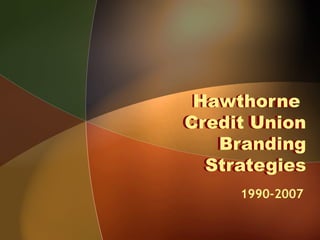
2. 1990s
With the move from the Hawthorne
Works Plant in Cicero to its office on
Diehl Road in Naperville, an identity is
created.
The triangle represents the financial
cooperative with the flow of funds from
member deposits to member loans to
reserves and back to its members.
3. 2000
First Generation Update and Tagline
• Contemporary, classic color & font
• Addition of a graphic effect in triangle
• Tagline communicates competitive
difference
For Banking, There’s Nothing Quite Like Us!
4. Branding Challenge
• Awareness of credit unions is low in
the Chicago market
– Many consumers don’t know what a
credit union is
– Those who do know what a credit union
is don’t know we’re open to the
community!
– Confuse us with a Labor Union!
5. 2007
• Second Generation
• Same color, minor font changes
• Size of “Credit Union” reduced!
– Addresses the credit union philosophy
after membership is established
Mary put new logo here
6. More Branding Challenges!
Create a campaign with imagery
that will:
1) Cut through the “noise” of
advertising in Chicago - the most
competitive banking market in the
United States
2) Make an impact in one of the most
expensive markets in the US
3) Spend a fraction of what WaMu,
Citibank and Harris spend
7. Hawthorne’s Strategy
Our branding is designed to:
• Strengthen our position in the
marketplace
• Convey that what you’ll find at
Hawthorne is not quite what you’ll
find at other financial institutions
• Gain top-of-mind awareness
• Increase utilization
• Attract new members
8. 2000-2002 The Smile Campaign
• First Generation: Big Smiles, Happy
Members
– Highly Memorable images
– Personable, lighthearted approach heard above
the advertising noise in Chicago
– Communicate friendliness
smile
9. Top National Honors 2003
• Smile Campaign
wins top award
“Best of Show”
at Credit Union
Executive
Society Golden
Mirror Awards
• Wins top award from more than 3,000
entries nationwide
smile
11. Smile Campaign Grows CU
• Balances grow significantly
• Hawthorne earns high marks for
deposit and loan balances in
comparison to peer credit unions
• Product Per Household increased
since 2003 from 1.63 to 1.77 while
peers’ PPH decreased from
2.05 to 2.01
12. 2007 A New Direction!
• Member-Focused Imagery
• Emphasizes Member-Owner and
“People Helping People” philosophy
• Communicates Trust – We strive to be
our members’ Trusted Financial
Advisor
• Coincides with Third Generation of
logo updates
• Aggressive Membership Goal
– 500 Net New Members in 2007