HTML Injection Attacks: Impact and Mitigation Strategies
The Mummy Returns
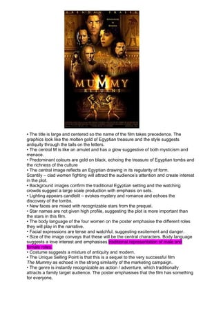
1.
• The title is large and centered so the name of the film takes precedence. The
graphics look like the molten gold of Egyptian treasure and the style suggests
antiquity through the tails on the letters.
• The central M is like an amulet and has a glow suggestive of both mysticism and
menace.
• Predominant colours are gold on black, echoing the treasure of Egyptian tombs and
the richness of the culture
• The central image reflects an Egyptian drawing in its regularity of form.
Scantily – clad women fighting will attract the audience’s attention and create interest
in the plot.
• Background images confirm the traditional Egyptian setting and the watching
crowds suggest a large scale production with emphasis on sets.
• Lighting appears candlelit – evokes mystery and romance and echoes the
discovery of the tombs.
• New faces are mixed with recognizable stars from the prequel.
• Star names are not given high profile, suggesting the plot is more important than
the stars in this film.
• The body language of the four women on the poster emphasise the different roles
they will play in the narrative.
• Facial expressions are tense and watchful, suggesting excitement and danger.
• Size of the image conveys that these will be the central characters. Body language
suggests a love interest and emphasises traditional representation of male and
female roles.
• Costume suggests a mixture of antiquity and modern.
• The Unique Selling Point is that this is a sequel to the very successful film
The Mummy as echoed in the strong similarity of the marketing campaign.
• The genre is instantly recognizable as action / adventure, which traditionally
attracts a family target audience. The poster emphasises that the film has something
for everyone.