Downloaded 114 times


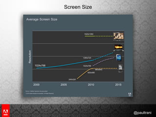


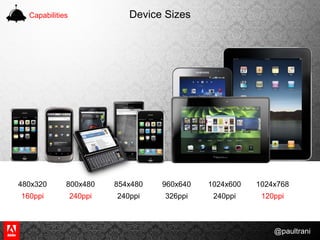


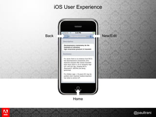

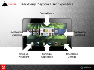


The document provides tips and tricks for mobile flash development, emphasizing the importance of optimizing content for various mobile devices and screen sizes. It covers aspects such as gesture-based navigation, device capabilities, and performance optimization strategies. Additionally, it highlights the significance of testing and the differences in user experience across platforms like iOS, Android, and Blackberry.


