SlideShare a Scribd company logo
1 of 3
Masthead
The bright colours to attract teenagers
and young people and it also catches
people’s attention. It is very large and is
in the primary optical area, this is so as
soon as you look at the magazine , you
know its Q.
Main image
The main image is a close up of jay-z’s
face, there is high key lighting to highlight
the anger in jay-z face. This shows the
genre of magazine and that it is about
non-conformists.
Model credit
The words ‘Jay-z’ are in gold to show
his wealth. The colours gold has
connotations of royalty and wealth.
The size of the text represents his
position within the world of music.
Cover lines
The cover lines never use more than 4
colours; here the colours are orange,
black, gold and white. These colours go
together nicely and fit in with the house
style.
Main cover line
The main cover line is ‘meet the planet’s
greatest rock star’ and ‘jay-z’ I know this
because they’re both in gold. This makes
the viewer want to read on and look at
the interview with jay-z.
The words ‘meet the planet’s greatest
rock star’ are highlighted in gold to draw
the viewers eyes to the text.
Colour
Red and gold have connotations of
wealth, power and royalty. This is
because jay-z is one of the richest men
in the world.
Typefaces
They have chosen fonts that are easy
to read, the black against the white
makes it easy to read. The text is in
capital letters to make it sound like
who ever is saying it is shouting
Photography Lighting
There is high key lighting on the right
side of his face which gradually lessens
into low key lighting on the left side of
his face. It looks realistic and 3
dimensional.
Design Principles Used?
The guttenburg design principle has
been used. It directs the eye from the
masthead to the barcode, left to right.
(it is not necessarily good as it directs
the eye to the price and not the actual
content of the magazine.
House Style
The majority of the text is sans serif; this means that it is easy to
read. The text is quite harsh; it represents the rapper on the front.
The colours are mainly red, black and gold; these are the main
colours for Q magazine. The text for the main cover lines are quite
large however the cover lines are quite small.
Comment on how the design of the magazine cover attracts the target audience:
Masthead
The white text against the vibrant red
hair attracts teenagers and young people
and it also catches people’s attention. It
is very large and is in the primary optical
area, this is so as soon as you look at the
magazine, you know that it is NME.
Main image
The main image is a close up of Florence
Welsh’s face, there is high key lighting to
highlight her porcelain skin. This shows
the genre of magazine (indie).
Model credit
The words ‘Florence’ are in bold black
text to show that she has a bold
personality. The colours black has
connotations of class as she is a very
classy, sophisticated and mysterious
woman.
Cover lines
The cover lines never use more than 4
colours; here the colours are white and
black. These colours go together nicely
and fit in with the house style.
Main cover line
The main cover line is ‘I would never have
got through the x factor auditions’ I know
this because it is just above the text
‘florence’. This makes the viewer want to
read on and see what Florence welsh is
saying.
House Style
The majority of the text is sans serif; this means that it is easy to
read. The text is quite harsh; it represents the genre of magazine.
The colours are mainly red, black and white; these are the main
colours for NME magazine. The text for the main cover lines are
quite large however the cover lines are quite small.
Comment on how the design of the magazine cover attracts the target audience: Colour
The colours black and red have
connotations of class and mystery. This
is because Florence Welsh is one of
the very classy.
Typefaces
They have chosen fonts that are easy
to read, the black against the red
makes it easy to read. The text is in
capital letters to make it sound like
who ever is saying it is shouting
Photography Lighting
There is high key lighting on the
Florence Welsh’s face which shows her
porcelain face.
Design Principles Used?
The guttenburg design principle has
been used. It directs the eye from the
masthead to the barcode, left to right.
(it is not necessarily good as it directs
the eye to the price and not the actual
content of the magazine.
Masthead
The blue text against the grey attracts
teenagers and young people and it also
catches people’s attention. It is very large
and is in the primary optical area, this is
so as soon as you look at the magazine,
you know that it is vibe, although Kanye
Wests head is covering the masthead, we
still know that it is VIBE.
Main image
The main image is a close up of Kanye
West’s, there is high key lighting to
highlight his facial expression and make
the viewers focus on his face. This shows
the genre of magazine (indie).
Model credit
The words ‘Kanye West’ are in bold
pink text and is on a slant to show
that he is different and isn’t the
normal genre of music. The colours
blue and pink show that the magazine
is for all genders.
Coverlines
The cover lines never use more than 4
colours; here the colours are grey, blue,
pink and black. These colours go together
nicely and fit in with the house style
Main cover line
The main cover line is ’10 big secrets the
film wont tell’ I know this because it is
just above the text ‘VIBE’. This makes the
viewer want to read on and see what the
secrets are, it is in big bold text and in the
primary optical area to direct the viewer
to it
House Style
The majority of the text is sans serif; this means that it is easy to
read. The text is quite soft because of the colours but has harsh
edges; it represents the genre of magazine. The colours are mainly
pink, blue, grey and black; these are the main colours for VIBE
magazine.
Design Principles Used?
The guttenburg design principle has
been used. It directs the eye from the
masthead to the barcode, left to right.
(it is not necessarily good as it directs
the eye to the price and not the actual
content of the magazine.
Photography Lighting
There is high key lighting on Kanye
West’s face to highlight his facial
expression.
Typefaces
They have chosen fonts that are easy
to read, the blue and the pink make it
easy to read as they are bright. The
text is in capital letters to make it
stand out
Colour
The colours black, grey, pink and blue
show that the magazine is aimed at
both genders and the black is very
striking to catch the readers eye when
they see it on the shelf
Comment on how the design of the magazine cover attracts the target audience:

More Related Content

Viewers also liked

Blog invitation 7th birthday party
Blog invitation 7th birthday partyBlog invitation 7th birthday party
Blog invitation 7th birthday party
Eloise Witbooi
 
Market research results
Market research resultsMarket research results
Market research results
ninacollins78
 
Anti hazing 4.2
Anti hazing 4.2Anti hazing 4.2
Anti hazing 4.2
joeroachex
 
Garaziren ipuina
Garaziren ipuinaGaraziren ipuina
Garaziren ipuina
garazi14
 

Viewers also liked (17)

Survey monkey
Survey monkeySurvey monkey
Survey monkey
 
Shab bday ppt
Shab bday pptShab bday ppt
Shab bday ppt
 
Principles of Design
Principles of DesignPrinciples of Design
Principles of Design
 
Blog invitation 7th birthday party
Blog invitation 7th birthday partyBlog invitation 7th birthday party
Blog invitation 7th birthday party
 
Market research results
Market research resultsMarket research results
Market research results
 
Executive Summary: Global Initiative on Out-of-School Children in South Asia
Executive Summary: Global Initiative on Out-of-School Children in South AsiaExecutive Summary: Global Initiative on Out-of-School Children in South Asia
Executive Summary: Global Initiative on Out-of-School Children in South Asia
 
Workplace Video Conferencing Reinvented
Workplace Video Conferencing ReinventedWorkplace Video Conferencing Reinvented
Workplace Video Conferencing Reinvented
 
Analysis task music video
Analysis task music videoAnalysis task music video
Analysis task music video
 
Survey monkey
Survey monkeySurvey monkey
Survey monkey
 
DAMMAM SECOND INDUSTRIAL CITY - IPS REHABILITATION WORKS
DAMMAM SECOND INDUSTRIAL CITY - IPS REHABILITATION WORKSDAMMAM SECOND INDUSTRIAL CITY - IPS REHABILITATION WORKS
DAMMAM SECOND INDUSTRIAL CITY - IPS REHABILITATION WORKS
 
Anti hazing 4.2
Anti hazing 4.2Anti hazing 4.2
Anti hazing 4.2
 
Raw images
Raw imagesRaw images
Raw images
 
Shabs budday ppt
Shabs budday pptShabs budday ppt
Shabs budday ppt
 
How did you attract
How did you attractHow did you attract
How did you attract
 
Production diary
Production diaryProduction diary
Production diary
 
Garaziren ipuina
Garaziren ipuinaGaraziren ipuina
Garaziren ipuina
 
Lacey’s repertoire of elements3
Lacey’s repertoire of elements3Lacey’s repertoire of elements3
Lacey’s repertoire of elements3
 

More from ninacollins78 (20)

Storyboards
StoryboardsStoryboards
Storyboards
 
hfTest shots
hfTest shotshfTest shots
hfTest shots
 
Music advert analysis jessie j
Music advert analysis jessie jMusic advert analysis jessie j
Music advert analysis jessie j
 
Music advert analysis ellie goulding
Music advert analysis ellie gouldingMusic advert analysis ellie goulding
Music advert analysis ellie goulding
 
Lana del rey
Lana del reyLana del rey
Lana del rey
 
Music advert analysis jessie j
Music advert analysis jessie jMusic advert analysis jessie j
Music advert analysis jessie j
 
Lana del rey
Lana del reyLana del rey
Lana del rey
 
Permission to use song
Permission to use songPermission to use song
Permission to use song
 
Lana del rey
Lana del reyLana del rey
Lana del rey
 
Lacey’s repertoire of elements
Lacey’s repertoire of elementsLacey’s repertoire of elements
Lacey’s repertoire of elements
 
Music video analysis1
Music video analysis1Music video analysis1
Music video analysis1
 
Analysis task music video
Analysis task music videoAnalysis task music video
Analysis task music video
 
Sia chandelier
Sia chandelierSia chandelier
Sia chandelier
 
Sia chandelier
Sia chandelierSia chandelier
Sia chandelier
 
Sia chandelier
Sia chandelierSia chandelier
Sia chandelier
 
Sia chandelier
Sia chandelierSia chandelier
Sia chandelier
 
Final draft of double page article
Final draft of double page articleFinal draft of double page article
Final draft of double page article
 
Band image man
Band image manBand image man
Band image man
 
Focous group
Focous groupFocous group
Focous group
 
What have you learnt about technologies from the process of constructing this...
What have you learnt about technologies from the process of constructing this...What have you learnt about technologies from the process of constructing this...
What have you learnt about technologies from the process of constructing this...
 

Magazine cover analysis_worksheet
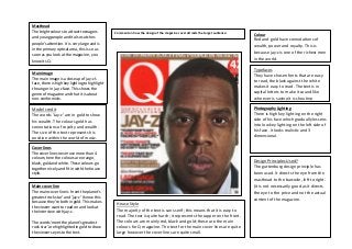
  • 1. Masthead The bright colours to attract teenagers and young people and it also catches people’s attention. It is very large and is in the primary optical area, this is so as soon as you look at the magazine , you know its Q. Main image The main image is a close up of jay-z’s face, there is high key lighting to highlight the anger in jay-z face. This shows the genre of magazine and that it is about non-conformists. Model credit The words ‘Jay-z’ are in gold to show his wealth. The colours gold has connotations of royalty and wealth. The size of the text represents his position within the world of music. Cover lines The cover lines never use more than 4 colours; here the colours are orange, black, gold and white. These colours go together nicely and fit in with the house style. Main cover line The main cover line is ‘meet the planet’s greatest rock star’ and ‘jay-z’ I know this because they’re both in gold. This makes the viewer want to read on and look at the interview with jay-z. The words ‘meet the planet’s greatest rock star’ are highlighted in gold to draw the viewers eyes to the text. Colour Red and gold have connotations of wealth, power and royalty. This is because jay-z is one of the richest men in the world. Typefaces They have chosen fonts that are easy to read, the black against the white makes it easy to read. The text is in capital letters to make it sound like who ever is saying it is shouting Photography Lighting There is high key lighting on the right side of his face which gradually lessens into low key lighting on the left side of his face. It looks realistic and 3 dimensional. Design Principles Used? The guttenburg design principle has been used. It directs the eye from the masthead to the barcode, left to right. (it is not necessarily good as it directs the eye to the price and not the actual content of the magazine. House Style The majority of the text is sans serif; this means that it is easy to read. The text is quite harsh; it represents the rapper on the front. The colours are mainly red, black and gold; these are the main colours for Q magazine. The text for the main cover lines are quite large however the cover lines are quite small. Comment on how the design of the magazine cover attracts the target audience:
  • 2. Masthead The white text against the vibrant red hair attracts teenagers and young people and it also catches people’s attention. It is very large and is in the primary optical area, this is so as soon as you look at the magazine, you know that it is NME. Main image The main image is a close up of Florence Welsh’s face, there is high key lighting to highlight her porcelain skin. This shows the genre of magazine (indie). Model credit The words ‘Florence’ are in bold black text to show that she has a bold personality. The colours black has connotations of class as she is a very classy, sophisticated and mysterious woman. Cover lines The cover lines never use more than 4 colours; here the colours are white and black. These colours go together nicely and fit in with the house style. Main cover line The main cover line is ‘I would never have got through the x factor auditions’ I know this because it is just above the text ‘florence’. This makes the viewer want to read on and see what Florence welsh is saying. House Style The majority of the text is sans serif; this means that it is easy to read. The text is quite harsh; it represents the genre of magazine. The colours are mainly red, black and white; these are the main colours for NME magazine. The text for the main cover lines are quite large however the cover lines are quite small. Comment on how the design of the magazine cover attracts the target audience: Colour The colours black and red have connotations of class and mystery. This is because Florence Welsh is one of the very classy. Typefaces They have chosen fonts that are easy to read, the black against the red makes it easy to read. The text is in capital letters to make it sound like who ever is saying it is shouting Photography Lighting There is high key lighting on the Florence Welsh’s face which shows her porcelain face. Design Principles Used? The guttenburg design principle has been used. It directs the eye from the masthead to the barcode, left to right. (it is not necessarily good as it directs the eye to the price and not the actual content of the magazine.
  • 3. Masthead The blue text against the grey attracts teenagers and young people and it also catches people’s attention. It is very large and is in the primary optical area, this is so as soon as you look at the magazine, you know that it is vibe, although Kanye Wests head is covering the masthead, we still know that it is VIBE. Main image The main image is a close up of Kanye West’s, there is high key lighting to highlight his facial expression and make the viewers focus on his face. This shows the genre of magazine (indie). Model credit The words ‘Kanye West’ are in bold pink text and is on a slant to show that he is different and isn’t the normal genre of music. The colours blue and pink show that the magazine is for all genders. Coverlines The cover lines never use more than 4 colours; here the colours are grey, blue, pink and black. These colours go together nicely and fit in with the house style Main cover line The main cover line is ’10 big secrets the film wont tell’ I know this because it is just above the text ‘VIBE’. This makes the viewer want to read on and see what the secrets are, it is in big bold text and in the primary optical area to direct the viewer to it House Style The majority of the text is sans serif; this means that it is easy to read. The text is quite soft because of the colours but has harsh edges; it represents the genre of magazine. The colours are mainly pink, blue, grey and black; these are the main colours for VIBE magazine. Design Principles Used? The guttenburg design principle has been used. It directs the eye from the masthead to the barcode, left to right. (it is not necessarily good as it directs the eye to the price and not the actual content of the magazine. Photography Lighting There is high key lighting on Kanye West’s face to highlight his facial expression. Typefaces They have chosen fonts that are easy to read, the blue and the pink make it easy to read as they are bright. The text is in capital letters to make it stand out Colour The colours black, grey, pink and blue show that the magazine is aimed at both genders and the black is very striking to catch the readers eye when they see it on the shelf Comment on how the design of the magazine cover attracts the target audience: