1. Mid-Close up of Lewis outsideof the DT
building. I used this type of shotdue to it being
the stereotypicalshot you would expect to see
on a frontcover. The brick is a solid
background and makes the person in the main
image stand out more.
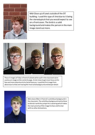
These 3 imagesof Toby infrontof a blankwhite wall inthe classroomwere
usedas an image onthe contentspage.A mid-close togetmore focusonhis
face and more attentiontohisfacial features.Iusedthe firstimage from
above due to that one having the mostsolidbackgroundanddeeperdetail.
Mid-close of Beninfrontof a solidblue backgroundin
the classroom.The solidblue backgroundmainlythere
to blendinwiththe jumperhe iswearingwhichmakes
the mainpriorityof the image hisface andhishair
withno otherdistractions.
2. This long shot of myself leaning onto a tree outside
of college, I used this shot again to make myself
stand out on the article that I included myself in,
green background and grey/black clothes, makes
myself stand out as a pose to a black background.