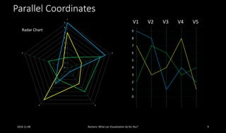
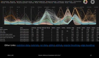
Download to read offline

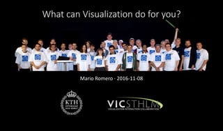
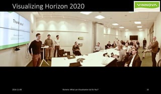
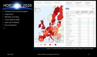
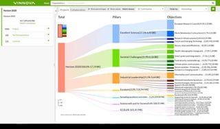
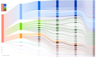
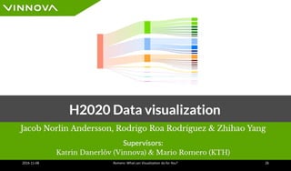
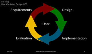

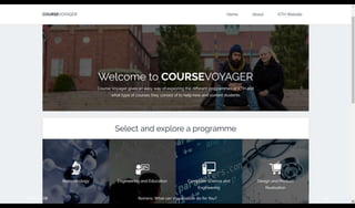

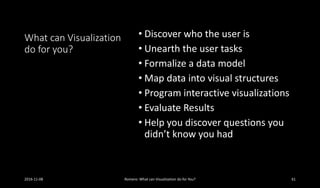
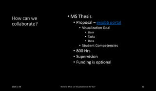

This document discusses how visualization can help users understand and analyze data. It provides examples of visualizations created at KTH to analyze EU Horizon 2020 funding data, transportation systems, water usage, and education impacts. The document emphasizes the importance of understanding the user and their tasks, collecting and structuring the relevant data, and designing visualizations that effectively support the analysis process through an iterative user-centered approach. Collaboration opportunities for student thesis projects focusing on visualization design and evaluation are also mentioned.


![Hacking-Uncovered-How-People-Get-Hacked-and-How-to-Stay-Safe[1].pptx](https://cdn.slidesharecdn.com/ss_thumbnails/hacking-uncovered-how-people-get-hacked-and-how-to-stay-safe1-260130170011-4883a9c7-thumbnail.jpg?width=640&height=640&fit=bounds)


