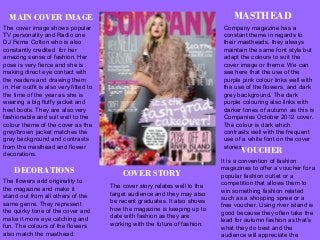
MASTHEAD 
Company magazine has a 
constant theme in regards to 
their mastheads, they always 
maintain the same font style but 
adapt the colours to suit the 
cover image or theme. We can 
see here that the use of the 
purple pink colour links well with 
the use of the flowers, and dark 
grey background. The dark 
purple colouring also links with 
darker tones of autumn as this is 
Companies October 2012 cover. 
The colour is dark which 
contrasts well with the frequent 
use of a white font on the cover 
storiesV. OUCHER 
It is a convention of fashion 
magazines to offer a voucher for a 
popular fashion outlet or a 
competition that allows them to 
win something fashion related 
such as a shopping spree or a 
free voucher. Using river island is 
good because they often take the 
lead for autumn fashion as that’s 
what they do best and the 
audience will appreciate the 
money off. 
MAIN COVER IMAGE 
The cover image shows popular 
TV personality and Radio one 
DJ Ferne Cotton who is also 
constantly credited for her 
amazing sense of fashion. Her 
pose is very fierce and she is 
making direct eye contact with 
the readers and drawing them 
in. Her outfit is also very fitted to 
the time of the year as she is 
wearing a big fluffy jacket and 
heel boots. They are also very 
fashionable and suit well to the 
colour theme of the cover as the 
grey/brown jacket matches the 
grey background and contrasts 
from the masthead and flower 
decorations. 
DECORATIONS 
The flowers add originality to 
the magazine and make it 
stand out from all others of the 
same genre. They represent 
the quirky tone of the cover and 
make it more eye catching and 
fun. The colours of the flowers 
also match the masthead. 
COVER STORY 
The cover story relates well to the 
target audience and they may also 
be recent graduates. It also shows 
how the magazine is keeping up to 
date with fashion as they are 
working with the future of fashion.
IMAGES FROM INSIDE THE MAGAZINE. 
These two images have inspired me a lot because of their 
simplicity. In my opinion fashion magazines often over do 
photos with wild backgrounds etc and I like how company 
focuses on the model and the outfits they are wearing. 
This is a re occurring theme for them and they utilise the 
grey background as their own individual style which sets 
them apart from competitors. Rather than going all out 
they have took the less is more approach and I feel that 
they have achieved their goal very well. The outfits are 
also fitting for the autumn edition because they look more 
suited to the season with the use of vintage floral patterns 
which has been a reoccurring trend over the last few 
autumn seasons. Ferne cotton also has her own individual 
style which is portrayed on these images, this shows how 
company respects peoples individualities and own 
personal styles. By removing any background competition 
the clothing stands out more and emphasis is placed on 
them and the model rather than the surroundings. The 
poses are also very important because they compliment 
the clothing, both show clearly the shoes being warn and 
neither hide the dresses they help to extenuates them.
EXAMPLES OF ARTICLES FROM INSIDE THE MAGAZINE 
These are examples of 4 inside pages of companies October 2013 edition. One trend you can 
see throughout is the use of a plain white background which allows them to highlight the 
clothing/accessories. By removing background images they allow the focus to be on the fashion 
and the trends they are trying to express. I also like how they haven't tried to over board us with 
images of models and instead have took simple images of the items, which allows them to space 
out the images while using more than would have been previously possible. My favourite of the 4 
is the 'Candy Coated' page because I think it is very aesthetically pleasing, the theme is very well 
links with the overall genre of the magazine and they have played around with the colour theme to 
make the page more interesting without over cluttering it. They have also used a very stead 
colour theme throughout the page to keep it constantly linked and place emphasis on the fact that 
browns and peaches are on trend this season. They also use constant colours throughout the 
pages that compliment each other so that it is easy on the eye.

Company magazine deconstruction

  • 2.
    MASTHEAD Company magazinehas a constant theme in regards to their mastheads, they always maintain the same font style but adapt the colours to suit the cover image or theme. We can see here that the use of the purple pink colour links well with the use of the flowers, and dark grey background. The dark purple colouring also links with darker tones of autumn as this is Companies October 2012 cover. The colour is dark which contrasts well with the frequent use of a white font on the cover storiesV. OUCHER It is a convention of fashion magazines to offer a voucher for a popular fashion outlet or a competition that allows them to win something fashion related such as a shopping spree or a free voucher. Using river island is good because they often take the lead for autumn fashion as that’s what they do best and the audience will appreciate the money off. MAIN COVER IMAGE The cover image shows popular TV personality and Radio one DJ Ferne Cotton who is also constantly credited for her amazing sense of fashion. Her pose is very fierce and she is making direct eye contact with the readers and drawing them in. Her outfit is also very fitted to the time of the year as she is wearing a big fluffy jacket and heel boots. They are also very fashionable and suit well to the colour theme of the cover as the grey/brown jacket matches the grey background and contrasts from the masthead and flower decorations. DECORATIONS The flowers add originality to the magazine and make it stand out from all others of the same genre. They represent the quirky tone of the cover and make it more eye catching and fun. The colours of the flowers also match the masthead. COVER STORY The cover story relates well to the target audience and they may also be recent graduates. It also shows how the magazine is keeping up to date with fashion as they are working with the future of fashion.
  • 3.
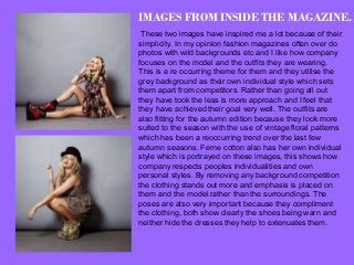
    IMAGES FROM INSIDETHE MAGAZINE. These two images have inspired me a lot because of their simplicity. In my opinion fashion magazines often over do photos with wild backgrounds etc and I like how company focuses on the model and the outfits they are wearing. This is a re occurring theme for them and they utilise the grey background as their own individual style which sets them apart from competitors. Rather than going all out they have took the less is more approach and I feel that they have achieved their goal very well. The outfits are also fitting for the autumn edition because they look more suited to the season with the use of vintage floral patterns which has been a reoccurring trend over the last few autumn seasons. Ferne cotton also has her own individual style which is portrayed on these images, this shows how company respects peoples individualities and own personal styles. By removing any background competition the clothing stands out more and emphasis is placed on them and the model rather than the surroundings. The poses are also very important because they compliment the clothing, both show clearly the shoes being warn and neither hide the dresses they help to extenuates them.
  • 4.
    EXAMPLES OF ARTICLESFROM INSIDE THE MAGAZINE These are examples of 4 inside pages of companies October 2013 edition. One trend you can see throughout is the use of a plain white background which allows them to highlight the clothing/accessories. By removing background images they allow the focus to be on the fashion and the trends they are trying to express. I also like how they haven't tried to over board us with images of models and instead have took simple images of the items, which allows them to space out the images while using more than would have been previously possible. My favourite of the 4 is the 'Candy Coated' page because I think it is very aesthetically pleasing, the theme is very well links with the overall genre of the magazine and they have played around with the colour theme to make the page more interesting without over cluttering it. They have also used a very stead colour theme throughout the page to keep it constantly linked and place emphasis on the fact that browns and peaches are on trend this season. They also use constant colours throughout the pages that compliment each other so that it is easy on the eye.