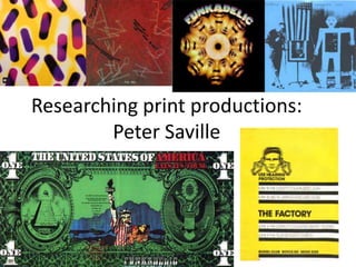
2. Peter Saville, graphic designer for
factory records
• Peter Saville is an award winning art director and graphic designer, as well
as a pioneer of modern typography. He is a cofounder of factory records
and is known for many record sleeves he designed for Factory Records
artists, such as post-punk ‘Joy Division’, ‘New Order’, ‘Orchestral
Manoeuvres In The Dark’ and ‘The Happy Mondays’ .
3.
4. Peter Saville continued
•
•
•
•
•
Alice Twemlow, Design critic wrote: "... in the 1980s ... he would directly and
irreverently "lift" an image from one genre—art history for example—and
recontextualize it in another. A Fantin-Latour "Roses" painting in combination with a
colour-coded alphabet became the seminal album cover for New Order's Power,
Corruption and Lies (1983), for example.“
(Quote taken from:
http://en.wikipedia.org/wiki/Peter_Saville_%28graphic_designer%29)
“Design has become the cover for unnecessary consumption.”- Peter Saville. The more
fine tuning design towards a specific audience, the more a manufacturer can charge for
whatever they are selling, the better something is designed, the more it is valued. Is the
design profession through his eyes, nothing more than a slave to the current economic
system, creating products tailored to a specific audience to make them feel they need it
as it is important for their identity within a subculture etc.
“Meanwhile design, which used to be known as a profession, has become a major
source of pollution.” Jasper Morrison. Every time a new gadget (like another “game
changing” gadget) is introduced, it triggers a massive dump-and-buy reaction all around
the world. Great news for the manufacturers of course. Not so good for just about
every one else.
(Quote’s taken from: http://eicolab.com.au/2011/01/design-and-unnecessaryconsumption/)
5. Peter Saville’s, development of the graphic identity of ‘Joy
Division’ throughout their career – ‘Unknown Pleasures’
Released: June 1979
Label: Factory
Formats: LP, cassette
This was the first and only time that the band gave me something that
they’d like for a cover. I went to see Rob Gretton, who managed them,
and he gave me a folder of material, which contained the wave image
from the Cambridge Encyclopaedia of Astronomy. They gave me the
title too but I didn’t hear the album. The wave pattern was so
appropriate. It was from CP 1919, the first pulsar, so it’s likely that the
graph emanated from Jodrell Bank, which is local to Manchester and
Joy Division. And it’s both technical and sensual. It’s tight, like Stephen
Morris’ drumming, but it’s also fluid: lots of people think it’s a heart
beat. Having the title on the front just didn’t seem necessary. I asked
Rob about it and, between us, we felt it wasn’t a cool thing to do. It
was the post-punk moment and we were against overblown stardom.
The band didn’t want to be pop stars. ( account copied from:
http://www.theguardian.com/music/gallery/2011/may/29/joydivisionneworder)
6. Peter Saville’s, development of the graphic identity of
‘Joy Division’ throughout their career – ‘Closer’
Released: July 1980
Label: Factory
Formats: LP, cassette
Peter Saville: “This cover for the band’s second album was like a
work of antiquity, but inside is a vinyl album, so it’s a postmodern
juxtaposition of a contemporary work housed in the antique. At
first, I didn’t believe the photo was an actual tomb but it’s really in
a cemetery in Genoa. When Tony Wilson (Factory co-founder) told
me Ian Curtis had died I said, ‘Tony, we have a tomb on the cover.’
There was great deliberation as to whether to continue with it. But
the band, Ian included, had chosen the photograph. We did it in
good faith and not in any post-tragedy way” ( account copied from:
http://www.theguardian.com/music/gallery/2011/may/29/joydivisi
on-neworder)
7. Emphasis on artists identity
Released: October 1981
Label: Factory
Formats: Double LP,
cassette, CD
These album covers are very minimal and do little for the promotion of the
band, although this is a typical convention within graphic design for music
distribution, bands and artists who are well known enough do not need to
paste their faces all over the covers in order to sell. For example the initial
‘Beatles’ albums were colourful and created so as to sell the artists,
however when the band had become a pop sensation, when they released
their ‘White’ album which was a blank glossy white background with ‘The
Beatles’ small in the corner. ‘The Beatles’ at that point did not need to
promote themselves and so instead left the case blank, with images of
themselves inside
Released: July 1988
Label: Factory
Not all albums or in complete chronological order