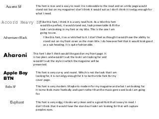
AccentSF This fontis nice and is easy to read. It is noticeable to the read and on a title page would
stand out but on my magazine I don’t think it would suit as I don’t think it is edgy enough for
what I need.
Accord Heavy SFI like this font, I think It is a very neat font. As a title this font
would be perfect, it would stand out, look presentable & fit the
look I am looking in my font or my title. This is the one I am
going to use.
AdventurerBlack I like this font, it as a retro feel to it. I don’t feel as though it would have the ability to
stand out on my front cover as the main title. I do however feel that it would look good
as a sub heading. It is quite fashionable.
Aharoni This font I don’t think would like good on my front page. It
is too plain and wouldn't suit the look I am looking for and
wouldn't suit the style in which the magazine will be
presented.
Apple Boy
BTN
This font is very curvy and round. Which is not the look that I am
looking for, it is not edgy enough for it to be the title font for my
cover page.
BoltsSF This font is very modern. Maybe to modern for my magazine and what I am looking for.
It to me feels more footbally and sport rather than the music genre and look I am going
for.
Elephant This font is very edgy, it looks very clean and is a good font that is easy to read. I
don’t think that it would have the stand out look I am looking for that will capture
peoples eyes.
2.
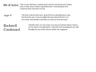
MS UI GothicThis is not a title font, it would more suit the actual text and content
font, in that sense I think it would be what I am looking for and
would be clean and easy to read.
Jagger SF This font is like the first font, Accent SF the only difference is the
fact that this one is more straight than the Accent SF font. It is
very clean and wouldn’t look bad as a title on my front cover.
Rockwell
Condensed
I like this font, it is very clean. It is easy to read but doesn’t stand
out for what I am looking for. I think this font would good as a side
heading for one of the articles within the magazine.